Job application forms on WordPress sites are vital for a streamlined hiring process. They help collect necessary applicant information, such as contact details, qualifications, and experience.
Using WordPress for these forms simplifies application collection and candidate management, which is especially beneficial for recruiting agencies, hiring websites, and businesses of all sizes.
With JetFormBuilder, you can create a job application form by implementing all the needed features.
Contents:
- Why You Need a WordPress Job Application Form
- Top WordPress Job Application Form Features
- WordPress Job Application Form Structure
- How to Create a WordPress Custom Job Application Form
- WordPress Job Application Form Pro Features
Why You Need a WordPress Job Application Form
The JetFormBuilder application forms help to collect job applications and detect potential employees directly on your website.
With a user-friendly form, you can not only attract more candidates but also organize the needed candidate information in one place for easy comparison and selection.
Top WordPress Job Application Form Features
- Turn long application forms into multi-step and make them user-friendly;
- Decide which form fields you want to make required;
- Allow applicants to easily attach files to their applications. Set specific file types and sizes, adjust restrictions and verification options to ensure file security and maintain a clean database;
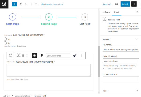
- Implement the Conditional Visibility feature to make job application forms more dynamic. It allows form fields to be shown or hidden based on the applicant’s previous inputs;
- Use reCAPTCHA v3 validation to protect the application form from spam and bot submissions. Keep the application pool relevant and manageable, saving time and resources in the recruitment process;
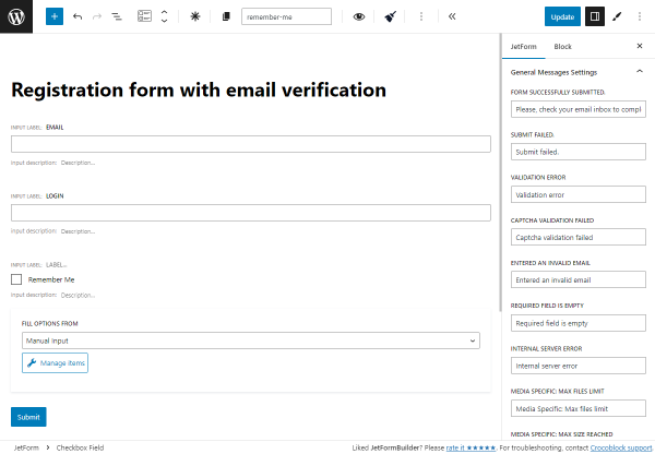
- Provide the Success, Validation, and Error Messages during form submission;
- Receive email notifications to the specified email address each time the form is submitted.
WordPress Job Application Form Structure
Step 1 — Personal Information
- Name. A required Text Field for filling in the applicant’s name;
- Surname. A required Text Field for filling in the applicant’s last name;
- Email Address. A required Text Field of “Email” FIELD TYPE for filling in the applicant’s email;
- Phone Number. A required Text Field of “Tel” FIELD TYPE for filling in the applicant’s phone number;
- LinkedIn Profile. A required Text Field for filling in the applicant’s LinkedIn profile;
- Next page. A Next Page block for proceeding to the next page;
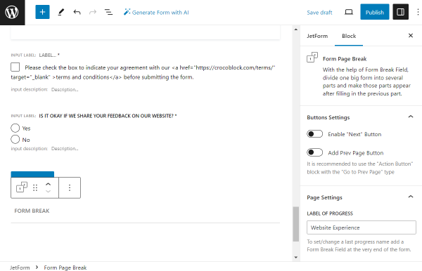
- Form Page Break. An indicator of the end of the first part of the form.
Step 2 — Experience
- Fulfill Work Experience and Education Info. A required Radio Field with two options so the applicant can choose whether they want to upload a resume or complete the needed information manually;
- Upload Resume. A required Media Field for the resume file uploading;
- Job Title. A required Select Field for filling in the applicant’s previous job title;
- Company Name. A required Text Field for filling in the company name of the applicant’s previous place of work;
- Start Date. A required Date Field for filling in the start date of the applicant’s previous company;
- End Date. A required Date Field for filling in the end date of the applicant’s previous company;
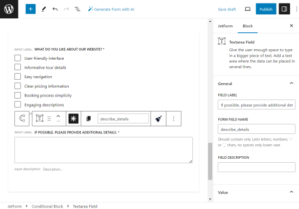
- Responsibilities. A Textarea Field for filling in the applicant’s responsibilities;
- Repeater. A Repeater Field if the applicant wants to add several places of work;
- Previous page. A Prev Page block for going back to the previous page;
- Next page. A Next Page block for proceeding to the next page;
- Form Page Break. An indicator of the end of the second part of the form.
Step 3 — Education
- Highest Degree. A required Select Field for filling in the applicant’s higher education degree;
- Institution. A required Text Field for filling in the applicant’s institution of learning;
- Field of Study. A required Text Field for filling in the applicant’s field of study;
- Graduation Date. A Text Field for filling in the applicant’s graduation date;
- Previous page. A Prev Page block for going back to the previous page;
- Next page. A Next Page block for proceeding to the next page;
- Form Page Break. An indicator of the end of the third part of the form.
Step 4 — Additional Information
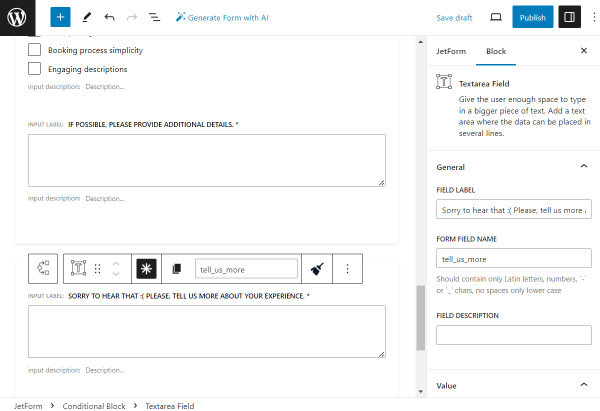
- Cover Letter. A Textarea Field for filling in the applicant’s cover letter;
- Portfolio URL. A Text Field of “Url” FIELD TYPE for filling in the URL of the portfolio;
- Additional Comments. A Textarea Field for filling in the applicant’s additional comments;
- Previous page. A Prev Page block for going back to the previous page;
- Save and complete. An Action Button block for completing the form.
How to Create a WordPress Custom Job Application Form
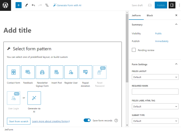
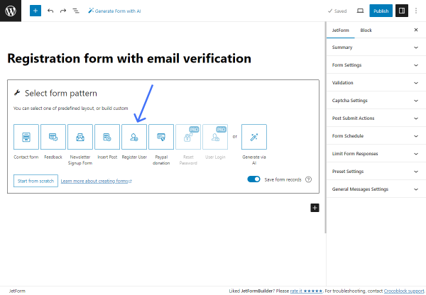
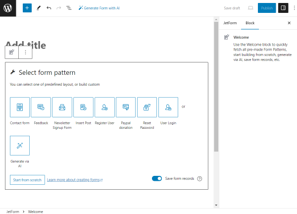
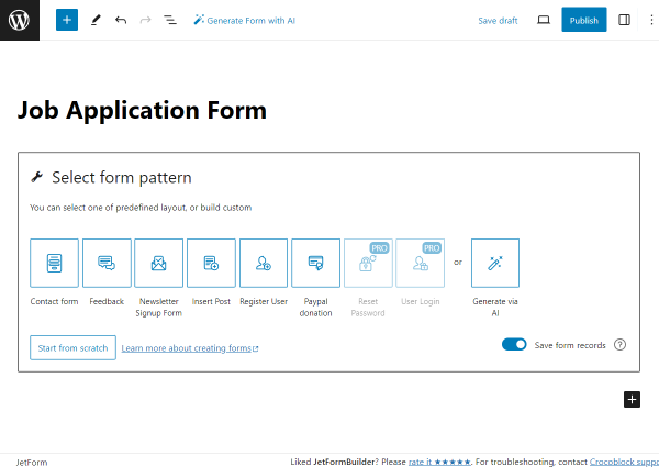
To create a WordPress online application form, navigate to WordPress Dashboard > JetFormBuilder > Add New.
Type in the title of the form.
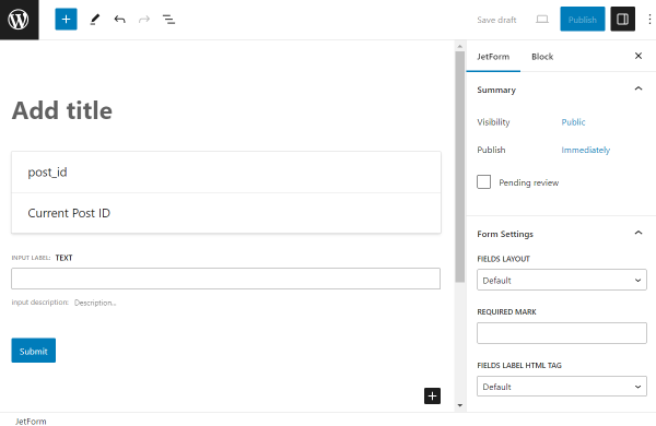
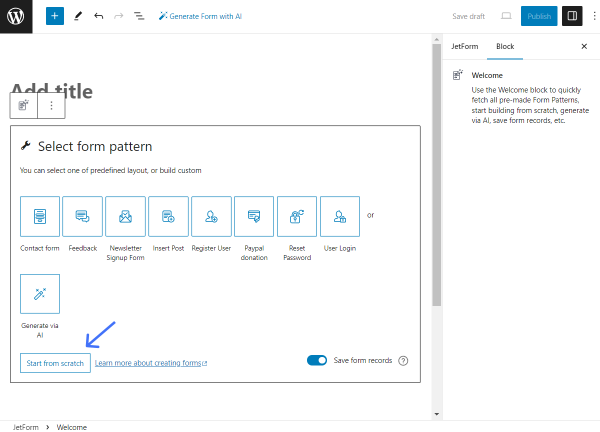
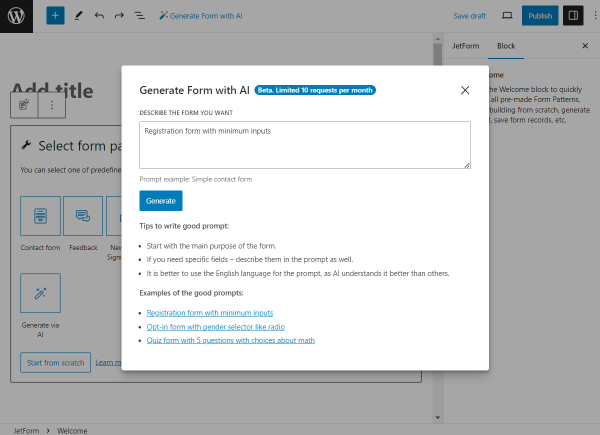
At first, the Welcome block is added to the form by default. Push the “Start from scratch” button to build a brand-new form.
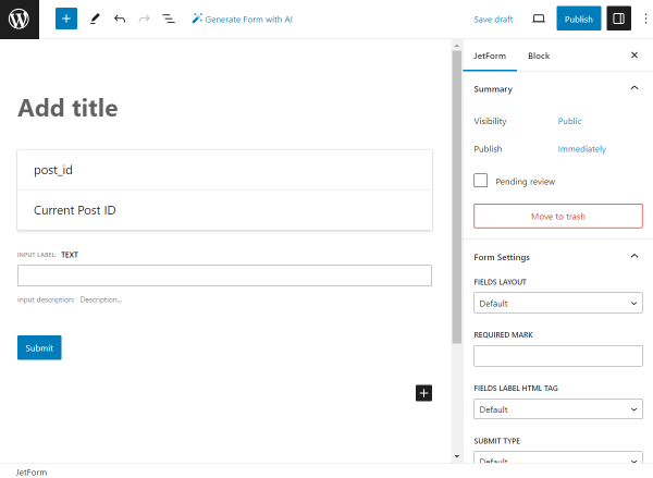
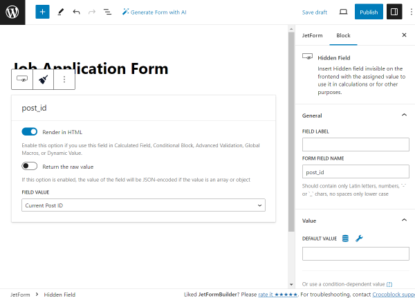
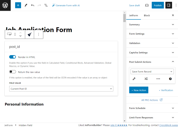
The three blocks are now added to the page: the Hidden Field, the Text Field, and the Action Button.
We delete the Text Field and the Action Button, leaving only the Hidden Field on the page.
No alterations to the block are needed at this time. We will keep the settings default to save the “Current Post ID” to the Form Records page later.
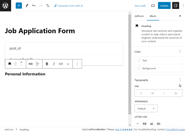
We begin the form with the “Personal information” Heading block.
The style settings can be adjusted right in the block settings.
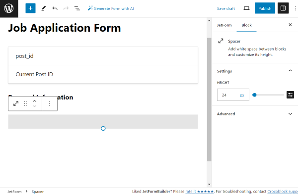
The following block is a Spacer placed to create additional space between the fields.
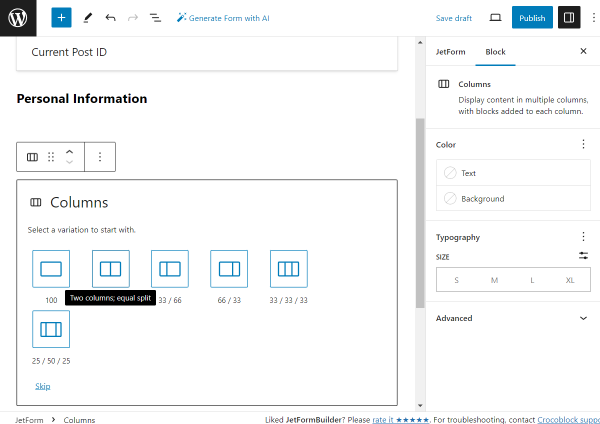
Then, we add the Columns block and choose the two-column layout.
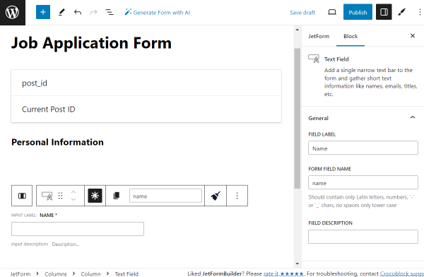
In the left column, we add the first Text Field.
We set its LABEL to “Name,” and therefore, the FORM FIELD NAME is generated automatically based on the set LABEL — “name.” It can be optionally changed if needed.
We also make this field required by clicking the “asterisk” icon located above it in the horizontal settings panel.
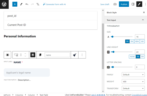
Right away, we work on the style settings. To make it possible, we installed and activated the free JetStyleManager plugin.
Every style change is up to your preference.
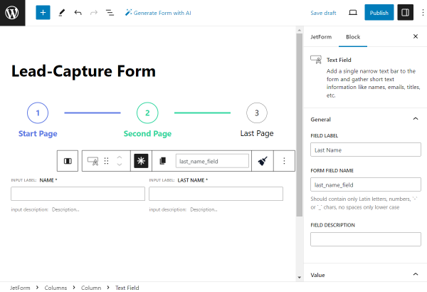
In the right column, we place the Text Field indicating “Surname,” which is also set as required and has settings similar to those of the previous field.
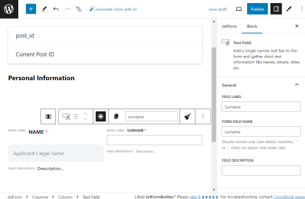
Adjust the style settings according to your preferences.
We add one more Spacer to create a gap between the previous and following fields.
Then, we add one more two-column layout with the help of the Columns block.
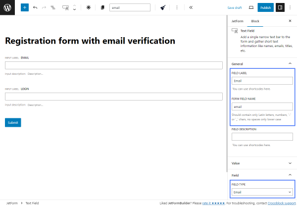
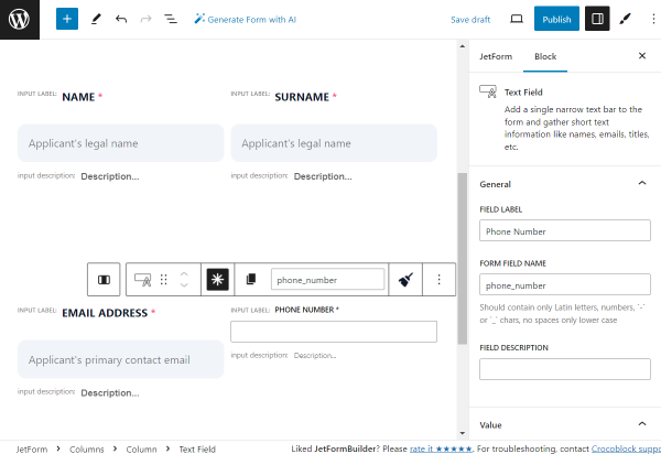
In the left column, we put the required Text Field with the “Email Address” Label.
This time, we change the FIELD TYPE from the default “Text” option to “Email.”

Adjust the style settings according to your preferences.
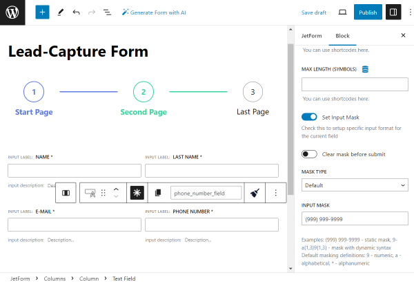
In the right column, we put the following required Text Field with the “Phone Number” FIELD LABEL.
Its FIELD TYPE should be set to “Tel.”
Adjust the style settings according to your preferences.
Then, we add one more Spacer and the Columns block with a two-column layout once again.
In the left column, we put the last Text Field of this form part, the required “LinkedIn Profile.”
We change the FIELD TYPE to “Url” and leave other settings by default.
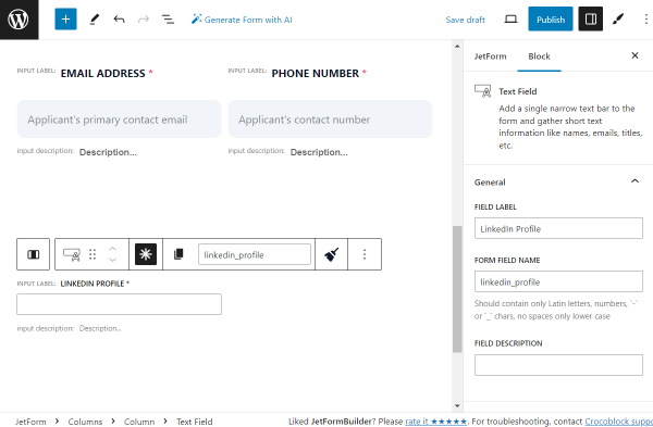
Adjust the style settings according to your preferences.
We leave the right column of this two-column layout blank and add one more Columns block with the two-column layout below.
The left column is empty now, and in the right column, we put Spacer.
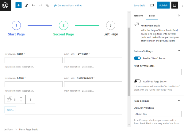
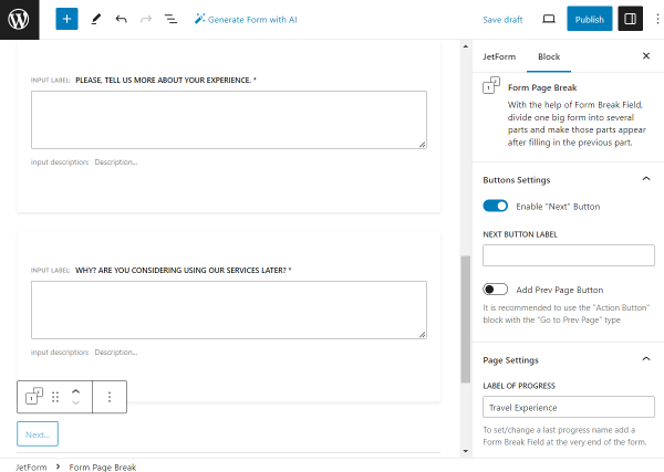
Below the Spacer, in the same column, we add the Next Page block. Since it will serve as the “Next” button, we complete the FIELD LABEL accordingly.
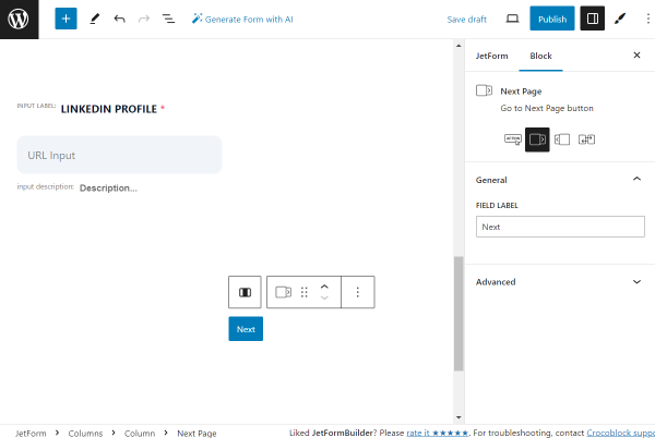
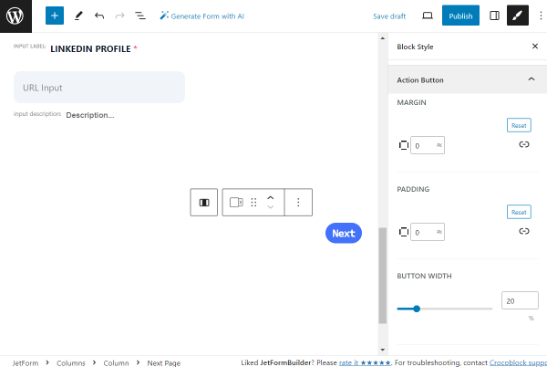
Adjust the style settings according to your preferences.
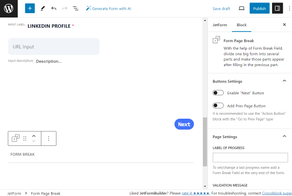
Then, we add the Form Page Break block to finish this part of the form. Its settings remain default.
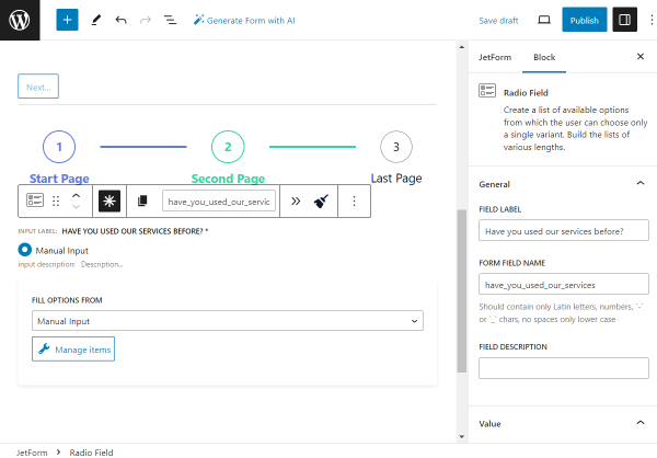
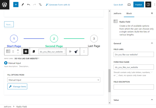
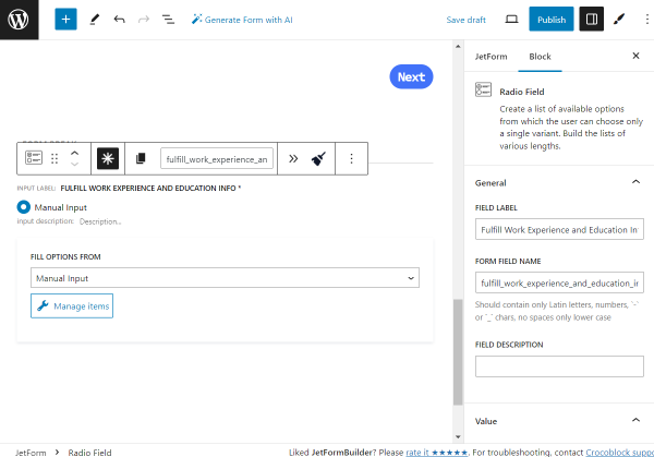
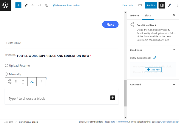
The first field of the second part of the form is the required Radio Field.
Its LABEL is set to “Fulfill Work Experience and Education Info,” the FORM FIELD LABEL is generated automatically, and the DEFAULT VALUE is set to “manually,” the option we will now add to the radio.
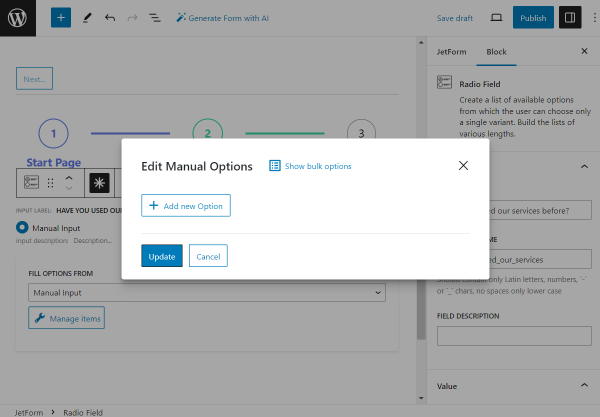
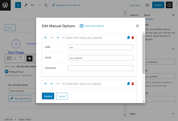
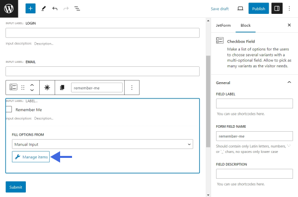
To add the options, push the “Manage items” button.
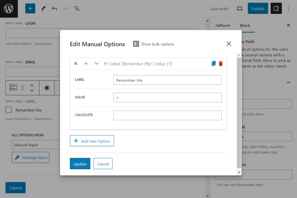
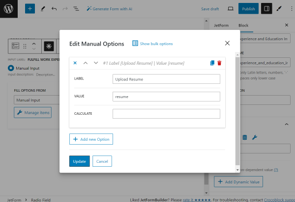
In the opened pop-up, click the “Add new Option” button.
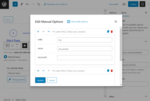
We add the first option, setting its LABEL to “Upload resume” and VALUE to “resume.”
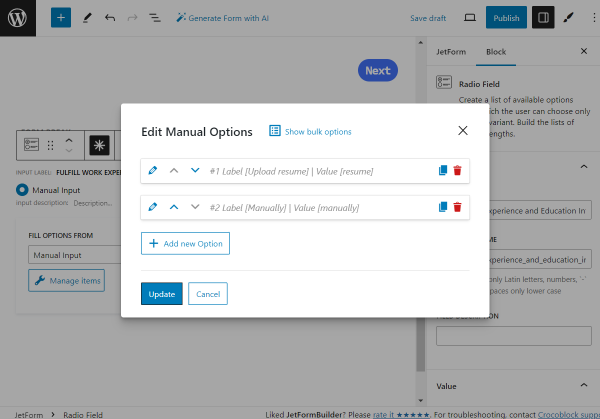
Then, we add one more option by clicking the “Add new Option” button.
Another option has the “Manually” LABEL and “manually” VALUE.
Once all the options are set, push the “Update” button.
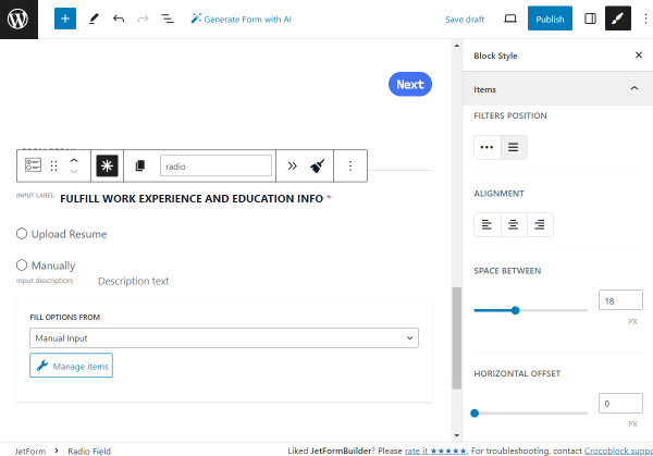
Now, adjust the style settings according to your preferences.
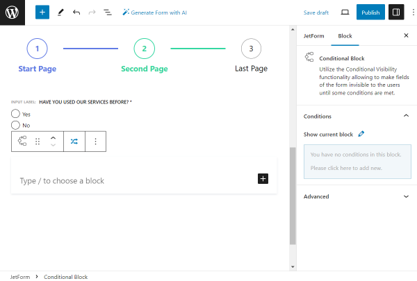
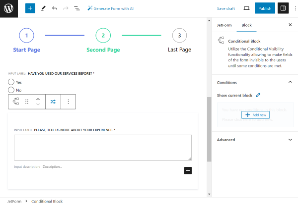
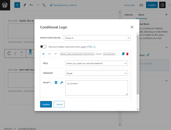
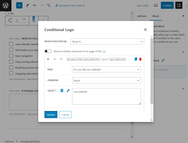
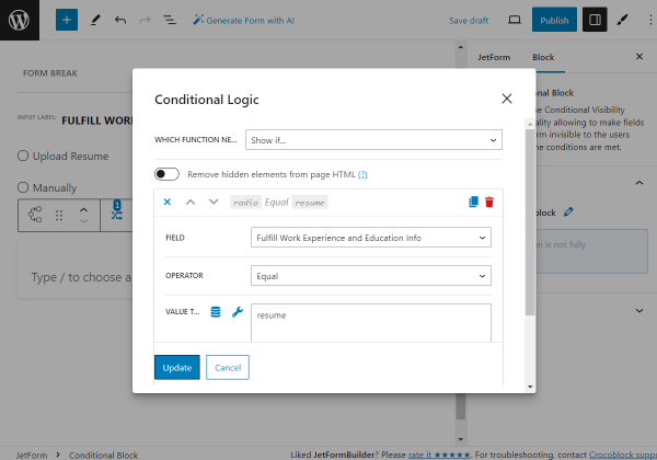
We want to show different fields depending on the selected field in the previous Radio Field. So, we add the Conditional Block to the page.
The first Conditional Block is for the “Resume” option. We click the “Add new” button that appears when hovering over the section in the Show current block field of the Conditional Block settings.
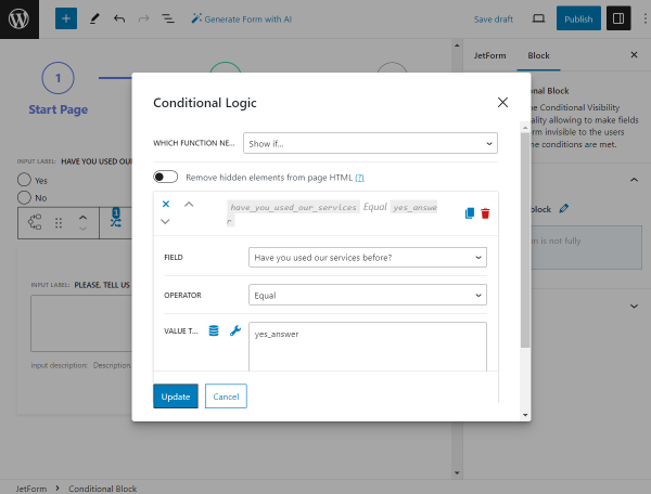
In the appeared pop-up, we define the “Show if…” option in the WHICH FUNCTION NEED EXECUTE? field, pick the “Fulfill Work Experience and Education Info” FIELD, set “Equal” OPERATOR, and complete the VALUE TO COMPARE field with the “resume” value.
Then, we hit the “Update” button.
Next, we add the required Media Field block. We leave the LABEL field empty and complete the FORM FIELD NAME with the “upload_resume” value.
Also, in the Field tab, you can set the needed USER ACCESS option. For instance, the “Any registered user” option allows uploading files for only the registered users correspondingly.
If enabled, the Insert attachment toggle will save the attachment to the Media Library.
The MAXIMUM ALLOWED FILES TO UPLOAD field allows you to define the maximum number of files the user can upload. If left empty, the uploading limit is set to one file.
We set the MAXIMUM FILE SIZE MESSAGE to “Upload PDF or DOCX file up to %max_size%,” where the %max_size% value is the macro used to display the maximum allowed file size.
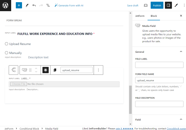
Adjust the style settings according to your preferences.
The first Conditional Block is now completed.
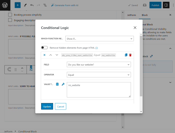
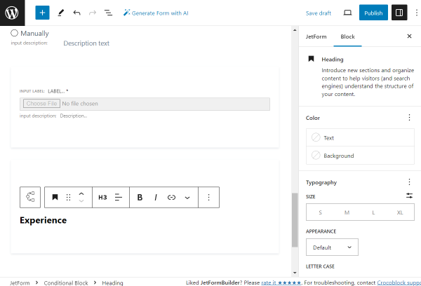
Now, we add one more Conditional Block; this time for the “Manually” answer selected in the previously added “Fulfill Work Experience and Education Info” Radio Field.
Once again, we click the “Add new” button to add a condition for the current block.
In the appeared pop-up, we define the “Show if…” option in the WHICH FUNCTION NEED EXECUTE? field, pick the “Fulfill Work Experience and Education Info” FIELD, set “Equal” OPERATOR, and complete the VALUE TO COMPARE field with the “manually” value this time.

The first block in this condition is the Spacer, which creates a space between the fields.
To begin a “Manually” part of the form, we add a Heading block, “Experience.”
In this case, the style settings can be adjusted right in the block settings.
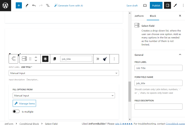
The following block is the required Select Field. Its FIELD LABEL is set to “Job Title” and the FORM FIELD NAME to “job_title” accordingly.
In the Advanced tab, we set the PLACEHOLDER to the “Title of the position held.” Also, we activate the Disable placeholder feature, so the placeholder itself can not be picked as an option.
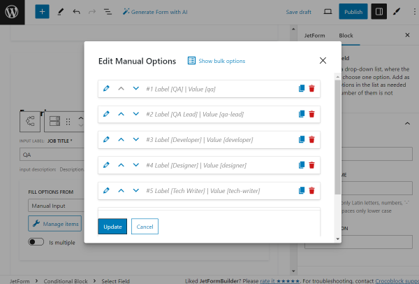
Click the “Manage options” button to add the options for selection.
We add the following options: “QA,” “QA Lead,” “Developer,” “Designer,” “Tech Writer,” and “Motion designer.”
Once the options are set, push the “Update” button.
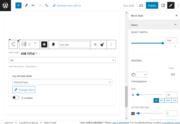
Adjust the style settings according to your preferences.
We place one more Spacer in the form.
Then, we add one more required Text Field with the “Company Name” FIELD LABEL.
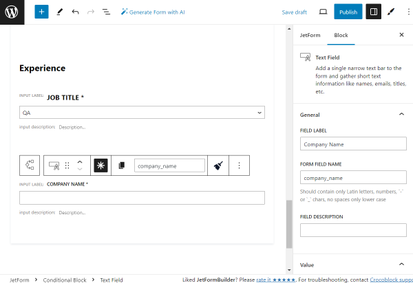
Adjust the style settings according to your preferences.
We place one more Spacer on the page.
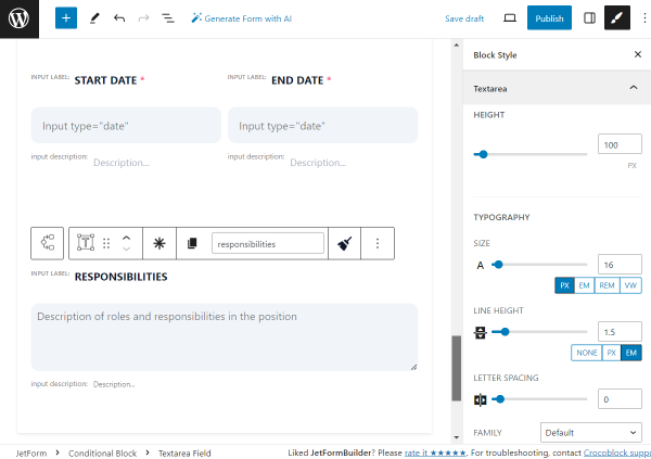
Then, we add the Columns block with the two-column layout. In the left field, we place the required Date Field named “Start Date.”
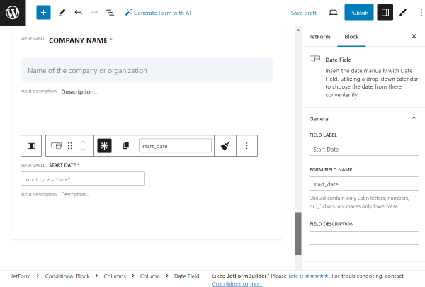
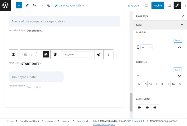
Adjust the style settings according to your preferences.
In the right column, we add one more required Date Field called “End Date.”
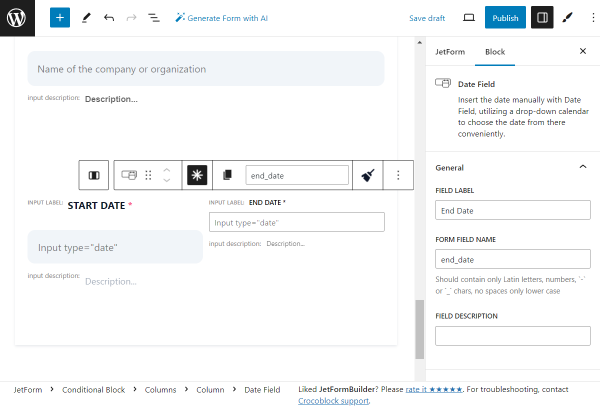
Adjust the style settings according to your preferences.
Now, we put one more Spacer to create some space between blocks.
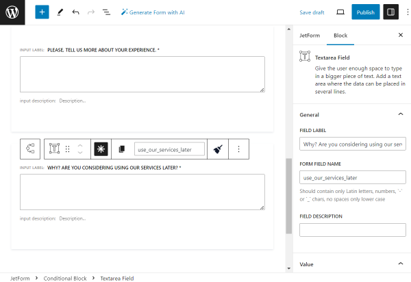
The next block we add is the “Responsibilities” Textarea Field block. Its settings are left default in the described case.
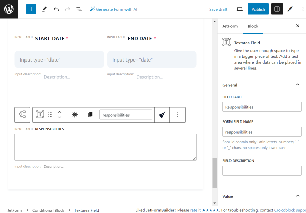
Adjust the style settings according to your preferences.
We add a Spacer block to create an additional space between blocks.
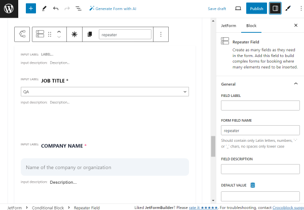
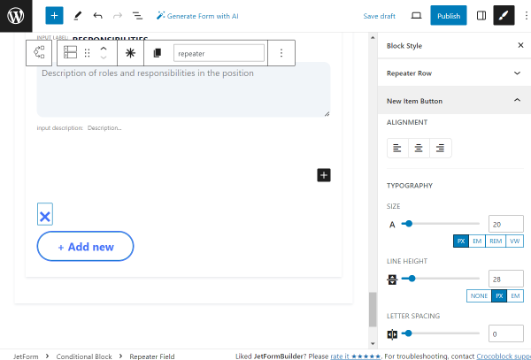
Then, we add the Repeater Field so the applicant can later add several job positions held.
Leave the FIELD LABEL field empty and complete the FORM FIELD NAME with the “repeater” value.
In the MANAGE REPEATER ITEMS COUNT, we leave the “Manually” option so the user can add blocks by clicking the button. The ADD NEW ITEM LABEL is set to “+ Add new.”
Inside the Repeater, we put the same fields we put before, beginning from the “Job title” Select Field and ending with the “Responsibilities” Textarea Field.
Adjust the style settings of all mentioned fields according to your preferences.
Then, we add one more Spacer to the form.
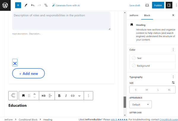
The following block is the Heading indicating the “Education” part of the form.
In this case, the style settings can be adjusted right in the block settings.
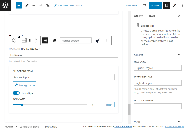
The next field is the required Select Field block called “Highest Degree.”
The PLACEHOLDER here is set to “The highest level of education attained by the applicant.” Also, we activate the Disable placeholder feature, so the placeholder can not be picked as an option.
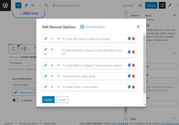
Click the “Manage items” button to set the select options.
You can add the necessary options by clicking the “Add new Option” button each time you need a new one.
Our options are: “No Degree,” “Bachelor’s Degree,” “Master’s Degree,” “PhD,” and “Other.”
Once all the options are added, press the “Update” button.
Adjust the style settings according to your preferences.
Then, we add one more Spacer to the block.
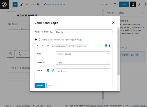
Inside the current Conditional Block, we add one more Conditional Block. This time, it will hide the following fields if the “No Degree” option is selected in the “Highest Degree” Select Field.
So, in the appeared conditions pop-up, we now define the “Hide if…” option in the WHICH FUNCTION NEED EXECUTE? field, pick the “Highest Degree” FIELD, set “Equal” OPERATOR, and complete the VALUE TO COMPARE field with the “no-degree” value this time.
Once done, we push the “Update” button.
As the first block in this Conditional Block, we add a required Text Field, “Institution.”
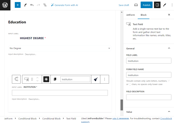
Adjust the style settings according to your preferences.
Then, we put one more Spacer on the page.
After that, we add one more required Text Field, “Field of study.”
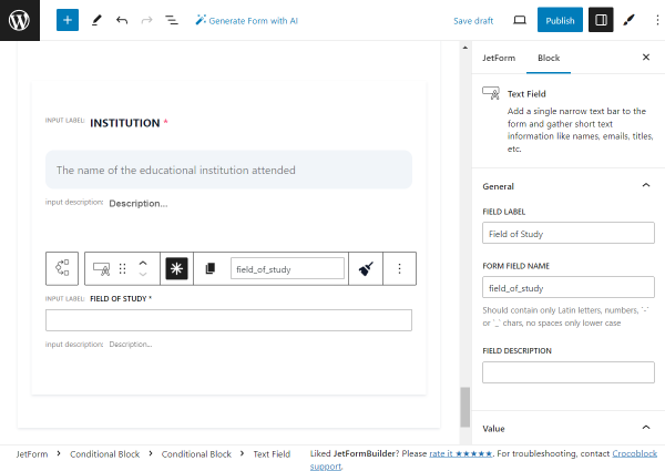
Adjust the style settings according to your preferences.
We add one more Spacer to the form.
Then, we add one more Date Field to the form. The FIELD LABEL is “Graduation Date,” and the FIELD DESCRIPTION is “Date of graduation or expected graduation.”
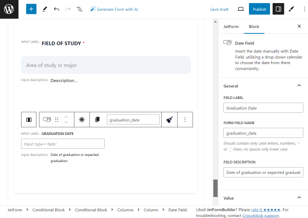
Adjust the style settings according to your preferences.
Outside of the Conditional Block, we add a Spacer.
After the Conditional Block, we create one more two-column layout with the help of the Columns block.
In the left column, we add the Prev Page block with the “Previous step” FIELD LABEL.
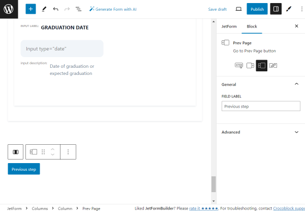
Adjust the style settings according to your preferences.
In the right column, we put the Next Page block with the “Next” FIELD LABEL.
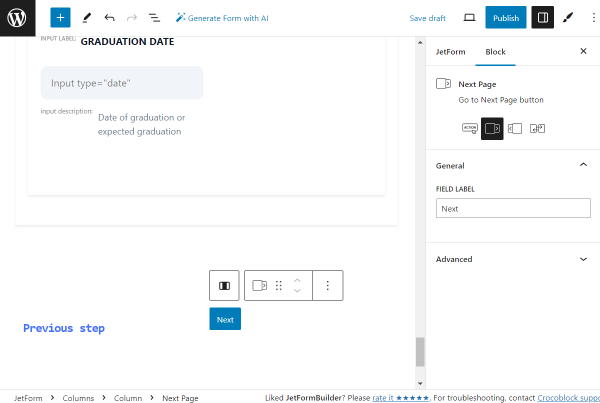
Adjust the style settings according to your preferences.
Now, we add one more Form Page Break block to indicate the end of the second part of the form.
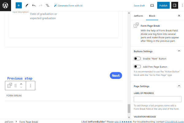
Then, we add one more Heading block, “Additional Information.”
In this case, the style settings can be adjusted in the block settings.
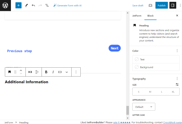
Next, we add a Spacer block to the form.
The following field is the Textarea Field named “Cover Letter.”
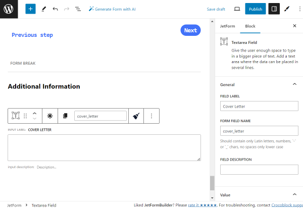
Adjust the style settings according to your preferences.
Now, let’s add one more Spacer.
The next field is a Text Field with the “Portfolio URL” FIELD LABEL.
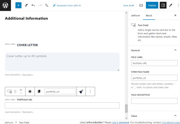
Adjust the style settings according to your preferences.
After that, we add one more Spacer.
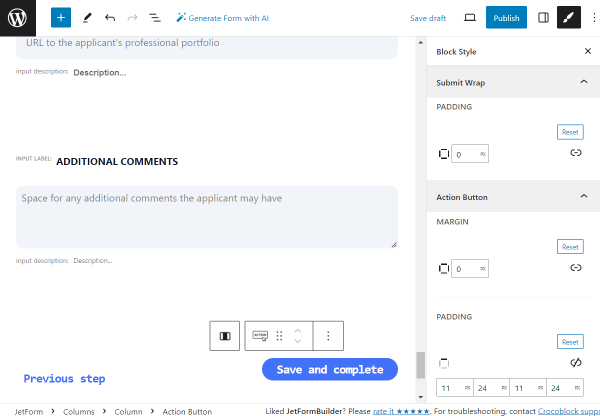
Then, we add one more Textarea Field block called “Additional Comments.”
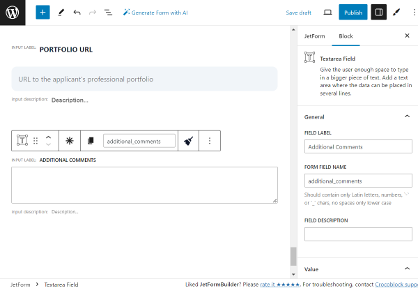
Adjust the style settings according to your preferences.
We add one more Spacer to the form.
Then, we create one more two-column layout with the Columns block.
In the left column, we put the Prev Page block with the “Previous step” FIELD LABEL.
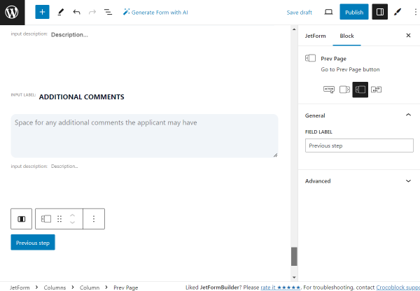
Adjust the style settings according to your preferences.
In the right column, we put the last block of the form, the Action Button block with the “Save and complete” FIELD LABEL.
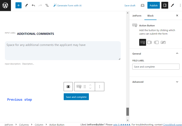
Adjust the style settings according to your preferences.
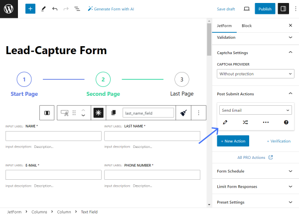
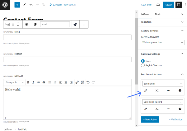
Now, let’s adjust the Post Submit Actions. To do so, open the JetForm tab of the settings and find the Post Submit Actions section.
Press the “New Action” button.
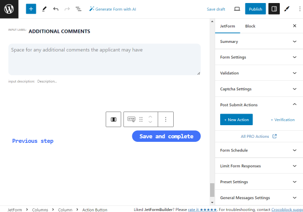
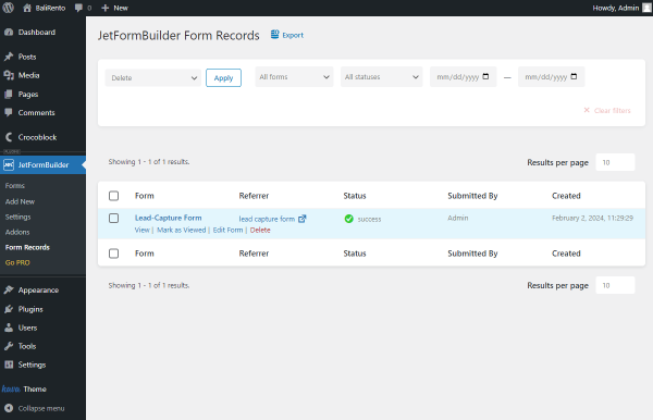
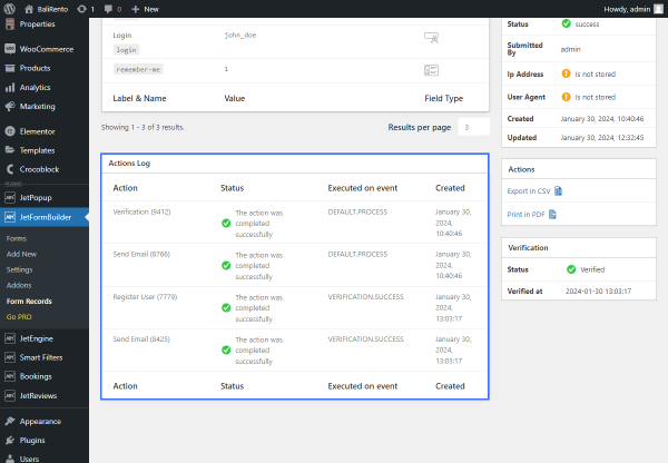
Select the “Save Form Record” action from the drop-down list. This action saves all form submissions on the Form Records Page.
You can customize the action by pressing the “pencil” button if needed.
However, now, we leave the default settings.
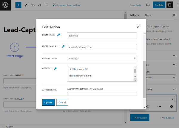
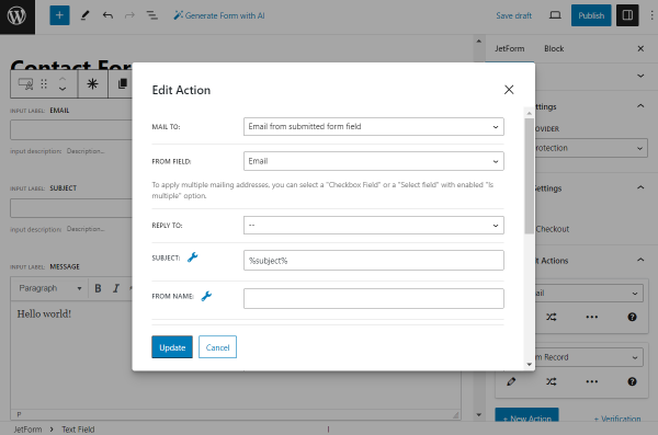
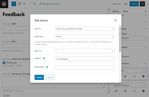
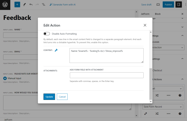
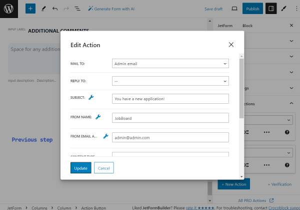
Now, we add one more action, “Send Email.” This action will send an email whenever the form is submitted.
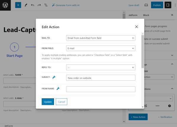
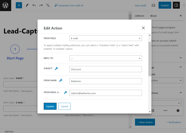
Adjust the action settings by pressing the “pencil” button and completing the needed fields.
In our case, we want to get an email sent to the admin email once the form is submitted, so we adjust it accordingly.
Once done, press the “Update” button.
Whenever the form is ready, you can click the “Publish/Update” button to save the result.
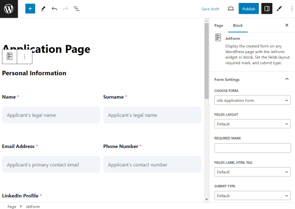
Now, go to the page where you want to place the form. It can be a page built with either Gutenberg, Elementor, or Bricks page builders.
We will work in Gutenberg, but the settings in the mentioned builders are the same.
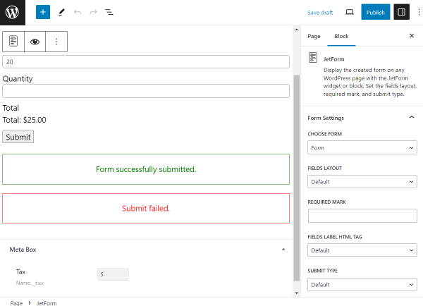
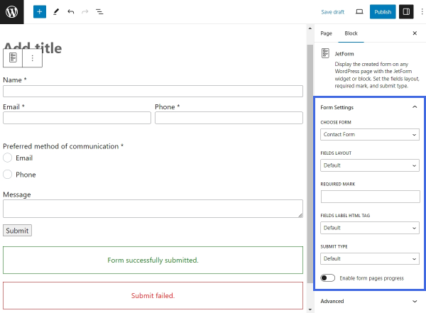
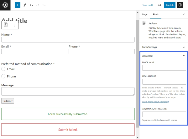
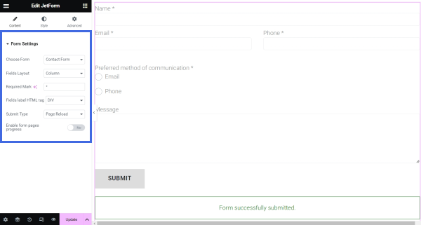
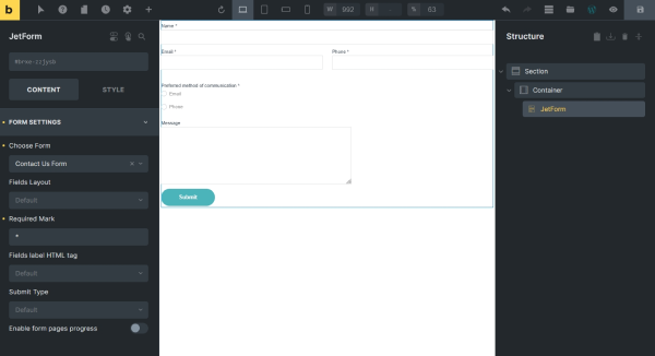
Find the JetForm block/widget/element and place it on the page.
Select the needed form in the CHOOSE FORM drop-down list, adjust the form settings if necessary, and press the “Publish/Update” button.
Go to the front end of the just-edited page to check the result.
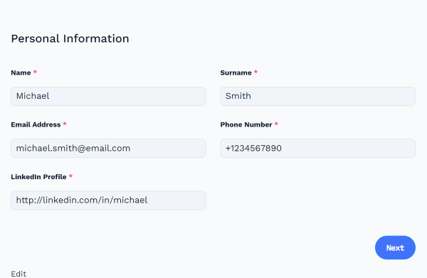
Now, the first part of the form is displayed.
Let’s complete it to check if the form works correctly.
Press the “Next” button whenever you complete the fields.
Complete the second part of the form and press the “Next” button.
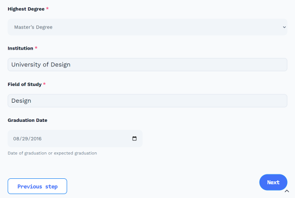
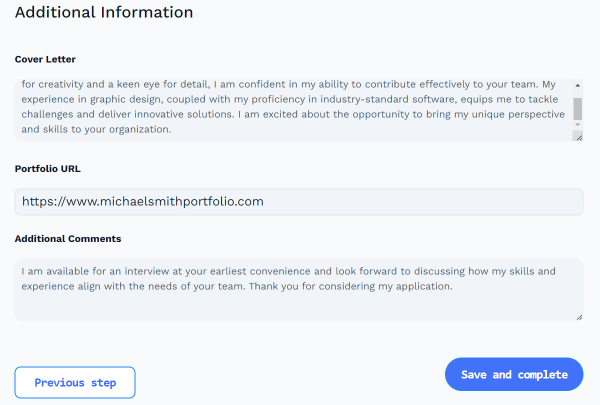
Complete the third part of the form and press the “Save and complete” button.
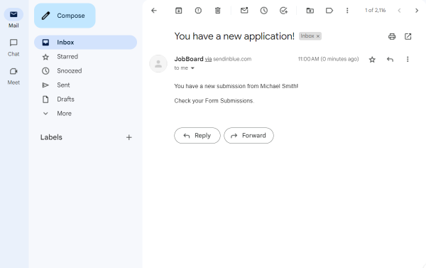
If everything is fine, you will see the message of successful form completion.
Let’s see if the “Send Email” post submit action also works properly.
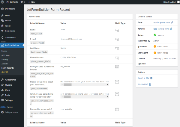
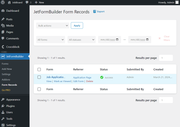
Now, let’s check the WordPress Dashboard > JetFormBuilder > Form Records to see the new form submission.
Here it is, in the list. Click on the “View” button that appears once you hover over the item to check the details.
You can now see the details of the applicant’s form submission.
That’s all; now you know how to build a job application form using the JetFormBuilder plugin for WordPress.