Tutorial requirements:
- JetFormBuilder plugin installed and activated;
- User Login Action addon installed and activated.
The free version of JetFormBuilder allows building a Register Form, and the User Login Action addon enables the creation of a front-end login form. While they can exist as two separate forms, it is possible to combine the functionalities of registration and login in one form using the Render States.
This tutorial will explain how to use the Render States feature to combine the two forms and switch between them with a button.
Contents:
- Create a New Form
- Build the Login Form
- Render State for Login Form
- Build the Registration Form
- Render State for Registration Form
- Add the Change Render State Buttons
- Post Submit Actions
- Set Up Events for Actions
- Add the Form to a Page
- Test the Flow
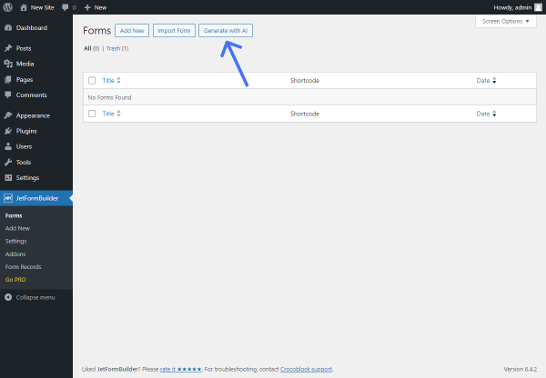
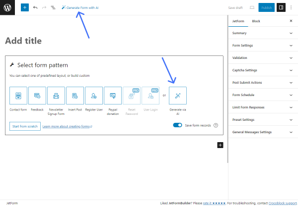
Create a New Form
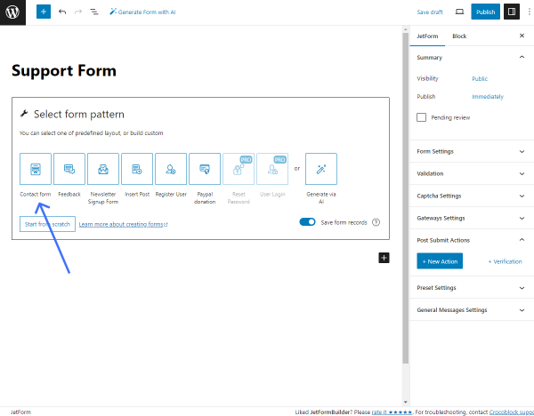
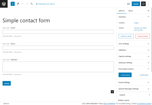
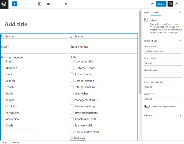
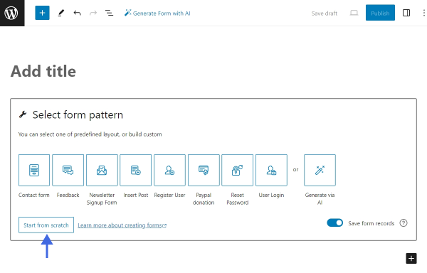
Follow to WordPress Dashboard > JetFormBuilder > Forms > Add New to create a new form. To start building a new form from scratch, press the “Start from scratch” button in the Welcome block.
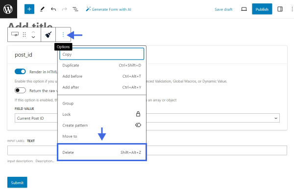
Give the form a title and remove all the field blocks from the canvas. To remove a block, click on it, find the “Options” button in the toolbar, and select “Delete.”
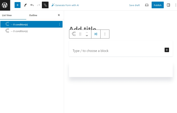
After removing all the blocks, toggle the Block Inserter by clicking the blue “plus” icon in the top toolbar and search for the Conditional Block. Add two Conditional Blocks to the canvas. Alternatively, use the shortcut slash command “Conditional Block” to add the blocks quickly.
The first Conditional Block will display the login form, and the second block will show the registration form. Using the Change Render State buttons, we will switch between the Conditional Blocks, and as a result, the user will see only one form at a time.
Build the Login Form
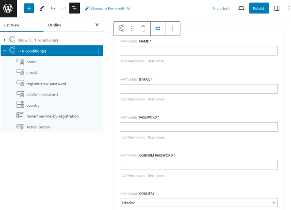
Let’s build the login form in the first Conditional Block. The form will consist of a Text Field for login, a Text Field for password, and a “Remember Me” Checkbox Field. We will also add an Action Button to submit the form and a Change Render State button to switch to the registration form.
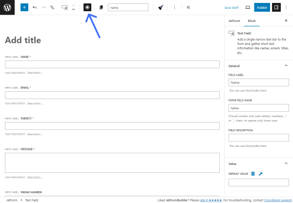
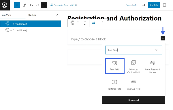
Select the first Conditional Block and click the black “plus” icon on the right side to toggle the Block Inserter. Search for the Text Field and add it.
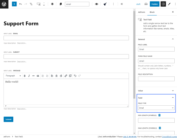
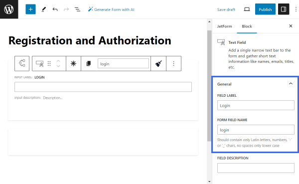
Open the Block settings. Give this field a FIELD LABEL — “Login,” and a FORM FIELD NAME — “login.” In this field, users will insert their login.
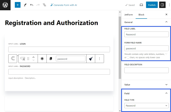
Next, add a new Text Field for the user password. Set the FIELD LABEL to “Password” and the FORM FIELD NAME to “password.” Then, scroll the Block settings down and find the FIELD TYPE drop-down menu. Select the “Password” option.
After that, add a Checkbox Field below the Text Fields, but still inside the Conditional Block. Leave the FIELD LABEL empty and enter the FORM FIELD NAME — for example, type “remember-me-by-login.”
The “Remember Me” field helps to keep the user authenticated for a longer period of time — after checking the “Remember Me” checkbox, the user will remain logged in for fourteen days; if not, only for two days.
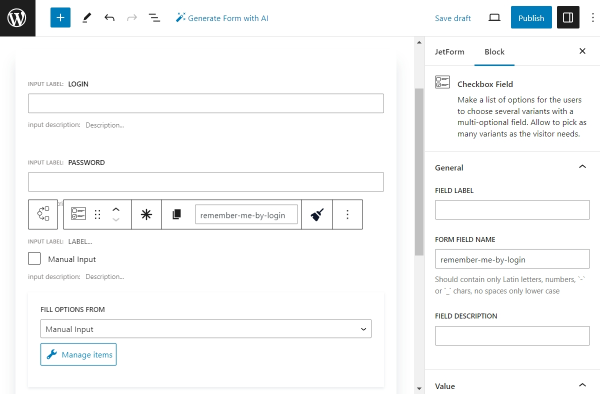
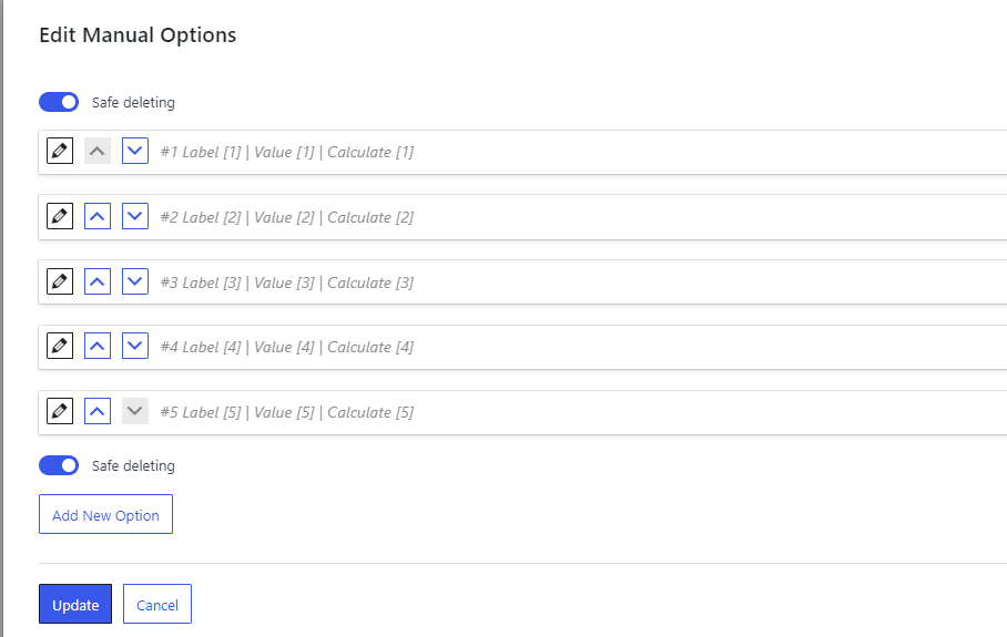
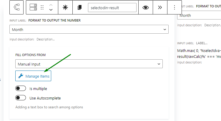
Press the “Manage Items” button to add checkbox options. In the opened pop-up, click “+ Add new Option.” Insert “Remember Me” as the LABEL of the option and “1” as its VALUE.
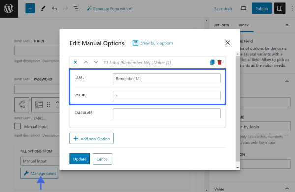
Save the changes by clicking the “Update” button.
Finally, add an Action Button to let users submit the login form. Enter “Log In” as the FIELD LABEL.
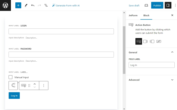
For now, the layout of the login form is completed. The Change Render State button will be added later.
Let’s proceed to setting up the current Conditional Block.
Render State for Login Form
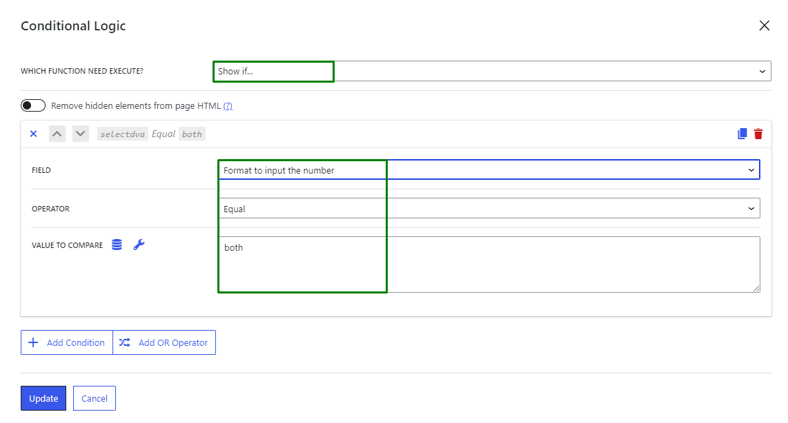
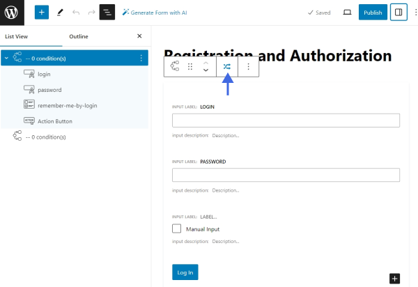
Select the first Conditional Block and click the button in the toolbar to assign a new condition.
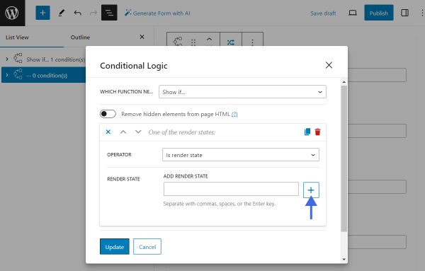
Inside the Conditional Logic pop-up, select which function to execute — “Show if…”. Then, press the “+ Add Condition” button and start setting up the condition. In the OPERATOR drop-down list, select the “Is render state” option. Pick the “DEFAULT.STATE” option from the RENDER STATE list. Click “Update” to save the changes.
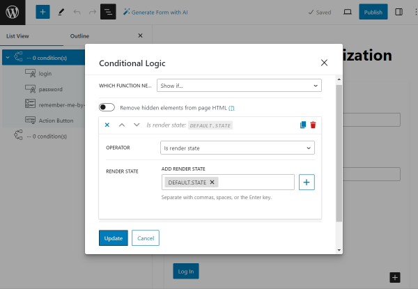
The “DEFAULT.STATE” is a form default render state. When a page with a JetFormBuilder form is opened in a browser, the form is rendered in its default state. Therefore, all the content inside this Conditional Block will be displayed simultaneously. To see the content of other Conditional Blocks designed for different form states, you should switch the form state to the one needed.
Now, let’s proceed to building the Registration Form part.
Build the Registration Form
Find the second Conditional Block. Inside this block, we will place a Registration Form.
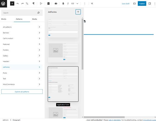
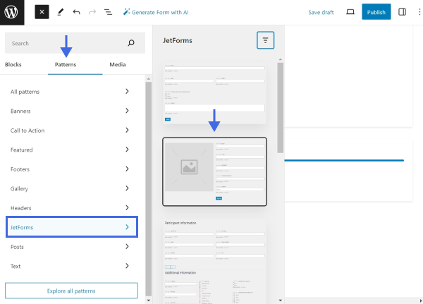
Instead of building this part from scratch, we will use a ready Pattern. Toggle the Block Inserter (the blue “plus” button) in the top toolbar and switch to the Patterns tab. Proceed to the JetForms tab and select the “Register Form” Pattern. Place it inside the second Conditional Block.
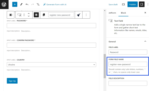
Next, remove any extra columns and blocks. Rename the FORM FIELD NAME of the “Password” Text Field. We will give it a unique name — “register-new-password.”
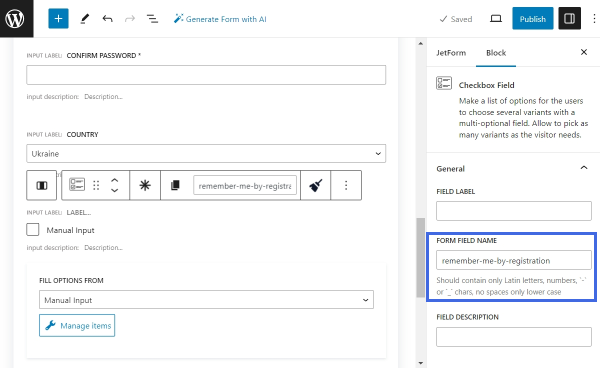
Lastly, copy the “Remember Me” field from the login form and insert it into the registration form part right above the Action Button. Give it a new FORM FIELD NAME.
With that, the registration part is completed.
Render State for Registration Form
Let’s configure the render state of the second Conditional Block. As previously, select the block and open the Conditional Logic pop-up. Set the function to “Show if…” and the Operator to “Is render state.”
Then, press the “New render state” plus-shaped button to add a new custom state.
Set the name of your choice. We will call the new state “REGISTER.” Once the new state is added, it is assigned automatically to the Conditional Block.
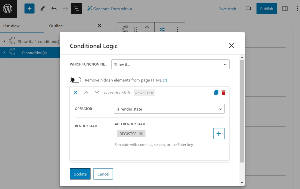
Lastly, save the changes by hitting the “Update” button.
Add the Change Render State Buttons
To switch between states, the Change Render State block should be utilized. We will place this block inside both Conditional Blocks. The Change Render State blocks will enable us to switch between the form for login and the form for registration.
Locate the first Conditional Block. Under the Action Button, place the Change Render State block.
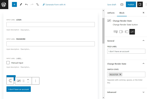
This button will allow users to switch from the login form, the default state, to the registration form. Therefore, give this block an appropriate label and set the “REGISTER” state into the SWITCH STATE multi-select.
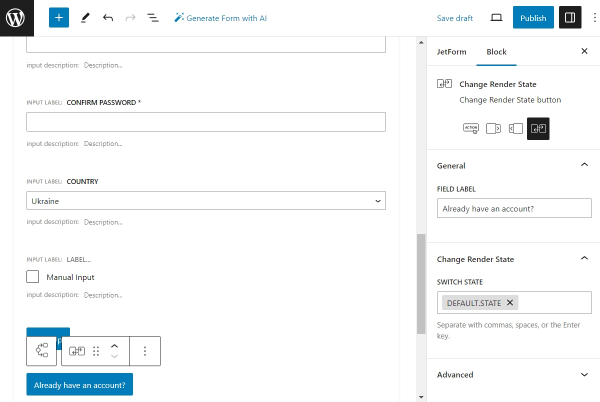
Next, add a new Change Render State block into the second Conditional Block. This button will enable users to switch from the registration to the login form. In the SWITCH STATE field, pick the “DEFAULT.STATE” option.
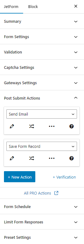
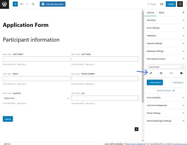
Post Submit Actions
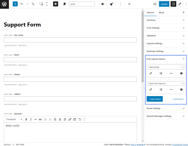
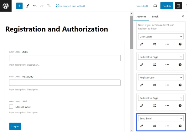
The form layout is complete. The next part of the work is to add Post Submit Actions that should be executed after form submission.
User Login
Let’s start by adding the “User Login” action, which will log users in if they submit the first part of the form.
Switch to the JetForm settings tab in the right sidebar and unfold the Post Submit Actions tab. Instead of the default “Save Form Record” action, pick the “User Login” action.
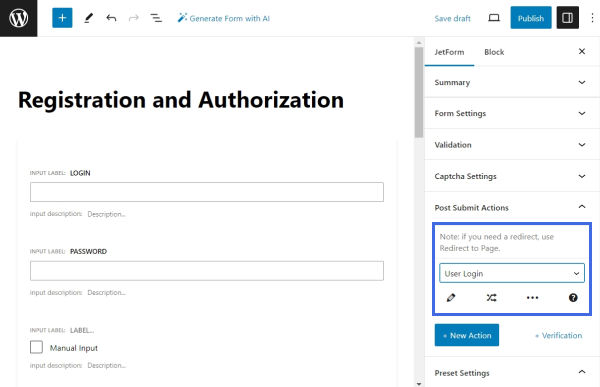
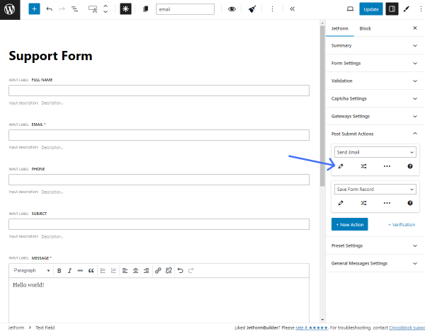
Click the pencil-shaped button under the action name to edit it.
Map the USER LOGIN FIELD with the “Login” form field, the USER PASSWORD FIELD with the “Password” field, and the REMEMBER FIELD with the “remember-me-by-login” Checkbox Field from the first Conditional Block.
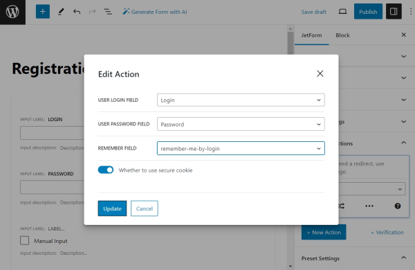
Click the “Update” button to save the changes and proceed to the next step.
Register User
Click the “+ New Action” button to add a new action — “Register User.” This action will be executed if the user completes the second part of the form.
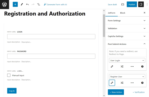
Press the “pencil” button to edit the action. Then, link the User Login, Email, Password, and Confirm Password fields with their corresponding form fields from the second Conditional Block.
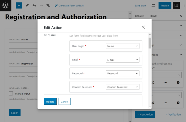
Scroll the settings down to select the USER ROLE, which will be assigned to the newly registered user. If you previously created custom meta fields for users, you can link the form fields with them. To link a form field with a custom field of a user, type in the name of the corresponding meta field in front of the form field’s name in the USER META section.
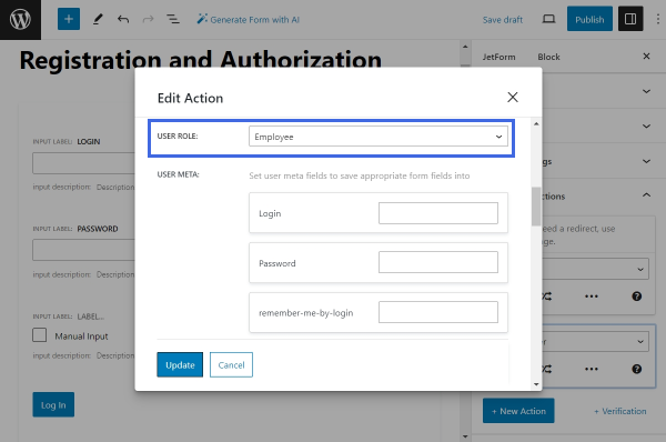
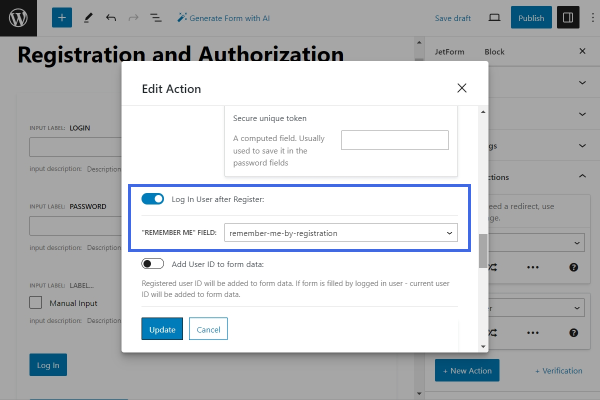
Scroll past the USER META section to activate the Log In User after Register toggle. Connect the “REMEMBER ME” FIELD with the “remember-me-by-registration” Checkbox Field from the registration form. This setting allows users to log in automatically after the registration is completed.
Follow the article about the “Register User” action to learn about each further setting in detail.
Once done, click “Update” to save the changes.
Redirect to Page
After users log in or register, it might be convenient to redirect them to different pages. For this purpose, add two “Redirect to Page” actions — one below the “User Login” action and another below the “Register User” action.
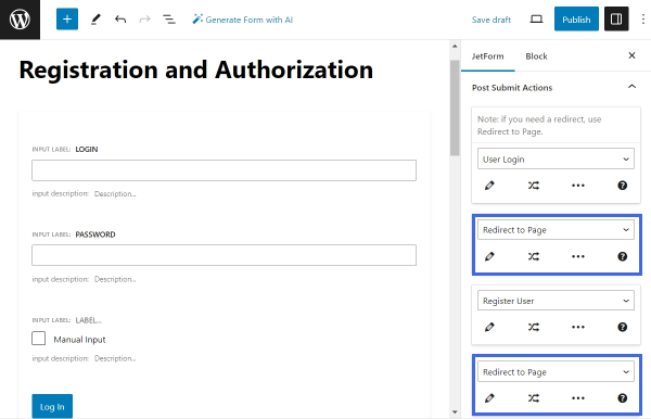
Edit the first action. In our case, we will use it to redirect users to their “Account” page after they log in.
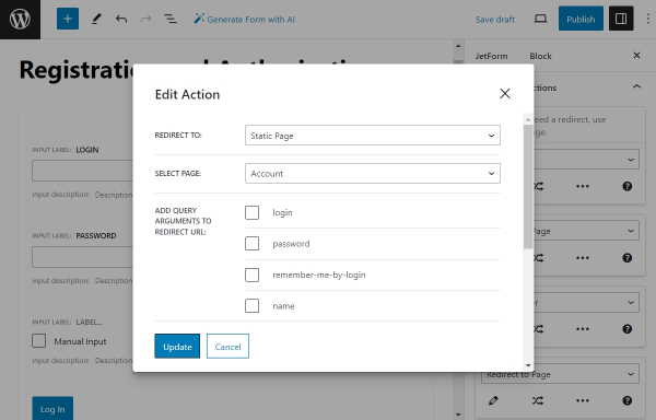
Select the “Static Page” option from the REDIRECT TO drop-down and select the needed page — we will select the “Account” page.
Repeat the same procedure for the second “Redirect to Page” action.
To learn how to craft the Account page, proceed to the Creating User Account Page With Different Dashboard Structures tutorial.
To make the Account page for the e-commerce website, go to the How to Create My Account Page With Endpoint Templates tutorial.
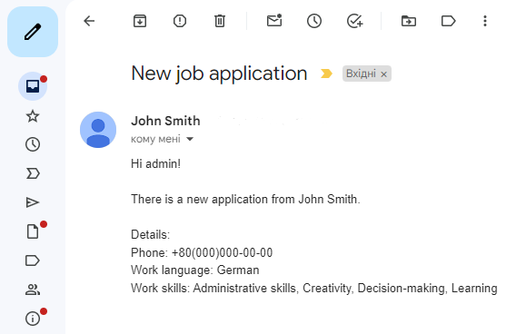
Send Email
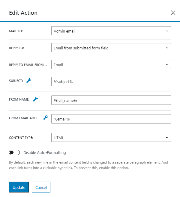
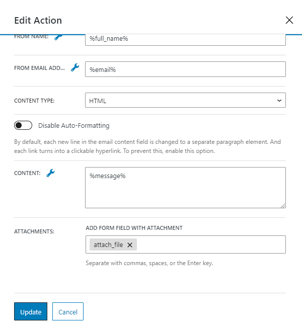
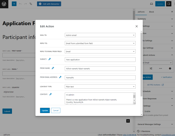
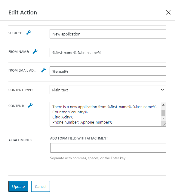
Add the last post submit action to the form—the “Send Email” action—at the end of the actions list. This action will send an email to the user after a successful registration. Then, click the “pencil” icon to edit the action.
Proceed with the configuration according to our guide on the “Send Email” action. Set the MAIL TO setting to “Email from submitted form field” and select the “E-mail” field in the dropdown below. Next, define the subject of the email. Use the macro [%CT::SiteName%] to insert the website’s name dynamically into the email subject or content. Then, fill in the required fields FROM NAME, FROM EMAIL ADDRESS, and CONTENT.
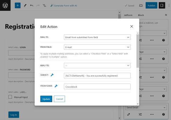
Once the setup is complete, click the “Update” button to save the changes.
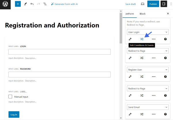
Set Up Events for Actions
The last step in the form configuration process is to assign Post Submit Actions with Events. Events define when a specific action is executed.
Click the “Edit Conditions & Events” button under the first action, “User Login.”
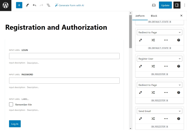
Inside the “Edit Action Conditions & Events” pop-up, switch to the “Events match” tab and assign the “ON.DEFAULT.STATE” EVENT.
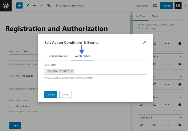
Click “Update” to save the changes. Assign the same “ON.DEFAULT.STATE” EVENT to the first “Redirect to Page” action. Then, assign the “ON.REGISTER” EVENT to the rest of the actions.
Now, click “Publish/Update” to create the form. The configuration part is complete.
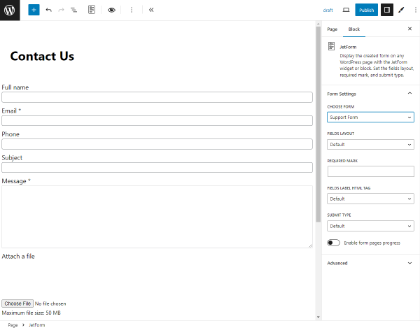
Add the Form to a Page
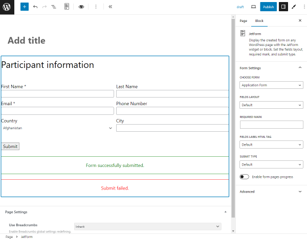
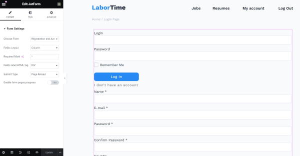
Open the page or template where the form should be located and place it using the JetForm widget (in Elementor), JetForm block (in Block Editor), or JetForm element (in Bricks). From the CHOOSE FORM drop-down list, select the built form. Learn about other settings from the JetForm Overview.
We placed our form on the page edited in Elementor. To display the form on other page builders, check our guide on How to Display a Form on the Front End.
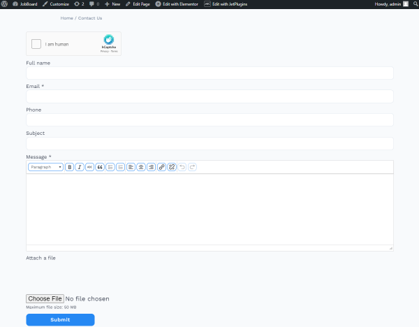
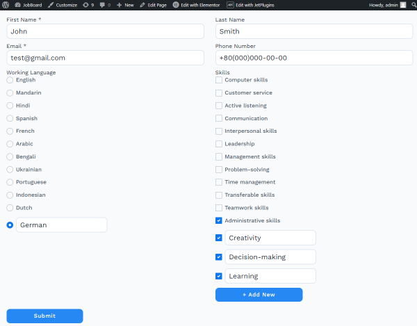
Test the Flow
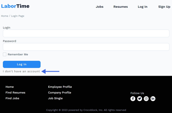
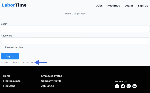
Open the page where the form is located on the front end. Only the first part—the login form—should be visible. To switch to the registration form, click the “I don’t have an account.” — the Change Render State button.
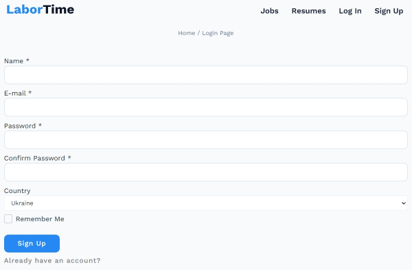
Now, the registration form is displayed.
That’s all about using the Render States to combine the functionalities of several forms in one with the JetFormBuilder plugin on your WordPress website.