All the settings that are connected to the appearance of the text are gathered here. All elements with text can be customized separately. For example, you can set the look of the label and the description of the field differently. Let’s take a closer look at all of the features that can be placed in the Typography section.
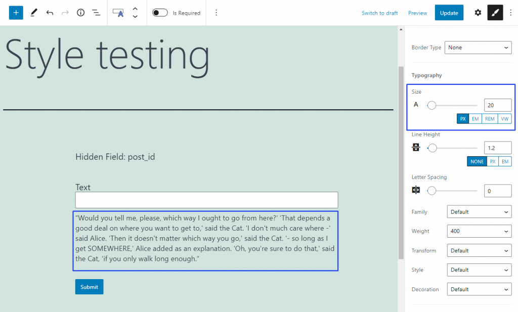
Size
This feature defines the size of the letters. By default, it is set to 14 pixels but you can change it by moving the slider manually or typing the needed size into the bar.
The default units of measurement are pixels (PX) but you can change them to one of three others:
EM – this is the unit that allows you to set the size of the font relatively to the size of some parent element. The parent element can be defined in the CSS code;
REM – this unit sets the size of the font relatively to the size you set in the HTML code;VW – a very flexible unit of measurement. It sets the size of the text relative to the height of the browser window, so it always has the same proportions.
Line Height
The height of the text line can be changed without changing the size of the letters. When you make it bigger, the space between the lines increases. By default, it is set to 1.2 and you can change it by dragging the slider or typing in the value.
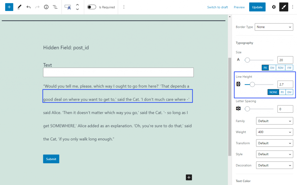
NONE measurement unit defines the height of the line according to the height of the text. So, when you set it to 2, it means that the line generally will be twice the height of the text. You can change the measurement unit to pixels (PX) or the unit that depends on the size of some parent element set in CSS code (EM).
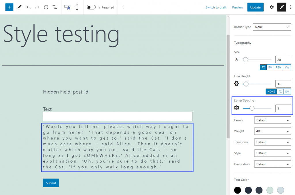
Letter Spacing
It is clear from the title that this feature allows you to set the space between the letters of the text. By default, it is set to 0, which means that the spacing is normal for the chosen font. When you change that value, either manually or by typing in the number, the normal spacing is multiplied by it. So, when you set the Letter Spacing to 5, it means that space will be five times bigger than normal.
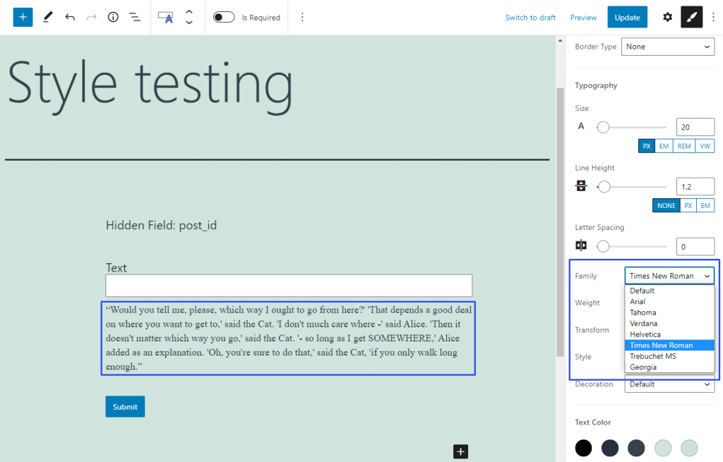
Family
In this drop-down menu, you can choose the font family for your text. The “Default” option means that the text will have a font that is defined by the website template. There are seven additional fonts that are the most popular among the users. The number and type of fonts are set in the JetStyleManager settings and can be changed via coding only.
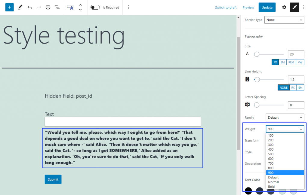
Weight
Here you can choose the boldness of the text. In the drop-down menu, you can select the values from 100 to 900 and also one of the pre-sets:
- Default – set the weight that is defined by the website template for this part of the page;
- Normal – the weight of the text will match the “normal” weight of the chosen font;
- Bold – the weight will match the “bold” style of the chosen font.
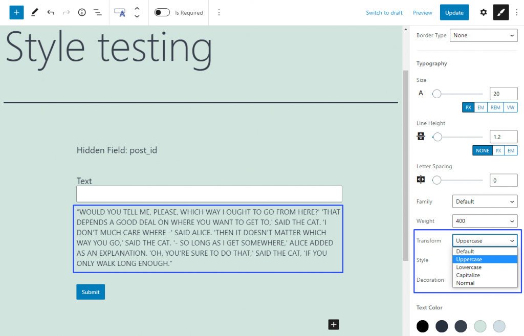
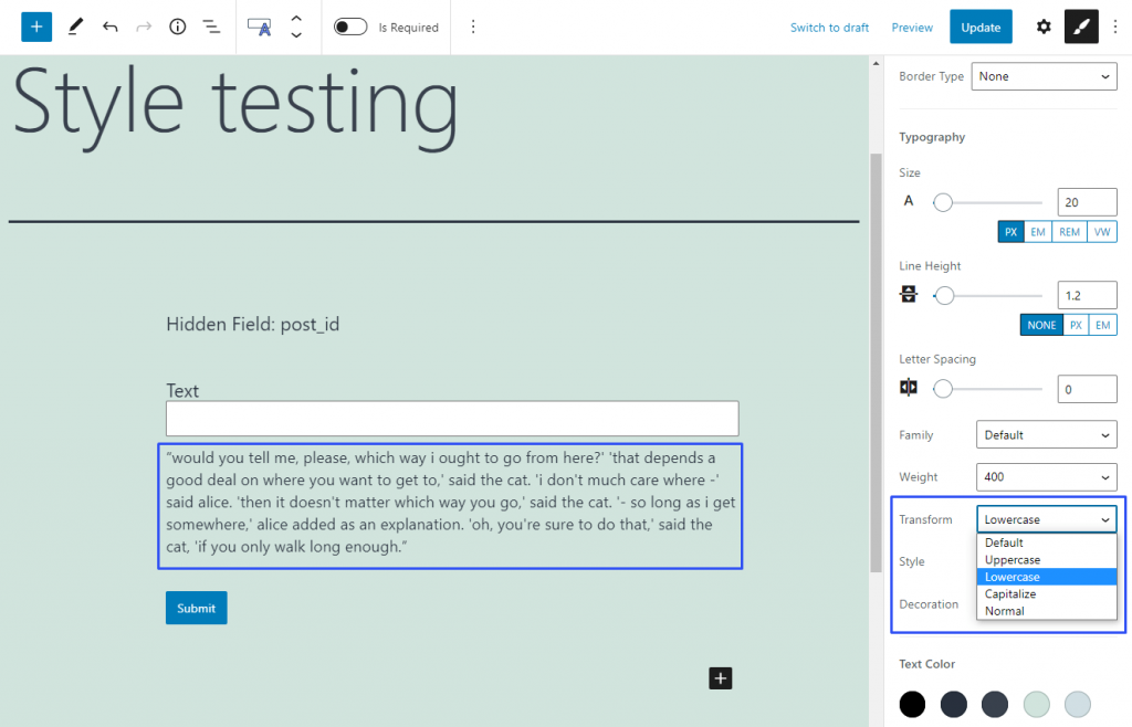
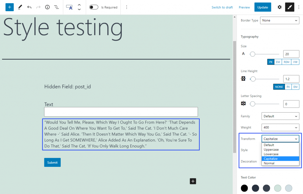
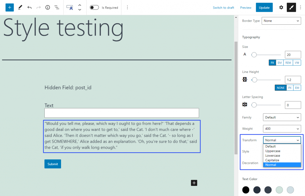
Transform
This feature helps you define the case of the text’s letters. Default is the way the text looks after you type it in.
The Uppercase option makes all letters capitalized.
The Lowercase variant makes all the letters small.
If you choose the Capitalize option, it will capitalize every first letter of every word.
And the Normal option will capitalize only the first letter in every sentence.
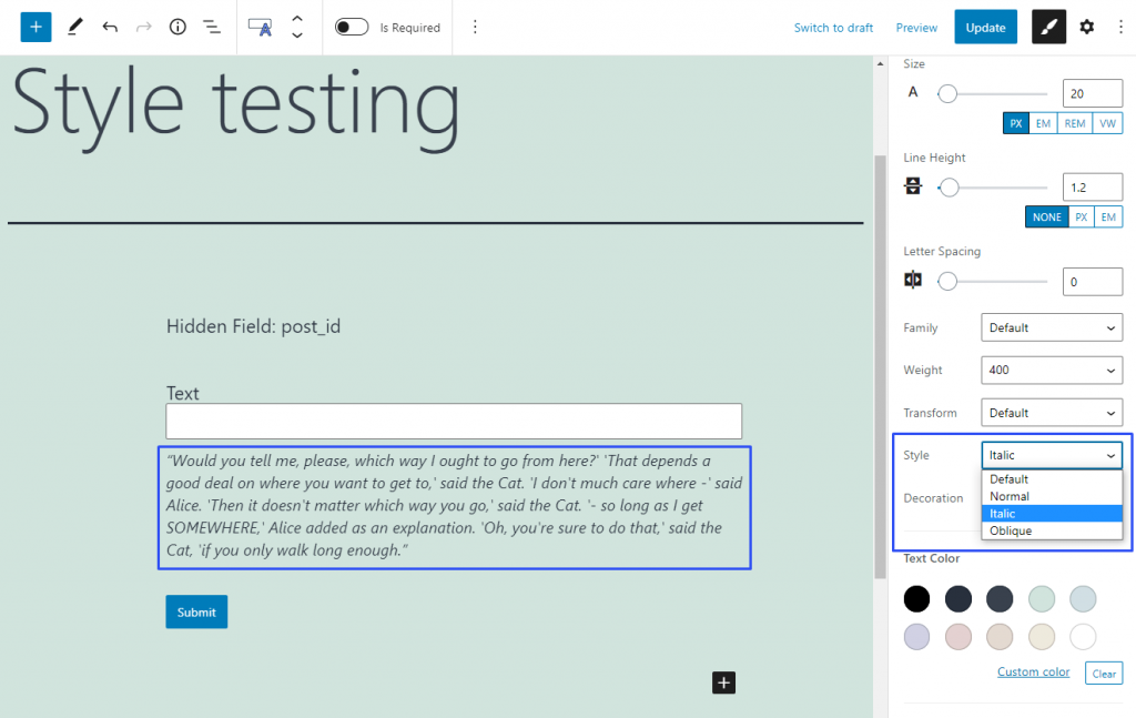
Style
As you can choose the boldness of the letters in the Weight feature, here you can select the tilt. The Default option leaves the text as it was inserted. The Normal option makes the text straight. The Italic and Oblique options make the text slanted. If you have no idea about the difference between those two styles, read this article.
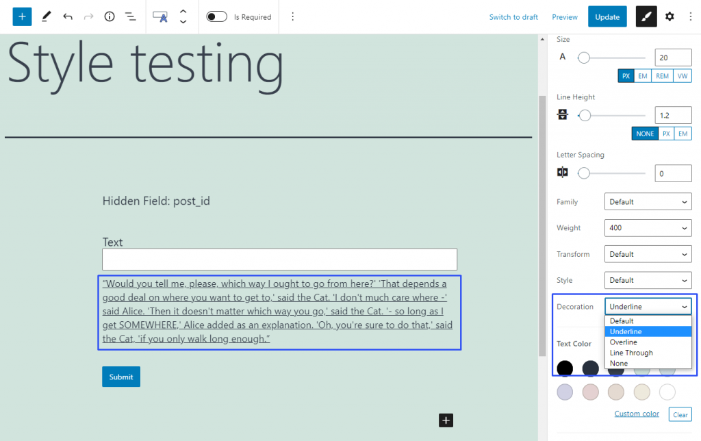
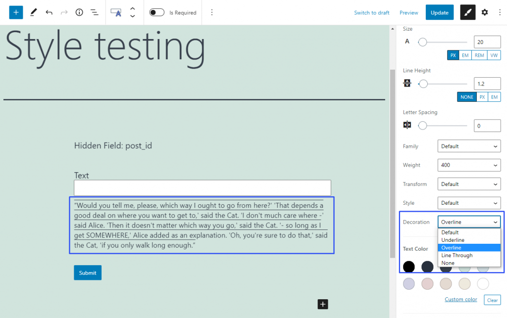
Decoration
In this drop-down menu, you can add some decorative elements that are not crucial for the appearance but could make the text more understandable. The Default option leaves the text you inserted untouched.
The Underline option will add the line under the text lines.
The Overline option will put the line over the text rows.
The Line Through option will create a line that goes over the text, crossing it out.

And the None option will remove all lines from the text, even if there were some in the default text.