Contact Us Page Design: Effective Strategies and Inspiring Examples
Have you ever considered removing the Contact Us page from your website, assuming only a handful of visitors would reach it? Think again. In the digital landscape, the Contact Us page is often one of the first points of contact for potential customers.
Contact Us holds a lot of weight in influencing consumer perception. Its “Contact Us” title serves as a compelling call to action, making visitors want to get in touch. Creating an effective Contacts page requires careful consideration and attention to best practices to balance functionality and aesthetics.
Throughout this article, we’ll explore the intricacies of the Contact Us page design, offering invaluable insights, practical tips, and notable examples for developers and site owners.
How Can You Improve a ‘Contact Us’ Page?
At the core of every Contact Us page lies a pivotal objective: to seamlessly convert website visitors into loyal clients. This pivotal gateway should foster confidence in users, assuring them that their decision to engage with your company is the right one. While there exists no universal blueprint for the contacts page design, certain fundamental principles remain relevant:
- Enhance your website’s aesthetic appeal by using visually engaging design elements.
- With intuitive interfaces and responsive design, clients can communicate effortlessly with your company.
- Keep all vital contact info handy, including physical addresses, phone numbers, and alternative ways to get in touch.
- Use persuasive copywriting to highlight your company’s value proposition.
- Make sure all form fields and contact methods work smoothly by testing them thoroughly.
- To foster trust, give comprehensive information beyond contact info, like team bios or office pics.
- Make navigation easy and clear with calls-to-action that are prominently placed across all devices and browsers.
The Contact Us page is a direct line of communication between users and website owners, offering a streamlined way to ask questions, give feedback, and get support. Every contact method needs to work flawlessly to facilitate prompt and efficient interactions, whether it’s an email address, a phone number, or a form.
The Essential Elements of Your Contact Page
Understanding the mechanics of a Contact Us page reveals its pivotal role in establishing communication and building connections. Besides the basics like contact forms and email, let’s look at ways to enhance these elements for an engaging user experience.
Contact form fields
A contact form isn’t just a functional necessity; it’s a gateway to meaningful interactions. To maximize its impact, tailor its design as follows:
- To make the form as simple as possible, remove unnecessary fields.
- Ensure the contact form is visible so users don’t have to scroll down.
- Send a confirmation message upon submission of the form. This small gesture acknowledges the user’s action and signals the completion of the interaction.
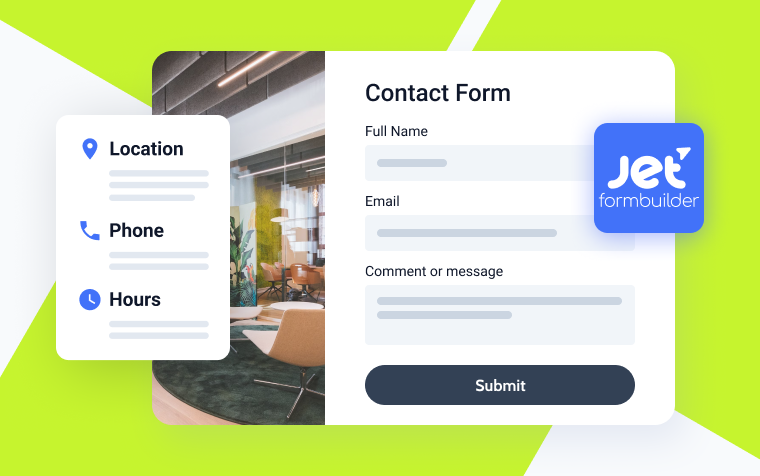
Plugins like JetFormBuilder make it easier to craft customizable and intuitive contact forms, boosting user engagement.
Email and phone numbers
Contact info isn’t just an obligation; it’s a way to foster inclusive and accessible communication:
- Offer two options for contacting you: email and phone. It caters to diverse user preferences so everyone can engage.
- With the “tel:” and “mailto:” protocols, static information can be transformed into actionable links. This simple yet effective trick allows quick user actions.
Social media links
Adding social media to your contact page is a great way to engage your audience. Here’s how:
- Place social media buttons strategically so users can follow your brand across platforms.
- The design of your social media buttons should complement your website’s aesthetics without dominating the essential contact information.
Google Maps
Businesses with physical locations benefit greatly from Google Maps integration. JetElements has a highly customizable Advanced Map widget that can be integrated into your contact page to make it more sophisticated and functional.
With these elements combined with design finesse and user-centricity, your Contact Us page turns from a mere functional necessity to a dynamic hub of connections, driving meaningful interactions and building lasting relationships. Let’s look at some interesting and functional contact page examples.
Contact Us Page Design Examples
Universal Computing
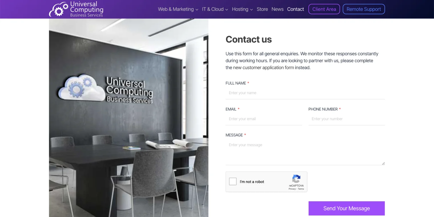
Visitors are greeted by a captivating photo of the company’s office, reflecting its professionalism and corporate ethos. The page has a sleek Kadence Contact Form for streamlined inquiries and fast responses. The “Get in touch” section offers multiple ways to contact them, including phone, email, and physical address. The page also has a Google Maps widget to get directions or make physical visits.
This feature shows the company’s location and office hours, helping visitors plan their interactions. Crafted with Elementor, the page exudes professionalism, functionality, and a user-centric approach, making it a standout example of effective contact page design.
Expert Web Designing
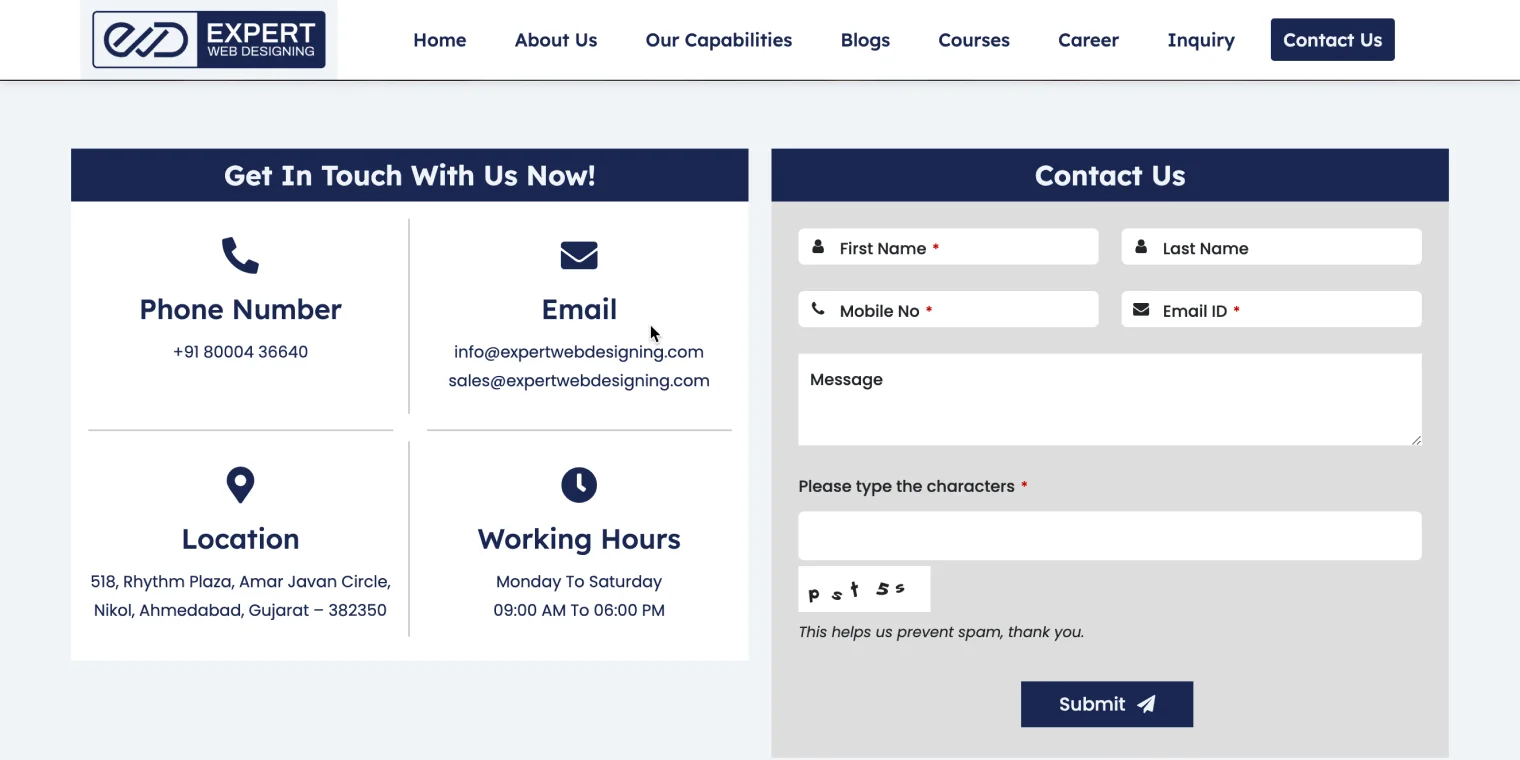
A big “Get In Touch With Us Now!” section shows the phone number, email address, physical location, and hours of operation. Visitors can connect effortlessly, no matter how they communicate. The Quform plugin powers the Contact Us form on the page. The page seamlessly integrates Google Maps so people can easily find their way around.
CloudNation
A stylish black-and-white team photo welcomes CloudNation website visitors, reflecting the company’s professional and cohesive culture. Essential contact info is located in a structured block at the bottom of the About Us page design. For immediate help, there’s a direct phone number, an email address, and a live chat. These multiple touchpoints ensure that users can choose the most convenient communication channel.
The page has a block with top management’s contact info if you want to connect with company executives. It also has a captivating picture of the office building to facilitate physical visits or correspondence, along with a Google Maps widget. The interactive feature shows CloudNation’s location and nearby landmarks to make it easier to find.
Send a Message, powered by HubSpot form, offers a comprehensive platform for inquiries, feedback, and collaboration.
Marko Pantelic
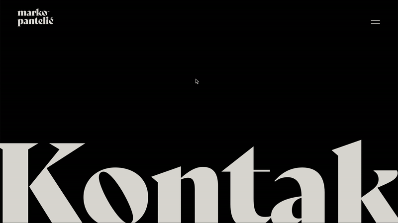
Marko Pantelic’s Contact Us page combines minimalism with functionality in a captivating black-and-white color scheme. With zero distractions, the page exudes focus and clarity, ensuring visitors’ attention is solely focused on the key elements.
The large title at the top of the page commands attention and indicates the page’s tone. The Contact Us page is about streamlined communication, highlighted by the contact form design. You’ll find links to Marko Pantelic’s social media profiles in the footer.
ProgrammingPredators
This website contact form is powered by Elementor and features an isomorphic illustration. Adding this artistic touch enhances the visual appeal and makes reaching out intuitive and engaging for the user.
Visitors will find a concise contacts block adjacent to the contact form, displaying essential information such as phone number and email address. This streamlined approach allows users easy access to direct communication channels. In the footer, users will find additional engagement opportunities, including links to ProgrammingPredators’ social media presence.
MotoDiscovery
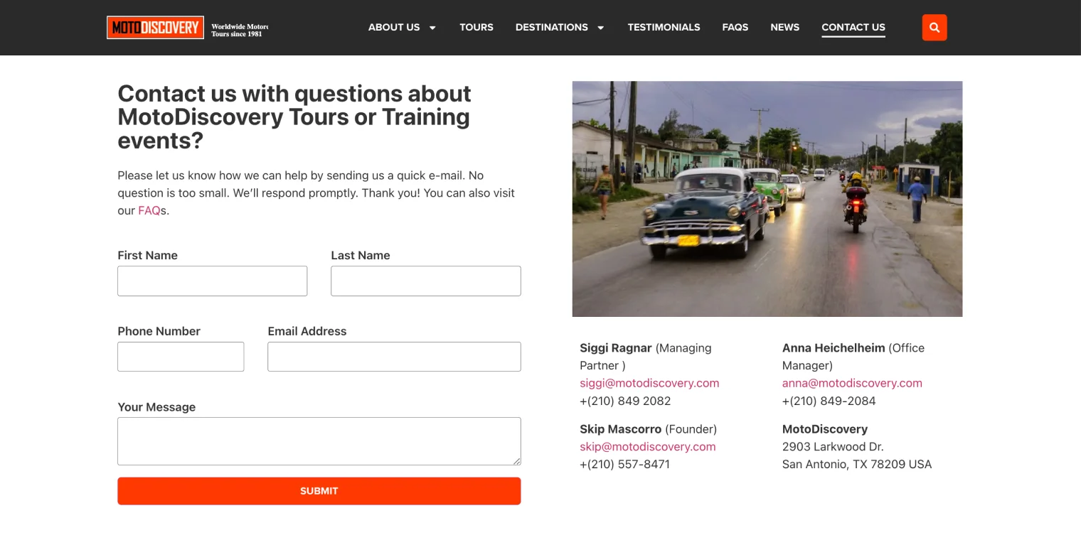
This page features a contact form powered by JetFormBuilder at the top. Visitors can submit inquiries, feedback, and requests using this powerful form builder. MotoDiscovery Tour photo accompanies the contact form, showing the excitement and beauty of their tours.
The contacts block has essential information, such as the management team’s phone numbers, email addresses, and office addresses. Social media links, phone numbers, and email addresses are in the footer.
Quinta do Paral
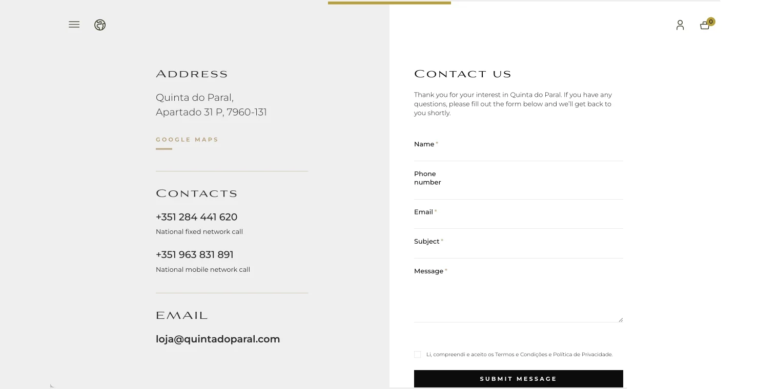
Contact Us design at Quinta do Paral is divided into two visually distinct columns, so it’s balanced and engaging. Users can find contact information such as the address, a Google Maps link for easy navigation, phone numbers, and email addresses in the left column. Users have multiple options for reaching out, regardless of whether they prefer traditional or digital communication.
The right column of the page features the contact form powered by Elementor. The footer section has social media links, phone numbers, and email addresses.
Ddmetrics
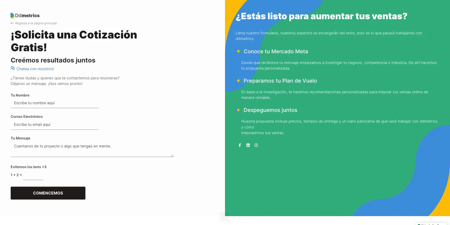
The page is split into two columns to increase user engagement. Users can find the contact form in the left column, powered by Contact Form 7. A live chat option is in the right column next to the contact form so visitors can get real-time help. This instant communication channel can provide immediate answers to your questions.
A stylish three-color background on the right side of the page explains Ddmetrics’ services, enhancing clarity and understanding. Additionally, this section includes social media links, providing users with additional avenues to connect and stay updated.
SunVest
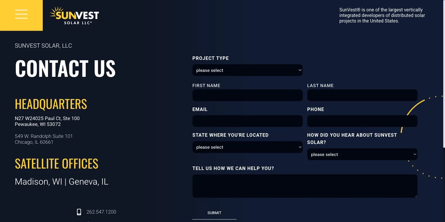
A bold black background adds a sense of sophistication and modernity to SunVest’s Contact Us page. A two-column layout maximizes accessibility and usability. Links to social media profiles, the company’s address, and phone numbers are in the left column. Access to multiple communication channels makes it easy for users to contact SunVest. The Gravity Forms contact form is in the right column against the sleek black background.
Travel Therapy
The contact form is at the bottom of this one-page website. This site is filled with animated objects and adorable cartoon-style mascots, and every element is carefully crafted to make your experience as enjoyable as possible. With animations, the site becomes both informative and pleasant to interact with.
Users can contact the site using the contact form powered by Elementor. This placement allows visitors to explore the website before connecting, aligning with a user-centric communication approach. Despite being a one-page website, Travel Therapy visually conveys a ton of information.
Optimizing Your Contact Page: Dos and Don’ts
Adhering to a set of best practices while steering clear of common pitfalls is crucial to ensuring your Contact Us page makes a lasting impact. Let’s explore the dos and don’ts lists to enhance your contact page’s effectiveness.
The don’ts of contact us pages ❌
- The absence of a contact page is a glaring omission.
- Users may have trouble getting in touch if contact info is tucked away or barely visible.
- Providing incomplete contact information reduces the possibility of engaging clients.
- Inaccurate or misleading contact info undermines trust.
- Lack of calls to action. Failing to prompt users to take action can lead to missed opportunities for interaction.
The dos of contact us pages ✅
- To maximize user engagement, check that the Contact Us page is easily accessible with one click (from your website’s header).
- Utilize contact forms over emails to streamline communication and minimize spam.
- The contact page should be visually balanced to avoid distracting visuals.
- Convince users to contact you by crafting a concise, persuasive microcopy.
- Incorporate authentic team and office photos to show off your company’s culture.
- Provide users with information about your company on the contact page, as it’s often the first place they go.
- A Google Maps widget will make it easy to find your office.
- Display individual team members’ contact information to facilitate personalized communication.
- Organize your address data and contacts based on regions and cities to make finding it easier.
- Allow users to specify a preferred time for a callback.
Although Contact Us page designs may differ, using plugins like JetFormBuilder simplifies creating and customizing contact pages, whether from scratch or using templates. With intuitive widgets and configurations, crafting an impactful contact page becomes more manageable and effective.
Summing Up
Even though it’s often overlooked, the Contact Us page is a vital touchpoint for demonstrating customer importance. This crucial resource is usually neglected, resulting in uninspiring designs and missed opportunities.
An effective contact page design provides users with intuitive ways to get in touch with you. Maintain simplicity and usability on the page. A thorough test is essential to eliminate bugs and ensure a seamless user experience, paying attention to every detail from the client’s perspective.
Still have some questions?

Written bу
Related articles
Created with JetFormBuilder
WordPress Form Submission: JetFormBuilder Scenarios
Created with JetFormBuilder
6 Free Contact Form Plugins for Any WordPress Website (2026)