Contact Form
Use the WordPress Contact Form plugin to quickly build and place a custom contact form anywhere on the site.
Contents:
- Why You Need a WordPress Contact Form
- Top WordPress Contact Form Features
- WordPress Form Pattern Structure
- How to Create a WordPress Custom Contact Form
- WordPress Contact Form Pro Features
Why You Need a WordPress Contact Form
Contact forms serve to bridge the gap between website users and website admins/owners. They can help get more leads, expand the customer base, collect precious feedback, improve user experience, reduce spam emails, etc.
WordPress contact form is not that difficult to create. Using a WordPress form pattern, you will get a basic form layout in one click. It embraces default fields, but you can always add more if desired. Such a pattern can help you build a Sales, Request, Leads contact form, and make users subscribe via the contact form.
Top WordPress Contact Form Features
- Use a shortcode to add the contact form to WordPress posts, pages, or widgets;
- Receive the submitted form data to default admin or custom email addresses;
- Embed additional sender’s details into a notification by email;
- Use reCAPTCHA v3 form validation to protect the form from spam;
- Decide which form fields you want to make Required;
- Provide the Success, Validation, and Error Messages during form submission;
- Apply custom style settings to contact form fields;
- Build mailing lists for MailChimp, GetResponse, Active Campaign, Zapier, Integromat, and other email marketing integrations.
WordPress Form Pattern Structure
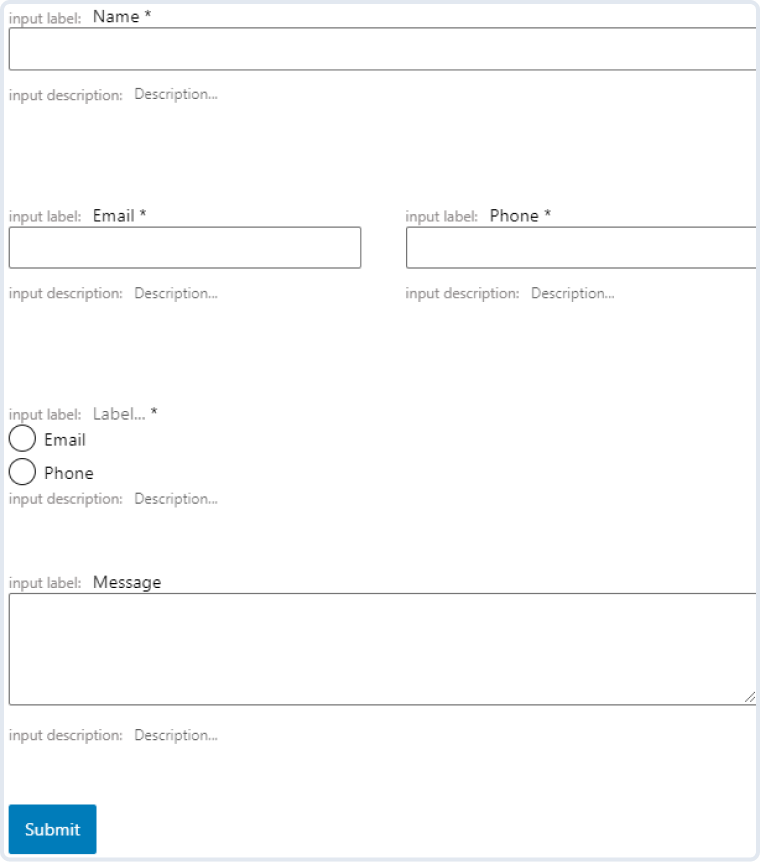
- Name. A required Text field for filling in the user name;
- Email. A required Text field for filling in the user email;
- Phone. A required Text field for filling in the user phone;
- Preferred method of communication. A required Radio field with two options to choose from – “Email” and “Phone”;
- Message. A Textarea field for inputting additional information, questions, comments, etc.;
- Submit. A Submit field to submit a form.
How to Create a Custom WordPress Contact Form
As Gutenberg has no options for creating forms, you can start to work with the JetFormBuilder plugin, which is entirely free. If you are not familiar with this plugin’s features, you can check JetFormBuilder tutorials on the Crocoblock YouTube channel.
Create a Contact Form
Navigate to JetFormBuilder > Add New. Although when you begin, the editor is not empty, some blocks appear by default.
Specifically, there are Hidden, Text, and Submit Fields. They are unnecessary, so it is possible to delete this content.
If you want to add some other content to the Contact Form, there are two ways to do it. You can either use Gutenberg Blocks or the JetFormBuilder plugin’s Patterns.
Patterns
The Pattern is a layout that you can edit and style to your liking. It can be used if you want to simplify work and save time.
Add a new block and click on “Patterns” near the Blocks tab to apply them. These patterns represent already created sections that can be attached to the page.
Firstly, we need to choose from the available types of patterns: Buttons, Columns, Gallery, Headers, Text, Query, and, if you have installed and activated the JetFormBuilder plugin, JetForms.
Let us find out about the last option — JetForms. In our case, we will remove all the default form blocks and use Contact Us Form Pattern. This pattern already includes some blocks.
- Text Field – there are three of them reserved for Name, Email, and Phone accordingly;
- Radio Field – allows to pick the Preferred method of communication;
- Textarea Field – enter a custom Message here;
- Submit Field – represents a regular “Submit” button.
Customize or delete these blocks without restraint. In fact, you can attach more blocks to the form or duplicate existing ones.
Any of these filed blocks have Is Required toggle if you need to make a particular field obligatory. However, all the other field settings can either repeat themselves or be different so customize them accordingly.
Text field
Let’s start with the Text Field Block Settings.
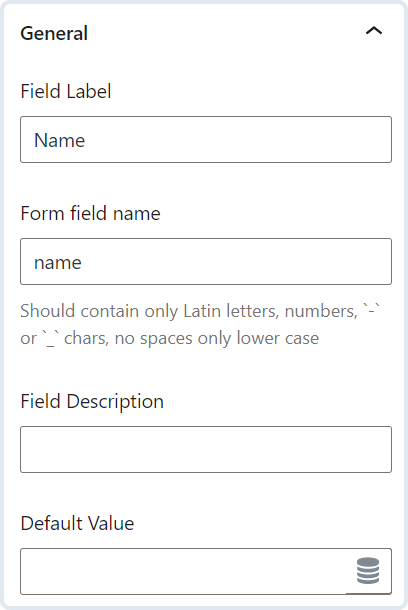
- Field Label — a name visible to users that shows what kind of information this field requires. For instance, Name, Phone, or Password. It will appear above the field bar;
- Form field name — a name that is used as an ID. Commonly it is similar to the Field Label. It should contain only Latin letters in lower case, numbers, hyphens, and underscores. Spaces are inapplicable, so if you want to write two words or more, divide them with hyphens or underscores;
- Field Description — an extra explanation about how to fill in the information. It will appear under the field;
- Default Value — the data you put here will be automatically placed in the field. It is used if the information is already available. For example, if the user is already logged in, the Default value can pull out their name to fill in the field. The user can change it if needed.
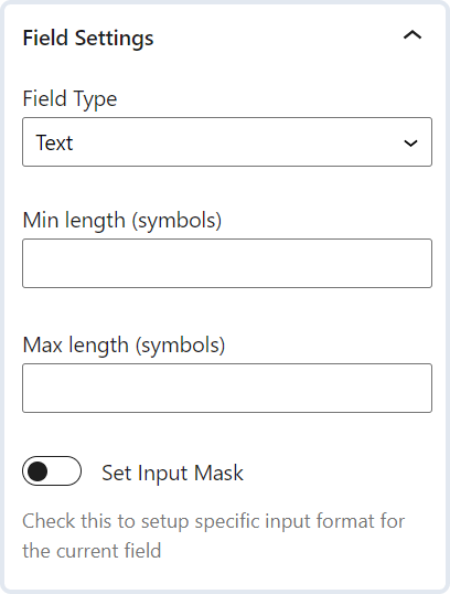
- Field Type — here, you can specify what this information stands for. The choice lies between “Text,” “Email,” “Url,” “Tel,” and “Password”;
- Min and Max length — you can set values that will limit the input information;
- Set Input Mask — the mask will set up a specific input format for the current field. When enabled, there is a possibility to choose a Mask Type, its Visibility, and Placeholder.
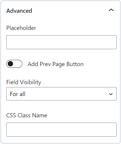
- Placeholder — shows text in the bar until the user clicks on it; it can be an input data example. It differs from the Default Value as this data doesn’t fill in the bar;
- Add Prev Page Button — this toggle is helpful if you use the Form Break Field. It allows a user to turn back to the previous page;
- Field Visibility — some fields can be invisible for some users if you limit the field visibility – for all, only for logged in or not-logged users;
- CSS Class Name — this field contains a CSS class name from which styles will be pulled. The styles can be written in the customizer.
Now let’s look at the Radio Field and its settings.
Radio field
The Contact Us Form Pattern that we have chosen contains one Radio Field called Preferred methods of communication. It, therefore, has two types — Email and Phone, that can be deleted if there is a need.
You can handle items directly from the editor page.
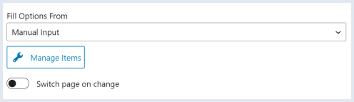
You can also choose where you can pull the data from; it can be “Posts,” “Terms,” “Meta Field,” “Glossary,” generate it dynamically or input manually.
If you click on the “Manage Items” button, you can change, add new, delete, or clone existing options.
You can also enable switching the page when changing the items.
Message and Submit fields have almost the same settings as Text and Radio fields, so you are already acquainted with all the customization options.
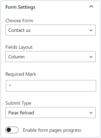
JetForm Settings
We have discovered the customization options for the Contact Us Form Pattern. Now we will get familiar with the JetForm Settings. These are sited just near the Block Settings,
This section allows you to apply general layout and appearance features. The settings will work for all the fields that you will add to the form. Let’s take a closer look at them.
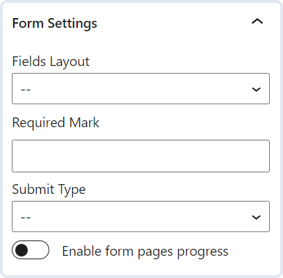
- Fields Layout — defines the correspondence between the field bar and the field label. When “Column” is chosen, the label is over the bar, and “Row” places the label and the bar in one row;
- Required Mark — fill in this field to change the appearance of the required fields. If the field is empty, this mark will be represented with an asterisk symbol;
- Submit Type — the action after clicking on the “Submit” button. You can either pick “Page Reload” or “AJAX” so that the page will not be reloaded;
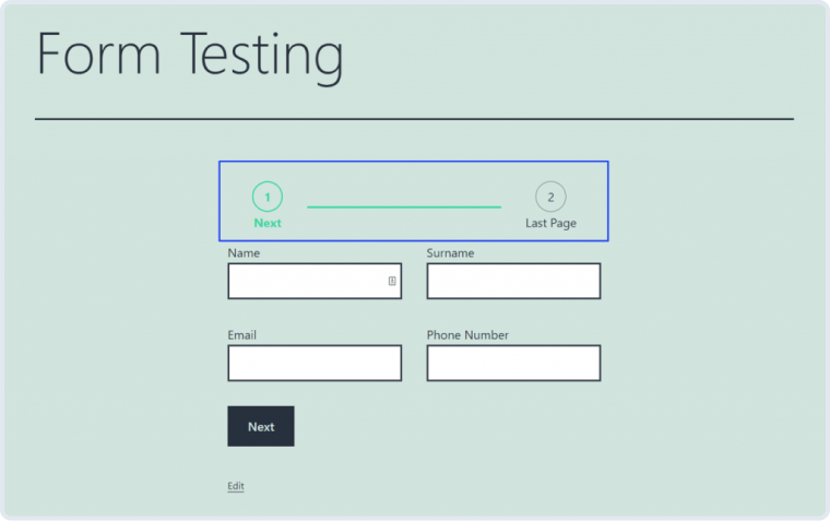
- Enable form pages progress — this toggle works in cooperation with the Form Break Field. The form progress bar will be added if you divide the form into parts and enable this toggle. It will display the part the user is currently on.
Next are Captcha Settings. This tab contains only one toggle, Enable reCAPTCHA V3 FORM verification. All the details about how to add reCAPTCHA to a form you can learn from our video overview.
We also have a video about the next Post Submit Actions settings tab, so do not hesitate to check it out.
Let’s move on, and you will see General Messages Settings that are in charge of the messages displayed to the user in specific cases. For instance, you can type in the notification for users who haven’t filled in the required field.
Style settings
Gutenberg doesn’t have the styling options. However, you can still apply some styling to the Contact Form if you install the JetStyleManager plugin. To find out what customizations are available with this plugin, read our Gutenberg blocks styling overview.
Once you are done with all the styling and customizing, click on the “Publish” button.
Now you can add your Gutenberg Contact Form with the help of the JetForm block in the Gutenberg Editor. If you are using Elementor Page Builder, add your Elementor Contact Form by applying the JetForm widget.
Go to WordPress > Pages. Choose any page or create a new one. You can add a JetForm block and choose the form you have just created in the relevant field.
As you may have noticed, the settings of the JetForm are pretty much the same as you have already applied while creating the form.
Pay attention that the form settings will override the JetForm block settings. For example, you can change Required Mark in the JetForm block settings into an exclamation mark, while the form settings will be set up to show a default asterisk symbol. As a result, the user will see an asterisk symbol near the required fields, as it will have more priority.
Except for the standard settings, you can style the Form Break Field block and Success and Error Messages using the JetStyleManager plugin.