Advanced Choices Field Block Overview
Advanced Choices Field block is a feature for more advanced selection options in the form, which can be used instead or additionally to the alternative Checkbox, Select, and Radio fields.
With this block, text, images, or other objects can turn into the object for selection. And now, this block is available for WordPress with the JetFormBuilder plugin.
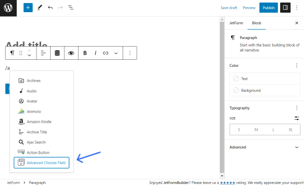
The Advanced Choices Field block can be found in the Gutenberg block search or by typing the “/” right in the empty spot in the form.
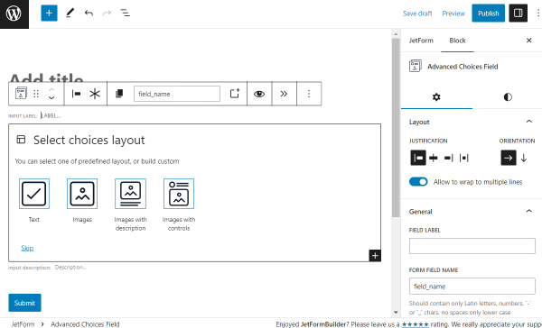
Block Layouts
There are four default layouts available for selection: “Text,” “Images,” “Images with description,” and “Images with controls.” Besides the given layouts, the user can build a custom block by pressing the “Skip” button.
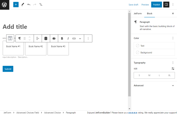
Text
Except for the general Advanced Choices Field block settings, the Paragraph blocks can be customized in every separate choice field.
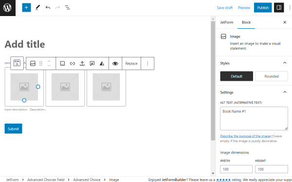
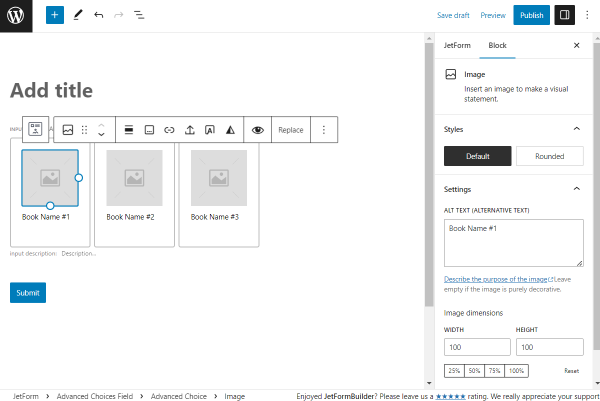
Images
In this case, the Image block settings can be customized.
Images with description
Once this option is picked, there are both Paragraph and Image block settings are available for every choice box.
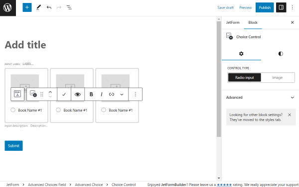
Images with controls
The “Images and Controls” layout provides adjusting options for the Image and Choice Control block.
Custom
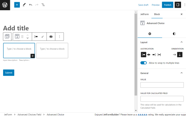
If the “Skip” button is pressed, two empty options for completing appear. Inside them, different needed blocks can be added.
Advanced Choices Field Block Settings
Once the Advanced Choices Field block is added, a panel with the following toolbar controls appears above the block:
- Transformation button (this block can turn to Conditional Block, Columns, and Group);
- Elements for controlling the position of the block;
- Justification button. The block can be put left, center, or right. Or a space between items can be added;
- Button to make the field required;
- Button for name copying;
- “New Advanced Choice” button to create an additional choice box;
- Automatic transition button that redirects to the next page when the values are changed;
- Other options.
There are two settings tabs to adjust the Advanced Choices Field block: General and Styles.
General
In this tab, the main customization options of the block are available.
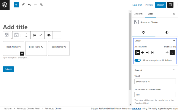
Layout
In the Layout section of the Settings tab, there are the following settings:
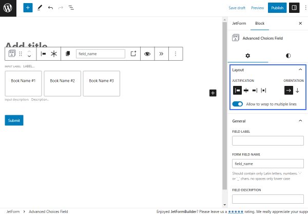
- Justification — options to justify a block. It can be put left, center, or right. Additionally, the gap between blocks can be added with the help of the corresponding buttons. Mind that the last option is available only when horizontal Orientation is picked;
- Orientation — the view of the columns, which can be either horizontal (in a line) or vertical (stackable boxes);
- Allow to wrap to multiple lines — toggle that allows putting options in the next line if there is not enough space on the screen. For instance, on mobile devices.
General
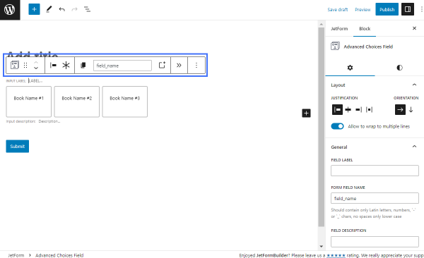
The next section is called General:
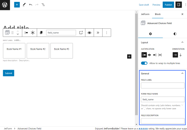
- Field Label — label for the field that will be displayed in the form before options;
- Form Field Name — unique field name/ID that can be used for further work with the field on the WordPress back end. It should contain only lowercase Latin letters, numbers, and “-” or “_” characters with no spaces;
- Field Description — optional field for the field description. If completed, the description will be displayed under the field.
Value
The Value section includes several settings options:
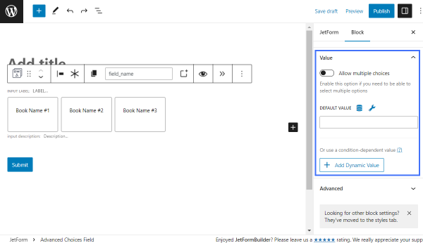
- Allow multiple choices — a toggle that allows selecting several options in the field (basically, like a Checkbox Field). Otherwise, the field works as a Radio Field, meaning that only one option of the field can be picked.
- Default Value — a field where one can put the Value of one or more fields. If put, this exact value will be selected by default. For instance, “Book Name #1”. If several options are desired to be default, these can be separated by a comma and space.
- Add Dynamic Value — a button that allows setting value under certain conditions. Once clicked, the Edit Dynamic Value pop-up with additional customization options appears.
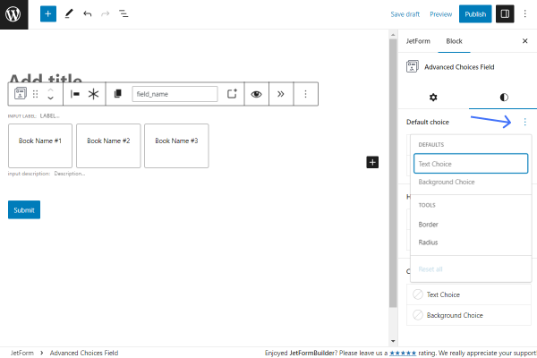
Styles
In the Styles tab of the settings, by default, the user can alter the Text Choice and Background Choice of the default, hover, and checked states of the choice boxes.
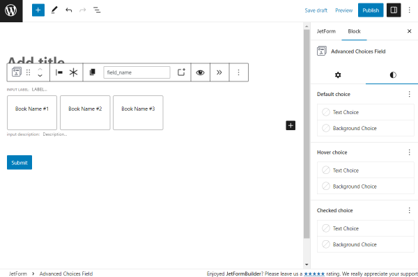
Except for the mentioned text and background settings, there is a three-dots button next to each section.
By clicking, additional Tools, like Border and Radius of the field, can be added, default Text and Background can be removed, or the selected options can be reset by pressing the “Reset All” button.
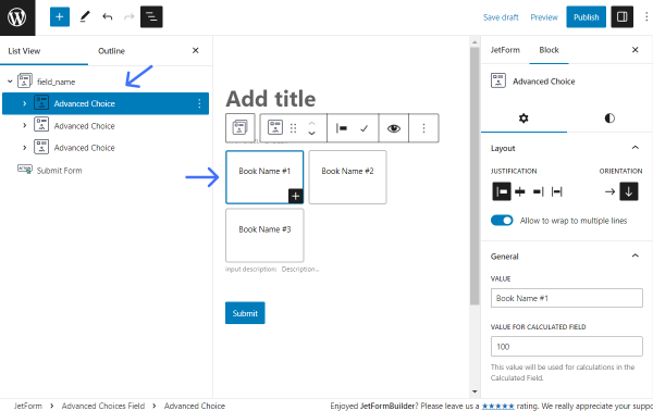
Advanced Choice Block Settings
These are the settings of the one particular choice block. For example, in the “Text” layout, there are three boxes by default (but more can be added.) So, clicking on one of the boxes will open the Advanced Choice block settings.
A needed box can also be found in a Document Overview section.
Above the selected box, there is a toolbar with controls located:
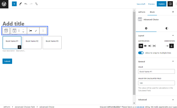
- Button to switch to the Advanced Choices Field block;
- Inactive transformation button (the structure cannot be changed);
- Justification button;
- Button to switch between “Default” and “Checked” states.
General
Layout
Initially, the general Layout settings can be adjusted. These are the same as in the Advanced Choices Field block.
General
In this section, there are two fields displayed:
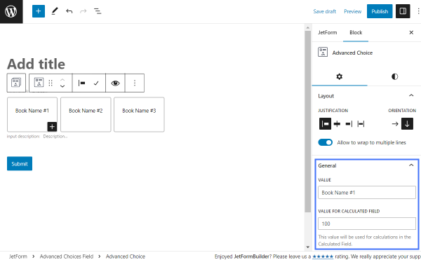
- Value — value for an option. It will be displayed in the choice box;
- Value for Calculated Field — value that will be used in the Calculated Field if needed.
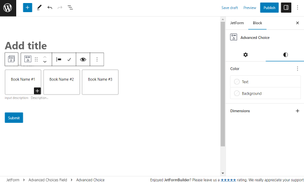
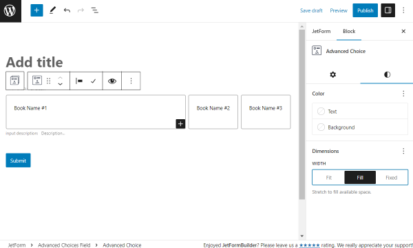
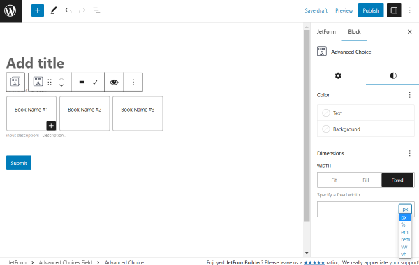
Styles
Except for the General Settings tab, there is also the one called Styles.
In the Color section, the Text and Background colors for an option can be selected.
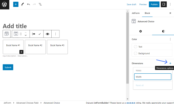
The Dimensions section is initially empty. To add settings, the plus-shaped icon should be clicked.
Here, the Width line can be pressed to add its settings.
The “Fit” option is set by default. By picking this option, the option boxes will be displayed as standard, fit options.
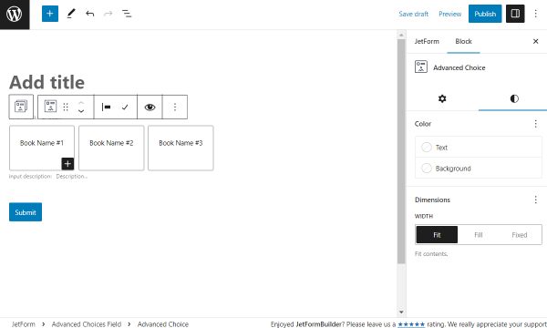
The “Fill” Width stretches options to available space.
With the “Fixed” variant, a needed field width can be specified in the appeared field.
It is also possible to choose the desired unit in the selector next to the field: “px,” “%,” “em,” “rem,” “vw,” or “vh.”
That’s all about the Advanced Choices Field block settings available with the JetFormBuilder plugin for WordPress.