
Border
Learn how to customize the border settings (e.g., width, colors, or styles) around the block and its specific parts.
The Border feature defines the visible line framing the block’s part and allows setting the border of the specified type, width, and color around the block and its specific parts. For each part of the field, the border can be set independently.
The following settings of the Border feature can be set: border width, border color, and border style. The BORDER settings are presented by the controls; each of them has no specific name (except the Border color and style picker). Therefore, in this tutorial, we use their functionality as descriptions.
- Border width 一 a text field that defines the width of a specific border or the width of all borders as a whole. By default, it can be set in pixels for the whole border.
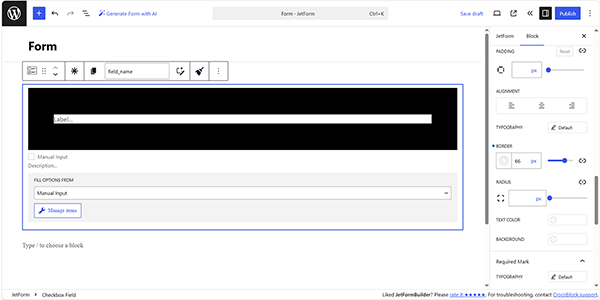
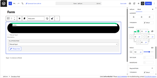
The width of the BORDER can be set either for the whole BORDER or separately for each of its sides. By default, the whole BORDER value is set.
To separate the values for each side, the “Unlink Sides” button (a blue button with the chain-shaped icon) should be pressed. In this case, the BORDER bars for each side will appear.
The first cell is for the top side, the second is for the right side, the third is for the down side, and the fourth is for the left side. The little square-shaped icon in the left corner shows what side options are set now.
To undo all the changes, the “Reset” button should be pressed.
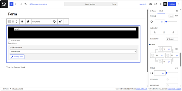
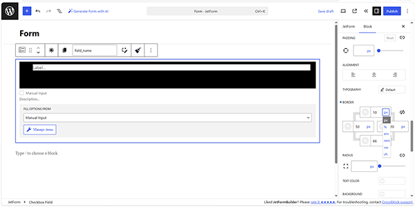
By default, the width of the border is set in pixels. Also, other units such as %, em, rem, vw, and vh are available.
- Border color and style picker 一 a picker that allows selection of the color of the BORDER and its STYLE. The Color guide should be checked for more details.
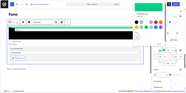
Setting the border type, e.g., “Solid,” “Dashed,” or “Dotted”, can be performed by pressing the corresponding button on the Border color and style picker panel.
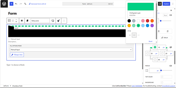
- RADIUS 一controls that allow making the angles of the border curvy. In the bar, the radius of curvature in pixels can be inserted. A similar radius for all angles or individual ones can be set. To set different curvatures, the “Unlink Sides” blue button with a chain-shape icon should be clicked. The opened cells correspond with the upper left corner, upper right corner, bottom right corner, and bottom left corner. All the changes can be reset by clicking the “Reset” button or by clicking the same button again to link the sides – “Link Sides”.
FAQ
Yes. By default, the same width can be applied to the entire border. To configure each side separately, click “Unlink Sides”.
Yes. Border width can be specified in pixels (px) as well as other supported units.
That’s it. Now you know how to customize the border settings (e.g., width, colors, or styles) around the block and its specific parts using the JetFormBuilder plugin for WordPress.