Range Field
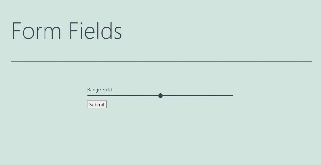
This field creates a range with a slider in the form and gives the user an opportunity to move that slider. This way, the user chooses one value in a range. The Range Field works nicely when you want the users to evaluate something. It looks eye-catching, so it will also be a kind of decoration if there are lots of multi-choice fields already.
Settings
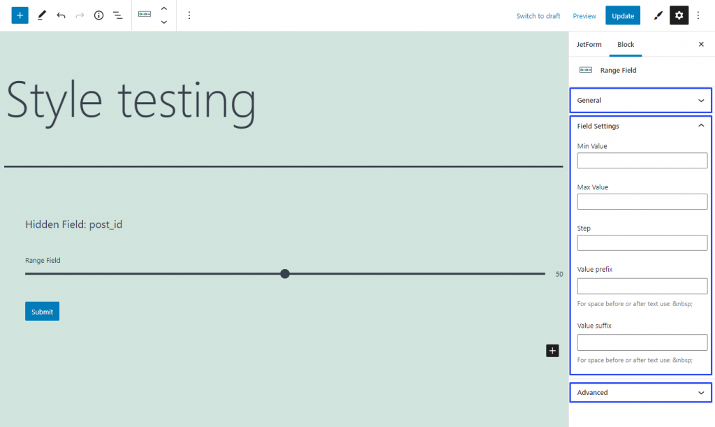
Field Settings
- Min/Max Value. By default, the range has values from 1 to 100. If you need some other minimum and maximum values, you can set them in those bars;
- Step. When the user moves a slider, it goes through the small steps. By default, the step is set to 1. However, you can change the value if you need it;
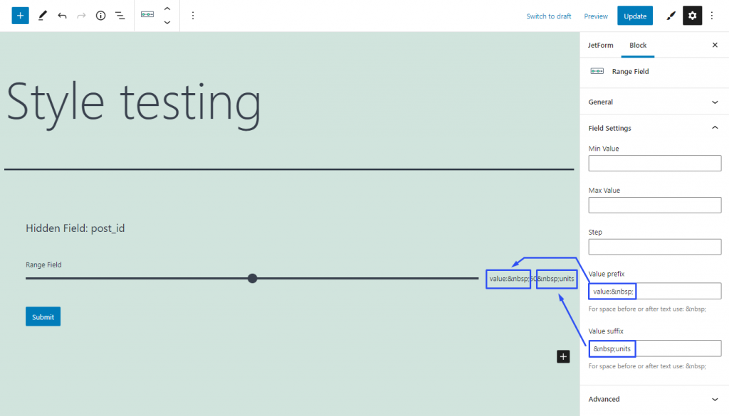
- Value prefix/suffix. This is the text that goes before and after the value that is shown at the end of the range, on the right side. To create a space, use the “ ” code; in the front, it will be visible as space, not as the set of symbols.
Style Settings
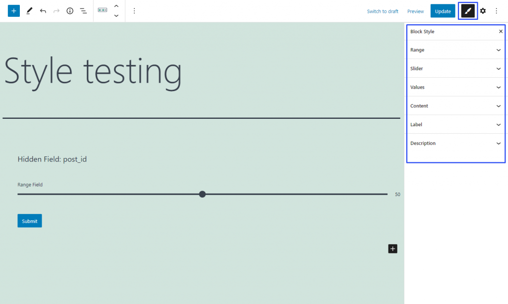
If you have installed the JetStyleManager plugin, the Block Style button will appear in the top right corner of the editing window. Here are the styling settings you can meet there: