Switcher Field Overview
The Switcher Field block is a horizontal toggle form field for switching between two states of the same form. The Switcher Field block functionally can be replaced by the Checkbox, Radio, or Advanced Choices Field blocks. This block can be used in contact forms, registration forms, order forms, etc. (for example, while selecting the email or mobile method of communication, preferred services, and more).
Field Settings
To add the Switcher Field block to a JetFormBuilder form, navigate to WordPress Dashboard > JetFormBuilder and open a new form or edit a previously built one.
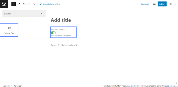
Find the Switcher Field block and drag and drop it into the form.
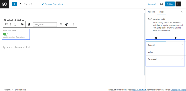
The Switcher Field block has two settings tabs 一 Settings and Style.
Settings Tab
The Settings tab includes the General, Value, and Advanced settings.
General settings
The tab contains the following fields: FIELD LABEL, FORM FIELD NAME, and FIELD DESCRIPTION:
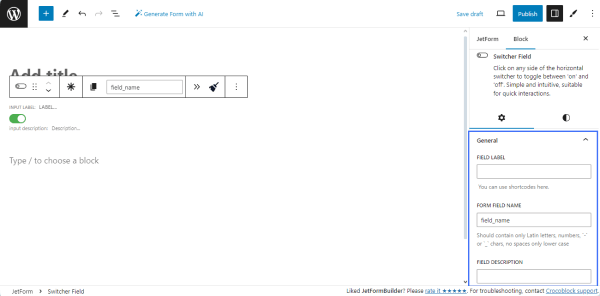
- the FIELD LABEL field allows typing the text to be displayed over the switcher;
- the FORM FIELD NAME field allows typing the form’s ID text;
- the FIELD DESCRIPTION field is for the text about the field or to enter a shortcode.
Value settings
The Value settings include the DEFAULT VALUE, VALUE, and CALCULATED VALUE fields:
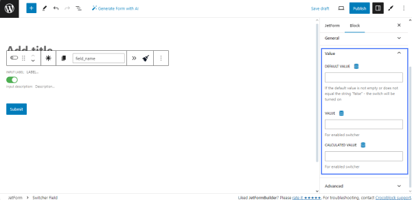
- the DEFAULT VALUE field allows typing or selecting the default value for the on/off switcher: If the default value is not empty or does not equal the string “false,” the switcher will be turned on. Pressing the “Dynamic Tag” icon allows users to select dynamic data (i.e., data from posts, user data, queries, option pages, or related terms). If the “Restrict access” toggle is enabled, it sets the default value from preset only for users allowed to edit this value; if disabled, it sets the default value from preset for all.
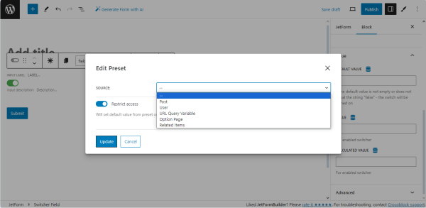
- the VALUE and CALCULATED VALUE fields allow typing/selecting data for the enabled switcher. Pressing the “Dynamic Tag” icon turns on the Edit Preset pop-up with the SOURCE drop-down menu to select data from posts, user’s data, queries, option pages, or related terms).
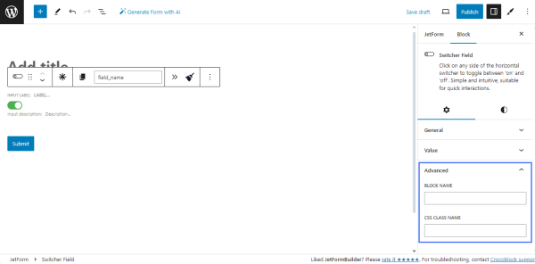
Advanced settings
The Advanced tab consists of two fields: the BLOCK NAME and CSS CLASS NAME fields intended to type the block name and a custom CSS class to style the block.
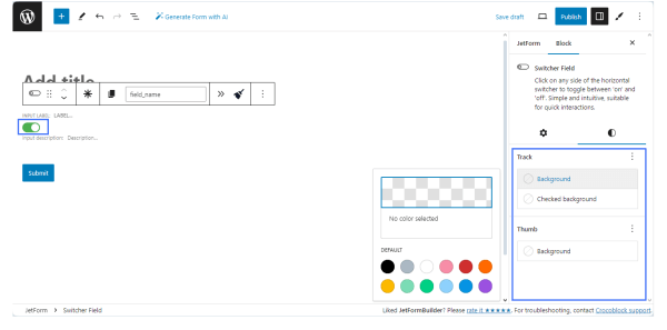
Style Settings Tab
The Style Settings tab manages the background colors of the Track (for the enabled and disabled switcher) and Thumb.
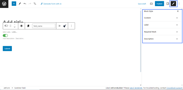
JetStyleManager Style Settings
In contrast to the default block Style settings, the JetStyleManager plugin allows customization of the block’s Alignment, Border, Color, Margin, Padding, and Typography.
Click the pencil icon in the top right corner of the page and apply the necessary settings to the block’s Content, Label, Required Mark, and Description.
That’s all about the Switcher Field’s settings from the JetFormBuilder plugin.