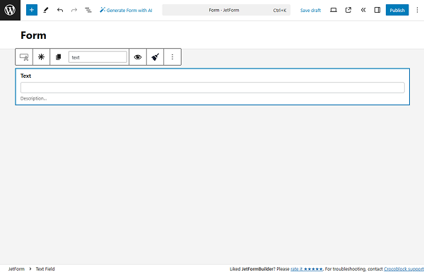
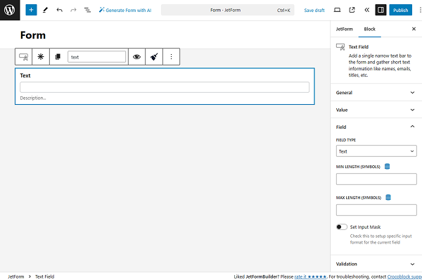
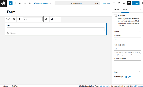
Text Field
This field gathers short text information like names, emails, titles, etc. It adds a single narrow text bar to the form. The Text Field could be filled with symbols, numbers, and letters of every language.
- General Settings
- Value Settings
- Field Settings
- Validation Settings
- Advanced Settings
- Additional Settings Panel
- Style Settings
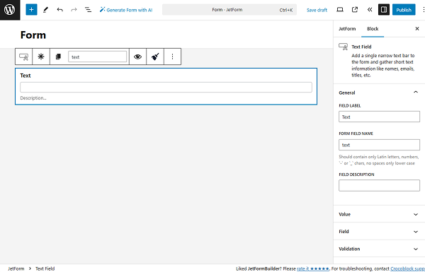
General Settings
The General settings tab includes the most common settings for field customization.
More information about the settings can be found in the General settings section article.
Value Settings
The Value settings tab has two optional setting fields for completion.
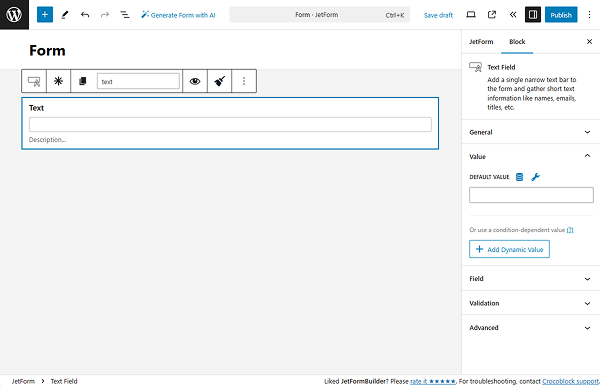
- DEFAULT VALUE — data put here will be automatically shown in the field. Although it can be changed by the user who completes the form;
- Add Dynamic Value — a button that allows adjusting the value displayed under specific conditions. Once pressed, the Edit Dynamic Value pop-up appears.
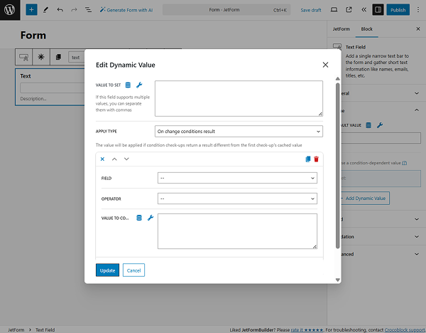
- VALUE TO SET — a value that will be put in the field once the required conditions are met;
- APPLY TYPE — a selector for the dynamic behavior. Among the options are “On change conditions result,” “Once,” or “Always”;
- FIELD — a drop-down list with fields from the current form that should be compared;
- OPERATOR — a comparison operator that will be a binding for the selected FIELD and VALUE TO COMPARE options;
- VALUE TO COMPARE — a field for the name of the value to compare;
- Add New Condition — a button that opens one more settings repeater for setting a new condition;
- Set value only if field is empty — a toggle that makes the dynamic value feature work only if the FIELD is empty.
After finishing with the dynamic value settings, the “Update” button should be clicked.
Field Settings
The following Field settings tab includes several options for adjusting that will make the Text Field more specific for the needed purpose:
- FIELD TYPE — a drop-down menu with the most common types of information that can be gathered via the Text Field: “Text,” “Email,” “Url,” “Tel,” and “Password.” The type selected here defines the information considered “correct” for this field. For example, if the user places the letters into the “Tel” field, they will receive a notification saying that one of the fields was filled incorrectly;
- MIN/MAX LENGTH (SYMBOLS) — the minimal and maximal number of symbols for the field;
- Set Input Mask — the input mask should be used to restrict the users from inserting the wrong data into the field. When this toggle is switched on, access to the mask settings is opened.
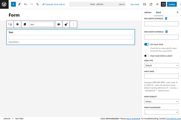
- Clear mask before submit — a switcher that inactivates the mask once the form is submitted. This feature prevents the mask value from being saved in the meta field or sent in the email. For instance, the Text Field is completed with “(384) 682-4827”, but it includes a mask, so the user filled in the field only with “3846824827,” and the entered numbers will be saved;
- MASK TYPE — the “Default” and “Datetime” variants differ only in the rules of mask creation. The first one is for any alphanumeric data, and the second is for date and time only;
- INPUT MASK — a bar where the mask formula should be inserted. There are three definitions: “9” marks the numeric value, “a” means the alphabetic value, and “*” means that both numeric and alphabetic values can be used here.
For example, a “(999) 999-9999” mask for the phone number defines that the first three symbols must be numbers enclosed in brackets, followed by another three numbers, a hyphen, and four more numbers. The user can only insert numbers into that field, following the pattern set by the mask.
- MASK VISIBILITY — a time when the mask will be visible to the users. “Always” means that it won’t be hidden, “Hover” will show the mask only when the user hovers a pointer over the field, and “Focus” means that the mask will become visible when the user clicks on the field;
- MASK PLACEHOLDER — the symbol that will show the user the structure of the mask. That symbol will display where the number or letter has to be inserted.
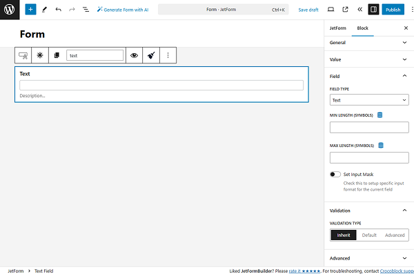
Validation Settings
A validation is a feature that can be set either for the entire form or for a separate field. With the form/field validation, a browser/web server will verify that the data adheres to the specified format and within constraints set by the program.
By default, the “Inherit” option is set. But two more can be used: “Default” or “Advanced.” Learn more about them in the Advanced Form Validation for Separate Blocks article.
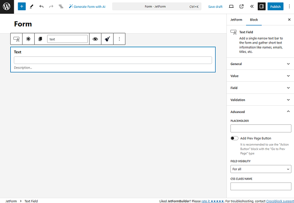
Advanced Settings
This tab has an additional set of settings for the field. More information about it can be found in the Advanced settings section article.
Additional Settings Panel
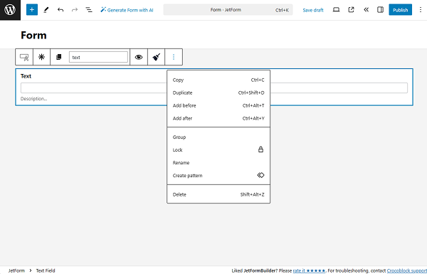
Once the person who creates the form clicks on the Text Field, an additional settings panel with buttons is displayed.
- The “Text Field” button allows converting the current field into any other required type within JetFormBuilder. Learn more about it in the How to Use WordPress Blocks Transformation article;
- “Click to make this field required” is self-explanatory. If the form creator wants to make the field obligatory for completion (which means a user must fill it in to submit the form), this button should be pressed;
- “Copy name” button copies the Form Field Name into the clipboard;
- Form Field Name is the same field as in the general settings. Having it in this settings panel can make the form-creation process easier;
- “Sanitize value” clears unwanted characters in the field. Once clicked, more specific options for selection are displayed:
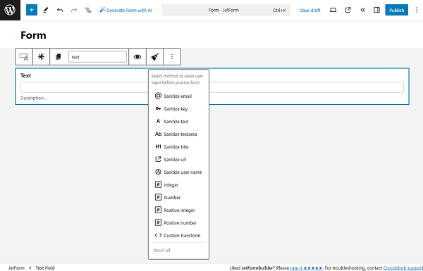
- “Sanitize email” — strip out all the characters that are not allowable in an email;
- “Sanitize key” — keys are used as internal identifiers. Lowercase alphanumeric characters, dashes, and underscores are allowed;
- “Sanitize text” — checks for invalid UTF-8, converts single “<” characters to entities; strips all tags; removes line breaks, tabs, and extra whitespace; strips percent-encoded characters;
- “Sanitize textarea” — the function is like “Sanitize text,” but preserves new lines (\n) and other whitespaces, which are legitimate input in textarea elements;
- “Sanitize title” — sanitizes a string into a slug, which can be used in URLs or HTML attributes;
- “Sanitize url” — sanitizes a URL for database or redirect usage;
- “Sanitize user name” — sanitizes a username, stripping out unsafe characters;
- “Custom transform” — specify the name of the PHP function to process the value.
Another button above the Text Field is “Options,” the default settings window for any field used in the Block Editor.
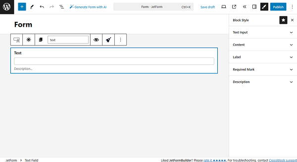
Style Settings
If the JetStyleManager plugin is installed and activated, the “Block Style” button will appear in the top right corner of the editing window.
The styling settings included here are Alignment, Border, Color, Margin, Padding, and Typography.
That’s all about the Text Field available with the JetFormBuilder plugin for your WordPress forms.