Advanced Form Validation
Form validation is the process when users enter data, and the browser and/or the web server will check to see that the data is in the correct format and within the constraints set by the program. To a JetFormBuilder form, one can apply the Default (browser) or Advanced validation.
The Advanced option has such advantages compared to the Default (browser) option:
- Editing or translating the error text;
- Customizing the appearance;
- Custom validation rules;
- Server-side validation;
- Validate non-basic inputs.
Table of Contents:
- Advanced Form Validation
- Advanced Form Validation for Separate Blocks
- Checking Form Validation on the Front End
Advanced Form Validation
If validation needs to be added to the WordPress form, the Validation menu section in the Form settings tab should be accessed. Once unfolded, the following settings will be displayed:
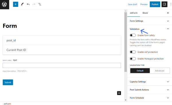
- Enable form safety — this option is used when form caching or conflict issues are present. The form is protected with a WordPress nonce. This option should be toggled off if the form page’s caching cannot be disabled;
- Enable csrf protection — if enabled, it protects a form from attacks that force authenticated users to submit a request to a website against which they are currently authenticated;
- Enable Honeypot protection — this feature adds an invisible field to the form. If the hidden field is somehow completed, the form will be considered filled out by a bot;
- Validation type — here, one can pick two options:
- Default — native validation that works by browser;
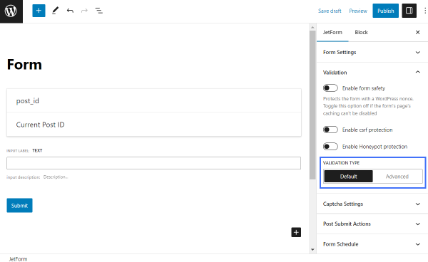
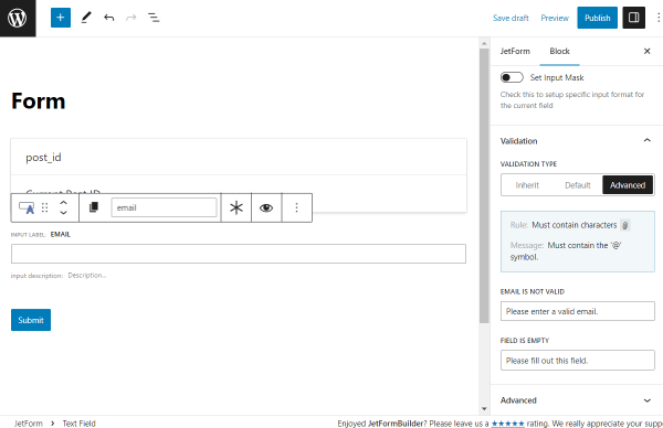
- Advanced — if this option is selected, the “Edit validation messages” button can be clicked, revealing the “Edit Manual Options” pop-up, where the error text for different field types can be changed:
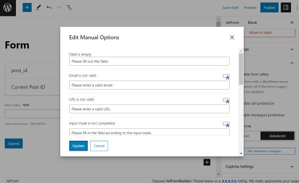
- Field is empty — for all field types if the Is Required option is enabled for the specified field. It will be shown if the Required field is not filled in and the “Submit” button is clicked;
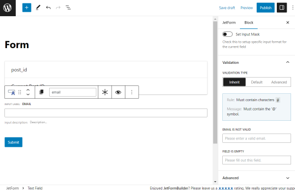
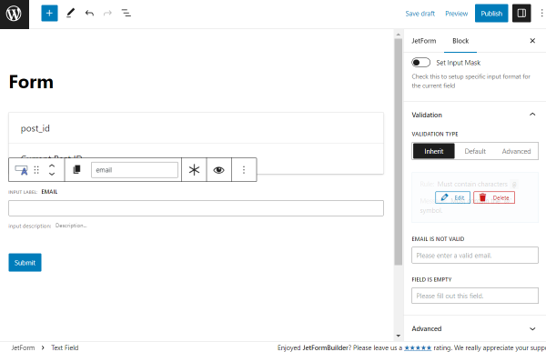
- Email is not valid — for the Text Field with the selected “Email” Field Type in the Field Settings menu section for the block. The message will be shown if an incorrect email address is entered;
- URL is not valid — for the Text Field with the selected “Url” Field Type in the Field Settings menu section for the block. It will be shown if an incorrect web address is entered;
- Input mask is not completed — for the Text Field with the selected “Tel” Field Type, the enabled Set Input Mask toggle, and the filled Input mask field in the Field Settings menu section for the block. It will be shown if the phone number is entered incorrectly according to the Input mask field settings and the “Submit” button is clicked;
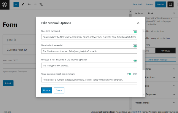
- Files limit exceeded — for the Media Field with the Maximum allowed files to upload field completed. For example, if set to “3,” the error message will be shown if users try to upload four files or more;
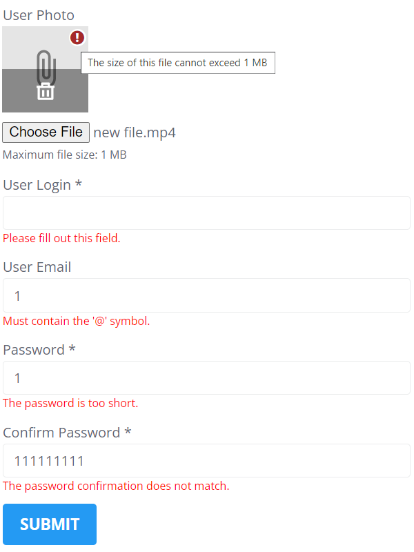
- File size limit exceeded — for the Media Field with the Maximum size in MB field filled. For example, if set to “1” Maximum size in MB, the notification will be “The size of this file cannot exceed 1 MB” if users upload a file whose size is bigger than 1 MB;
- File type is not included in the allowed types list — for the Media Field with the Allow mime types field filled. For example, if one selects the “gif/image” option, the error message will be shown if users try to upload files of other types;
- Value does not reach the minimum — for the Number Field and Range Field with the Min value field filled. For example, if set to “5,” the error message will be shown if users try to enter or set a number less than “5”;
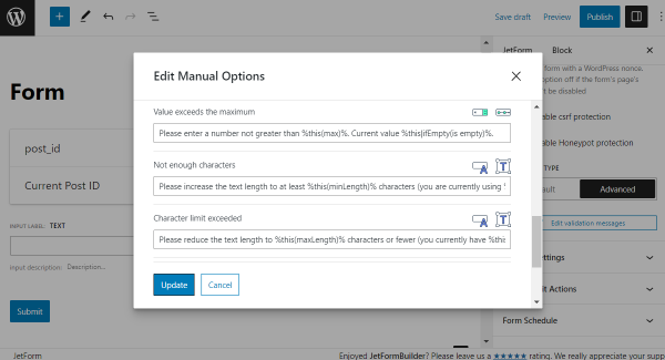
- Value exceeds the maximum — for the Number Field and Range Field with the Max value field completed. For example, if set to “100,” the error message will be shown if users try to enter or set a number greater than “100”;
- Not enough characters — for the Text Field and Textarea Field with the Min length (symbols) field filled. For example, if set to “5,” the error message will be shown if users try to enter less than five symbols;
- Character limit exceeded — for the Text Field and Textarea Field with the Max length (symbols) field filled. This message may appear if one sets the Value option and the value exceeds the limit. For example, when creating a post editing form and adding the Text Field for the post title. In the Value section, the field is set to display the current post title, and if the limit is exceeded, an error message will appear when the “Submit” button is clicked, requiring the title to be edited before the form can be submitted;
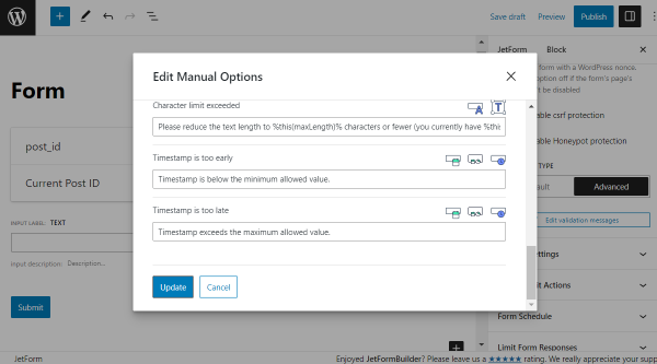
- Timestamp is too early — for the Date Field, Datetime Field, and Time Field with the Starting from time/date fields filled. For example, if set to “8:00,” in the Starting from time field, the error message will be shown if users try to set the time that is earlier than 8 AM;
- Timestamp is too late — for the Date Field, Datetime Field, and Time Field with the Limit time/dates to fields filled. For example, if set to “17:00,” in the Starting from time field, the error message will be shown if users try to set the time that is later than 5 PM.
Advanced Form Validation for Separate Blocks
In addition to the advanced form validation, one can set the Validation for separate form fields in the Block settings tab. This option is available for the Text Field, Textarea Field, Media Field, Number Field, Range Field, Date Field, Datetime Field, and Time Field blocks. Following Validation Types are available:
Inherit
If one selects this option, validation is inherited from the form arguments. Here, one can only add advanced rules that check the entered data in the Text Field and Textarea Field blocks, and if the data does not match the rule, the error message will appear.
The message in the blue rectangle should be hovered over, and the “+ Add Rule” button should be pressed.
In the Rule Type drop-down menu, one can select such types:
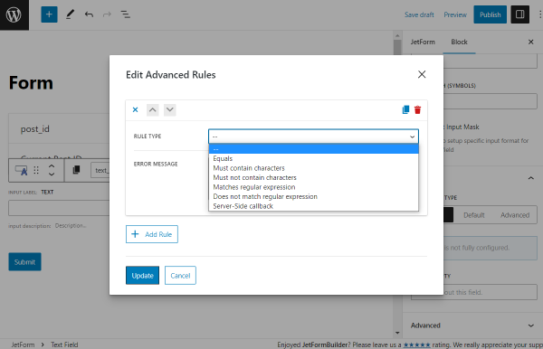
- Equals — displays the error message if the rule’s condition doesn’t match the data users enter into the form. In the Choose Field drop-down menu, one can select one of the form fields or set “Custom value.” If you pick the “Custom value” option, the Symbols field will appear, where one can enter symbols that must be typed in the form field. If you hit the coin-stack-shaped button near the Symbols field, one can set the Preset for this field. To learn more, proceed to the Preset Settings overview. Also, if you push the “wrench” button, one can use macros with the form field names. In the Error Message field, one can set the custom error message.
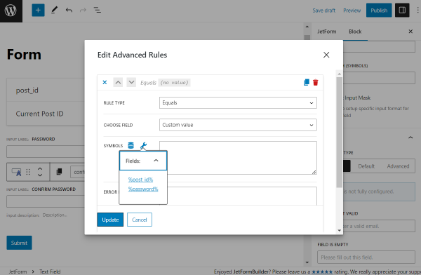
For example, you have two text fields: “Password” and “Confirm Password.”
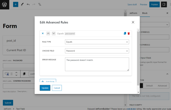
The “Confirm Password” Text Field should be clicked, and the “Edit Advanced Rules” button should be hit. In the Edit Advanced Rules pop-up, one should pick the “Equals” Rule Type, select the “Password” Text Field in the Choose field, and set the custom Error Message.
So the error message will appear when the text in the “Password” and “Confirm Password” fields doesn’t match.
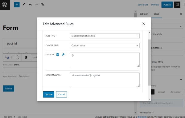
- Must contain characters — the message will appear when users don’t enter the required characters, for example, “@” for the email field;
- Must not contain characters — the message will appear when users enter the restricted characters;
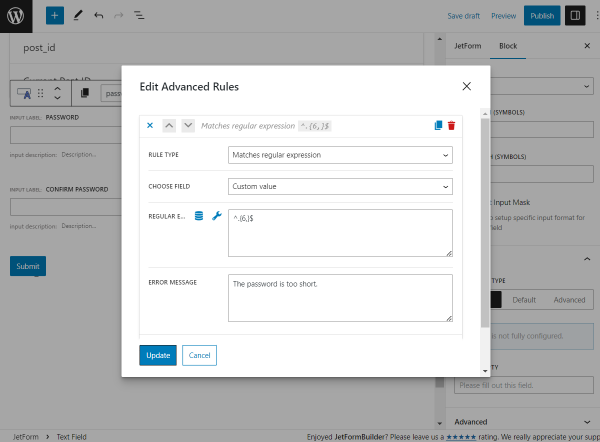
- Matches regular expressions — the message will appear if a combination of symbols that does not match the regular expressions is entered. For example, one can set the “^.{6,}$” Regular expression for the Text Field with the “Password” Field Type, and the custom Error Message “The password is too short” will appear if users enter less than six characters into the field;
- Does not match regular expressions — the message will appear if users enter the symbol combination that matches the regular expressions;
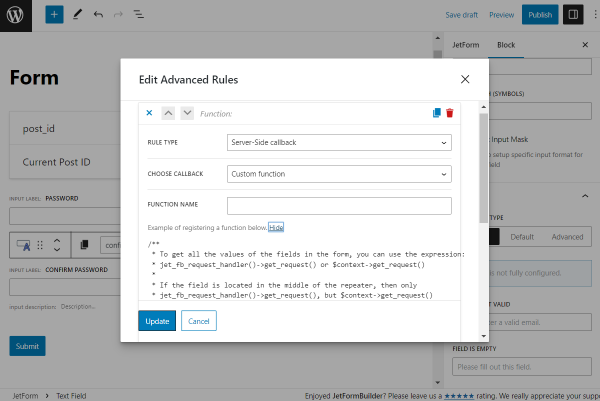
- Server-Side callback — there are four callbacks available:
- Custom function — with this option, the Function Name field appears, where you can enter a function. The “Show” button should be hit to get examples of function registering;
- Is user login unique — the custom Error Message will appear if users try to enter a login that already exists on the website;
- Is user email unique — the custom Error Message will appear if users try to enter the email already registered on the website;
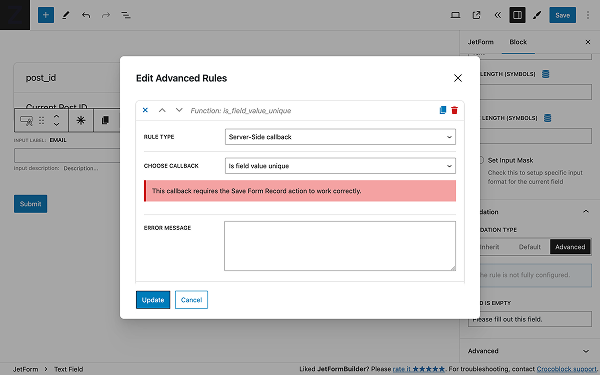
- Is field value unique — this option checks whether a specific field value has been previously submitted in the same form. It works by storing form submission logs using the “Save Form Record” action. When this validation is enabled, the system verifies whether the submitted field-value pair already exists in records for the same form ID. If a match is found, an error message is triggered. The “Save Form Record” action must be enabled for this validation to function properly.
One can add two or more advanced rules to every form field by clicking the “+ Add Rule” button.
After setting all needed advanced rules and hit the “Update” button, one can see the rules and messages in the Validation block section.

You can hover over it and click to edit or delete the rule.
Default
The native validation provided by the browser.
Advanced
Here, one can add the advanced rules described above and change the text of the error messages. The number of available messages is dependent on the field type and settings. All error messages are described in the Advanced Form Validation chapter. The custom messages set for the separate field will override the form validation settings.
Checking Form Validation on the Front End
The form or block’s Advanced Validation settings should be accessed, and the custom error messages and advanced rules should be set. Upon completion, one should click the “Update” or “Publish” button to save the progress. To learn how to add the form to the page, one should refer to the guide on placing the form on the page. To check the error messages, the form fields should be filled in improperly.
That’s all about the advanced form validation and rules of the JetFormBuilder forms on the WordPress website.