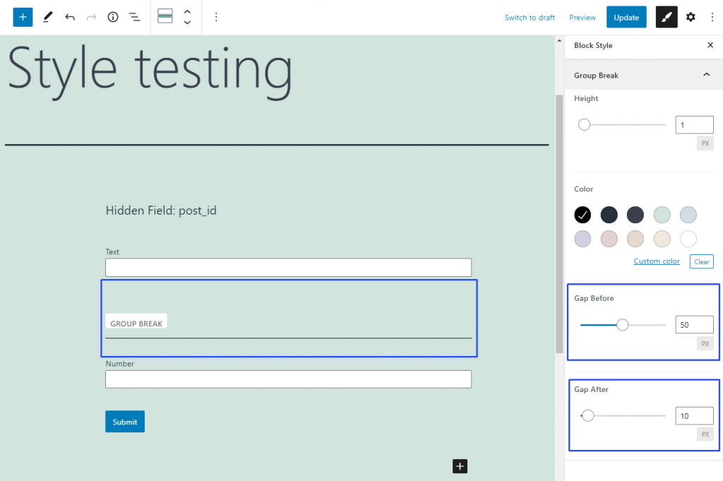
These two features help you define the width of space before the Group Break line and after it. They are also used for the Form block rows. They can have the same values or you can make them different if it is better for the design. The gaps are set in pixels and you can specify them as a specific number in the bar or choose manually via the slider.
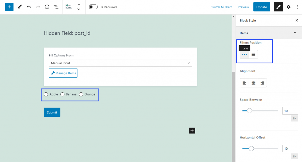
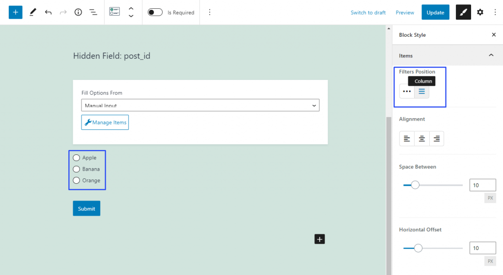
You can meet this styling feature in the Items settings section of the Radio and Checkboxes Field. It defines whether the options will be placed in a line or in a column.
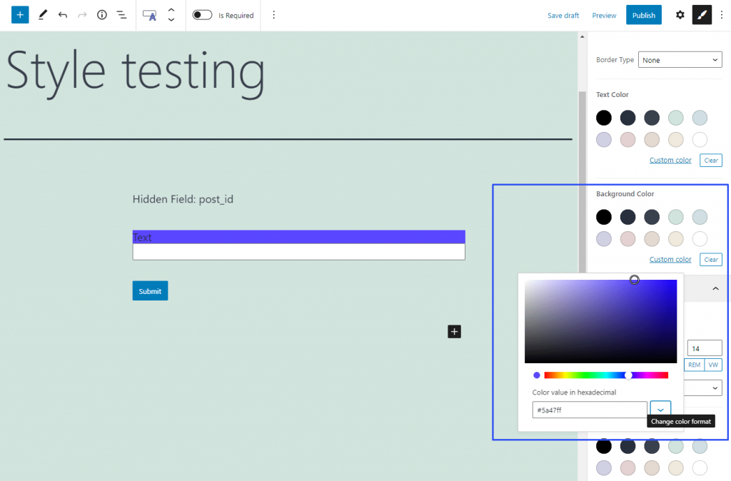
The color of the field and its parts is the most eye-catching part of the design. There are different “color” features throughout the style settings that differ according to the element they are meant for like Background Color or Text Color. However, they look the same and have the same settings.
First of all, this feature offers you a set of default colors. Those colors will depend on the website template you are using and can change if you install a new skin. Besides that, you can select a custom color. Click on the “Custom color” link and you will see a palette. You can manually pick the fitting color from it or insert the coding into the bar. There are three ways to insert the code of the color that can be switched by pressing the “Change color format” button:
Hexadecimal – this is the format suitable for HTML. It codes the color in six alphanumeric symbols;
RGB – the color is set as a ratio between red, green, and blue colors. Here’s an article about the RGB color model;
HSL – the color is coded as a ratio between hue, saturation, and luminosity. A little more details in the article about the HSL color model.
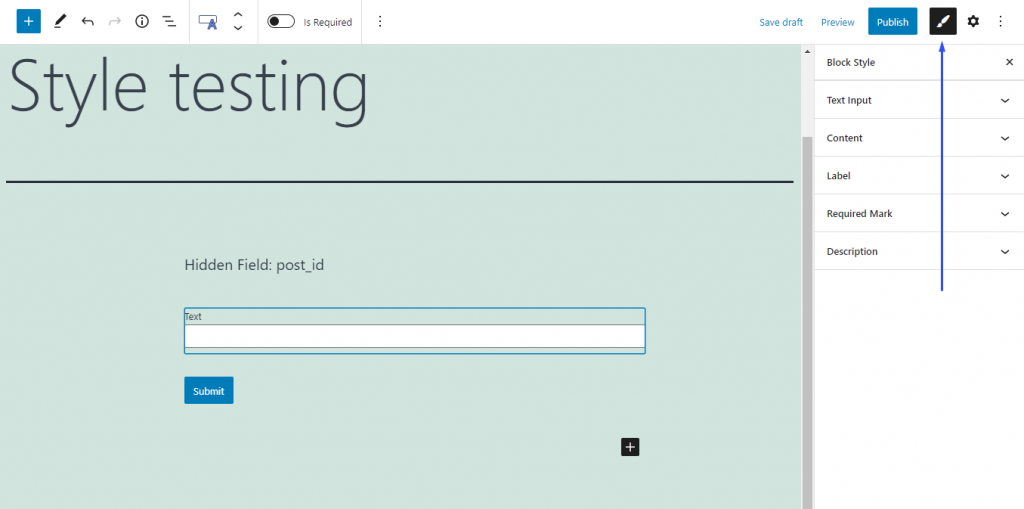
Individual settings of form fields have a bigger priority than more general ones. This means that if you do some changes in, for example, the design settings of a Text Field, the settings chosen for the whole form will affect the Text Field only partially or won’t affect it at all.The Style settings can be reached by clicking on the “Block Style” button. It is available when you click on the separate field while creating the form:
For the elements that can change color on hover, like the “Next Page” buttons, there can be additional tabs in this feature. For example, there can be a Hover tab that allows you to choose how the color of the element will change when the user places the pointer over it.
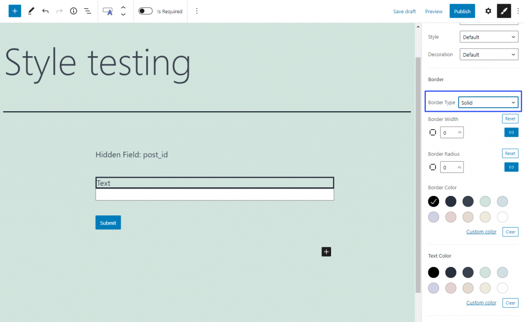
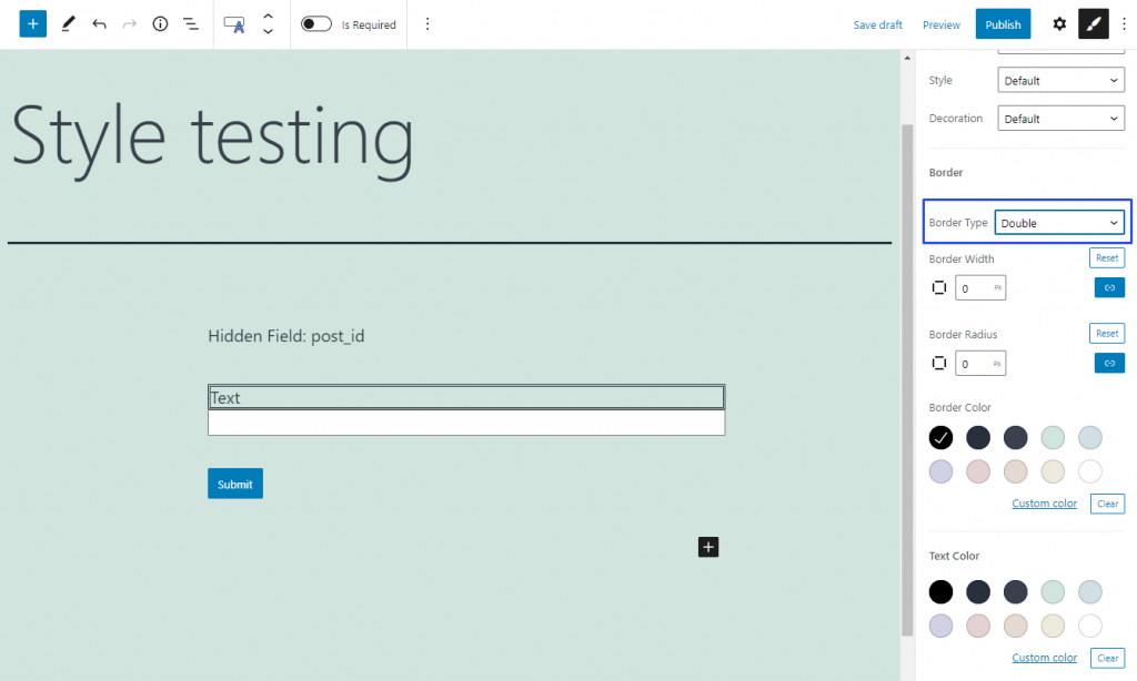
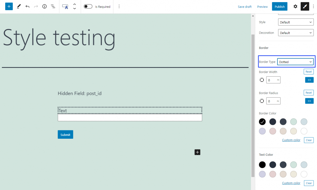
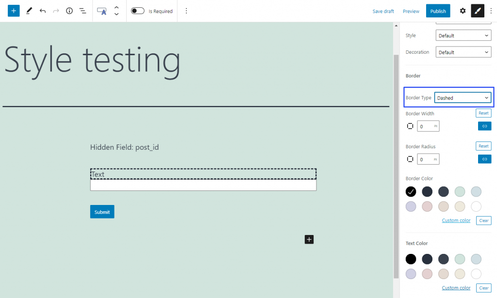
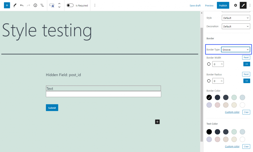
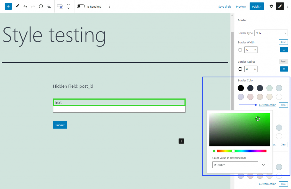
The Border feature creates a border around the element. It could surround different parts of the same field, so you will find it in different settings sections. For each element of the field, the border can be set independently.
Border Type
Solid
Double
Dotted
Dashed
Groove
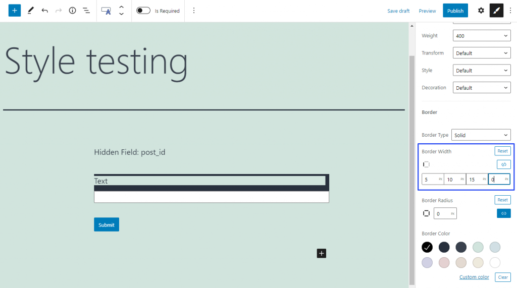
Border Width
The width of the border is set in pixels. It can be set either for the whole border or separately for each of its sides.
To separate the values, click the “Unlink Sides” button (a little blue button with the chain-shaped icon). In this case, bars for each side will appear. The first cell is for the top side, the second is for the right side, the third is for the down side, and the fourth – for the left side. The little square-shaped icon in the left corner shows you what side you are setting now. If you want to undo all the changes, press the “Reset” button. You can also link the sides again by hitting the “Link Sides” button (it is the same button as the “Unlink Sides” but it became white now).
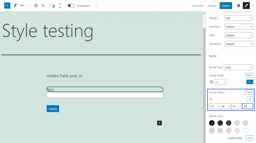
Border Radius
If you want to make the angles of the border curvy, you can set it with the help of the Border Radius feature. In the bar, you can type in the radius of curvature in pixels. You can set a similar radius for all angles or unlink them and define each of them separately.
To set different curvatures, click the “Unlink Sides” little blue button with a chain-shape icon.
The opened cells correspond with the angles like that: 1 – upper left corner, 2 – upper right corner, 3 – bottom right corner, 4 – bottom left corner. You can reset all the changes by clicking the “Reset” button or link the sides again by clicking the same button that became white – “Link Sides”.
Border Color
All the Color features in the style settings are the same. It allows you to choose the color of the border, in this case. You can select one of the default colors or a custom one. Check the Color guide if you need more details.
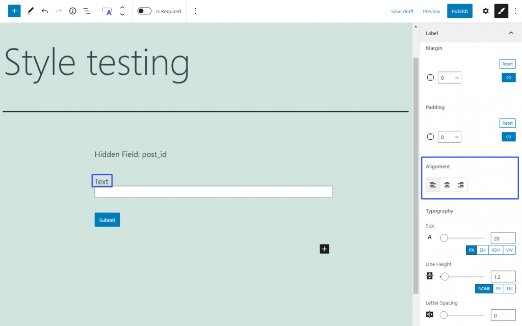
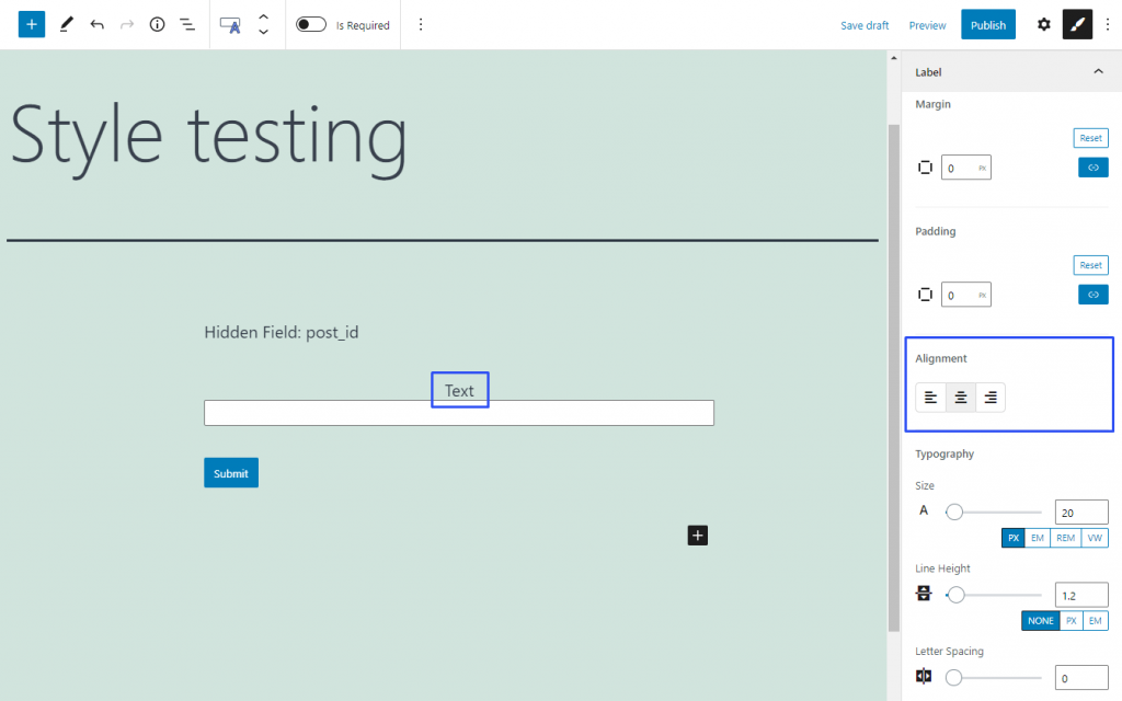
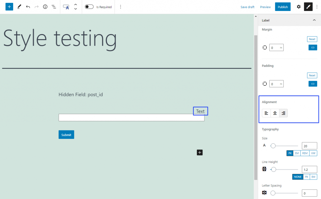
The Alignment feature defines the position of an element or its part. Some parts of the field such as label, description, or content can have different alignment. That’s why this feature can be met in several style settings sections related to a single field.
By default, the design settings of every element on the page in WordPress are defined by the website template. Colors, fonts, shapes, and other details are set for the whole site, and you can’t change them for a separate element if you want to. However, with the JetStyleManager plugin, styling options become available in JetFormBuilder.
There are two sets of design options in the JetFormBuilder plugin;
The style settings of every form field;
The style settings, which can be applied to the whole form.
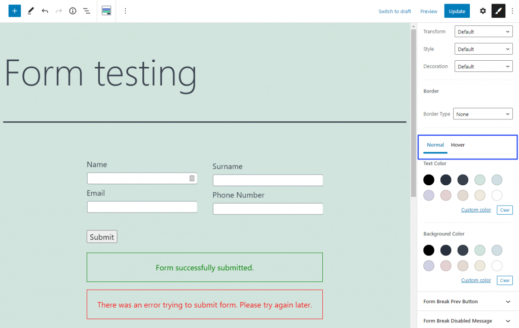
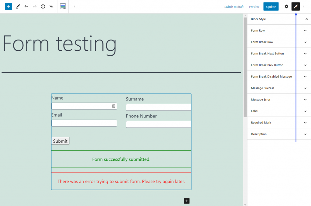
Individual settings of form fields have a bigger priority than more general ones. This means that if you do some changes in, for example, the design settings of a Text Field, the settings chosen for the whole form will affect the Text Field only partially or won’t affect it at all.The Style settings can be reached by clicking on the “Block Style” button. It is available when you click on the separate field while creating the form:
Or you can find it by clicking on the Form block that you placed on the page:
Be aware that the Form Break Field can be styled only in the settings tab for the whole form.
We use cookies to assist you with navigation and analyze site traffic. If you continue to use this site, you consent to our use of cookies.