By default, the design settings of every element on the page in WordPress are defined by the website template. Colors, fonts, shapes, and other details are set for the whole site, and you can’t change them for a separate element if you want to. However, with the JetStyleManager plugin, styling options become available in JetFormBuilder.
There are two sets of design options in the JetFormBuilder plugin;
- The style settings of every form field;
- The style settings, which can be applied to the whole form.
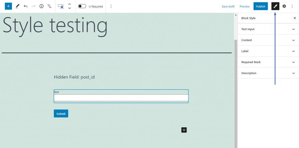
Individual settings of form fields have a bigger priority than more general ones. This means that if you do some changes in, for example, the design settings of a Text Field, the settings chosen for the whole form will affect the Text Field only partially or won’t affect it at all.The Style settings can be reached by clicking on the “Block Style” button. It is available when you click on the separate field while creating the form:
Or you can find it by clicking on the Form block that you placed on the page:
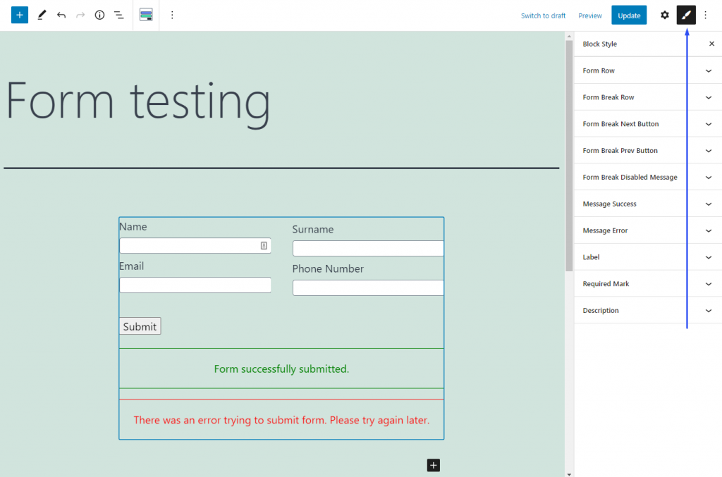
Be aware that the Form Break Field can be styled only in the settings tab for the whole form.