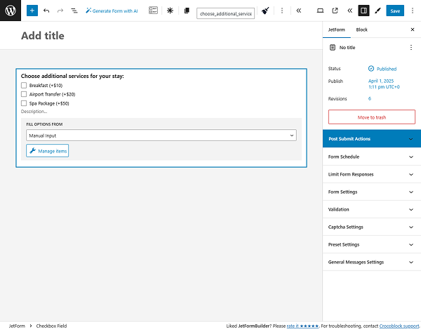
Checkbox Field
The Checkbox Field in JetFormBuilder is the only multi-optional form field type that allows users to choose several variants. Options can be added manually or pulled dynamically from the specified source. For example, this block can be used for a newsletter subscription form to let users choose several topics that they are interested in.
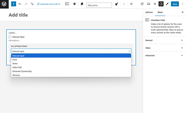
Source Settings
Checkbox Field is a field that allows users to choose one or several options from a ready-made list. The list can be added manually, from posts, terms, meta fields, glossary sources, or generated dynamically. All settings are described in the Multi-Optional Field Source Settings overview.
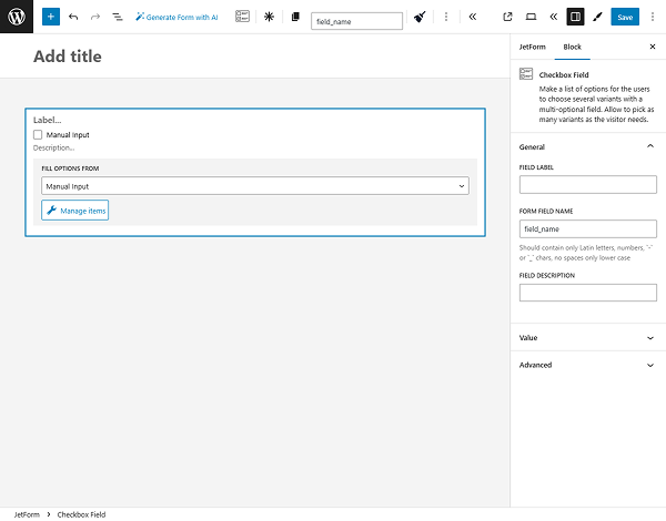
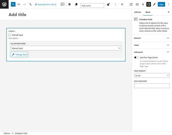
General Settings
The General settings tab includes the most common settings for field customization. More information can be found in the General settings section article.
Value Settings
The Value settings tab has the following settings:
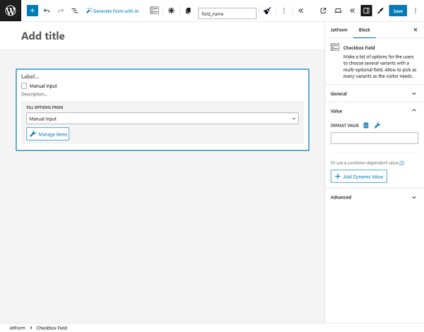
- DEFAULT VALUE — data put here will be automatically shown in the field. Although it can be changed by the user who completes the form;
- Add Dynamic Value — a button that allows adjusting the value displayed under specific conditions. Once pressed, the Edit Dynamic Value pop-up appears.
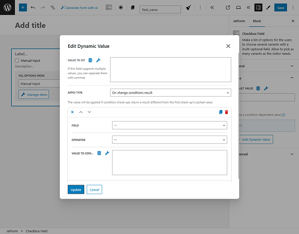
- VALUE TO SET — a value that will be put in the field once the required conditions are met;
- APPLY TYPE — a selector for the dynamic behavior. Among the options are “On change conditions result,” “Once,” and “Always”;
- FIELD — a drop-down list with fields from the current form that should be compared;
- OPERATOR — a comparison operator that will be a binding for the selected FIELD and VALUE TO COMPARE options;
- VALUE TO COMPARE — a field for the name of the value to compare;
- Add New Condition — a button that opens one more settings repeater for setting a new condition;
- Set value only if field is empty — a toggle that makes the dynamic value feature work only if the FIELD is empty.
After customizing the dynamic value settings, the “Update” button should be clicked.
Advanced Settings
This tab has an additional set of settings for the field. More information about it can be found in the Advanced settings section article.
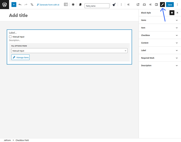
Style Settings
If the JetStyleManager plugin is installed and activated, the “Block Style” button will appear in the top right corner of the editing window. Here are the styling settings:
That’s all about the Checkbox Field available with the JetFormBuilder plugin for WordPress forms.