Color (Background/Border/Text)
The color of the field and its parts is the most eye-catching part of the design. There are different “color” features throughout the style settings that differ according to the element they are meant for like Background Color or Text Color. However, they look the same and have the same settings.
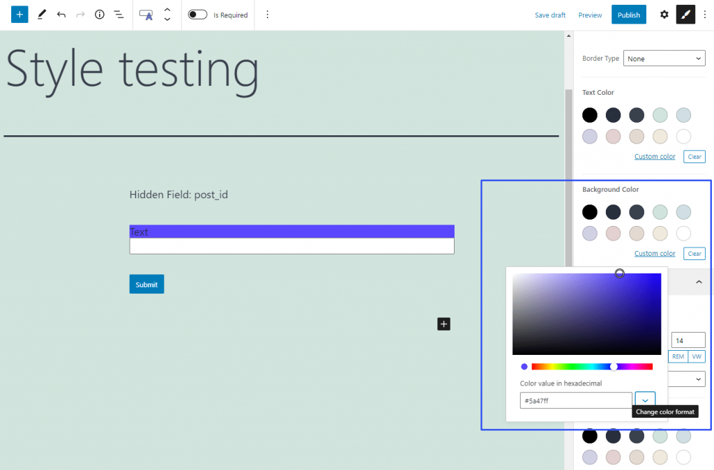
First of all, this feature offers you a set of default colors. Those colors will depend on the website template you are using and can change if you install a new skin. Besides that, you can select a custom color. Click on the “Custom color” link and you will see a palette. You can manually pick the fitting color from it or insert the coding into the bar. There are three ways to insert the code of the color that can be switched by pressing the “Change color format” button:
- Hexadecimal – this is the format suitable for HTML. It codes the color in six alphanumeric symbols;
- RGB – the color is set as a ratio between red, green, and blue colors. Here’s an article about the RGB color model;
- HSL – the color is coded as a ratio between hue, saturation, and luminosity. A little more details in the article about the HSL color model.
Individual settings of form fields have a bigger priority than more general ones. This means that if you do some changes in, for example, the design settings of a Text Field, the settings chosen for the whole form will affect the Text Field only partially or won’t affect it at all.The Style settings can be reached by clicking on the “Block Style” button. It is available when you click on the separate field while creating the form:

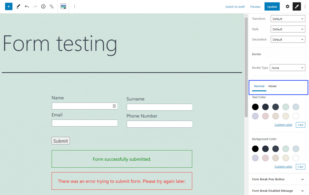
For the elements that can change color on hover, like the “Next Page” buttons, there can be additional tabs in this feature. For example, there can be a Hover tab that allows you to choose how the color of the element will change when the user places the pointer over it.
