How to Create a Survey Form?
With the JetFormBuilder WordPress plugin, you can easily create custom survey forms tailored to your needs. Whether you are collecting user feedback, running a quiz, or gathering research data, this guide will walk you through building an interactive survey form fields step by step.
Table of Contents:
- Creating the Form
- Closed-Ended Questions
- Open-Ended Questions
- Filter or Branching Questions
- Date/Time Questions
Creating the Form
In this tutorial, we will create a survey form with various field types to gather customer satisfaction feedback.
To build a WordPress survey form, we navigate to WordPress Dashboard > JetFormBuilder > Add New Form.
We enter the form’s title (“Survey Form”).
The Welcome block appears by default. From here, you can select a form pattern or generate a form with OpenAI.
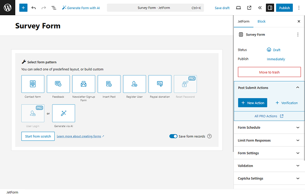
We hit the “Start from scratch” button and delete the three fields added by default to begin anew.
Closed-Ended Questions
In this tutorial, we will focus on creating different types of questionary fields.
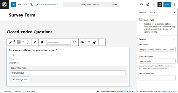
First, we add the Heading Field with the text “Closed-ended Questions”.
“Yes/No” questions
For a simple “Yes/No” question, we can use Radio or Select fields to ensure that only one option is checked.
In this case, we add the Radio Field.
In the FIELD LABEL, we put the “Do you currently use our product or service?” question. For the FILL OPTIONS FROM, we select the “Manual Input” option. Click the “Manage items” button and add two options (“Yes” and “No”). Then, click the “Update” button.
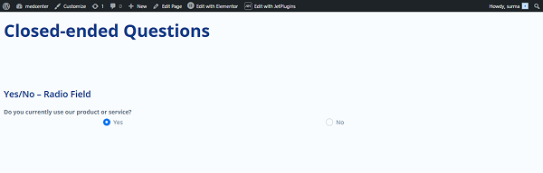
When we save the progress and proceed to the frontend page, we see the field works and allows us to select one option only.
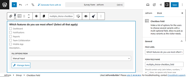
Multiple choice questions
Let’s return to the form settings and focus on setting up the multiple-choice questions. For this aim, the Select or Checkbox fields can be used.
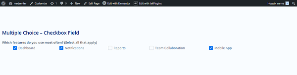
We use the Checkbox Field. We add the question to the FIELD LABEL and use the “Manual Input” option from the FILL OPTIONS FROM field. Click “Manage items” and add the options (we add five options).
Save the form and proceed to the frontend. Here, we see that several options can be checked.
Likert scale
Now, let’s set a bit more complicated block, the Likert scale. Since there is no ready solution for the scale, we will need to add the following code to the site. Proceed to the WordPress Dashboard > Appearance > Customize > Additional CSS and paste the CSS code:
.checkradio-wrap {
    display: flex !important;
    flex-direction: row !important;
    justify-content: space-around !important;
    flex-wrap: nowrap !important;
    gap: 1rem;
}

.checkradio-wrap .jet-form-builder__field-wrap {
    flex-grow: 1 !important;
    width: auto !important;
    text-align: center;
}

.wp-block-columns:nth-of-type(odd) {
    background-color: #FFFACD !important;
}

.wp-block-columns:nth-of-type(even) {
    background-color: #FFD700 !important;
}

.wp-block-columns {
    border-left: 1px solid #cccccc;
    border-right: 1px solid #cccccc;
    border-bottom: 1px solid #cccccc;
    padding: 10px;
}

.wp-block-columns:first-of-type {
    border-top: 1px solid #cccccc;
}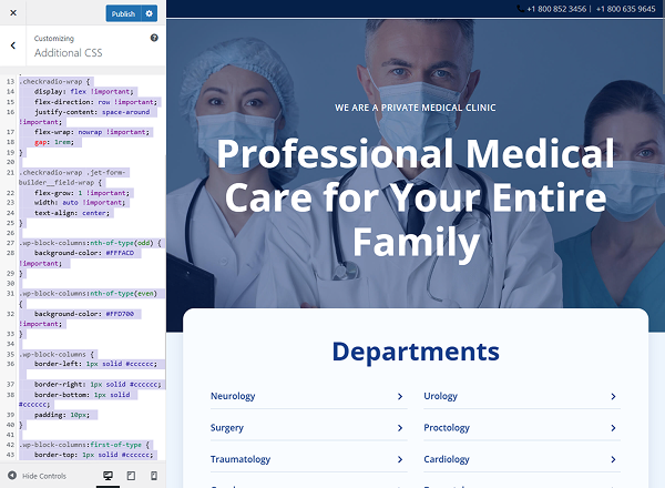
Click the “Publish” button when the code is added.
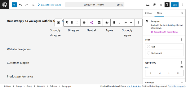
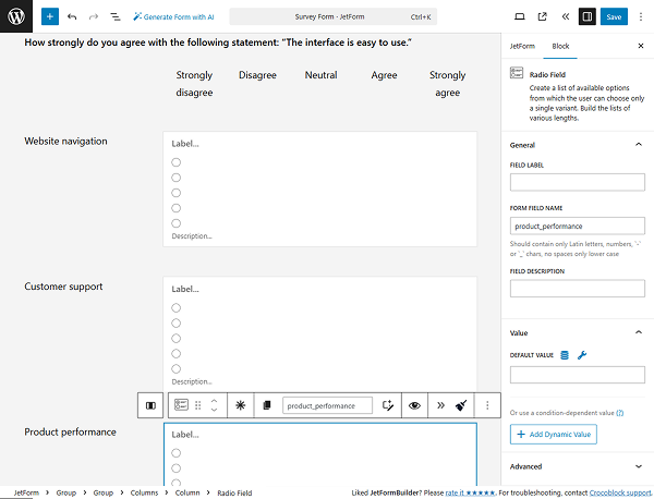
Move back to the form editing page. In the Paragraph, we add the question (“How strongly do you agree with the following statement: “The interface is easy to use.”).
Then we need to add three parameters and five options to select (“Strongly disagree”, “Disagree”, “Neutral”, “Agree”, “Strongly agree”). For that, we add six Columns. Starting from the second column, we put the options’ names in the Paragraphs.
Below, we add three more columns for two sections, and in the first section, we add the parameters that are expected to be evaluated.
Now, we need to add the Radio Field. Leave the LABEL empty and manually enter five options, adding numbers in the VALUE field.
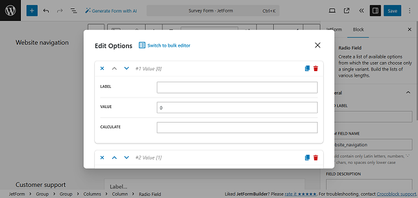
We need as many options in the field as we have added options to select (“Strongly disagree”, “Disagree”, “Neutral”, “Agree”, “Strongly agree”). Once you have added all the options, click the “Update” button.
Now we need to add two more of the same Radio Fields (or we can simply duplicate them). When duplicating, ensure that the fields have unique names.
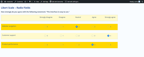
Now, let’s save the changes and check how the Likert scale works on the frontend. Here, we see that for each parameter, we can check only one option.
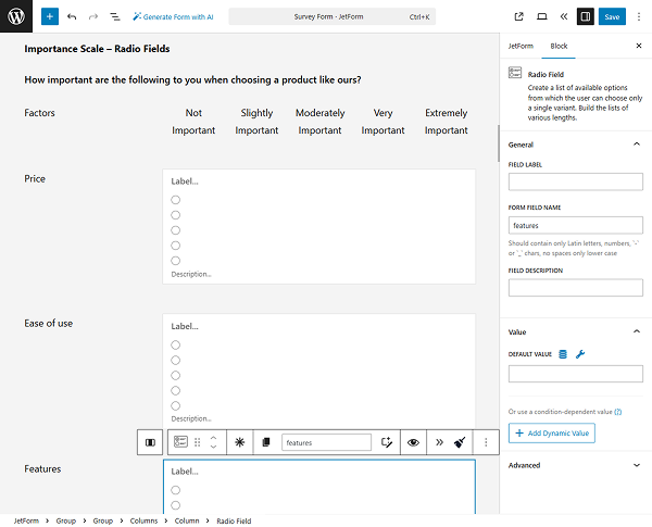
Importance scale questions
For the importance scale questions, we can use the same setup we used for the Likert scale.
In this case, we simply change the parameter and option names, allowing the user to select the importance of each parameter.
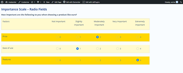
After saving the progress, we can check it on the frontend. Here, we can evaluate the importance of each factor by selecting one option.
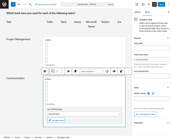
Matrix or multiple-choice grid questions
If we need to allow users to select more than one option on the scale, we can use a similar approach to the Likert scale, but instead of Radio Fields, we use Checkbox Fields.
In this tutorial, we decided to add more columns to the options and to the parameters. Ensure that the number of options inside the Checkbox Field matches the number of options added at the top of the grid.
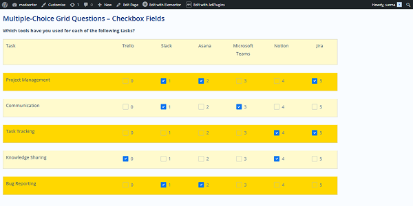
Save the form and proceed to the frontend – we can now select multiple options for each parameter.
Rating scale and slider questions
For questions of this type, such as rating scales or slider questions, we can use the Range Field.
So open the form editing page and add the Range Field. In the FIELD LABEL, enter the question.
In the Field tab, set the MIN and MAX VALUES (in this case, we set them to “0” and “10”). Enter the STEP value (we use “1”).
Additionally, we add the FIELD DESCRIPTION (“0 – Not at all likely, 10 – Extremely likely”) to make the field easier to use.
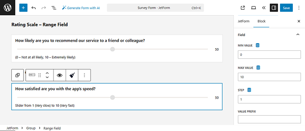
The same setup we used for the slider question Range Field – we changed the question (FIELD LABEL) and FIELD DESCRIPTION.
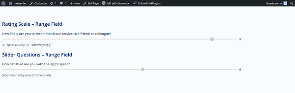
Save the progress and proceed to the frontend. The Range Fields allow users to set the desired rate by dragging the slider.
Semantic differential scale
In cases where we need to choose a point between semantic values (for example, “Outdated – Modern” or “Slow – Fast”), some customization is required.
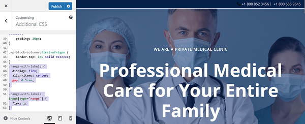
Proceed to the WordPress Dashboard > Appearance > Customize > Additional CSS and paste the following CSS code:
.range-with-labels {
  display: flex;
  align-items: center;
  gap: 0.5rem;
}

.range-with-labels input[type="range"] {
  flex: 1;
} 
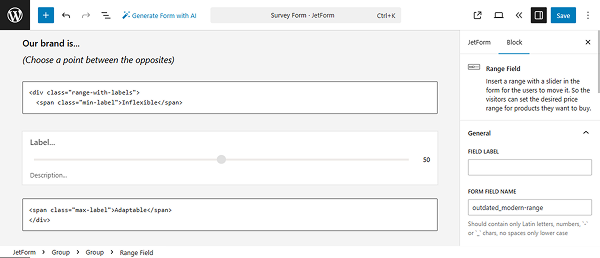
Let’s open the form editing page and add the Paragraph with the “Our brand is…
(Choose a point between the opposites)” text.
Then, add the Custom HTML field. In the field, enter the following code:
<div class="range-with-labels">
  <span class="min-label">Inflexible</span>
Here, instead of the “Inflexible”, put the needed value.
Add the Range Field. We do not include either the LABEL, the MAX, or the MIN VALUES for the Range Field.
Then, add one more Custom HTML field with the following code:
<span class="max-label">Adaptable</span>
</div>
Instead of “Adaptable”, use the value you need.
That’s it. We added two more semantic differential scale fields for “Outdated – Modern” and “Complicated – Simple” values.
Now, save the form and open the frontend page. Here, we can select if the brand is adaptable, modern, and simple.
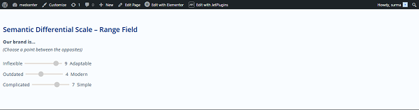
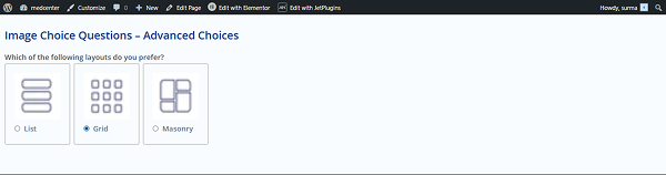
Image choice questions
If we need to allow users to select an image, we can use the Advanced Choices Field.
Proceed to the form editing page and add the Advanced Choices Field. Add the question in the Label and select one of the options for the Choices Layout (we use the “Images with controls” option).
Add the needed images and text to the Choice Controls.
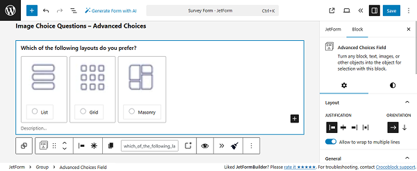
Save the form progress and open the frontend page – we can select the desired image option.
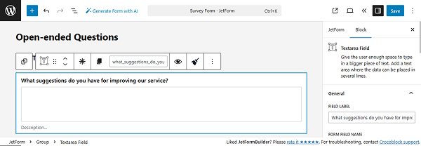
Open-Ended Questions
For the open-ended questions, the Text, Textarea, or WYSIWYG fields can be used.
In this tutorial, we use the Textarea Field for long text. Add the question in the FIELD LABEL input.
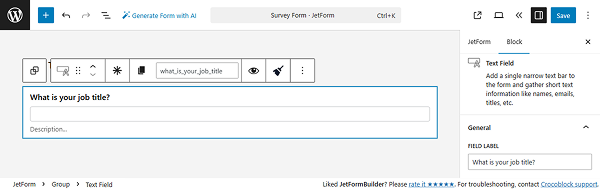
Additionally, we add a Text Field for short text answers. Here, add the question in the FIELD LABEL input as well.
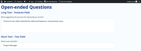
After saving the form, we can check how the fields work on the frontend page.
Filter or Branching Questions
If you need to show or hide dedicated fields based on the options checked in other fields, the Conditional Block should be used.
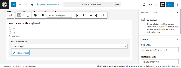
Return to the form editing page and add the main field, which will determine which other fields are shown or hidden. In this tutorial, we add a Radio Field with the question, “Are you currently employed?” and “Yes/No” options to choose from.
Then, add the Conditional Block with several Checkbox and Range fields to show only when the “Yes” option is selected in the previous Radio Field.
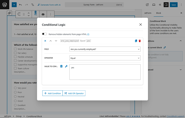
Click the “Add new” button next to the Show Current Block box. In the newly appeared pop-up, select the “Show if…” option for the WHICH FUNCTION NEED EXECUTE? dropdown.
In the FIELD input, select the needed field according to which data should be displayed (the Radio field, in this case). Choose the “Equal” OPERATOR. Put the needed value in the VALUE TO COMPARE field – “yes” in this tutorial.
Click the “Update” button once you’re ready.
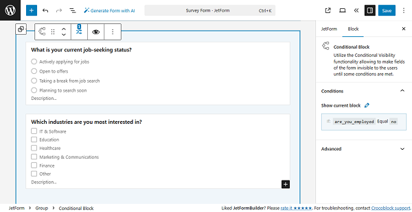
We also add another Conditional Block to display when the “No” option is selected.
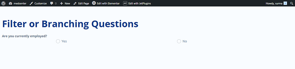
Save the changes, and let’s proceed to the frontend to check how it works.
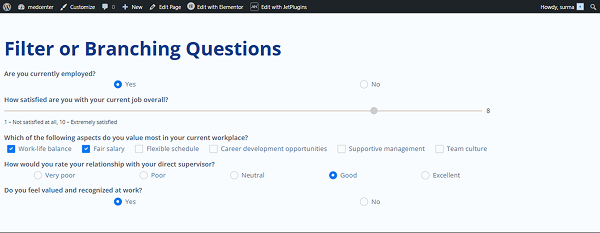
Originally, the Radio Field is visible.
Let’s choose the “Yes” option. We see the first block is displayed.
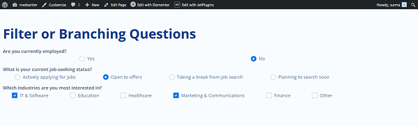
Additionally, if we select the “No” option, another block is displayed.
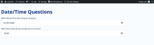
Date/Time Questions
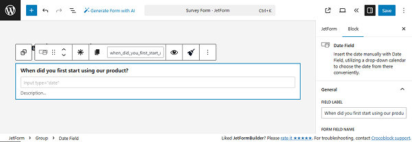
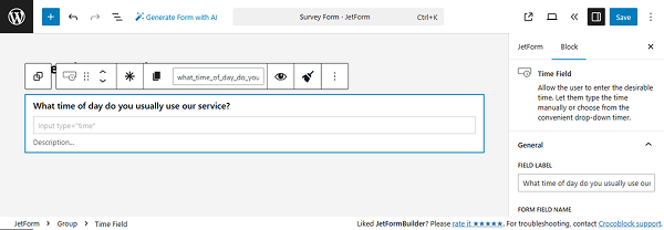
For the date/time questions, the Date, Datetime, and Time fields can be used.
In this tutorial, we use the Date Field for a date question. Add the question in the FIELD LABEL input.
For the time question, the Time Field is used. Here, add the question in the FIELD LABEL input as well.
Save the form and open the frontend page. Here we see that the date and time can be selected on the front.
That’s it. Now you know how to create different types of fields for the survey form with the help of the JetFormBuilder WordPress plugin.