How to Customize the Confirmation Message
Learn how to customize the confirmation message in the JetFormBuilder WordPress plugin to match your form’s purpose and branding. This guide will show how to edit the text itself, adjust the design in Elementor, display the message inside a pop-up if needed, and completely hide the default message. Whether you want to modify the wording or change the way the message is presented, you will find practical steps here.
Table of Contents:
- Customize the Text of the Confirmation Message
- Customize the Confirmation Message Styles in Elementor
- Adjust a Pop-up to Display the Confirmation Message
Customize the Text of the Confirmation Message
To build a WordPress form, we navigate to WordPress Dashboard > JetFormBuilder > Add New Form.
Enter the form’s title.
The Welcome block appears by default. From here, you can select a form pattern or generate a form with OpenAI. Otherwise, you can hit the “Start from scratch” button and delete the three fields added by default to begin anew.
In this case, we select the “Contact Form” pattern.
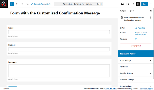
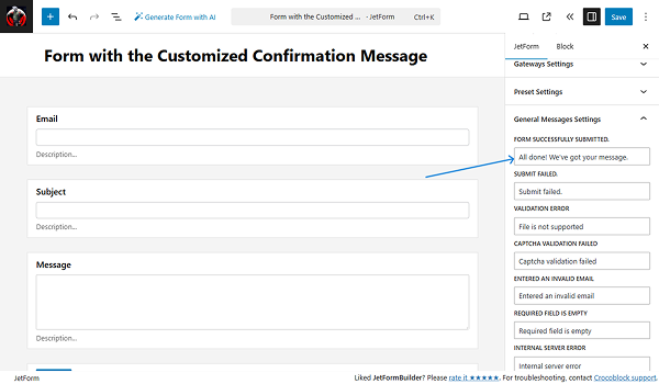
In the right-side settings tab in the General Messages Settings section, you can see the list of all the messages. Here you can set up the desired text for any of them.
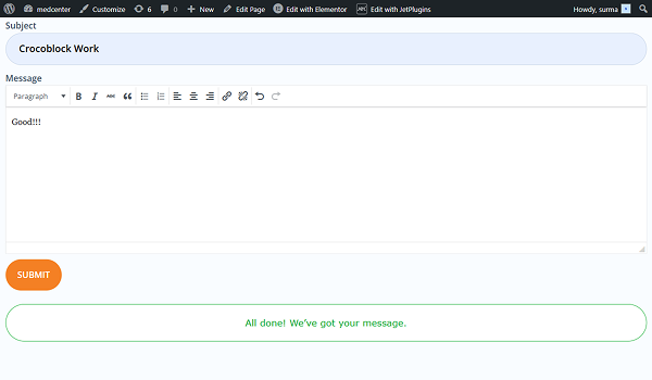
Let’s change the FORM SUCCESSFULLY SUBMITTED message to “All done! We’ve got your message.”
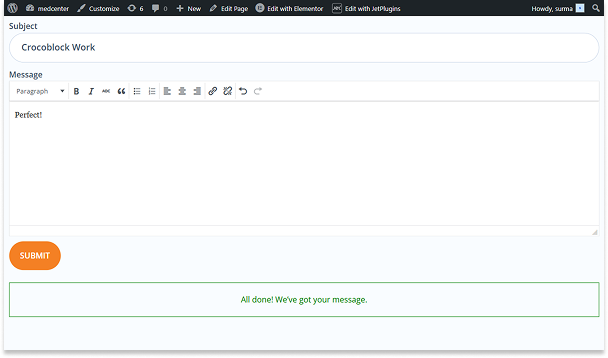
Once you have set all the necessary messages, click the “Save” button.
So when you proceed to the front end and submit the form, a different message from the default one will be displayed.
Customize the Confirmation Message Styles in Elementor
When you add the form to the page, you can style the form and the confirmation messages in particular.
Refer to our How to Display a Form on the Front End tutorial if you are not sure about the setup. In this case, we add the form to the page in the Elementor editor.
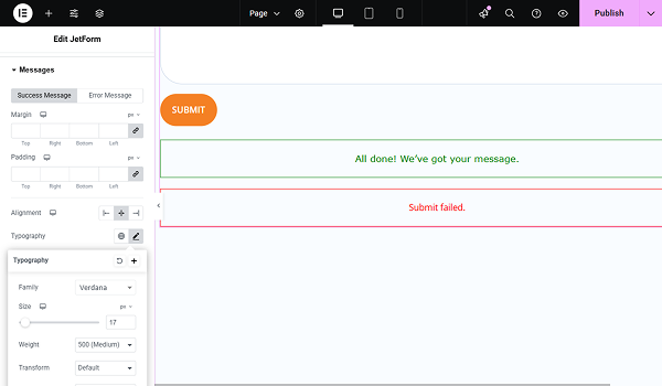
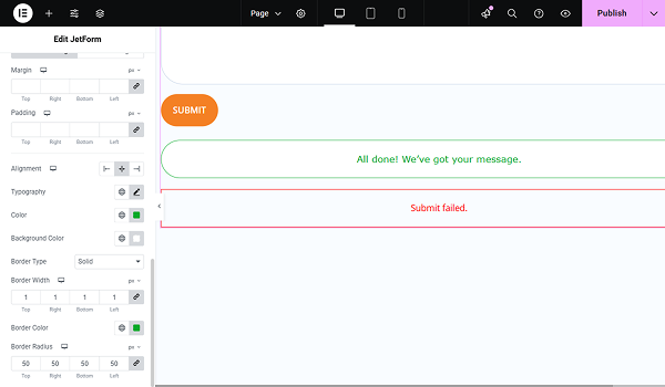
Proceed to the Style tab and scroll down to the Messages section. Here you can set up the style for the success and error messages by switching the tabs.
So in this case, we style the success message. We do not change Marging, Padding, and Alignment for the message, and will move on to the Typography and click the pencil-shaped icon.
Here, the pop-up appears with the common Elementor settings, where you can choose the Family, Size, Weight, Style, ot Decoration for the text. We select the Family, set up the Size, and choose the Weight.
Then, we set up the text’s Color and Background Color.

Now, we can set the message border styles. We choose “Solid” for the Border Type and set “1” as the Border Width. Additionally, we set the Border Color and changed the Border Radius to “50”.
All the same settings can be applied to the Error Message.
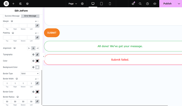
Click the “Publish” button when you are ready, and then proceed to the front end to submit the form. Here are the styles applied.
Adjust a Pop-up to Display the Confirmation Message
Now, let’s further customize the confirmation message and display it in the pop-up.
First, ensure that the Forms pop-up notification add-on is installed and activated on your site. It is a free add-on that can be obtained from the DevTools page.
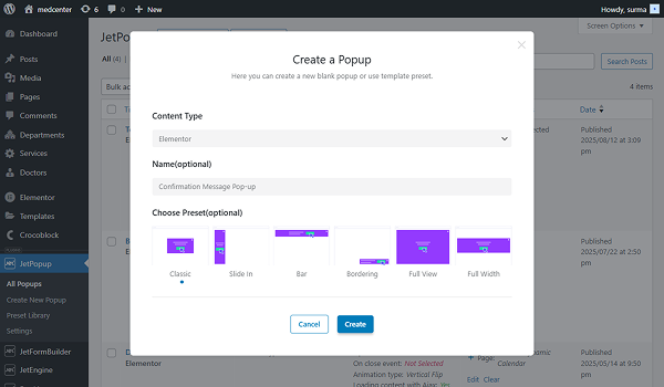
Return to WordPress Dashboard > JetPopup and click the “Create New Popup” button. Fill in the field in the Create a Popup window that appears. In this case, we select the “Elementor” Content Type, type the “Confirmation Message Pop-up” text in the Name field, and tick the “Classic” option in the Choose Preset field. Finally, click the “Create” button.
Inside the pop-up, we add only the Heading widget.
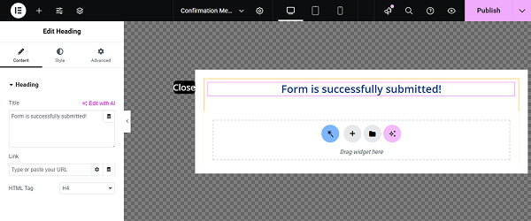
Style it according to your requirements and click the “Publish” button.
Now, proceed to the form you are working with. In the settings tab, open the Post Submit Actions and click the “New Action” button. In the newly opened pop-up, find and select the “Show Popup” action.
Then, in the Edit Show Popup window, choose the provider in the SELECT PROVIDER, and the pop-up you have just created in the SELECT POPUP. Click the “Update” button.
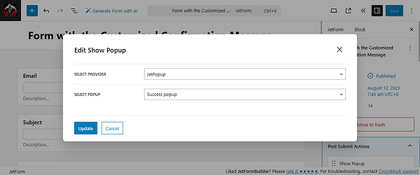
Click the “Save” button once you are ready.
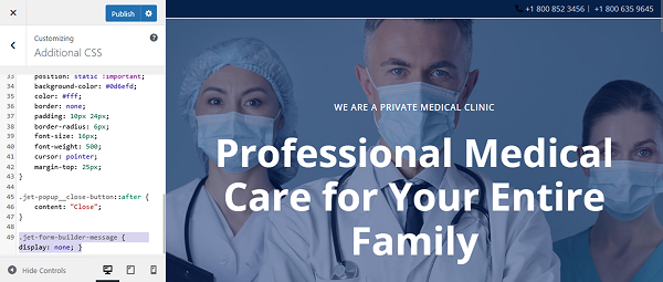
Now, proceed to WordPress Dashboard > Appearance > Customize > Additional CSS and paste the following code:
#jet-popup-5102 .jet-popup__container-content {
    display: flex;
    flex-direction: column;
    align-items: center;
}
.jet-popup__close-button svg {
    display: none;
}

.jet-popup__close-button {
    position: static !important;
    background-color: #0d6efd;
    color: #fff;
    border: none;
    padding: 10px 24px;
    border-radius: 6px;
    font-size: 16px;
    font-weight: 500;
    cursor: pointer;
    margin-top: 25px;
}

.jet-popup__close-button::after {
    content: "Close";
}
Here, the “5102” refers to the pop-up’s ID, so ensure you are using the correct one.

Click the “Publish” button when the code is added.
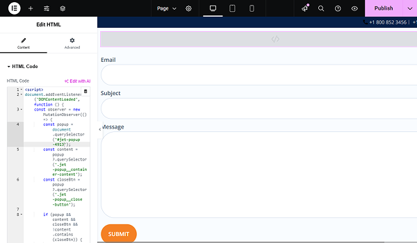
Let’s proceed to the last step. Open the editing page, where the form is added. Add the HTML widget before the JetForm widget, and inside the widget, add the following code:
<script>
document.addEventListener('DOMContentLoaded', function () {
    const observer = new MutationObserver(() => {
        const popup = document.querySelector('#jet-popup-5102');
        const content = popup?.querySelector('.jet-popup__container-content');
        const closeBtn = popup?.querySelector('.jet-popup__close-button');

        if (popup && content && closeBtn && !content.contains(closeBtn)) {
            content.appendChild(closeBtn);
        }
    });

    observer.observe(document.body, { childList: true, subtree: true });
});
</script>
Here, the “5102” refers to the pop-up’s ID, so ensure you are using the correct one.
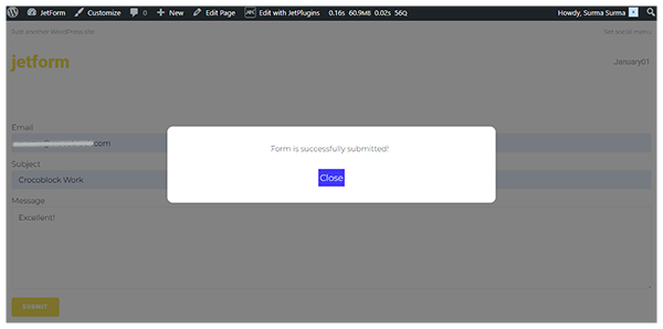
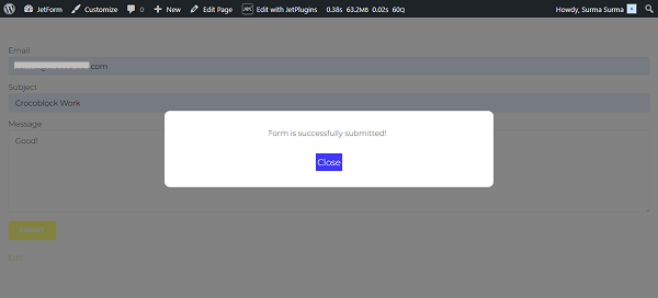
Click the “Publish” button and proceed to the front end. After the form is submitted, the confirmation message appears in the pop-up.
Regarding the error message, it will still be displayed as the default message, which can be customized in Elementor, as mentioned earlier.
Hide the confirmation message
In case you additionally need to completely hide the confirmation message, add the following code to the WordPress Dashboard > Appearance > Customize > Additional CSS:
.jet-form-builder-message { display: none; }Click the “Publish” button.
Then proceed to the front end and submit the form. Then the pop-up is displayed, and the default message is hidden.
That’s it. Now you know how to customize the text and styles of the confirmation message, display it in the pop-up, or hide it using the JetFormBuilder WordPress plugin.