Form Settings
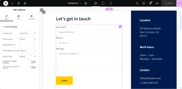
The Form Settings section defines the FORM LAYOUT, the special mark for the form’s fields, FIELDS LABELS HTML TAGS, SUBMIT TYPE, and other appearance features valid for all the fields you add to the form.
Location of the Form Settings
Move to the JetForm tab and scroll it down. Unroll the Form Settings section that is placed under the Post Submit Actions settings.
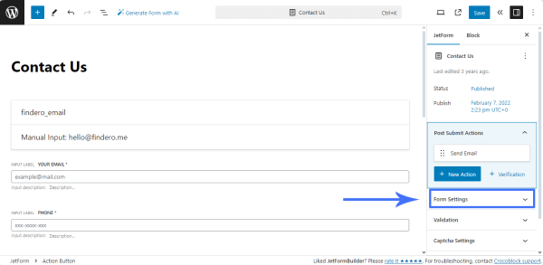
Form Settings
The Form Settings section includes the FIELDS LAYOUT, REQUIRED MARK, FIELDS LABEL HTML TAG, SUBMIT TYPE fields, and the Enable form pages progress and Clear data on success submit toggles.
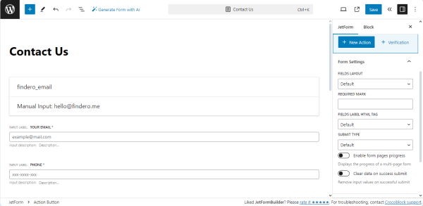
Fields layout field
The FIELDS LAYOUT — a drop-down list that defines how the field bar and the field label correspond to each other. It has three options:
- Default 一 an option that, if selected, works as the Column option, i.e., allows the label to be placed over the field bar;
- Column 一 an option that allows the label to be placed over the field bar;
- Row 一 an option that places the label in one row with the bar to the left.
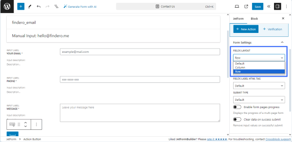
Required mark option
Fields marked as “required” must be filled out; users cannot submit the form without completing them. If you want to make the field required, click the “asterisk” icon on the top options panel. In that case, you will be able to set the appearance of the “required” mark in the REQUIRED MARK bar.
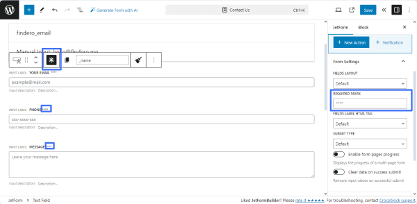
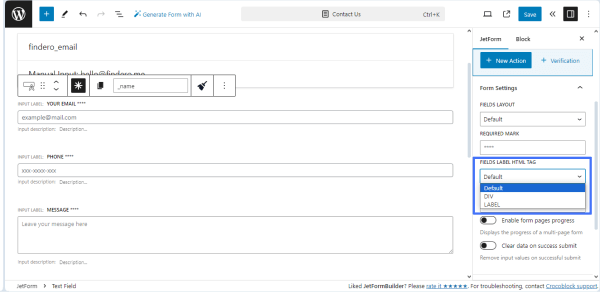
Fields Label HTML Tag field
The <label> tag is used to specify a label for an <input> element of the form. It adds a label to a form control such as text, password, email, text area, etc.
The FIELDS LABEL HTML TAG field can be set to DIV or LABEL. These are field name wrappers, and <label> can provide focus on the Text, Number, Textarea fields, and the other default form elements. When the “Default” option is selected, the FIELDS LABEL HTML TAG field will be set to DIV.
Submit Type field
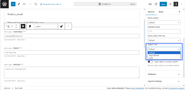
The SUBMIT TYPE — a drop-down list that allows users to select how the page will behave after the user hits the “Submit” button. This list has three options:
- Default 一 an option that works similarly to the Page Reload option, i.e., allows reloading the page after the form is submitted.
- Page Reload 一 an option that allows reloading the page after the form is submitted;
- AJAX 一 an option that does not allow reloading the page after the form submission because the data was transferred without interrupting its work.
Enable form pages progress toggle
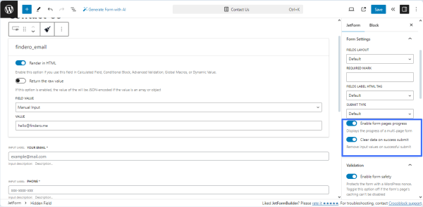
The Enable form pages progress toggle can be useful if you divide the form into several parts using the Form Break Field. In that case, if you enable this toggle, the form progress bar will be added above. It will show the user the part of the form they are currently on.
Clear data on success submit toggle
The Clear data on success submit toggle is used when you want to remove input values on successful submit.
Form Preview
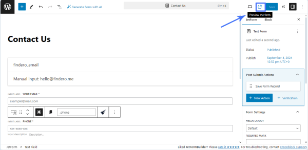
To preview the form, navigate to the top right corner of the published form and press the “Preview the form” button. Then, you will be redirected to the front end.
The URL link to the form preview page looks as follows:
https://site.url/?jet-form-builder-preview=
where the link includes the <ID> of the form for preview and the <nonce> global attribute to make this URL unique.
The form preview page displays the form (regardless of whether this form is added or not to a page) and the default site header and footer. Moreover, the “USE THE FORM” button is shown near the form’s title, which is intended to provide users with clear instructions on how to add this form where they need to.
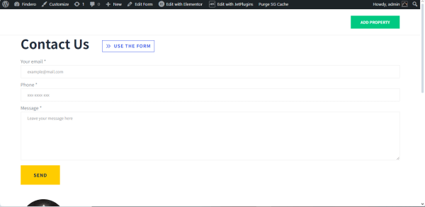
After pressing the “USE THE FORM” button, the Use the form pop-up will appear.
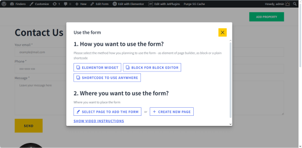
The Use the form pop-up includes three blocks:
- How you want to use the form? block allows selecting the page builder you prefer to work with the form. This block displays buttons referring to all page builders you have on your site (i.e., Elementor or the Bricks theme). The Block Editor and shortcode buttons are always present. Select the needed editor or press the “SHORTCODE TO USE ANYWHERE” to get the shortcode. Then, scroll the pop-up and go to the second block of this pop-up.
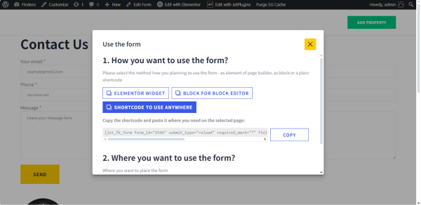
- Where you want to use the form? block includes two buttons: “SELECT A PAGE TO ADD THE FORM” and “+ CREATE A NEW PAGE“:
- If you click the “SELECT A PAGE TO ADD THE FORM,” the SELECT A PAGE drop-down list with enlisted previously created pages will appear.
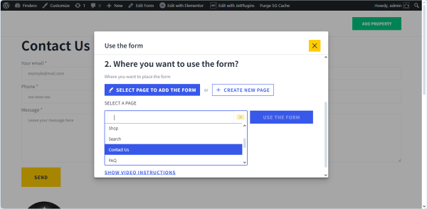
After choosing the required page and pressing the “USE THE FORM” button, the page with the added form will be opened in a new window. In this case, the JetForm widget/block/element will be added to the end of the page. Here, you can customize this page according to your preferences.
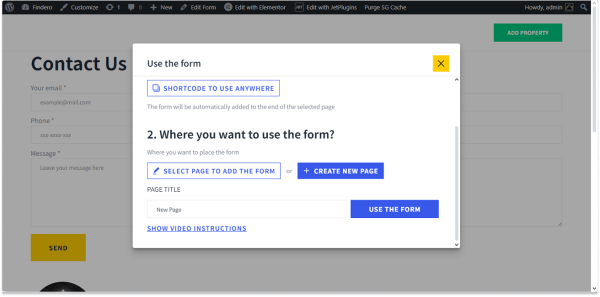
- To place the form on a new page, click the “+ CREATE A NEW PAGE” button and then type the name of this page in the newly-appeared PAGE TITLE text field.
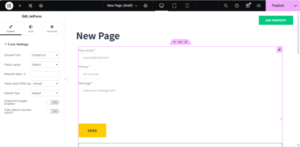
After pressing the “USE THE FORM” button, the page with the added form will be opened in a new window.
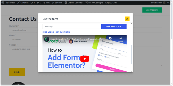
- “SHOW VIDEO INSTRUCTIONS” link, if clicked, displays the video on how to add the form in the editor you selected.
That’s it. Now you know how to manage the Form Settings section and set form appearance features that are valid for all the fields you add to the form created with the JetFormBuilder plugin for WordPress.