Action Button
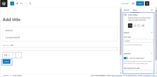
The Action Button field block inserts the form submission button with the default “Submit” text, which is the final and only field of every form. This block includes three additional block options to insert the “Next Page,” “Prev Page,” and “Change Render State” buttons. Users can switch these variations of the Action Button directly from the Inserter.
Settings
The “Action Button” button has the following settings:
- the General setting tab includes the FIELD LABEL field to type the text on the button instead of the default “Submit” text. This field allows the use of shortcodes;
- the Advanced settings tab, which includes:
- the “Add Prev Page Button” toggle, which turns on the PREV PAGE BUTTON LABEL field to type its label. The field allows to use the shortcodes;
- the CSS CLASS NAME field to type the CSS class to modify the button’s design.
Style Settings
Users can style the Action Button field block using the free JetStyleManager plugin. After installing and activating it, the brush-shaped icon appears in the top corner of the screen.
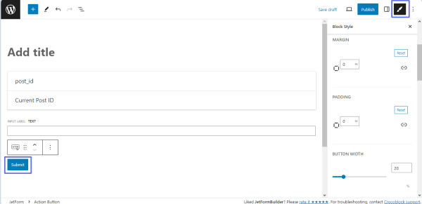
This plugin enables two styling tabs: Submit Wrap and Action Button. Inside these tabs, one can customize the block’s Alignment, Border, Color, Margin, Padding, Typography, and other options.
That’s all about the Action Button block settings.