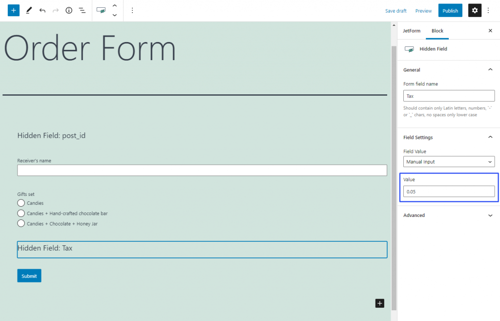
The value of the Hidden Field can be used in the formula of the Calculated Field just as the value of any other field. However, the fact that this field is invisible to the user gives you an opportunity to add some values secretly. For example, with the help of the Hidden Field, you could add taxes to the Total Price formula.
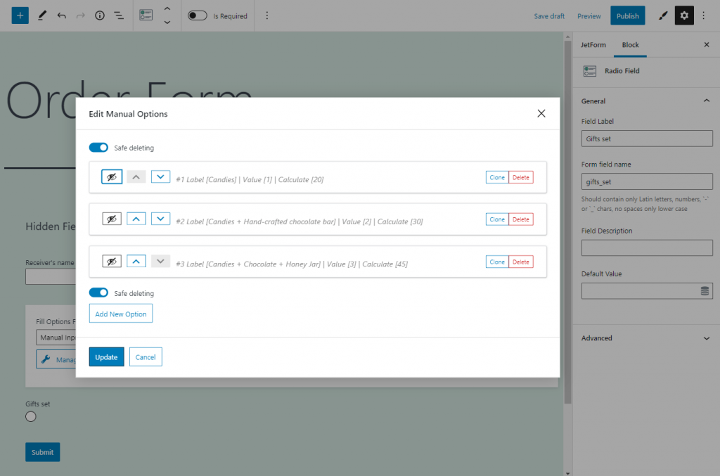
Let’s assume we are creating an Order Form for a gift box. The user can choose which items to put inside, and you want to show the Total Price of the order and include taxes in it.
First of all, create a field with options that will have different values. For example, a Radio Field. Insert the values that will be used in the formula into the Calculate bar.
Now, the Hidden Field. Let’s assume that you have to pay 5% of the item’s price as a tax. So, the Value will have to be set to “0.05”.
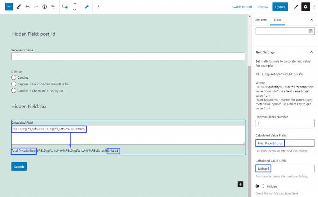
The total price of the item will be the price of the item plus 5% of the price for taxes. That’s why the Calculated Field formula will look like that:
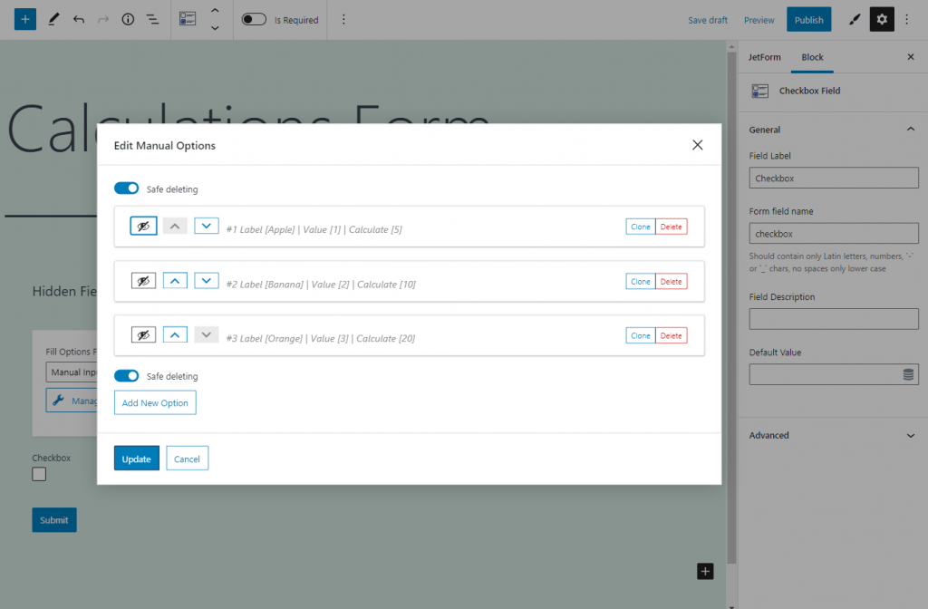
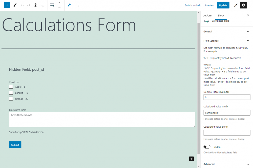
As in every multi-choice field, the Checkbox Field creates a list of options, and each of those options can have different values. The difference is that the user can select not one but several variants. Still, the value of the Checkbox Field can be used in the formula of Calculated Field.The values you type into the Calculated bar will be used in the formula.
If you use the macro code of the Checkbox Field in the formula, it will insert the sum of values selected by the user.
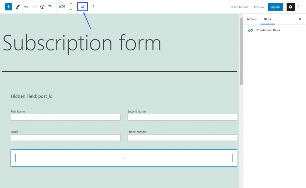
Conditional Visibility is a functionality that allows you to make parts of the form invisible to the users until some conditions are met. Conditions and fields to be hidden are set with the help of the Conditional Block.
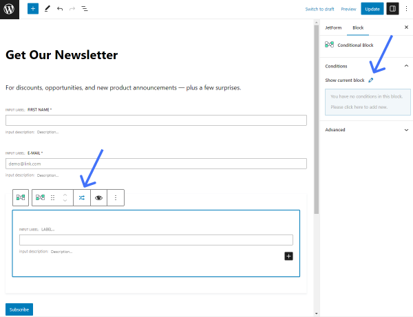
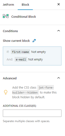
When you add the Conditional Block to the form, it looks like that:
Inside the block, you can see a big button with a plus-shaped icon. You can add any field to the conditional block by clicking on it. Let’s name it a connected field. When the defined conditions are met, the connected field will be shown (or hidden, depending on the settings). You can add several connected fields but be aware that they will be shown and hidden in one pack.
Afterward, you choose another field of the form – let’s name it a target field – and the operator in the settings window. The operator defines the condition that the target field value should meet. For example, you can choose that the value of the target field has to be equal to some value.
The conditional block compares the value of the target field with the value set in the settings window. If it meets the operator’s requirement, the connected field will be shown (or hidden).
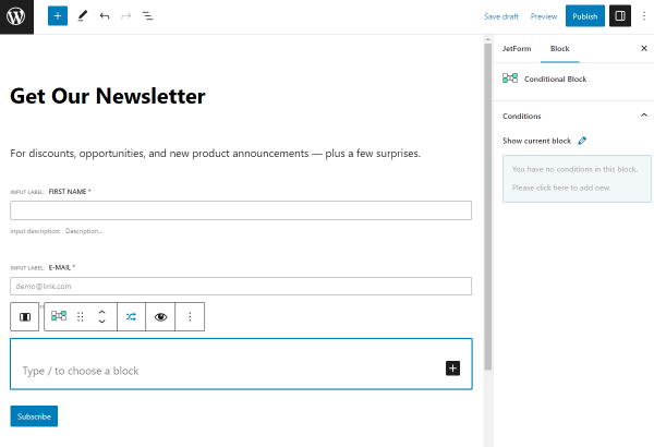
To open the Conditional Block settings window, press the button with the crossed arrows icon, which is placed on the top tool panel to the left of the “Options” button. Also, you can press the pencil-shaped button in the Block section on the right.
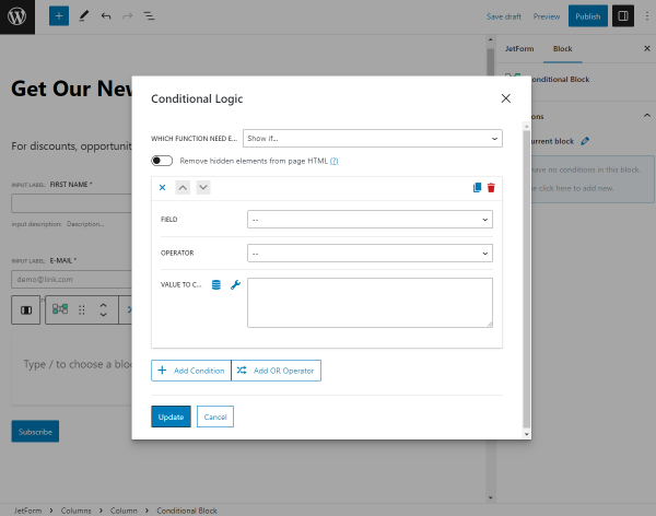
The Conditional Logic pop-up window contains all the conditional visibility settings. Click the “+Add Condition” button to observe all settings.
Settings
Which Function Need Execute? Here you can set the visibility of the connected field by default. If you choose the “Hide if” option, the connected field will be visible until the conditions are met. The “Show if” option will make the field invisible by default, and it will only appear if the conditions are met;
Remove hidden elements from page HTML. This option is available after you select the “Hide if” or “Show if” function. If this block is removed from the HTML, then when sending the form, the values from the inner fields will be empty. For example, in the Send Email action in the email content, the field value can be empty if it is hidden (in DOM) at the form sending time. Also, this feature provides security: a usual user won’t be able to easily find the fields and make them visible. As well, now it is possible to make the fields required inside the block;
“Close” button. When you click on it, it folds/unfolds the condition;
“Arrow” buttons. If you have several conditions, those buttons move the condition up or down in the list. It doesn’t affect its efficiency. The position in the conditions list may be important for the navigation;
“Duplicate” button. It creates a duplicate of the condition;
“Delete” button. This button deletes the condition;
Field. Here you can choose the target field. The value of this field will be compared with the value from the Value to Compare bar. You choose one of the fields that are already added to the form, so all of them will be listed in this drop-down menu, named by their labels;
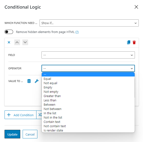
Operator. The option you choose here will define how the value of the target field will be compared to the data you put into the Value to Compare text area. All options from this drop-down will be described further in the Conditions chapter;
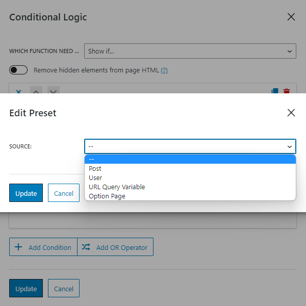
Value to Compare. The value you set here will be compared to the value of the target Field. It can be text, symbols, and numbers. If you push the wrench-shaped button, you can use macros with the form field names and the Extra macros for the Date/Time Field. Besides that, you can fill this field dynamically with the value from some posts or user’s meta fields. To do it, click on the button with a coin-stack-shaped icon. You will be offered to choose the Source:
Post. Specify where to take the data from (Get post ID from), and choose the meta field to take the information from (Post property);
User.Specify where to take the data from (Get user ID from), and choose the meta field to take the information from (User field);
URL Query Variable. This is a small piece of data located in the URL. For example, the “post=123” in the post’s URL is a query variable that shows the post’s ID. The query variable is a parameter you can choose by yourself. As an example, you can set the query variable “items” and type it into the appeared Query variable name bar. Afterward, you can manually add that variable to the Post permalink or Dynamic Link of the JetEngine plugin. Then the form will check if the URL of the page it is placed on has that variable and autofill the data in the form only if it does;
Option Page. This option is available with the JetEngine plugin. It lets you display value from the Option Page field. To learn more, proceed to the Options Page Overview.
“+Add Condition” button. You can add as many conditions as you need for your form by clicking on this button;
“Add OR Operator” button. By default, all conditions are connected with the Operator AND, and the connected field will be only shown if all conditions are met. If you add Operator OR between conditions, the connected field will be displayed if one of the conditions is met.
Operators
Equal
The condition will be met if the value in the target field equals the value from the Value to Compare bar.
Example:
The connected field (“Number of rooms”) appears only if the value of the target field (“Number of visitors”) is equal to “3”.
Not equal
In this case, the connected field will stay visible/invisible if the value of the target field is not equal to the value from the Value to Compare bar.
Empty
The field will be shown/hidden if the connected field contains no value. This condition is useful for fields that take values in particular formats (JSON, date period, address), e.g., Check-in/check-out dates, Media Field.
Not empty
The field will be shown/hidden if the connected field contains some value.
Greater than
The connected field will be shown/hidden if the value of the target field is greater than the one you put in the Value to Compare field.
Lesser than
If the value of the target field is lesser than the number you put to the Value to Compare text area, the connected field will be shown or hidden.
Between
This operator allows you to insert a range into the Value to Compare text area. The first and last numbers have to be typed in ascending order (from lesser to greater) and separated by a comma. The first and last numbers also count in the range. If the value of the target field is equal to one of the numbers in the range, the connected field will be shown/hidden.
Example:
Let’s assume you’ve put the range “2,5” to the Value to Compare text area. The connected field will be shown or hidden if the value of the target field is equal to “2”, “3”, “4”, or “5.”
Not between
This operator works similarly to the “Between” operator, but it shows/hides the connected field if the target field value is not equal to one of the numbers in the range or if the field is empty.
Example:
If you set the “Show if” the Value to Compare is“4,6” condition, the connected field will be shown until you enter 4, 5, or 6 into the target field.
In the list
This operator works with all form fields except Media, Wysiwyg, and Repeater. It is similar to Equal, but you can write several values separated with commas to the Value to Compare bar. Every option of the multi-choice fields has a value. The conditional block takes the value of the option that was chosen by the user and compares it with the several values you put in the Value to Compare bar. If there is a match – the connected field will be shown. The value can be either numeric or alphabetical.
Example:
The connected field (“Parking place”) will be only shown if the value of the target field (“What transport will you use”) is equal to “3”, which is the value of the “car” option.
Not in the list
Works similarly to the “In the list” operator but shows/hides the connected field if the value of the target field is not equal to the value you set in the Value to Compare bar.
Contain text
This operator works with the Text and Textarea form fields. It makes the conditional block seek the value you place in the Value to Compare bar in the text that the user inserts into the target field. If it finds a match, the connected field will be shown or hidden. The value can be either numerical or alphabetical.
Example:
The target field (“Would you like to take a look at our grill menu?”) will be only shown if the word “meat” appears in the target field (“Any food preferences”).
Not contain text
It shows/hides the connected field if the target field text doesn’t contain the value you set in the Value to Compare bar.
Is render state
It allows you to create several different states inside one form. Fields will be shown according to the triggered state.
Example:
With this operator, you can set one state for the login form and another state for the reset password or sign-up form, and users will be able to switch between these forms by clicking a button. You can learn more from the How to Create User Login Form with the Reset Password Featurevideo tutorial.
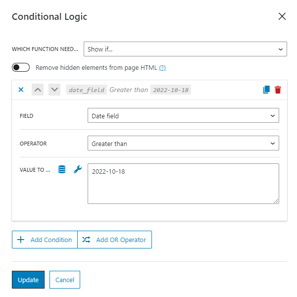
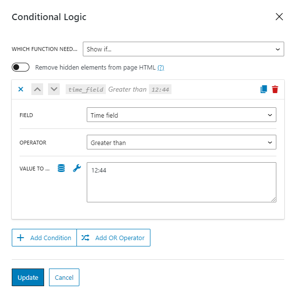
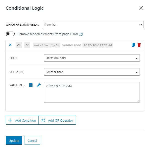
Date/Time/Datetime Fields
You can use the value from these fields in the Conditional Block.
If you want to enter a date into the Value to Compare bar, it should be in the YYYY-MM-DD format.
Time should be in the HH:MM:SS format.
If you want to enter the date and time, it should be in the YYYY-MM-THH:MM:SS format, so the date and time should be separated by “T” without spaces.
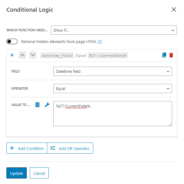
Also, you can compare values with the dynamic date using macros.
After you set the conditions, they will appear in the Block section on the right.
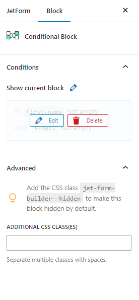
If you hover over the conditional block, you will see the “Edit” and “Delete” buttons.
That’s all. Now you know how to apply conditional visibility for JetFormBuilder form fields via Conditional Block.
If you have installed the free JetStyleManager plugin, you will see the WordPress Block Style button in the top right corner of the editing window. Every field of the WordPress form can be styled separately during the process of form creation. However, you can also define some general design settings. Be aware that the settings you choose separately for the field have a higher priority than the general design settings.
The Form Row, Label, Required Mark, and Description sections contain styling features that will change the general look of the form.
The appearance of the Form Break Field can’t be set during the form creation process, you can define it only here, in the Form style settings tab. The Form Break Row, Form Break Next Button, Form Break Prev Button, Form Break Disabled Message sections are responsible for that.
The form progress bar can also be styled only in the WordPress Form style settings tab, in the Form Progress – Wrapper and Form Progress – Pages sections.
You can style the success message in the Message Success section, whilst the error message can be styled in the Message Error section.
Here are the WordPress form styling settings you can meet there:
The JetFormBuilder plugin offers wide flexibility in displaying a form on the front end. After a form is created in WordPress Dashboard > JetFormBuilder > Forms, it can be shown anywhere on the website.
To display a form in Elementor, Block Editor, or Bricks Builder, a JetFormwidget, block, or element can be used, respectively. Outputting a form in other WordPress page builders is possible with a shortcode. Below, we will go into this process in detail.
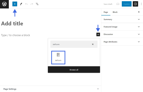
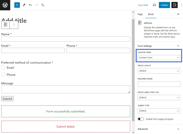
If the page is built in Block Editor, a form can be displayed using the JetForm block.
To add a new block, edit the needed page in Block Editor or create a new one. Click the blue plus-shaped icon in the left corner of the top toolbar or the black plus-shaped icon to the right of an empty block to open the Block Inserter. Search for “JetForm.”
Once the JetForm block is added to the canvas, proceed to configure the block settings. Select the needed form in the CHOOSE FORM drop-down menu in the Form Settings section. Then, configure the rest of the settings according to the “JetForm Overview.”
Once finished, click the “Publish” button to save the changes.
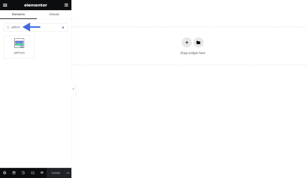
Adding the JetForm Widget in Elementor
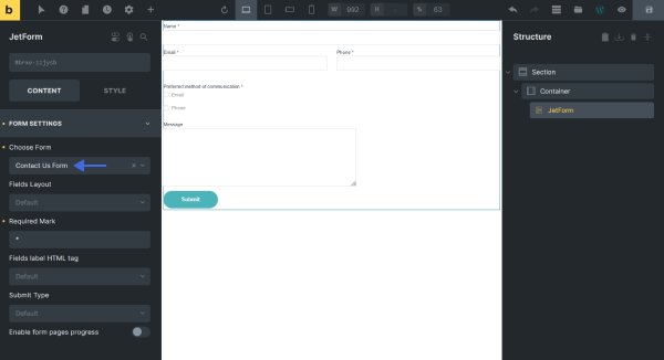
To add the JetFormBuilder form in the Elementor Page Builder, edit the needed page or template with Elementor or create a new one. Find the JetForm widget. Drag and drop the widget onto the canvas.
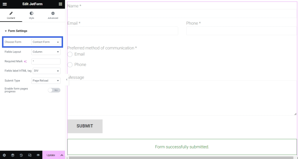
Then, select the needed form in the Choose Form drop-down menu. Configure the rest of the settings by following the “JetForm Overview.”
After configuring the Form Settings, proceed to the Style tab to customize the form appearance.
Once finished, don’t forget to save the changes by hitting the “Update” button.
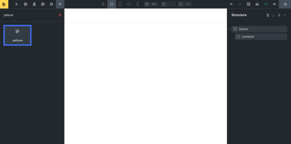
Adding the JetForm Element in Bricks Builder
To display a form in Bricks Builder, open the needed page or template in Bricks or create a new one. Search for the JetForm element. Drag and drop it on the canvas.
Unfold the FORM SETTINGS tab to configure the JetForm settings. Start by selecting the needed form in the Choose Form drop-down menu.
Set up the rest of the settings by following the “JetForm Overview.”
After configuring this part, go to the STYLE tab to customize the form.
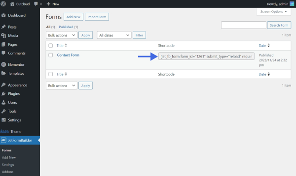
Displaying a Form in Any Page Builder Using a Shortcode
It is possible to add a JetFormBuilder form in any page builder, including the ones mentioned above, using a shortcode. This JetFormBuilder feature is available with Divi, Oxygen, Blocksy, and other page builders.
To locate the form shortcode, go to WordPress Dashboard > JetFormBuilder > Forms and find the needed form. The shortcode is in front of the form name.
Follow our video tutorial to learn how to place a JetFormBuilder form shortcode in the page builders mentioned above.
That’s all about adding the JetForm block/widget/element to the WordPress page with the help of the JetFormBuilder plugin.
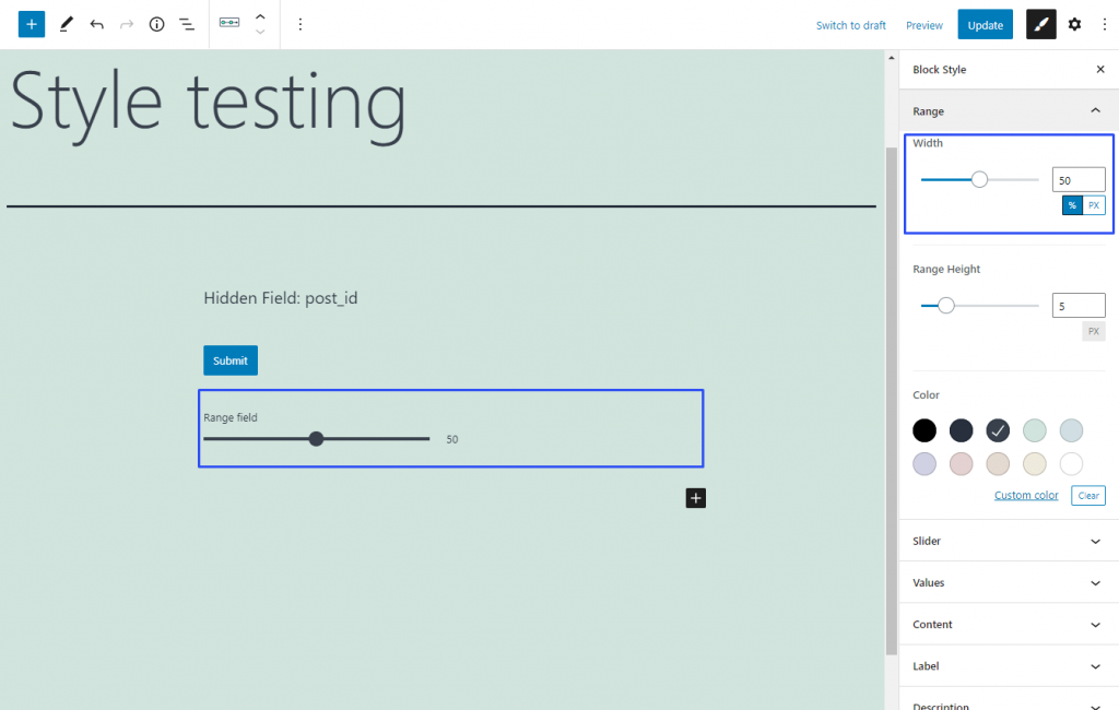
This is a unique styling feature of the Range Field. You can find it in the Range section of the Block Style settings tab. It helps you to set the width of the range. You can use pixels (PX) as the unit of measurement or choose to set the width as the percentage of the total column width. By default, it is set to 100%, so the range occupies the full width of the column to which you have put it.
We use cookies to assist you with navigation and analyze site traffic. If you continue to use this site, you consent to our use of cookies.