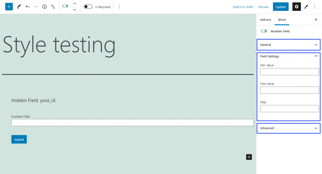
Despite the Text Field allowing the user to insert numbers in it, you need a field for numbers only. With the help of this field, you can either make a bar in the form that will be filled with numbers or set a range for the user to choose from. The value of the Number Field can be used in the formula of the Calculated Field.
This field was created for numbers, so the user won’t be able to put letters or other symbols into it. By default, it is possible to type in both whole and fractional numbers into the field. It also has controls that allow choosing any whole positive or negative number, including 0, with the step of 1. However, you can change the range settings.
Min/Max Value. By default, there are no restrictions for the field, so the user can insert any value. In those two bars, you can set the maximum and minimum values if you need to limit the possible values;
Step. When the user clicks on the controls, a number, equal to the one you have set in this bar, is added to or extracted from the current value in the field. By default, it is set to 1 but you can change it to any whole or fraction number.
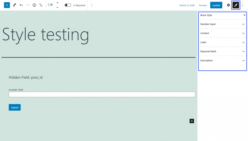
Style Settings
If you have installed the JetStyleManager plugin, the Block Style button will appear in the top right corner of the editing window. Here are the styling settings you can meet there:
This settings tab includes the basic customization fields:
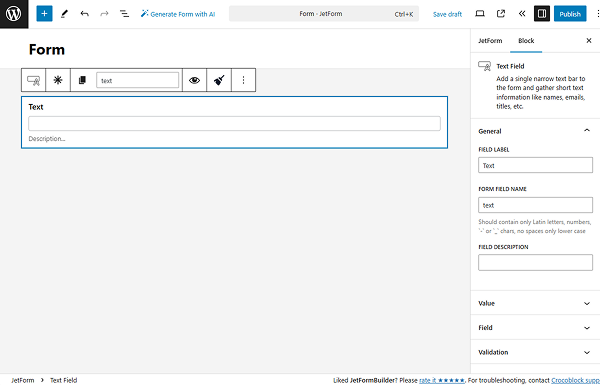
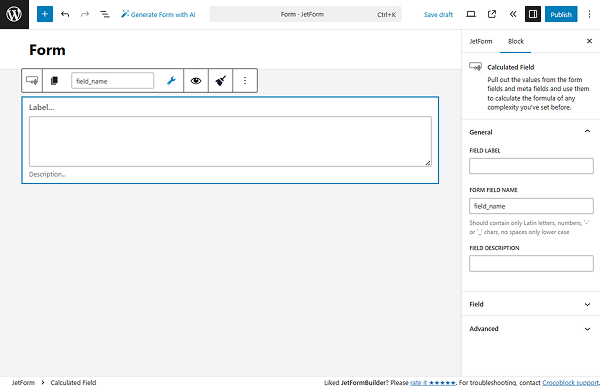
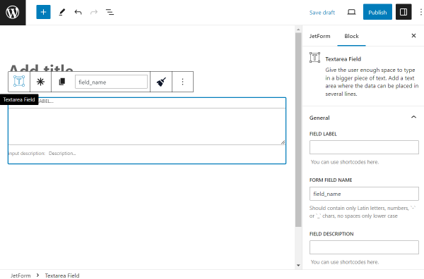
FIELD LABEL — a name that appears above the field and is visible to users;
FORM FIELD NAME — a value that is used as an ID of this field. By default, it is generated from the FIELD LABEL value, but it can be changed if needed.
NOTE
The FORM FIELD NAME value should be unique for the page; it can have no spaces and contain only lowercase Latin letters, numbers, and “-” and “_” symbols.
FIELD DESCRIPTION — a description displayed under the field. It can be added to explain how to complete the field.
Field Settings
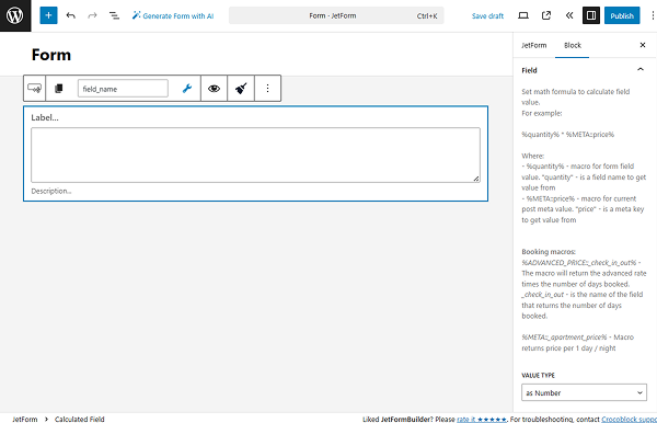
In the Field settings, one can set the math formula to calculate the field values. For example:
%quantity% * %META::price%
Where %quantity% is a macro for form field value (“quantity” is a field name to get value from) and %META::price% is a macro for current post meta value (“price” is a meta key to get value from).
Also, the following macros can be used for booking:
%ADVANCED_PRICE::_check_in_out%
This macro returns the advanced rate multiplied by the number of days booked (“_check_in_out” is the name of the field that returns the number of days booked).
%META::_apartment_price%
This macro returns the price per 1 day/night.
A set of options that allows customizing the input of the field:
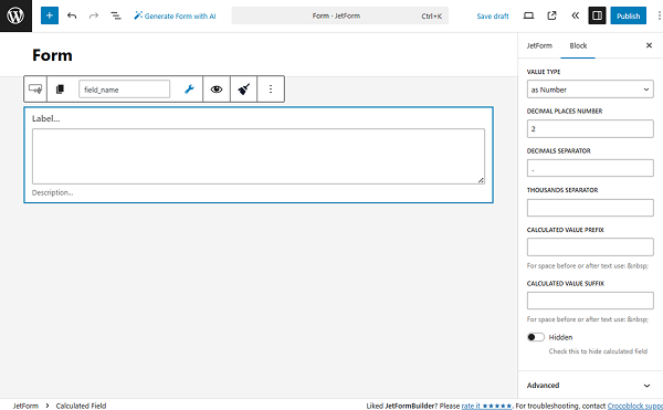
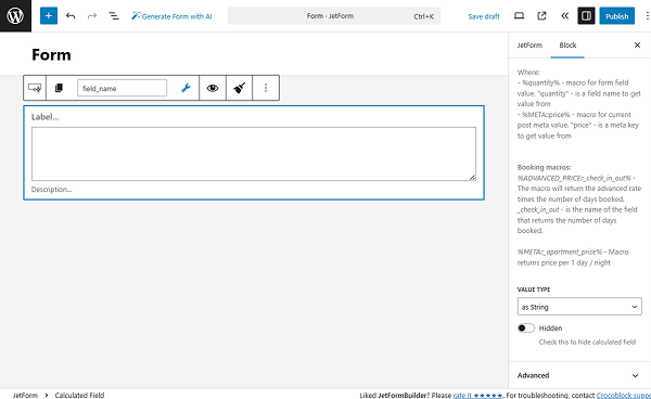
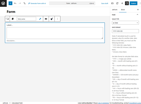
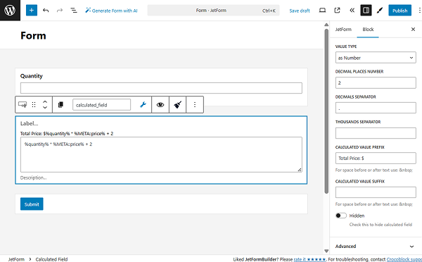
VALUE TYPE — a value type stored in the Calculated Field. There are three options available: “as Number,” “as String,” and “as Date.”
As Number
With the “as Number” VALUE TYPE, the Calculated Field will calculate the numeric values taken from the form fields.
These numeric values can be set in the settings of the needed field. Some of the fields have corresponding customization fields: the CALCULATE field for the Select, Radio, and Checkbox Fields, the VALUE FOR CALCULATED FIELD for the Advanced Choices Field, and the CALCULATED VALUE for the Switcher Field.
NOTE
If the VALUE TYPE is changed from “as Number” to “as String,” usual values will be pulled for concatenation. More about it can be checked in the next “as String” part of the overview.
When this VALUE TYPE is used, the value should be put within “%” characters. The formula will look similar to this:
%first_field% + %second_field%
NOTE
The provided formula is an example. The formula should be set individually depending on the fields added to the form.
DECIMAL PLACES NUMBER — the number of digits that will be displayed to the right of the decimal point;
DECIMALS SEPARATOR — the separator put after the decimals. By default, it is set to “.”;
THOUSANDS SEPARATOR — the separator put after the decimals. By default, there is no separator set;
CALCULATED VALUE PREFIX — the text that will be shown before the resulting value here;
CALCULATED VALUE SUFFIX — the text that will be displayed after the calculated value;
Hidden — a toggle that can be activated to make the current field invisible to users.
If selected, this option can concatenate string values. For example, the “as String” VALUE TYPE can be added to summarize the content completed in the form.
In this case, the set VALUE will be taken from the fields to make concatenations and not its CALCULATE value.
NOTE
If the “as String” VALUE TYPE is changed to “as Number”, the Calculated Field numeric values will be pulled for concatenation, as mentioned above in the “as Number” part of the overview.
If one selects the “as String” option, the values should be put inside the single or double quotes. For instance, like:
'%first_field% %second_field%'
or
'%first_field%' + '%second_field%'
NOTE
The provided formula is an example. The formula should be set individually depending on the fields added to the form.
With the “as String” option selected as VALUE TYPE, no additional settings are displayed. However, there is a common customization field left for both “as Number” and “as String” VALUE TYPES, the Hidden toggle.
As Date
This VALUE TYPE allows calculating the date/time/datetime with other number values in order to get the result in date format.
NOTE
If the calculated result is used as a dynamic value for another Date, Datetime, or Time Field, the following formats should be used:
YYYY-MM-DD (Date Field);
YYYY-MM-DD HH:mm (Datetime Field);
HH:mm (Time Field).
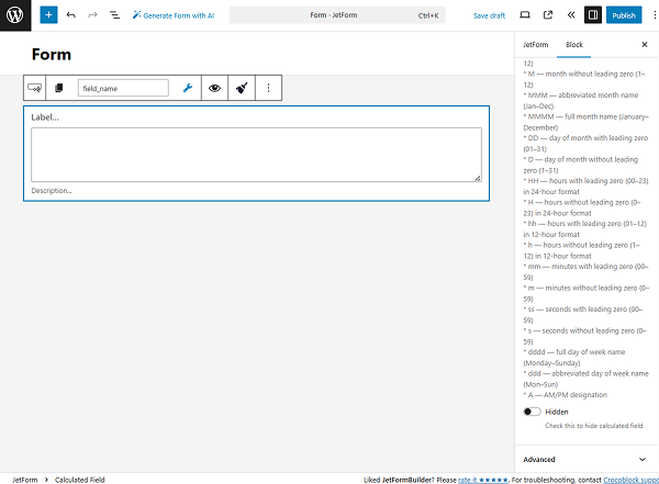
The following date and time formats should be used to calculate the field values:
YYYY — 4-digit year (e.g., 2024);
MM — month with leading zero (01–12);
M — month without leading zero (1–12);
MMM — abbreviated month name (Jan–Dec);
MMMM — full month name (January–December);
DD — day of the month with leading zero (01–31);
D — day of the month without leading zero (1–31);
HH — hours with leading zero (00–23) in 24-hour format;
H — hours without leading zero (0–23) in 24-hour format;
hh — hours with leading zero (01–12) in 12-hour format;
h — hours without leading zero (1–12) in 12-hour format;
mm — minutes with leading zero (00–59);
m — minutes without leading zero (0–59);
ss — seconds with leading zero (00–59);
s — seconds without leading zero (0–59);
dddd — full day of the week name (Monday–Sunday);
ddd — abbreviated day of the week name (Mon–Sun);
A — AM/PM designation.
When this VALUE TYPE is used, the value should be put within “%” characters. The formula will look similar to this:
%event_start_date|T% + %event_duration|toDayInMs%
where “event_start_date” is the FORM FIELD NAME of the Date Field, “T” is a macro indicating timestamp (transforms the date into timestamp), “event_duration” is the FORM FIELD NAME of the Number Field, and “toDayInMs” macro transforms the number from days to milliseconds.
If such a formula is taken, the result will show the end date of the event.
NOTE
The provided formula is an example. The formula should be set individually depending on the fields added to the form.
In order for the calculation to work fine, one should define the correct value in the DATE FORMAT field. More about formats can be found in the field description.
One more toggle presented in the “as Date” VALUE TYPE settings is Hidden, the same as for the “as Number” and “as String” VALUE TYPES.
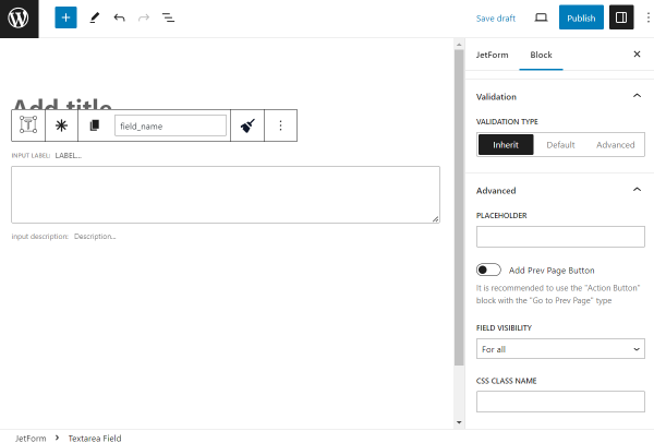
Advanced Settings
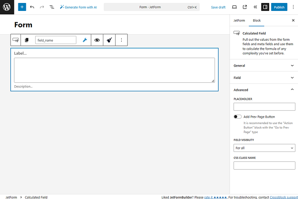
One more settings tab of the Calculated Field is Advanced. It contains the following fields for customization:
PLACEHOLDER — a placeholder of the field value that will be shown before the calculations are made in the field;
Add Prev Page Button — a toggle that adds a “Prev Page” button to the form;
FIELD VISIBILITY — a selector that allows picking for whom the field will be visible: for all users, only for logged-in users, or only for not logged-in users;
CSS CLASS NAME — a field that allows customizing the appearance of the field with CSS code.
Style Settings
NOTE
This tab becomes available only if the JetStyleManager plugin is installed and activated.
To open the style settings, one should press the “brush” button.
With the Style tab, the following settings can be customized:
To perform calculations, one should put the formula in the Calculated Field.
As Number
If the “as Number” FIELD TYPE is selected, the following types of values can be used in the formula:
Static numbers —these could be either whole or fractions;
Form field value — to get the value, the macro code %field_name% should be used, where “field_name” is the title you put to the FORM FIELD NAME bar;
Meta field value — the value will be taken from the meta field that is attached to the post where the form is placed. To get the value, use the macro code %META::field_name%, where “field_name” is the name of the field.
Also, once the “wrench” icon above the Calculated Field is clicked, a list of macros is available. There, the form field macros and extra macros, including date operations, can be found.
One can do all sorts of mathematical operations with those values. Just type the formula into the Calculated Field text area. For example, let’s take a close look at the formula:
%quantity% * %META::price% + 2
This means that the field will take the value from the “quantity” form field, multiply it by the value of the “price” meta field, and add two to it.
Despite the fact that the formula is put into the field’s text area during editing, the users will see only the result of the calculations.
As String
If the “as String” FIELD TYPE is selected, the fields from the current form can be concatenated.
For instance, two Text Fields can be concatenated with the following formula:
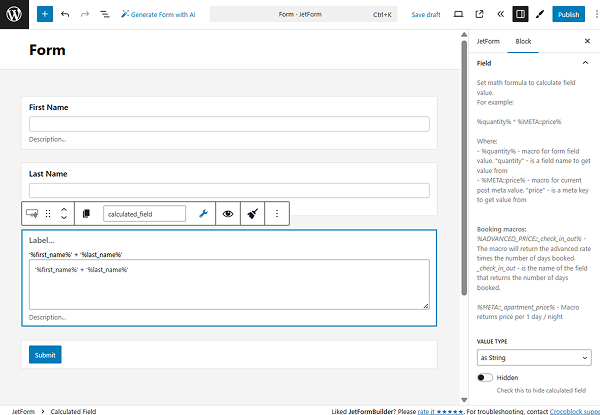
'%first_name%' + '%last_name%'
where “first_name’” and “last_name” are the FORM FIELD NAMES of the needed fields.
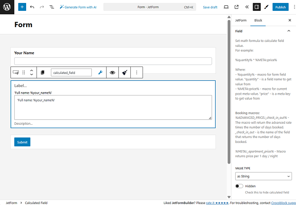
Or, one can add a custom text before or after the values. For instance, the form includes two fields: Text Field with a “your_name” FORM FIELD VALUE and Calculated Field with the following formula inside:
'Full name: %your_name%'
With this formula, a value put inside the “Your name” Text Field on the front end will be immediately displayed after the “Full name:” string.
As Date
If the “as Date” VALUE TYPE is selected, the two values taken from the Time/Date/Datetime Fieldand another number field can be calculated.
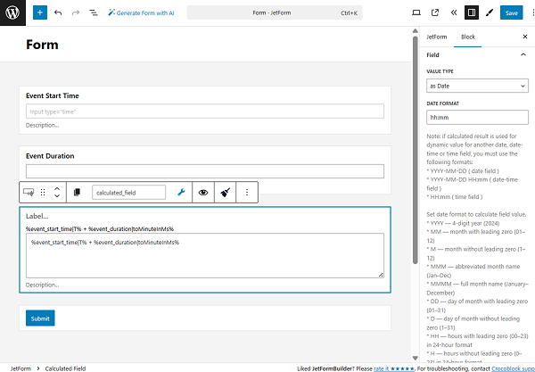
For instance, the formula to calculate the time duration of the event will look like this:
where “event_start_time” is the FORM FIELD NAME of the Time Field, “T” is a macro indicating timestamp (transforms the time into a timestamp), “event_duration” is the FORM FIELD NAME of the Number Field, and “toMinuteInMs” macro transforms the number from minutes to milliseconds.
Also, with this formula, one should change the DATE FORMAT to “hh:mm” where “hh” is hours with a leading zero (01–12) in 12-hour format and “mm” is minutes with a leading zero (00–59).
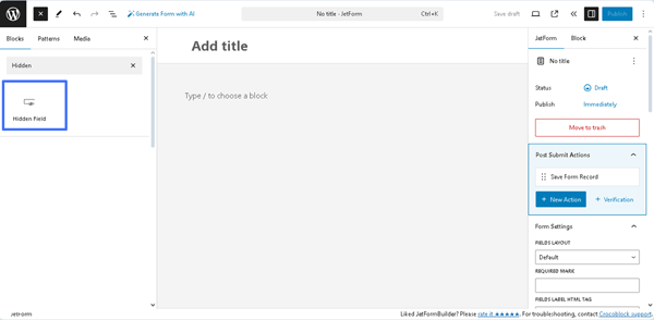
The Hidden Field block is added to the default JetFormBuilder’s form, as well as to the embedded templates, presented in the Welcome block, and patterns.
Also, after creating a new form or opening a previously built one, the Hidden Field block can be found in the search bar of the block inserter (the “plus” icon) and then inserted where needed.
Settings of the Hidden Field
The Hidden Field block settings are presented by the General, Value, Field, and Advanced tabs.
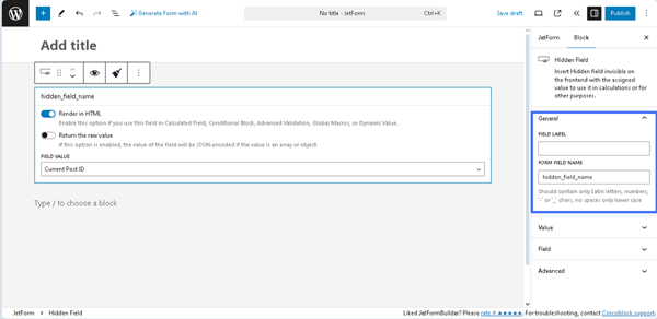
General
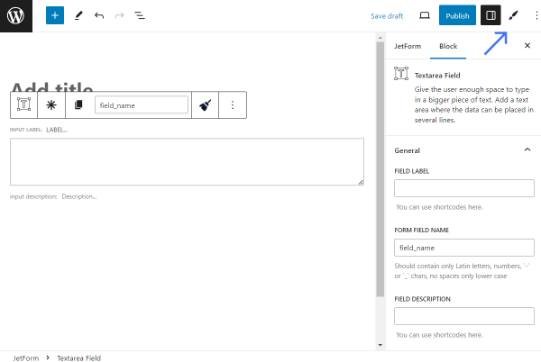
The General settings tab includes the FIELD LABEL and FORM FIELD NAME fields:
FIELD LABEL ㅡ a field intended for the field’s label;
FORM FIELD NAME ㅡ a field intended for the field’s name. This field will be filled out automatically after the text is added to the FIELD LABEL field. Since it will work as an ID, this field should contain the original name. The Latin letters, hyphens, and underscores for the name (but no spaces) are permitted.
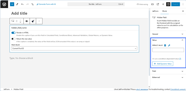
Value
This tab is presented by the DEFAULT VALUE field and the “+ Add Dynamic Value” button.
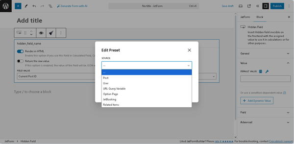
The needed value can be inserted into the DEFAULT VALUE field, selected from the required SOURCE, or set as a macro. In particular, pressing the “Dynamic Tag” icon opens the Edit Preset pop-up with the SOURCE drop-down list, which has the following options: “Post,” “User,” “URL Query Variable,” “Option Page,” and more. In turn, each selected option turns on the appropriate field, allowing one to choose the needed data. Also, this pop-up includes the Restrict access toggle that allows restricting users who are allowed to edit this value.
The needed settings should be saved by pressing the “Update” button.
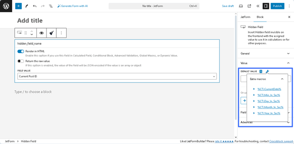
Pressing the “wrench” icon displays a list of Extra macros that can be added to the DEFAULT VALUE field.
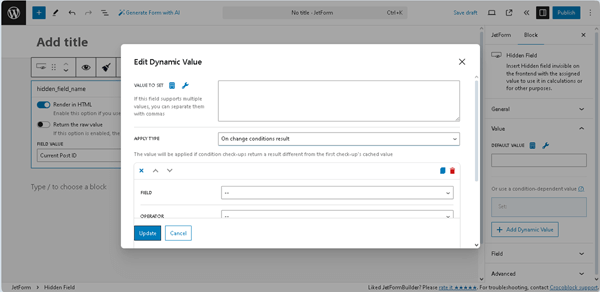
Pressing the “+ Add Dynamic Value” button opens the Edit Dynamic Value pop-up with the following fields:
VALUE TO SET ㅡ a field that supports multiple values and allows entering or selecting them dynamically, as well as applying macros;
APPLY TYPE ㅡ a drop-down list that specifies how to apply the needed condition: “On change conditions result,” “Once,” or “Always”;
FIELD ㅡ a drop-down list that allows selecting the needed form’s field to compare;
OPERATOR ㅡ a drop-down list that allows selecting the needed operator to compare (e.g., “Equal,” “Not equal,” and more);
VALUE TO COMPARE ㅡ a text field that allows entering or selecting values to compare fields dynamically, as well as applying macros;
+Add New Condition ㅡ button that adds another FIELD, OPERATOR, and VALUE TO COMPARE set of fields to compare the form’s field with the specific value;
Set value only if field is empty ㅡ a toggle that, if enabled, allows setting the needed value only for empty fields.
Pressing the “Update” button closes this pop-up.
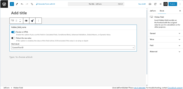
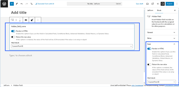
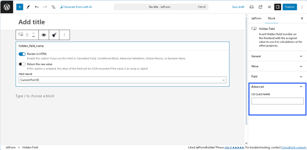
Field
These settings reproduce the settings on the Hidden Field block:
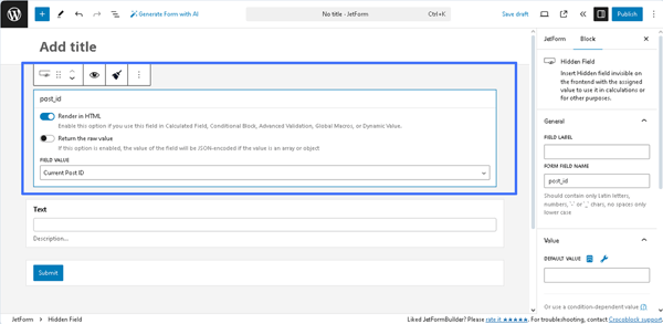
Render HTML toggle (enabled by default) ㅡ a toggle that allows use of this field in Calculated Field, Conditional Block, Advanced Validation, Global Macros, or Dynamic Value;
Return the raw value ㅡ a toggle that sets the value of the field JSON-encoded if the value is an array or object. Read more about these toggles in the How to Use Really Hidden Fields tutorial;
Return the raw value ㅡ a drop-down list that allows assigning specific values to the field:
Current Post ID ㅡ an option that assigns the ID of the post where you placed the form;
Current Post Title ㅡ an option that assigns the title of the post where you put the form;
Current Post/Page URL ㅡ an option that assigns the URL of the page where the form is placed;
Current Post Meta ㅡ an option that assigns the value of the meta field that is attached to the post where the form is placed. The name of the field is defined in the Meta Field to Get Value From bar;
Current User ID ㅡ an option that assigns the ID of the user that is currently logged in;
Current User Email ㅡ an option that assigns the email address of the user that is currently logged in;
Current User Name ㅡ an option that assigns the name of the user who is logged in right now;
Current User Meta ㅡ an option that assigns the value of the meta field that is attached to the account of the currently logged-in user. That very meta field can be set in the Meta Field to Get Value From bar;
Current Post Author ID ㅡ an option that assigns the ID of the author who published the post where you placed the form;
Current Post Author Email ㅡ an option that assigns the email address of the author who wrote the currently opened post;
Current Post Author Name ㅡ an option that assigns the name of the currently opened post author;
URL Query Variable ㅡ an option that assigns the query variable that can be further used for some other field;
Current Date ㅡ an option that assigns the date when the form is filled in. You can set the format of the date in the Format bar;
Manual Input ㅡ an option that allows you to define the value of the Hidden Field manually by typing it into the Value bar;
Referer URL ㅡ an option that helps to see from which page the user comes to the WordPress form.
Advanced
The setting includes the CSS CLASS NAME ㅡ a field for adding the CSS class.
That’s it. Now you know how to use the JetFormBuilder plugin to add the Hidden Field to your form, which is designed for calculations or other purposes on WordPress websites.
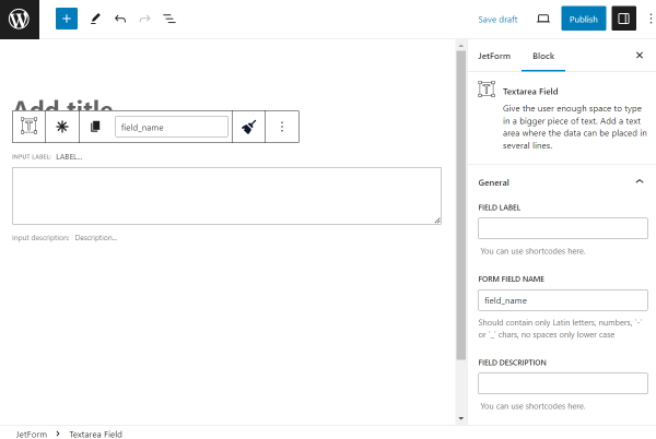
The General settings tab includes the most common settings for field customization. Their description can be found in the General settings section overview.
NOTE
The Dynamic Value setting is transferred to the Value settings tab.
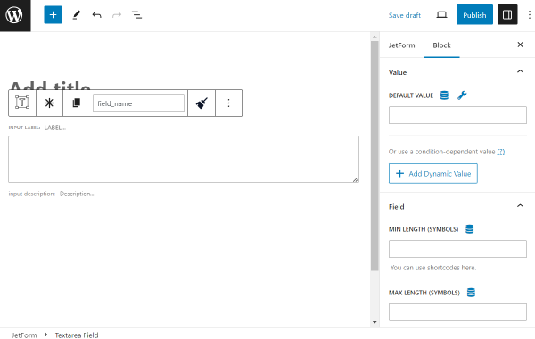
Value Settings
In the Value settings tab, one can adjust default and dynamic values.
DEFAULT VALUE— a value that will be placed in the form right away when the user opens the form. It can be completed with macros or dynamic presets to pull specific data. User can still change the value if desired;
Add Dynamic Value — a button that opens a window to adjust the dynamic value in the Textarea Field.
The Edit Dynamic Value pop-up includes the following customization settings:
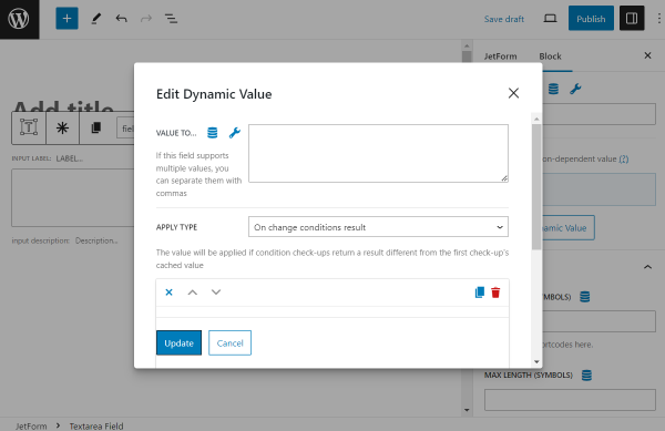
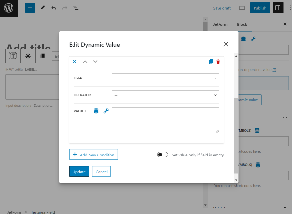
VALUE TO SET — a value that will be put in the Textarea Field if the conditions are complied with;
APPLY TYPE— a drop-down menu with the following options: “On change conditions result,” “Once,” and “Always.” These refer to the application trigger.
FIELD— a list of fields from the built form. Here, the field for comparison should be selected;
OPERATOR— a defining operator that will connect the Field and Value to Compare;
VALUE TO COMPARE— here, one more value for comparison should be put;
Add New Condition — a button that allows setting more dynamic value conditions;
Set value only if field is empty — a switcher that activates the Dynamic Value feature only when the FIELD is empty in the form.
To save the changes, one should press “Update.”
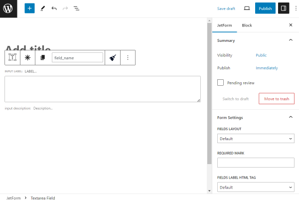
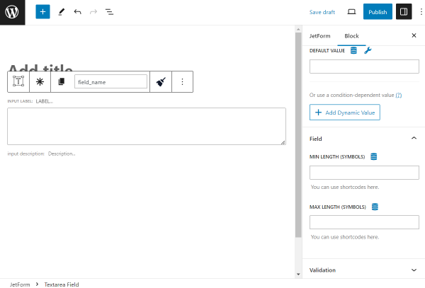
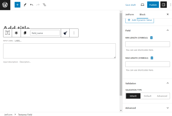
Field Settings
The Field settings tab includes the following customization settings:
MIN/MAX LENGTH (SYMBOLS) — fields where a minimal and maximal number of allowed characters should be put.
Validation Settings
Validation is a process when a browser/web server verifies whether the data in the form has the correct format and works within limits set by the program.
Validation can be set both for the form and for a separate field. In the Textarea Field,there are three types of validation: “Inherit,” “Default,” and “Advanced.” More information about them can be found in the Advanced Form Validation for Separate Blocks article.
In addition to the block settings next to the form, a settings panel is displayed above the field once it is pushed.
The panel consists of buttons with icons.
The “Textarea Field” button can transform this field into a different one. Not all the fields are compatible for the transformation; their list can be found in the How to Use WordPress Blocks Transformation article;
“Click to make this field required” button makes the field required so a user can’t submit the form without completing this specific field;
“Copy name” copies the following Form Field Name value into the clipboard;
Form Field Name is the same field as in the General tab. It can be completed/changed either here or there;
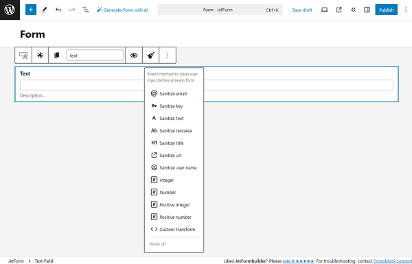
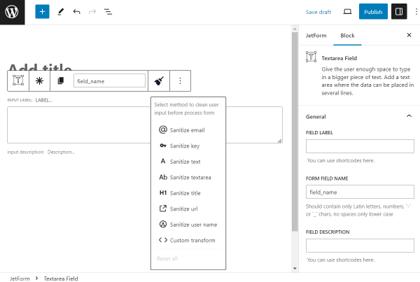
“Sanitize value” option clears disallowed symbols in the field. This button should be pressed to see the specific list of options:
“Sanitize email”— deletes symbols that are not allowable in an email;
“Sanitize key”— keys are used as internal identifiers. Lowercase alphanumeric characters, dashes, and underscores are allowed;
“Sanitize text” — checks for invalid UTF-8, converts single “<” characters to entities; strips all tags; removes line breaks, tabs, and extra whitespace; strips percent-encoded characters;
“Sanitize textarea” — the option is like “Sanitize text,” but preserves new lines (\n) and other whitespaces, which are legitimate input in textarea elements;
“Sanitize title” — sanitizes a string into a slug, which can be used in URLs or HTML attributes;
“Sanitize url” — sanitizes a URL for database or redirect usage;
“Sanitize user name” — sanitizes a username, stripping out unsafe characters;
“Custom transform” — specifies the name of the PHP function to process the value.
Also, the ”Options” button is available, which shows the window with default settings used in the Block Editor.
Style Settings
To style the Textarea Field, one can use the JetStyleManager plugin, which is free and can be installed and activated on your WordPress website.
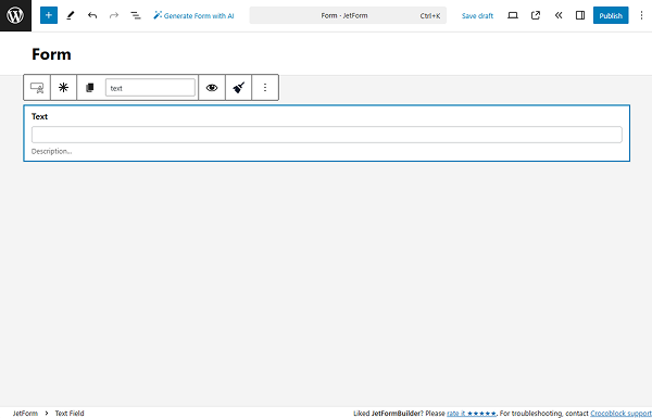
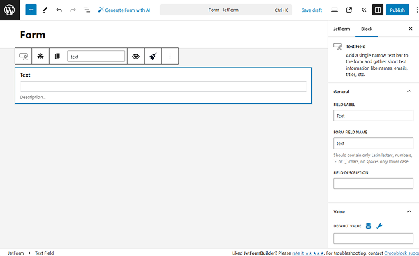
This field gathers short text information like names, emails, titles, etc. It adds a single narrow text bar to the form. The Text Field could be filled with symbols, numbers, and letters of every language.
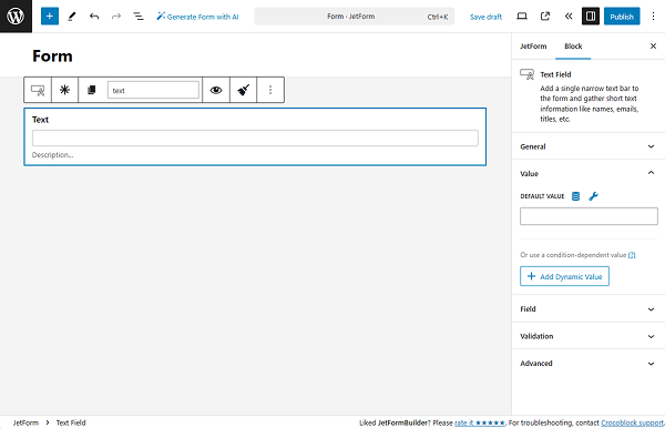
The Value settings tab has two optional setting fields for completion.
DEFAULT VALUE — data put here will be automatically shown in the field. Although it can be changed by the user who completes the form;
Add Dynamic Value — a button that allows adjusting the value displayed under specific conditions. Once pressed, the Edit Dynamic Value pop-up appears.
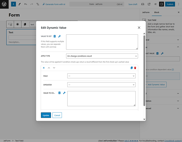
VALUE TO SET — a value that will be put in the field once the required conditions are met;
APPLY TYPE — a selector for the dynamic behavior. Among the options are “On change conditions result,” “Once,” or “Always”;
FIELD — a drop-down list with fields from the current form that should be compared;
OPERATOR — a comparison operator that will be a binding for the selected FIELD and VALUE TO COMPARE options;
VALUE TO COMPARE — a field for the name of the value to compare;
Add New Condition — a button that opens one more settings repeater for setting a new condition;
Set value only if field is empty — a toggle that makes the dynamic value feature work only if the FIELD is empty.
After finishing with the dynamic value settings, the “Update” button should be clicked.
Field Settings
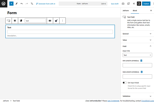
The following Field settings tab includes several options for adjusting that will make the Text Field more specific for the needed purpose:
FIELD TYPE — a drop-down menu with the most common types of information that can be gathered via the Text Field: “Text,” “Email,” “Url,” “Tel,” and “Password.” The type selected here defines the information considered “correct” for this field. For example, if the user places the letters into the “Tel” field, they will receive a notification saying that one of the fields was filled incorrectly;
MIN/MAX LENGTH (SYMBOLS) — the minimal and maximal number of symbols for the field;
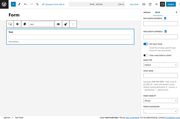
Set Input Mask — the input mask should be used to restrict the users from inserting the wrong data into the field. When this toggle is switched on, access to the mask settings is opened.
Clear mask before submit — a switcher that inactivates the mask once the form is submitted. This feature prevents the mask value from being saved in the meta field or sent in the email. For instance, the Text Field is completed with “(384) 682-4827”, but it includes a mask, so the user filled in the field only with “3846824827,” and the entered numbers will be saved;
MASK TYPE — the “Default” and “Datetime” variants differ only in the rules of mask creation. The first one is for any alphanumeric data, and the second is for date and time only;
INPUT MASK — a bar where the mask formula should be inserted. There are three definitions: “9” marks the numeric value, “a” means the alphabetic value, and “*” means that both numeric and alphabetic values can be used here.
For example, a “(999) 999-9999” mask for the phone number defines that the first three symbols must be numbers enclosed in brackets, followed by another three numbers, a hyphen, and four more numbers. The user can only insert numbers into that field, following the pattern set by the mask.
MASK VISIBILITY — a time when the mask will be visible to the users. “Always” means that it won’t be hidden, “Hover” will show the mask only when the user hovers a pointer over the field, and “Focus” means that the mask will become visible when the user clicks on the field;
MASK PLACEHOLDER — the symbol that will show the user the structure of the mask. That symbol will display where the number or letter has to be inserted.
Validation Settings
A validation is a feature that can be set either for the entire form or for a separate field. With the form/field validation, a browser/web server will verify that the data adheres to the specified format and within constraints set by the program.
This tab has an additional set of settings for the field. More information about it can be found in the Advanced settings section article.
Additional Settings Panel
Once the person who creates the form clicks on the Text Field, an additional settings panel with buttons is displayed.
The “Text Field” button allows converting the current field into any other required type within JetFormBuilder. Learn more about it in the How to Use WordPress Blocks Transformation article;
“Click to make this field required” is self-explanatory. If the form creator wants to make the field obligatory for completion (which means a user must fill it in to submit the form), this button should be pressed;
“Copy name” button copies the Form Field Name into the clipboard;
Form Field Name is the same field as in the general settings. Having it in this settings panel can make the form-creation process easier;
“Sanitize value” clears unwanted characters in the field. Once clicked, more specific options for selection are displayed:
“Sanitize email”— strip out all the characters that are not allowable in an email;
“Sanitize key”— keys are used as internal identifiers. Lowercase alphanumeric characters, dashes, and underscores are allowed;
“Sanitize text” — checks for invalid UTF-8, converts single “<” characters to entities; strips all tags; removes line breaks, tabs, and extra whitespace; strips percent-encoded characters;
“Sanitize textarea” — the function is like “Sanitize text,” but preserves new lines (\n) and other whitespaces, which are legitimate input in textarea elements;
“Sanitize title” — sanitizes a string into a slug, which can be used in URLs or HTML attributes;
“Sanitize url” — sanitizes a URL for database or redirect usage;
“Sanitize user name” — sanitizes a username, stripping out unsafe characters;
“Custom transform” — specify the name of the PHP function to process the value.
Another button above the Text Field is “Options,”the default settings window for any field used in the Block Editor.
Style Settings
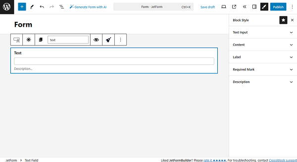
If the JetStyleManager plugin is installed and activated, the “Block Style” button will appear in the top right corner of the editing window.
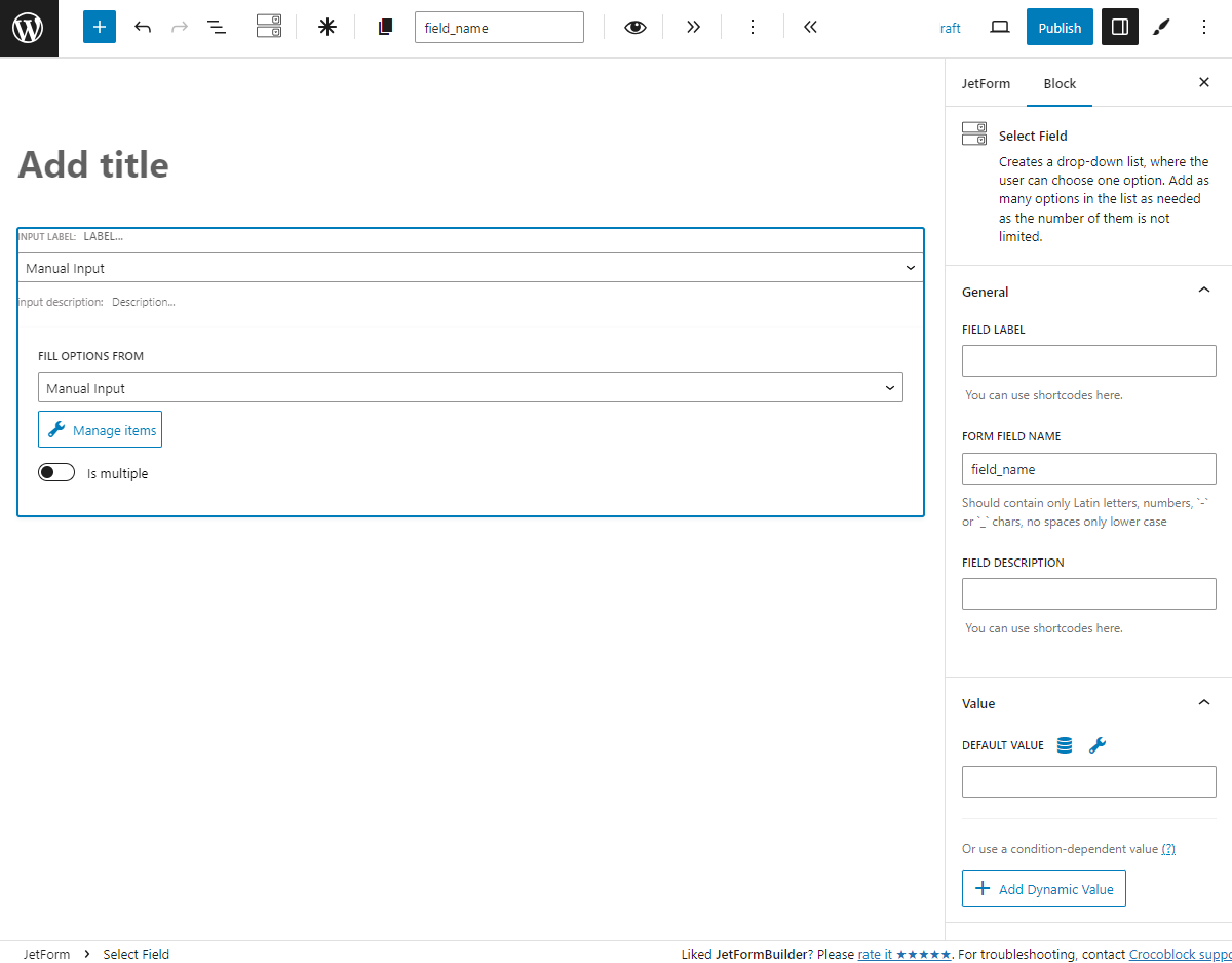
Multi-optional fields allow users to choose one or several options from the ready-made list – Select, Radio, and CheckboxFields. These three fields have a similar settings window where you can choose the source of the options that will be available to the users.
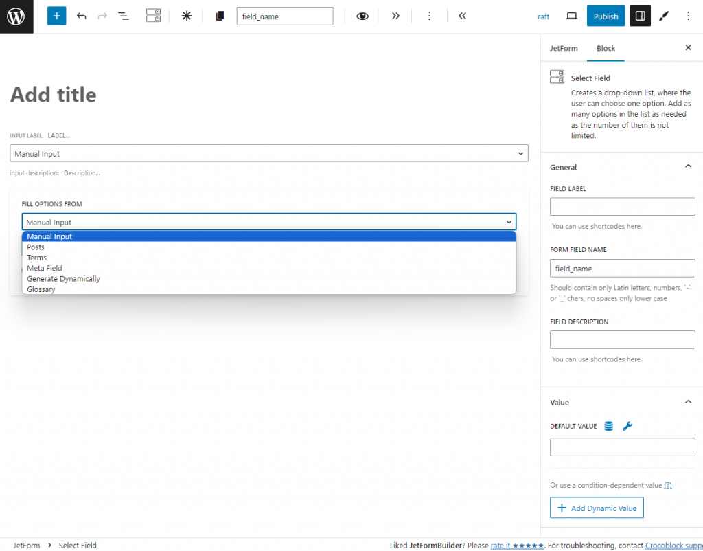
Selecting Source for Options List
In this drop-down menu, you can select the source of the options list. You can add options manually or use the pre-made list from custom meta fields.
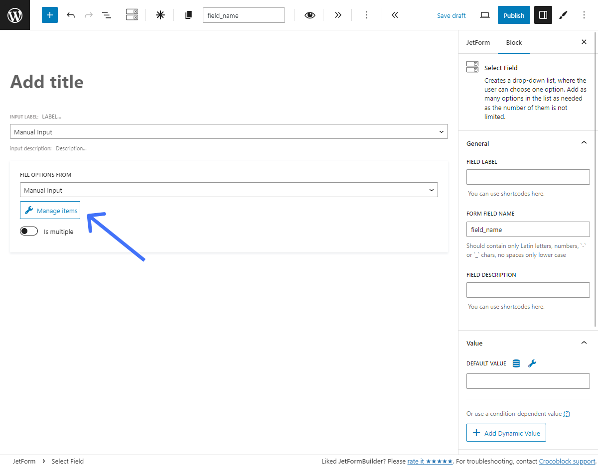
Manual Input
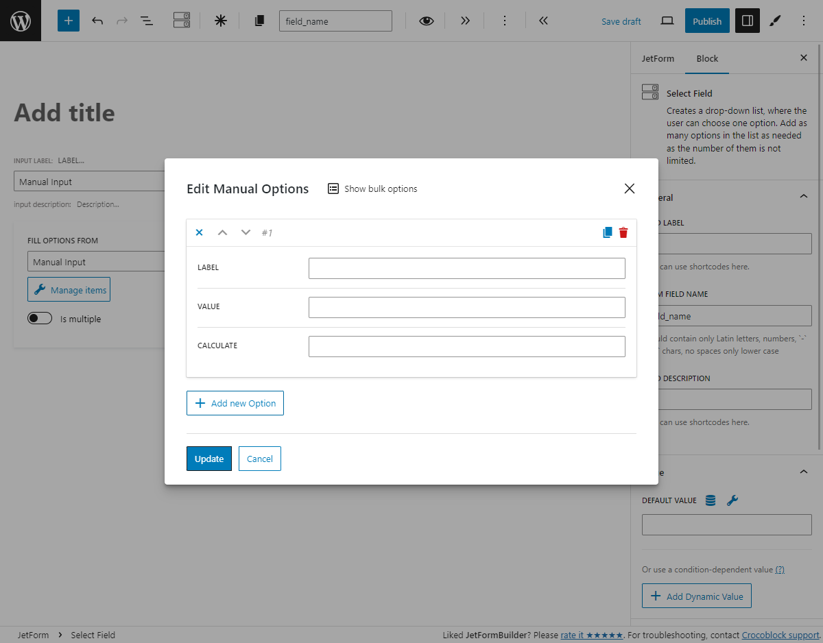
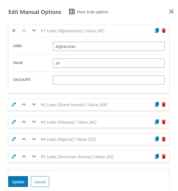
Choose this method to fill the options list manually. Click the “Manage Items” button.
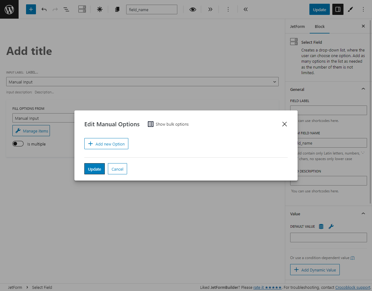
You will see the option creation and editing window.
To add a new option manually, hit the “+ Add new Option” button.
Let’s go through the available features:
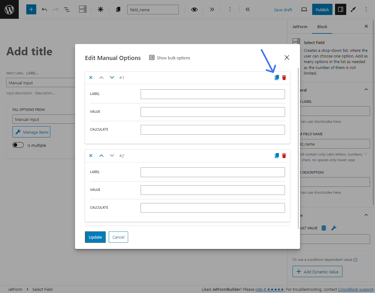
“Clone” button. Creates a copy of the created option underneath;
“Delete” button. Deletes the item;
LABEL. This is the name of the option that the user sees in the list;
VALUE. The inner data, the value that corresponds to the option;
CALCULATE. The value from this bar will be taken to the formula, which is calculated by the Calculated Field.
You can add as many options to the list as you need by clicking the “+ Add new Option” button.
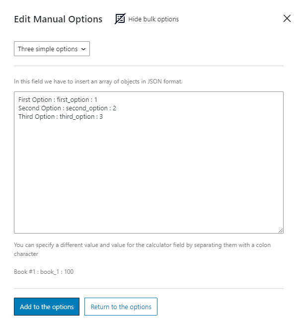
Bulk adding of options
Hitting the “Show bulk options” button opens a field for adding a list of custom or preset choices in bulk.
NOTE
Ensure to input only one option in each line of the input field.
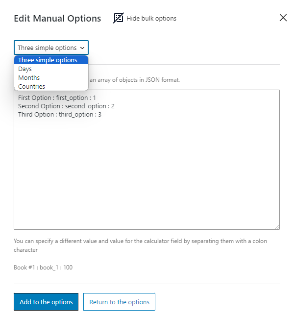
You can pick such variants from the drop-down menu:
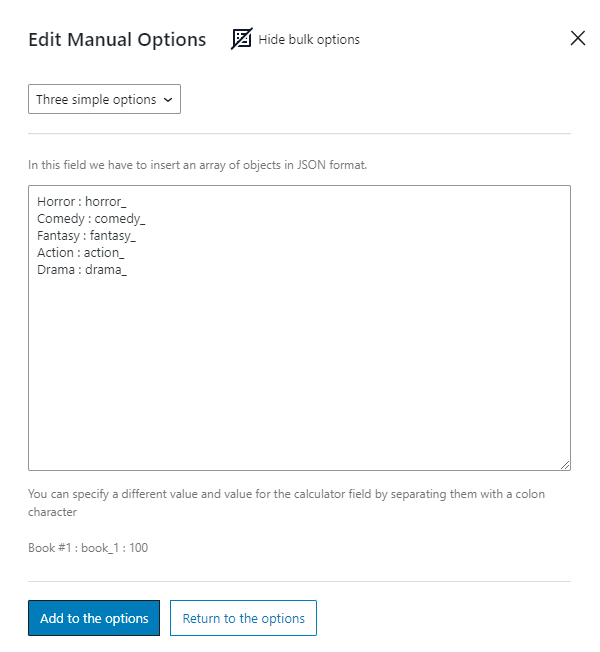
Three simple options. This variant allows inputting your custom options in bulk. After selecting it, you will see an example format for the options: “First Option : first_option : 1,” where the “First Option” is a label, the “first_option” is a value, and “1” is the value for the calculated field (if such is needed). For example, to add a custom list of movie genres, we typed “Horror : horror_” in the first line, “Comedy : comedy_” in the second, and so on;
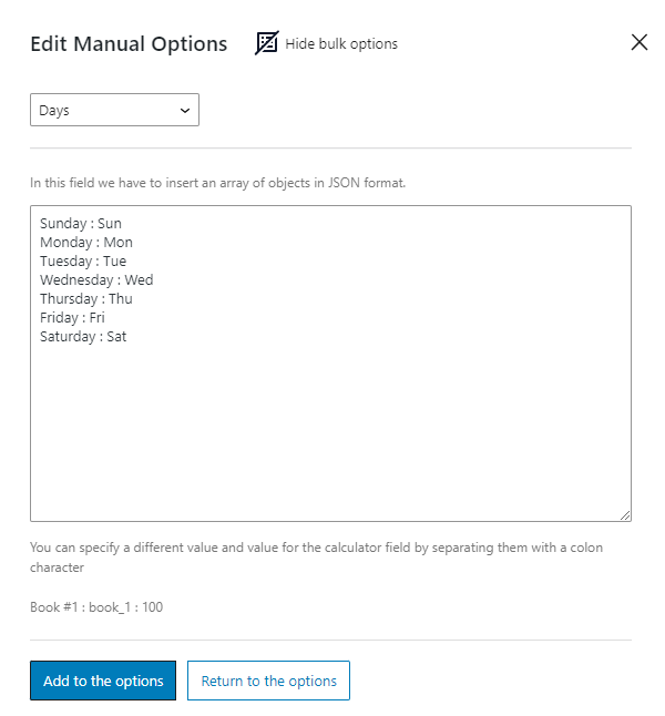
Days. It’s a preset that inserts the list of the weekday names;
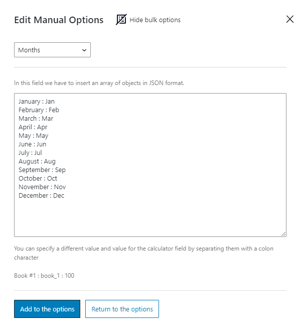
Months. It’s a preset that inserts the list of the month names;
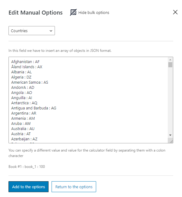
Countries. It’s a preset that inserts the list of the country names.
There are two buttons on the bottom of the window:
“Add to the options.” Clicking this button adds bulk options to the multi-optional field alongside any manually created options you may already have;
“Return to the options”button. After clicking, you will return to the manual option input window without saving the bulk options field changes.
When you are done with the options list, press the “Update” button.
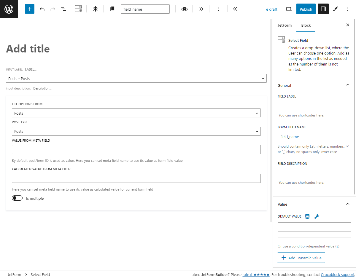
Posts
This type of source allows you to choose the data from the post or page’s meta field to create the list of options automatically. For example, you can create a list of the post titles. If you create a custom post type and custom meta fields via plugins like JetEngine or ACF, you will be able to choose them here, too.
POST TYPE. In this drop-down list, you can choose the source for the items. The available options include WordPress Posts, Pages, and Media, or the custom post types if you have them;
VALUE FROM META FIELD. By default, when you choose the Post Type, the values of the options will be taken from the post or page IDs. However, in this bar, you can specify the name of the concrete meta field from which the value will be pulled. Be aware that this will work with the custom meta fields only;
CALCULATED VALUE FROM META FIELD. If you use Calculated Field in the form and want to include a value from a specific meta field in the formula, you should specify the name of this field here. You can choose a different meta field from the one selected in the VALUE FROM META FIELD bar.
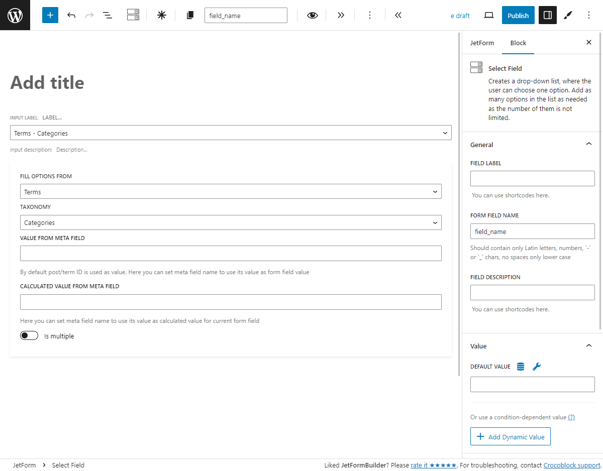
Terms
Use this type of source if you want to build a list from the categories or taxonomies you’ve created. For example, if you use the WooCommerce plugin, you can create a list of product categories. And if you use such plugins as ACF or JetEngine and have a custom taxonomy, you can create a list of its contents, too.
TAXONOMY. Here, you select the type of taxonomy that will be used to create a list. Besides the default WordPress categories, you can select tags, navigation menus, link categories, and formats. If you have created a custom taxonomy for your posts, it will also be listed in this drop-down. The names of the taxonomy items will be used as labels in the list;
VALUE FROM META FIELD. By default, the term IDs are used as the values for the list items. If you want to take the values from a custom meta field added to the taxonomy instead, type its name into this bar;
CALCULATED VALUE FROM META FIELD. The value for the Calculated Field formula can differ from the one used for other fields. Type in the name of the custom meta field with the calculation values.
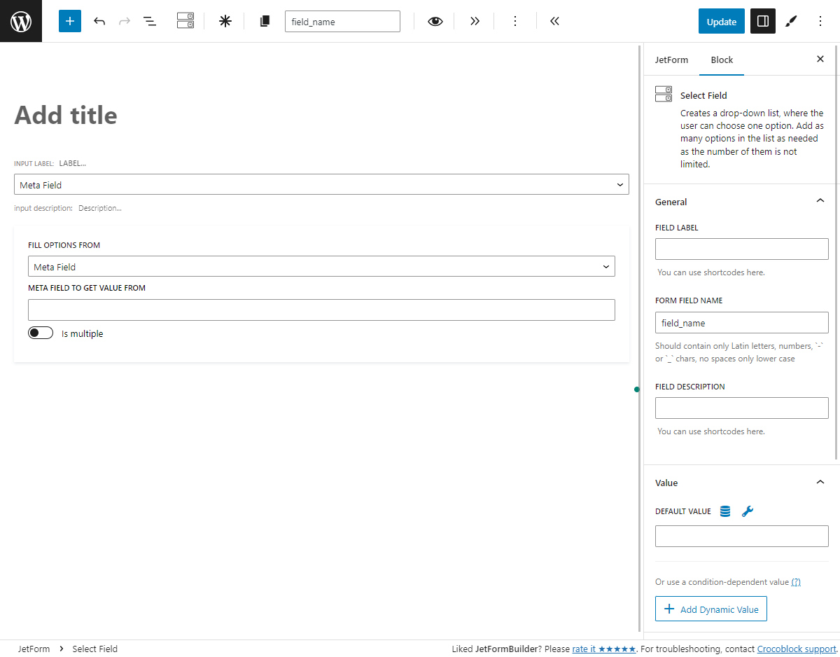
Meta Field
Custom meta field data can also be used to create an options list. The information for each post will be different, and you can show it separately from the post’s meta fields. Be aware that this type of source allows you to display only the values of the custom meta fields created with plugins like JetEngine or ACF.
Type the name of the meta field into the META FIELD TO GET THE VALUE FROM bar. The meta field values can also be used as calculated values.
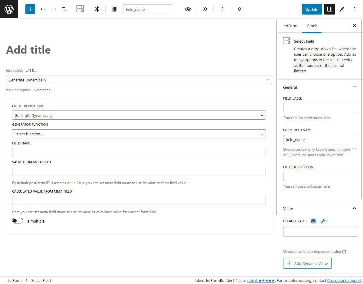
Generate Dynamically
This source can create two types of dynamically generated lists. In this case, “dynamically generated” means that it is not taken from the meta fields. The list is created by one of the generator functions you choose.
GENERATOR FUNCTION. It defines the rules of options list generation. It has such options:
“Numbers Range by meta value.” Creates a range of numbers from 1 to the number in the meta field you define in the FIELD NAME bar. For example, you have a meta field “Available items,” and for the post where the form is placed, it has a value of 5. In this case, the “Numbers Range” will create a list containing numbers from 1 to 5;
“Numbers Range by manual input.” Enter numbers into the START OF RANGE and END OF RANGE fields to create a list of numbers. The STEP field defines the gap between numbers in the list. E.g., if you set the “1” in the START OF RANGE, “10” in the ENG OF RANGE, and “3” in the STEP, the options will be: “1, 4, 7, 10”;
“Get values list from database.” After you enter the meta key into the FIELD NAME bar, this function searches the database and shows the list of values of every position with a matching key. Be aware that you have to create database fields with that key before using this function;
“Get values list from JetEngine list options.” With the JetEngine plugin, you can add custom meta fields to posts, terms, or users via the Meta Boxes feature. Enter the meta key into the FIELD NAME bar to get a list from the Meta Box meta fields;
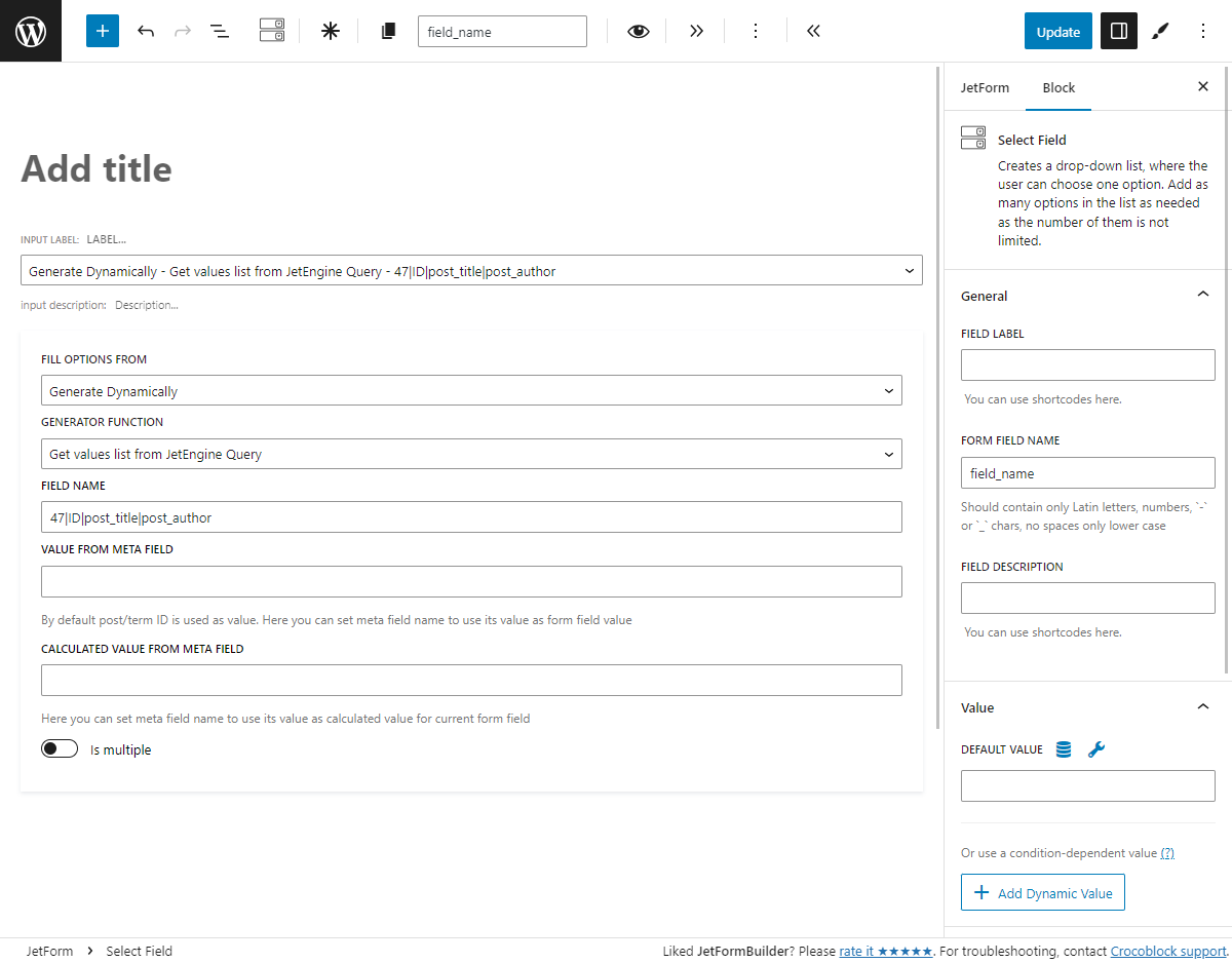
“Get values list from JetEngine Query.” Creates a list of options based on the query results of the custom query built with the Query Builder tool of the JetEngine plugin. This option gets values from any type of custom query (post query, terms query, etc.). For example, you have built a custom query of the Users Query type that filters down the list of users by a custom meta field. You can use this query to generate a list of queried users as options for the multi-optional fields. Mind that this generator function requires installing the JetEngine plugin. In the FIELD NAME bar, specify the ID of the custom query, property to get values from, property to get labels from, and property to get calculated value from. If you use Posts Query and you do not need to use a calculated value, you may just set the query ID. An example for the Posts Query may look like this:
47|ID|post_title|post_author
where
“47” is the ID of the custom query;
“ID” is the property that provides values;
“post_title” is the property that provides labels;
“post_author” is the property that provides calculated values.
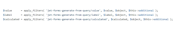
Values, labels, and calculated values can be filtered:
In this case, $this->additional is args_additional parameter.
Other source settings:
VALUE FROM META FIELD. You place the name of the meta field in the FIELD NAME bar, and that meta field is attached to some post type. The IDs of that post type items are used, by default, as the values of the list options. But you can choose another meta field to take values from and type its name here.
CALCULATED VALUE FROM META FIELD. Paste the name of the meta field into this bar, and its values will be used for Calculated Field formulas.
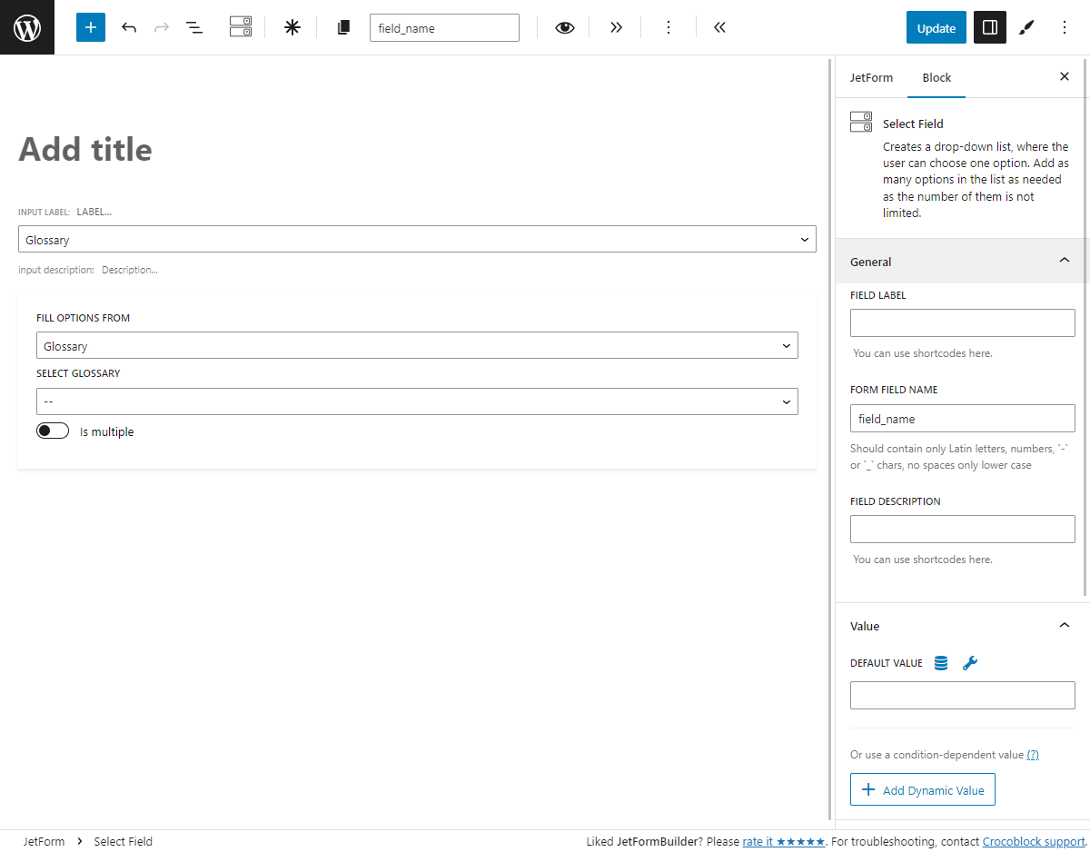
Glossary
The JetEngine Glossary feature allows you to create a list of the options and use it for different custom meta fields and form fields.
Pick the needed glossary from the SELECT GLOSSARY drop-down menu.
Enabling Custom Options
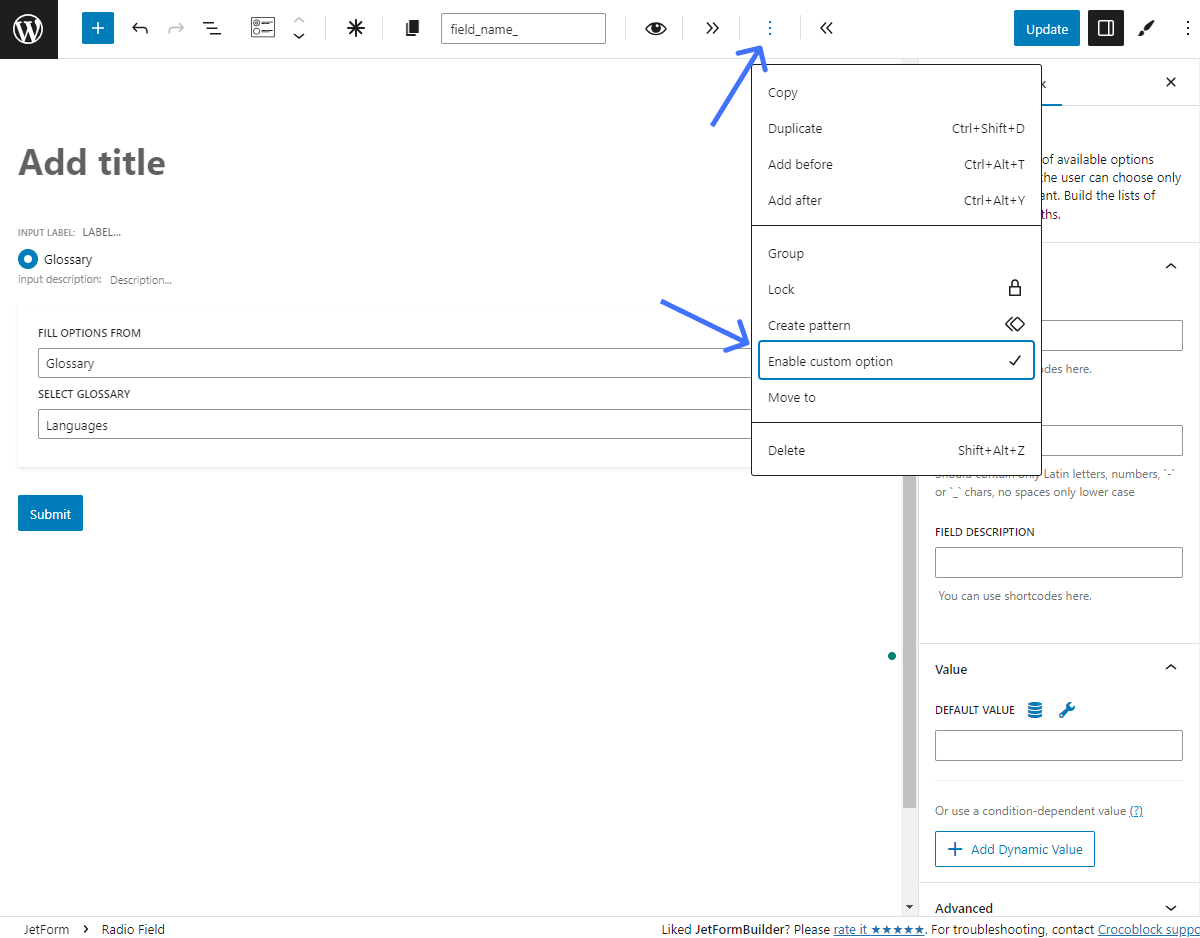
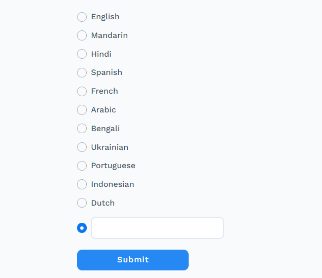
This option is available only for the Radio and CheckboxFields. It allows users to add custom options from the front end. To activate this feature, hit three dots and click the “Enable custom option.”
For the Radio Field, the input field appears as one of the options. When users check the option, the input field becomes enabled, and they can enter the custom option.
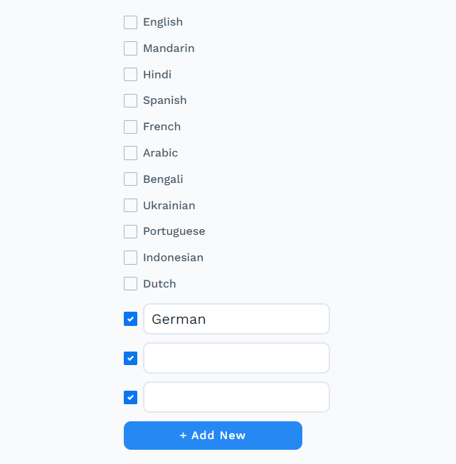
For the Checkbox Field, the “+ Add New” button appears, and users can click it to add a checked custom option with the input field. If they uncheck it and leave the input field empty, the option disappears. The input text will be saved if the field is not empty.
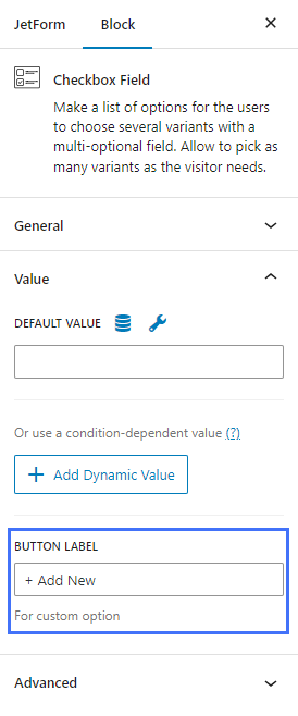
To change the button text, proceed to the Checkbox Field Block settings and go to the BUTTON LABELfield in the Value tab.
That’s all. Now you know how to add a list of multiple options into the JetFormBuilder form and allow users to choose from using multi-optional form fields, such as Radio, Select, and Checkbox.
All the form fields have this settings section as well as the General settings unfold. It contains a set of additional features that can vary a little for different fields. Let’s take the Text Field as an example and take a closer look at the settings.
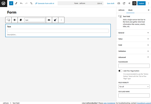
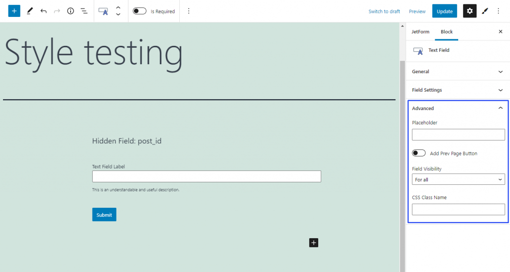
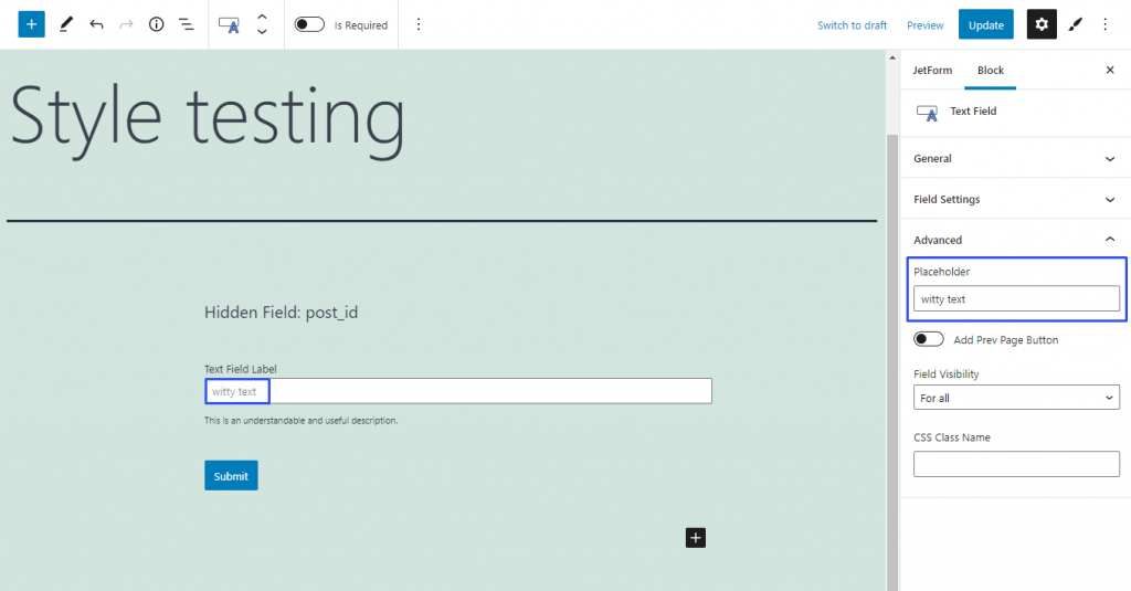
Placeholder. The text you will type in here will be shown in the bar until the user clicks on it. You can write an example of data you want the user to put in. Unlike the Default Value, this text doesn’t count as data that fills in the bar, so, if the field is required, the user would still have to insert his/her own information;
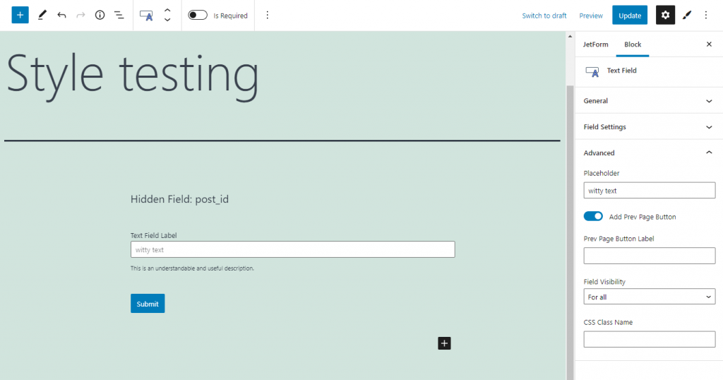
Add Prev Page Button. If you have used the Form Break Field to create several independent pages, you might want to give the users an opportunity to turn back to the previous page. In this case, turn this toggle on and type in the name of the button in the Prev Page Button Label bar;
Field Visibility. You can make a certain field invisible for some of the users. Here you can choose who will be able to see it: all users (For all), the ones who are logged in (Only for logged in users), or those who are not (Only for NOT-logged in users);
CSS Class Name. This bar is for the CSS code if you would like to add it.
This settings section is common for all the form fields and contains almost the same set of options. Let’s take a closer look at it on the example of the Text Field.
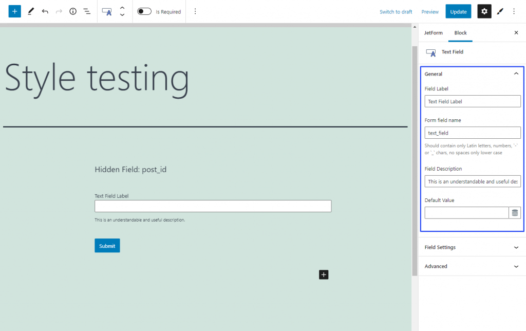
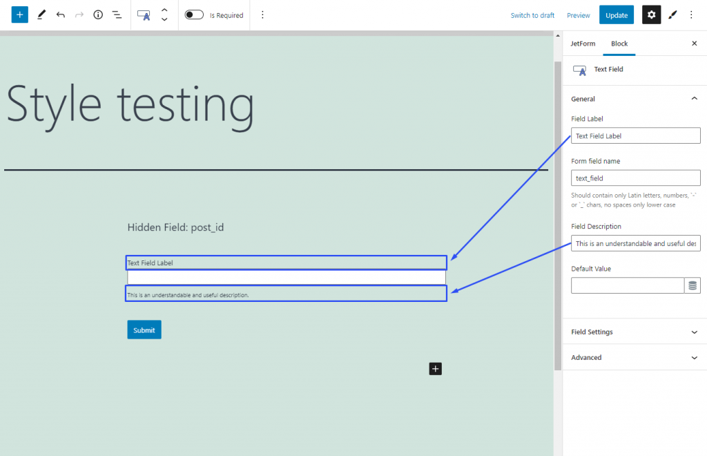
Field Label. It is a name that appears above the field bar and is visible to users. Usually, it shows the users what kind of information this field requires. For example, it can be Name, Email, or Country;
Form field name. This name is visible only to you and is used as an ID. Usually, it originates from the Field Label. Be aware that you can use only Latin letters for this name. Numbers, hyphens, and underscores are also acceptable but don’t leave spaces. If you want to use two words to name the field, divide them with an underscore or hyphen;
Field Description. If you need to give the user some additional explanations about how to fill in the field, you can do it in the description. The text you insert into this text bar will appear under the field;
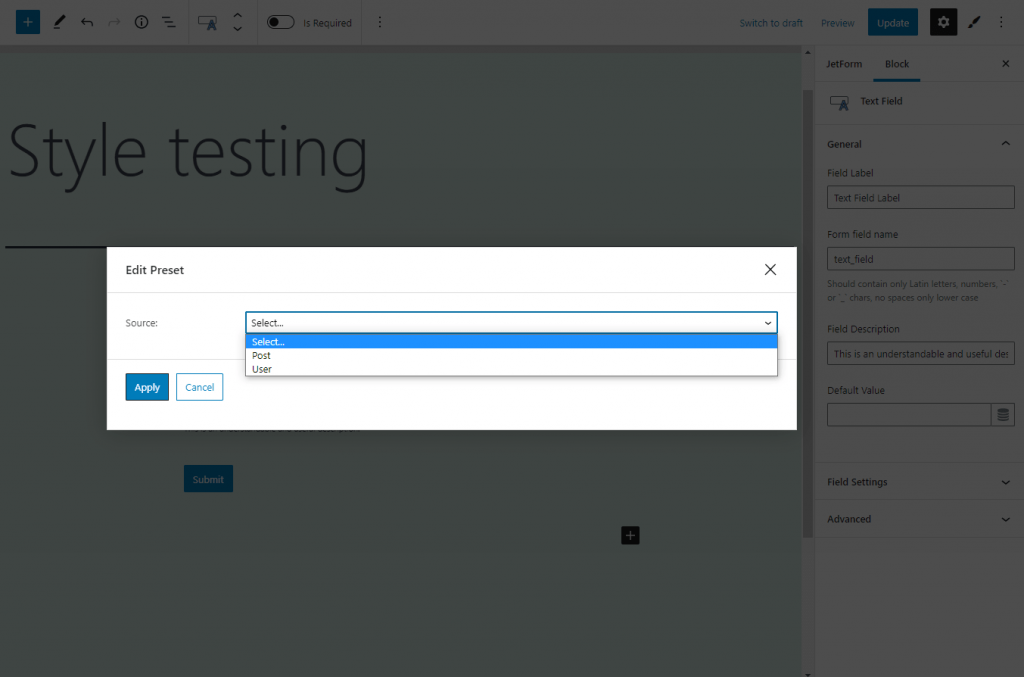
Default Value. The data you place here will be automatically added to the field. The user will be able to change it; however, if he won’t, this information will be added instead. You can also add a preset here. Click the button with a cylinder-shaped icon and the preset creation window will pop up.
You can choose to take the information from the Post or User data.
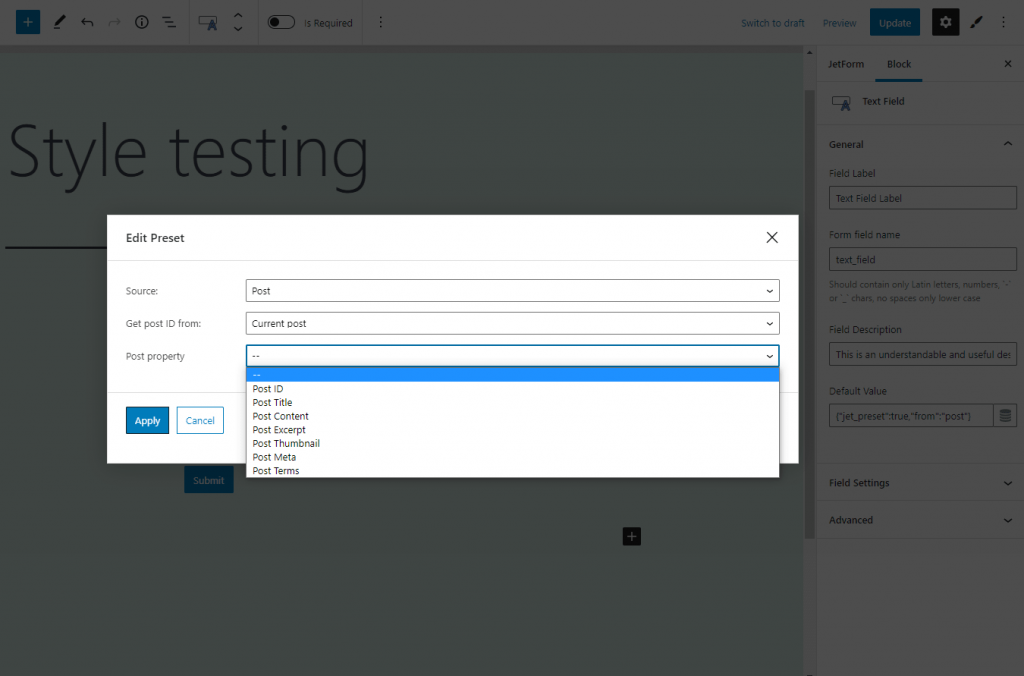
In the Get post ID from select, gather data from the current post or add the query variable. Concrete information can be chosen in the Post property drop-down menu. More details about the Preset creation you can learn from this tutorial.
We use cookies to assist you with navigation and analyze site traffic. If you continue to use this site, you consent to our use of cookies.