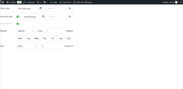
The Advanced Date Field block is intended to select the needed date range with the required recurrence of the events. The dates and times are stored in the site’s database in the YYYY-MM-DD HH:MM format.
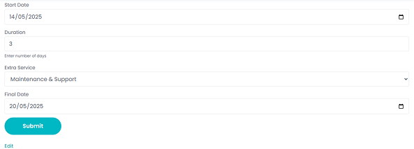
On the front end, the Advanced Date Field is presented by two Datetime Fields and corresponding toggles that allow setting the recurrence rules.
The JetFormBuilder’s Advanced Date Field block is fully compatible with the JetEngine plugin’s side in the Dynamic Calendar module, as well as the JetEngine’s “Advanced Date” meta field. Therefore, the JetFormBuilder’s Advanced Date Field block is available if the JetEngine’s meta field and the Dynamic Calendar module are activated.
Due to the full compatibility with the JetEngine plugin, this block allows data to be entered into Custom Post Types via the “Insert/Update Post” Post Submit Action.
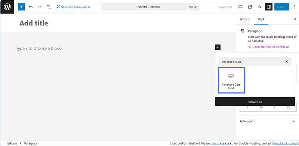
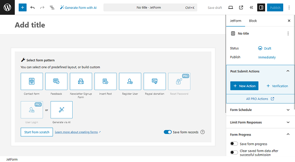
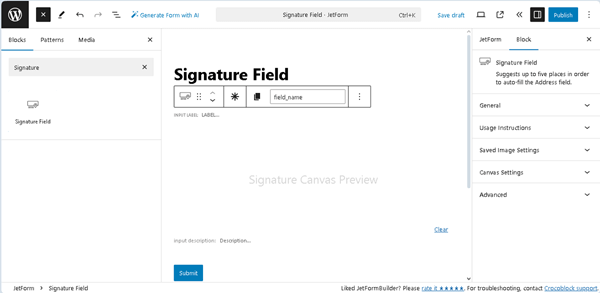
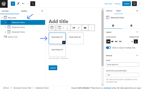
Inserting the Advanced Date Field Block
This block can be added to any form by finding it in the search bar of the block inserter (the “plus” icon) and placing it where preferred.
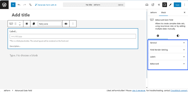
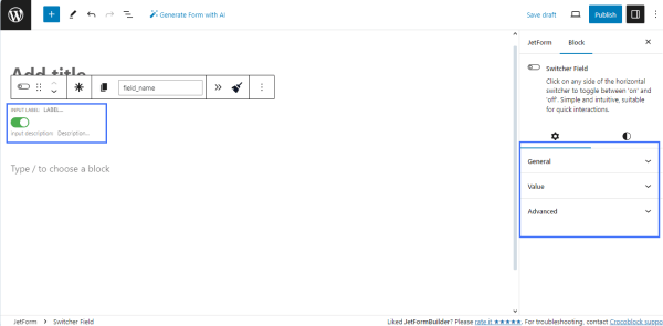
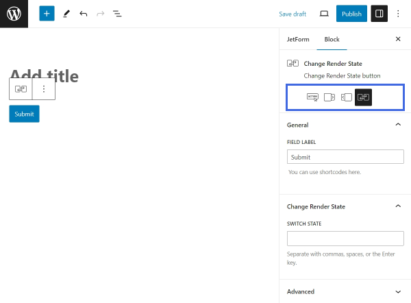
Advanced Date Field Settings
The block settings are divided into two groups: Settings and Styles. The Settings tab consists of the General, Field Render Setting, Labels, and Advanced settings.
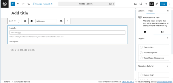
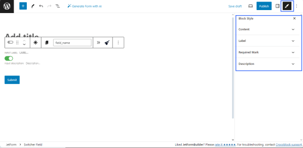
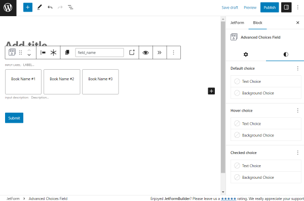
In turn, the Styles tab is intended to specify the colors and backgrounds for different field elements.
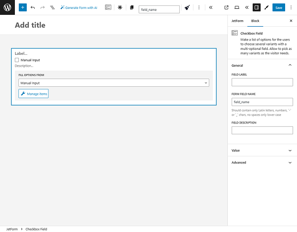
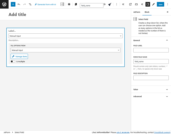
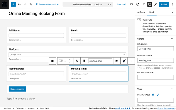
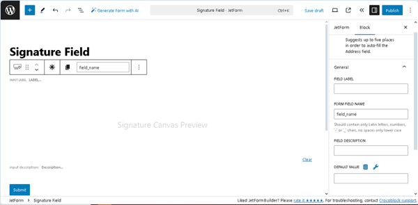
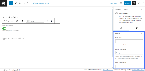
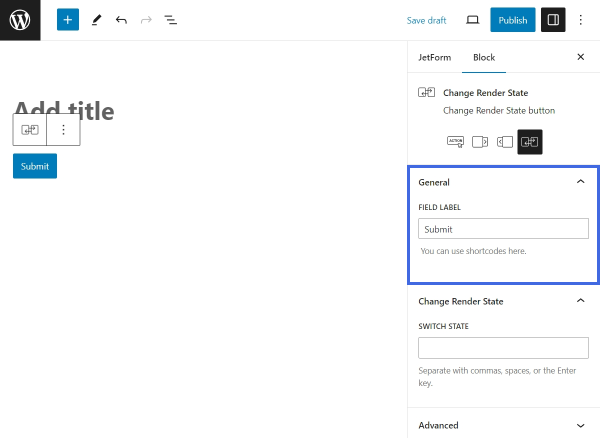
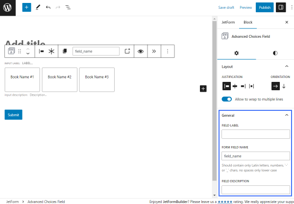
General
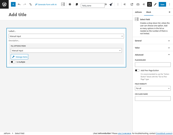
The General settings are presented by the following fields:
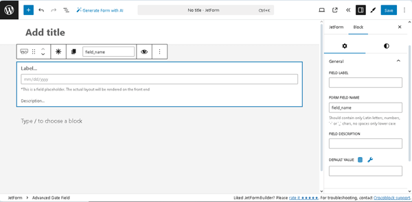
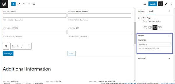
- FIELD LABEL ㅡ a field that allows inserting the field’s label;
- FORM FIELD NAME ㅡ a field designed for the field’s name. This field will be filled out automatically after the FIELD LABEL is added;
- FIELD DESCRIPTION ㅡ a non-required field intended to insert the field’s description;
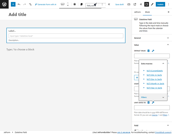
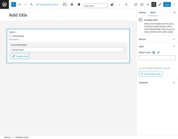
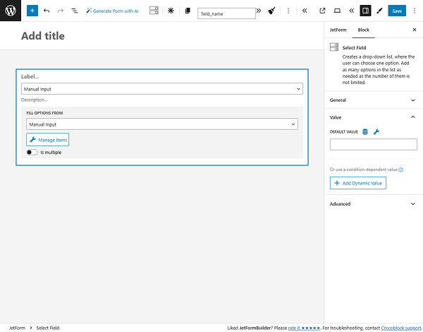
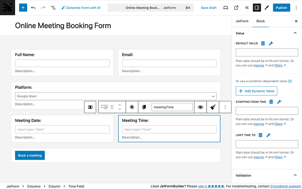
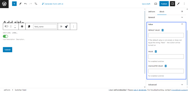
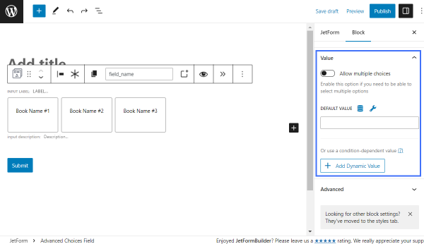
- DEFAULT VALUE ㅡ a text field that allows inserting data that will be automatically shown in the field. However, it can be changed by the user who completes the form.
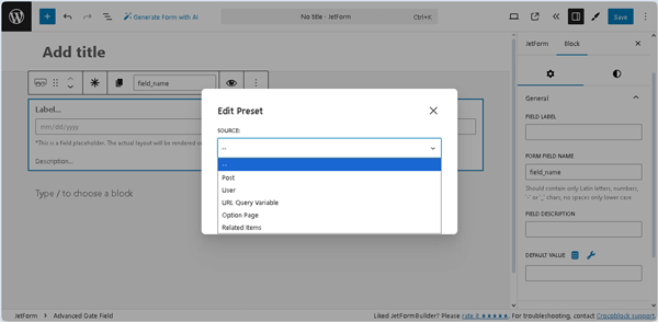
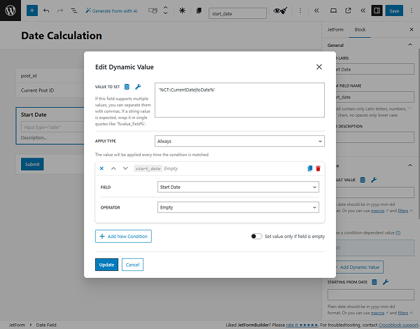
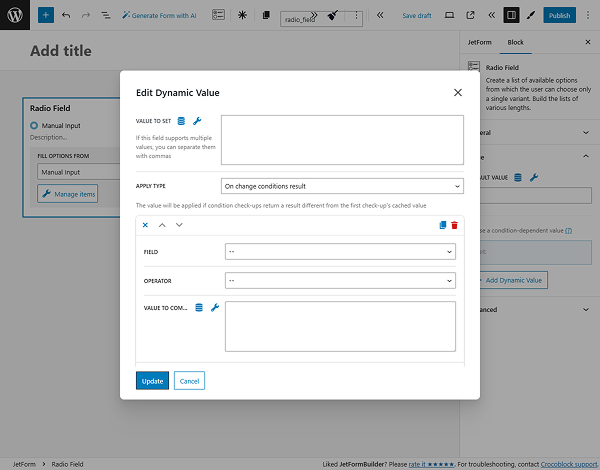
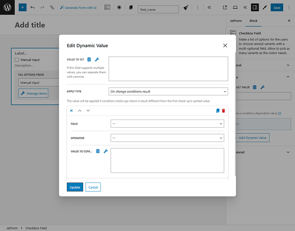
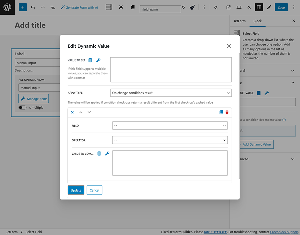
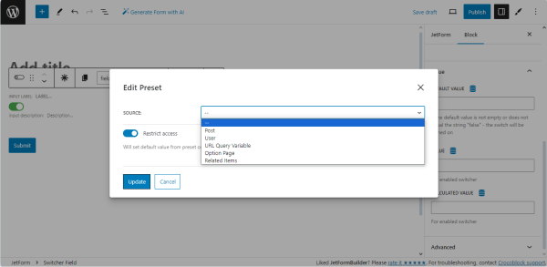
Pressing the “Dynamic Tag” icon opens the Edit Preset pop-up with the SOURCE drop-down list, which has the following options: “Post,” “User,” “URL Query Variable,” “Option Page,” and more. In turn, each selected option activates the appropriate field, allowing one to choose the needed data. Also, this pop-up includes the Restrict access toggle that allows restricting users who are allowed to edit this value.
The required settings should be saved by pressing the “Update” button.
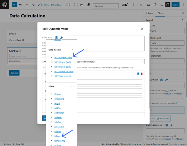
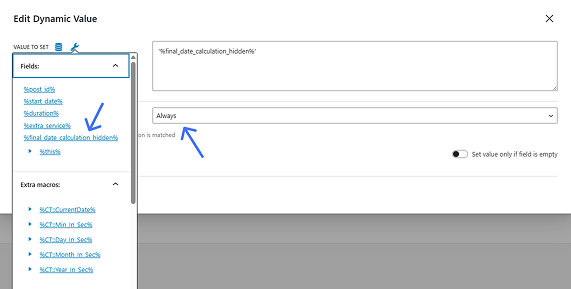
Pressing the “wrench” icon next to the DEFAULT VALUE field unfolds the list of the form’s Fields, available extra macros, and filters:
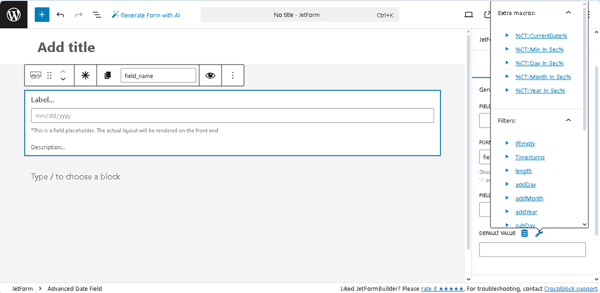
- %CT::CurrentDate% — a macro that returns the date as a timestamp (to use this macro, the quotation marks are required as follows: ‘%CT::CurrentDate%’);
- %CT::Min_In_Sec%, %CT::Day_In_Sec%, %CT::Month_In_Sec%, %CT::Year_In_Sec% — the macros that return the number of milliseconds in one minute, day, month, year, correspondingly, and can be used, for example, to get the difference between dates in the needed values.
The macros can be used individually or with filters to provide calculations, return timestamps, etc. The following filters are available for the Advanced Date Field:
- ifEmpty — a filter that returns the value passed in the argument if the macro returns an empty value;
- length — a filter that returns the length of the string or array;
- T — a filter that returns the timestamp and is usually used in conjunction with the Date, Datetime, and Time Fields;
- toDatetime — a filter that gets the timestamp from the macro and formats it according to the field format;
- addMin, addHour, addDay, addMonth, addYear — filters that add minutes, hours, days, months, and years correspondingly via an argument to a macro that returns a date or timestamp;
- subMin, subHour, subDay, subMonth, subYear — filters that subtract minutes, hours, days, months, and years correspondingly via an argument to a macro that returns a date or timestamp;
- setMin, setHour, setDay, setMonth, setYear — filters that set minutes, hours, days, months, and years correspondingly via an argument to a macro that returns a date or timestamp.
Field Render Settings
These settings are presented by the following drop-down and toggle:

- RECURRENCE FORMAT — a drop-down list that allows setting the required recurrence rule and has two options:
- Recurring Rule — a default option that, if selected, displays the Is requiring toggle on the front end to set the recurrence rule by selecting the needed day, week, month, etc.;
- Manual Input — an option that, if selected, displays the “+ADD DATE” button(s) on the front end to choose the needed date(s) manually;
- Allow timepicker — a toggle that enables the time picker;
- SAVE AS — a drop-down list that allows saving the dates in the “Date” or “Timestamp” formats.
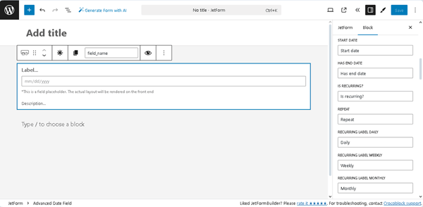
Labels
These settings are a set of text fields to insert the labels that will be shown on the front end on the corresponding fields or toggles: START DATE, HAS END DATE, IS RECURRING?, REPEAT, RECURRING LABEL DAILY, RECURRING LABEL WEEKLY, and more.
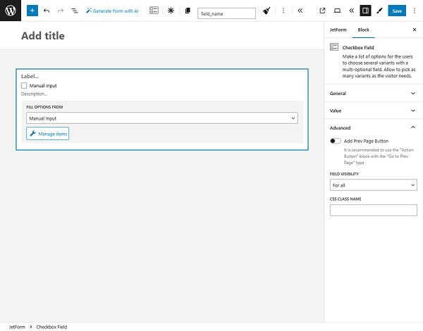
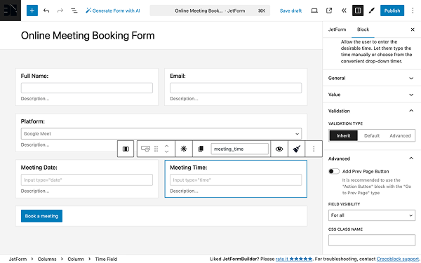
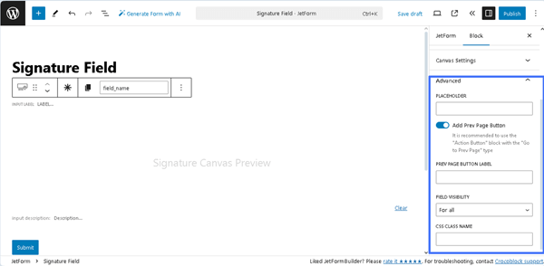
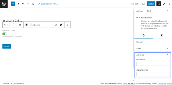
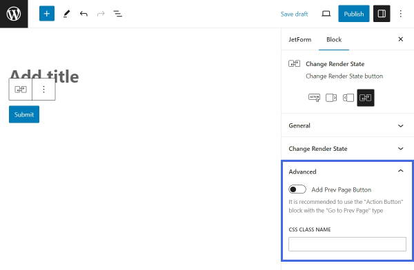
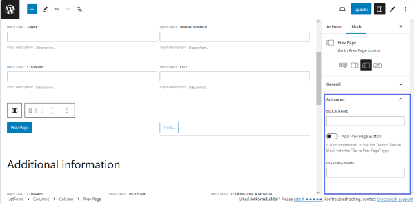
Advanced
The Advanced section includes the following fields:
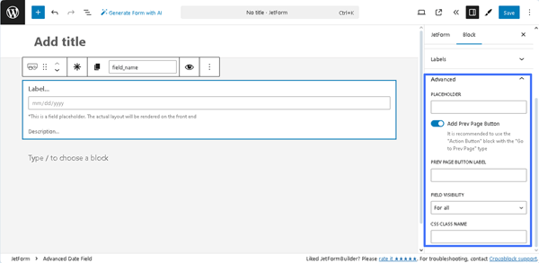
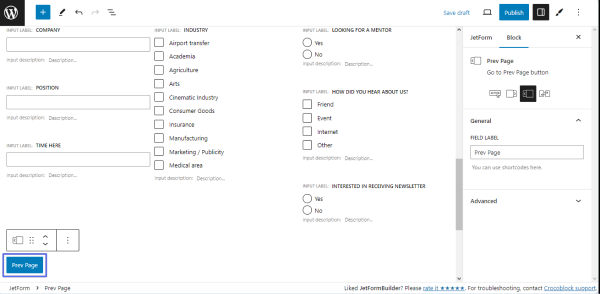
- Add Prev Page Button ㅡ a toggle that enables the PREV PAGE BUTTON LABEL, a field for inserting text that will be displayed on the corresponding button (if added);
- FIELD VISIBILITY 一 a drop-down list that allows selecting who can observe the block. It includes the following options: “For all,” “Only for logged in users,” or “Only for NOT-logged in users”;
- CSS CLASS NAME 一 a text field that allows inserting an additional CSS class to design the block field.
The JetFormBuilder Plugin: Looking Through Advanced Settings tutorial explains how to configure the Advanced settings.
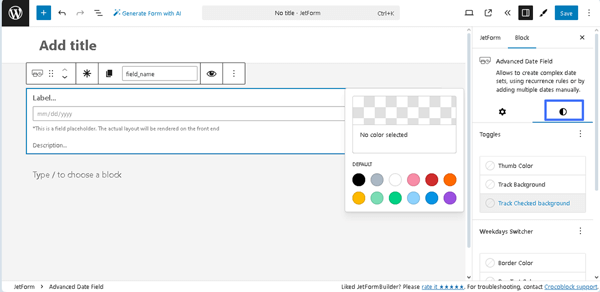
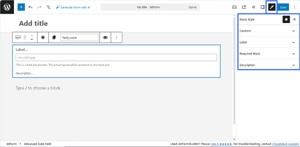
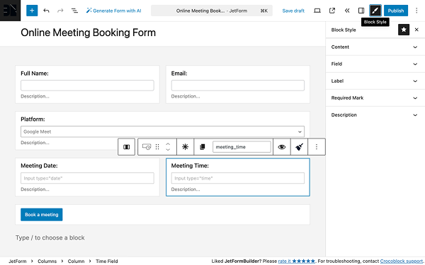
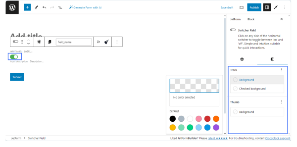
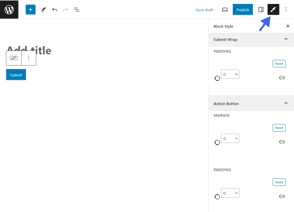
Style Settings
The Style settings are intended to set the colors and backgrounds for the Toggles (e.g., “Thumb Color,” “Track Background,” “Track Checked background”), Weekdays Switcher (e.g., “Border Color,” “Day Text Color,” “Day Background,” “Day Checked Background”), and Manual Add Date (e.g.,”Color” and “Color Hover”).
Also, the free JetStyleManager plugin allows more customization of the Alignment, Border, Color, Margin, Padding, and Typography settings of the Advanced Date Field.
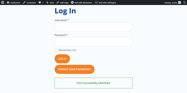
That’s it. Now you know how to use the Advanced Date Field block of the JetFormBuilder plugin for WordPress and manage its settings.


