Filling out a comprehensive form can be a tiresome process for users.
Optimize the process by creating a multi-step WordPress form with a step indicator using the JetFormBuilder plugin. This free WordPress plugin allows customizing a form and making it more user-friendly.
Let’s learn some tips for making the form more convenient to fill out.
Upgrade the Form
- Group fields logically — divide the form fields into coherent sections with the help of the Form Page Break block. Name these steps accordingly;
- Use the progress bar — show a step indicator to notify users about the number of steps left until completing the form;
- Set visibility conditions — enable certain fields to display under the specified conditions;
- Optimize the “Next/Submit” buttons — enable the controls to make the form more user-friendly.
As an example, we created two forms that differ in the form break logic. One was made with just form breaks, while the other implies conditional visibility.
Multi-Step WordPress Form
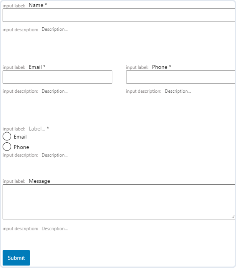
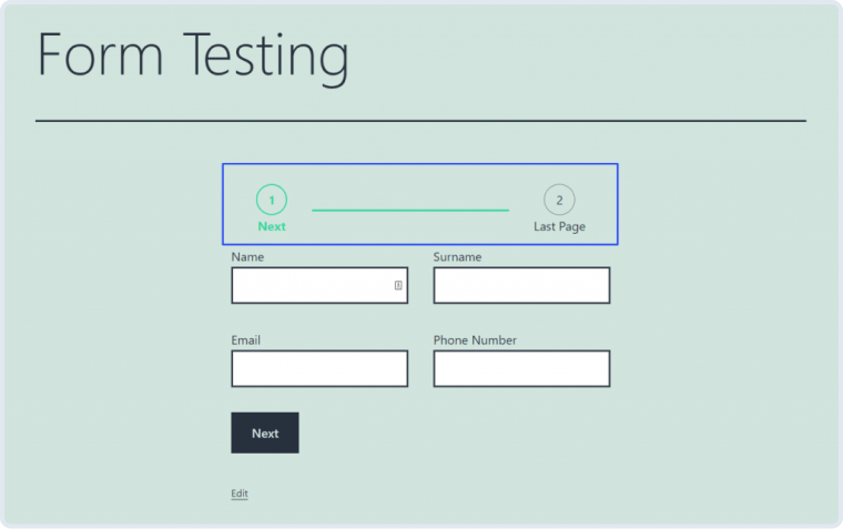
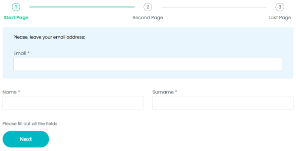
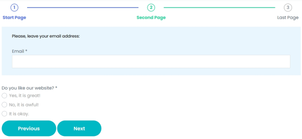
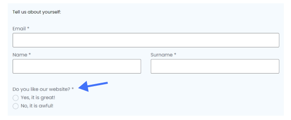
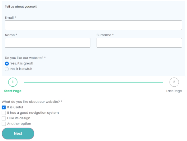
Our first form allows site visitors to leave a website review. It contains a header and three pages. The first page is the “Start Page,” where users can fill out contact information. The second page is called the “Second Page,” where users will rate the website using the Radio Field. The third step is named the “Last Step,” where users can extend their feedback. At the top of each page is a required field for inputting the email address.
To add a multi-step WordPress form, proceed to JetFormBuilder > Add New.
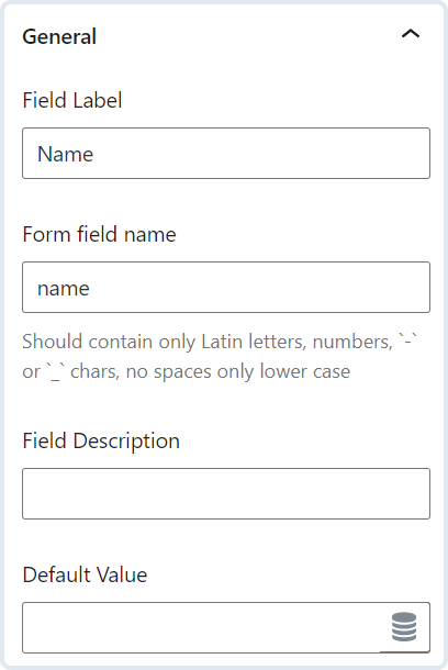
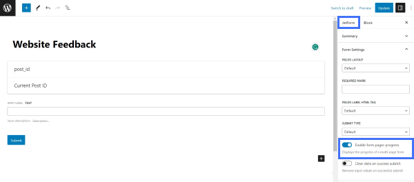
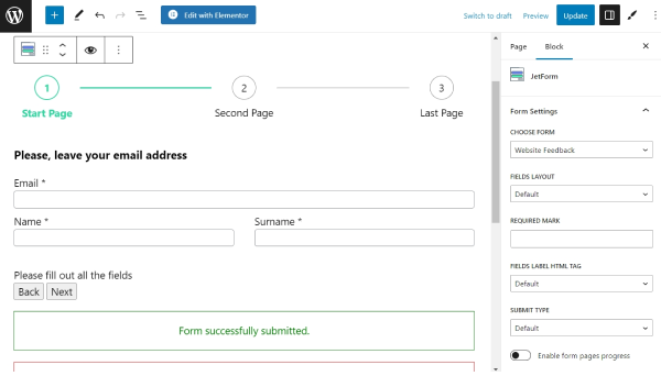
Give a title to the form. For instance, we created a Website Feedback form with the corresponding name.
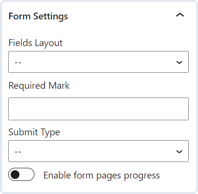
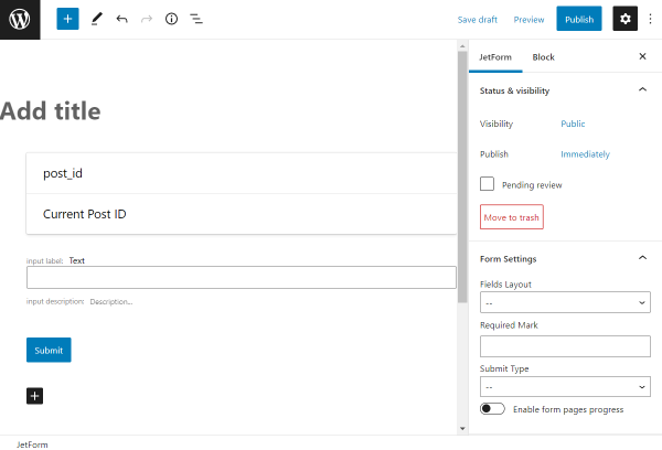
In the JetForm tab of the right sidebar, scroll down to the Form Settings section and toggle on the Enable form pages progress switcher. With the help of this switcher, a progress bar will be displayed on top of each step in the form.
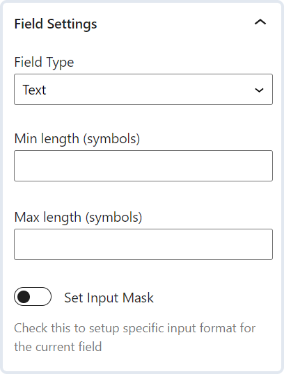
There are three types of fields shown by default: Hidden Field, Text Field, and Action Button. Feel free to delete them if they are unnecessary in your case.
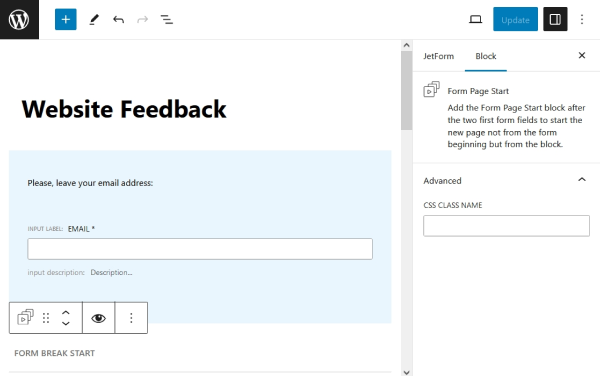
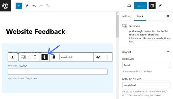
We deleted the Hidden Field and kept the Text Field. In this field, the user is expected to enter the email address, so we named the field “Email” and selected the “Email” FIELD TYPE. Above the Text Field, we added a Paragraph block and entered a message encouraging users to leave their email addresses. This part of the form serves as a header and is visible on every page of the form. You can put these two blocks inside the Columns or Flexible Container blocks to have more control over the layout of this section.
Next, we added the Form Page Start block, which indicates the start of the first form page. Everything above this block is regarded as a header.
Don’t forget to enable the Is Required option near desired fields to make them mandatory.
After that, we started building the first page of the form. We added a Columns block under the Form Page Start block. In each column, we added a Text Field where the user can enter the name and surname.
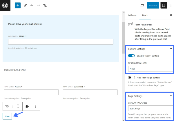
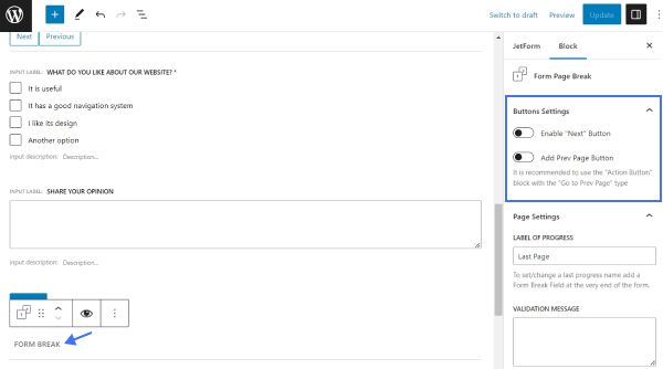
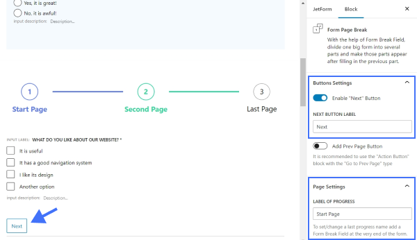
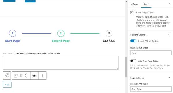
It is the first logical part of the form, and thus, we divided it with the help of the Form Page Break.
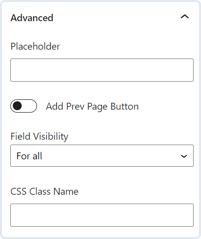
In the Form Page Break block settings, the Enable “Next” Button toggle can be enabled, and the NEXT BUTTON LABEL can be set to change the default name of the “Next” button. In this first Form Back Break block, we didn’t use the “Back” button, so we kept the Add Prev Page Button switcher disabled. The LABEL OF PROGRESS option can be filled in if you want to show the step labels below the progress bar.
Also, you can write the VALIDATION MESSAGE, which will be displayed if users don’t fill out the fields properly.
The first segment of the form is ready. The Form Page Break indicates that the part is complete, and the next section will be displayed after completing the first one.
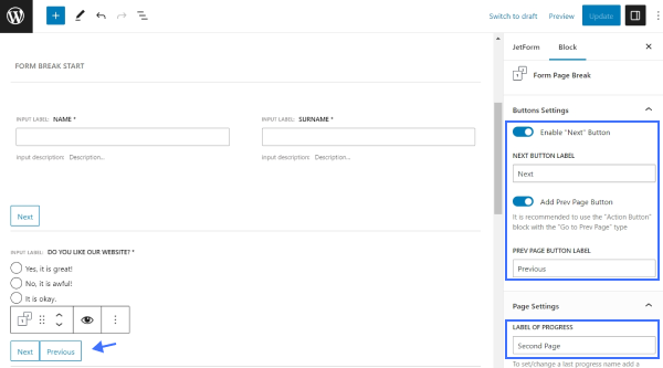
The second part of the form consists of the Radio Field and one more Form Page Break block. Instead of the Radio Field, you can use the Advanced Choices Field block to make its layout more appealing.
This time, we enabled both the “Next” and “Prev Page” buttons to lead users to the previous or next part of the form when clicked.
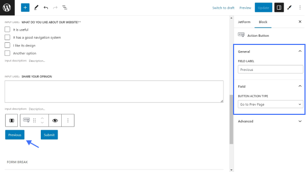
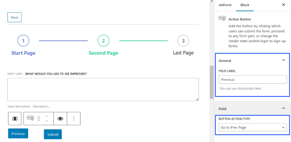
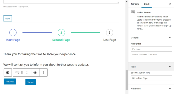
After all the customizations, we added one more part, which is the final, before submitting the form. This time, we put a Checkbox Field and Textarea Field blocks. Then, we placed a Columns block with two columns, and each column contains an Action Button. The first Action Button allows users to go to the previous step in the form, while the second one allows them to submit the form.
Below, we placed the last Form Page Break block.
In the Form Page Break settings, we turned off both the “Next” and “Prev Page” buttons and set only the “Last Page” LABEL OF PROGRESS.
Note that you can customize the fields in the WordPress block editor with the help of the free JetStyleManager plugin. Also, if you display the form using the JetForm widget of Elementor, you can customize the fields in the JetForm widget Style settings.
Additionally, you can use the Advanced Form Validation instead of the default validation to add custom rules and error messages for each form field so users can fill in fields only in the suitable format.
Once you are done with all the customizations, click the “Publish/Update” button.
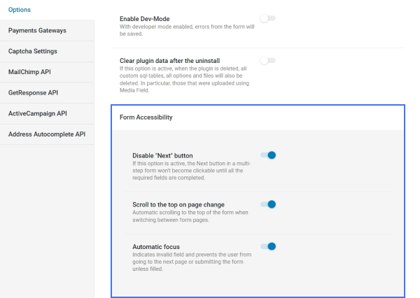
Before placing the form on the page, navigate to the WordPress Dashboard > JetFormBuilder > Settings tab and adjust the settings available for multi-optional forms in the Form Accessibility section.
Let’s add our form to the page and check how it looks.
Go to Pages > Add New or open one of the existing pages or templates. Now, we need to use a JetForm block. If you add the form in Elementor, use a JetForm widget. In other page builders, you can use a shortcode to display the form.
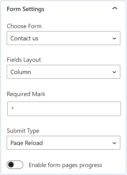
Choose a form that you have just created and customize its settings:
- FIELDS LAYOUT — choose how the label will be positioned relative to the input field. Select either the “Column” or “Row” option;
- REQUIRED MARK — type a symbol that will be displayed near the required fields. By default, it is an asterisk;
- FIELDS LABEL HTML TAG – here, you can select the HTML tag that will represent the field’s label. The available options are “DIV” and “Label”;
- SUBMIT TYPE — pick from the “Post Reload” and “AJAX” options. The second option will not reload the page after submitting a form, while the first one will;
- Enable form pages progress — toggle to add a step indicator to the form. Keep this option disabled if the step indicator is already enabled in form settings;
- ADDITIONAL CSS CLASS(ES) — put the supplemental CSS classes if needed.
When you are done editing, click the “Publish/Update” button. Now, you can check the form on the front end.
Note that when going to the next page, the email field stays on top of the page.
The WordPress multi-step form is ready. To make the form logic more complex, check the next chapter about creating a multi-step form with conditional logic.
Multi-Step WordPress Form with Conditional Logic
To build a multi-step form with conditional logic, head to the JetFormBuilder > Add New tab.
We provide an example, while you can create any other form suitable for your needs.
We named the form and deleted the default Hidden, Text, and Action Button Fields since we don’t need them.
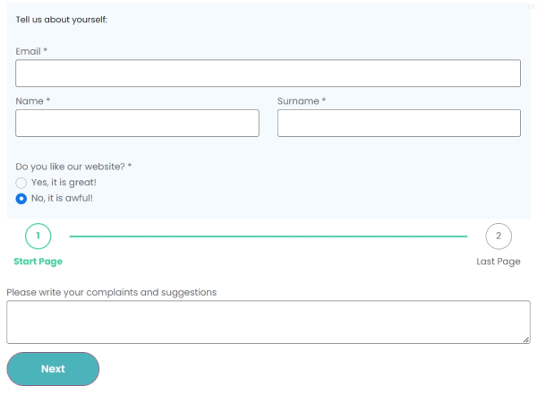
The goal was to create a form to gather user feedback about the website. The form consists of three sections: the first to enter the contact information, the second section to enter the positive feedback, and the third multi-step section to enter the negative feedback. The second and third sections will appear conditionally – if the user decides to share the positive feedback, the second section will be displayed; if the feedback is negative, the third section will appear. To let users choose which feedback they want to share, the first section will contain a Radio Field.
Let’s build the first section. We added three Text Fields for user email, name, and surname, and one Radio Field. The fields can be separated into columns with a Columns block if needed.
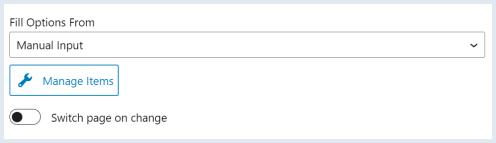
In this case, the Radio Field options were filled in manually. Feel free to use other sources from the Fill Options From drop-down menu.
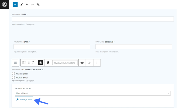
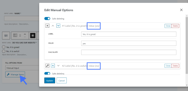
We hit the “Manage Items” button and set the values as “yes” and “no,” as we need them to implement the conditional logic.
This part of the form is the main one. Depending on the answer given in the Radio Field, the following fields will be changed. Let’s build this logic with the help of a Conditional Block.
We added a Conditional Block to the page. Inside, we built the content of the second section that should appear if users select the “yes” answer in the Radio Field above. This section is divided into two steps.
Firstly, we added three blocks inside the Conditional Block: a Progress Bar, a Checkbox Field, and a Form Page Break block. These blocks constitute the first step in the form, where users need to fill the Checkbox Field.
The Progress Bar block doesn’t require any configuration. In the Checkbox Field block, you can enter the options of your choice.
Let’s take a closer look at the Form Page Break block settings. We filled in the LABEL OF PROGRESS in the Form Page Break settings to change the default Progress Bar label for the first step, hit the Enabled “Next” button toggle, and set a label to this button.
After we finished building the first step of the form, we proceeded to the second step. Below the Form Page Break but still inside the Conditional Block, we added a Progress Bar, a Textarea Field, and a Columns block with two columns. In each column, we inserted an Action Button block.
The left Action Button will lead users to the previous page, and the right Action Button will submit the form.
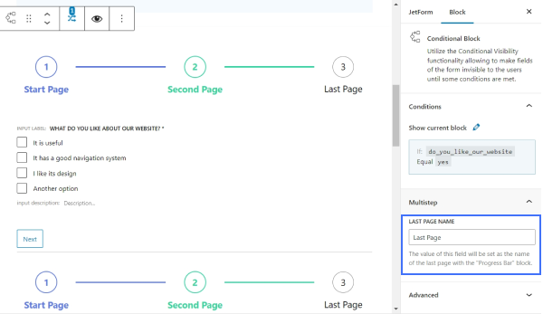
Now, we can move on to configuring the Conditional Block itself.
Firstly, we set the label for the last step of this multi-step section in the LAST PAGE NAME input field.
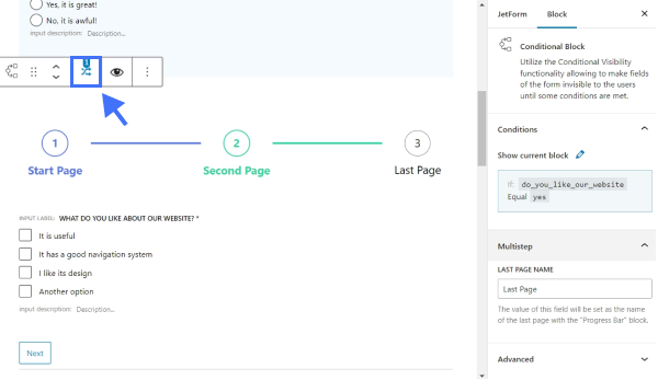
Then, we hit the “Conditional Logic” icon to set conditions for the Conditional Block.
We defined conditions for the “yes” option: we selected the Radio Field label from the FIELD drop-down menu, chose the “Equal” OPERATOR, and set the “yes” VALUE TO COMPARE.
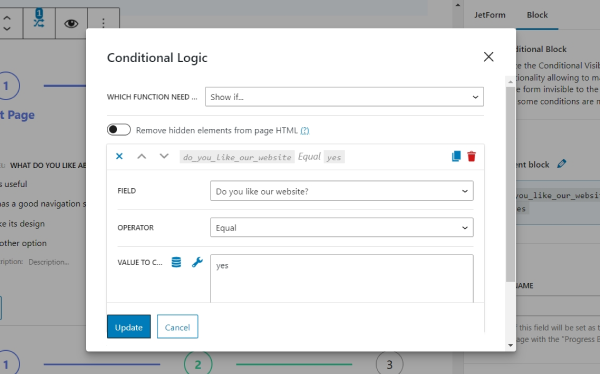
After adjusting all the Conditional Block settings, we pushed the “Update” button.
Let’s add one more Conditional Block for the “no” value. If users decide to leave negative feedback, the form will present the content of this Conditional Block.
To complete the first part of this multi-step section, we added a Progress Bar, Textarea Field, and Form Page Break blocks.
We duplicated the Form Page Break block settings from the previous setup.
To build the second page in this section, we added a Progress Bar, a Paragraph, and two columns with Action Buttons, the same as previously.
We clicked the Conditional Block to set the LAST PAGE NAME and conditions.
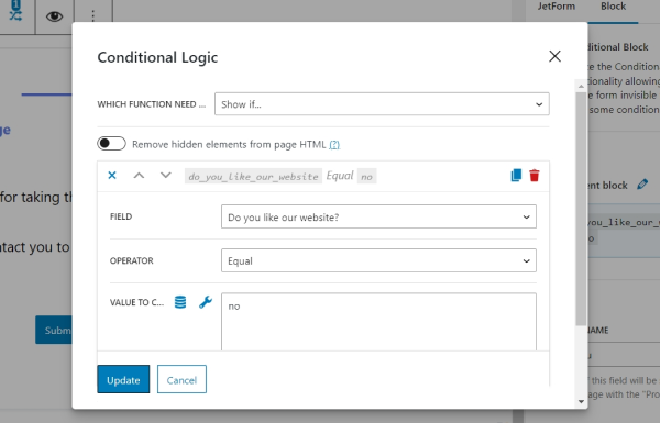
We hit the “Conditional Logic” icon to open the corresponding pop-up.
We defined conditions for the “no” option: we selected the Radio Field label from the FIELD drop-down menu, chose the “Equal” OPERATOR, and set the “no” VALUE TO COMPARE.
We updated the Conditional Logic by hitting the “Update” button.
Note that you can customize the fields in the WordPress block editor with the help of the JetStyleManager plugin. Also, if you display the form using the JetForm widget of Elementor, you can customize the fields in the JetForm widget Style settings.
Additionally, you can use the Advanced Form Validation instead of the default validation to add custom rules and error messages for each form field so users can fill in fields only in the suitable format.
Once you are done with all the customizations, click the “Publish/Update” button.
Before placing the form on a page, navigate to the WordPress Dashboard > JetFormBuilder > Settings tab and adjust the settings available for multi-optional forms in the Form Accessibility section.
We created a default WordPress page by going to the Pages > Add New tab.
Next, we placed a JetForm block onto the page. We chose a newly created form in the similarly named drop-down menu and adjusted all the following fields:
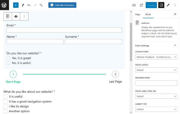
- FIELDS LAYOUT — choose how the label will be positioned relative to the input field using the “Column” or “Row” options;
- REQUIRED MARK — type a symbol that will be displayed near the required fields. By default, it is an asterisk;
- FIELDS LABEL HTML TAG – here, you can select the HTML tag that will represent the field’s label. The available options are “DIV” and “Label”;
- SUBMIT TYPE — pick from the “Post Reload” and “AJAX.” The second option will not reload the page after submitting a form, while the first one will;
- Enable form pages progress — toggle to add a step indicator to the form. Keep this option disabled if the step indicator is already enabled in form settings;
- ADDITIONAL CSS CLASS(ES) — put the supplemental CSS classes if needed.
When everything is ready, we hit the “Publish/Update” button and checked out the result.
Once the “yes” value is picked in the radio field, the form displays one set of fields.
If the “no” value is chosen, other fields are displayed.
Well done. Now you know how to build various WordPress multi-step forms using the JetFormBuilder plugin.