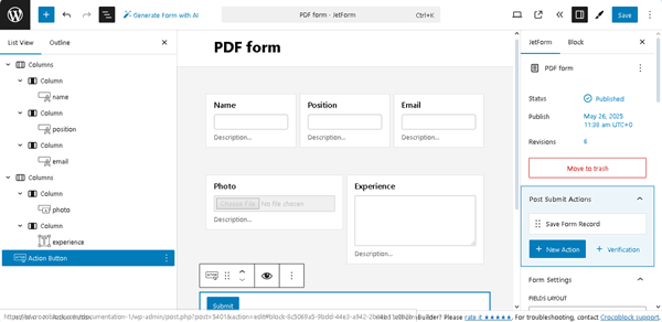
If needed, add other Post Submit Actions (for example, the“Send Email” to mail the generated file).
Finally, to create the PDF download link for users after form submission, insert the “Redirect to Page” Post Submit Actions.
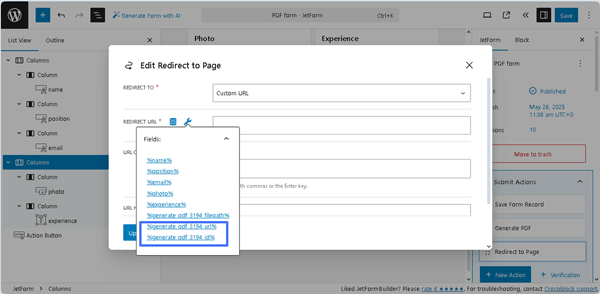
Here, in the newly opened “Edit Action” pop-up, select the “Custom URL” REDIRECT TO and then press the “wrench” icon in the REDIRECT URL field. Next, set the “%generate_pdf_3194_url%” macro to create the PDF download link or the “generate_pdf_3194_id%” macro to create an ID of the file.
Once completed, press the “Update” button on the pop-up and save the form.
Add the Form to a Page
Create a page or open a page/post you need in the editor you prefer. Here, we use Elementor. Place the JetForm widget.
That’s it. Now you know how to use the PDF Attachment add-on for the JetFormBuilder plugin for WordPress to make a PDF download link for users, e.g., when someone submits a form and intends to download it as a ready-made PDF file.
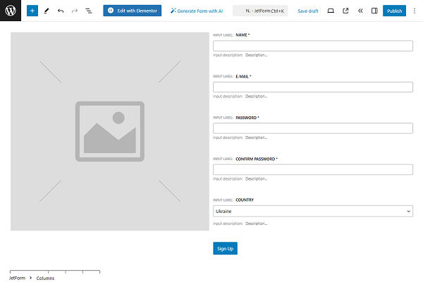
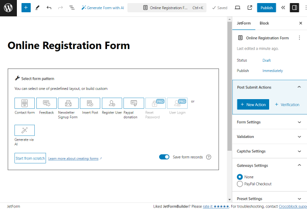
In this tutorial, we exemplify a case of creating two forms for registration, focusing on passing data from one form to another with the help of the JetFormBuilder plugin.
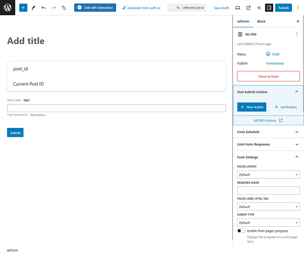
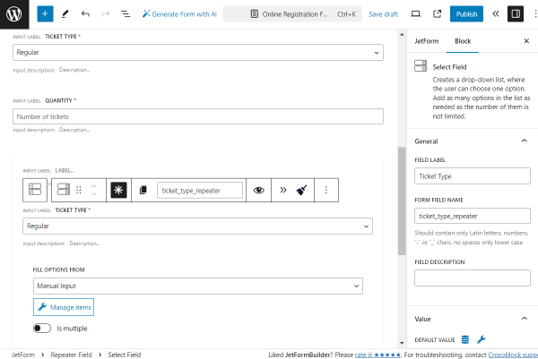
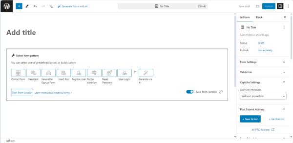
Navigate to the WordPress Dashboard > JetFormBuilder > Add New tab to create a new form. The form will open in the Gutenberg editor. Initially, the form includes the Welcome block, which allows the application of pre-created orAI-generated forms.
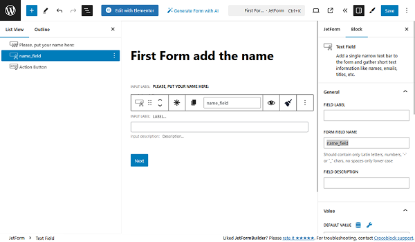
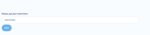
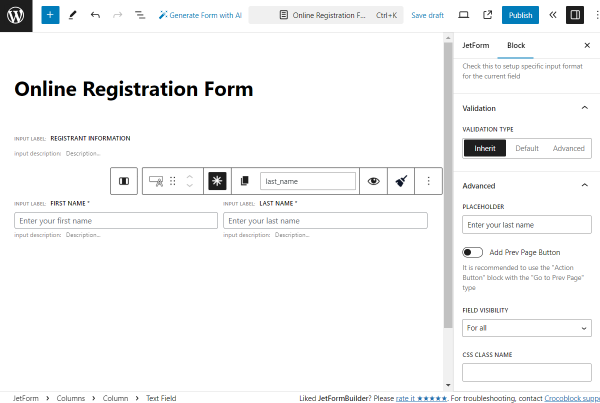
In this case, we type the form’s name (the “Add Name Form” text) and press the “Start from scratch” button to create a fully custom form. Thus, we get the Hidden Field, Text Field, and Action Button.
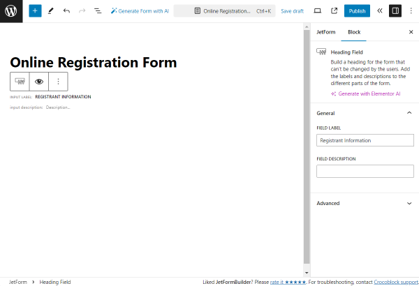
Here, we delete the Hidden Field as it is not necessary in this case.
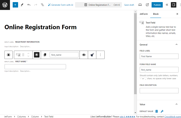
Then, we add the Heading Field to add the “Please, put your name here:” text. Proceeding to the Text Field, we set its name in the FORM FIELD NAME.
We also change the Action Button’s label to “Next”.
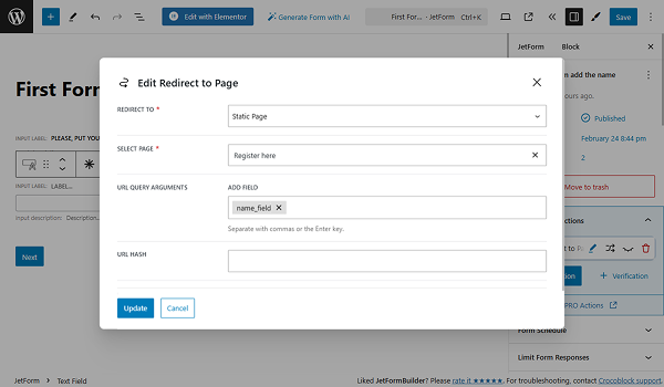
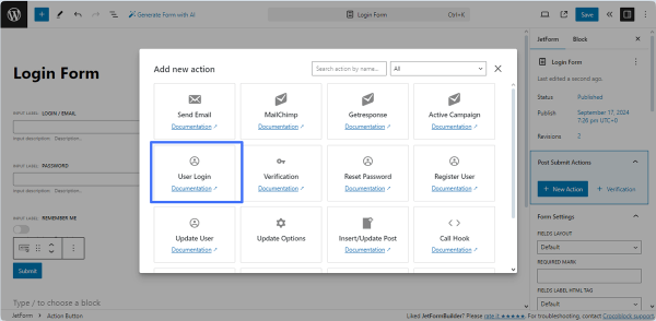
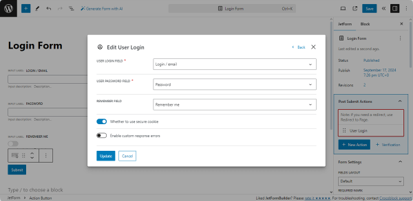
Afterward, we proceed to the Post-Submit Actions settings in the JetForm tab, press the “+ New Action” button, and select the “Redirect to Page” action from the pop-up.
In the editing window, we put the “Static Page” option from the REDIRECT TO dropdown. In the newly appeared SELECT PAGE field, we choose the needed “Register Here” page.
Then, we proceed to the URL QUERY ARGUMENTS — in this select field, we choose the “name_field” out of the fields added previously to the form. When selecting the field(s), their values are used as query arguments and added to the URL.
Click the “Update” button. Now, we are done with the first form, so press the “Save” button in the top right corner.
Setting Up the Second Form
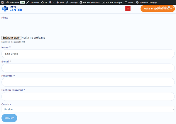
Proceed to the WordPress Dashboard > JetFormBuilder > Add New tab to create another form. After deleting the Welcome block, we insert the premade “Register Form” pattern.
In the next step, we delete the added Image Field and change it to the Media Field. Check the Register Form tutorial to learn how to manage the Register Form pattern’s settings. Also, the Form Creation tutorial details the main fields and settings of the form-building process.
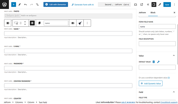
To get the data from the Text Field from our first previously set form, we need to proceed to the settings of the “Name” Text Field in our current form.
We are focusing on the DEFAULT VALUE field — data put here will be automatically shown in the field. Also, it can be changed by the user who completes the form. Click the “Dynamic Tag” icon to open the settings pop-up.
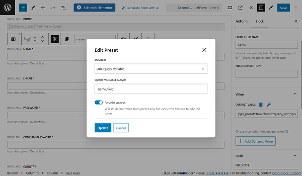
Select the “URL Query Variable” option from the SOURCE dropdown. To the QUERY VARIABLE NAME field, we put the name of the Text Field from the first form — “name_field” in our case.
Hit the “Update” button to save the settings for the Default Value.
When moving on to Post Submit Actions, press the “+ New Action” button, and select the “Register User” action from the pop-up to create the Register Form. You can add more actions if needed. Press the “Save” button when you are ready with the settings.
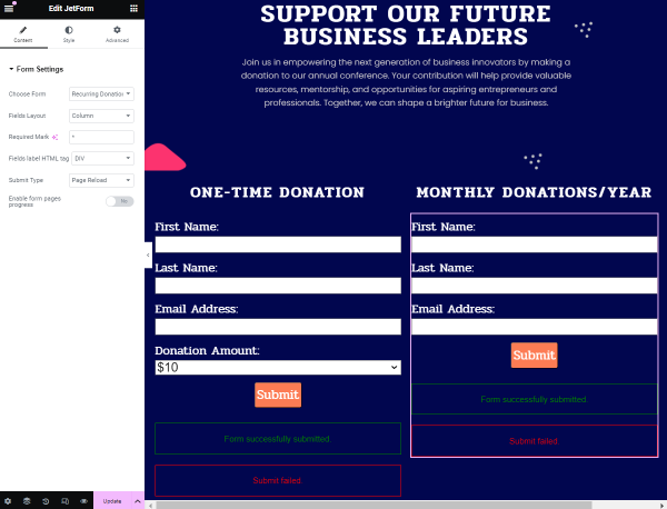
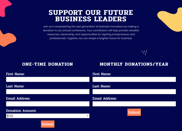
Adding Forms to Pages
Create a page to which you want to add this form or open a previously built page in the Elementor or Gutenberg editors or the Bricks theme. In this case, we opened the Home page in the Elementor editor.
Find the JetForm widget/block/element in the search bar and drag and drop it to the page.
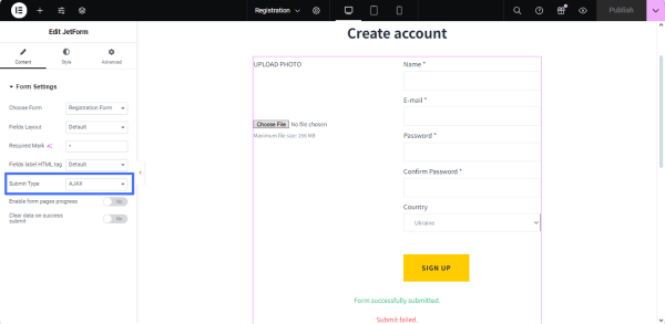
Select the created form in the Choose Form drop-down list and set the “Page Reload” option in the Submit Type drop-down list.
Once we complete it, we click the “Publish/Update” button.
In the same way, we add the second form to the “Register Here” page.
Check the Results
Move to the front end of the Home Page and fill in the “Name” form field.
Press the form’s Action Button (the button with the “NEXT” text in our case). After the correct form submission, we are redirected to the Register Here page, where we see that the “Name” field has the value we set in the first form.
Now, you can fill the other fields and submit the form.
That’s it. Now you know how to pass the data from one form to another, as shown in the example of the registration form for WordPress using the JetFormBuilder plugin.
In this tutorial, you will learn how to add a Signature Field to PDF files. We will describe how to build a form for signing, which will further generate a PDF file with an online signature.
You can add this functionality alongside other Post Submit Actions, such as the “Register User” Post Submit Action to register users who signed the contract.
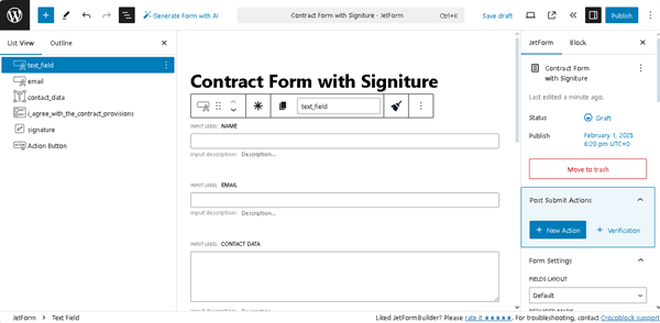
Navigate to the WordPress Dashboard > JetFormBuilder > Add New tab to create a new form. The form will be opened in the Block editor, and the Welcome block, which allows the application of pre-created or AI-generated forms, will be displayed.
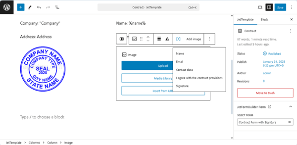
Type the form’s name instead of the “Add title” placeholder (the “Contract Form with Signature,” in this case).
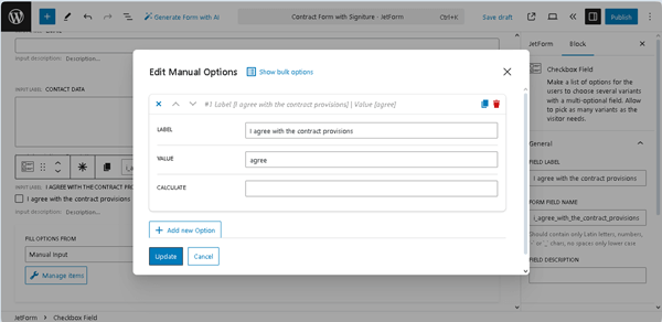
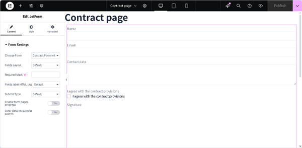
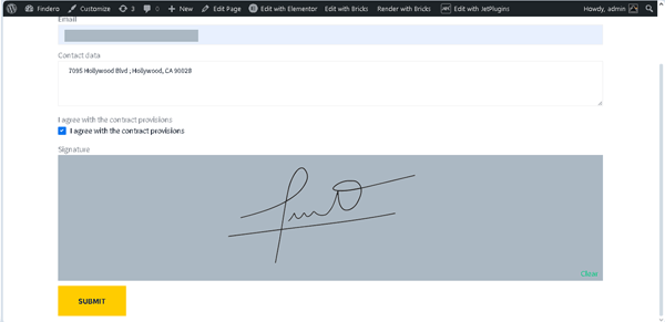
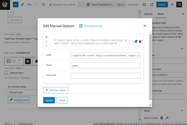
In this tutorial, we add the Text Fields to enter the user’s name and email, respectively, the Texarea Field to enter the user’s contact data, and the Checkbox Field to tick the agreement with the contract provisions. Next, we press the “Manage Items” button and specify the following options in the Edit Manual Options pop-up: insert the “I agree with the contract provisions” text into the LABEL field and the “agree” text in the VALUE field. After that, press the “Update” button.
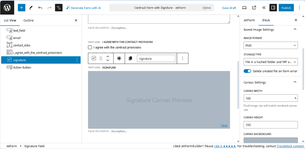
In the last step, we insert the Signature Field so the user can sign the contract.
Next, configure the Signature Field.
First, insert the block field’s name in the FIELD NAME field (in this case, “Signature”), and then the FORM FIELD NAME will be filled out automatically.
Second, select the IMAGE FORMAT to specify the format to generate the final image (in this case, we set the “PNG” option).
After that, configure the STORAGE TYPE settings to specify how to save the generated image (in this tutorial, we select the “File in a hashed folder and WP attachment” option and activate the newly-appeared Delete created file on form error toggle to allow storage of successfully submitted form data). Third, adjust the Canvas Settings. Here, we leave the default values in the CANVAS WIDTHCANVAS HEIGHT, PEN COLOR, and CLEAR BUTTON LABEL settings but select the “Cyan bluish gray” CANVAS BACKGROUND. In this case, we do not intend to save the signature with the color background, but we apply the background color for usability reasons.
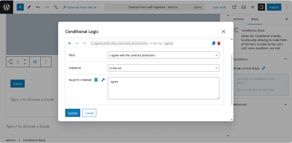
In this case, we intend to allow signing only after the contract has been fully read. Therefore, the Action Button will not be visible until users tick the Checkbox Field and draw their signatures on the Signature Field. To achieve this, we add the Conditional Block to the form and insert the Action Button onto it.
Then, we open the Conditional Block settings window and press the button with the “crossed arrows” icon (located on the top tool panel, to the left of the “Options” button).
After that, in the newly-appeared Conditional Logic pop-up, we select the “Show if …” option in the Which Function Need Execute? drop-down list. Next, we enable the Remove hidden elements from page HTML toggle and press the “+ Add Condition” button to observe all settings. Here, we set two conditions. First, we unroll the FIELD drop-down list in the Conditional Logic pop-up and select the form’s FIELD LABEL of the Checkbox Field (the “I agree with the contract provisions” in this case). After that, we select the “In the list” OPERATORand type the “agree” VALUE TO COMPARE. Then, press the “+ ADD CONDITION” button in the Conditional Logic pop-up.
Next, we select the FORM FIELD NAME of the Signature Field (the “Signature,” in this case) and choose the “Not empty” OPERATOR. After that, we click the “Update” button to save the condition.
Set the Post Submit Actions
Navigate to the JetForm settings tab and open the Post Submit Actions tab. Since we deleted the Welcome block, the “Save Form Record” Post Submit Action was not set by default. We press the “+ New Action” button and add this action to collect and manage data via the JetFormBuilder dashboard. In particular, it allows uploading the generated PDF file as an attachment to the Media Library and displays the appropriate link on the Form Records Page.
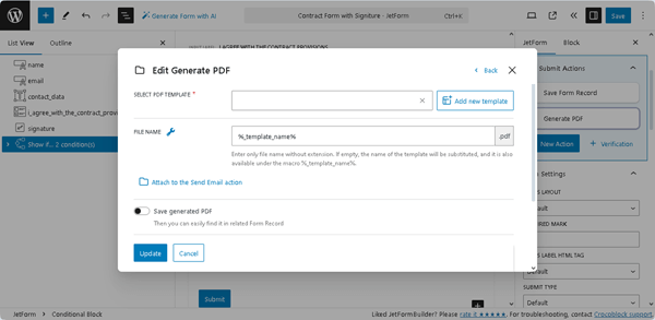
Set the “Generate PDF” Post Submit Action
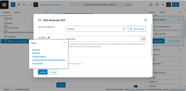
After that, we add the “Generate PDF” Post Submit Action. Next, we click the “pencil” icon to open the Edit Action pop-up and configure the action’s settings. Then, press the “Add new template” button.
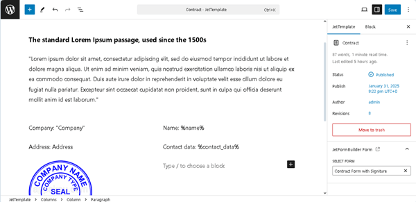
Once done, you will be redirected to a new template. Type the template’s name instead of the “Sample template [locale time]” default text. Customize the template content according to your needs.
In this tutorial, we insert the “Contract” text instead of the default template’s title. Next, we divide the layout into two Columns and add the needed fields and the “%field name%” macro to the template. Read the How to Generate PDF on Form Submission tutorial to learn how to use macros and convert a submitted form to a PDF file with a predefined design.
In the next stage, we add the Image block to the second Column below the %contact_data% macro. We also hit the “[/]” button in the block toolbar to select the needed form field from the drop-down list (here, the “Signature” field).
Finally, press the “Save” button and return to the form. The last step in setting the “Generate PDF” Post Submit Action is selecting the previously built template in the SELECT PDF TEMPLATE drop-down list (the “Contract” in this case) and adding the FILE NAME. Type the required FILE NAME or press the “wrench” icon to select the form field, the name of which will be used as the file name of the submitted form (in this case, we chose the data from the “Name” Text Field to name the PDF file according to the user’s name, e.g., “John-Smith.pdf”).
Also, enable the Save generated PDF toggle. Finally, scroll down the pop-up and type the texts of the ERROR CREATING FILE and ERROR CREATING ATTACHMENT messages.
Set the “Send Email” Post Submit Action
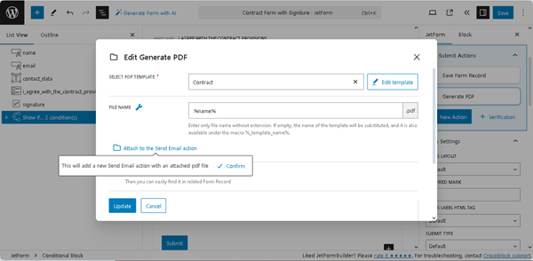
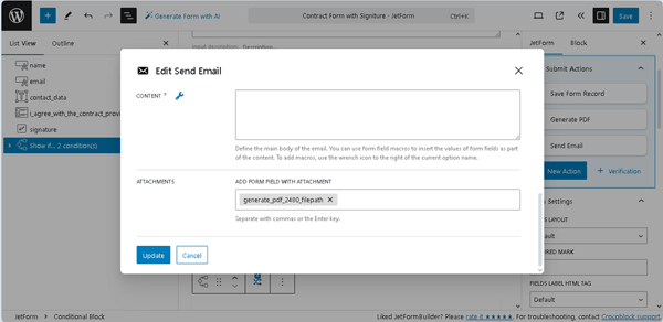
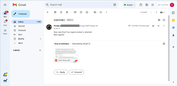
To attach the generated PDF file with the submitted data to the email, click the “Attach to the Send Email action“button in the Edit Action pop-up. Once pressed, this button opens a tooltip with a “Confirm” button. Clicking the “Confirm” button adds the “Send Email” action after the “Generate PDF” Post Submit Action is created.
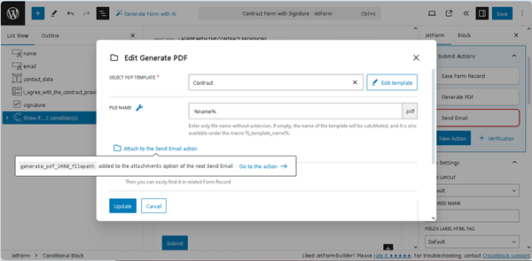
The tooltip will display the text that your file path is added to the attachments option of the next “Send Email,” and the “Go to the action” link.
After pressing this link, the “Send Email” Edit Action pop-up will appear. Scroll down to the ATTACHMENTS section and add the generated PDF file as an attachment.
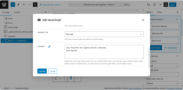
Then, we scroll up this pop-up, select the “Email from submitted form field” option from the MAIL TO drop-down list, and choose the form’s “Email” Text Field in the appeared FROM FIELD field. Then, we complete the SUBJECT field (type the “contract” text), set the “Plain text” CONTENT TYPE, and add the text in the CONTENT text field (“Dear %name%! Your contract is attached. Best regards!” text, in this case).
Finally, click the “Update” button. The form is built now, so press the “Save/Publish” button.
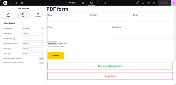
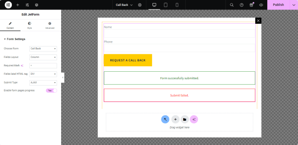
Add the Form to a Page
Create a page or open a page/post you need in the editor you prefer (we use Elementor) and add the JetForm widget/block/element to the page. Learn about its settings from the JetForm Overview. Select the built form in the Choose Form drop-down list.
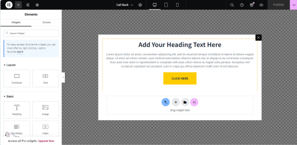
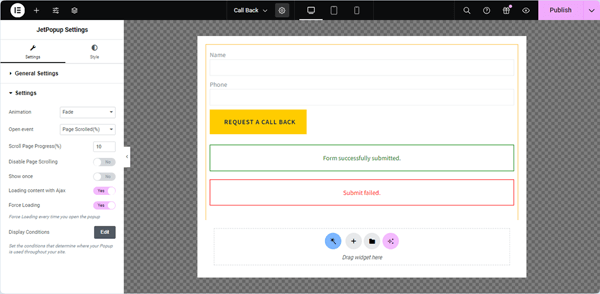
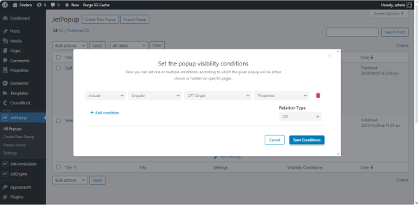
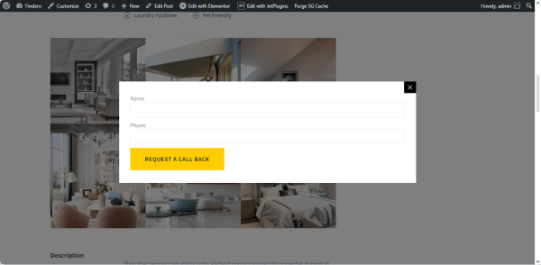
Also, for better usability, you can insert the form into a pop-up that will appear if pre-specified conditions are met. Read how to do it in the How to Set Up a WordPress Pop-up tutorial.
Press the “Publish” button to save the page.
Test the Flow
Let’s check how the form works. We’ll fill out the form’s fields and check the mailbox and the form records.
Fill out the form
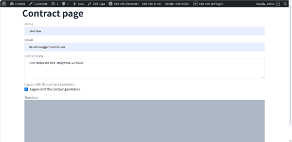
Navigate to the front end and fill out the form’s fields. First, insert the text data (e.g., name, email, etc.) into the corresponding fields and tick the Checkbox Field.
Second, draw your signature in the Signature Field canvas and press the newly-appeared “SUBMIT” button.
Check the Mailbox
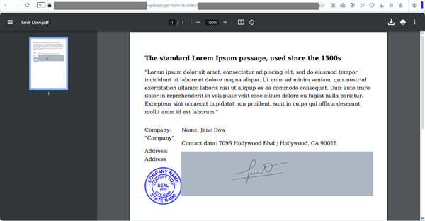
Open the mailbox you entered in the form and check if you received the email. The PDF file should be attached.
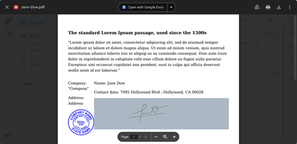
Open the attached file and check if the signature is inserted correctly.
Check the form record
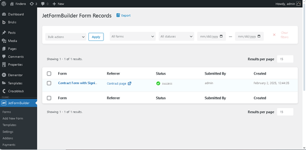
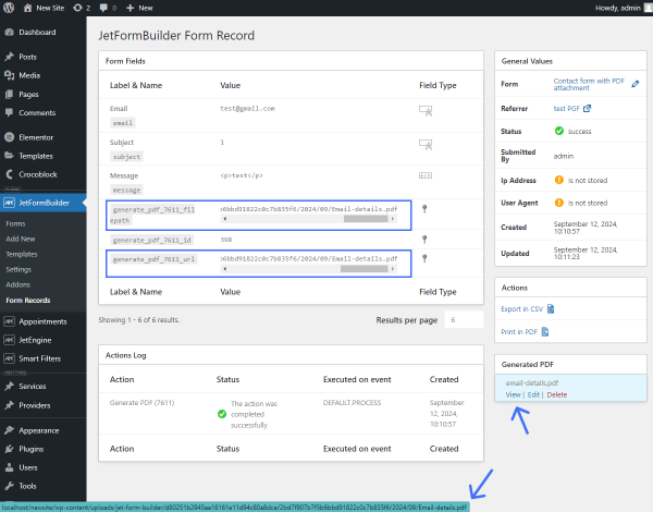
Finally, navigate to the WordPress Dashboard > JetFormBuilder > Form Records tab.
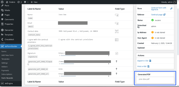
Unroll the submitted form details. Scroll the record down and find the Generated PDF section.
Press the “View“link to open the attachment in the Media Library. You can also copy the file path link under the Label & Name section and paste it into the browser to view the created PDF file. Read the How to Access the Generated PDF Files tutorial to learn how to find the PDF file storage location generated with the JetFormBuilder plugin and PDF Attachment add-on for the WordPress website. That’s all about creating the PDF file of a predefined design with the online entered signature and emailing this file to a specified address using the Signature and PDF Attachment PRO Addons from the JetFormBuilder plugin for WordPress.
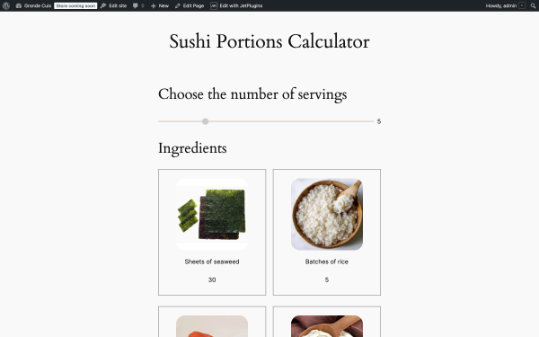
A sushi enthusiast’s website might need a recipe portion calculator. This tool allows users to adjust ingredient quantities for sushi rolls based on the desired number of servings. Created with JetFormBuilder, the form utilized calculated fields and conditional logic to deliver a dynamic and user-friendly experience.
For this use case, we’ll use a basic sushi recipe to illustrate how the portion calculator adjusts ingredient quantities. Base ingredients for six rolls (default serving size):
6 sheets of nori;
1 batch of rice;
227 g of raw salmon (or other raw fish);
113 g cream cheese;
1 avocado;
3 tablespoons of soy sauce.
The goal is to create a dynamic form that recalculates ingredient quantities based on the user’s desired number of servings. This ensures that users can effortlessly adjust recipes for any number of servings.
Form Fields Structure
This section describes the arrangement and purpose of the form fields, explaining how each element enhances the form’s dynamic and interactive capabilities.
Portion selection section:
Range Field block — a serving amount slider that users can drag to increase the multiplicator for the ingredients fields.
Ingredients section:
Image block— a field that displays an ingredient;
Paragraph block — a field that displays the name of an ingredient;
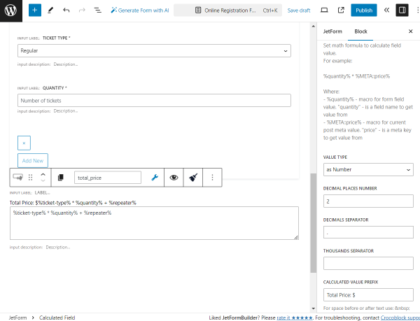
Calculated Field block — a field that adjusts the amount of ingredients based on the Range Field block input.
Custom HTML block — a field that displays the number of servings that the user has selected in the Range Field block with the code:
<!-- JFB_FIELD::number_of_servings -->
Custom HTML block — a field that displays the number of ingredients based on the Range Field block input using the code:
<!-- JFB_FIELD::ingredient_field_name -->
Extra ingredients calculation and details output section:
Calculated Field blocks — hidden fields that adjust the amount of ingredients based on the Range Field block input;
Conditional Blocks — fields that contain Custom HTML blocks that display the number of ingredients based on the Range Field block input using the code:
<!-- JFB_FIELD::ingredient_field_name -->
Setup calculation
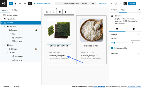
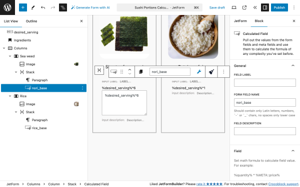
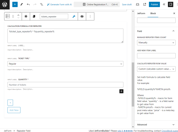
The base quantities of ingredients will be used in formulas. The calculations are performed using the JetFormBuilder’sCalculated Field block. Example calculation for the nori sheets:
Required nori sheets = base quantity * desired portions/servings amount
Base ingredients formulas:
Nori — %desired_serving%*6;
Rice — %desired_serving%*1;
Salmon — %desired_serving%*0.22;
Cream Cheese — %desired_serving%*0.1;
Avocado — %desired_serving%*3;
Soy sauce — %desired_serving%*3.
Extra ingredients formulas:
Smoked salmon — %desired_serving%*0.22;
Spring onions — %desired_serving%*1.
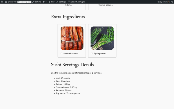
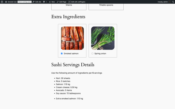
As users adjust the number of servings, the ingredient quantities dynamically update, providing immediate results. To improve performance, we’ve added the Extra Ingredients section to modify the recipe further.
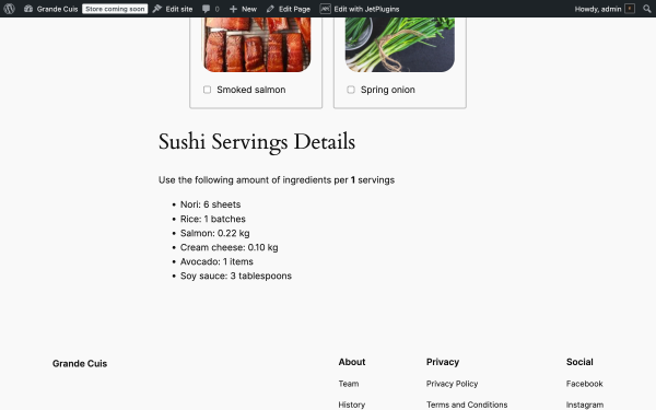
Example outputs — when the user selects three servings, they will get the following output:
Nori: 18 sheets
Rice: 3 batches
Salmon: 0.66 kg
Cream cheese: 0.3 kg
Avocado: 3 items
Soy sauce: 9 tablespoons
Build the Form
To create a form, go to WordPress Dashboard> JetFormBuilder and click the “Add NewForm” button. Remove the Welcome block, as we don’t need it for this form.
Servings selection section
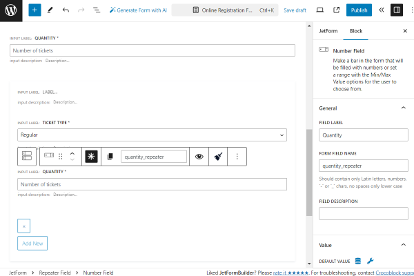
This section includes a Range Field block, which allows users to adjust the serving size by dragging a slider. The slider dynamically updates the ingredient quantities by multiplying the ingredient fields.
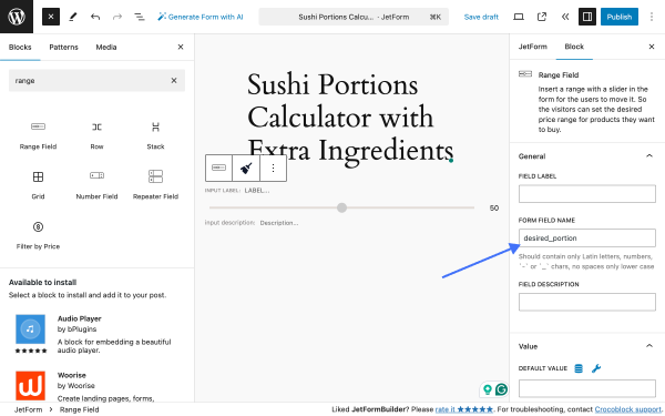
Click on the “+” to toggle the block inserter, and type “range” in the search field to find the Range Field block.
Go to the block settings, General tab, and in the FORM FIELD NAME, type the “desired_portion.”
In the Value tab, we need to set DEFAULT VALUE to “1.”
In the Field tab, we need to set MIN VALUE to “1,” MAX VALUE to “20,” and STEP to “1.” These values mean that the minimal portion size is “1,” the maximum portion size is “20,” and the adjustment step is “1.”
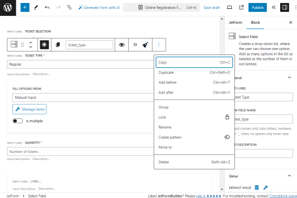
Ingredients section
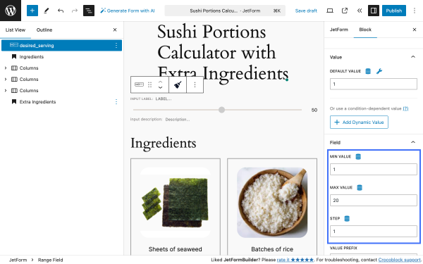
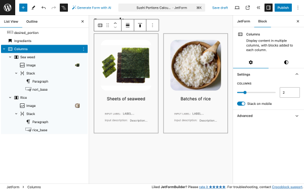
This section provides a dynamic display of ingredients. It features an Image block that showcases the ingredient visually, a Paragraph block that presents its name, and a Calculated Field block that automatically adjusts ingredient quantities based on user input in the Range Field block, ensuring precision and flexibility.
Click on the “+” to toggle the block inserter and add the following blocks: an Image block, a Paragraph block, and a Calculated Field block.
Our base recipe contains six ingredients, which is why we need to add this set of blocks six times. For more convenience, we’ll structure these blocks in the following way:
Columns block
Column block (ingredient #1)
Image block (ingredient image)
Stack
Paragraph block (ingredient name)
Calculated Field block (ingredient portion calculation)
Column block (for ingredient #2)
Image block (ingredient image)
Stack
Paragraph block (ingredient name)
Calculated Field block (ingredient portion calculation)
Since we already have all the necessary formulas, we can add them to the corresponding Calculated Field blocks.
Make sure you’ve added the corresponding value to the Calculated Field blocks; we’ll need them further. To do so, go to the Block settings and then the General section, find the FORM FIELD NAME, and set the corresponding value for each of the ingredients.
In our case, the nori sheets will have the value “nori_base,” the rice will have the value “rice_base,” and so on.
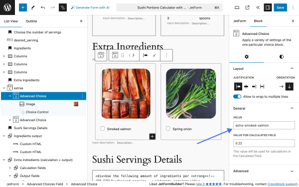
Extra ingredients section
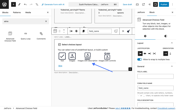
This section features an Advanced Choices Field block, which enables users to view and select additional ingredients to customize their recipes.
Click on the “+” to toggle the block inserter, and type “advanced” in the search field to find the Advanced Choices Field block.
In the Select choices layout, we’ll opt for “Images with description.”
After clicking on the “Images with description” option, three Advanced Choice blocks will be added automatically. Since we have only two extra ingredients, we’ll remove one block; then, we’ll add images and names of the ingredients.
Further, we’ll add a set of Calculated Fields that will count the amount of these extra ingredients, but first of all, we need to adjust the values. Go to the Block tab and, in the General tab, adjust the VALUE and VALUE FOR CALCULATED FIELD.
Since the smoked salmon is needed in the same amount as the raw, we’ll set the VALUEFOR CALCULATED FIELD to “0.22. ” For the spring onion, we’ll set the VALUEFORCALCULATED FIELD to “1,” as they are counted in stems per portion.
Details output section
This section uses Custom HTML blocks to display dynamic details based on user input.
Click on the “+” to toggle the block inserter, and type “html” in the search field to find the Custom HTML block and add it twice.
Into the first block, we’ll add the following code:
<div>Use the following amount of ingredients per <strong><!-- JFB_FIELD::desired_serving --></strong> servings</div>
Into the second block, we’ll add the following code:
As mentioned previously, the “nori_base,” “rice_base,” etc., are the values of the Calculated Field blocks we’ve used in the ingredients section.
After filling in these blocks, check if the content is displayed correctly on the front end.
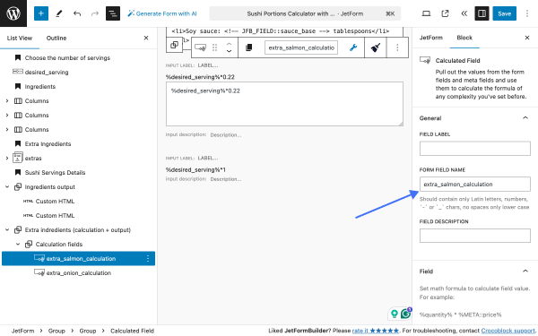
Extra ingredients calculation and details output section
This section dynamically calculates through a set of Calculated Field blocks and displays the quantities of additional ingredients through Conditional Blocks based on the desired serving size.
In our case, for additional ingredients, the Calculated Field blocks are the same as for the main ingredients. That’s why we’ll duplicate those fields, drag them to the bottom of the form, and group them. Make sure you’ve added unique FORM FIELD NAMES.
Now, let’s add the last set of fields: a pair of Conditional Blocks. Each block will contain an HTML block with the following code.
<ul><li>Extra spring onion: <!-- JFB_FIELD::extra_onion_calculation --> kg</li></ul>
Here, the “extra_salmon_calculation” and “extra_onion_calculation” are the Calculated Field block FORM FIELD NAMES from the previous step.
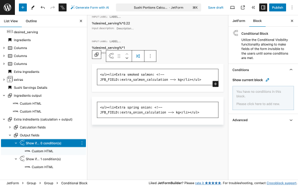
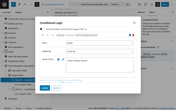
Click on the “+” to toggle the block inserter, and type “conditional” in the search field to find the Conditional Block block and add it twice.
When added, click on the Block, go to the Conditions section, and click on the “pencil” icon.
In the Conditional Logic popup in the WHICH FUNCTION NEED EXECUTE? dropdown, select “Show if…” and then click on the “+ Add Condition” button, which will reveal the set of fields.
FIELD —a field that triggers the conditional block; in our case, it’s the Advanced Choices Field, which has a FORM FIELD NAME value “extras”;
OPERATOR — an option that allows you to set rules for conditional display or behavior based on user input. In our case, it’s “In the list” because the field value must match one of the specified values in a list of Advanced Choices Field options;
VALUE TO COMPARE — a value of an ingredient from the Advanced Choice block’s VALUE field.
When done, click on the “Update” button.
Checking the Results
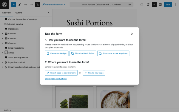
Now, it’s time to embed the form on the website. Click the “Publish” button to publish the form.
In the top right corner, click on the “<<” (double brackets) button to open the Use the form popup to get the shortcode or Elementor widget.
In this tutorial, we exemplify two cases of combining the Mailchimp email marketing service with forms. In particular, we are considering configuring the “Mailchimp”Post Submit Action to email users to confirm the subscription.
We also describe the countercase: we created an email campaign using the email marketing service and added a link to a newsletter signup form on a needed site. After clicking the link in the email, users are redirected to the newsletter signup form, where they can finally confirm the subscription.
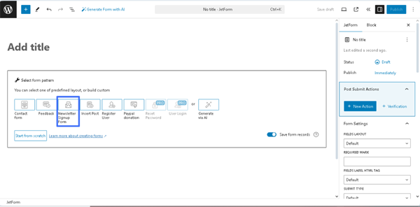
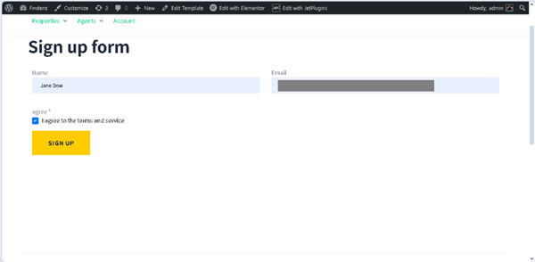
Navigate to the WordPress Dashboard > JetFormBuilder > Add New tab to create a new form. The form will be opened in the Gutenberg editor, and the Welcome block, which allows the application of pre-created or AI-generated forms, will be displayed.
In this case, we pressed the “Newsletter Signup Form” button on the Welcome block.
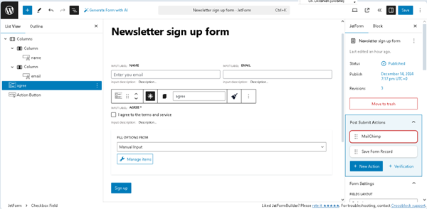
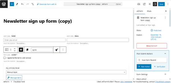
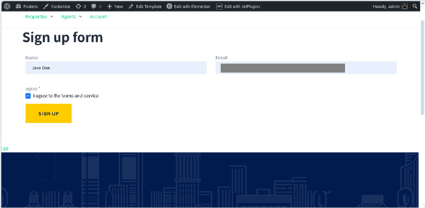
In this case, we typed the form’s title (the “Newsletter sign up form” text), then added another Text Field for the user’s name and the SelectField for ticking that the user agrees with the terms and conditions. In the last step, we made the Select Field necessary and arranged the fields.
Save the form by pressing the “Publish/Save” button.
Read the Form Creation tutorial for more details on the main fields and settings of the form-building process.
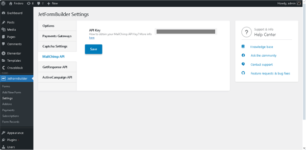
Navigate to the WordPress Dashboard > JetFormBuilder > Settings page and unroll the MailChimp API tab. Here, insert the MailChimp API key into the API Key field.
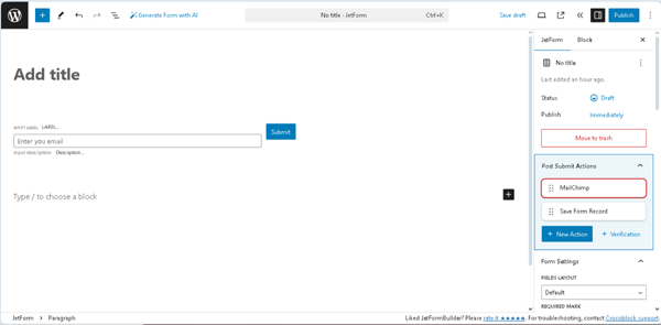
Configure the “MailChimp” Post Submit Action settings
Return to the form.
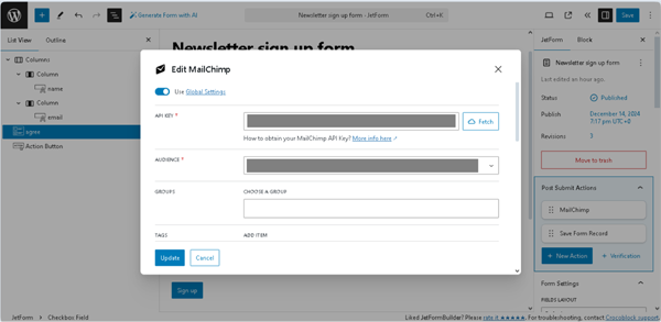
The “MailChimp” Post Submit Action is set by default for the “Newsletter Signup Form” pattern. Move to the JetForm Settings, hover over the “MailChimp” Post Submit Action, and press the “pencil” icon. Then, the Edit MailChimp pop-up will appear. In this pop-up, first, enable the Use Global Settings toggle; after that, the Mailchimp API Key will be displayed in the API KEY pop-up field.
Next, select the needed MailChimp campaign in the CAMPAIGN pop-up’s drop-down list.
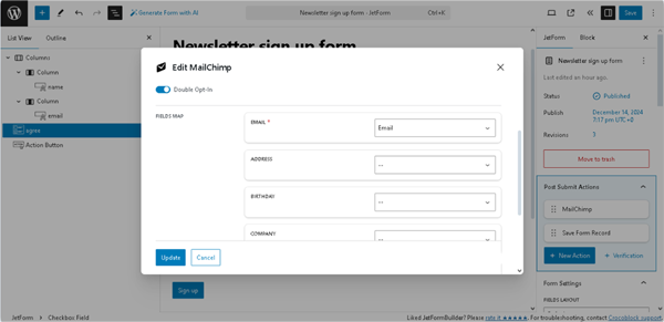
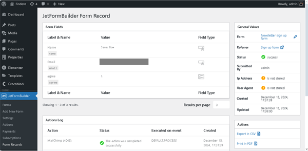
In this case, we scrolled the Edit MailChimp pop-up to the FIELDS MAP block. Here, we selected the “Email” Text Field in the EMAIL field and the “Name” Text Field in the FIRST NAME field. Then, press the “Update” button.
Finally, if needed, add another Post Submit Action or delete the default “Save Form Record.” Here, we kept this action.
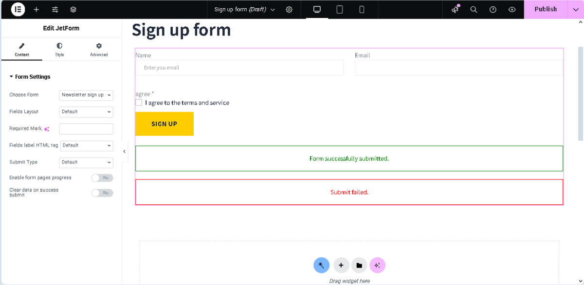
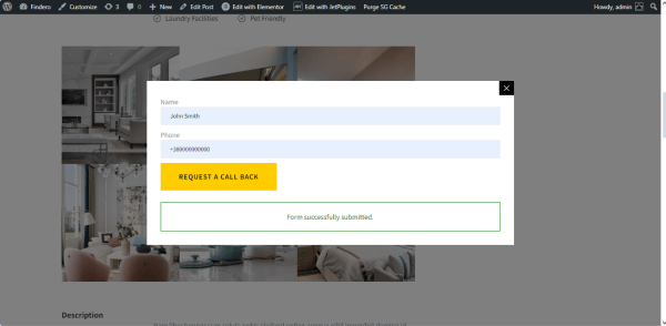
Then, if the form was submitted successfully, the following text “Form successfully submitted.” will be shown.
In the next step, move to your Mailchimp Dashboard > Audience > All contacts page to observe the list of your subscribers. If you need to add a subscriber, press the “Add contacts” button.
Create an Email Campaign for Subscription Confirmation via Forms
Modify the form
Open the previously created “Newsletter Signup Form” form or a duplicated one. In this case, we used a copy of the form.
Then, delete the “MailChimp” Post Submit Action and add the needed ones. For instance, you can send an email if the subscription is successfully paid. Read how to manage payments (e.g., configure gateway settings, set conditions and events, use macros for payment success or failed messages, etc.) in the How to Build WordPress Registration Form With Payment tutorial.
In this case, we kept the “Save Form Record” Post Submit Action only.
Add the form to a page
As it was for the previously created form, open an editor you prefer and insert the form on the page via the JetForm widget/block/element. In this tutorial, we used Elementor.
Finally, publish the page and copy the link to the page from the front end.
Configure the Mailchimp settings
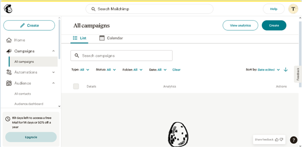
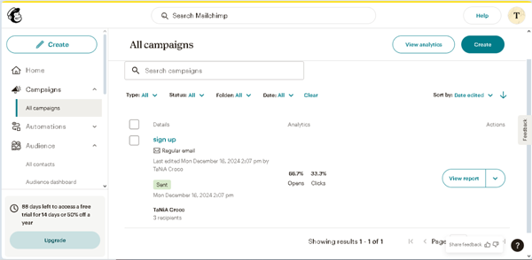
Navigate to the Mailchimp Dashboard > Campaigns > All campaigns page. Here, press the “Create” button.
Next, select the “Regular email” type of the campaign on the newly-opened page.
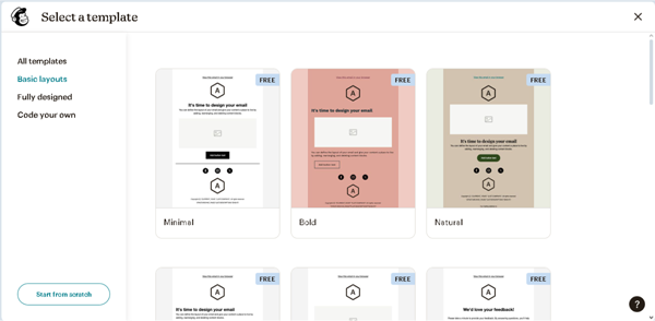
Then, select and design the needed e-mail pattern.
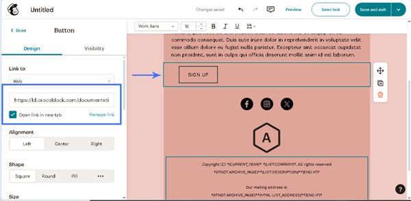
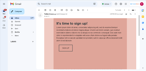
In this case, we selected a free “Bold” layout and added the copied link to the page with the form to the button with the “SIGN UP” text.
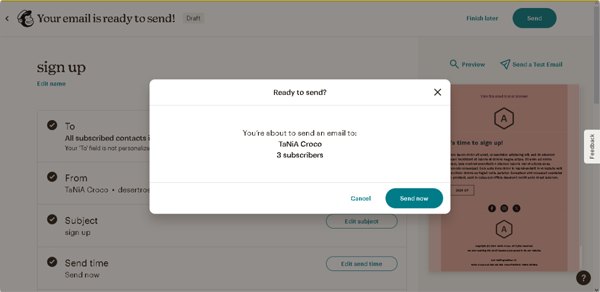
Then, press the “Save and exit” button at the top right corner of the page to be redirected to the “Edit campaign” page, where you should fill out the campaign’s name, e-mail subject, select the subscribers, etc. In this case, we will mail to all subscribers set on the Mailchimp Dashboard > Audience > All contacts page, but you can add/remove subscribers as you need. Finally, once completed, press the “Send” button at the top of the page and confirm it in the “Ready to send?” pop-up.
Test the flow
The recipients will receive the e-mails.
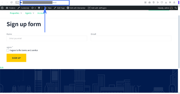
After pressing the “SIGN UP” button in the e-mail, they will be redirected to the page with the form.
Then, if the form was submitted successfully, the following text “Form successfully submitted.” will be shown.
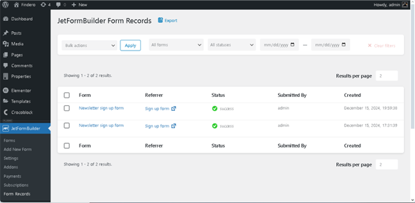
Move to the WordPress Dashboard > JetFormBuilder > Form Record page to observe the list of completed forms.
Unroll the needed record to scrutinize the user data.
Finally, return to the Mailchimp Dashboard > Campaigns > All campaigns page to check the campaign’s statistics.
That’s it. Now you know how to use the Mailchimp email marketing service with the JetFormBuilder plugin for WordPress to create a newsletter signup form.
In this tutorial, we exemplify creating a conference registration form with payment. We focus on setting the payment options and explaining how this feature works (e.g., configuring gateway settings, setting conditions and events, using macros for payment success or failed messages, etc.). The needed information about creating registration forms and managing their settings can be found in the corresponding tutorials, i.e., in the How to Create an Event Registration Form tutorial.
NOTE
Forms intended for payments should have a field with number values. This field will be set further as the Price/amount field for payments in the gateway settings.
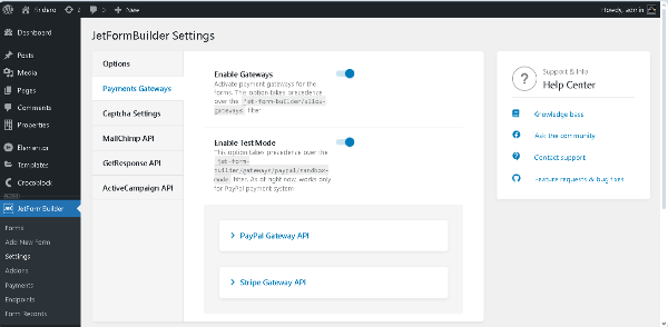
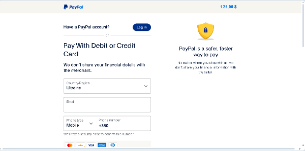
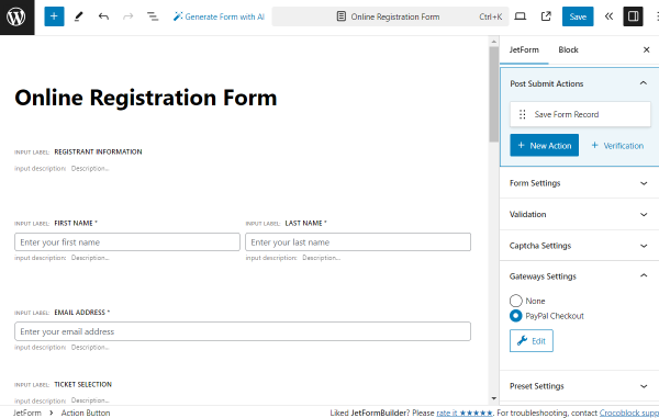
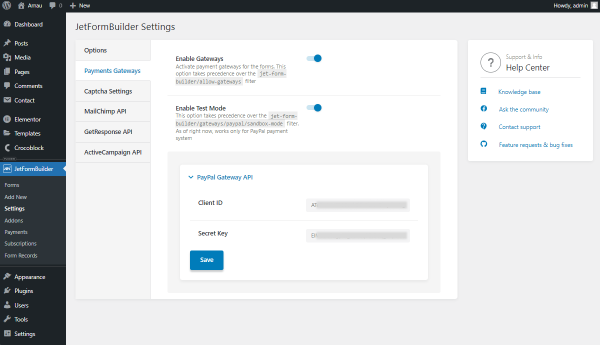
Navigate to the WordPress Dashboard > JetFormBuilder > Settings tab and unroll the Payment Gateway section. Here, switch on the Enable Gateways and Enable Test Mode toggles.
NOTE
The Test Mode is a testing environment, so the Test Mode toggle should be disabled for active configured sites.
This section displays all available gateways. The PayPal gateway is available by default, but you can use the Stripe functionality if the Stripe Payments add-on is installed and activated.
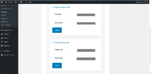
Unroll the needed section and insert the Client ID and Secret Key.
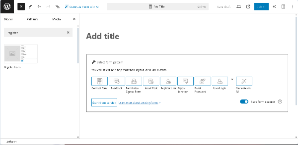
Navigate to the WordPress Dashboard > JetFormBuilder > Add New Form tab to create a new form. The form will be opened in the Gutenberg editor, and the Welcome block, which allows the application of the pre-created or AI-generated forms, will be displayed.
Here, you can select the needed pre-created form from the Welcome block, delete this block and choose the needed JetForm pattern, or build the form from scratch by adding the required fields.
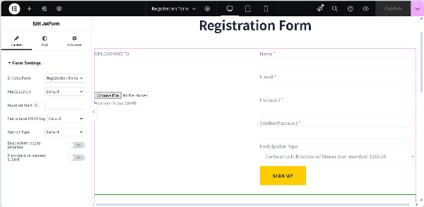
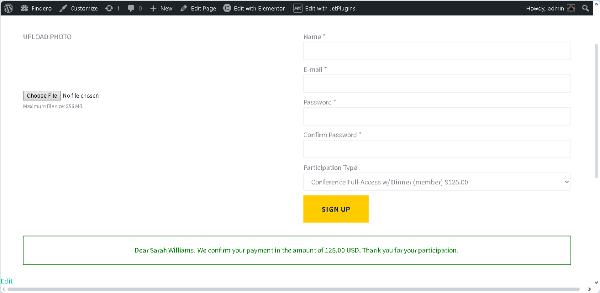
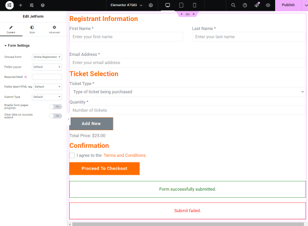
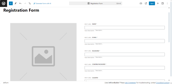
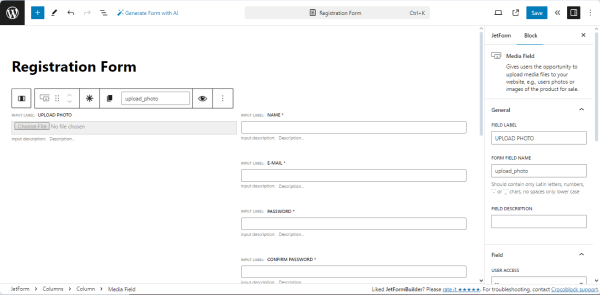
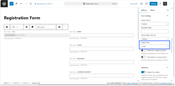
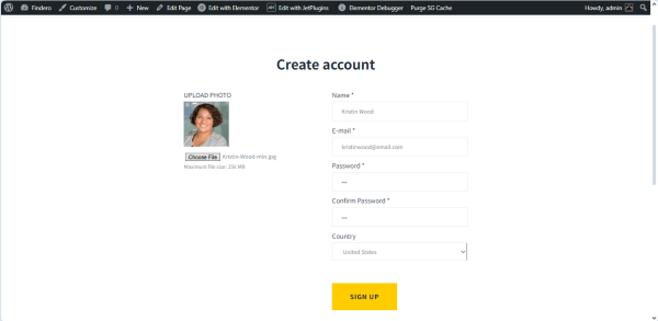
In this case, we deleted the Welcome block, typed the form’s name (the “Registration Form” text), and inserted the premade “Register Form” pattern. After that, we changed the Image block to the Media Field. Now, the built form contains the Media Field, Text Fields, and the Action Button.
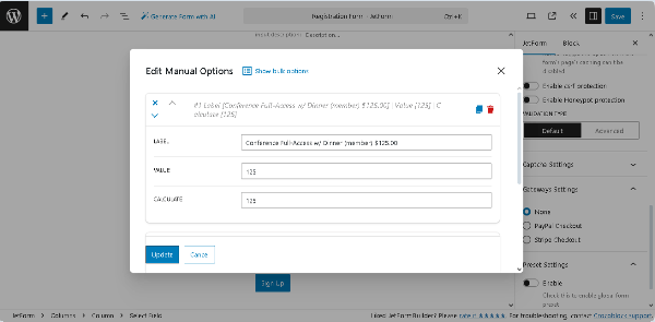
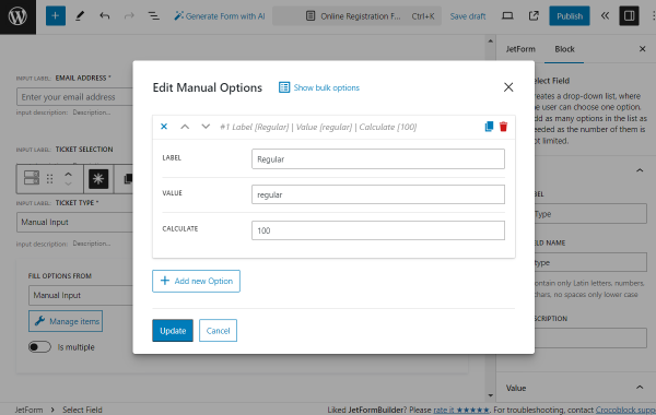
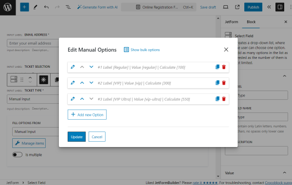
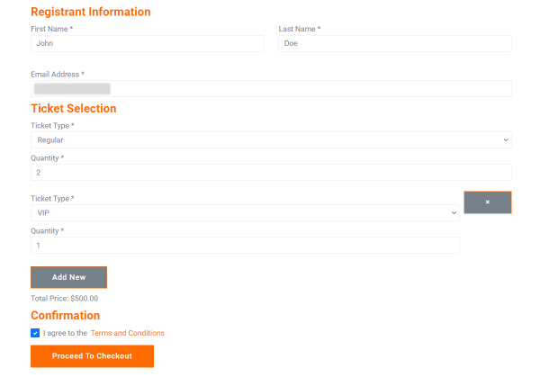
In the next step, we inserted the Select Field to choose the needed type of participation and moved down the Action Button. This field will be set as a PRICE/AMOUNT FIELD for payments in the gateway settings.
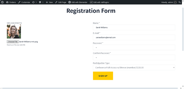
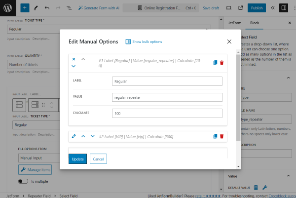
After adding the Select Field, we pressed the “Manage Item” button and filled out the fields of the newly appeared pop-up. In particular, we added two options 一 the “Conference Full-Access w/ Dinner (member) $125.00” and “Conference Full-Access w/ Dinner (non-member) $150.00” and typed the corresponding VALUE and CALCULATE fields.
Once completed, press the “Update” button in the pop-up. Read the Form Creation tutorial for more details on the main fields and settings of the form-building process.
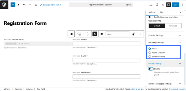
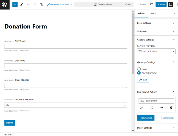
Configure the Gateway Settings
Scroll the JetForm settings down to the Gateway Settings block, which displays all available gateways. In this case, it shows the “None,” “PayPal Checkout,” and “Stripe Checkouts” options.
NOTE
You can’t have more than one active gateway.
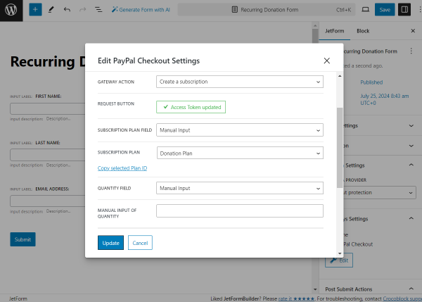
Adjust the PayPal Checkout settings
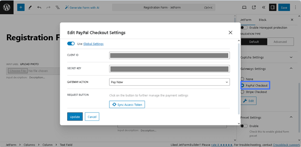
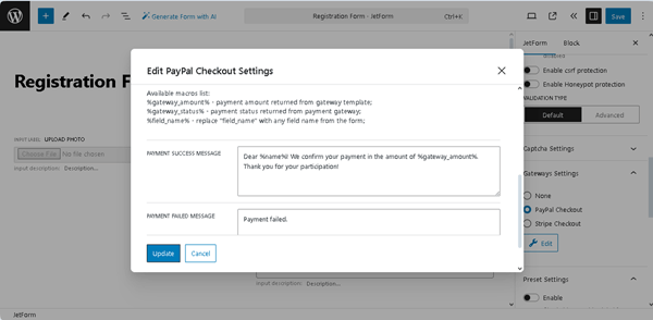
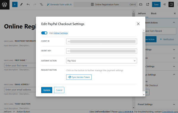
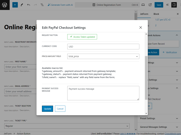
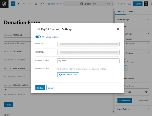
To adjust the PayPal Checkout settings, tick the “PayPal Checkout” option. Then, click the newly-appeared “Edit” button and fill out the fields in the Edit PayPal Checkout Settings pop-up.
First, activate the Use Global Settings toggle. Then, the data from the Client ID and Secret Key fields inserted on the WordPress Dashboard > JetFormBuilder > Settings page will be added to the CLIENT ID and SECRET KEY fields of the pop-up.
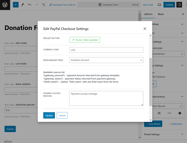
After that, click the “Sync Access Token” button. After synchronization is completed, the text on the button will change to “Access Token updated.”
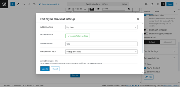
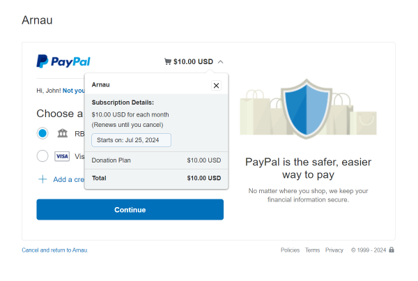
In the next step, type the required CURRENCY CODE (the “USD” text, in this case) and select the PRICE/AMOUNT FIELD (the “Participation Type” form field in this tutorial).
In the last step, add the texts in the PAYMENT SUCCESS MESSAGE and PAYMENT FAILED MESSAGE. In this tutorial, we used the %field_name% and %gateway_amount% embed macros and typed the following text in the PAYMENT SUCCESS MESSAGE field: “Dear %Name%! We confirm your payment in the amount of %gateway_amount%. Thank you for your participation!”. Here, the %Name% text will be changed with the user’s name taken from the form’s “Name” field, and the %gateway_amount% text will be changed with the payment amount taken from the form’s field set as the PRICE/AMOUNT FIELD.
Finally, click the “Update” button and close the pop-up.
Configuring the Stripe Checkout settings
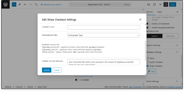
The Stripe Checkout settings are the same as the PayPal Checkout ones. To configure the Stripe Checkout settings, tick the “Stripe Checkout”option in the Gateway Settings block. After that, the “Edit” button will appear. Press this button and fill out the fields in the Edit Stripe Checkout Settings pop-up.
First, activate the Use Global Settings toggle. Then, as for the PayPal gateway settings, the data from the Client ID and Secret Key fields of the WordPress Dashboard > JetFormBuilder > Settings page will be added to the CLIENT ID and SECRET KEY fields of the pop-up. Finally, click the “Sync Access Token” button to synchronize.
After that, the CURRENCY CODE field will be displayed, as will the PRICE/AMOUNT FIELD, PAYMENT SUCCESS MESSAGE, and PAYMENT FAILED MESSAGE fields, prefilled with the previously entered data.
In this case, we typed “USD” into the CURRENCY CODE field and left prefilled data in the other fields.
Finally, press the “Update” button to save settings.
Set the Post-Submit Actions
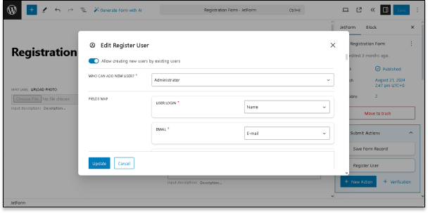
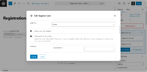
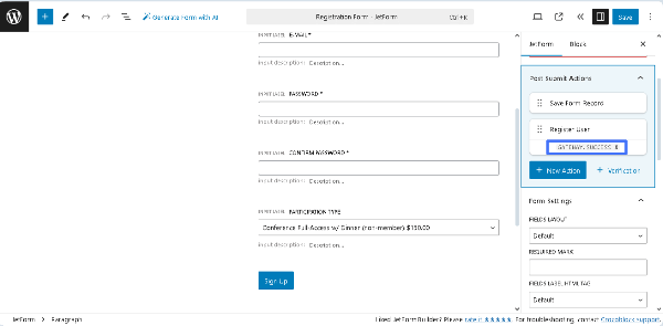
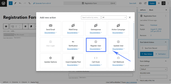
Navigate to the JetForms > Post Submit Actions section. The Save Form RecordPost Submit Action is set by default. Here, press the “+ New Action” button and add the Register UserPost Submit Action. After that, the “Edit Register User” window will appear.
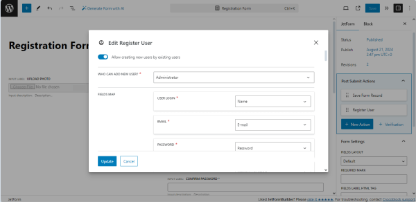
In this window, first, enable the Allow creating new users by existing users toggle. Then, select the “Administrator” option in the WHO CAN ADD NEW USER drop-down and fill in the FIELDS MAP. In this case, we selected the form fields in the appropriate drop-down lists.
In the last step, choose the “Author” USER ROLE.
Also, if needed, enable the Log In User after Register toggle to make the user logged-in.
Finally, press the “Update” button to save the changes and close the window.
NOTE
Read the Register User Action Overview to learn more about managing the “Register User” Post Submit Action (i.e., select roles, add custom meta fields to user accounts, customize messages, and more).
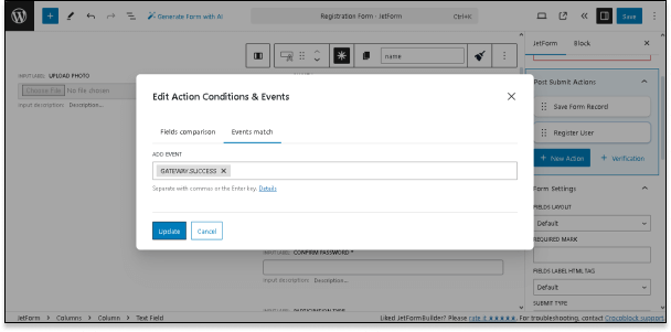
To set the condition that this Post Submit Action should be performed only after successful payment, we hovered over the action and pressed the “Edit Conditions & Events” button. Once pressed, the Edit Action Conditions & Events pop-up will appear. In this pop-up, click the Events match tab and select the “GATEWAY.SUCCESS” option from the ADD EVENT drop-down list.
Finally, press the “Update” button in the pop-up. Then, the “GATEWAY.SUCCESS. X” text will be added below the “Register User” Post Submit Action.
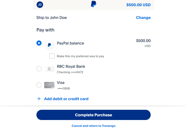
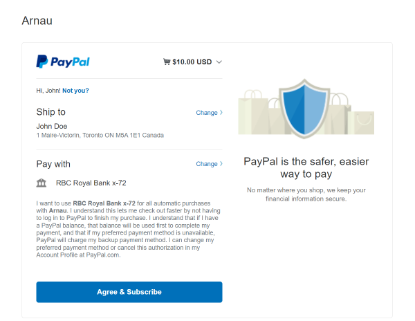
After that, press the “SIGN IN” button. If the form was submitted successfully, you will be redirected to the PayPal page with the option to pay.
After completing the payment, you will be redirected back to the form, where the following text will be shown: “Dear “user name”! We confirm your payment in the amount of **** USD. Thank you for your participation!”
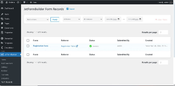
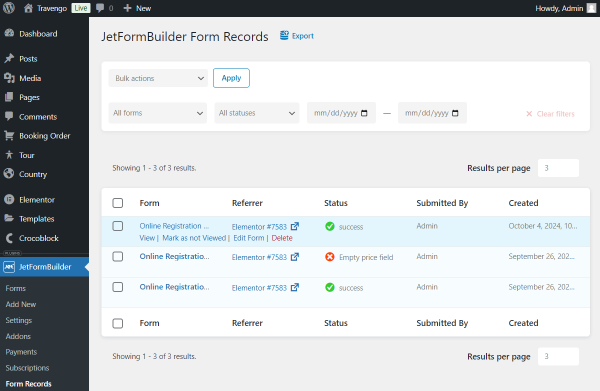
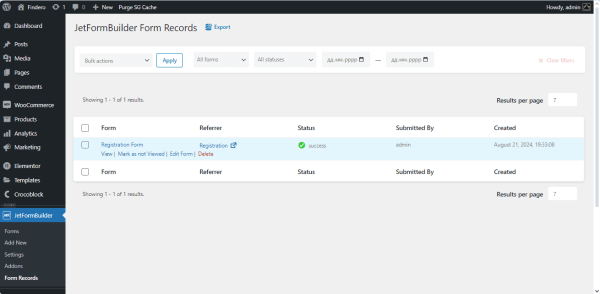
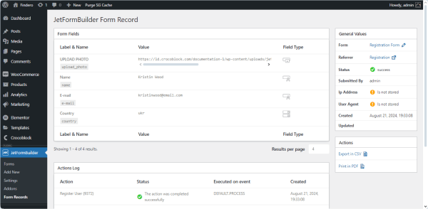
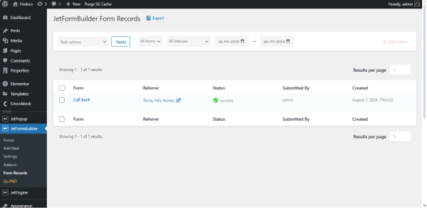
JetFormBuilder Form Records Data
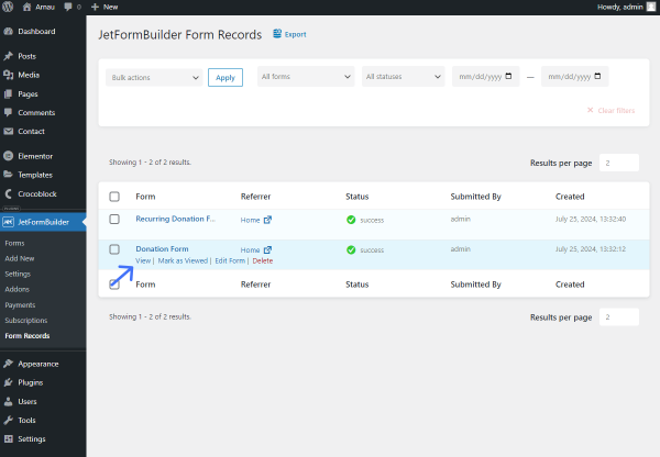
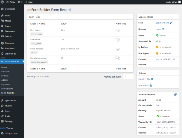
Since we set the “Save Form Record” Post Submit Action, the JetFormBuilder plugin saves the submitted form data in the WordPress Dashboard > JetFormBuilder > Form Records tab. This tab displays all submitted forms and their status.
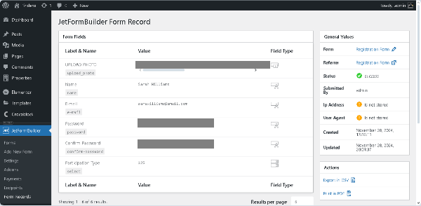
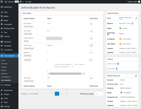
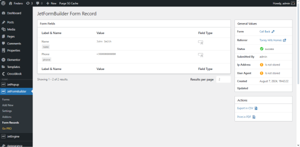
To view more details about a specific form submission, hover the cursor under the form’s name and press the “Edit” link below it.
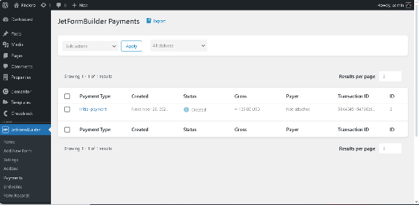
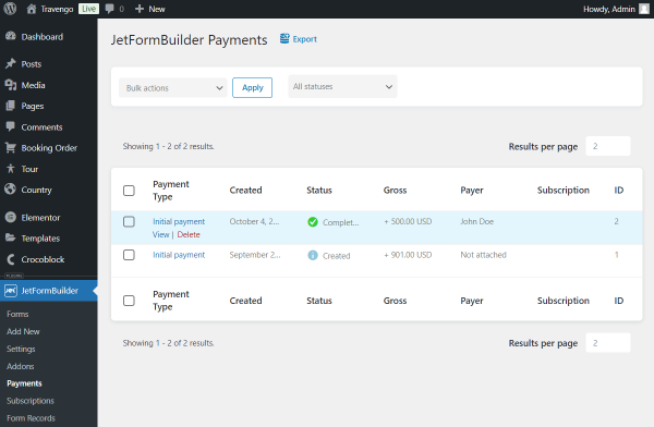
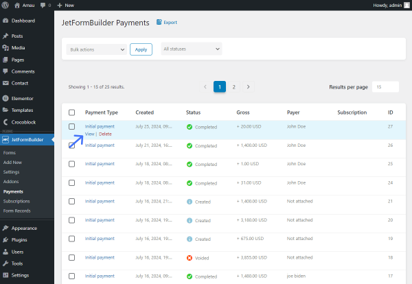
JetFormBuilder Payments
The JetFormBuilder plugin collects all payments and their data in the WordPress Dashboard > JetFormBuilder > Payments path.
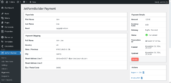
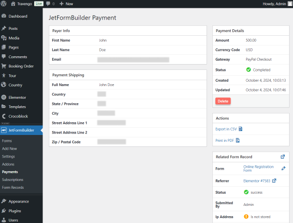
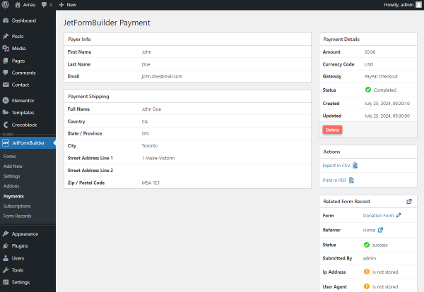
Hover over the payment’s name and press the “View” link. Then, observe the payment details.
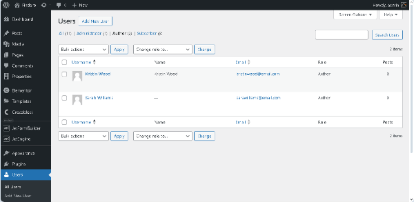
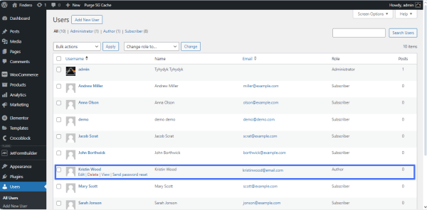
WordPress Dashboard Users Tab
To check if the user was created, proceed to WordPress Dashboard > Users.
Here you go; the new user is already displayed. As we previously selected, its user role is set to “Author.”
Press the “Edit User” button to see if the completed information is saved in the database.
That’s it. Now you know how to build WordPress registration forms with payment.
In this use case, we’ll demonstrate how to create a customer survey form using JetFormBuilder, focusing on gathering feedback about the shopping experience.
Whether you want to understand customer satisfaction, identify areas for improvement, or receive direct comments, this survey will cover multiple key aspects of a shopper’s experience in six steps.
As a demonstration of this use case, we’re going to build a form that has the following structure:
Progress Bar — a block that adds the navigation and shows users on what page they are now and how many pages are left to finish the form;
Form Page Break — a block that allows navigating to the next or previous step; it displays the “Next” / “Previous” buttons within the current page, demonstrating the user’s current progress. On the front end, it looks like a “Back” or “Next” button that opens the previous or next part of the form when the current one is finished.
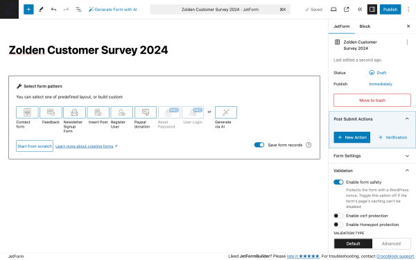
Create a Survey Form
To create a web form with the JetFormBuilder plugin, follow the WordPress Dashboard > JetFormBuilder > Forms path and click the “Add New Form” button.
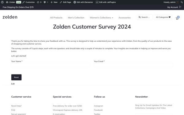
In the title field, write the name of the survey. In our case, it’s the “Zolden Customer Survey 2024.”
Upon default, the newly created form contains the Welcome block; with its help, one can fetch all pre-made Form Patterns, use the Generate via AI feature, and so on.
We’re not going to use so we’ll delete it.
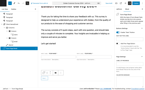
Form step 1: Form intro
The form intro includes short information about the survey, and two Text Field blocks to collect basic user information, including name and email.
We’re going to group both fields into columns to make the layout more convenient.
The structure of fields:
Paragraph — a block that contains an introduction to the form;
Group — a set of blocks that contain two Column blocks of equal width:
left Column — contains the required Text Field block to collect the user name;
right Column — includes the required Text Field block to collect user email;
Form Page Break — a block that divides the form into several parts and makes those parts appear after filling in the previous part.
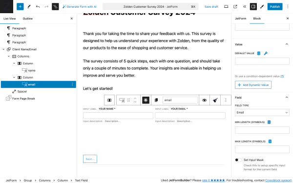
So, to enable the Text Field to collect and validate email ID, we need to go to the Block settings in the side menu.
Scroll to the Field settings, and in the FIELD TYPE dropdown, select the “Email” value. Following the same pattern, you can enable the Text Field block to collect specific data, including:
website by applying the “Url” value;
phone number by applying the “Tel” value;
password by applying the “Password” value (if you’re creating a registration form).
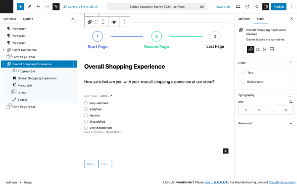
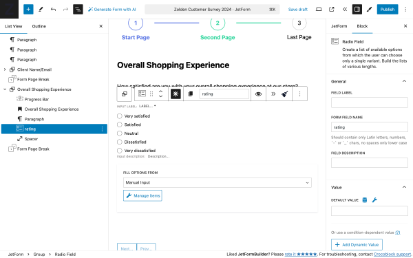
Form step 2: Overall shopping experience
The survey begins by estimating the customer’s overall shopping experience. This section aims to provide an overview of customer satisfaction, making it crucial for understanding general impressions.
The structure of fields:
Progress Bar — a block that adds navigation and shows users on what page they are now and how many pages are left to finish the form;
Heading — a block that contains the title of the form step “Overall Shopping Experience”;
Paragraph — a block that contains a question: “How satisfied are you with your overall shopping experience at our store?”;
Radio Field — a block that provides a list of answers where customers can select all relevant satisfaction levels: “Very satisfied,” “Satisfied,” “Neutral,” “Dissatisfied,” and “Very dissatisfied”;
Form Page Break — a block that divides the form into several parts and makes those parts appear after filling in the previous part.
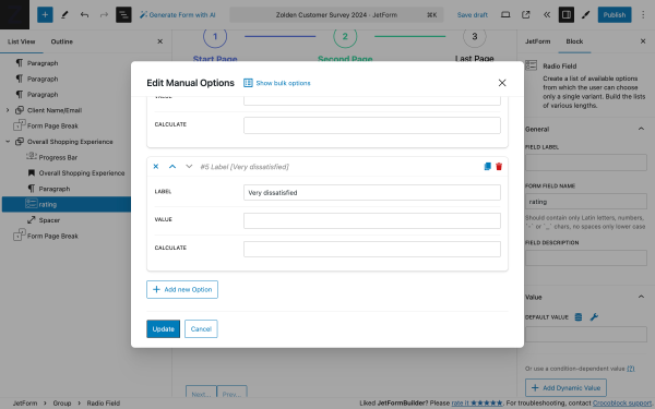
To add the values to the Radio Field block, select the block, and in the FILL OPTIONS FROM, select “Manual input” and then click on the “Manage Items” button.
In the Edit Manual Options pop-up, you can create as many field options as you need. To create field options, click on the “+ Add new Option” button. To remove the field option, click on the red “trash can” icon in the upper right corner.
When you’re done, click on the “Update” button to save settings or “Cancel” to discard them.
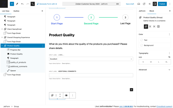
Form step 3: Product quality
In this step, we give respondents the chance to rate and share details about product quality.
The structure of fields:
Progress Bar — a block that adds navigation and shows users on what page they are now and how many pages are left to finish the form;
Heading — a block that contains the title of the form step “Overall Shopping Experience”;
Paragraph — a block that contains a question: “What do you think about the quality of the products you purchased? Please share details.”;
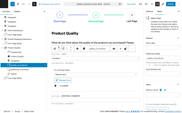
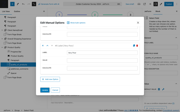
Select Field — a block that provides a dropdown list where customers can select all relevant options: “Excellent,” “Good,” “Average,” “Poor,” and “Very Poor” to get a quick categorical rating from customers;
Text Field — a block that provides space for additional comments;
Form Page Break — a block that divides the form into several parts and makes those parts appear after filling in the previous part.
To add the values to the Select Field block, select the block, and in the FILL OPTIONS FROM, select “Manual input” and then click on the “Manage Items” button.
In the Edit Manual Options pop-up, you can create as many field options as you need. To create field options, click on the “+ Add new Option” button. To remove the field option, click on the red “trash can” icon in the upper right corner.
When you’re done, click on the “Update” button to save settings or “Cancel” to discard.
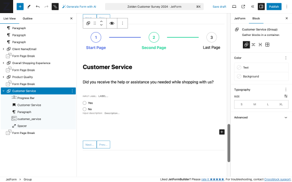
Form step 4: Customer service
It’s essential to know whether customers received adequate support during their shopping journey. Here, customers can express if they are satisfied with the assistance they receive.
The structure of fields:
Progress Bar — a block that adds navigation and shows users on what page they are now and how many pages are left to finish the form;
Heading — a block that contains the title of the form step “Customer Service”;
Paragraph — a block that includes a question: “Did you receive the help or assistance you needed while shopping with us?”;
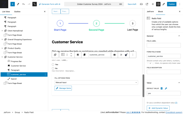
Radio Field — a block that provides “Yes” and ”No” options where customers can select if assistance was/was not effective;
Form Page Break — a block that divides the form into several parts and makes those parts appear after filling in the previous part.
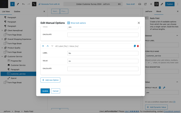
To add the values to the Radio Field block, select the block, and in the FILL OPTIONS FROM, select “Manual input” and then click on the “Manage Items” button.
In the Edit Manual Options pop-up, you can create as many field options as you need. To create field options, click on the “+ Add new Option” button. To remove the field option, click on the red “trash can” icon in the upper right corner.
When you’re done, click on the “Update” button to save settings or “Cancel” to discard them.
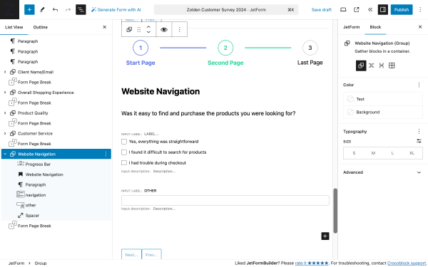
Form step 5: Website navigation
If the store operates online, understanding how easily customers can navigate your website can help identify friction points.
The structure of fields:
Progress Bar — a block that adds navigation and shows users on what page they are now and how many pages are left to finish the form;
Heading — a block that contains the title of the form step “Website Navigation”;
Paragraph — a block that contains a question: “Was it easy to find and purchase the products you were looking for?”;
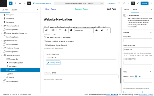
Checkbox Field — a block that provides a list where customers can select all relevant options that describe their experience: “Easy to Find Products,” “Complicated Checkout,” “Quick Loading Time,” and “Other.”
Form Page Break — a block that divides the form into several parts and makes those parts appear after filling in the previous part.
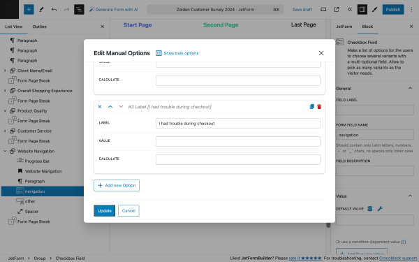
To add the values to the Checkbox Field block, select the block, and in the FILL OPTIONS FROM, select “Manual input” and then click on the “Manage Items” button.
In the Edit Manual Options pop-up, you can create all the necessary field options. Click on the “+ Add new Option” button to create field options.
When you’re done, click on the “Update” button to save settings or “Cancel” to discard.
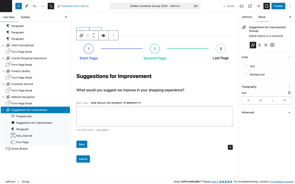
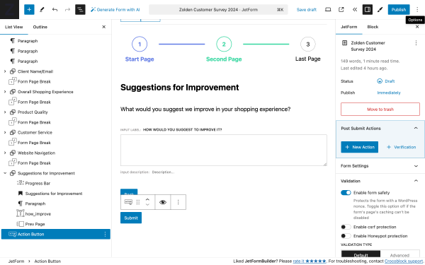
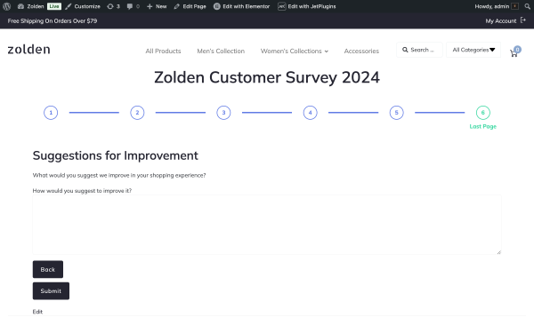
Form step 6: Suggestions for improvement
To close the survey, we provide a space for open-ended responses where customers can list specific suggestions.
The structure of fields:
Progress Bar — a block that adds navigation and shows users on what page they are now and how many pages are left to finish the form;
Heading — a block that contains the title of the form step “Website Navigation”;
Paragraph — a block that contains the question: “What would you suggest we improve in your shopping experience?”;
Textarea Field — a block that gives the user enough space to type a detailed response;
Form Page Break — a block that divides the form into several parts and makes those parts appear after filling in the previous part;
Action Button — a block that allows the user to submit the responses.
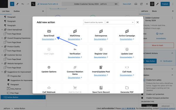
Add Post-Submit Actions
To finalize this form, we’re going to add several form actions. To add form action, click on the JetForm in the side menu and press the “+ New Action” button in the Post Submit Actions tab.
Send Email
With this form action, we’re going to send emails with entries from this survey to both the store admin and the user.
In the Add new action pop-up, click on Send Email to add it to your form.
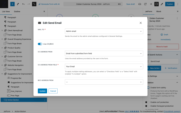
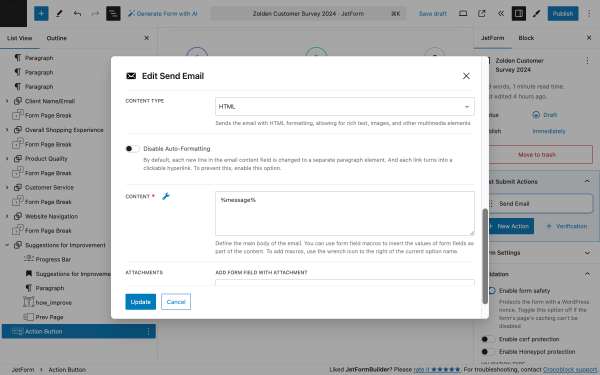
Once the action is added, hover it over and click the “pencil” icon to edit the action. In the Edit Send Email pop-up, we have the following settings.
MAIL TO 一 a required field to select who will receive the message. It includes several options, and we’re going to pick “Admin email”;
Use CC/BCC — a toggle that enables the CC ADDRESS FROM and BCC ADDRESS FROM drop-down lists, which allows sending the secondary and hidden recipients of the email:
CC ADDRESS FROM — in this field, we’re to choose the option “Email from submitted form field”;
CC ADDRESS FROM FIELD — in this field, we’re to specify the fold that contains the user’s email. In our case, it’s the “Your Email” field;
BCC ADDRESS FROM — we’re going to leave it empty.
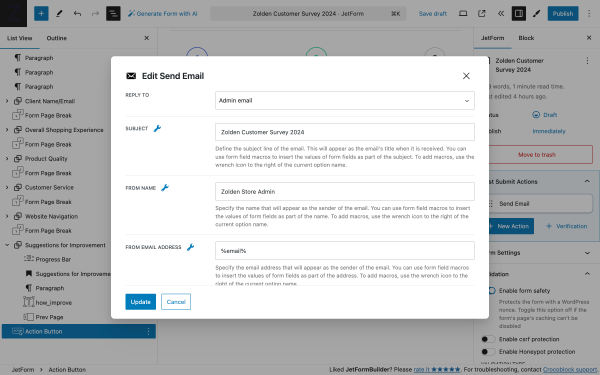
REPLY TO 一 a drop-down list that allows setting the email that you would like to use for receiving answers; we’re going to pick “Admin email”;
SUBJECT 一 a text field that is intended to enter the subject of the letter that the user will receive; if you click the “wrench” icon, you can choose the desired macros, but we’ll use a custom subject “Zolden Customer Survey 2024”;
FROM NAME and FROM EMAIL ADDRESS 一 text fields for inserting the name that will appear as the email’s sender and the email address that will be added as the address of the letter sender; in our case, those are “Zolden Store Admin” and “%email%”.
CONTENT TYPE 一 a dropdown list allowing choosing if the message will be text only or with HTML formatting; we’re opting for “HTML”;
CONTENT 一 a textarea field intended for adding to the body of the email. To add macros to insert the form field data, click the “wrench” icon to the right of the current option name.
When you’re done, click on the “Update” button to save settings or “Cancel” to discard.
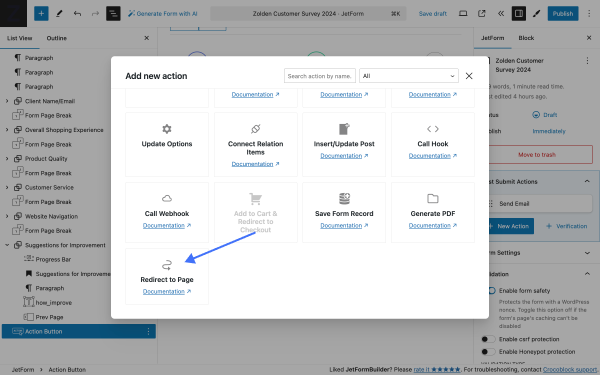
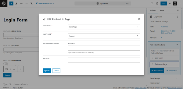
Redirect to Page
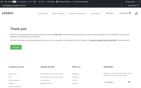
Another form action we’re going to use is the Redirect to Page. It allows users to be redirected to custom pages after they submit the form. For this case, we’ve prepared a “Thank you” page that our users will see upon completing the survey form.
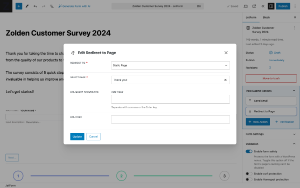
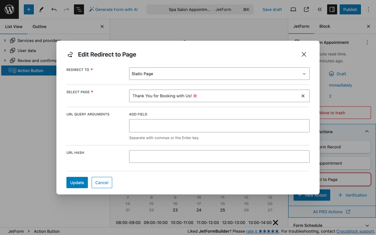
Once the action is added, hover it over and click the “pencil” icon to edit the action. In the Edit Redirect to Page pop-up, we have the following settings.
REDIRECT TO 一 a required drop-down field where you can choose the type of page you would like to send the user to; we’ll choose “Static Page.” Once selected, the next field will be revealed;
SELECT PAGE — a required drop-down field that lists all pages available on the website; among them, we can choose our “Thank you” page;
The rest of the fields we’ll leave as is. When you’re done, click on the “Update” button to save settings or “Cancel” to discard.
Alternatively, you can generate a PDF report for each form entry and add a Generate PDF Form Action; with its help, your form will automatically generate PDF files with the information submitted.
Add Form to Page
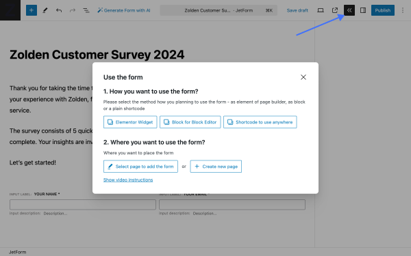
To use the form, one needs to click on the “Use the form” button “<<” to open Use the form pop-up. The pop-up contains a set of buttons divided into two steps:
1. How you want to use the form? — contains a set of buttons that allow the creation of an elementor widget, block, or generate a shortcode;
2. Where you want to use the form? — contains a set of buttons that allow one to select an existing page for the form or create a new one.
After adding the form page to the page we can preview it.
Preview the Form
On the front, the first form step contains intro text and two Text Fields for collecting names and emails.
Upon filling in the form, the Progress Bar will change the color to demonstrate progress.
Upon clicking the “Submit” button, the data is saved, and the user is redirected to the Thank You page.
That’s all one needs to know about building the survey form with the JetFormBuilder plugin on a WordPress website.
The combination of JetFormBuilder and JetAppointment allows users to create flexible appointment forms. This setup simplifies appointment scheduling for anyone running a service-based business, managing a clinic, or organizing events.
Follow these steps to create your form.
Use Case Details
This tutorial helps you create a booking system for spa procedure appointments. Following the same logic, one can create appointment forms for all kinds of use cases and websites like:
personal training sessions where clients choose a trainer and service (“Strength training”, “Yoga”);
beauty salon where customers select stylists and services (“Manicure”, “Haircut”);
tutoring services where students can choose a tutor and subject (“Math”, “English”).
For our use case, we need two CPTs (Custom Post Types):
Team — this CPT represents individual professionals (Provider Post Type);
Services —this CPT represents services offered (Service Post Type).
You can create three types of appointment forms to suit different booking needs:
Static Form — a form where users select both a service and a service provider, then book an appointment;
Service Form — a form where users choose a service provider on a specific service page (usually located on the single service page);
Team Form — a form where users select a service by a particular provider and book directly (usually located on the single provider page).
Further, we’re going to build the Static form, which provides flexibility and a smooth user experience and caters to varied booking preferences.
Configure JetAppointment Plugin
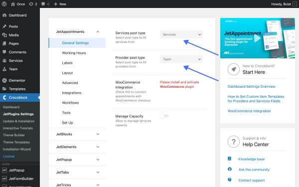
Go to WordPress Dashboard > JetAppointments > Settings to configure the plugin (alternative path: WordPress Dashboard > Crocoblock > JetPlugins Settings > JetAppointments).In the General Settings, you should select the post types that represent services and providers on your website:
Service post type —a dropdown field where one needs to choose the post type that will represent the services; in our case, it is “Services”;
Provider post type —a dropdown field where one needs to choose the post type that will represent the providers; in our case, it is “Team.”
To fine-tune all features of the plugin (including the Booking Schedule and service price), you should run the Set Up wizard.
Set the relations between services and providers
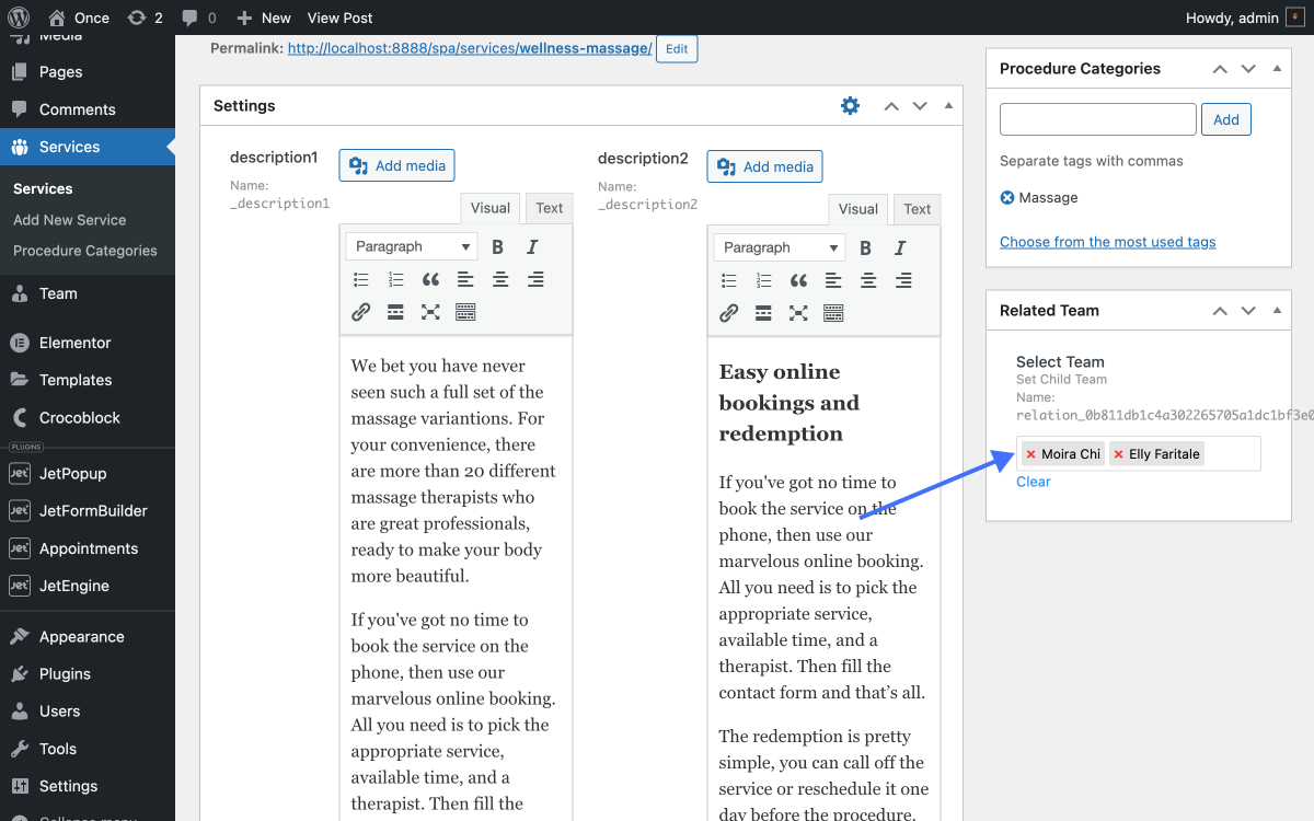
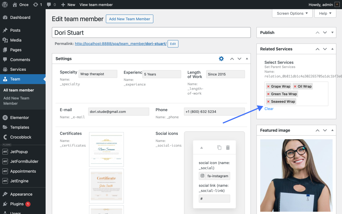
With the JetAppointment plugin, one can set relationships between services and providers using dedicated screen elements:
On Provider pages (in our use case, it’s the “Team” CPT) — one can add multiple services that the provider performs using the Related Services screen element;
On Service pages (in our use case, it’s the “Services” CPT) — one can add multiple providers who execute the service using the Related Team screen element.
This setup ensures dynamic filtering on the front end.
When a user selects a service through the booking form, the service providers field displays only those providers associated with the chosen service.
Create a Static Form with JetFormBuilder
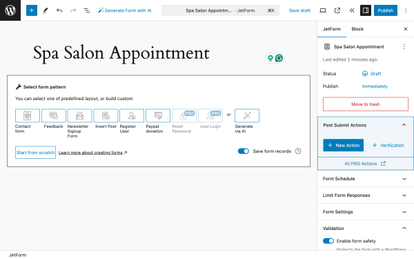
Go to WordPress Dashboard > JetFormBuilder > Add New Form.
Name your form (e.g., “Spa Salon Appointment”). Upon default, the new form contains the Welcome block; we don’t need it, so we’ll remove it.
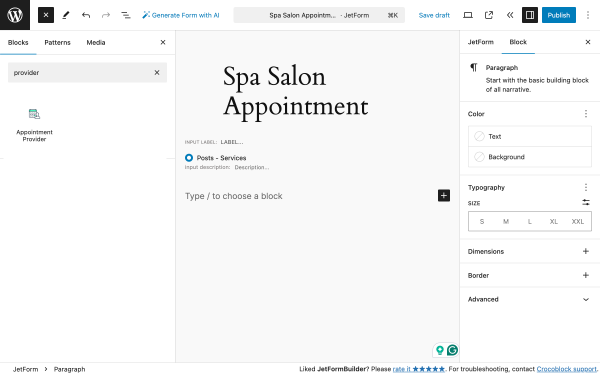
Add the form fields
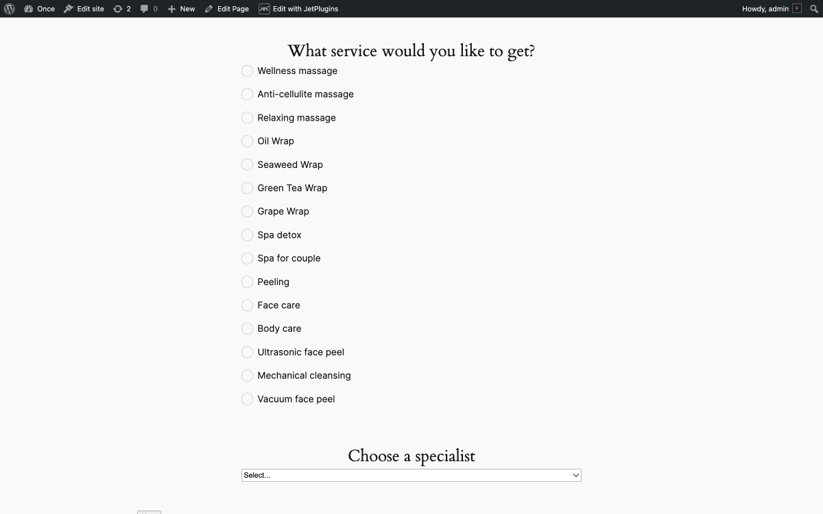
For our use case, we’ll need the following fields:
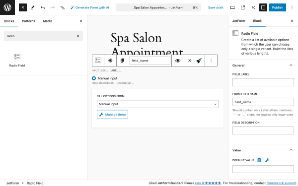
Radio Field — a block that will display a list of services;
Appointment Provider — a block that will display a list of providers;
Appointment Date — a JetAppointment plugin form field block that adds an appointment calendar;
Text Field — a block that users will use to enter their name;
Text Field — a block that users will use to enter their email address;
Text Field — a block that users will use to enter their phone number;
Action Button — a block that adds a button by clicking which users can submit the form.
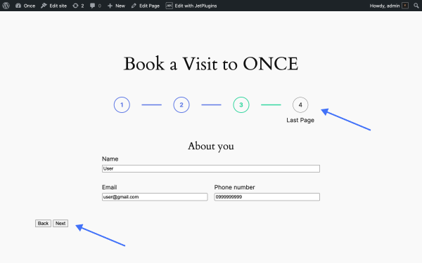
All major steps in this form will be separated by the Form Page Break Field block and a Progress Bar block that adds the navigation and shows users on what page they are now and how many pages are left to finish the form.
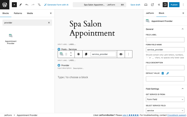
Services and providers fields
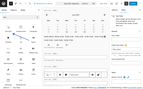
Now, let’s add fields to display the services and providers. Click on the “+” button to add form blocks.
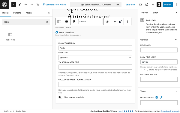
This block will display the list of available services. In the FILL OPTIONS FROM dropdown, we need to select “Posts.” Then, a new field, POST TYPE, will appear. There, we need to select “Services.”
In the block settings, we need to change the FROM FIELD NAME value to “service.”
Since we have installed the JetAppointment plugin, it adds several additional fields to the JetFormBuilder’s array.
Type “provider” in the search field to find the Appointment Provider block. Then, click on it to add it to your form.
In the block settings, we need to change the FROM FIELD NAME value to “service_provider,” and in the Field Settings section in the GET SERVICE IDFROM, choose “Form Field” and select the previous field “service.”
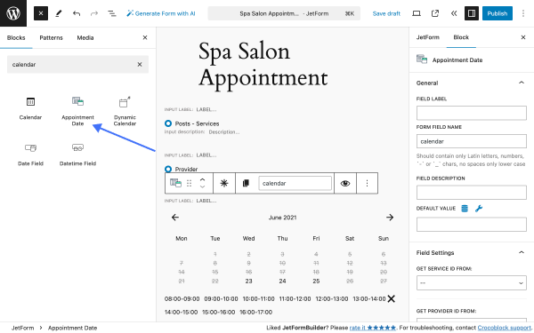
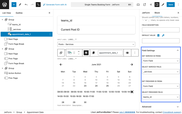
Now, let’s add the Appointment Date block; type “calendar” in the search box and click on the block to add it to your form.
In the block settings, we need to change the FROM FIELD NAME value to “calendar.”In the Field Settings, we need to adjust a set of fields:
GET SERVICE ID FROM — in this field, select the value “Form field.” When selected, a SELECT SERVICE FIELD field will appear:
SELECT SERVICE FIELD — in this field, select the value “service,” which is the first field of this form that calls the list of services;
GET PROVIDER ID FROM — in this field, select the value “Form field.” When selected, a SELECT PROVIDER FIELD field will appear:
SELECT PROVIDER FIELD — in this field, select the value “service_provider,” which is the first field of this form that calls the list of services.
When added, both front-end fields allow users to select a service and its corresponding service provider.
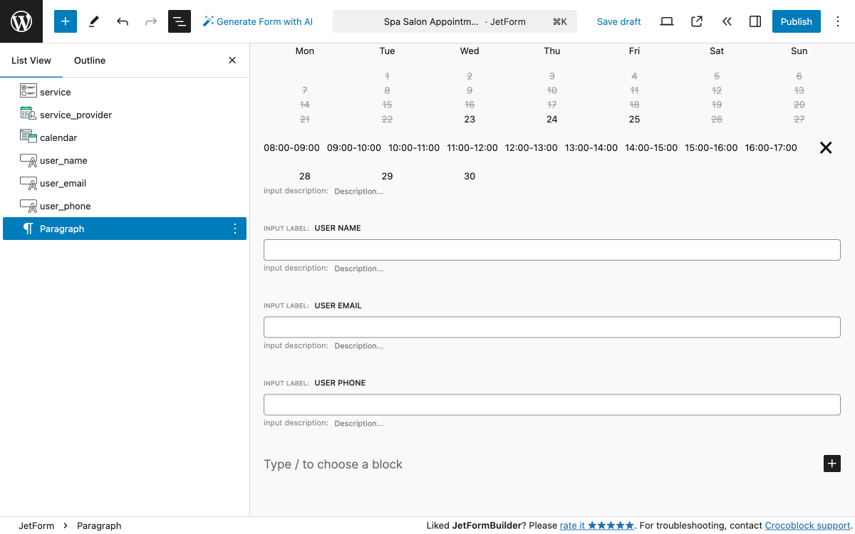
User data fields
For this, we’ll need three Text Field blocks to collect basic user information, including “Name,” “Email,” and “Phone number.”
Use the search to find the Text Field block, type “text,” and add it three times.
Now, we’ll adjust the blocks accordingly:
Text Field — in the first block, change the FIELD LABEL to “User name”;
Text Field — in the second block, change the FIELD LABEL to “User email,” scroll down to the Field section, and change the FIELD TYPE value to “email”;
Text Field — in the second block, change the FIELD LABEL to “User phone,” scroll down to the Field section, and change the FIELD TYPE value to “tel.”
As a result, you will get a set of three Text Field blocks to collect basic user information.
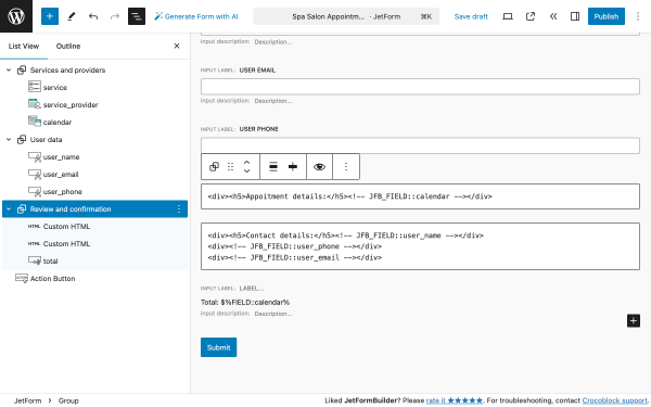
Review and confirmation fields
The last group of blocks sums up the information gathered through the form. For this, we’ll need two CUSTOM HTML blocks and a Calculated Field block.
The first CUSTOM HTML block will display the details of the selected service, its provider, and the date/time fetched from the “calendar” field; we’ll use the code:
The Calculated Field block will display the price of the service fetched from the “calendar” field.
The final block in this form is the Action Button.
Additional blocks
For more convenience, you can group the form fields into meaningful steps by adding the Form Page Break block. This block divides one large form into several parts and makes each part appear after filling in the previous part.
With the help of Heading blocks, you can name those groups so users will immediately understand what they will have to do next.
Alternatively, you can add the Progress Bar blocks. They will add navigation and show users what page they are on now and how many pages are left to finish the form.
Create a Service and Team Appointment Form with JetFormBuilder
The Service and Team forms have minor differences while having similar logic.
Each service or team member page may contain a booking form with a hidden field that obtains the ID of this page. Through the form, we’re going to get this page ID, and the Appointment Provider field and Appointment Date field will filter relevant entries.
Service page booking form
The first thing we need to do is to establish a “service-provider”relationship. To do so, go to the service custom post type page, find the section Related Team, and add all providers relevant to this service.
Similarly, you can add all relevant services by editing the provider’s CPT page.
Now, we can proceed to the JetFormBuilder form.
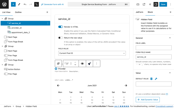
The Service form should have a Hidden Fields block that allows us to obtain the ID of a service page with the following options enabled:
FIELD VALUE — is set to “Current Post ID”.
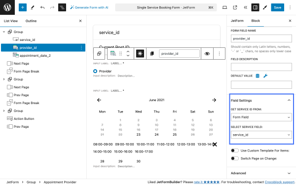
To select providers related to the service we’re interested in, we need to map the Appointment Provider block to the Hidden Field block.
Go to Appointment Provider block settings, Field Settings section, and apply the following settings:
GET SERVICE ID FROM — in the dropdown, select the “Form Field” option;
SELECT SERVICE FIELD — in the dropdown, choose the Hidden Block.
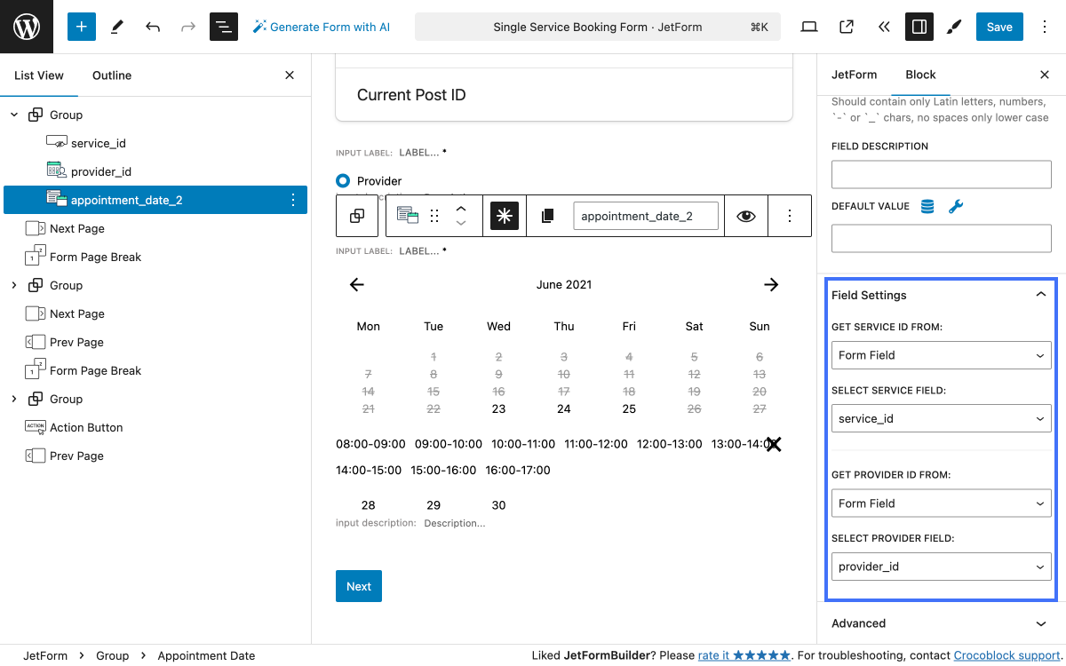
We need to adjust the Appointment Date block accordingly so that the user can book a date during certain providers’ booking hours.
Go to Appointment Date block settings, Field Settings section, and apply the following settings:
GET SERVICE ID FROM — in the dropdown, select the “Form Field” option;
SELECT SERVICE FIELD — in the dropdown, choose the Hidden Block;
GET PROVIDER ID FROM — in the dropdown, select the “Form Field” option;
SELECT SERVICE FIELD — in the dropdown, choose the Appointment Provider block.
This way, users will be able to choose providers related to the service and book specific dates.
Team page booking form
The first thing we need to do is to establish a “provider-service” relationship. To do so, go to the provider custom post type page, find the section Related Team, and add all providers relevant to this service.
Now, we can proceed to the JetFormBuilder form.
The same form-building logic applies to this type of form. The only thing that differs is that on the provider page, we no longer need the Appointment Provider block.
Apply the following form block settings:
Hidden Field — this field will obtain the ID of the provider page, FIELD VALUE set to “Current Post ID”;
Select Field — this field will display the services related to the provider:
Fill Options From — select “Posts”;
Post Type — set to “Services” (which is the “Services” CPT);
Appointment Date Field — this field will display the booking dates when a certain provider is available; go to block settings, Field Settings section, and apply the following settings:
GET SERVICE ID FROM — in the dropdown, select the “Form Field” option;
SELECT SERVICE FIELD — in the dropdown, choose Select Field block;
GET PROVIDER ID FROM — in the dropdown, select the “Form Field” option;
SELECT SERVICE FIELD — in the dropdown, choose the Hidden Block.
This way, your users will be able to choose services related to the provider and book specific dates.
Configure Form Actions
Go to JetForm in the right menu, under Post Submit Actions, and click the “+ New Action” button to add three form submit actions:
We’ll add them all at once and fine-tune them one by one.
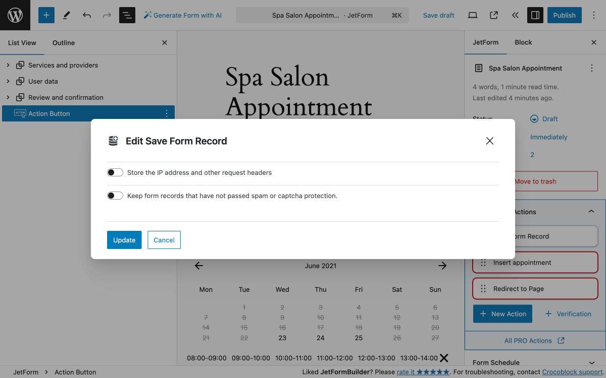
Save Form Record
The “Save Form Record” form action does not require fine-tuning. The action pop-up contains two switchers, both disabled by default. To edit the form submit action, hover it over and click the “pencil” icon.
The first switcher allows storing the IP address and other request headers.
The second switcher allows the keeping form records that have not passed spam or captcha protection.
When done, click “Update” to save or “Cancel” to discard settings.
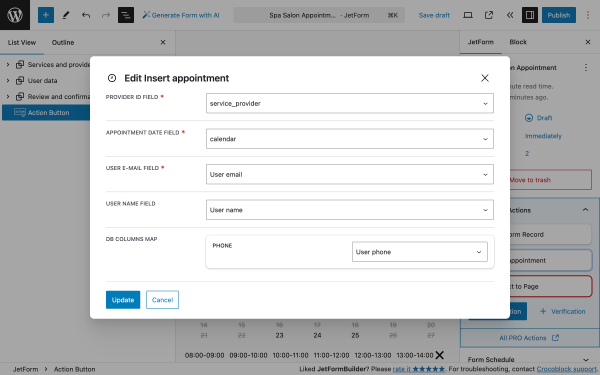
Insert appointment
The “Insert appointment” form submit action allows one to create an appointment entry in the corresponding section: WordPress Dashboard > Appointments > Appointments.
To edit the form submit action, hover it over and click the “pencil” icon.
In the Edit Insert appointment pop-up, you need to map the fields that correspond to your form.
When done, click “Update” to save or “Cancel” to discard settings.
Redirect to Page
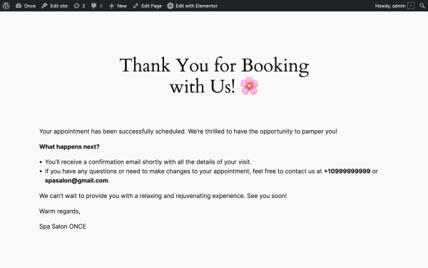
The “Redirect to Page” form submit action redirects the user to a “Thank you” or “Success” page upon completing the form. For this, you should create a separate page if you don’t have it.
For our use case, we’ve created a “Thank you” page that users will see after clicking on the “Submit” button.
To edit the “Redirect to Page”form submit action, hover over it and click the “pencil” icon.
The Edit Redirect to Page pop-up contains the following fields:
REDIRECT TO — in this drop-down menu, you can choose the type of page you would like to send the user to. We will choose the “Static page” value. When selected, the SELECT PAGE field will appear:
SELECT PAGE — this drop-down contains all the pages you’ve created so far. In our case, it’s the “Thank You for Booking with Us!” page;
URL QUERY ARGUMENTS — in this field, you can see the list of the fields added to the form. When you tick the checkbox near one of the fields, its value is used as the query argument and added to the URL. In our case, we leave this field empty;
URL HASH — in this field, you can set the subject of the letter that the user will receive. In our case, we leave this field empty.
When done, click “Update” to save or “Cancel” to discard settings.
Preview and Test
Preview the page and test the form to ensure all fields and integrations work correctly.
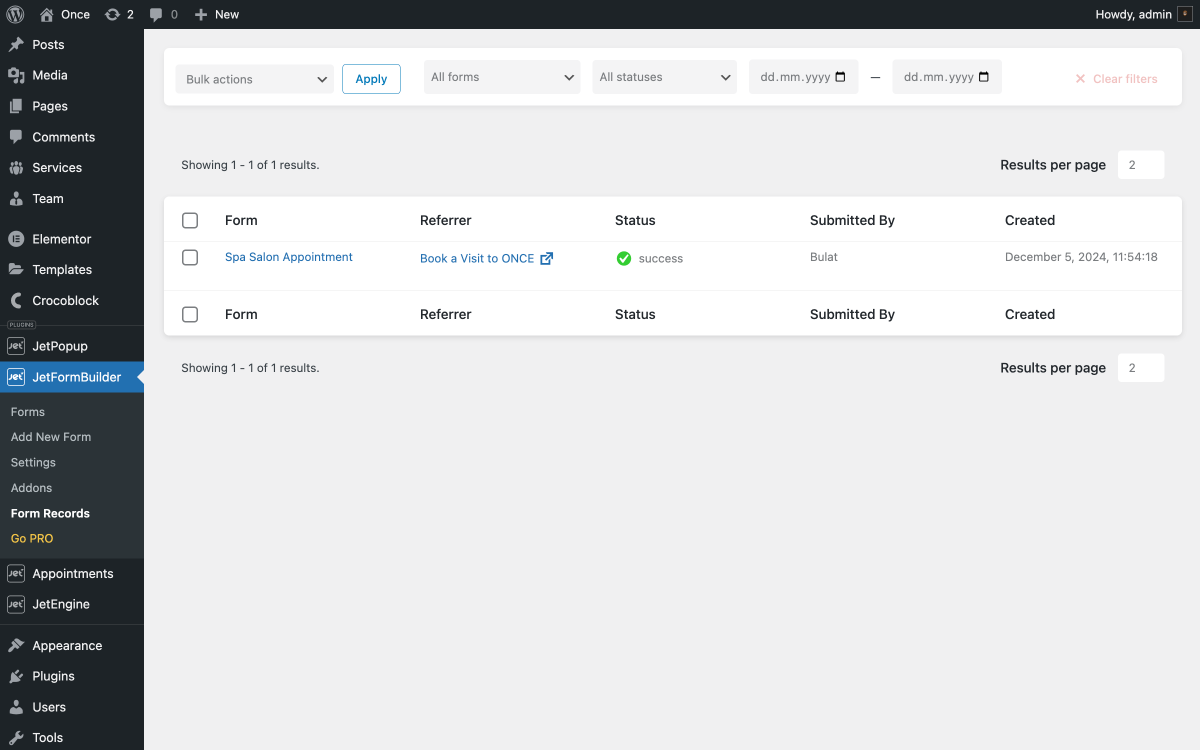
To check if the “Save Form Record” and “Insert appointment” form submit actions fired successfully, go to WordPress Dashboard > JetFormBuilder > Form Records.
There, you will see a new form record and its status. In our case, it’s “Success,” meaning that all form submit actions are working, and the appointment data has been saved.
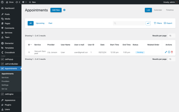
To check the status of a newly created appointment, go to WordPress Dashboard > Appointments > Appointments.
You will see a new appointment and its status there. All columns contain the data submitted on the front-end form, which means that the form is working and ready to accept booking appointments.
By following these steps, you can create a fully functional appointment form on your WordPress website using JetFormBuilder and JetAppointment.
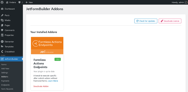
For this guide, you need the Formless Actions Enpoints addon installed and activated on your website.
Build a Form
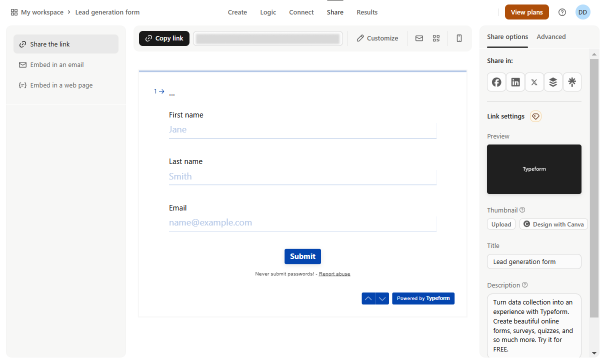
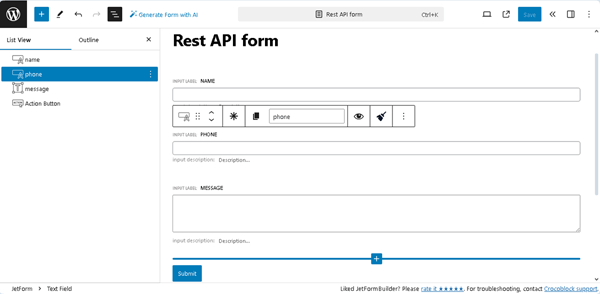
First, build a form on the Typeform website. For instance, we create a lead generation form with the “First name,” “Last name,” and “Email” fields.
Then, proceed to WordPress Dashboard > JetFormBuilder > Add New.
Here, we give a tilt to the form (“New Contact”) and delete the Welcome block added by default to build a form from scratch.
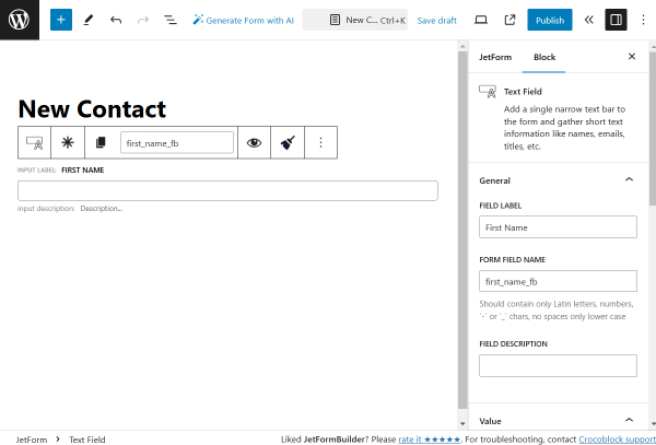
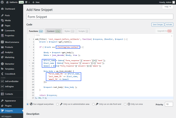
We add a Text Field with the “First Name” FIELD LABEL and the “first_name_fb” FORM FIELD NAME.
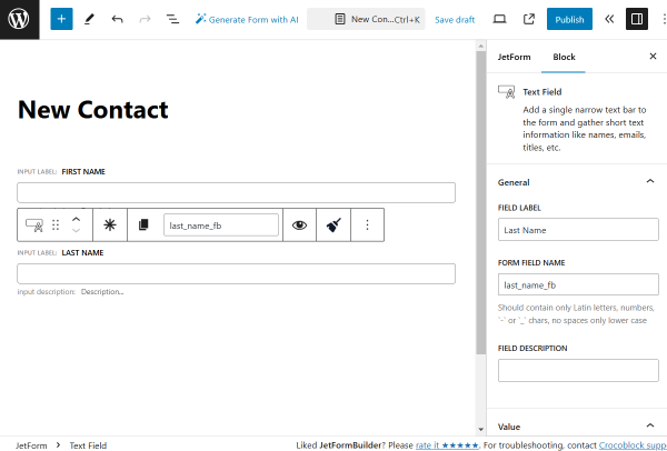
The next field is also a Text Field, this time with the “Last Name” FIELD LABEL and “last_name_fb” FORM FIELD NAME.
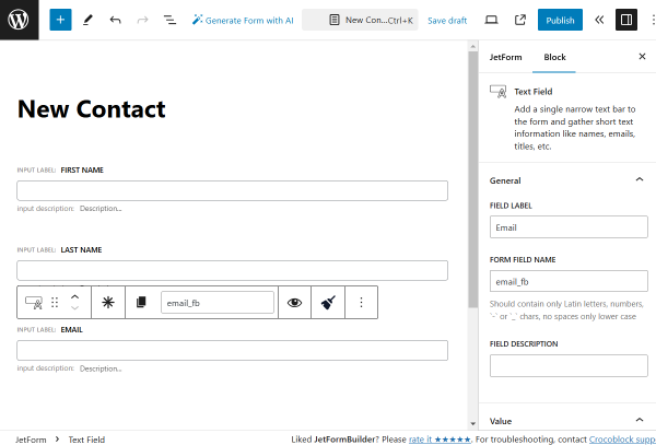
Then, we add one more Text Field with the “Email” FIELD LABEL and “email_fb” FORM FIELD NAME. Also, we change the FIELD TYPE to “Email.”
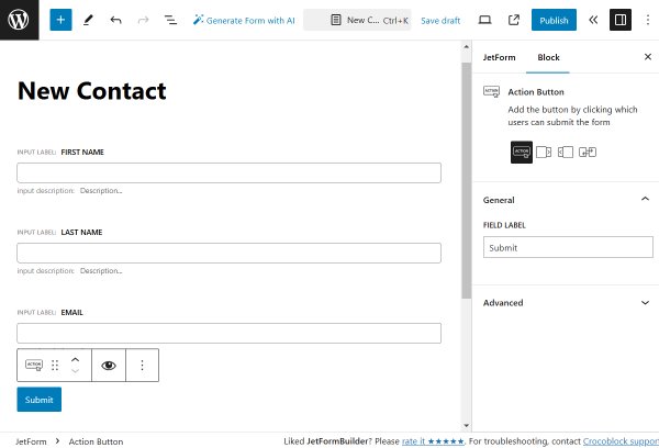
The last field in the form is the Action Button. For this field, we leave the settings default.
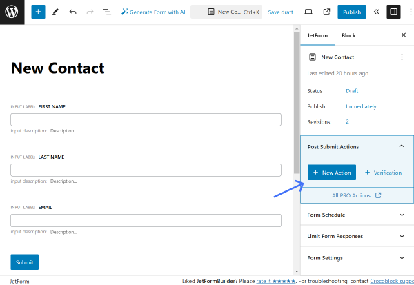
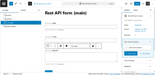
Proceed to the JetForm tab and open the Post Submit Actions section.
Press the “+ New Action” button.
If you want to update the default posts, select the “Insert/Update Post” action.
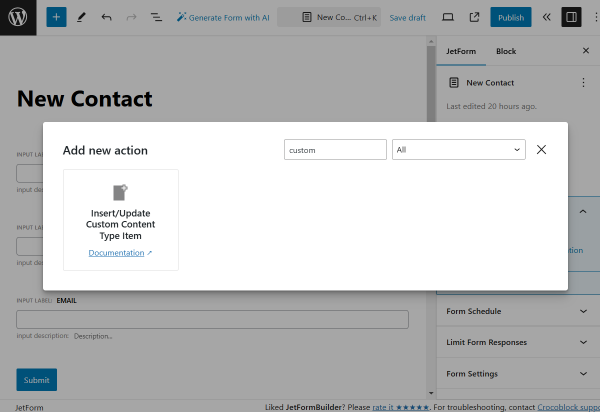
As we want to update the Custom Content Typeitems (available with JetEngine,) we find the “Insert/Update Custom Content Type Item” action and click it to open its settings.
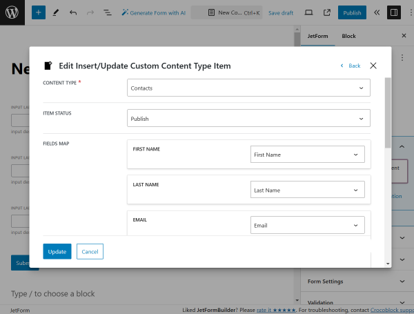
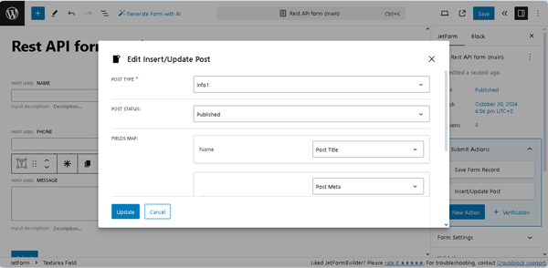
Pick the CONTENT TYPE where the posts should be created and set the ITEM STATUS. For example, we pick the “Publish” status to publish the submitted items right away.
Then, connect the form fields to the CCT fields in the FIELDS MAP.
Press the “Update” button to save the action.
When the form is ready, press the “Publish” button.
Create an Endpoint
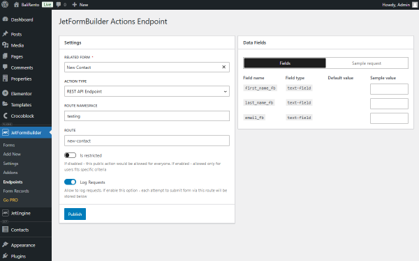
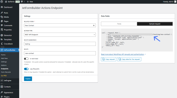
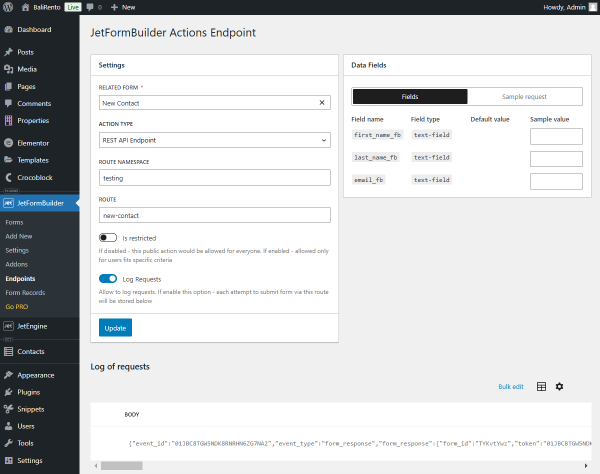
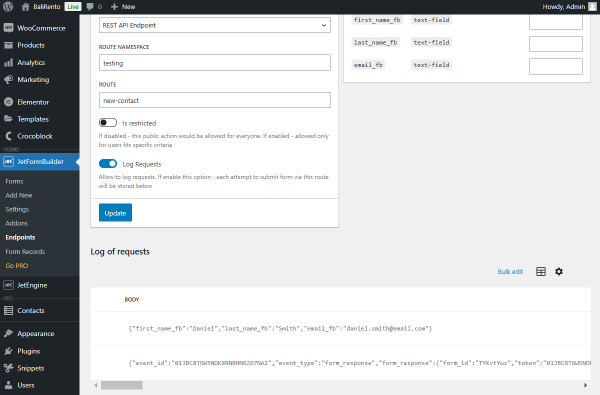
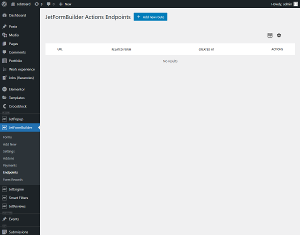
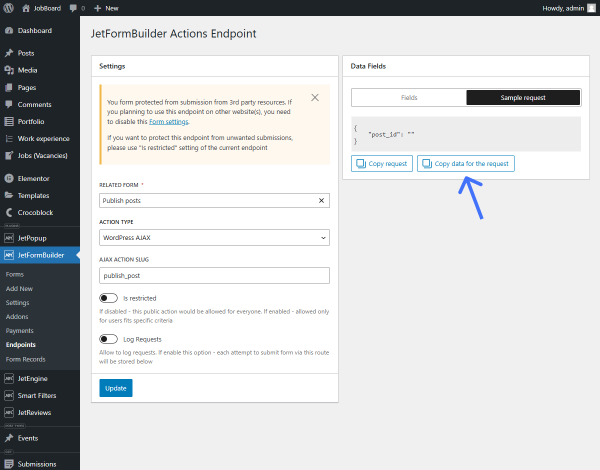
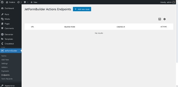
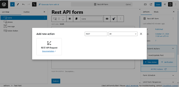
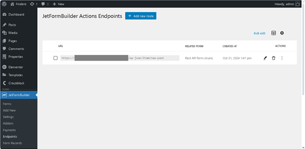
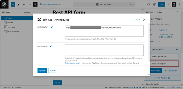
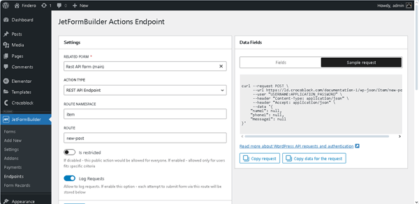
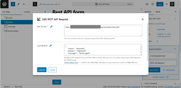
Head to WordPress Dashboard > JetFormBuilder > Endpoints and press the “+ Add new route” button.
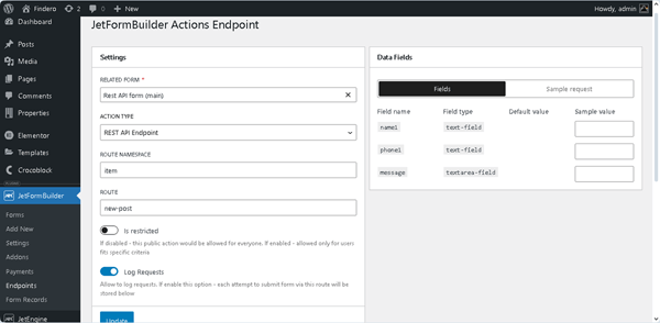
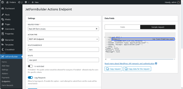
Pick the just-built form in the RELATED FORM field and change the ACTION TYPE to “REST API Endpoint.”
Then, complete the ROUTE NAMESPACE and ROUTE fields. In our case, we set the “testing” ROUTE NAMESPACE and “new-contact” ROUTE.
Also, activate the Log Requests toggle to save the form submission attempts into this endpoint’s record stored below the current settings fields.
Hit the “Publish” button.
Open the Sample request tab and copy the generated URL.
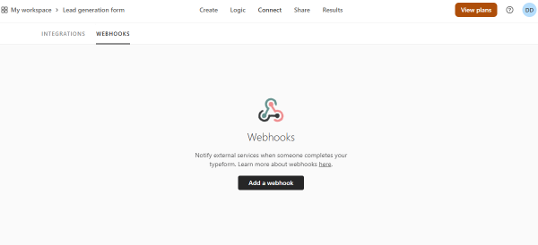
Return to the Typeform website and open the Connect tab.
There, open the Webhooks tab and hit the “Add a webhook” button.
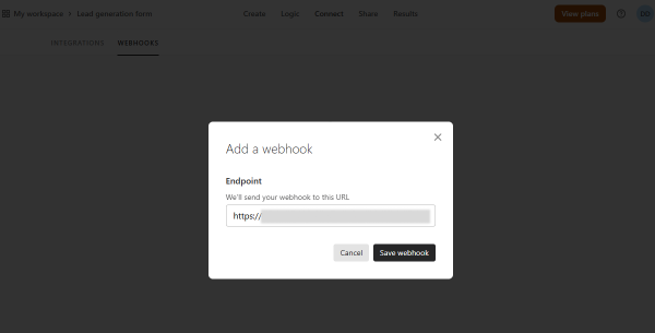
Paste the copied URL in the Endpoint field and click the “Save webhook” button.
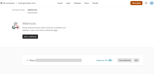
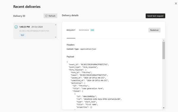
Enable the toggle next to the built webhook to activate the webhook and press the “View deliveries” button.
Send a Request
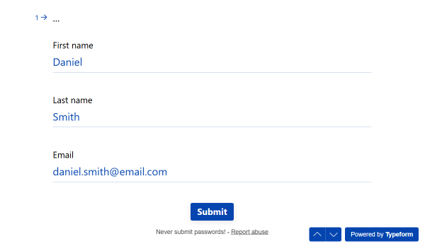
You can now send a test request. To do so, hit the “Send test request” button.
Now, on the same page, you will see if the test form submission is successful.
Return to the WordPress Dashboard > JetFormBuilder > Endpoints page to check the Log of requests section.
Here, you will see the form submission data.
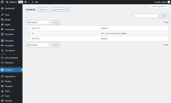
You can also check if a new item was created by opening your CCT page.
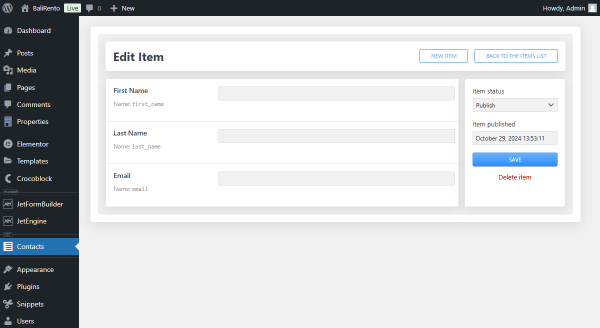
Press the “Edit” button to check the item.
The field data is now empty, as it was the test submission.
You can now delete this test item by pressing the corresponding button.
Add a Code Snippet
NOTE
The following part requires the plugin where the code snippets can be inserted, installed and activated on your website. In our case, it’s the Code Snippets plugin.
If you also work with the Code Snippets plugin, proceed to WordPress Dashboard > Snippets > Add New.
Name a snippet and paste the code snippet into the empty area.
This tutorial details setting up WordPress front-end post management using the JetFormBuilder plugin, making it available to preview and publish posts from the front end.
With the Formless Actions Endpoints addon, you can create an endpoint and attach it to the button so that the user can publish the posts that are pending review.
In this tutorial, we will describe how to create the endpoint and how it can be used in two use cases:
How to create a custom front-end post manager with a listing of user’s pending posts on the User Account page that can be published;
How to set a pending post review system with a dedicated Pending Review page, where the user can review their submitted posts before publishing.
This chapter describes how to create endpoints that can be used differently on your WordPress website with the Button widgets.
Create a form
Go to WordPress Dashboard > JetFormBuilder > Add New to open the form creation page.
Press the “Start from scratch” button in the Welcome block to develop your own form.
Type the form’s name (“Publish posts” for this case) instead of the “Add title” placeholder.
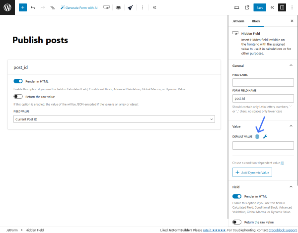
Delete all field blocks except the Hidden Field, which is first.
Keep the “Current Post ID” FIELD VALUE.
Navigate to the Block settings tab on the right panel and scroll to the Value section. Here, hit the “coin-stack” icon near the DEFAULT VALUE field.
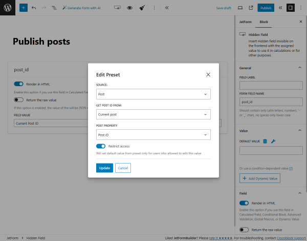
In the Edit Preset pop-up, pick the “Post” SOURCE, “Current post” option in the GET POST ID FROM field, and “Post ID” POST PROPERTY.
Then, hit the “Update” button.
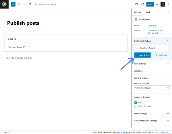
Afterward, open the JetForm settings tab on the right panel, scroll to the Post Submit Actions tab, and hit the “+ New Action” button.
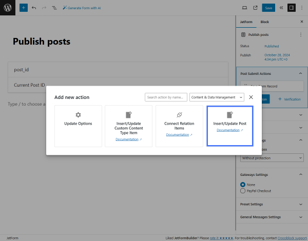
In the Add new action pop-up, find and select the “Insert/Update Post” action.
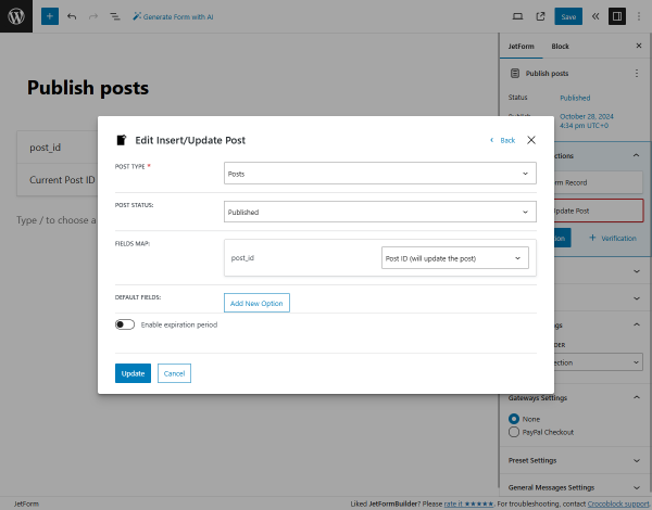
Then, set the required POST TYPE (“Posts” in our case, but it also can be a Custom Post Type (CPT)) and “Published” POST STATUS.
In the FIELDS MAP section, choose the “Post ID (will update the post)” option as the post_id.
To save the settings, push the “Update” button.
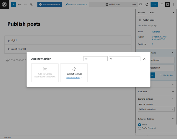
Additionally, you can add the “Redirect to Page” action. To do so, hit the “+ New Action” button and select the corresponding action from the pop-up.
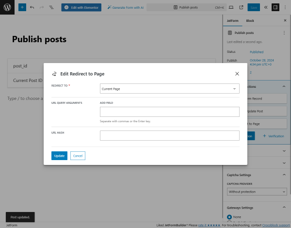
In the Edit Redirect to Page pop-up, we set the “Current Page” option in the REDIRECT TO drop-down menu, so after publishing a post, the user will be returned to the same page. You can adjust other options here that suit you more, like the “Static Page,” “Custom URL,” or “Inserted/Updated post.”
Hit the “Update” button to save the action settings.
Eventually, press the “Publish/Save” button to save the form.
Create a new endpoint
Navigate to the WordPress Dashboard > JetFormBuilder > Endpoints tab that appears when the Formless Actions Endpoints addon is installed and activated. Here, press the “+ Add new route” button.
It opens the JetFormBuilder Actions Endpoint page in a new tab.
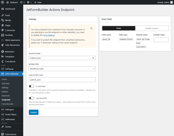
In the Settings section, pick the newly-created form as the RELATED FORM, the “WordPress AJAX” ACTION TYPE, and enter the “publish_post” AJAX ACTION SLUG.
Then, hit the “Publish” button. Keep this page open since we will return to it later.
After that, you can proceed to set the Listing template or the Single page for posts with the “Pending Review” status.
Listing with the User Posts with the Pending Status
We will create a listing with the user’s pending posts and the “Publish” button and place it on the User Account page.
Create a custom query
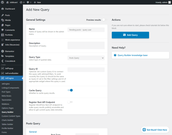
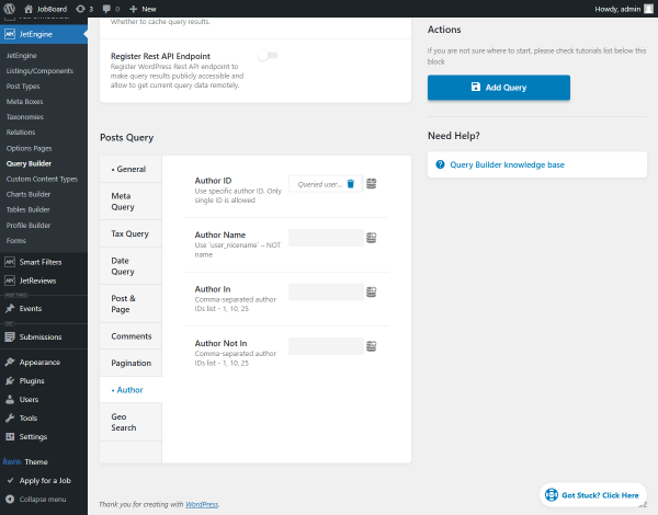
Go to WordPress Dashboard > JetEngine > Query Builderand click the “Add New” button.
Enter the Name and keep the “Posts Query” Query Type.
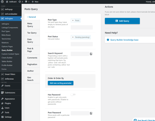
Scroll down to the Posts Query section and set the required Post Type (“Posts” in our case) and “Pending (pending)” Post Status in the General settings tab.
Then, unroll the Author settings tab, where you should hit the “coin-stack” icon near the Author ID field and set the “Queried user ID” macro.
After that, hit the “Add/Update Query” button to save the query settings.
Create a Listing template
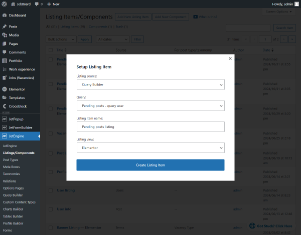
Head to WordPress Dashboard > JetEngine > Listings/Components directory and click the “Add New Listing Item” button.
Pick the “Query Builder” Listing source and the just-built query as the Query. Then, complete the Listing item name and pick the “Elementor” Listing view.
Press the “Create Listing Item” button.
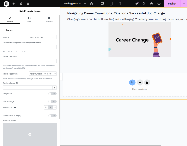
Fill in the Listing template with the needed content using Dynamic Widgets.
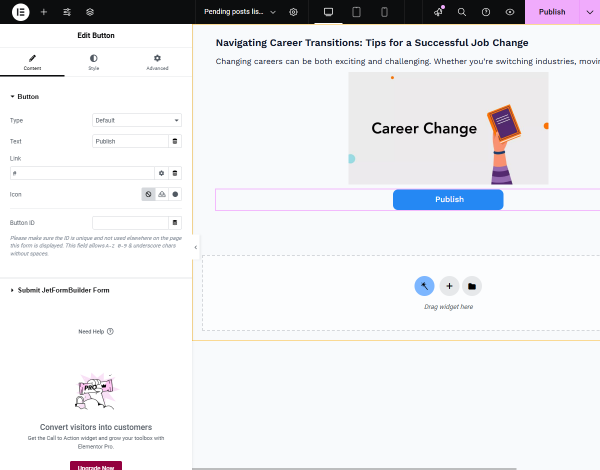
Then, add the Button (by Elementor) or Button (by the JetElements plugin) widget and adjust the general settings as needed. In the given case, we add the Elementor’s Button widget and change the Text to “Publish.”
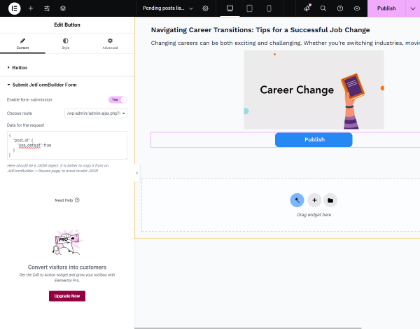
With the Formless Actions Endpoints addon installed and activated, the Submit JetFormBuilder Form settings tab is available.
Unroll it and activate the Enable form submission toggle.
In the Choose route drop-down, select the recently created endpoint URL.
Then, revisit the JetFormBuilder Actions Endpoint page with the created endpoint, open the Sample request tab in the Data Fields section from the right side, and hit the “Copy data for the request” button.
Return to the Listing template and enter the copied data into the Data for the request field.
Then, press the “Publish” button to save the settings.
Attach template to Profile Builder
Move to WordPress Dashboard > JetEngine > Profile Builderand open the Account Page tab.
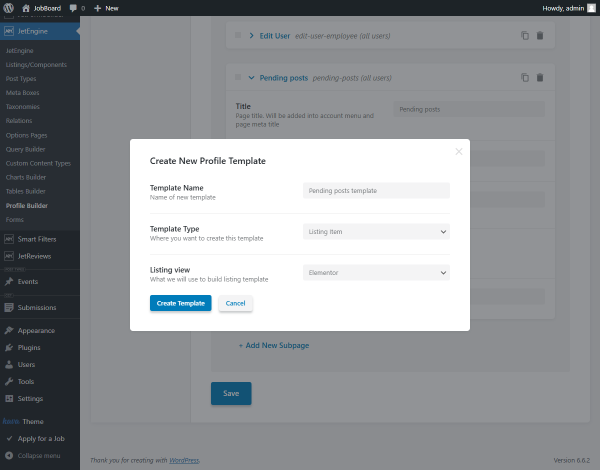
Scroll down the page and hit the “+ Add New Subpage” button.
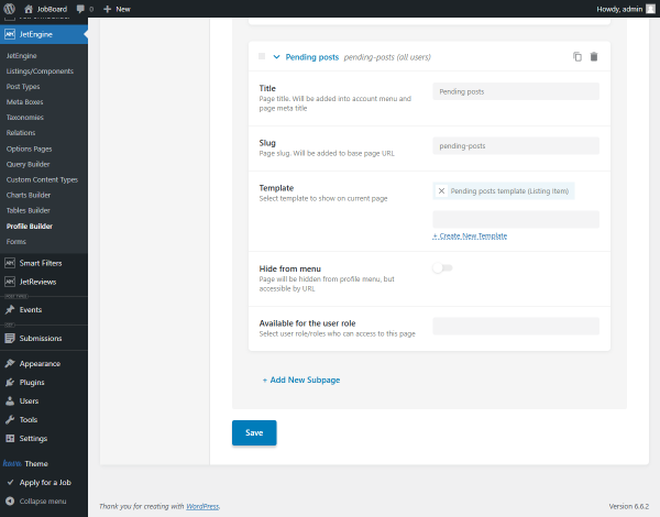
We complete the Title field with “Pending posts,” and the Slug is filled automatically.Here, you can set the pre-mage Template, but we create it from scratch, so we click the “+ Create New Template” link. In the pop-up, we enter the Template Name and pick the Template Type (it can be “Listing Item” or “Elementor Template”). Since we choose the “Listing Item” option, we also select the Listing view.
By clicking the “Create Template” button, we open the Listing template in the selected editor in the new tab.
Drag-n-drop the Listing Gridwidget to the editing page and set the recently created Listing.
Customize the template additionally if needed, and whenever you are ready, hit the “Publish” button to save the template.
After that, you can return to the Account Page tab and set other template settings if needed.
Checking the Results
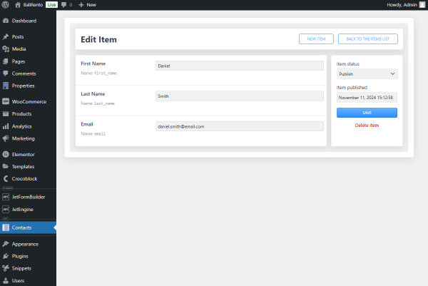
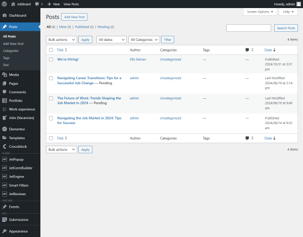
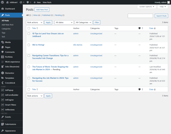
We open the WordPress Dashboard > Posts > All Posts tab to check the post list. Two of the posts have pending status.
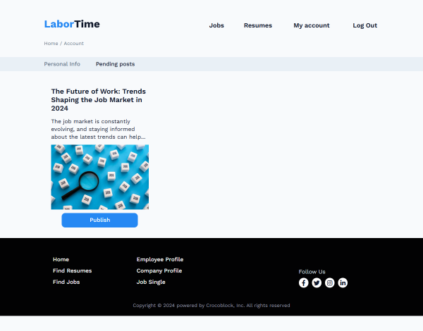
Then, we open the Account page on the front end and proceed to the “Pending posts” tab from the Profile Menu with the recently created account template.
Here, we hit the “Publish” button under the “Navigating Career Transitions” post. After the page reloads, only one post with the pending status is left.
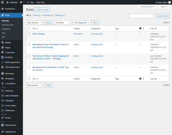
We return to the back end to check the post list. The “Navigating Career Transitions” post is published now.
By following the same steps, you can also create an Account subpage that shows the published posts.
Single Post template as the Pending Preview Page
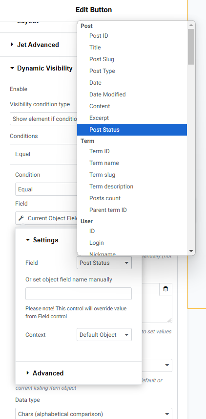
In this chapter, we will create the “Add new post” form and place it on the User Account page. After submitting it, the user will be redirected to the Single Post template with the inserted post. Here, the “Publish” button will be placed, which will be visible only for the pending post via the Visibility Condition.
Create a new form
Go to WordPress Dashboard > JetFormBuilder > Add New to open the form creation page.
Press the “Start from scratch” button in the Welcome block to develop your own form. Type the form’s name (“Add new post” for this case) instead of the “Add title” placeholder and delete the Hidden Field.
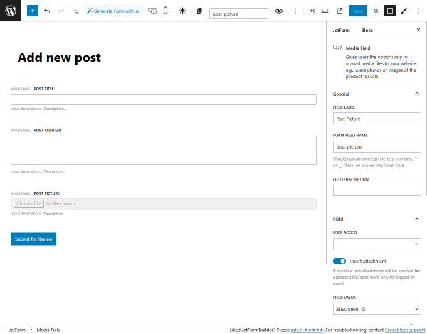
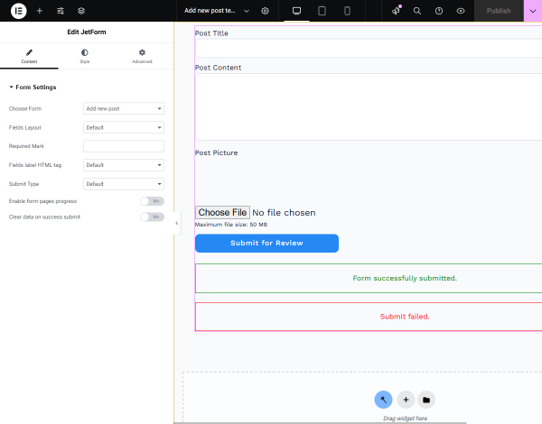
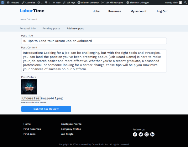
Now, you can add form fields for users to fill in the post content. In our case, we set such fields:
Media Field with the “Post Picture” FIELD LABEL. We enable the Insert attachment toggle and set the “Attachment ID” FIELD VALUE;
Action Buttonwith the “Submit for Review” FIELD LABEL.
Open the JetForm settings tab on the right panel and hit the “+ New Action” button in the Post Submit Actions tab.
In the Add new action pop-up, find and select the “Insert/Update Post” action.
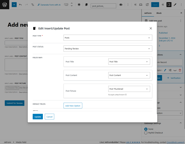
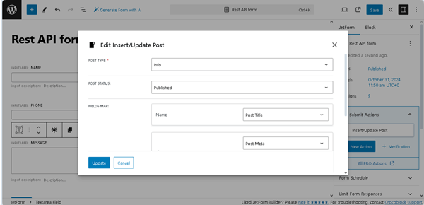
In the Edit Insert/Update Post pop-up, set the required POST TYPE (“Posts” in our case, but it also can be a Custom Post Type (CPT)) and “Published” POST STATUS.
In the FIELDS MAP section, choose the post’s meta field where the data from the form field will land. For example, for the “Post Picture” form field, we pick the “Post Thumbnail” option.
To save the settings, push the “Update” button.
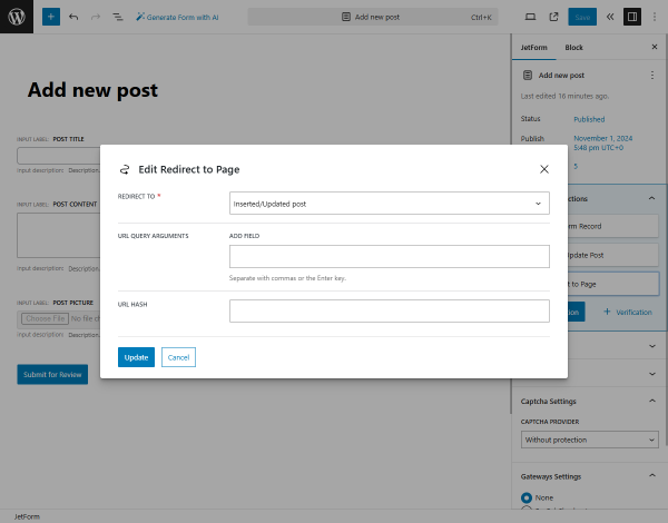
Then, hit the “+ New Action” button and select the “Redirect to Page” action from the pop-up.
In the Edit Redirect to Page pop-up, set the “Inserted/Updated post” option in the REDIRECT TO drop-down menu, so after submitting the form, the user will proceed to the unpublished post’s Single page.
Hit the “Update” button to save the action settings.
Eventually, press the “Publish/Save” button to save the form.
Add form to the account template
Move to WordPress Dashboard > JetEngine > Profile Builderand open the Account Page tab.
Scroll down the page and hit the “+ Add New Subpage” button.
Complete the Title field (“Add new post” in our case), and the Slug will be filled out automatically.
For the Template field, click the “+ Create New Template” link. In the pop-up, enter the Template Name and pick the Template Type (it can be “Listing Item” or “Elementor Template”). If you choose the “Listing Item” option, you can also select the Listing view.
Afterward, click the “Create template” button.
In the editor, add a JetForm widget and pick a just-built form in the Choose Form field.
Customize the form settings if needed and press the “Publish/Update” button.
After that, you can return to the Account Page tab and set other template settings if needed.
Set the post content with Dynamic Widgets and the “Publish” button as described in the Create a Listing template chapter.
Then, we will adjust the Dynamic Visibility conditions so the “Publish” button will be hidden for the published posts and shown for the pending posts.
Open the Advanced section of the Button widget, unroll the Dynamic Visibility tab, and Enable the toggle.
Keep the “Show element if condition met” Visibility condition type and pick the “Equal” Condition.
Hit the “Dynamic Tags” button near Field and select the “Current Object Field” option from the JetEngine section.
Then choose the “Post Status” Field.
In the Value texarea, type the “pending” text.
Also, you can add a button for the post editing. To learn how to create the corresponding form and place it in the template, proceed to the Front-End Post Submission Formtutorial.
Afterward, hit the “Publish” button to save the Single Post template settings.
Testing the flow
First, open the Account page on the front end and proceed to the template for adding a new post.
Fill in the fields and submit the form to create a post with the “Pending Review” status.
At the same time, you can navigate to the WordPress Dashboard > Posts > All Posts tab to check if the pending post appears in the list.
After submitting the form, it will redirect to the inserted post’s single page.
Since the post has the “Pending Review” status, the “Publish” button is visible. You can click it to publish the post.
After the post is published, the “Publish” button is hidden.
On the backend, the post gets the appropriate status.
That’s all. Now you know how to create and use an endpoint that enables users to publish posts pending review with the help of the JetFormBuilder plugin and Formless Actions Endpoints addon for WordPress.
In this tutorial, we explain how to use the Formless Actions Endpoints add-on for theJetFormBuilder plugin to create an endpoint on the main site that allows users to add WordPress default posts or/and Custom Post Types (CPT) posts simultaneously on the main and auxiliary sites via the same form.
To install the add-on, move to the main site, then go to WordPress Dashboard > JetFormBuilder > Addons. Find the “Formless Actions Endpoints” add-on in the All Available Addons section. Press the “Install Addon“button, and once installed, it will appear in the Your Installed Addons section. Next, click “Activate Addon” to prepare it for further work.
Also, you can install and activate this add-on as any WordPress plugin. Read a detailed tutorial to go through the installation process.
After the add-on activation, the Endpoint tab will be added to the JetFormBuilder Dashboard.
Create a Form on the Main Site
This form is created on the first site (“Findero” in this tutorial).
Navigate to the WordPress Dashboard > JetFormBuilder > Add New tab to create a new form.
Insert form fields
Press the “Start from scratch” button in the Welcome block to develop your form. Then, press the “replace” link.
Type the form’s name (“Rest API form (main)” for this case) instead of the Add title placeholder.
In the next stage, add the needed fields.
In this case, we did the following to the form fields:
Customized the default Text Field: inserted its FIELD LABEL (“Name”), and the FORM FIELD NAME was generated automatically based on the completed FIELD LABEL; then we made this field required for completion by pressing the “asterisk” button in the block’s inline toolbar;
Added another Text Field (typed the “Phone” FIELD LABEL and selected the “Tel“ FIELD TYPE) for inserting the contact phone;
You can also watch the Post Submit Actions Overview video for more details about managing the Post Submit Actions.
To add the needed Post Submit Action, press the “+ New Action” button under the default“Save Form Record” and select the “Insert/Update Post” option in the pop-up. Then, in the newly-appeared Edit Insert/Update Post pop-up, set the POST TYPE and POST STATUS, and select the options in the FIELD MAP block.
In this case, we selected the “Info1” CPT as the POST TYPE and picked the “Published” POST STATUS. Then, we set values that would be entered into the form’s “Name” field as the CPT “Post Title” and assigned the corresponding CPT “Post Meta” fields to the form’s fields.
NOTE
Selecting the “Post” POST TYPE allows for the addition of WordPress default posts.
Finally, press the “Update” button and save the form by pressing the “Publish/Save” button.
Set the Actions Endpoint on the Main Site
Navigate to the WordPress Dashboard > JetFormBuilder > Endpoints tab to set the needed route options. First, press the “Add new route” button to create a new one.
Select the required form from the RELATED FORM drop-down list (here, we selected the previously developed “Rest API form (main)”). Then, choose the “Rest API Endpoint” ACTION TYPE option.
After that, the ROUTE NAMESPACE and ROUTE text fields were activated. Type the names of the ROUTE NAMESPACE and ROUTE 一 the “item” and “new-post” texts in this case, respectively. In the next step, enable the Log Request toggle to allow logging requests to collect all attempts to submit the form via this route.
Finally, scroll the tab down and press the “Update” button.
Read about managing the endpoint settings in the How to Set Up Formless Actions Endpoints tutorial.
Enable the JetEngine’s Settings on the Auxiliary Site
Navigate to the auxiliary site (the “BaliRento” in this case). Move to the WordPress Dashboard > JetEngine > JetEngine dashboard tab. Then, enable the Rest API Listings toggle of the opened Modules > Default Modules section. Scroll this section down and press the “Save” button under the Default Modules section.
Create a Form on the Auxiliary Site and Customize its Post-Submit Actions
Navigate to the WordPress Dashboard >JetFormBuilder > Add New tab to create a new form and add the needed fields that will include data to be shown on both sites.
Here, we built the form from scratch: deleted the Welcome block, typed the “Rest API” text as the form’s name instead of the Add title placeholder, and inserted the Text Fields and Textarea Fields.
NOTE
Displaying data from the auxiliary site on the main site via REST API is available for the Text, Number, Checkbox, Radio, Select, Date, Datetime, Time, Textarea, and Range Fields.
After that, navigate to the Post Submit Actions section of the JetForm settings, press the “+ New Action” button, then find the “Insert/Update Post” action in the Add new action pop-up and click on it.
In the newly-appeared Edit Insert/Update Post pop-up, select the needed POST TYPE (the “Info” CPT option, in this case), choose the needed POST STATUS (“Published”, here), then fill in the FIELDS MAP fields. As previously, we assigned the corresponding CPT “Post Meta” fields to the form’s fields.
Once completed, press the “Update” button on the pop-up.
In the next step, press the “+ New Action” button and find the “REST API Request” action in the search bar of the Add new action pop-up.
After that, press the “REST API Request” button.
Return to the main site (“Findero” in this tutorial) to the WordPress Dashboard > JetFormBuilder > Endpoints tab to the enlisted endpoint and unroll the created endpoint (hover over it and press the “pencil” icon).
In the JetFormBuilder Actions Endpoint page, navigate to the Data Fields section and open the Sample request tab. Here, copy the URL from the request data (the “https://*******************.com/wp-json/item/new-post” text in this case).
After that, return to the auxiliary site and continue to develop the form. Here, paste the copied URL into the REST API URL field of the Edit REST API Request pop-up.
Then, return to the main site (“Findero” in this tutorial) to the JetFormBuilder Actions Endpoint page, navigate to the Data Fields section and Sample request tab. Here, copy the data referring to the form field (in our case, the following text):
After that, move back to the form on the auxiliary site and paste the copied values into the CUSTOM BODY field of the Edit REST API Request pop-up. Here, you need to define the connections between the fields of forms developed on the main and auxiliary sites in the following format:
“main site form field” : “auxiliary site form field”
Press the “wrench” icon near the CUSTOM BODY field and select the name of the needed form field.
In this tutorial, the text in the CUSTOM BODY field looks as follows:
Once completed, press the “Update” button to close the Edit REST API Request pop-up.
Finally, save the form.
Fill in the Form on the Front End
Move to the top of the form and press the “Use the form” button. After pressing it, the Use the form pop-up will appear. Set the needed widget/block/element and a page to add the form.
Then, the page with the added form will be opened in a new window. In this case, the JetForm widget/block/element will be added to the end of the page. Here, you can customize this page according to your preferences.
Navigate to the front and fill out the form.
After completing the form, the “Form successfully submitted.” text will be displayed under the form.
To check if the posts were added both to the main and auxiliary sites, navigate to the WordPress Dashboard and unroll the CPT posts tab on the auxiliary site.
Also, return to the main site. Unroll the corresponding CPT posts tab.
That’s it. Now you know how to use the Formless Actions Endpoints addon for the JetFormBuilder plugin to create an endpoint on the main site that allows users to add the WordPress default posts or/and CPT posts simultaneously both on the main and auxiliary sites via the same form.
Go to WordPress Dashboard > JetFormBuilder > Add New to create a new form.
Give it a name; in our case, it’s “Online Registration Form.”
Initially, the Welcomeblock will be added to the page. With the help of this block, you can select the ready-form patterns.
As we want to build a new form from scratch, we just delete the Welcome block.
We want to begin our form with the heading so we add a Heading Fieldto the page and complete its FIELD LABEL; in our case, “Registrant Information.”
Then, we add a Columns block to create a two-column layout.
In the first column, we put a Text Field named “First Name” (FIELD LABEL). The FORM FIELD NAME is generated automatically based on the completed FIELD LABEL.
We also make this field required for completion by pressing the “asterisk” button above the field.
Then, we proceed to the Advanced tab of this field and complete the PLACEHOLDER field with the “Enter your first name” value.
This way, this placeholder text will be displayed in the field when it has not been completed yet.
In the second column, we add a Text Field, “Last Name” this time. It is also required for completing (“asterisk” button above the field) and has the “Enter your last name” PLACEHOLDER set in the Advanced tab.
Once again, we add one more Text Field, this time called “Email Address” and make it required.
Besides the default FIELD LABEL and FORM FIELD NAME fields, we should change the FIELD TYPE value in the Field tab now — from the default “Text” to the “Email” option.
Then, we set the PLACEHOLDER to the “Enter your email address” value.
Next, we want to add another section of fields, so we separate it with the “Ticket Selection” Heading Field.
The following block we add is a required Select Fieldnamed “Ticket Type.”
We set its PLACEHOLDER to “Type of ticket being purchased.”
Then, we press the “Manage items” button to add some options to this Select Field.
Press the “Add new Option” button to add an option to the Select Field.
Complete the LABEL, VALUE, and CALCULATE fields with the needed values.
For instance, we complete the LABEL with “Regular,” VALUE with “regular,” and CALCULATE with “100” to use this value for calculations.
Add as many options as needed by repeating the steps described earlier.
Once done, press the “Update” button.
The following field we add to the form is the “Quantity” Number Field.
In the Field tab, we set its MIN VALUE to “1” and MAX VALUE to “5” to limit the number of tickets that can be purchased in one form completion.
Here, we also set the PLACEHOLDER in the Advanced tab to “Number of tickets.”
Next, we add a Repeater Fieldand set its FORM FIELD NAME to “tickets_repeater.”
As we want to complete the Repeater Field with the already built Ticket Selection and Ticket Type fields, we return to them and press the “three dots” and “Copy” buttons.
Then, return to the Repeater Field, click the right button, and paste the copied field.
To make the fields unique, we change their FORM FIELD NAME so they will look like “ticket_selection_repeater” and “ticket_type_repeater”.
We also need to make the VALUES of the Select Field optionsunique. To do so, press the “Manage items” button.
In the pop-up, we change the VALUE of each option by adding “_repeater” to the already completed value.
To save the options, click the “Update” button.
For the “Quantity” Number Field, we change the FORM FIELD NAME by adding the “_repeater” part to it as well.
After that, we return to the Repeater Field settings itself and move to the Field tab.
Here, we pick the “Custom (calculate custom value for each row)” option in the CALCULATE REPEATER ROW VALUE field.
In the CALCULATED FORMULA FOR REPEATER field that appeared in the repeater field, we paste the following formula that will be later used for calculations:
%ticket_type_repeater% * %quantity_repeater%
The following field we add to the form is the Calculated Field. As for the settings, we set the CALCULATED VALUE PREFIX to “Total Price: $”.
Inside the field, we put the following formula:
%ticket-type% * %quantity% + %repeater%
The last section of the form will be called “Confirmation,” so we add a Heading Field with such a FIELD LABEL.
We add a Checkbox Fieldwith no FIELD LABEL but with the “terms_and_conditions” FORM FIELD NAME.
Leaving the default “Manual Input” option in the FILL OPTIONS FROM selector, we press the “Manage items” button to add an option.
We put the “I agree to the <a href=”https://crocoblock.com/terms/” target=”_blank”>Terms and Conditions</a>” text as the LABEL and “agree” as the VALUE. Then, press the “Update” button.
The last field put in the form is the Action Button.
In the General tab of the settings, we change the FIELD LABEL to “Proceed to Checkout.”
Then, open the JetForm tab of the form settings.
Here, we add the “Save Form Record” action in the Post Submit Actions tab.
Next, we move to the Gateways Settingstab and select the “PayPal Checkout” option.
NOTE
The Gateways Settings tab is available when the Enable Gateways toggle is activated in the WordPress Dashboard > JetFormBuilder > Settings > Payments Gateways tab.
Press the “Edit” button to open the settings pop-up.
We activate the Use Global Settings toggle to pull out the needed credentials from the global settings.
Then, we leave the default “Pay Now” GATEWAY ACTION and press the “Sync Access Token” button.
Once the token is activated successfully, the corresponding message will appear, and the following settings will be made available.
We complete the CURRENCY CODE field with the “USD” value to make transactions in American dollars and pick the “total_price” field as the PRICE/AMOUNT FIELD.
When the settings are adjusted, press the “Update” button.
Save the form by pressing the corresponding button.
Add a Form to a Page
Head to the page/template where you want to place the form. For instance, we go to the static page in the WordPress Dashboard > Pages > Add New directory.
We edit the page with Elementor Page Builder. However, you are free to work with the Block Editor (Gutenberg) or Bricks.
Customize the settings of the form and its appearance. Once the page is ready, hit the “Publish” button.
Check the Results
Go to the front end of the just edited page and complete the form.
Submit it to be redirected to the payment page.
In our case, we are redirected to the PayPal payment page.
Complete the information asked to make a transaction.
Let’s check if the payment was successful. Go to WordPress Dashboard > JetFormBuilder > Payments.
Find the needed payment, hover over it, and click the “View” button.
The payment is now open. Here, all the information on the payment is displayed.
As we also had a “Save Form Record” post submit action activated for the form, we now head to WordPress Dashboard > JetFormBuilder > Form Records to check if the data on form submission was saved.
Find the needed record, hover over it, and click the “View” button.
Once done, the form record is opened. All the information on the submitted form is displayed here.
That’s all; now, you know how to build an event registration form with the JetFormBuilder plugin for WordPress.
Learn how to use the User Login Action add-on for the JetFormBuilder plugin to build a WordPress login form using the provided email/login and password.
Navigate to the WordPress Dashboard > JetFormBuilder > Addons tab and find the User Login Action add-on in the All Available Addons section. Press the “Install Addon” button. Then, this add-on will appear in the Your Installed Addons. Next, click “Activate Addon” to get it ready for further work.
Also, you can download this add-on from your JetFormBuilder account and install and activate it as any otherWordPress plugin. The JetFormBuilder WordPress Plugin Installation tutorial details different installation methods.
Create a Form
Move to the WordPress Dashboard > JetFormBuilder > Add New path. Then, a new form with the default Welcome block will appear. Here, press the “User Login” button to get a pre-built form or press the “Start from scratch” button to develop your form.
Read the Creating a Form tutorial for an in-depth understanding of this process.
In the given case, we used the pre-built User Login form. This form includes the default Text Fields for the login and password, respectively, and the Switcher Field for a “Remember Me” toggle. Also, you can add any required field by pressing the “plus” icon and selecting the field block in the search bar. For instance, you can add the Checkbox Field instead of the Switcher Field.
Type the form’s title.
Then, navigate to the Action Button block. By default, the “Submit” text is added to the Action Button of the User Login form. Ifneeded, customize the text according to your preferences.
Set the Post Submit Action
Navigate to the JetForm > Post Submit Actions tab. Here, press the “+ New Action” button and select the “User Login” button in the newly-appeared Add new action pop-up. To get more information about this Post Submit Action, press the “Documentation” link below the “User Login” text on this button.
Once pressed, the Edit User Login pop-up will be opened. In this pop-up, we selected the form’s fields associated with the USER LOGIN FIELD (the “Login / email” form field, in this case), USER PASSWORD FIELD (the “Password” form field), and the REMEMBER FIELD (the “Remember me” field). Finally, we enabled the Whether to use secure cookie toggle for secure authorization because our site will run on the HTTPS protocol.
Then, press the “Update” button to save the “User Login” Post Submit Action settings.
For redirection to another page, press the “+ New Action” button and select the “Redirect to Page” button. In the newly-appeared “Edit Redirect to Page” pop-up, set the page for redirection. In this case, we picked the “Static Page” REDIRECT TO option and specified the page for redirection in the SELECT PAGE drop-down list. In the last step, press the “Update” button on the Edit Redirect to Page pop-up and publish/save the form.
Add the Form to Your Site
Open a page in an editor you prefer. In this tutorial, we use Elementor. We created the page and named it the “Login” page.
Then, find the JetForm widget and drag-n-drop it to the page. Here, select the developed form in the Choose Form drop-down list. Read the How to Display a Form on the Front End tutorial for more details on the JetForm widget/block/element settings.
In the next stage, publish the page.
Also, you can insert the form into a pop-up to display this pop-up further while scrolling a specific page. Read the How to Set Up a WordPress Pop-up Form tutorial, which exemplifies this case.
In this tutorial, we added the login form to a header. In particular, we opened a header template, inserted the Button widget, and then typed the needed text in the Text field, and finally, added the link to the page with the inserted form to the Link field.
Save the template.
Test the Flow
Navigate to the front end to check if the form works correctly.
Here, we pressed the “LOGIN” button in the header, and then we were redirected to the page with the login form.
That’s it. Now you know how to use the User Login Action add-on for the JetFormBuilder WordPress plugin to build a login form using the provided email/login and password.
To find your {unique_name}, use any FTP client or the cPanel File Manager to navigate to /wp-content/uploads/jet-form-builder/.
Inside this folder, the files are organized into subfolders named by years and months. Follow the path for the desired period (e.g., 2024 > 09), and you will reach the required PDF files.
Also, if you add the “Save Form Record” action to the form, you can proceed to the WordPress Dashboard > JetFormBuilder > Form Records tab, hover over the needed form, and hit the “View” link.
In the form details, you can find the PDF file path in such ways:
It’s stored in the generate_pdf_{…}_filepath and generate_pdf_{…}_url fields;
Hover over the “View” button in the Generated PDF section on the right side of the page, and the path will appear at the bottom of the page.
That’s all. Now you know how to find the PDF file storage location generated with the JetFormBuilder plugin and PDF Attachment addon for the WordPress website.
In this tutorial, we exemplify a case of customizing a JetFormBuilder ready-made registration form and managing its submit settings. In particular, we are focusing on setting the “AJAX” Submit Type. Other details about creating the specific features of the AJAX registration forms for WordPress (i.e., building them from scratch, using form fields, setting email verification, and more) can be found in the corresponding tutorials.
Navigate to WordPress Dashboard > JetFormBuilder > Add New tab to create a new form. The form will be opened in the Gutenberg editor. Initially, the form includes the Welcome block, which allows the application of the pre-created or AI-generated forms.
In this case, we typed the form’s name (the “Register Form” text), deleted the Welcome block,and inserted the premade “Register Form” pattern.
In the next step, we deleted the added Image Field and changed it to the Media Field.
Read the Register Form tutorial to learn how to manage the Register Form pattern’s settings. Also, the Form Creation tutorial details the main fields and settings of the form-building process.
Scroll down the form and type the needed text on the Action Button. In the given case, the applied Register Form pattern adds the Action Button with the “Sign Up” text.
Adjust the Submit Settings
Unroll the JetForm settings block and scroll down to the Form Settings section. Then, set the “AJAX” option in the SUBMIT TYPE drop-down list.
Customize the Post Submit Settings
Scroll up the form’s settings to the Post Submit Actions. The “Save Form Record” Post Submit Action is set by default.
Press the “+ New Action” button and pick the “Register User” Post Submit Action option in the opened pop-up.
Once picked, this action opens the “Edit Register User” window. In this window, we:
enabled the Allow creating new users by existing users toggle;
picked the “Administrator” option in the WHO CAN ADD NEW USER drop-down list;
filled in the FIELDS MAP: selected the form fields in the appropriate drop-down lists near the FIELDS MAP fields;
chose the “Author” USER ROLE;
filled in the USER META fields.
Finally, we pressed the “Update” button to save the changes and closed the pop-up.
Read the Register User Action Overview to learn more about managing the “Register User” Post Submit Action (i.e., select roles, add custom meta fields to user accounts, customize messages, and more).
Additionally, you can set other Post Submit Actions, such as adding the email verification. To learn how to manage the email verification settings, read the How to Verify Users by Email Before Registration tutorial.
Create a page or post you want to add this form or open a previously built page/post in the Elementor and Gutenberg editors or the Bricks theme. In this case, we used the Elementor editor.
Find the JetForm widget in the search bar and drag and drop it to the page.
Select the created form in the Choose Form drop-down list and set the “AJAX” option in the Submit Type drop-down list.
Once we completed it, we clicked the “Publish/Update” button.
Fill in the Form on the Front End
Move to the front end and fill in the form fields. Press the form’s Action Button (the button with the “SIGN UP” text in our case). If the form was submitted correctly, the “Form successfully submitted.” text will be shown.
Check the Backend Records
Go back to the WordPress Dashboard. Unroll the users’ list in the Users > All Users tab. Here, the user data is added. If needed, hover over the username and press the “Edit” link to modify the user’s data or the “View” link to observe them.
Since we left the default “Save Form Record” Post Submit Action, the JetFormBuilder plugin saves the form data in the WordPress Dashboard > JetFormBuilder > Form Records tab. To view the form record data, hover over the username and press the “View” link to unroll the record.
The JetFormBuilder Form Record tab displays the General Values of the form (i.e., name of the form, referrer, status, creation date, and more), Form Fields values that users submitted, Actions Log with the data on executed actions and their status, etc.
More details about managing the form records enlisted in the Form Records tab, as well as the information on the specific form records, can be found in the WordPress Custom Form Records Page Overview.
That’s it. Now you know how to create a registration form with the “AJAX” Submit Type registration forms for WordPress using the JetFormBuilder plugin.
In this tutorial, we consider a case of creating a WordPress pop-up form that will be displayed on a property sale site. The form allows users to request a call back for a property viewing appointment.
The form includes the Text Field, theAction Button, and applied Post Submit Actions. Further, the form will be added to a JetPopup pop-up, and special visibility conditions will be set (the form will be displayed when a single post is scrolled).
Press the “Start from scratch” button to develop a custom form.
The Welcome block will be closed, and theHidden Field, the Text Field, and the Action Button will be added by default.
Add the form’s title (“Call Back” in the given tutorial).
In this case, the form will contain Text Fields for entering the clients’ names and phones.
First, we deleted the default Hidden Field because it is unnecessary in this case.
Then, we customized the Text Field and typed its label (the “Name” text) in the FIELD LABEL field.
We added another Text Field, added its FIELD LABEL, and set its “Phone” FIELDTYPE.
Finally, we modified the text on the Action Button: we typed the “Request a call back” text instead of the default one.
Navigate to the JetForm settings and unroll the Post Submit Actions tab. The “Save Form Record” option is set by default. We left this option enabled to collect data via the JetFormBuilder Dashboard.
Once we completed it, we clicked the “Publish/Save” button.
Create a Pop-up
Return to the WordPress Dashboard. Then, move to theJetPopup > Create New Popup path and fill in the field in the Create a Popup window that will appear. In this case, we selected the “Elementor” Content Type, typed the “Call Back” text in the Name(optional) field, and ticked the “Classic” option in the Choose Preset(optional) field. Finally, we clicked the “Create” button.
After that, you will be redirected to the selected editor (Elementor, in this case).
We deleted the pop-up’s default content and added the JetForm widget. In the JetForm widget, we selected the built form (“Call Back” in this case) in the Choose Form drop-down list and chose the “AJAX” Submit Type.
To set the pop-up settings, unroll the JetPopup Settings (i.e., by pressing the “gear” icon at the bottom left corner of the page). Then, unroll the Settings block in the opened tab.
Here, we specified the “Page Scrolled(%)” Open event and set the Scroll Page Progress(%) to display a pop-up on the page while it is being scrolled.
The Popup Trigger Events Overview explains how to attach pop-ups to a widget or block and set the trigger event type.
Set the Pop-up Visibility
Then, we pressed the “Edit” button near the Display Conditions option on the Settings tab. This redirects to the WordPress Dashboard > JetPopup > All Popups tab and opens the Set the popup visibility conditions pop-up. In this pop-up, we pressed the “+ Add condition” button, selected the “Include,” “Singular,” and “CPT Single” options, and chose the needed Custom Post Type (CPT) to display the pop-up (the “Properties” CPT in this tutorial).
To learn more about how to set and manage the pop-up visibility conditions, read the Popup Conditions Overview.
Set the conditions and press the “Save Conditions” button.
Check the Result
The last stage is opening a page/CPT post you want to display this pop-up with the form. In this case, we display the pop-up on the single pages.
Navigate to the front end to check if the form works correctly. Fill in the form’s fields and press the “Submit” button (in the given case, with the “Request a call back” text).
If the form was submitted successfully, the pop-up will display the “Form successfully submitted.” text.
Check the Form Record
Since the “Save Form Record” Post Submit Action was set, the JetFormBuilder plugin will save the submitted form data.
To check the form data records, navigate to the WordPress Dashboard > JetFormBuilder > Form Records tab. This tab displays all submitted forms and their statuses.
Hover the cursor over the name of the specific form and press the “View” link below the name of the form to unfold it.
That’s it. Now you know how to create a WordPress pop-up form using the JetFormBuilder and JetPopup plugins.
Build a donation form for your WordPress website with JetFormBuilder. Let users select where they want to make a one-time or a recurring donation for a set amount of time.
For nonprofits and even individual content creators, a donation form can be a valuable tool for raising funds directly from your audience. With the JetFormBuilder WordPress plugin, you can create a professional donation form. By integrating a donation form, you make it easier for supporters to contribute, helping to sustain your efforts and expand your reach.
Top WordPress Donation Form Features
Adjust multiple payment gateways to offer donors flexibility;
Activate SSL support and encryption;
Store donation records and form submissions in the JetFormBuilder dashboard;
First Name.A Text Field indicating the first name of the user;
Last Name.A Text Field indicating the last name of the user;
Email Address.A Text Field of the “Email” FIELD TYPE where the email address of the user should be put;
Donation Amount.A Select Field for users to pick the desired amount of donation;
“Submit” Button — an Action Button to send the form.
Recurring donation form
First Name.A Text Field indicating the first name of the user;
Last Name.A Text Field indicating the last name of the user;
Email Address.A Text Field of the “Email” FIELD TYPE where the email address of the user should be put;
“Submit” Button — an Action Button to send the form.
How to Create a WordPress Custom Donation Form
Before building a form, check that you have activated the payment gateways. To do so, open the WordPress Dashboard > JetFormBuilder > Settings > Payments Gateways tab and activate the Enable Gateways toggle.
NOTE
We also activate the Enable Test Mode toggle as we want to test the form first. However, this toggle should be deactivated on the live website.
Additionally, you can adjust the Paypal Gateway API and Stripe Gateway API (if you have the JetFormBuilder Proversion and the Stripe Paymentsaddon installed and activated on your website) by completing the Client ID/Public Key and Secret Key fields in the needed payment system tab. These values can be found in your PayPal/Stripe account.
If changes are made to the API, don’t forget to press the “Save” button.
One-time donation form
Go to WordPress Dashboard > JetFormBuilder > Add New.
Type in the title of the form.
The Welcome block is initially presented in the form. You can either create a new form by pressing the “Start from scratch” button or generate the form with AI by hitting the “Generate via AI” button.
To get started with AI-generated forms, you can use the following prompt:
“Create a donation form with fields for donor first name, last name, email address, and donation amount with option: 10$, 20$, 50$, 100$.”
Click the “Generate” button.
Once clicked, you will see the preview of the form.
If the generated form is suitable, press the “Use this form” button.
Once clicked, the form will be displayed in the editor. There, the form fields can also be edited if needed.
In the generated form, the following fields are presented:
First Name — a Text Fieldindicating the first name of the user;
Last Name — a Text Field indicating the last name of the user;
Email Address — a Text Field of the “Email” FIELD TYPE where the email address of the user should be put;
Donation Amount — a Select Fieldfor users to pick the desired amount of donation;
“Submit” Button — an Action Button to send the form.
Also, open the JetForm tab and head to the Gateways Settings section.
Select the needed payment service among the options. In our case, it’s “PayPal Checkout.”
NOTE
If you have the JetFormBuilder Pro version and the Stripe Payments addon installed and activated on your website, you can also adjust the Stripe payments here.
Click the “Edit” button to open the settings.
In the pop-up, complete the CLIENT ID and SECRET KEY manually or activate the Use Global Settings toggle to pull out the needed credentials from the JetFormBuilder settings.
Press the “Sync Access Token” button to synchronize the data.
Set the CURRENCY CODE; in our case, it’s “USD.”
Also, we select the “Donation Amount:” option as the PRICE/AMOUNT FIELD.
You can also change the notification messages if needed.
Once the pop-up settings are adjusted, press the “Update” button.
Then, proceed to the Post Submit Actions tab and add more actions if needed by pressing the “New Action” button.
Once the form is ready, press the “Publish” button.
Recurring donation form
We also want to set up an alternative form for recurring donations.
NOTE
To set up the recurring donation form, you should have the PayPal Recurring Payments addon installed and activated on your website.
This form is intended to be similar to the previously built one-time donation form, so we go to WordPress Dashboard > JetFormBuilder, hover over the built donation form, and press “Duplicate.”
Now, we open the duplicated form by hitting the “Edit” button next to it.
The form is now open. We change the form’s title and delete the Select Field indicating price, as the amount of the donation will be set in our subscription plan.
You can also change the FORM FIELD NAME(S) of the fields to make them unique in the forms.
Return to the form and open the Payment Gateways settings. Press the “Edit” button below.
In the appeared pop-up, select the “Create a subscription” GATEWAY ACTION and press the REQUEST BUTTON.
In the SUBSCRIPTION PLAN FIELD, leave the default “Manual Input” option and pick the just-built plan in the SUBSCRIPTION PLAN field.
We leave the quantity settings default as the plan we built is fixed and doesn’t include the quantity settings.
Customize the success/failure messages if needed and press the “Update” button.
Adjust the Post Submit Actions if needed and press the “Update” button to save the form.
Place the form(s) on the page
Choose the page/template where you want to place the built form(s).
For instance, we go to WordPress Dashboard > Pages and open the already-built page to place the donation forms there.
Open the page editor; the page/template can be built with Elementor, Gutenberg, or Bricks. We work with Elementor.
We add two Columns with the “One-time donation” and “Monthly donations/year” Headings.
Under the first heading we add the donation form that we have created for the one-time donation. To define the form, pick it in the Choose Form field.
We repeat the same steps for the second column by putting there the recurring donation form.
Then, adjust the Style settings and press the “Publish/Update” button to save the page.
Check the result
Open the just-edited page on the front end.
First, we complete the one-time subscription form. Once we submit it, the PayPal transaction page will open.
Complete it with the test credentials to make the transaction and press the “Complete Purchase” button.
Now, as the first form is submitted, we check the second form the same way.
Initially, select the way to pay for the transaction.
You can also check the subscription details by clicking the arrow button next to the price.
Once the “Continue” button is clicked, you can preview the details and press the “Agree & Subscribe” button.
Once the forms are completed successfully, check if the post submit actions have been worked.
In our case, we only set the “Save Form Record” action, so we go to WordPress Dashboard > JetFormBuilder > Form Records to check if the form records have been saved.
Everything was set fine, so there will be two records: one about the one-time donation form submission and the other one about the recurring form submission.
You can check the details by pressing the “View” button next to one of the records.
By opening the record, you can check all the details on the submitted fields.