Turnstile Captcha lets you make user verification via WordPress form possible and, moreover, easy. In addition, the whole customization process takes minimum effort with the JetFormBuilder plugin.

Create Turnstile Keys

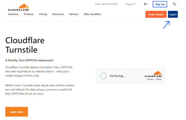
Initially, open the Cloudflare Turnstile website and press the “Sign Up/Log In” button to log into your account.

cloudflare turnstile starting page

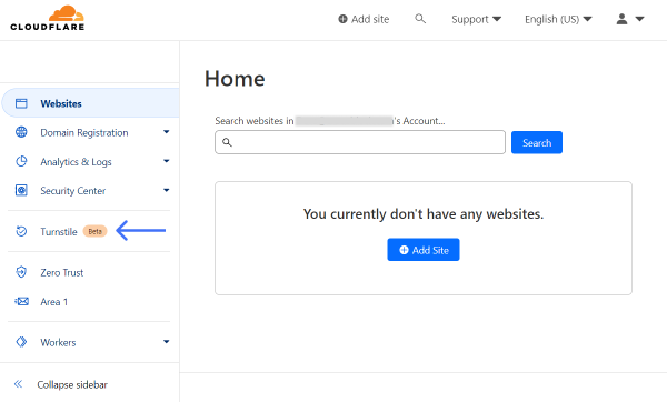
Now that the dashboard is open, find and press the Turnstile option in the sidebar.

cloudflare dashboard

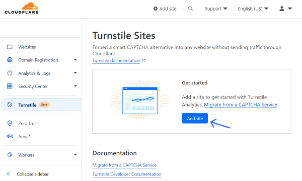
In the Get started section, click the “Add site” button to open a CAPTCHA editor.

add turnstile site

Complete the Site name field to identify the website where you will be using CAPTCHA.

Then, specify a Domain so the CAPTCHA will be connected to the particular domain. Here, you can specify several options if needed.

site name and domain fields

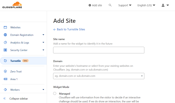
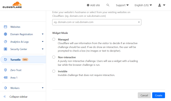
In the following Widget Mode radio field, you can pick the level of CAPTCHA interaction. 

Pick “Managed” to let Cloudflare decide if an interactive challenge should be used or not in a particular case, “Non-interactive” to make the widget run itself, or “Invisible” to make verification invisible for the user.

In the described case, we pick the “Managed” option.

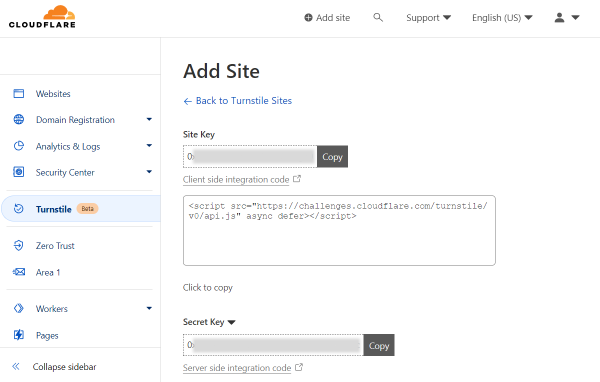
Push the “Create” button to finish the setup.

widget mode field

Straightaway, you will see generated Site Key and Secret Key. There are also “Copy” buttons next to these fields for user convenience.

turnstile site key and secret key

Adjust Global Settings

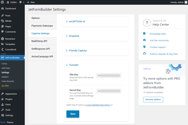
Head to WordPress Dashboard > JetFormBuilder > Settings and open the Captcha Settings tab. 

Unfold the Turnstile section to access its settings. They are called global because the changes applied here can be later pulled globally for all the needed JetFormBuilder forms.

As for the fields themselves, the Site Key and Secret Key are available for completion. Here, paste the keys generated beforehand.

Once keys are pasted into the corresponding fields, make sure to press the “Save” button.

turnstile settings

Create/Edit Form

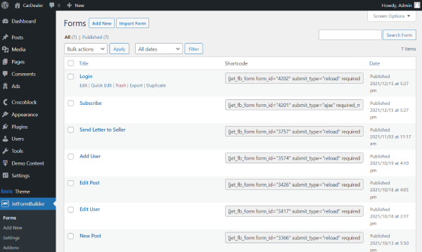
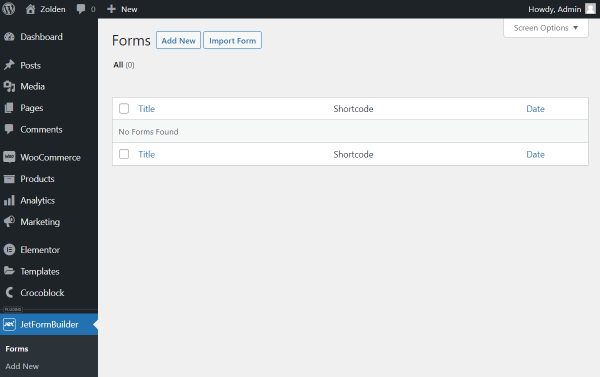
Proceed to WordPress Dashboard > JetFormBuilder > Forms. Here, you can select the already built form for editing or create a new form by pushing the “Add New” button.

jetformbuilder forms directory

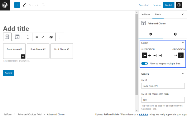
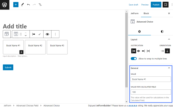
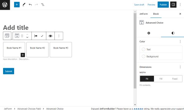
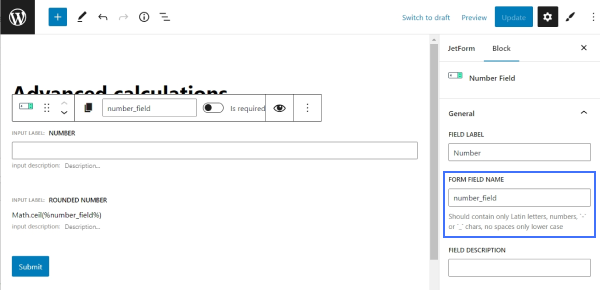
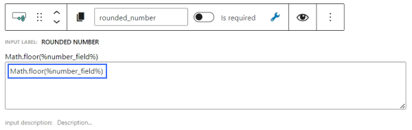
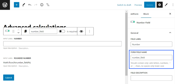
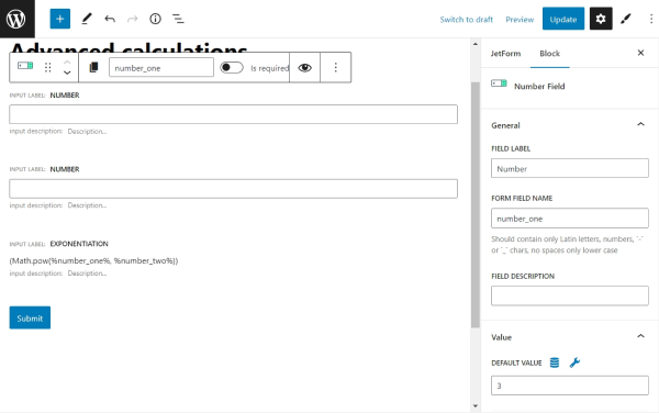
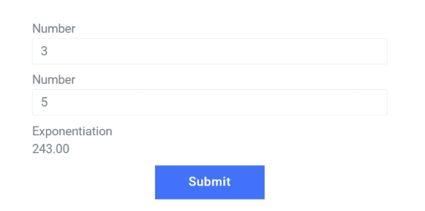
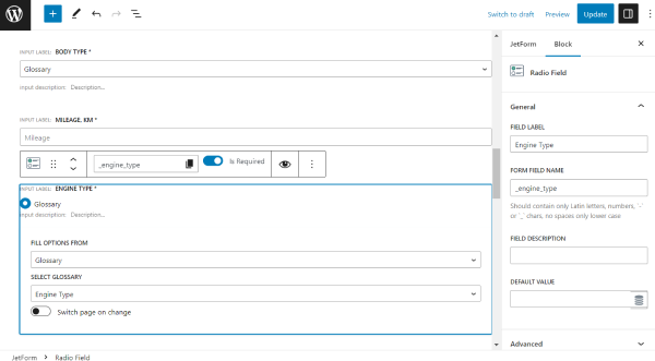
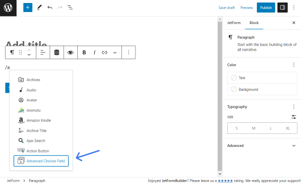
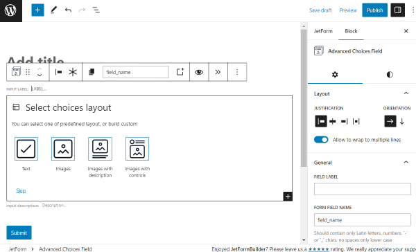
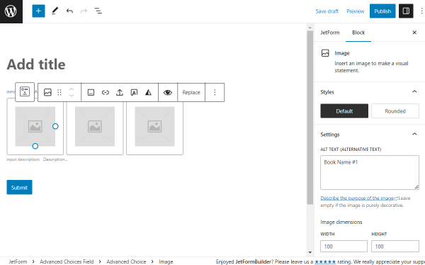
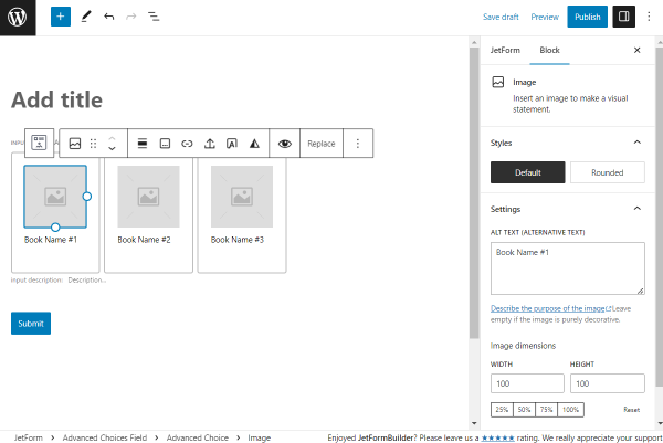
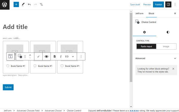
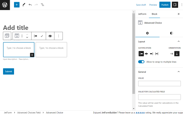
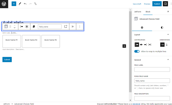
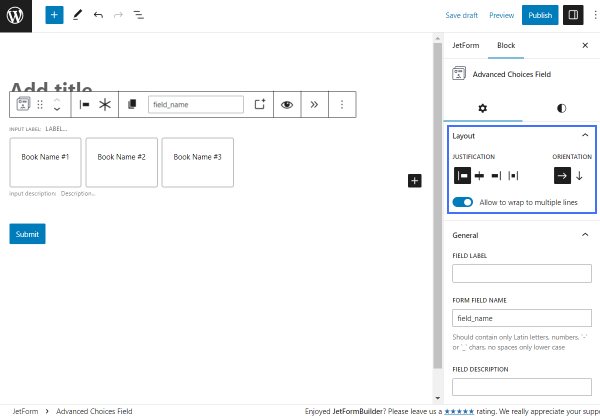
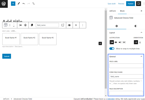
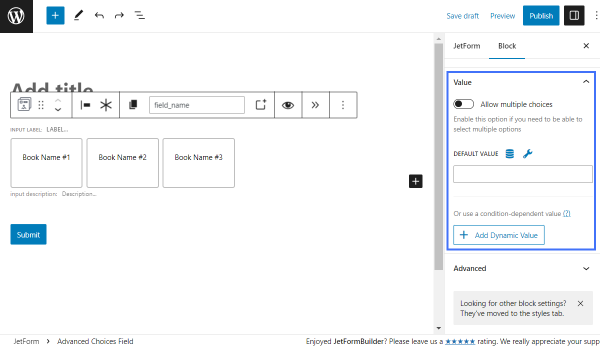
You can build a form according to your needs with the various fields available with JetFormBuilder.

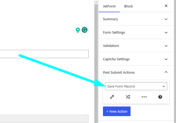
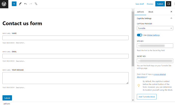
Then, open the JetForm settings tab and scroll down to Captcha Settings.

In the Captcha Provider selector, pick the “Turnstile” option to open further settings.

captcha provider selector

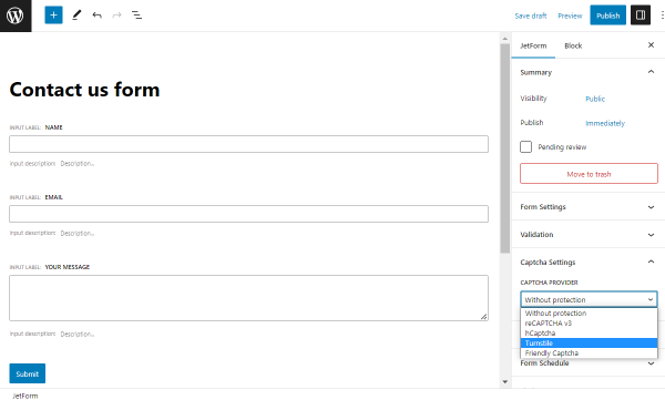
Here, you can activate the Use Global Settings toggle to use the keys we have entered before. Or, paste the Site Key and Secret Key manually right for this exact form.

turnstile captcha settings

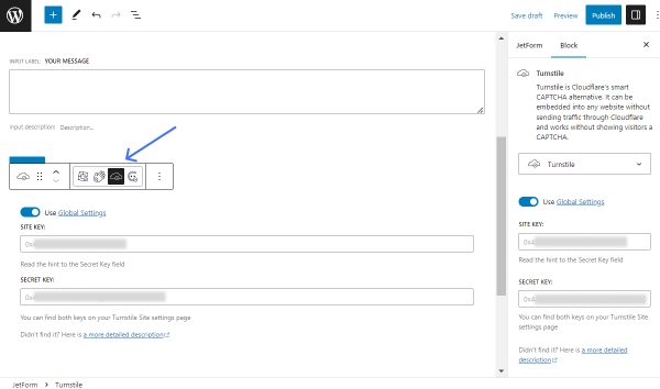
By default, the Turnstile Captcha is located before the “Submit” button of the form. However, if you want to change its position in the form, press the “Add Turnstile block” button.

NOTE

You can also find this block in the default block search in the form by pressing the plus-shaped button in the editor.

With this button, a Turnstile block is added after the “Submit” button, but you can drag it to place in any needed place of the built form.

add turnstile block button

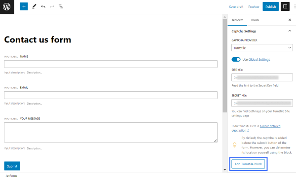
For instance, you can put the Turnstile block next to the “Submit” button if desired.

NOTE

Also, make sure that the icon in the block should be left as “Turnstile.” If you click on any other icon, the Captcha provider will be changed automatically.

turnstile block icon

Press the “Publish/Update” button to save the form.

Place Form on the Page

Now it’s time to decide where to place the form itself. For instance, it can be a default page built with Gutenberg or Elementor, JetPopup item, or JetThemeCore template.

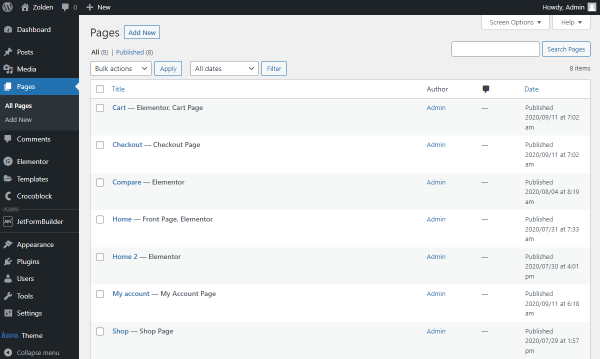
For example, we will place the form on the usual Elementor page. To do so, we navigate to WordPress Dashboard > Pages and press the “Add New” button. Here, we select Elementor as a primary editor and move on to customizing.

wordpress pages directory

Add the JetForm widget/block onto the page. Pick the newly created item in the Choose Form field.

You can adjust further settings if needed. Press the “Publish/Update” button.

jetform widget in elementor

Check the Result

Open the published content on the front end to check if the form works.

captcha form on front end

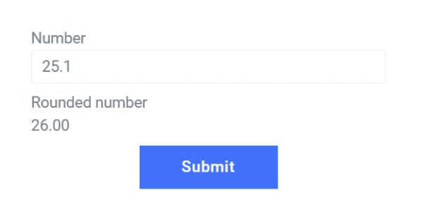
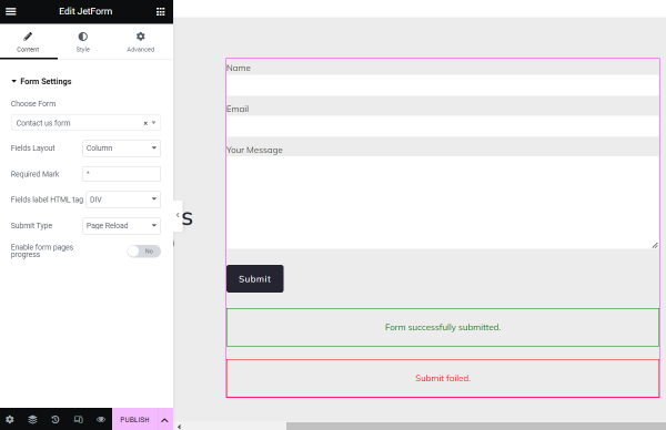
Complete the fields and a captcha. Let’s check what will happen if you fail:

failure captcha

And the result for a captcha success will look like this:

success captcha

Now you know how to add the Turnstile Captcha to the WordPress form built with the JetFormBuilder plugin.

Advanced Choices Field block is a feature for more advanced selection options in the form, which can be used instead or additionally to the alternative Checkbox, Select, and Radio fields.

With this block, text, images, or other objects can turn into the object for selection. And now, this block is available for WordPress with the JetFormBuilder plugin.

The Advanced Choices Field block can be found in the Gutenberg block search or by typing the “/” right in the empty spot in the form.

adding advanced choices field block

Block Layouts

There are four default layouts available for selection: “Text,” “Images,” “Images with description,” and “Images with controls.” Besides the given layouts, the user can build a custom block by pressing the “Skip” button.

select choices layout

Text

Except for the general Advanced Choices Field block settings, the Paragraph blocks can be customized in every separate choice field.

paragraph block settings

Images

In this case, the Image block settings can be customized.

image block settings

Images with description

Once this option is picked, there are both Paragraph and Image block settings are available for every choice box.

image block settings for image with description

Images with controls

The “Images and Controls” layout provides adjusting options for the Image and Choice Control block.

choice control block settings

Custom

If the “Skip” button is pressed, two empty options for completing appear. Inside them, different needed blocks can be added.

NOTE

JetFormBuilder form fields can’t be added inside the Advanced Choice option.

build custom layout

Advanced Choices Field Block Settings

Once the Advanced Choices Field block is added, a panel with the following toolbar controls appears above the block:

advanced choices field icons
  • Transformation button (this block can turn to Conditional Block, Columns, and Group);
  • Elements for controlling the position of the block;
  • Justification button. The block can be put left, center, or right. Or a space between items can be added;
  • Button to make the field required;
  • Button for name copying;
  • New Advanced Choice” button to create an additional choice box; 
  • Automatic transition button that redirects to the next page when the values are changed;
  • Other options.

There are two settings tabs to adjust the Advanced Choices Field block: General and Styles.

General

In this tab, the main customization options of the block are available.

Layout

In the Layout section of the Settings tab, there are the following settings:

advanced choices field layout settings
  • Justification — options to justify a block. It can be put left, center, or right. Additionally, the gap between blocks can be added with the help of the corresponding buttons. Mind that the last option is available only when horizontal Orientation is picked;
  • Orientation — the view of the columns, which can be either horizontal (in a line) or vertical (stackable boxes);
  • Allow to wrap to multiple lines — toggle that allows putting options in the next line if there is not enough space on the screen. For instance, on mobile devices.

General

The next section is called General:

advanced choices field general settings
  • Field Label — label for the field that will be displayed in the form before options;
  • Form Field Name — unique field name/ID that can be used for further work with the field on the WordPress back end. It should contain only lowercase Latin letters, numbers, and “-” or “_” characters with no spaces;
  • Field Description — optional field for the field description. If completed, the description will be displayed under the field.

Value

The Value section includes several settings options:

advanced choices field value settings
  • Allow multiple choices — a toggle that allows selecting several options in the field (basically, like a Checkbox Field). Otherwise, the field works as a Radio Field, meaning that only one option of the field can be picked.
  • Default Value — a field where one can put the Value of one or more fields. If put, this exact value will be selected by default. For instance, “Book Name #1”. If several options are desired to be default, these can be separated by a comma and space.
NOTE

If several values are put in the Default Value field, but only one option is allowed for selection (the Allow multiple choices toggle is disabled), only the first option will be chosen by default in the form. The following ones are going to be ignored.

  • Add Dynamic Value — a button that allows setting value under certain conditions. Once clicked, the Edit Dynamic Value pop-up with additional customization options appears.

Styles

NOTE

For this block, there is no need to install JetStyleManager to configure styles, as they are located in a separate tab.

In the Styles tab of the settings, by default, the user can alter the Text Choice and Background Choice of the default, hover, and checked states of the choice boxes.

advanced choices field styles tab

Except for the mentioned text and background settings, there is a three-dots button next to each section. 

By clicking, additional Tools, like Border and Radius of the field, can be added, default Text and Background can be removed, or the selected options can be reset by pressing the “Reset All” button.

advanced choices field styles tab default and tools list

Advanced Choice Block Settings

These are the settings of the one particular choice block. For example, in the “Text” layout, there are three boxes by default (but more can be added.) So, clicking on one of the boxes will open the Advanced Choice block settings.

A needed box can also be found in a Document Overview section.

advanced choice in the document overview

Above the selected box, there is a toolbar with controls located:

advanced choice block icons
  • Button to switch to the Advanced Choices Field block;
  • Inactive transformation button (the structure cannot be changed);
  • Justification button; 
  • Button to switch between “Default” and “Checked” states.
NOTE

This button does not affect the preset in any way. It is designed to view the applied styling in the Checked choice section of the Advanced Choices Field block.

General

Layout

Initially, the general Layout settings can be adjusted. These are the same as in the Advanced Choices Field block.

text advanced choice layout settings

General

In this section, there are two fields displayed:

text advanced choice general settings
  • Value — value for an option. It will be displayed in the choice box;
  • Value for Calculated Field — value that will be used in the Calculated Field if needed.

Styles

Except for the General Settings tab, there is also the one called Styles.

In the Color section, the Text and Background colors for an option can be selected.

text advanced choice style settings

The Dimensions section is initially empty. To add settings, the plus-shaped icon should be clicked.

Here, the Width line can be pressed to add its settings.

text advanced choice dimensions options

The “Fit” option is set by default. By picking this option, the option boxes will be displayed as standard, fit options.

text advanced choice fit width

The “Fill” Width stretches options to available space.

text advanced choice fill width

With the “Fixed” variant, a needed field width can be specified in the appeared field.

It is also possible to choose the desired unit in the selector next to the field: “px,” “%,” “em,” “rem,” “vw,” or “vh.”

text advanced choice fixed width

That’s all about the Advanced Choices Field block settings available with the JetFormBuilder plugin for WordPress.

This tutorial dives into creating a custom query for the JetFormBuilder Records source using the Query Builder module of the JetEngine plugin. You will learn how to show values from different field types using dynamic widgets and shortcodes.

Add JetFormBuilder Form

Let us start with creating a form in the JetFormBuilder directory. To do so, proceed to WordPress Dashboard > JetFormBuilder > Add New

For instance, we have added the following fields to the form: Text Field, Checkbox Field, Media Field, Select Field, and Date Field.

form list view

In the Post Submit Actions tab, you need to add the “Save Form Record” action to make sure the submitted values are saved in the Form Records.

save form record action

Once the form is created, press the “Publish” button. Then the form should be added to the page and submitted to create a Form Record, which will be displayed on the front end later.

Build JetFormBuilder Records Query

Now proceed to WordPress Dashboard > JetEngine > Query Builder to create a custom query for JetFormBuilder Form Records.

Hit the “Add New” button to build a query. 

In the General Settings section, complete the Name field and choose the “JetFormBuilder Records” option as Query Type.

jetformbuilder records query

In the JetFormBuilder Records Query, you need to select a Form to query its records. Feel free to add any other settings to the query if needed.

jetformbuilder records query

The query is completed. Now it can be saved by hitting the “Add Query” button.

Create Listing for JetFormBuilder Records Query

At this point, we can create a Listing template for the custom query in WordPress Dashboard > JetEngine > Listings. Select “Query Builder” as a Listing source, and pick the custom “Query for Form Records” that has just been created.

query builder listing pop-up

In the listing template, you can display the values from fields using dynamic widgets like Dynamic Field, Dynamic Image, etc. In the case of Form Records, some values from the fields can be shown using just dynamic widgets, but some can not, which is why we will explore how shortcodes can help in this situation.

To understand better why dynamic widgets like Dynamic Field do not cover this request completely, let us turn to Query Builder again.

If you enable the Preview results toggle in the custom query, you can see that the fields of the form are saved in the ‘jfb_fields’ property as an array. It means a “Get child element from object/array” Callback is needed to get to the values of these fields.

preview results toggle

In the case of the ‘checkbox_field’ field, a second additional callback needs to be applied to output the options from its array as well.

The Dynamic Field widget does not have the opportunity to add multiple callbacks, but the shortcodes can handle them.

checkbox field preview

Output field types in the listing template

Let’s get back to the listing template.

The first field to show is ‘text_field.’ This field has a string value, which is why the “Get child element from object/array” Callback is enough to show its value using the Dynamic Field widget.

dynamic field widget in elementor

Proceed with the ‘checkbox_field’ field. As was stated earlier, it has an array as its value, so another callback is needed to show values from the array.

This is when the Shortcode Generator of the JetEngine needs to be used.

Use shortcode generator

In the WordPress Dashboard > JetEngine directory, you can see a Shortcode Generator tab, where the shortcodes can be created.

Firstly, select a “Meta Data” Source, and insert the name of the field from which the values need to be pulled in the Custom Object Field / Meta field / Repeater key field; it is ‘jfb_fields.’

shortcode generator

Now switch on the Filter Field Output toggle, and add the first “Get child element from object/array” Callback. This callback lets us get to the values of the Checkbox Field.

filter field output toggle

But the values of the Checkbox Field are in the format of the array. This is why another callback is required to show the values in a more presentable format. 

Therefore, we need to add another “Checked values list” Callback. In this callback, we selected a glossary because the options in the Checkbox Field in the form were added by the glossary source.

checked values list callback

The shortcode is ready now, so you can copy it from the bottom of the page by clicking the corresponding icon.

copy context button

In the Listing template, the shortcode can be displayed using the Shortcode widget or Shortcode block if a listing is created in the Gutenberg editor.

shortcode widget in elementor

Lastly, display an image from the ‘media_field’ field.

This media field has a URL as a value and, therefore, requires a “Get child element from object/array” Callback.

get child element from object/array callback

Also, the Customize field output toggle should be activated with the <img src=’%s’> Field format completed that can show an image by its link.

field format

After copying the shortcode, you can insert it into the Shortcode widget or block.

By the way, these settings can also be created in the Dynamic Field widget.

dynamic field output settings

The listing template is completed. Press the “Publish/Update” button. 

You can now display it using the Listing Grid widget on the needed page. 

Check the result; now Listing Grid shows the record from the JetFormBuilder Form Records.

form records listing

Now you know how to create a custom Form Records Query and display JetFormBuilder Form Records in the JetEngine Listing template.

Custom templates are a feature to customize forms view. Use JetEngine to build a custom item template and set it for any Form you fancy. In this way, make the Radio and Checkbox fields more appealing on the front end.

Creating a Custom Item Template in Elementor

Radio and Checkbox form fields provide a possibility to apply a template to their options. If the source of the field is “Posts” or “Terms”, you can create a Listing Template in JetEngine with the same source and make the Radio or Checkbox field inherit the layout from the template.

Also, it is possible to use a template if the source of the field is a JetEngine custom query.

NOTE

If the Radio or Checkbox field generates options from a meta field, it is not possible to apply a template.

In our case, we will customize a Checkbox field that lists posts from a custom post type named “Services”.

Since the custom item templates are not pre-made, you’ll have to build them manually.

Create a new listing

Go to WordPress Dashboard > JetEngine > Listings.

jetengine listing items

Click the “Add New” button to open a Setup Listing Item window.

creating listing template for jetformbuilder forms in jetengine

Make sure to pick the “Posts” as a Listing source, then select the post type to pull the options from; in our case, it’s the CPT named “Services”, and our future Checkbox field in the form will list SPA services as options. 

After that, enter the Listing item name and choose the Listing view. You can work either in Elementor or Gutenberg. Lastly, click the “Create Listing Item” button.

Right afterward, you’ll be redirected to the chosen webpage builder.

Build the listing in Elementor

First of all, select the desired layout for your new section. To do so, press the cross icon, then pick the desired structure:

section structure

Now, search for the Check Mark widget. Drag and drop it to the first column of the newly-created structure and choose the icon from the library or upload an SVG file.

adding check mark widget to the listing template
NOTE

Make sure to select icons for both unchecked and checked modes.

adding check mark widget to the listing template in checked state

Then proceed to the left-side toolbar, press Style, and customize the icons’ appearance if needed.

You can adjust the Box Size, Icon Size, and Border Radius, set Background Color for the Default icon, and play around with the Border Type, Width, Color, and Box Shadow of the Checked icon.

Configure the dynamic fields

Let’s configure the second column. We’ll use the Dynamic Field widgets to pull meta data from posts and build the listing layout.

Search for the Dynamic Field widget and drag and drop it to the second column.

dynamic field post data source
NOTE

You can also change the typography and font size to make your custom template pop.

We will display the post title and some meta field values with the help of this widget.

Once you are satisfied with your custom item template, click “Publish.”

Add Template to the Form

Now, it’s time to set the template you’ve created for the form.

Choose and edit the form

Go to WordPress Dashboard > JetFormBuilder > Forms.

edit button next to the form

Find the form you would like to customize and click the “Edit” button.

Configure the field settings

In the newly-opened window, there will be form fields settings. Click on the Checkbox field to edit it.

assigning custom template to checkbox form field in jetformbuilder
NOTE

The custom item templates can only be applied to the Radio or Checkboxes field types. You cannot set a custom item template for the rest of the field types.

Scroll down the settings until you see a Use custom template switcher. Tick it, and the new drop-down field will appear. Make sure to pick here the template you’ve created beforehand.

NOTE

This function will not work with the manual input, meta field, or glossary source.

Press the “Apply changes” button and then “Update the form.

Add form to the front end

After configuring fields settings and updating the form, check out how it looks on the front end.

jetformbuilder form on the front end
NOTE

If you need to use the Radio field, you can make the same steps; just change the field type in the form.

That’s all; now you know how to build a WordPress custom template for Radio and Checkbox form fields options.

The Calculated field of JetFormBuilder is not limited to basic mathematical operations like addition, subtraction, multiplication, and division. It supports all the Math object methods, which helps perform advanced calculations with numeric values returned by form fields. The complete list of Math properties and methods can be found in MDN Web Docs

Below, we will cover several usage examples — rounding a number, finding min and max numbers from a row, and raising a number to a power. The described methods can be used with a numeric value returned by any of the JetFormBuilder fields. In our examples, we will use a Number field to store the numeric value.

Rounding

The Math.round() method can be used to round the specified number to the nearest integer.

To apply this method in the Calculated field, use the below formula:

Math.round(%number_field%)

Insert the formula into the Calculated field to round a numeric value of another field.

rounding number in calculated field
NOTE

Remember to use the needed form field name instead of the ‘number_field’ value.

number field name to use for rounding

As a result, a float retrieved from another form field will be rounded in the Calculated field.

rounded value of a number field

Rounding Up

The Math.ceil() method returns the smallest integer greater than or equal to the specified number.

To apply this method in the Calculated field, use the below formula:

Math.ceil(%number_field%)

Insert the formula into the Calculated field to round up a numeric value of another field.

rounding up number in calculated field
NOTE

Remember to use the needed form field name instead of the ‘number_field’ value.

number field name to use for rounding up

As a result, a float retrieved from another form field will be rounded up in the Calculated field.

rounded up value of a number field

Rounding Down

The Math.floor() method returns the largest integer less than or equal to the specified number.

To apply this method in the Calculated field, use the below formula:

Math.floor(%number_field%)

Insert the formula into the Calculated field to round down a numeric value of another field.

rounding down number in calculated field
NOTE

Remember to use the needed form field name instead of the ‘number_field’ value.

number field name to use for rounding down

As a result, a float retrieved from another form field will be rounded down in the Calculated field.

rounded down value of a number field

Finding the Largest and the Smallest Numbers

The Math.min() method retrieves the smallest of several numbers. On the contrary, the Math.max() method is used to retrieve the largest of numbers.

To apply the Math.min() method in the Calculated field, use the below formula: 

 (Math.min(%number_one%, %number_two%, %number_three%))

For the Math.max() method, use this formula:

(Math.max(%number_one%, %number_two%, %number_three%))

Insert the needed formula into the Calculated field to find the largest or the smallest number from a row of numbers. 

NOTE

Remember to replace the ‘number_one,’ ‘number_two,’ and ‘number_three’ values with the actual field names.

In our example, we have three Number fields, each containing a specific number: 7, 3, 4, accordingly.

number fields to find the smallest and largest number

In the result, the Calculated field returns the value of 3 as the smallest number and the value of 7 as the largest number.

finding the smallest and the largest number in calculated field

Mind that the Math.min() method will return 0 if at least one of the number fields is empty. To handle the cases where one of the fields might be null (empty), you should use the below formula instead.


 ( Math.min( %number_one%, %number_two%, %number_three% ) == 0 
    ? 
        ( 
            ( %number_one% + %number_two% + %number_three% - Math.max( %number_one%, %number_two%, %number_three% ) ) == 0 
            ? 
            Math.max( %number_one%, %number_two%, %number_three% ) 
            : 
            ( %number_one% + %number_two% + %number_three% - Math.max( %number_one%, %number_two%, %number_three% ) ) 
        ) 
        : 
        Math.min( %number_one%, %number_two%, %number_three% ) )

In this formula, using ternary operators, we check if either of the number fields returns an empty value. If one of the fields is empty, we adjust the final result so that it returns the smallest of specified numbers. To find more information on ternary operators, check our tutorial on How to Use Conditional Formulas in the Calculated Field.

If one of the values is null, the formula will find the lowest value from those specified.

finding the smallest and the largest number where one of the numbers is null

Exponentiation

The Math.pow() method raises the first specified number to the power of the second number.

To apply this method in the Calculated field, use the below formula:

(Math.pow(%number_one%, %number_two%))

In the above formula, the ‘number_one’ value stands for the name of the form field that provides the base number; the ‘number_two’ value stands for the exponent. 

Insert the formula into the Calculated field to raise the value of the first specified field to the power of the second.

setting up exponentiation formula in calculated field

In our example, the first Number field contains the number 3; the second Number field contains the number 5. The expected result is 243.

raising a number to a power with calculated field

That’s all; now you know how to use advanced math calculations with the help of the Calculated Field available in the JetFormBuilder plugins bundle.

With the help of the Glossary functionality, available with the JetEngine plugin, you can create forms without completing all the field values manually several times.

Let’s find out how to use Glossary as the data source for your JetFormBuilder form.
Initially, create a glossary in the WordPress Dashboard > JetEngine directory.

jetengine dashboard glossaries tab

In the Glossary tab, ensure you have completed all the needed fields, and don’t forget to save the changes by pressing the corresponding button below your glossary.

glossary created with jetengine plugin

Then, head to the WordPress Dashboard > JetFormBuilder > Forms page. Build a new form by hitting the “Add New” button, or hover over the desired item to see the “Edit” button and click it to proceed to the form editor.

jetformbuilder forms

As for now, we will edit the existing form. Here, we add a Radio Field, which will display our glossary options for selection.

NOTE

Except for the Radio Field, you can use Checkbox Field or Select Field blocks to display glossary options.

Complete the block settings and mind filling in the Fill Options From field with the “Glossary” option. After that, select the built glossary in the corresponding field.

Adjust the rest of the form if needed, and press the “Publish/Update” button to save the form.

radio field with glossary source

Go to the page where the form is located or place it wherever you need to use it.

As you can see on the page, the Radio field is now available in the newly built form. 

jetformbuilder form on front end

That’s it; the form is ready, and now you know how to build a JetFormBuilder form by using JetEngine Glossary as the data source for the form fields on your WordPress website.