The Datetime Field block by the JetFormBuilder plugin merges the Date and Time Fields into one. The field is intended to insert/select the date and time manually in the “yyyy-mm-dd” and “hh:mm pm/am” formats, respectively. Also, the data can be set dynamically or using macros.
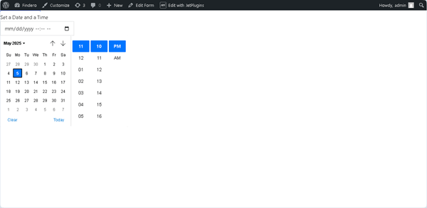
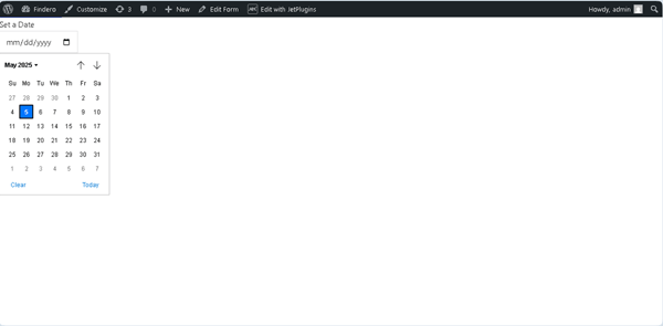
On the front end, the Datetime Field is presented as a text field that allows typing the needed date and time. In addition, pressing a “calendar” icon allows selecting the required ones. By default, the unrolled calendar displays the current local date and time.
Also, clicking the “Clear” and “Today” links allows resetting the data or setting the current date and time, respectively.
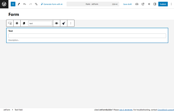
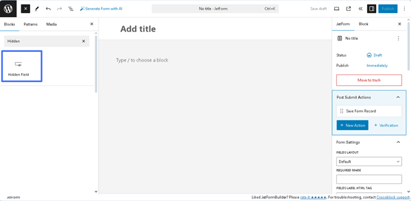
Inserting the Datetime Field
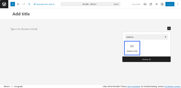
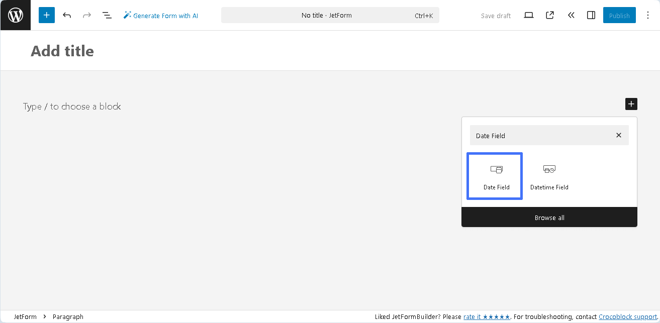
To insert this block, first, it should be found in the search bar of the block inserter (the “plus” icon) and then dragged and dropped where required into a form.
In addition, the Datetime Field can be found in the JetFormBuilder’s embedded templates, available via the Welcome block or patterns.
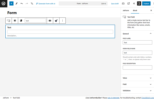
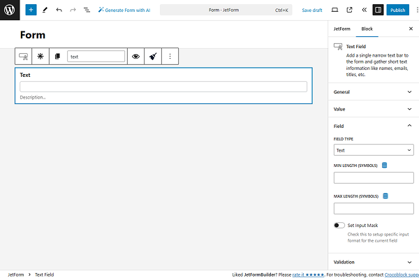
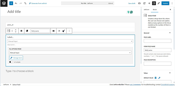
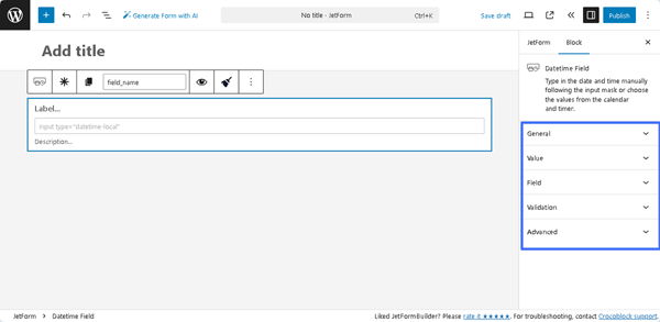
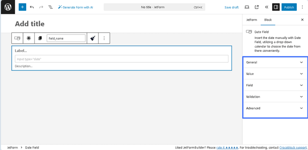
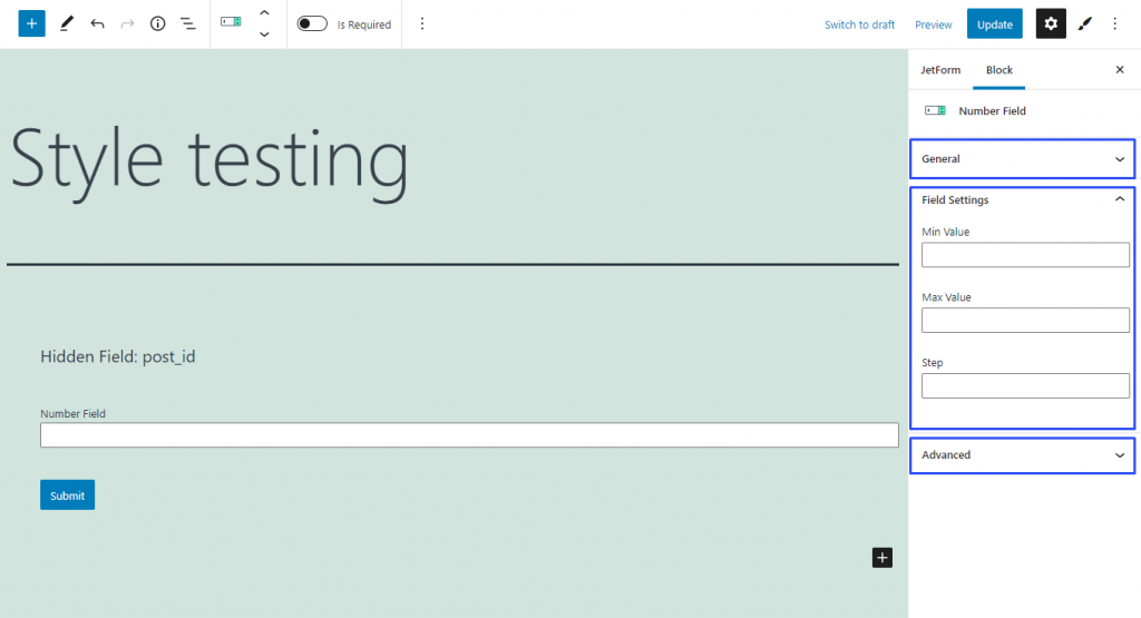
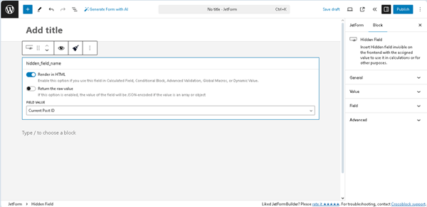
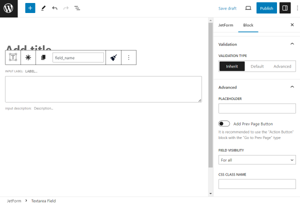
Datetime Field Settings
The settings of the Datetime Field include the General, Value, Field, Validation, and Advanced tabs.
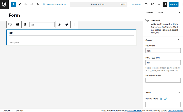
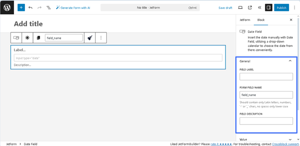
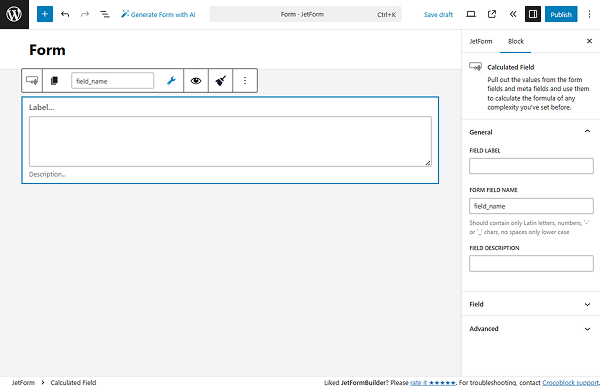
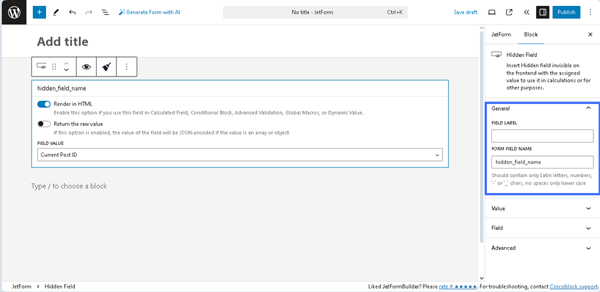
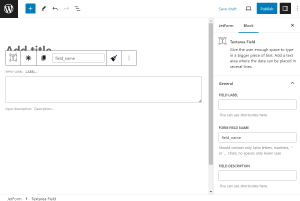
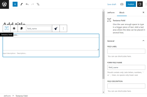
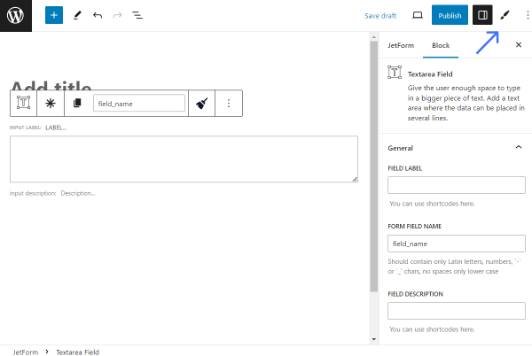
General
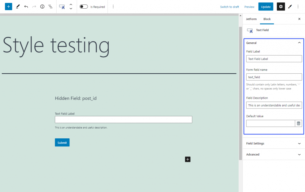
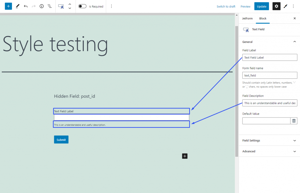
The General tab is presented by the following fields:
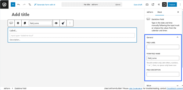
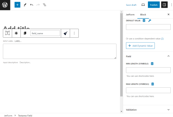
- FIELD LABEL ㅡ a field that allows inserting the field’s label;
- FORM FIELD NAME ㅡ a field designed for the field’s name. This field will be filled out automatically after the text is added to the FIELD LABEL field. Also, one can change this text if needed, but only Latin letters (lower case), numbers, `-` or `_` characters are allowed;
- FIELD DESCRIPTION ㅡ a non-required field intended to insert more information on this field, e.g., the field’s description.
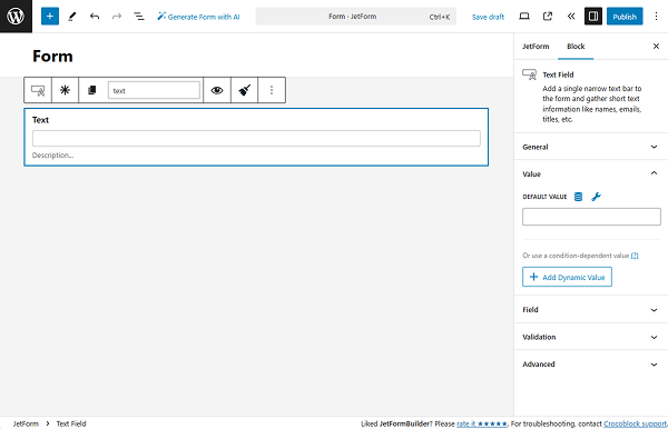
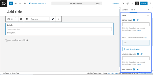
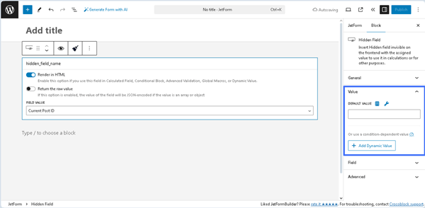
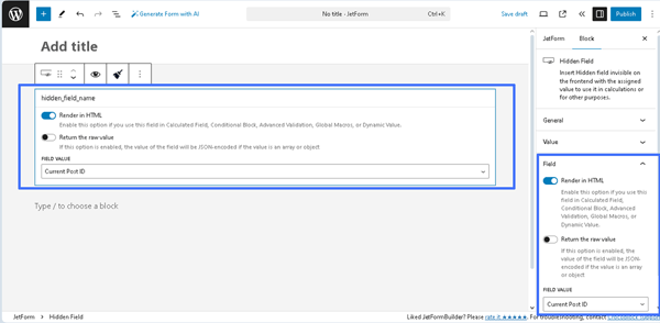
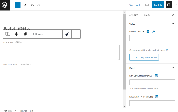
Value
These settings include the DEFAULT VALUE, STARTING FROM DATE, and LIMIT DATES TO fields. They allow setting the pre-defined values, selecting them dynamically (by pressing the “Dynamic Tag” icon), and selecting the needed macro (by clicking the “wrench” icon). Plain dates for all these fields are set in the “yyyy-MM-ddThh:mm” format.
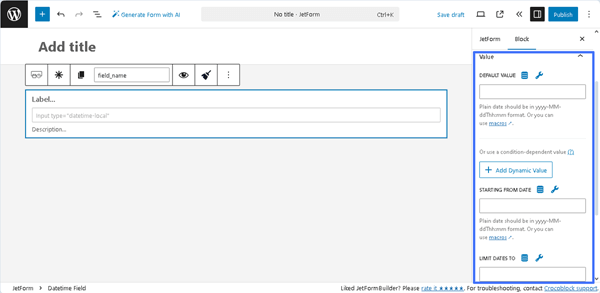
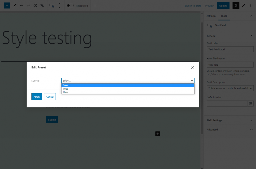
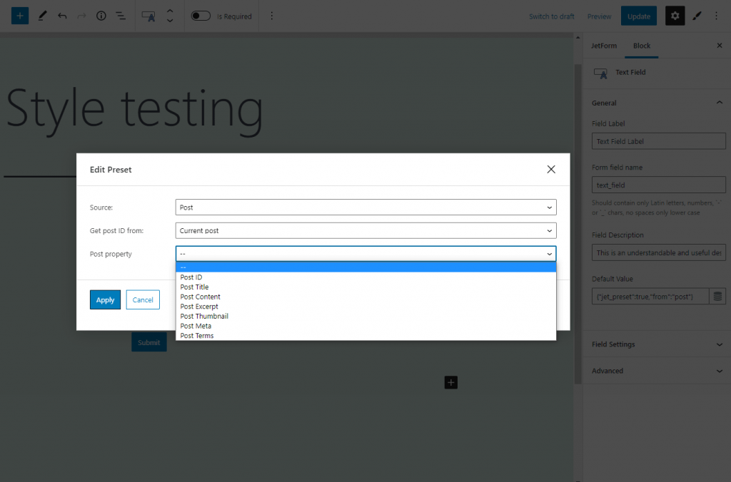
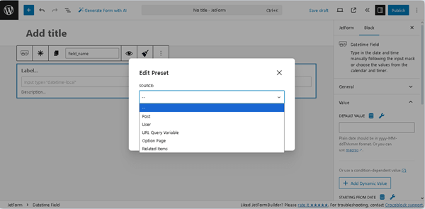
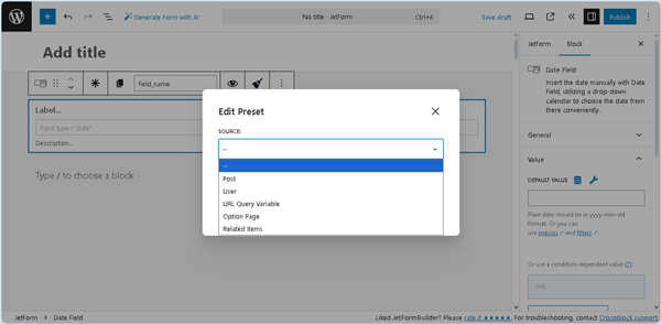
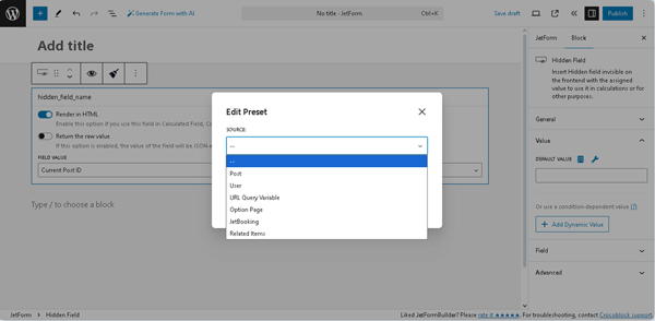
- DEFAULT VALUE ㅡ a field that allows adding the default value that will be shown in the Datetime Field. The following dynamic SOURCES can be set for this field (as well as for the other fields in the Value settings) after pressing the “Dynamic Tag” icon in the newly appeared Edit Preset pop-up: “Post,” “User,” “URL Query Variable,” “Option Page,” and “Related Items.” Each selected option activates the corresponding field, allowing one to choose the needed data. Also, this pop-up includes the Restrict access toggle that allows restricting users who are allowed to edit this value. The required settings should be saved by pressing the “Update” button.
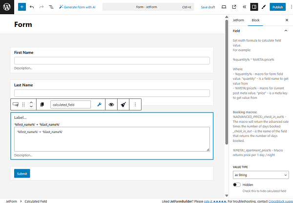
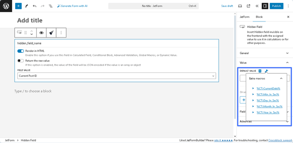
Also, one can set the needed DEFAULT VALUE by clicking the “wrench” icon and selecting the required form’s Fields, macro from the list of available Extra macros, and filters:
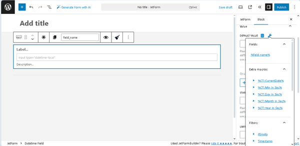
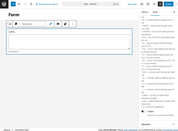
- %CT::CurrentDate% — a macro that returns the date as a timestamp (to use this macro, the quotation marks are required as follows: ‘%CT::CurrentDate%’);
- %CT::Min_In_Sec% — a macro that returns the number of milliseconds in one minute (can be used, for example, to get the difference between dates in minutes);
- %CT::Day_In_Sec% — a macro that returns the number of milliseconds in one day (can be used, for example, to get the difference between dates in days);
- %CT::Month_In_Sec% — a macro that returns the number of milliseconds in a month (can be used, for example, to get the difference between dates in months);
- %CT::Year_In_Sec% — a macro that returns the number of milliseconds in a year (can be used, for example, to get the difference between dates in years).
The macros can be used individually or with filters to provide calculations, return timestamps, etc. The following filters are available for the Datetime Field:
- ifEmpty — a filter that returns the value passed in the argument if the macro returns an empty value;
- length — a filter that returns the length of the string or array;
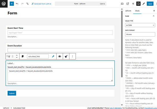
- T — a filter that returns the time stamp and is usually used in conjunction with Date & Datetime and Time Field;
- toDatetime — a filter that gets the timestamp from the macro and formats it according to the Datetime field format;
- addMin, addHour, addDay, addMonth, addYear — filters that add minutes, hours, days, months, and years correspondingly via an argument to a macro that returns a date or timestamp;
- subMin, subHour, subDay, subMonth, subYear — filters that subtract minutes, hours, days, months, and years correspondingly via an argument to a macro that returns a date or timestamp;
- setMin, setHour, setDay, setMonth, setYear — filters that set minutes, hours, days, months, and years correspondingly via an argument to a macro that returns a date or timestamp.
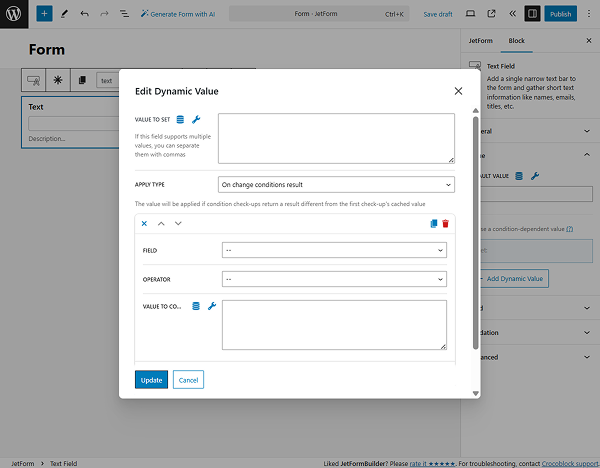
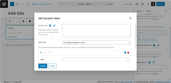
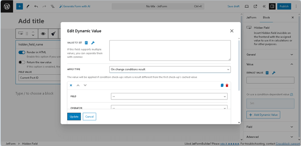
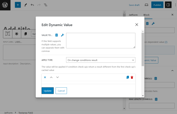
The DEFAULT VALUE field, in contrast to the STARTING FROM DATE and LIMIT DATES TO fields, allows adding a condition-dependent value by pressing the “+Add Dynamic Value” button. The Edit Dynamic Value pop-up will be open with the following fields:
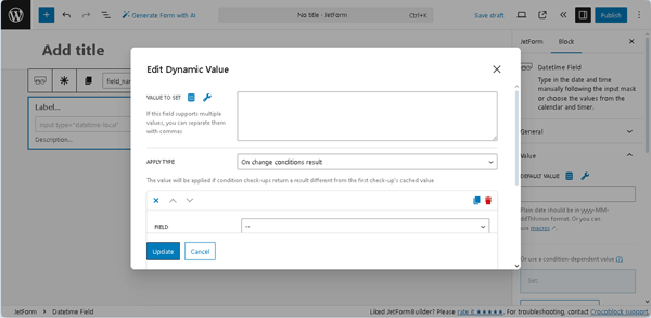
- VALUE TO SET ㅡ a field that supports multiple values and allows entering or selecting them dynamically, as well as applying macros;
- APPLY TYPE ㅡ a drop-down list that specifies how to apply the needed condition: “On change conditions result,” “Once,” or “Always”;
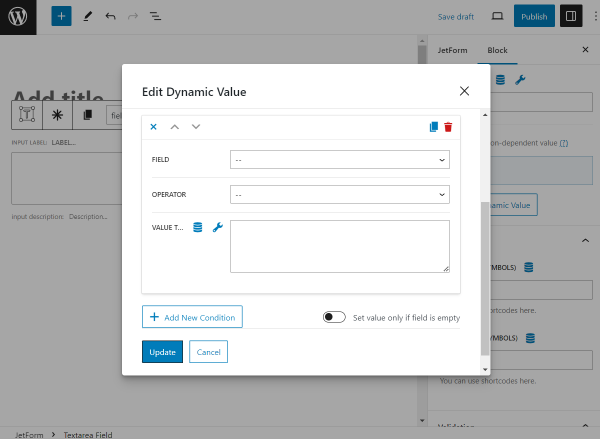
- FIELD ㅡ a drop-down list that allows selecting the needed form’s field to compare;
- OPERATOR ㅡ a drop-down list that allows selecting the needed operator to compare (e.g., “Equal,” “Not equal,” and more);
- VALUE TO COMPARE ㅡ a text field that allows entering or selecting values to compare fields dynamically, as well as applying macros;
- +Add New Condition ㅡ button that adds another FIELD, OPERATOR, and VALUE TO COMPARE set of fields to compare the form’s field with the specific value;
- Set value only if field is empty ㅡ a toggle that, if enabled, allows setting the needed value only for empty fields.
Pressing the “Update” button closes this pop-up and saves the settings.
More details on how to use conditional logic in forms can be found in the Conditional Logic for Form Fields on WordPress article.
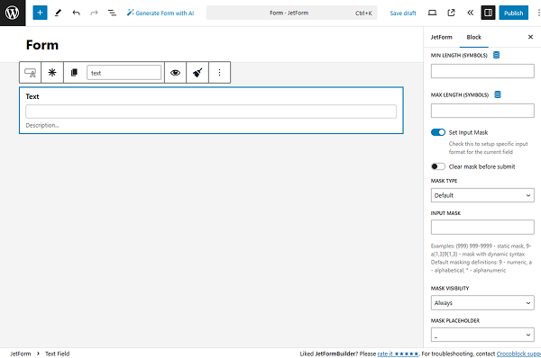
- STARTING FROM DATE and LIMIT DATES TO ㅡ the fields of the Value settings that allow users to set the earliest time and the latest time in the “yyyy-mm-dd” format, or setting them dynamically (by pressing the “Dynamic Tag” icon) or using the macros (pressing the “wrench” icon).
Field
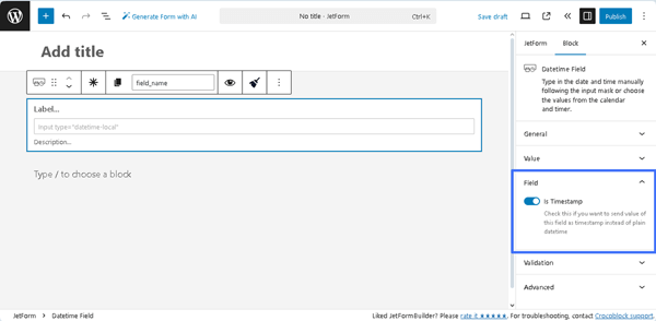
The Field setting is presented by the Is Timestamp toggle, which, if enabled, allows saving the date as a timestamp instead of the default plain date. Unlike the plain date data, the timestamps can be sent and used in some third-party apps like Google Calendar.
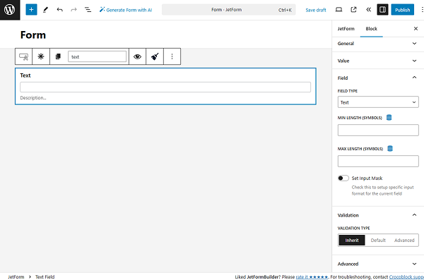
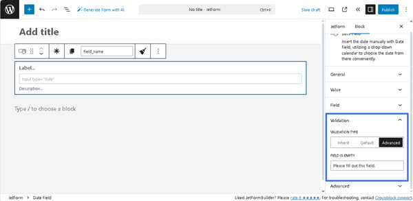
Validation
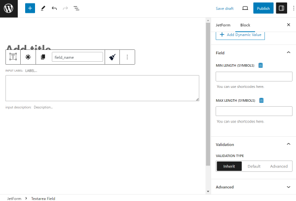
The Validation tab includes the VALIDATION TYPE field with three options:
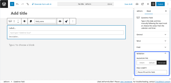
- Inherit ㅡ an option that sets the validation to be inherited from the form arguments;
- Default ㅡ an option that sets the native validation that works by a browser;
- Advanced ㅡ an option that sets the advanced rules for validation. If pressed, the FIELD IS EMPTY text fields will be shown, which are intended to type the corresponding text or use a macro if the validation is not completed.
Read the Advanced Form Validation and Advanced Field Validation with JetFormBuilder: Use Cases tutorials for a better understanding.
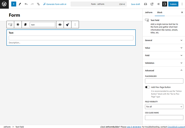
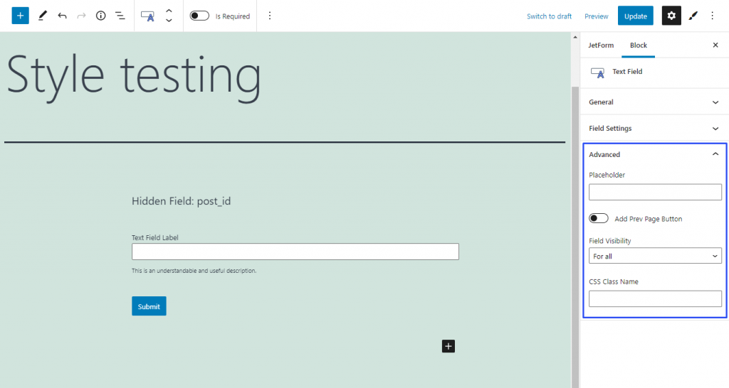
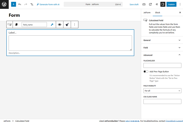
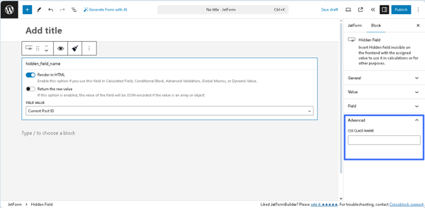
Advanced
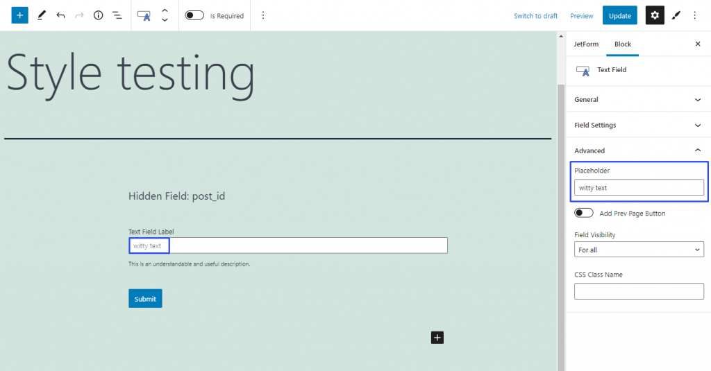
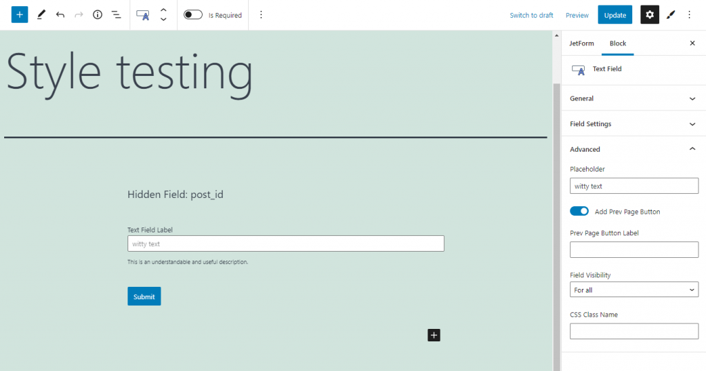
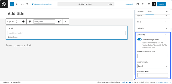
The Advanced section includes the following fields:
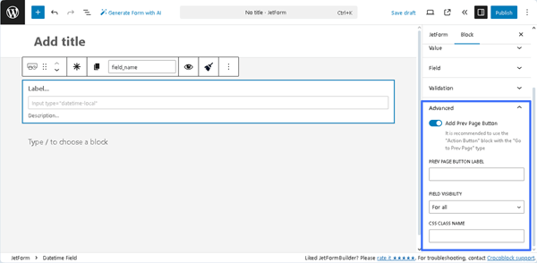
- Add Prev Page Button ㅡ a toggle that enables the PREV PAGE BUTTON LABEL, a field for inserting text that will be displayed on the corresponding button (if added);
- FIELD VISIBILITY 一 a drop-down list that allows selecting who can observe the block. It includes the following options: “For all,” “Only for logged in users,” or “Only for NOT-logged in users”;
- CSS CLASS NAME 一 a text field that allows inserting an additional CSS class to design the block field.
The JetFormBuilder Plugin: Looking Through Advanced Settings tutorial explains how to configure the Advanced settings.
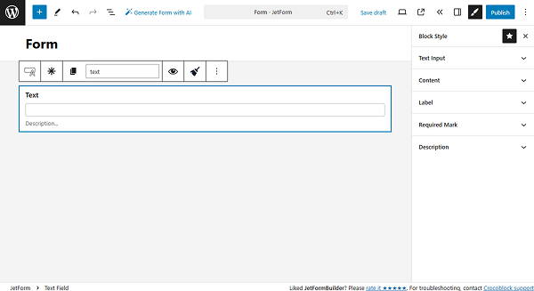
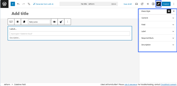
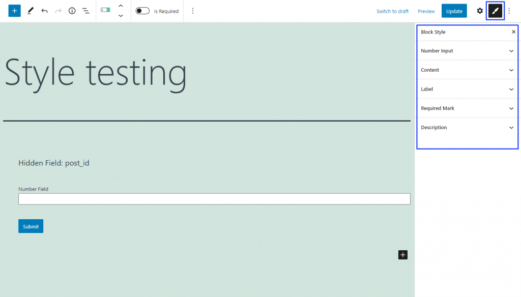
Styling the Block
If one has the free JetStyleManager plugin installed and activated, the “Block Style” button will appear in the top right corner. This plugin customizes the Alignment, Border, Color, Margin, Padding, and Typography settings of the Datetime Field.
That’s all about the Datetime Field available with the JetFormBuilder plugin for WordPress forms.
