The tutorial details creating a user-friendly, functional, and conversion-making T-shirt order form using the JetFormBuilder plugin for WordPress. It covers managing specific form fields, adding integrations with payment and marketing plugins and add-ons through Post Submit Actions, and optimizing orders for your business or event.
Contents:
Why You Need a WordPress T-Shirt Order Form
The T-shirt order form is the last stage of the sales funnel and a huge marketing tool, which:
- Collects fully personalized data on users and their preferences;
- Collects users’ emails for further marketing communications (i.e., for mailing propositions on sales or post-sales communications);
- Contributes to conversions by addressing the issue of users exiting the forms at the last step;
- Generates leads;
- Makes your site more user-friendly and thus increases the probability of further orders;
- Makes purchases easy and orders proceed quickly and safely by seamlessly integrating with payment systems and providing the needed security means.
Top WordPress T-Shirt Form Features
Order forms are a necessary site element and the last step between clients and their orders. Therefore, they should be user-friendly (intuitive, discreet, and simple), functional (provide payments and seamless integration with plugins and add-ons), and effective (provide conversions and collect the necessary marketing data on users and their orders).
- Develop a clear structure of a multi-step form with a logical sequence of only needed fields divided by breaks;
- Specify the required and not form fields;
- Provide safety identification, verification, and validation (i.e., reCAPTCHA v3) of the user-associated actions (i.e., auto-filling of fields after user registration);
- Collect and proceed with the order data via one dashboard;
- Integrate with email marketing services, including Mailсhimp, GetResponse, Active Campaign, Zapier, Make, etc.
Generally, the JetFormBuilder plugin provides the following:
- Variety of combinable tools: users can use JetFormBuilder’s block fields and patterns separately, generate forms via AI, or combine all three;
- Post Submit Actions automatize order being processed, i.e., redirect to pages, save data in the database, send emails, etc.;
- Seamless integration with JetPlugins, WooCommerce, and email marketing services (i.e., ActiveCampaign, GetResponse, Mailсhimp, Zapier, and Make);
- Form style customizations using the free JetStyleManager plugin;
- Safe payments and storage of user’s data;
- Different verification and validation methods;
- Identification of users and pre-filling the form fields with the saved data;
- Multiple PRO add-ons for additional tasks such as hierarchical selection, user login, advanced color picking, field autocompleting, saving form progress and form scheduling, payments, and more.
T-Shirt Order Form Typical Structure
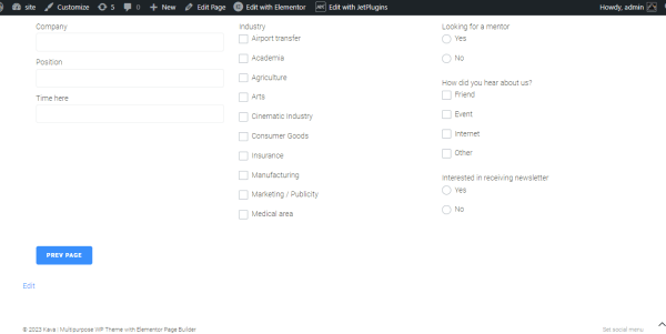
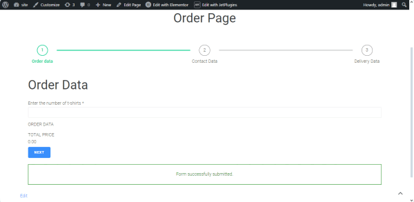
Step 1 一 Order data
This step includes fields for uploading images for printing on the T-shirt(s) and selecting the T-shirt sizes, colors, and quantities. It contains such blocks:
- Progress Bar block to specify the start of the form proceeding;
- Number Field to input the number of needed T-shirts;
- Repeater Field with the nested fields:
- Media Field for uploading an image for printing on the T-shirt,
- Advanced Choice Fields for selecting the size and colors available;
- Calculated Field to calculate the approximate price;
- Form Page Break to divide the form into steps;
- “Next” button to navigate to the next page.
This step includes the fields to store users’ data. It comprises such blocks:
- Progress Bar block to specify the next stage of the form proceeding;
- Text Fields to store users’ contact data;
- Form Page Break field to allow navigation to the next and previous pages.
Step 3 一 Delivery data
Felds for address and delivery method data. It contains such blocks:
- Progress Bar block to specify the next stage of the form proceeding;
- Text Fields to store the delivery settings;
- “Action” button to submit the form.
How to Create a WordPress Custom T-Shirt Form
In the given case, we explain how to build a multi-step form for ordering the needed number of T-shirts with a printed user’s image. Additionally, users can select the required color and size of the T-shirts. Due to this, pricing issues relating to printing are not considered.
Create a multi-step form
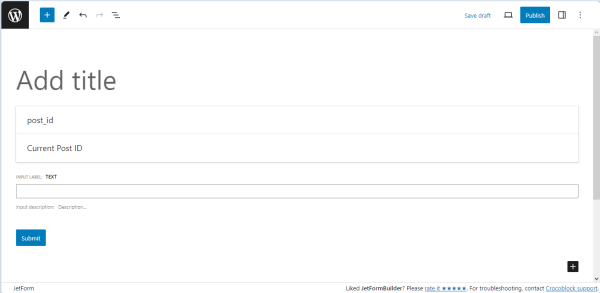
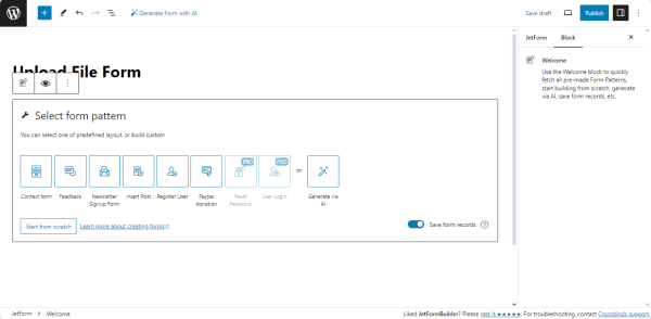
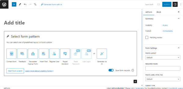
Navigate to the WordPress Dashboard > JetFormBuilder > Forms tab and press the “Add New” button to create a new form.
The created form has the Welcome block, allowing the application of a pre-created form. In the given case, we make the form from the beginning, so press the “Start from scratch” button.
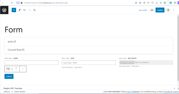
The Hidden Field, Text Field, and Action Button blocks are added by default; therefore, you can delete them if they are not needed in your form. Add the form’s title.
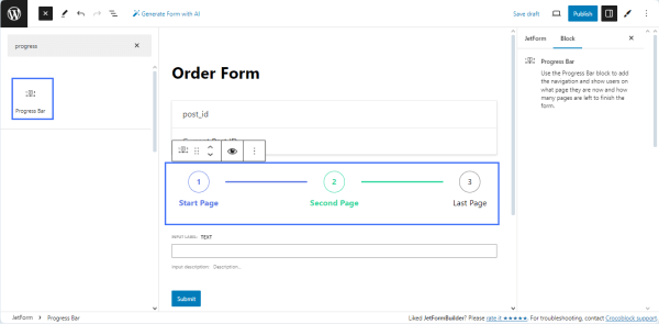
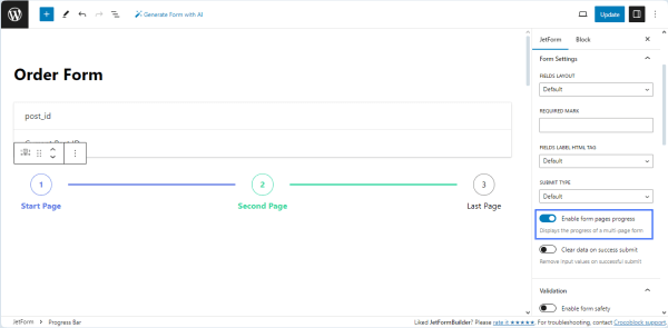
Find the Progress Bar block and add it to the page.
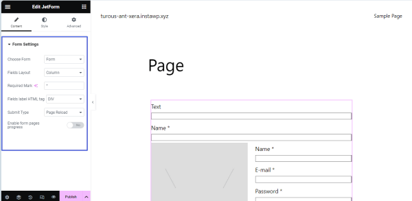
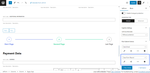
To divide the form into pages on the front end and display the progress on each page, navigate to the JetForm settings and activate the Enable form pages progress toggle.
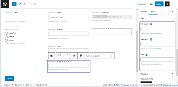
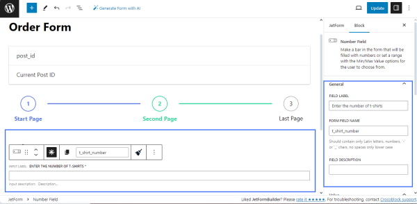
Drag and drop the Number Field to allow users to type the desired quantity of T-shirts.
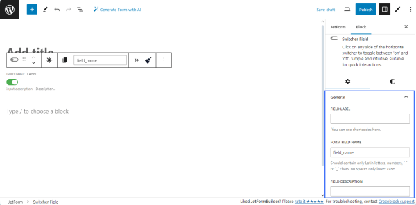
Navigate to the settings block and type the name in the FORM FIELD NAME field (e.g., “t_shirt_number”) and optionally type the FIELD LABEL (e.g., “Enter the number of T-shirts”).
NOTE
The FORM FIELD NAME should contain only Latin letters in lowercase, numbers, hyphens, and underscores. Spaces are inapplicable, so if you want to write two words or more, divide them with hyphens or underscores.
Add the Repeater Field and nested fields
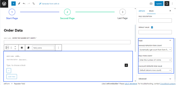
Then, find the Repeater Field and drag and drop it to the page.
Navigate to the settings block, enter the FORM FIELD NAME (e.g., order_data), and select the following:
- Select the “Dynamically (get count from form field)” option from the MANAGE REPEATER ITEMS COUNT field;
- Choose the name of the previously added Number Field (here, t_shirt_number) in the FIELD ITEMS COUNT drop-down list;
- Select the Default (columns row count) option from the CALCULATE REPEATER ROW VALUE drop-down list.
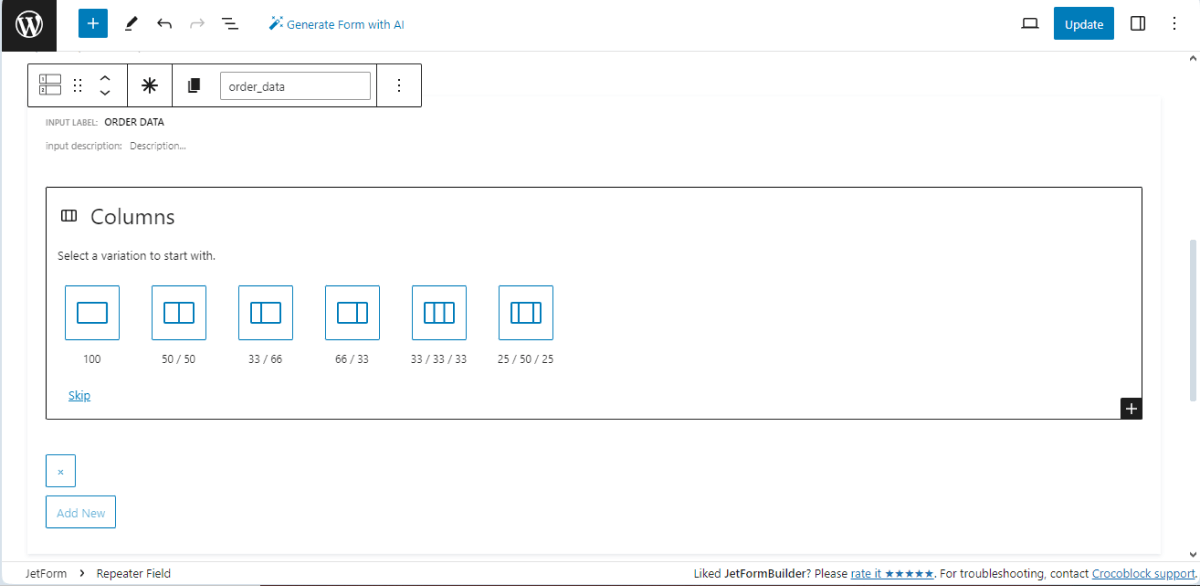
Press the “+” icon to add the Columns block into the Repeater Field.
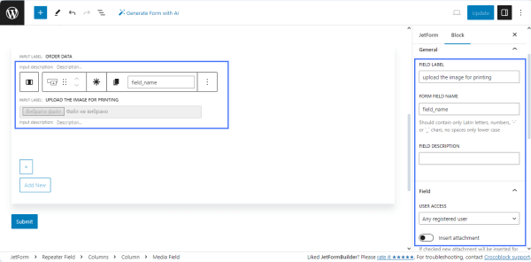
Here, we divided the form into two columns and added the following nested fields into the Repeater Field:
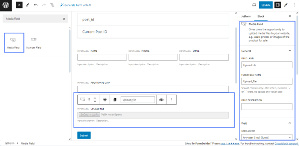
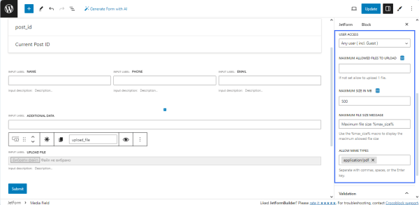
- the Media Field to upload an image for printing with the entered FIELD LABEL (e.g., “Upload the image for printing”) and FORM FIELD NAME (e.g., “image_for_printing”);
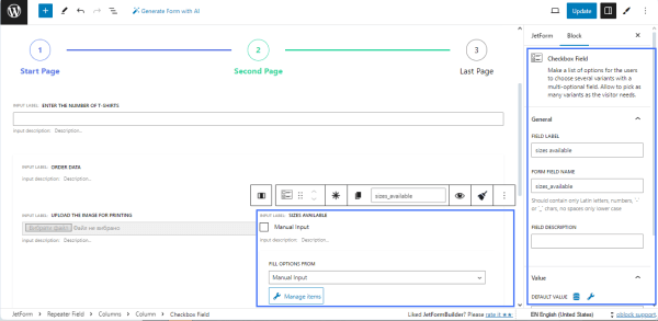
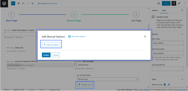
- the Checkbox Field to select the needed size of the T-shirt. Find the Checkbox Field block and drag and drop it to the page. Fill in the FIELD LABEL field (e.g., “sizes available”) and the FORM FIELD NAME field (e.g., “sizes_available”). The “Manual Input” option is selected by default in the FILL OPTIONS FROM drop-down menu.
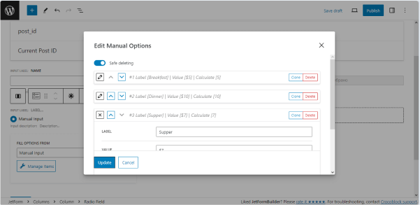
Press the “Manage items” button to open the Edit Manual Options pop-up to adjust the checkbox options and hit the “Add new Option” button.
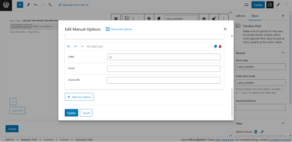
By clicking the button, you can add as many choice options to the Checkbox Field as needed. The settings include the LABEL field, which should be filled in with data displayed on the form as a list of variants (i.e., XS, S, L, etc.); the VALUE field, which should be filled in with inner data that corresponds to the option; and the CALCULATE field, which can be used in formulas.
For this tutorial, we used the same price for all sizes, so we left the VALUE and CALCULATE fields blank.
To add new options to the checkbox list, scroll down the Edit Manual Options pop-up and press the “Update” button.
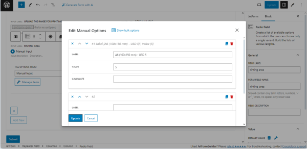
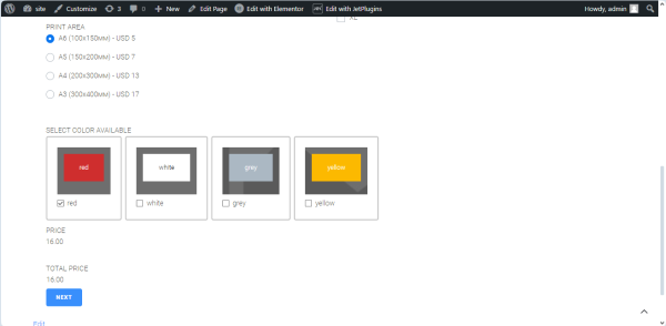
- the Radio Field to select the print area. The settings of this field are similar to those of the Checkbox Field block. In the given case, we added four variants to allow users to select the appropriate print area. Therefore, the only difference is adding the values into the VALUE fields of every item from the list.
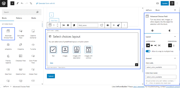
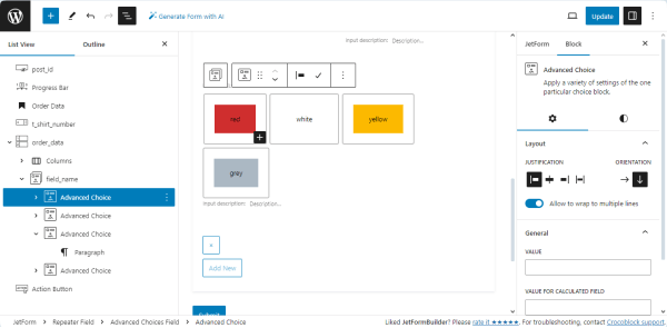
- the Advanced Choice Field to select the T-shirt color. Select the needed layout and type the field’s name (e.g., select color available). We selected the “Images with controls” layout option and filled in the FIELD LABEL and FORM FIELD NAME fields.
Due to the printing technology, we selected the colors of the covers, controls, and texts and added the specific VALUE FOR CALCULATED FIELD for each T-shirt color.
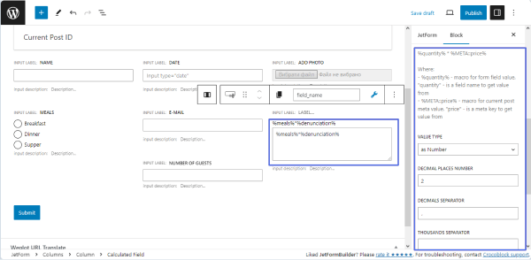
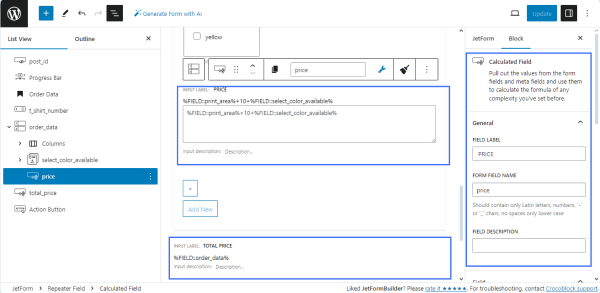
Calculated Fields
To calculate the approximated price for every T-shirt, we added the Calculated Field into the Repeater Field. Inside the Repeater Field, the Calculated Field defines the cost of printing for every T-shirt, and outside the Repeater Field, another Calculated Field defines the total costs.
The Calculated Field inside the Repeater Field summarizes the values from the selected fields; partially, it adds the options referring to the print area (Radio Field), T-shirt color (Advanced Choice Field), and the regular T-shirt price (here, USD 10). The calculation formula here is as follows: %FIELD::print_area%+10+%FIELD::%select_color_available%.
The Calculated Field outside the Repeater Field summarizes the values for each row from the Repeater Field and defines the total cost of the order. The calculation formula here is as follows: %FIELD::%order_data%, where the order_data is the Repeater Field’s name.
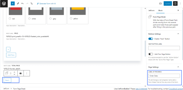
Separating the form pages
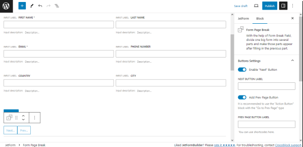
Add the Form Page Break field to separate the pages. Navigate to the block settings and activate the Enable “Next” button toggle to add the appropriate button to the form. Type the title of the form step in the LABEL OF PROGRESS field (e.g., Order Data). This text will be displayed via the PROGRESS BAR as the title of the form proceeding stage.
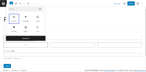
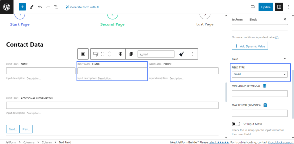
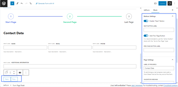
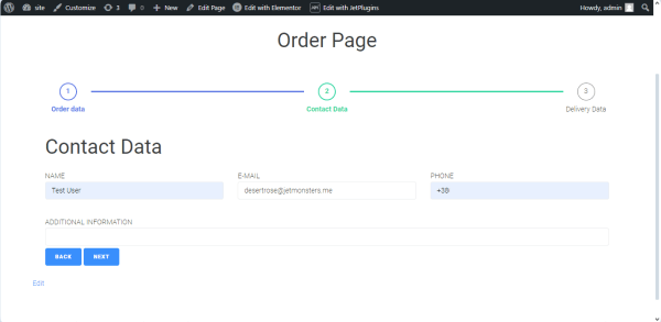
For the second page of the form, we added the Progress Bar block to display progress, the Heading field to display the step name (e.g., Contact Data), Columns to display text inline, Text Fields to input the users’ contact data (name, email, and phone), and the Form Page Break field to allow navigation to the previous page.
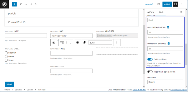
Specify the Text Field types: navigate to the Block settings, unroll the FIELD TYPE drop-down menu, and select the “Email” option for the “Email” Text Field and the “Tel” option for the “Phone” Text Field.
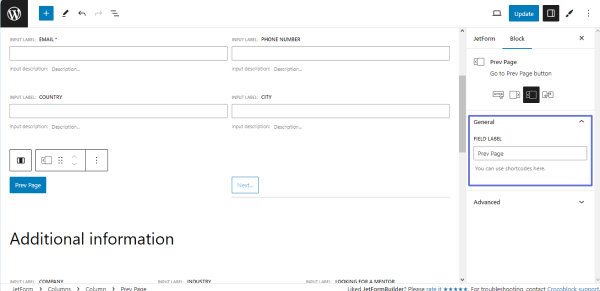
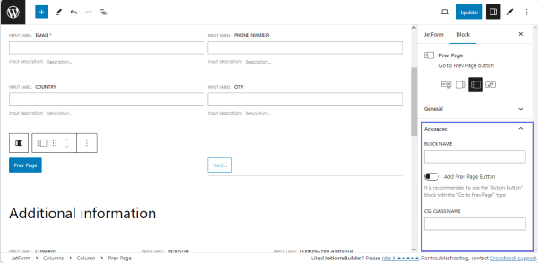
For the Form Page Break, we enabled the Add “Next” Button and Add Prev Page Button toggles to allow users to amend the entered data. We left blank the NEXT BUTTON LABEL and PREV PAGE BUTTON LABEL to display the default texts, but users can add any needed text. Then, we typed the text into the LABEL OF PROGRESS field (here, “Contact Date”) to display the form progress stage.
Add fields for delivery data
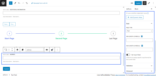
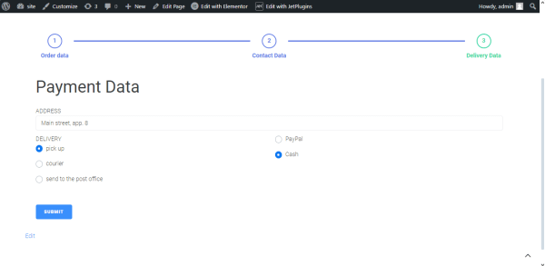
The last page contains data on the delivery method and payment. The page includes the Progress Bar block, Heading, Text Fields, Radio Fields, “Action” button, and Form Page Break block to submit the form.
The Progress Bar displays the current form proceeding stage, the Heading displays the page’s name (e.g., “Payment Data”), and the Text Field is intended to display the client’s address. As far as we did not limit the client’s location, we did not specify the min and max length of the field.
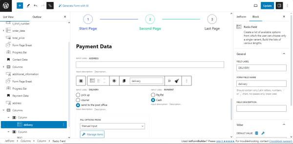
We added the Column block to display the Radio Fields and divided the form into two equal columns. We added the Radio Fields to each column. The first Radio Field is intended to select the preferred delivery method (e.g., pick up, courier, or send to a post office), and the second Radio Field allows the selection of the payment method. The settings of the Radio Fields are similar to the Checkboxes Field settings described above.
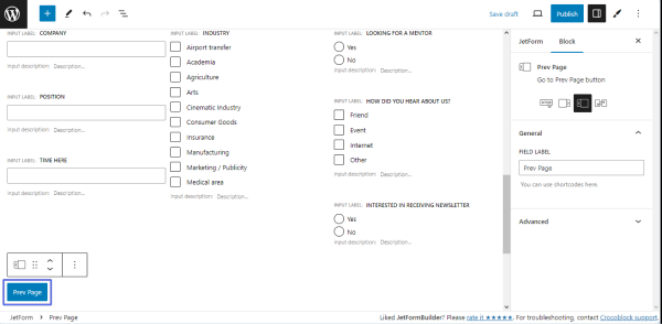
Add the Form Page Break block and enable the Add Prev Page Button to allow users to modify the entered data. Then, we typed the text into the LABEL OF PROGRESS field (here, Delivery Data) to display the form progress stage.
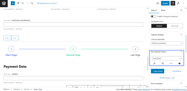
Post Submit Actions
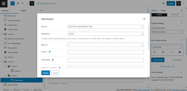
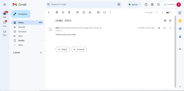
Go to JetForm, unroll the Post Submit Actions tab, and select the needed action from the drop-down list. Here, we selected the “Send Email” option to notify the user about the order.
Select the “Email from submitted field option” from the MAIL TO field and pick the name of the email form field from the FROM FIELD source to send the notification to the email the user will enter in this field.
If needed, scroll down the pop-up and fill in the following fields:
- SUBJECT to add the email subject;
- FROM EMAIL ADDRESS to add the email address from which the users will get the notifications;
- select the “Plain text” option from the CONTENT TYPE drop-down list;
- type the email text in the CONTENT field.
Press the “Update” button to save the action settings.
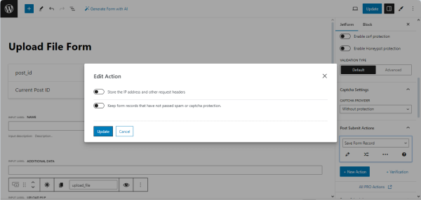
Add another Post Submit Action; select the “Save Form Record” option from the drop-down list to allow storage and managing of all orders.
After completing, publish or update the form.
NOTE
The JetFormBuilder’s PRO add-ons allow users to log in using the provided email/login and password. They can help to autocomplete the form’s fields, save the form’s progress, provide payment options, integrate email marketing and CRM services, etc.
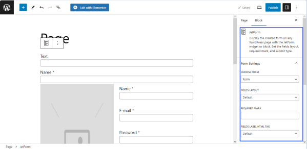
Add the form to a page
Open a page/post/CPT post/template you need and place the JetForm widget (in Elementor), JetForm block (in Block Editor), or JetForm element (in Bricks). Select the built T-shirt order form in the Choose Form drop-down list. Learn about other settings from the JetForm Overview.
Publish or update the page.
Order form in action
Open the page with the order form on the front end. Complete the form to check if it works correctly.
Scroll down the first form’s page and fill in all the fields.
Move to another page of the form and fill in the fields as well.
Fill in the fields on the last page and hit the “Submit” button.
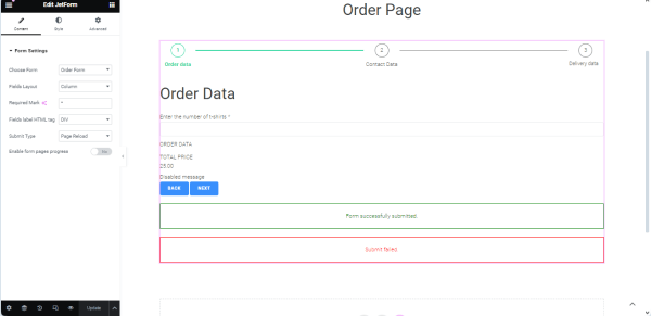
After successful submission, the “Form successfully submitted” message will appear.
The form has sent a notification to the email user entered into the email form field with the predefined text:
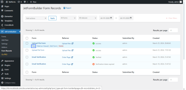
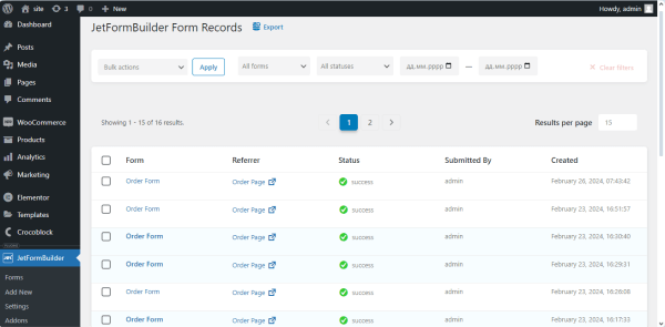
Navigate to the WordPress Dashboard > JetFormBuilder > Form Records tab. This tab collects all submitted form data.
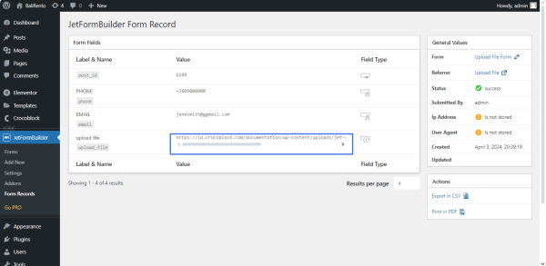
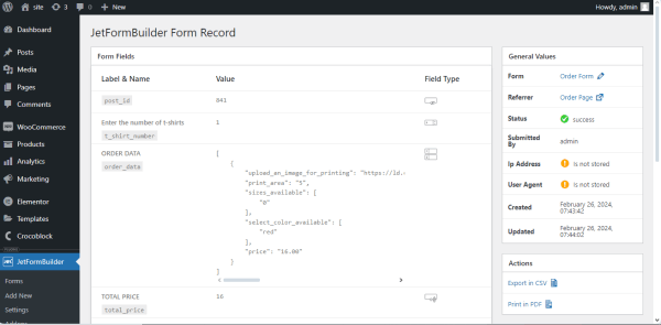
Click the “View” link under the form title (under the “Order Form” in our case) to unroll the recently submitted form and check the values from the submitted fields.
That’s all about creating a T-shirt order form using the JetFormBuilder plugin for WordPress and managing the form’s specific fields and Post Submit Actions.
WordPress T-Shirt Order Form Pro Features