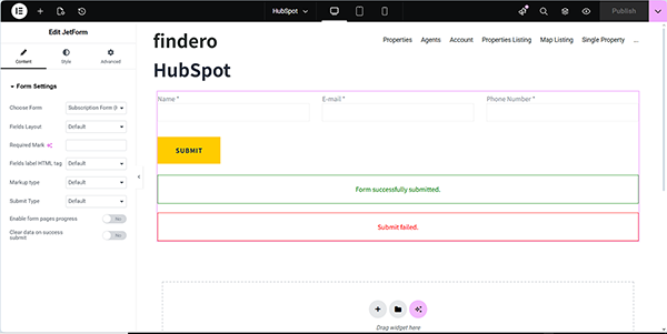
In this case, we create a form for purchasing a WooCommerce product and apply the “WC.CHECKOUT.COMPLETE” event on the “Update User” Post Submit Action to change the user’s status after successful payment.
To provide this functionality, the WooCommerce Cart & Checkout Action add-on and WooCommerce plugin should be installed and activated. Read the JetFormBuilder WordPress Plugin Installation tutorial to learn more about different methods of installation: from the WordPress Dashboard, by uploading to your site, or manually.
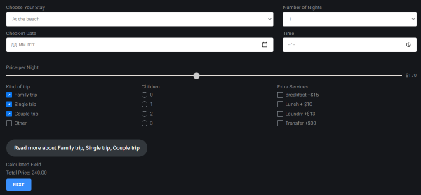
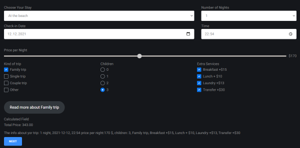
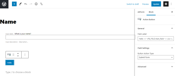
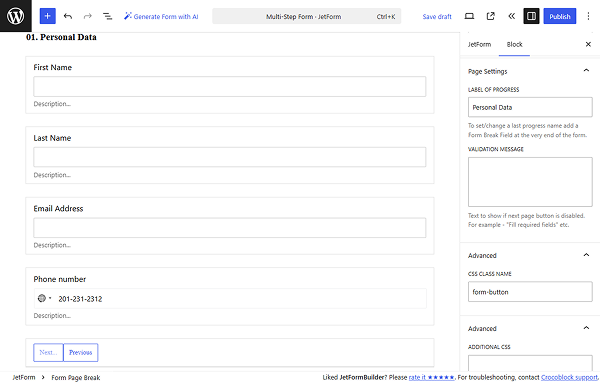
In this case, the order form is intended to be added to a page with a WooCommerce product; it contains the Hidden Field (with the “Current User ID” FIELD VALUE set), Text Fields, and the Action Button.
After adding the fields, move to the JetForm settings. Next, press the “+ Add New” button in the Post Submit Actions section and select the “Add to Cart & Redirect to Checkout” option in the newly appeared Add new action pop-up.
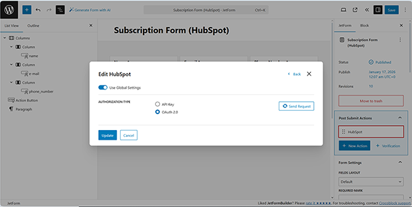
Once chosen, the Edit Add to Cart & Redirect to Checkout pop-up is opened.
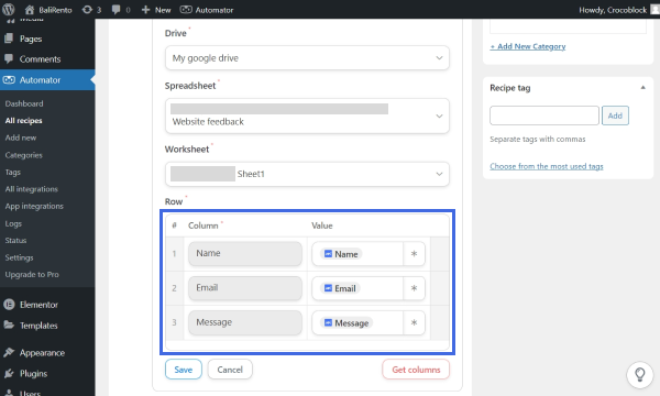
Here, configure the following settings. First, select the “Manual Input” option in the GET PRODUCT ID FROM and select the name of the product to which you intend to add the form in the SELECT PRODUCT field. Since the price will be taken automatically from the product page, keep the WOOCOMMERCE PRICE FIELD empty.
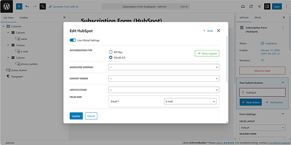
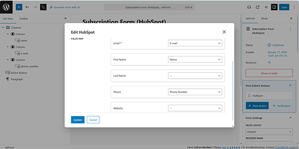
After that, scroll the pop-up down to the WOOCOMMERCE CHECKOUT FIELD section and assign the form’s fields that will be displayed on the checkout page to the corresponding drop-down options.
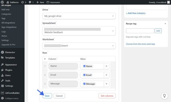
Finally, once completed, press the “Update” button and close the pop-up.
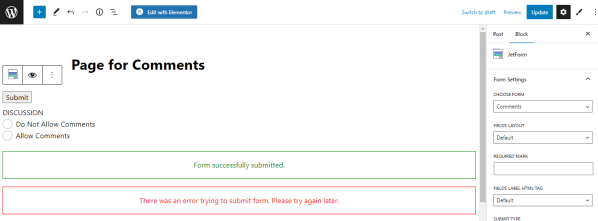
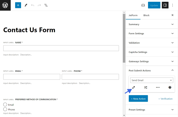
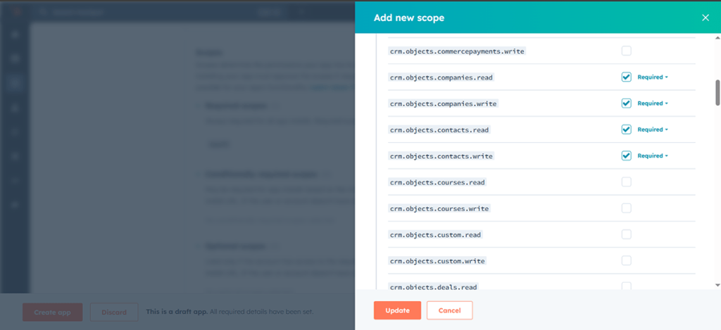
The next Post Submit Action is the “Update User” Post Submit Action. Here, complete the EditUpdate User pop-up fields:
In particular, we set the “User ID (will update this user)” option for the user_id form’s field, “First Name” option for the FirstName form’s field, “Email” option for the Email form’s field, and “Last Name” option for the Last Name field. These fields correspond to the names of the columns in which the user’s data is displayed via the WordPress Dashboard.
In the User Role field,we select the “Customer” option so that all users who submit the form and buy the product also upgrade their role to Customer.
In the last step, insert the required messages into the MESSAGE SETTINGS fields. Here, we keep the default data. Once completed, press the “Update” button at the bottom of the pop-up. Finally, save the form.
After that, press the “Edit Conditions & Events” icon (the crossed arrows) near the “Update User” Post Submit Action.
Here, select the “WC.CHECKOUT.COMPLETE” event in the appeared Edit Conditions & Events pop-up and press the “Update” button to close this pop-up.
In the last step, add other necessary Post Submit Actions (e.g., “Save Form Record”). Finally, save the form.
Once completed, save the page and open the product page.
Test the Flow
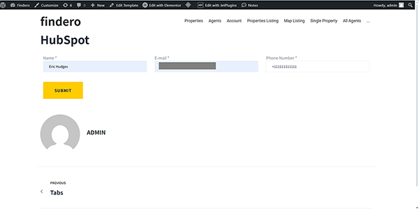
Move to the front end and fill out the form fields.
NOTE
Before changing their roles, the users should be logged in to the site.
If the form is built correctly, you will be redirected to the checkout page.
Scroll the page down and press the “PLACE ORDER” button.
NOTE
Since the “Add to Cart & Redirect to Checkout” action delegates the payment process to WooCommerce, the “WC.CHECKOUT.COMPLETE” event will automatically trigger the user role update as soon as the client successfully places the order on the WooCommerce checkout page, regardless of the payment gateway used.
Then you will be redirected to the thank you page.
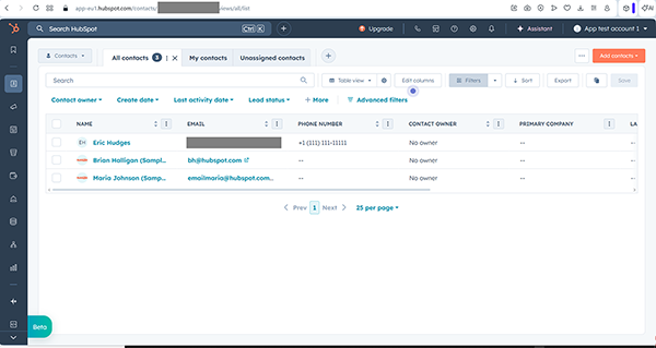
Check if the user completed the payment in the WordPress Dashboard > WooCommerce > Orders tab.
Finally, to check the update, proceed to the WordPress Dashboard > JetFormBuilder > Form Recordstab and observe that the new roles have been added to the needed user.
More details on the structure of the default <i>WooCommerce</i> checkout page, designs, layouts, widgets, combining pages, as well as useful code snippets, removing address fields if the product is virtual, and conditional payment options for physical and virtual products can be found in the WooCommerce Checkout Page Customization article.
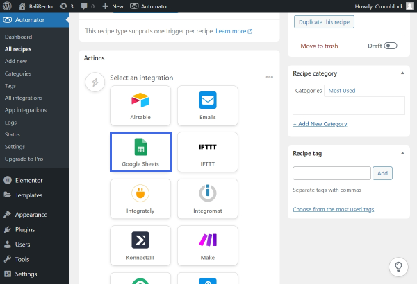
Can I connect my JetFormBuilder form with other apps?
Yes. Use the Uncanny Automator to facilitate the connection of plugins and apps and to enable the automation of WordPress website activity without coding. This plugin enables the seamless integration of JetFormBuilder forms with various apps, including Airtable, Google Sheets, Google Calendar, Instagram, Facebook, and more. A complete list of available integrations is on the Automator WordPress Plugin Integrations page.
Can I insert/update WooCommerce products via forms on the front end?
That’s it. Now you know how to change the user role after payment using the WooCommerce Cart & Checkout Action add-on for JetFormBuilder for WordPress, and the “Update User” Post Submit Action.
In this guide, we will show you how to activate the form translation functionality on your website and translate the form along with the page where it is located.
Activate Forms Translation
First, go to WordPress Dashboard > WPML > Settings and move to the Post Types translation section.
Find the Forms (jet-form-builder) row and set it to “Translatable.”
Don’t forget to click the “Save” button below the section.
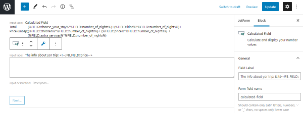
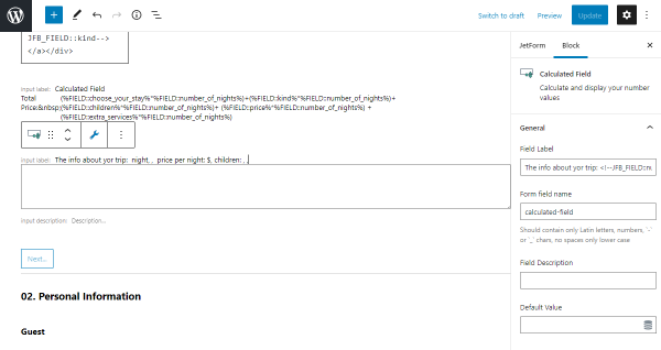
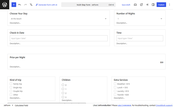
The Calculated Field, in tandem with smart formulas let you create highly dynamic JetFormBuilder formulas. Thus, you can perform not only simple arithmetic calculations but also advanced mathematical operations, such as rounding, exponentiation, conditional and comparison statements, and various calculations for JetBooking. In this guide, you will discover how each formula works and how to use it effectively in your calculations.
Use the name of the form Number Field #1 instead of the “number_meta_field_1”, as well as use the name of the form Number Field #2 instead of the “number_meta_field_2”.
Save the form and check the frontend page. Here, the numbers we add are multiplied correctly.
Division
To divide two numbers, add two Number Fields and paste the following formula into the Calculated Field:
Here, “number_meta_field_1” is a form Number Field #1 name, and “number_meta_field_2” is a form Number Field #2 name.
Save the changes and open the frontend page. Here, the calculation result is correct.
Advanced Calculations
The Calculated Field in JetFormBuilder is not limited to basic mathematical operations. It supports all the math object methods, which help perform advanced calculations with numeric values returned by form fields.
Refer to our Advanced Math Calculations tutorial for the detailed guide. In this article, we will summarize the most important information.
Rounding
To round the number to the nearest integer, ensure that you have a Number Field added to the form, and add the following formula to the Calculated Field:
Math.round(%number_field%)
Instead of the “number_field”, use the form Number Field name.
Save the settings and check the front page. The numbers are being rounded correctly.
Rounding up
If you need to return the smallest integer greater than or equal to the specified number, ensure you have the Number Field in the form and paste the following formula to the Calculated Field:
Math.ceil(%number_field%)
Use the form Number Field name instead of “number_field”.
Save the changes, and on the front, the Calculated Field will round up any floating-point value pulled from a separate form field.
Rounding down
To return the largest integer less than or equal to the specified number, add the Number Field to your form and add the following formula to the Calculation Field:
Math.floor(%number_field%)
Type in the form Number Field name instead of “number_field”.
Save the changes and proceed to the front end. The Calculation Field operates correctly.
Finding the largest and the smallest numbers
To define the largest or the smallest number, you need at least two Number Fields, and use one of the following formulas inside the Calculation Field:
In both cases, remember to change “number_one”, “number_two”, etc., to the names of your form Number Fields.
After saving the settings, we can verify that the Calculation Field correctly defines the maximum number on the front end.
Similarly, we can change the formula to get the smallest number and save the settings.
Then, the Calculation Field will return the smallest of the offered numbers.
Exponentiation
When you need to exponentiate the numbers (raise the first specified number to the power of the second number), ensure you add two Number Fields and add the following formula to the Calculated Field:
(Math.pow(%number_one%, %number_two%))
Here, “number_one” is a form Number Field #1 name, and “number_two” is a form Number Field #2 name.
Save the changes and check it on the front. Here, the numbers are exponentiated correctly.
In this article, we will investigate a particular use case in detail in which conditional formulas can be a useful and effective solution.
To set different prices for users of different ages, first create a custom number field for users to store their age.
NOTE
This approach will work only for logged-in users.
In the form, add the Number Field. In the field’s Value tab, click the “Dynamic Tag” button next to the DEFAULT VALUE field. In the newly opened pop-up, select the “User” SOURCE. Choose the “Current user” option for the GET USER ID FROM and select the “User Meta” for the USER FIELD. Insert the meta field name in the input field. Click the “Update” button.
In the Calculation Field, add the following formula:
(%user_age% >= 18) ? 100 : 50
Here, the “user_age” is the name of the Number Field in the form. “18” is the age at which you want to limit the content/price. “100” and “50” are the prices you want to apply to users aged 18 or older and those aged 18 or younger, respectively.
Save the changes and check the frontend page. When the user is 18 or older, the price is “100”.
For users under 18, the half-price option will be shown.
Comparison Operators
JetFormBuilder supports ternary operators in Calculated Fields. They allow you to return different calculation results depending on whether a condition is met.
The basic syntax looks like this:
condition ? value_if_true : value_if_false
For example, if the value of number_field equals 5, the calculated result will be 5 × 100. If the value is not 5, the calculated field will return 0. In order to implement this, add the following formula to the Calculated Field:
%number_field% == 5 ? %number_field% * 100 : 0
“number_field” is the name of a Number Field in the form. Instead of a fixed number (5), you can also compare the value against another Number Field or a dynamic value.
Save the changes and check the front end. When the Number Field has the “5” value, the Calculation Field returns the correct value.
When the value in the Number Field is different, the Calculated Field returns “0”.
JetBooking Calculations
The JetBooking pricing system usually requires various calculations. In this guide, we will investigate the most common JetBooking calculation cases.
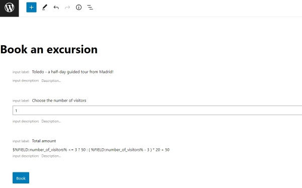
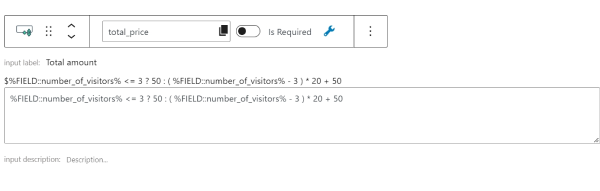
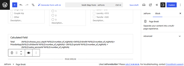
Total price
The main formula for total price calculation is suitable for even basic cases. Paste the following formula into the Calculated Field:
(%FIELD::quantity%+2)*%META::price%
Here, the “quantity” is a Number Field, “2” is a fixed value, which you can change, and the “price” is the current post JetBooking’s price field (when the form field for price is added).
Total price with additional services
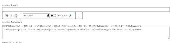
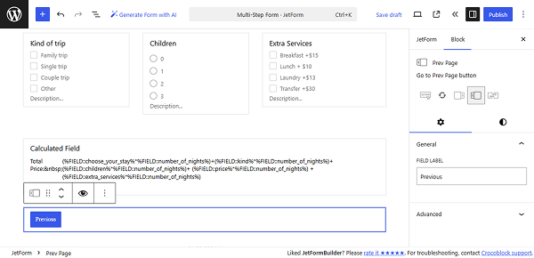
When the total amount needs to be counted based on the selected dates, additional services, or the number of guests, the following form should be used:
Here, “_dates”, “additional_services_a”, and “guest” are the form fields used inside the form, while %META::_apartment_price% is the macro that returns the price per 1 day/night.
Total price per hour
When you use a Timepicker field and need to count the price for the hours the customer used the service, the following formula should be used inside the Calculated Field:
Here, “ADVANCED_PRICE” is a macro for getting the flexible booking price, “BOOKING_TIME” is the macro to get the price per hour, “_dates” is a date field name, and “check-in-time” and “check-out-time” are the required keywords to retrieve the start and end time (you should not use your form fields’ name instead).
Total price of the WooCommerce order
When you use the WooCommerce-based mode for your booking system, the general simple form for the total price can be used:
(%FIELD::quantity%+2)*%META::price%
If you use additional services or need to base the total price on the number of guests or selected days, use the following formula:
In the same booking form built with the JetFormBuilder plugin, we can use a Calculated Field to set the price used in the WooCommerce checkout and order. To do so, open the Post Submit Actions tab and add the “Apartment Booking” action.
In addition to mapping the APARTMENT ID FIELD and CHECK-IN/CHECK-OUT DATE FIELD, we should select the Calculated Field, which contains the advanced price formula as a WOOCOMMERCE PRICE FIELD.
If you leave the WOOCOMMERCE PRICE FIELD empty, WooCommerce will use the value of the Price per 1 day/night meta field of the “Room” Custom Post Type.
Click the “Update” button.
Total price multiplied by the coefficient
In case you need to multiply the total price by the coefficient, you need to save the needed coefficient in the Hidden Field.
Add the following formula to the Calculated Field:
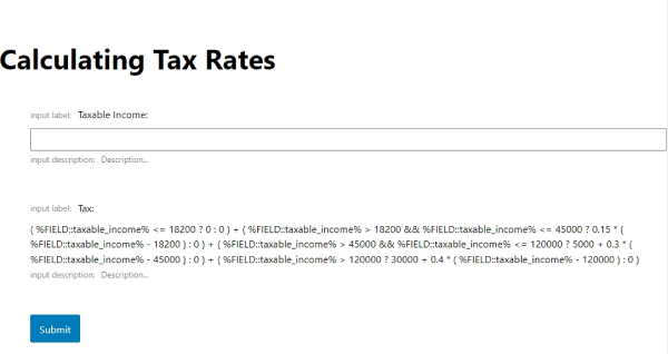
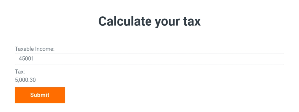
The approach for the tax calculation would be similar to the coefficient calculation. We would need to add the Hidden Field with the static tax applied.
When you put the Calculated Field outside the Repeater Field, for example, you want a total based on how many repeater rows are added, use the following formula:
%FIELD::quantity%*%META::price%
Here, the %FIELD::quantity% is a macro for the form field value. %META::price% is a macro that returns the current post meta value.
Calculated field inside a Repeater
When you want to calculate values per repeater item before tallying, for instance, each row shows how many adults and kids, and you want the total guests per row, use the following formula in the Calculated Field:
%FIELD::adults% + %FIELD::kids%
“adults” and “kids” are the names for the inner Repeater Field. The results can be summed in another Calculated Field outside the repeater.
Combined approach (inside and outside Repeater)
For complex pricing, you can use Calculated Fields within the repeater to compute per-row totals (e.g., the total number of people in that row). Then, use another Calculated Field outside the repeater to aggregate results and produce a final total price.
For example, we have a Repeater Field with Number Fields for adults and kids. In the Repeater Field, there is also a Calculated Field that counts all family members, so we need to sum the adults and kids.
Outside the Repeater Field, we have another Calculated Field to retrieve the total number of guests: we need to sum all family members across all repeaters.
Additionally, the form includes a pricing field (e.g., room price) and a Hidden tax field.
This multiplies the total number of guests across all repeaters by the selected room price, including tax.
That’s it. Now, you know JetFormBuilder calculated formulas and how to use them for dynamic forms in WordPress. In this guide, we explored simple arithmetic, advanced, conditional, and JetBooking calculation formulas.
Macros in JetFormBuilder let you dynamically insert form data into emails, calculated fields, or confirmation messages, etc. With them, you can display user input, format dates and times, show uploaded media, or include links to newly created posts.
%field-name% — use this macro in the content of the “Send Email” post-submit action to retrieve the form field value. Remember to replace the ‘field-name’ part with the actual name of the form field (e.g., if there is a Text Field with the name ‘text’, the macro will look like this: %text%). The macro also supports multiple optional fields, including Radio, Select, and Checkbox Fields.
ifEmpty — if the field or macro is empty, returns the value specified in brackets and apostrophes (”).
For example, we created a form and added a Text Field for user name input and a Calculated Field with the inserted macro:
%user_input|ifEmpty('visitor')%
Where ‘user_input’ is the Text Field name. Also, the VALUE TYPE should be set to “as String,” and the Hidden toggle can be enabled to hide the field in the form on the front end.
Then, we proceed to the JetForm > Post Submit Actions tab and add the “Send Email” action. In the CONTENT textarea, enter the Calculated Field name wrapped in percent signs, for example:
%test_output%
You can also combine it with other macros and plain text.
Then we open the form on the front end, submit it with the Text Field empty, and receive an email with the placeholder value.
Macros for Media Fields
%media-field|img_url_by_id% — retrieves the image URL from the Media Field. Mind using the Media Field name instead of the ‘media-field’ part. If you need to render the actual image in the content of the email, use HTML markup and the <img> tag, for example: <img src=”%media-field|img_url_by_id%”>.
NOTE
As this macro works with ID, choose “Attachment ID” as the FIELD VALUE option in the Media Field settings. In this way, the macro will send the URL of the chosen image. Alternatively, you can select the “Attachment URL” as the FIELD VALUE and use the %name% macro. Use this option if you want the user to upload multiple pictures.
For example, we create a simple form with the Media Field with the “image_” FORM FIELD NAME. In its settings, we set the “Attachment ID” as the FIELD VALUE.
Then, we proceed to the JetForm > Post Submit Actions tab and add the “Send Email” action. In its settings, we select “HTML” as CONTENT TYPE and enter these macros into the CONTENT textarea to display the image and its URL:
<img src="%image_|img_url_by_id%">
%image_|img_url_by_id%
The “image_” is the name of the Media Field.
We submitted the form on the front end. The uploaded image and its URL are displayed in the email.
%media-field|file_url_by_id% — retrieves the attachment URL from the Media Field. The “Attachment ID” should be chosen as the FIELD VALUE.
Macros for Post Fields
%post-field|post_title_by_id% — gets the post/page title from its ID stored, for example, in a Radio or SelectField with the “Post” source. The ‘post-field’ part should be replaced with the form field name.
%post-field|post_titles_by_ids% — gets the names of multiple posts from their ID stored, for example, in a Checkbox Field with the “Post” source.
For instance, we add a Checkbox Field with the “post_checkbox” FORM FIELD NAME. In the FILL OPTIONS FROM selector, we set “Posts” and keep the “Posts” POST TYPE.
Then, we proceed to the JetForm > Post Submit Actions > “Send Email” action and enter the macro into the CONTENT textarea:
%post_checkbox|post_titles_by_ids%
where the “post_checkbox” is the Checkbox Field name.
On the front end, we select two posts and submit the form.
In the email, two selected posts are displayed and separated by a comma.
%post-field|post_link_by_id% — retrieves the linked title of the post by its ID.
%post_field|post_url_by_id% — retrieves the URL of the post by its ID.
Macros for Term Fields
%term-field|term_title_by_id% — displays the term’s name by its ID stored, for example, in a Radio, Select, and Checkbox Field with the “Terms” source. The ‘term-field’ part should be replaced with the form field name.
%term-field|term_titles_by_ids% — displays the term names by their IDs.
Macro for Checkbox Fields
%checkbox-field|render_acf_checkbox% — displays values selected in the Checkbox Field created with the ACF plugin. The ‘checkbox-field’ part should be replaced with the form field name.
Additionally, in the WordPress Dashboard > JetFormBuilder > Add New Form tab, you can select the “Insert Post” pattern in the Welcome block to insert several form fields and the “Insert/Update Post” action.
In the “Insert/Update Post” action settings, we change the POST STATUS to “Published”. If the status isn’t specified, all posts will be added as “Draft”.
Then, add the “Send Email” action. In its settings, scroll down to the CONTENT textarea and add such a macro:
%inserted_post_id|post_url_by_id%
Or use %inserted_post_id|post_link_by_id% to display the post tile with a link.
Save the form settings and submit it on the front end.
How to Format Date Fields
%date-field|format_date% or %date-field|format_date(F j, Y)% — use those macros to change the date/time output of the Date, Time, andDatetime Fields. The ‘date-field’ value corresponds to the name of the Date/Time/Datetime Field, and F j, Y is the date format, which can be changed according to the Customizing date and time format article. Additionally, the macro can appear as follows: %date-field|format_date(d)% or %time-field|format_date(h)%.
For example, we create a Datetime Field with the “date_and_time” FORM FIELD NAME. In the JetForm > Post Submit Actions > “Send Email” action, we enter the macro into the CONTENT textarea:
%date_and_time|format_date(F j, Y g:i a)
%where the “date_and_time” is the Datetime Field name and “(F j, Y g:i a)” is the date and time format (example output: “November 6, 2010 12:50 am”).
We submit the form on the front end and get the email with the date and time in the adjusted format.
|T (%date_field|T%, %datetime_field|T%, %time_field|T%) — converts date/time to timestamp.
|toDate, |toDateTime, |toTime — converts timestamp back to date and time format (e.g., 2025-10-21).
|addDay(N), |addMonth(N), |addYear(N) — adds N days/months/years to a date or timestamp. If N is not specified, it adds 1 day, month, or year. For example, use the %date_field|addDay(1)% macro in the Calculated Field to add 1 day to the date set in the form field, so if you set “10-09-2025”, the Calculated Field will display “10-10-2025”. The “date_field” part should be replaced with the form field name.
|subDay(N), |subMonth(N), |subYear(N) — subtract N days/months/years from a date or timestamp. If N is not specified, it subtracts 1 day, month, or year.
|setDay(N), |setMonth(N), |setYear(N) — sets a specific month/day/year for a date or timestamp.
For the showcase, we create the Datetime and Calculated Fields. Into the Calculated Field, we enter the macro:
‘%start_date|T|addDay(5)|toDateTime%’
which takes the selected date, turns it into a timestamp, adds 5 days, and outputs the new date. The “start_date” is the name of the Datetime Field.
NOTE
Ensure to set the VALUE TYPE to “as String” in the Calculated Field block settings. This type should be set for date and datetime calculations; for time-only calculations, set the VALUE TYPE to “as Date” in the Calculated Field block settings and set the required DATE FORMAT (e.g., “HH:mm” for the Time Field). Also, the Hidden toggle can be activated to hide this field from the front end.
In the JetForm > Post Submit Actions > “Send Email” action, we enter the Datetime and Calculated Field names, wrapped in percent signs, into the CONTENT textarea. Click the “wrench” icon to input the macros in a simple way:
Your date: %start_date|format_date(F j, Y g:i a)%
Your final date: %final_date|format_date(F j, Y g:i a)%
We also add a macro to format the date, as without it, the result will appear as follows: 2025-11-11T12:20.
On the front end, we set the date and time and submit the form. The Calculated Field shows five days after the selected start date.
The email displays the start and final dates in the adjusted format.
If you try to display the options selected in the Select, Radio, and Checkbox Fields in emails, the values will be displayed instead of labels (e.g., “first_option” instead of “First Option”). Labels can be displayed using the JetEngine plugin.
First, proceed to WordPress Dashboard > JetEngine > Glossariesand press the “+ New Glossary” button to set the list of options.
Type the Name and select the Data Source (you can adjust options manually or upload a list from a file). We set three simple options. When you finish, push the “Save” button.
Second, add a piece of code either via a custom code snippets plugin (like Code Snippets) or directly in your theme’s functions.php file (preferably in a child theme to prevent changes from being overwritten on updates).
For example, we install and activate the Code Snippets plugin, then open the WordPress Dashboard > Snippets > Add New tab.
We type the name into the title bar (e.g., “Glossary labels in Send Email action”) and enter such code into the PHP textarea:
add_filter( 'jet-form-builder/content-filters', function( $filters ) {

	class Get_Labels_By_Glossary extends \Jet_Form_Builder\Classes\Filters\Base_Filter {

		public function get_id(): string {
			return 'get_label_by_glossary';
		}

		public function callback_args(): array {
			return array( ', ' );
		}

		public function apply_macros( $value, ...$args ): string {

			list( $glossary ) = $args;

			if ( ! function_exists( 'jet_engine' ) || ! $glossary ) {
				return $value;
			}

			return jet_engine_label_by_glossary( $value, $glossary );
		}
	}

	array_unshift( $filters, ( new Get_Labels_By_Glossary() ) );

	return $filters;
} );
Then, we click the “Save and Activate” button.
Third, open the JetFormBuilder form and set the required field using the Glossary.
For instance, we add a Checkbox Field with the “checkbox_field” FORM FIELD NAME. In the FILL OPTIONS FROM dropdown, we pick the “Glossary” option and select the created glossary.
In the JetForm > Post Submit Actions > “Send Email” action settings, enter such a macro into the CONTENT textarea:
%field_name|get_label_by_glossary(N)%
where “field_name” is the name of your form field and “N” is the ID of your Glossary.
Finally, submit the form on the front end, and selected options will be displayed in the email.
That’s it; now you know how to use JetFormBuilder functionality to display specific form data using available macros in emails sent from your WordPress website. Additionally, you can combine them with the JetEngine macros. For more details, check this guide.
JetFormBuilder macros let you create dynamic forms without custom code. They can pull values from fields, calculate dates, display conditional messages, or even format post data automatically. In this guide, you’ll learn how each macro works, where it can be used, and how to combine them for advanced form automation.
%field-name% — returns the value of any form field. Works everywhere inside the form. The ‘field-name’ part should be replaced with the actual name of the form field (e.g., if there is a Text Field with the name ‘text’, the macro will look like this: %text%). The macro also supports multiple optional fields, including Radio, Select, and Checkbox Fields.
%checkbox-field|render_acf_checkbox% — displays values selected in the Checkbox Field created with the ACF plugin. The ‘checkbox-field’ part should be replaced with the form field name.
%date_field|format_date(F j, Y g:i a) – formats date or datetime into a specific pattern.
|T% – converts date/time into a timestamp.
To showcase how this macro works, we create a Datetime Field with the “start_date” name and a Calculated Field, where we enter the “%start_date|T%” macro.
On the front end, after setting the date and time in the Datetime Field, the Calculated Field converts it into a timestamp.
|toDate, |toDateTime, |toTime — converts timestamp back to date and time format (e.g., 2025-10-21).
|addDay(N), |addMonth(N), |addYear(N) — adds N days/months/years to a date or timestamp. If N is not specified, it adds 1 day, month, or year. For example, use the %date_field|addDay(1)% macro in the Calculated Field to add 1 day to the date set in the form field, so if you set “10-09-2025”, the Calculated Field will display “10-10-2025”. The “date_field” part should be replaced with the form field name.
For the showcase, we use the previous Datetime and Calculated Fields. Into the Calculated Field, we enter the macro:
‘%start_date|T|addDay(5)|toDateTime%’
which takes the selected date, turns it into a timestamp, adds 5 days, and outputs the new date.
NOTE
Ensure to set the VALUE TYPE to “as String” in the Calculated Field block settings. This type should be set for date and datetime calculations; settings for time-only calculations will be shown later. Also, the Hidden toggle can be activated to hide this field from the front end.
On the front end, we set the date and time. The Calculated Field shows five days after the selected Start Date.
|subDay(N), |subMonth(N), |subYear(N) — subtract N days/months/years from a date or timestamp. If N is not specified, it subtracts 1 day, month, or year.
|addMin(N), |addHour(N), |subMin(N), |subHour(N) – manipulate hours and minutes.
For example, we set the Time Field and enter the macro (“time_start” should be replaced with the Time Field name) into the Calculated Field:
%time_start|addMin(15)%
NOTE
Set the VALUE TYPE to “as Date” in the Calculated Field block settings and set the required DATE FORMAT (e.g., “HH:mm” for the Time Field).
On the front end, we set the time in the Time Field,and the Calculated Field shows the time with 15 minutes added.
If you want to add both date and time, use the macro with a formula like this:
And set the VALUE TYPE to “as String” in the Calculated Field block settings.
On the front end, we set the date and time in the Datetime Field,and the Calculated Field shows the datetime with 5 days and 15 minutes added.
|setDay, |setMonth, |setYear — sets a specific month/day/year for a date or timestamp.
For example, we use the Datetime Field and enter such a macro into the Calculated Field:
%datetime_start|setYear(2077)%
We also set the VALUE TYPE to “as Date” in the Calculated Field block settings and set the required DATE FORMAT (e.g., “YYYY-MM-DD HH:mm” for the Datetime Field).
On the front end, we set the date and time in the Datetime Field (20/11/2025 13:43),and the Calculated Field shows the datetime with the year set with a macro (20/11/2077 13:43).
Milliseconds Conversion Macros
|toMinuteInMs, |toHourInMs, |toDayInMs, |toWeekInMs, |toMonthInMs, |toYearInMs — converts a regular number (e.g., from a Number Field) into the number of milliseconds equal to these minutes/seconds/days, etc. They can be used to perform math operations, e.g., to calculate the future date or to compare two dates by converting durations into milliseconds.
For example, we add a Number Field with the “duration_in_minutes” name and a Calculated Field with such a macro:
%duration_in_minutes|toMinuteInMs%
and the “as Number” VALUE TYPE selected.
On the front end, we enter “4” minutes in the Number Field, and a calculated result is displayed below as “240000” ms (milliseconds).
String Macro
length — returns the length of a string (number of characters) or the number of elements in an array.
For instance, we add a Text Field with the “Password” FIELD TYPE and a Calculated Field with such a macro:
%user_pass|length%
where the “user_pass” is the Text Field name. We also set the “as Number” VALUE TYPE.
On the front end, the Calculated Field counts the number of symbols entered in the password field.
Post and Term Macros (When a Field Stores IDs)
These macros can be used in emails, calculated fields, or displayed dynamically on confirmation pages:
%post_field|post_title_by_id%
%post_field|post_titles_by_ids%
%term_field|term_title_by_id%
%term_field|term_titles_by_ids%
Media Field Macros
These can be used in emails, Dynamic Values, hidden fields, or custom messages.
%media_field|img_url_by_id% – get the image URL.
%media_field|file_url_by_id% – get the file URL.
Macros for Emails Only
A few are specifically tied to the “Send Email” action context:
%inserted_post_id|post_url_by_id%
%inserted_post_id|post_link_by_id%
These rely on the form, creating a post with the “Insert/Update Post” action, so they don’t work in real-time form fields.
That’s all. Now you know about the JetFormBuilder macros and how to use them for dynamic forms in WordPress. Additionally, you can combine them with the JetEngine macros. For more details, check this guide.
This article focuses on customizing the Repeater Field’s look in the email sent by the WordPress JetFormBuilder plugin. We will describe two cases of adjusting the Repeater Field’s output in emails: with the Text Field and Select Field inside the Repeater Field.
Display Repeater Field Items with Custom Output Format
You can customize how Repeater Field items are displayed in the “Send Email” action by applying a custom output format. This approach enables looping through repeater items and incorporating specific subfield values into the email content.
After adding the code, click the “Save and Activate” button.
Set up the form
Let’s proceed to creating a form. To build a WordPress form, we navigate to WordPress Dashboard > JetFormBuilder > Add New Form.
Enter the form’s title – in this case, it is “Get Repeater in Email”.
The Welcomeblock appears by default. From here, you can select a form pattern or generate a form with OpenAI. Otherwise, you can hit the “Start from scratch” button and use the three fields added by default, or you can delete them to begin anew.
In this case, we used the “Contact” pattern and added a Repeater Field with a Text Field inside.
Proceed to the “Send Email” Post Submit Action and click the pencil-shaped edit button. In the CONTENT field, enter the following input:
Here, the “repeater_field” is the name of the main Repeater Field, and the “text_field” is the name of the inner Repeater’s fields.
Click the “Update” button when ready, then publish the form.
Check the result
Following the How to Display a Form on the Front End guide, we add the created form to the necessary page. Then, proceed to the front-end page and submit the form.
As soon as the form is submitted, we receive an email containing the text entered in the Repeater Field.
The list of inputs from the Repeater Field is presented in the received email.
Display Post Titles from a Select Field Inside a Repeater in the “Send Email” Action
Here, we will focus on a bit different case: instead of the Text Field, the Select Field will be used in the Repeater Field. The aim is to display the selected options from the Select Field in the email sent by the form.
Here, the “repeater_field” is the name of the Repeater Field, and the “select_field” is the name of the Select Field. Ensure that you are using the names of your fields.
Click the “Update” button and publish the form.
Result
Submit the form on the front-end page.
The result is that the email will contain the post titles you selected in the form.
That’s it. Now you know how to customize the Repeater Field’s output in email using the WordPress JetFormBuilder plugin.
With the JetFormBuilder WordPress plugin, you can restrict users from selecting dates that are either in the past or in the future. Our forms’ settings provide a wide range of time-based conditions, making them a user-friendly solution for use cases such as appointment forms, time-limited offers, registration deadlines, or any scenario where you need to ensure users select only valid, timely dates.
Let’s proceed to the WordPress Dashboard > JetFormBuilder > Forms > click the“Add New Form” button or hit the “Edit” button for an already existing form.
In this tutorial, we use the booking form Pattern to test the different settings for the Date Field.
Let’s proceed to the Date Field settings in the right-side editing tab. Open the Value tab and in the STARTING FROM DATE field, put the following macro:
'%CT::CurrentDate|toDate%'
Ensure that the single quotes (‘…’) are kept.
Click the “Save” button once you are ready, and then proceed to the frontend page where the form has been added.
When we click the Date Field to select a date, we see that all dates before today are disabled and unclickable.
Now, users can no longer book a service for a date before today.
Disallow Selecting Future Dates
Let’s return to the form and see how we can prevent future dates from being selected.
In this case, we need to use the same macro, but in the LIMIT DATES TO field:
'%CT::CurrentDate|toDate%'
Save the form and move to the frontend. Here, we can see that the dates after today are unavailable.
Adjust Date Limits by Time Period
Now, let’s focus on limiting the selection by time. For example, the appointment cannot be booked earlier than two days after today.
Open the form again and proceed to the Date Field settings. Open the Value tab and in the STARTING FROM DATE field, put the following macro:
%CT::CurrentDate|addDay(2)%
You can use the needed number instead of “2”.
Ensure that the Is Timestamp toggle is enabled. In the Validation tab, choose the “Advanced” option in the VALIDATION TYPE field.
Save the form and open the frontend page. Selecting the tomorrow date results in an error message.
When the date five days from now is selected, there is no problem.
If we need to restrict the years to allow users only 18 years old and older, we use a similar macro in the LIMIT DATES TO field:
'%CT::CurrentDate||addYear(-18)%'
You can use the needed number instead of “18”.
In the Validation tab, select the “Advanced” option in the VALIDATION TYPE field.
Save the form and proceed to the frontend to test it. When we select a date earlier than eighteen years ago, it works correctly.
However, when we select a date fifteen years ago, we encounter an error message.
Connecting Two Date Fields Dynamically
Let’s focus on the case where we need to limit the date selection according to the value of another DateField — for example, the service can be booked for at least seven days. So, the user should not be able to choose a date in the “check-out” field before seven days after the date selected in the “check-in date” field.
Therefore, we utilize two Date Fields (“check-in date” and “check-out date” in this case). No special settings needed for the “check-in date” field, so we proceed to the “check-out date”. Open the Value tab, in the STARTING FROM DATE field, put the following macro:
'%check-in-date||addDay(7)|toDate%'
Here, the “check-in-date” refers to the name of the DateField from which we obtain the first date. The “toDate” part disables the days that cannot be selected; without it, the user can click on the date, but will get a notification that this date cannot be selected.
Save the form and move to the frontend page. For the “check-in date” field, we selected 15.07.2025, and we can see that the following seven days are not available for check-in.
Applying Time-Based Restrictions
If you need to restrict form inputs based on a specific time of day — such as allowing submissions only after 9:00 AM or blocking access after a certain hour — it can be done through a time-based macro.
We add the Datetime Field to the form, and in the Value tab, STARTING FROM DATE field, add the following macro:
'%CT::CurrentDate||addDay(2)|toDateTime%'
Save the form and proceed to the frontend page. Here, we can see that we can select a date no earlier than two days after the current date.
Now, you know how to restrict users from selecting dates that are either in the past or in the future, or disallow dates according to the date and time dynamically with the help of the JetFormBuilder WordPress plugin.
With the Calculated Field from the JetFormBuilder WordPress plugin, you can automatically calculate the difference between two dates. This is especially useful for booking forms, availability checks, and any scenario where duration is a factor.
Calculate the Difference Between Two Date Fields in Days
Let’s proceed to WordPress Dashboard > JetFormBuilder > Forms and click the “Add New Form” button or the “Edit” button for an already existing form.
As we know from the Calculated Field article, the Calculated Field supports simple and more complex mathematical operations for the numeric values. However, in this tutorial, we will focus on calculating the values from Date Fields.
We add two Date Fields named “start_date” and “end_date”. In the Field tab, enable the Is Timestamp toggle.
Then, add the Calculated Field and enter the FIELD LABEL. Inside the Calculated Field, paste the following formula:
Here, “end_date” stands for the FORM FIELD NAME of the Date Field where the end date is selected, and “start_date” stands for the name of the Date Field where the start date is selected.
When we save the form and proceed to the frontend and select July 10, 2025, for the start date and July 15, 2025, for the end date, we get “5” as a result of the difference between the two Date Fields.
Calculate the Difference Between Two Date Fields in Months
Now, we come back to the form settings and continue to use the same “start_date” and “end_date” Date Fields, but to count the difference in months, we need the following formula to be added to the Calculated Field:
As in the previous case, “end_date” refers to the Date Field where users choose the end date, while “start_date” refers to the field used to select the start date.
So, click the “Save” button and proceed to the frontend. When we select the start date in July and the end date in October, we get “3” months in the Calculated Field.
Calculate the Difference Between Two Date Fields in Years
In case you need to count the years between two Date Fields, use the following formula for the Calculated Field in the form editor:
The “end_date” field represents the Date Field where the end date is selected, and “start_date” indicates the field used for choosing the start date.
After saving the form and proceeding to the frontend, we choose dates in different years, such as 2024 and 2026, and we obtain the correct “2” years value in the Calculated Field.
Calculate the Number of Days Between the Date Field and the Current Day
Let’s focus on the case when we need to calculate the number of days between the date selected in the Date Field and the current date.
For that, we proceed to the form editor and add a Hidden Field to retrieve the current date. In the FIELD VALUE, select the “Current Date” option. Put “U” in the FORMAT field to get the timestamp format.
Additionally, we added a Date Field with the Is Timestamp toggle enabled.
Then, we need the following formula to be added to the Calculated Field:
In this case, “current_date” refers to the Hidden Field where we retrieve the current date, while “date_field” refers to the field used to select the date.
Save the form and move to the frontend to check how it works. We submitted the form at midday on July 2 (so it is the current date for us), and in the Date Field, we selected July 20. In the Calculated Field, we obtained the correct result of “18”.
Calculate Date + X Days
Here, we focus on the form settings where we sum the number of days with the Date Field in the form and display the result in the Calculated Field.
We need to open the form editor and add a Date Field for the dates and a Radio Field to select the number of days to be added to our Date Field.
In the Calculated Field, we add the following formula:
+'%days%' * %CT::Day_In_Sec% +%date_field|T%
Here, “days” is the name assigned to the Radio Field used for selecting the number of days, and “date_field” is the name given to the field for the date.
In the Field tab of the Calculated Field, choose the “as Date” option for the VALUE TYPE input. In the newly appeared DATE FORMAT, set the desired format; in our case, we use the “DD-MM-YYYY”.
When we save the form settings, go to the frontend, select the date (July 10, 2025, for example), and the number of days from the Radio Field (we selected “5”), we get the correct date: “15-07-2025”.
Calculate Month + X Months
Let’s move back to the form edit page.
In case we need to sum months, we need the Date Field and Radio Field for selecting the month number.
The formula for the Calculated Field should be a bit different:
+'%months%' * %CT::Month_In_Sec% +%date_field|T%
In this case, “months” refers to the Radio Field where users choose the number of months, while “date_field” refers to the field used to select the date.
Ensure that the “as Date” option is chosen for the VALUE TYPE. You can use the needed format for the date. In this case, to focus on counting months, we use the “MM-YYYY” format.
When we save the form, move to the frontend, and select the date in July 2025, and “5” months from the Radio Field, in the Calculated Field, we get the correct answer of “12-2025”.
Calculate Year + X Years
When we need to sum the years from the Date and Radio Fields, we put the following formula in the Calculated field on the form editing page:
+'%years%' * %CT::Year_In_Sec% +%date_field|T%
In this setup, the “years” field is designated for selecting the number of years, and the “date_field” field is used for selecting the date.
Make sure that the “as Date” option is chosen for the VALUE TYPE. You can use the desired format for the date. In this tutorial, we focus on counting years using the “YYYY” format.
After saving the form and checking it on the frontend, we select the date in 2025 and choose “10” in the Radio Field. In the Calculated Field, we obtain the correct result of “2035”.
That’s it. Now you know how to calculate various date ranges with the help of the Calculated Field from the JetFormBuilder plugin for WordPress sites.
Conditional Visibility is a functionality that allows you to make parts of the form invisible to the users until some conditions are met. Conditions and fields to be hidden are set with the help of the Conditional Block.
When you add the Conditional Block to the form, it looks like an empty area where fields and blocks can be added.
Fields can be added inside this area by clicking the “+” button. Let’s name it a connected field. When the defined conditions are met, the blocks will be shown or hidden, depending on the settings. You can add as many blocks as you wish inside the Conditional Blockarea, but be aware that they will be shown or hidden in one pack.
Afterward, you choose another field of the form — let’s name it a target field — and the operator in the settings window. The operator defines the condition that the target field value should meet. For example, you can choose that the value of the target field has to be equal to some value.
The conditional block compares the value of the target field with the value set in the settings window. If it meets the operator’s requirement, the connected field will be shown (or hidden).
To open the Conditional Block settings window, press the button with the crossed arrows icon, which is placed on the top tool panel. Also, you can press the “pencil” button in the Block section on the right or hover over the blue info block in the same section and click the “+ Add new” button.
The Conditional Logic pop-up window contains all the conditional visibility settings. Click the “+ Add Condition”button to observe all settings.
Settings
WHICH FUNCTION NEED EXECUTE? — a dropdown menu where you can set the visibility of the connected field. If you choose the “Hide if” option, the connected field will remain visible until the specified conditions are met, at which point it will be hidden. On the other hand, choosing “Show if” makes the field hidden by default, and it will only become visible when the conditions are satisfied;
Remove hidden elements from page HTML — this toggle becomes available after selecting either the “Hide if” or “Show if” condition. When enabled, the block is completely removed from the HTML (DOM) if hidden, meaning any fields inside it will not retain their values when the form is submitted. For example, in the “Send Email” action, the email content may show an empty value if the corresponding field was hidden at the time of submission. This feature also enhances security by preventing regular users from inspecting the page and revealing hidden fields. Additionally, it now allows you to make fields inside the conditional block required;
Close / pencil — when you click on this button, it folds/unfolds the condition;
Arrows — if you have multiple conditions, these buttons let you move a condition up or down in the list. It doesn’t affect the condition efficiency, but the order can help with readability and easier navigation;
Duplicate — when clicked, this button creates a duplicate of the condition;
Delete — when clicked, this button deletes the condition;
FIELD — a dropdown menuwhere you can choose a target field. The value of this field will be compared with the value from the VALUE TO COMPARE textarea. You select one of the fields that are already added to the form, so all of them will be listed in this drop-down menu, named by their labels;
OPERATOR — the option you choose from this dropdown will define how the value of the target field will be compared to the data you put into the VALUE TO COMPARE textarea. All options from this drop-down will be described further in the Operatorschapter;
VALUE TO COMPARE —the value you set here will be compared to the value of the target FIELD. It can be text, symbols, and numbers. If you push the “wrench” button, you can use macros with the form field names and the Extra macros for the Date, Time, and Datetime fields. Besides that, you can fill this field dynamically with the value from posts or users’ meta fields. To do it, click on the “database” icon, and you will be offered to choose the Source:
Post — specify where to take the data from (GET POST ID FROM), and choose the meta field to take the information from (POST PROPERTY);
User —specify where to take the data from (GET USER ID FROM), and choose the meta field to take the information from (USER FIELD);
URL Query Variable — a query variable is a small piece of data included in the URL, such as ‘post=123’, which indicates a post’s ID. You can define your query variable—for example, items—and enter it into the QUERY VARIABLE NAME field. Once set, you can manually add this variable to a post permalink or a Dynamic Link of the JetEngine plugin. The form will then check whether the page URL contains that variable and will autofill the relevant field only if the condition is met;
Option Page — this option is available with the JetEngine plugin. It lets you display value from the Option Page meta field. To learn more, proceed to the Options Page Overview.
“+ Add Condition” button — with this button,you can add as many conditions as you need for your form;
Add OR Operator —by default, all conditions are connected with the Operator AND, and the connected field will be only shown if all conditions are met. If you add Operator OR between conditions, the connected field will be displayed if one of the conditions is met.
Operators
There’s a description of available operators for conditions.
Equal
The condition will be met if the value in the target field equals the value from the VALUE TO COMPARE textarea.
Example:
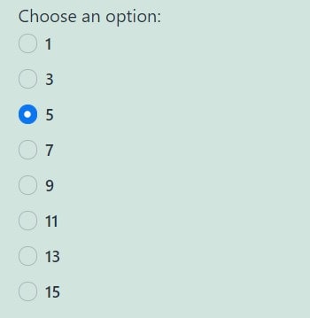
The connected field (“Number of rooms”) only appears if the value of the target field (“Number of visitors”) is equal to “3.”
Not equal
In this case, the connected field will stay visible/invisible if the value of the target field is not equal to the value from the VALUE TO COMPARE textarea.
Empty
The field will be shown/hidden if the connected field contains no value. This condition is useful for fields that take values in particular formats (JSON, date period, address), e.g., Check-in/check-out dates, Media Field.
Not empty
The field will be shown/hidden if the connected field contains some value.
Greater than/Greater than or equal
The connected field will be shown/hidden if the value of the target field is greater than (or equal to) the one you put in the VALUE TO COMPARE textarea.
Less than/Less than or equal
If the value of the target field is less than (or equal to) the number you put in the VALUE TO COMPARE textarea, the connected field will be shown or hidden.
Between
This operator allows you to insert a range into the VALUE TO COMPARE textarea. The first and last numbers have to be typed in ascending order (from lesser to greater) and separated by a comma. The first and last numbers also count in the range. If the value of the target field is equal to one of the numbers in the range, the connected field will be shown/hidden.
Example:
Let’s assume you’ve entered the range “2,5” into the VALUE TO COMPARE text area. The connected field will be shown or hidden if the value of the target field is equal to “2”, “3”, “4”, or “5”.
Not between
This operator works similarly to the “Between” operator, but it shows/hides the connected field if the target field value is not equal to one of the numbers in the range or if the field is empty.
Example:
If you set the “Show if” the VALUE TO COMPARE is“4,6” condition, the connected field will be shown until you enter “4,” “5,” or “6” into the target field.
In the list
This operator works with all form fields except Media,Wysiwyg, andRepeater. It is similar to the “Equal” operator, but you can write several values separated by commas in the VALUE TO COMPARE text area. Every option of the multi-choice fields has a value. The conditional block takes the value of the option that was chosen by the user and compares it with the several values you put in the VALUE TO COMPARE textarea. If there is a match, the connected field will be shown. The value can be either numeric or alphabetical.
Example:
The connected field (“Parking place”) will be only shown if the value of the target field (“What transport will you use”) is equal to “3”, which is the value of the “car” option.
Not in the list
Works similarly to the “In the list” operator but shows/hides the connected field if the value of the target field is not equal to the value you set in the VALUE TO COMPARE textarea.
Contain text
This operator works with the Text and Textarea form fields. It makes the conditional block seek the value you place in the VALUE TO COMPARE textarea in the text that the user inserts into the target field. If it finds a match, the connected field will be shown or hidden. The value can be either numerical or alphabetical.
Example:
The target field (“Would you like to take a look at our grill menu?”) will be only shown if the word “meat” appears in the target field (“Any food preferences”).
Not contain text
It shows/hides the connected field if the target field text doesn’t contain the value you set in the VALUE TO COMPARE textarea.
Is render state
It allows you to create several different states inside one form. Fields will be shown according to the triggered state.
Example:
With this operator, you can set one state for the login form and another state for the reset password or sign-up form, and users will be able to switch between these forms by clicking a button. You can learn more from the How to Create User Login Form with the Reset Password Featurevideo tutorial.
Date/Time/Datetime Fields
You can use the value from these fields in the Conditional Block.
If you want to enter a date into the VALUE TO COMPARE textarea, it should be in the YYYY-MM-DD format.
Time should be in the HH:MM:SS format.
If you want to enter the date and time, it should be in the YYYY-MM-THH:MM:SS format, so the date and time should be separated by “T” without spaces.
Also, you can compare values with the dynamic date using macros.
After you set the conditions, they will appear in the Block section on the right.
If you hover over the conditional block, you will see the “Edit”and “Delete”buttons.
That’s all. Now you know how to apply conditional visibility for JetFormBuilder form fields via Conditional Block on your WordPress website.
In this tutorial, we explain how to apply the Address Autocomplete add-on for JetFormBuilder to select an address from a drop-down list of five proposed addresses and display the selected location on a map using theMap Field.
This functionality is implemented via the Address Autocomplete add-on for JetFormBuilder, the Maps Listing Module of the JetEngine plugin, and the Map Field block.
First, install and activate the Address Autocomplete add-on as you would any other WordPress plugin. Read the Plugin Installation tutorial to know different ways to do it.
Also, the Maps Listing Module of the JetEngine plugin should be enabled.
Set the Map Provider
Proceed to the WordPress Dashboard > JetEngine > JetEngine > Maps Settings tab and select the Map Provider: “Google Maps,” “Leaflet Maps,” or “Mapbox” option.
Since we intend to keep the default “Google Maps” Map Provider, we have to obtain a Google API Key.
In addition, if you set the “Leaflet Maps” or “Mapbox” options, the API Keys are not needed.
Here, scroll the page down to the APIs & Services and press this button.
After that, the APIs & Services > Credentials tab will be unrolled. If you have previously created the API Key, it would be displayed in the API Keys section.
Click the corresponding link to unfold the API Key’s data.
Also, you can create another one by clicking the “Create credentials” button. Here, select the API Key tab and then set its restrictions.
Finally, complete the restrictions, push the “Show key” button, and copy the API Key.
Configure the JetEngine Settings
Return to your site, go to the WordPress Dashboard > JetEngine > JetEngine > Maps Settings tab, and paste the copied API Key into the API Key field.
After that, set the Geocoding Provider to select the provider to get coordinates by address string for all map listings: “Google,” “Open Street Map,” “Photon,” or “Bing”. Read the How to Choose Different Front-end and Geocoding Map Providers for Map Listingstutorial to adjust any provider for the maps you are using on the WordPress website with the help of the JetEngine plugin.
Once set, validate the API Key by pressing the “Validate API key” button to make a test request and verify that the Geocoding API is configured correctly for your API Key.
If the validation was successful, the following text will appear near this button: “We successfully get coordinates for random address with your API Key. You can use this key for address geocoding!”
After fulfilling the field(s), the data will be saved automatically.
Adjust the JetFormBuilder Settings
In the next step, return to your site and go to the WordPress Dashboard > JetFormBuilder > Settings > Address Autocomplete API tab, then insert the copied API Key into the Google Places API Key field.
Once completed, press the “Save” button.
Create a Form
Move to the WordPress Dashboard > JetFormBuilder > Add New tab and create a new form.
The newly opened default form contains the Welcome block. Since we decided to build the form from scratch, we click the “Start from scratch” button on this block.
Read the Creating a Form tutorial to learn how to build forms from scratch and customize their settings.
Add the fields you need. We create a form to get the client’s address and display it on the map, we add the Autocomplete Field block, specify its FIELD LABEL and FORM FIELD NAME, and then select the required PLACE TYPES.
After that, insert the Map Field and navigate to the Map settings section. Here, enable the Show search autocomplete ㅡ a toggle that, when enabled, adds a drop-down field to select an address from a list of the proposed five addresses and displays the selected location on a map. In addition, move the HEIGHT ㅡ a slider that allows setting the map dimensions. The map height can be adjusted between “50” and “1000” pixels. Pressing the “Reset” button sets the height to 300 pixels.
Finally, save the form by pressing the “Publish/Save” button.
Add the Form to a Page
You can place this form on a page, Single Post Page, or an Archive template using the JetFormwidget/block/element according to your requirements and preferences.
Next, move to the front end and fill out the form and type the first three characters of the text.
Then the text field in the Map Field block will display five addresses in the drop-down list. Select the needed variant, and the map will show you the location.
In this case, we pick the “Lviv National Opera, Svobody Avenue, Lviv, Lvivska Oblast, Ukraine” variant from the proposed ones.
Finally, after the form is successfully submitted, its record will be displayed in the WordPress Dashboard > JetFormBuilder >Form Records tab.
That’s it. Now you know how to apply the Address Autocomplete add-on for the JetFormBuilder and the Maps Listing Module of the JetEngine plugin for WordPress to allow selection of an address from a drop-down list and display the selected location on a map using the Map Field.
Combining the JetAppointment and JetEngine plugins, you can build a custom item template with the Check mark block/widget/element and then set it for the “Service” and “Provider” fields of the checkbox and radio types in the appointment booking forms.
In this tutorial, we will create a custom item template with the Check mark block for the “Service” field in the Single Provider (Teams) Booking Form. The form will be placed on the Single Provider page template.
Go to WordPress Dashboard > JetEngine > Listings/Components and press the “Add New Listing Item” button.
In the Setup Listing Item pop-up, pick the “Posts” option as the Listing source, set the required post type in the From post type field (“Services” in our case), enter the Listing item name, and choose the Listing view (for this case we choose “Blocks (Gutenberg),” but it can also be “Elementor” or “Bricks”).
Afterward, click the “Create Listing Item” button.
Customizing the Check mark widget/block/element
On the editor page, choose the desired layout for your new section, such as adding three columns.
Search for the Check mark widget/block/element and place it in the first column.
This block has two CONTROL TYPE options:
HTML input — keep this option if you want the default look for the checked and unchecked states;
Image — pick this option if you want to add a custom Default icon and Checked icon.
To set the custom icons, hit the “Choose” button next to the required fields.
Configuring the Dynamic Fields
Now, you can use the Dynamic Blocks, e.g., the Dynamic Field for the second and third columns, to pull the metadata for the service posts.
For the first Dynamic Field, we keep the “Post/Term/User/Object Data” SOURCE and “Title” OBJECT FIELD.
For the second, we choose the “Meta Data” SOURCE, keep the META KEY option unselected, and enter the “_app_price” in the OBJECT FIELD / META FIELD / REPEATER KEY / COMPONENT PROP field.
To customize the displayed value, we enable the Filter field output toggle and select the “Format number” Callback. Other settings we keep by default: the “.” Decimal point and “2” Decimal points.
Then, we enable the Customize field output toggle and enter the “$%s” into the FIELD FORMAT, where “$” is the currency and “%s” stands for the pulled value.
With the free JetStyleManager plugin installed and activated, you can alter the style settings of the Dynamic Field blocks by hitting the “pencil” button.
Once you finish adjusting the custom item template, hit the “Save” button.
Setting the Template for the Services Field
Choosing and editing the form
Go to WordPress Dashboard > JetFormBuilder, hover over the form you want to customize, and hit the “Edit” link. In our case, we edit the “Single Teams Booking Form” that is placed on the Single Provider page.
Configuring the “Service” field settings
On the form editing page, open the “Service” form field settings.
NOTE
The custom item templates can only be applied to the “Providers” and “Services” fields of either “Radio” or “Checkboxes” field types.
Enable the Use custom template toggle, and the CHOOSE CUSTOM TEMPLATE drop-down will appear. Select the just-built Listing template here and “Save” the form settings.
The form fields can also be edited with the JetStyleManager plugin. For example, for the Appointment Date block, we hit the “pencil” icon, open the Calendar tab, and set the CALENDAR WIDTH to “100” %.
Checking the Result
Placing the form on the Single page
If you haven’t placed the form yet, proceed to the Static page or Single Provider or Service template, depending on the form. For example, we opened the Single Provider template in the WordPress block editor.
Before the form, you can add a title and description with the Heading and Paragraph blocks.
Find the JetForm widget/block/element in the search bar and drag and drop it to the page.
Select the created form in the CHOOSE FORM drop-down list.
Once the page customization is completed, click the “Save” button.
Proceeding to the front end
Now, you can proceed to the front end to check if the Check mark widget/block/element works correctly by ticking one or several options.
That’s all. Now you know how to create a custom item template with the Check mark block to use it in the appointment booking forms created with the JetAppointment, JetEngine, and JetFormBuilder plugins for the WordPress website.
Radio and CheckboxFields are multi-optional form fields that allow users to pick one or more options. You can manually add options to these fields or use pre-made lists. Also, you can allow users to add their custom options from the front end by applying the custom feature to the needed fields of the JetFormBuilder form.
As an example, we added the Radio Field and Checkbox Field blocks with the enabled custom feature to the job application form.
Keep in mind that all the following steps are an illustration of how the feature works and you can create an entirely different form with other fields and submit actions that suit your needs.
To create the form, we proceeded to the JetFormBuilder > Add New tab and got to the form editing page.
We entered the form name and added four Text Fields (for the first and last names, email, and phone number) and the Action Buttonas the “Submit” button.
Then, we added a Radio Field, set the FIELD LABEL and FORM FIELD NAME values, selected the “Glossary” from the FILL OPTIONS FROM drop-down menu, and picked the “Language” glossary. Such settings will let users choose their working language.
Glossaries is the JetEngine feature that allows you to create a list of the options and use it for different custom meta fields and form fields. Instead of “Glossary,” you can choose the “Manual Input” option and set the desired options manually.
We hit the “three dots” and click the “Enable custom option.”
Next, we added the Checkbox Field, set the FIELD LABEL and FORM FIELD NAME values, selected the “Glossary” from the FILL OPTIONS FROM drop-down menu, and picked the “User Skills” glossary so that users can set their working skills. Options for this field can also be set via the “Manual Input” option.
We pressed the “Enable custom option” for this field, too.
After enabling this option, the BUTTON LABEL can be set in the Value tab of the Checkbox Field.
Setting a post-submit action
Next, we proceeded to the JetForm > Post Submit Actions tab, kept the “Send Email” action, and hit the “pencil” icon.
You can learn more about the “Send Email” action and its options from this tutorial.
In the Edit Action pop-up, the CONTENT field specifies the body of the message that will be sent by email. Insert the text or HTML code into this text area. Also, you can put values from the fields of the submitted form by clicking the “wrench” icon and selecting macros. We set such a text with inserted macros:
Hi admin!

There is a new application from %first-name% %last-name%.

Details:
Phone: %phone-number%
Work language: %working_language%
Work skills: %skills%
We configured the needed settings and hit the “Update” button.
Also, we clicked the “+ New Action” button in the JetForm > Post Submit Actions tab and selected the “Save Form Record” option that stores the form entries in the database.
After that, we hit the “Publish/Update” button to save form settings.
Placing the Form on the Page
Then, we navigated to the Pages > Add New Page tab, added the JetForm block to the page, selected the recently created job application form from the CHOOSE FORM drop-down menu, and pushed the “Publish” button.
Checking the Results
We opened the page with the form on the front end.
For the radio buttons section of the form, the input field appeared as one of the options. When we checked it, the input field was activated, and we entered the custom option (“German”).
For the checkboxes section, the “+ Add New” button appeared (the text label may be different if you changed it in the Checkbox Field settings). By clicking it, we were able to add several input fields and enter the custom options (“Creativity,” “Decision-making,” and “Learning”). If we wanted to delete the unwanted input fields, we would have unchecked their boxes.
Also, we filled in other fields to complete the form and pushed the “Submit” button.
According to the Post Submit Actions settings, we could observe the submitted form in an email and the Form Records list.
As we can see, the custom options are displayed in the email message:
Hi admin!

There is a new application from John Smith.

Details:
Phone: +80(000)000-00-00
Work language: German
Work skills: Administrative skills, Creativity, Decision-making, Learning
To check the form record, we went to the JetFormBuilder > Form Records tab and clicked the needed record.
The record shows the saved values from the fields of the submitted form, including the custom options.
That’s all. Now you know how to allow users to add custom options to the Checkbox and Radio fields of the JetFormBuilder form on the front end.
Select, Radio, and CheckboxFields are the multi-optional form fields that allow users to select one or more options. Using different field sources, you can add options manually or use the pre-made lists.
This tutorial describes how to add country, month, and weekday names to the form using the bulk add feature.
As an example, we added the Select Field with the county list to the Application form.
Keep in mind that all the following steps are the illustration of how the feature works, and you can create an entirely different form with other fields and submit actions that suit your needs.
To create the form, we proceeded to the JetFormBuilder > Add New tab and got to the form editing page. We deleted all fields since we added new ones via the pattern.
We gave a title to the form, hit the “+”button, moved to the Patterns > JetForms tab, and picked the Application Form pattern.
We selected this field, hit the “Text Field” icon, and changed the field type to the “Select Field.”
Then, we left the “Manual Input” option in the FILL OPTIONS FROM field and hit the “Manage Items” button.
We hit the “Show bulk options” button in the Edit Manual Options pop-up.
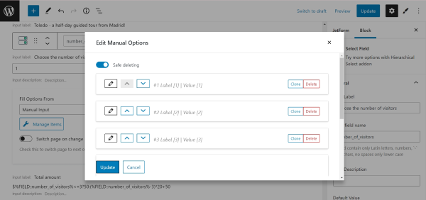
Afterward, we selected the “Countries” option in a drop-down list. Besides that, you can also pick the “Three simple options,” “Days,” and “Months” variants.
Items in the list were displayed in such a way:
label : value
If you display the selected results in an email or meta field, the value will be shown (e.g., AF) instead of the label (e.g., Afghanistan). So, we edited the values to be the same as the labels. For example:
Afghanistan : Afghanistan
You can use any text editor to do this quickly.
Also, be aware that you can input data in the JSON format, for example:
In the textarea, it’s automatically converted into the proper format:
Ukraine : UA : 1
United States : US : 2
United Kingdom : UK : 3
The third component of every line in this format is the value for the calculated field.
For our case, we created the option list in the “Afghanistan : Afghanistan” format and pushed the “Add to the options” button.
We hit the “Update” button to save the list of the countries.
Setting a post-submit action
Next, we proceeded to the JetForm > Post Submit Actions tab, ensured the “Send Email” action was selected, and hit the “pencil” button.
In the Edit Action pop-up, we set the “Admin email” option in the MAIL TO field.
In the REPLY TO field, we selected the “Email from submitted form field” variant, and from the REPLY TO EMAIL FROM FIELD drop-down menu, we picked the “Email” form field where a user will enter their email address. With such settings, a user would receive the answer on the email they indicated in the form.
The SUBJECT field defines what text will be displayed in the Subject bar of the received email. It can be plain text where you can also put values from the fields of the submitted form by clicking the “wrench” icon and selecting macros. We changed the text in this field to “New application.”
The FROM NAME field signifies what will be shown in the From bar of the letter. We entered the %first-name% and %last-name% macros to include the sender’s name.
The FROM EMAIL ADDRESS field specifies the email address that will serve as the sender’s in the letter. We entered the %email% macro here.
From the CONTENT TYPE drop-down menu, you can choose if the message will be “Plain Text” or an “HTML” code. We picked the “Plain text” option.
The CONTEXT is the body of the message. Insert the text or HTML code into this text area. Additionally, you can insert values from the fields of the submitted form by clicking the wrench-shaped icon and selecting macros. We set such a text with inserted macros:
Hi admin!

There is a new application from %first-name% %last-name%.
Country: %country%
City: %city%
Phone number: %phone-number%
The ATTACHMENTS option allows users to attach files to the form and send them via email. Create one or several Media Field blocks and set them here. Since we didn’t create any Media Fields for this form, we left this field empty.
Finally, we hit the “Update”button.
We finished customizing the form and pressed the “Publish/Update” button to save its settings.
Placing the Form on the Page
Then, we navigated to the Pages > Add New Page tab, added the JetForm block to the page, selected the recently created application form from the CHOOSE FORM drop-down menu, and pushed the “Publish” button.
Checking Results on the Front End
We opened the page on the front end, filled in the fields, and hit the “Submit” button.
In the received email, we can see values from the submitted form fields, including the select field with the list of the countries.
That’s all. Now you know how to bulk-add countries, months, and days of the week to the JetFormBuilder form fields, like Select, Radio, and Checkbox.
A Sanitize value feature helps validate the data entered into the form. It works immediately once the form is submitted and is available for some of the JetFormBuilder plugin’s blocks.
Initially, the needed field should be placed in the form. So, proceed to WordPress Dashboard > JetFormBuilder > Add New.
We will delete the default Hidden Field and search for the Text Field.The “Sanitize value” button can be found by clicking on the Text Field (it works the same for any other block you work with).
After pressing the “Sanitize value” button, a list of sanitizing options is displayed.
Set Up the Form
The next step is adjusting Post Submit Actions in the JetForm settings tab.
Once opened, choose the “Insert/Update Post” option and press the pencil-shaped button to edit the action.
Using the newly opened Edit Action pop-up, we can configure the form to add a new post and complete its content with the value we put in the Text Field.
Select the desired POST TYPE. For instance, we pick the default WordPress “Posts.”
Pick the needed POST STATUS.
The FIELD MAP area contains all the fields from the form. Now, we have one Text Field and connect it to the “Post Content” to demonstrate the result of the sanitized value in the post. However, you can choose any desired option.
To save the changes, hit the “Update” button.
That’s all about adjusting the basic form. Now, let’s look through all the “Sanitize value” options.
Adjust the Sanitize Value Options
Select one or several desired options in the Sanitize value list.
Let’s look through the available options.
Sanitize email
This option clears all the characters that are not allowed in the email address.
Let’s assume you need this option. So, once the form is ready, press the “Publish” button.
Then, we go to WordPress Dashboard > Pages and press “Add New” to create a new page.
Search for the JetForm block and add it to the page.
After selecting the Form from the list and making any adjustments, click the “Publish/Update” button.
Then open the page you just built and complete the field with data.
For instance, our email input looks like: “example@email.com!”.
Now we go to WordPress Dashboard > Posts, where, in our case, the new posts will be displayed. Then, we open the latest post to check the content. So now it is set to “example@email.com”.
Sanitize key
This feature can be used to validate keys, such as post slugs or category names. It ensures that input data is safe to use in URLs or other contexts.
Lowercase alphanumeric characters, dashes, and underscores are allowed.
For instance, we put the “New Car!” value and submit the form.
The content in the post will be changed to “newcar”.
Sanitize text
A text sanitizing process includes checking for invalid UTF-8, converting “less-than” (“<”) characters to an entity, stripping all tags, removing line breaks, tabs, and extra whitespace, and removing percent-encoded characters.
The user can complete the form with something like: “<b>My name is <i>Dave</i></b>.”
After the sanitizing process, the data will appear as follows: “My name is Dave.”
Sanitize textarea
It is similar to the “Sanitize text” option. However, it doesn’t clear new lines and whitespaces as they are considered normal for textarea fields.
To see the difference, let’s change the Text Field to a Textarea Field.
So, it’s better for the text that includes several lines. For instance, the user writes a letter in the text area that looks like this:
“Hi!
<p>I am inquiring about the status of <b>my order</b>. When can I expect delivery?</p>
Thank you.
John.”
As you can notice, new lines (\n) are put in the text. If we used “Sanitize text” instead, the new lines would not be preserved:
“Hi! I am inquiring about the status of my order. When can I expect delivery? Thank you. John.”
Sanitize title
Sanitizes string to a slug, which can be used in URLs or HTML attributes.
We entered the title “My Article” in the field.
The content is now sanitized to “my-article.”
Sanitize url
This option sanitizes the URL for use in redirects. It helps avoid issues with special characters that are not allowed in the links.
For instance, we put the “product-id-932-car” value in the Text Field.
The value will be sanitized to “http://product-id-932-car.”
Sanitize user name
This option can be used for user names accordingly. It clears all unsafe characters, such as tags, percent-encoded characters, or HTML entities.
We complete the field in the form with the “User%231” value.
So, the content will be changed to “User1.”
Integer
The “Integer” sanitizing option converts an entered value to an integer. It removes all characters except digits and, optionally, the minus sign at the beginning of the number.
NOTE
If the value contains any letters or unsupported characters (e.g, -34 kg or 18 px), the result becomes “0”. Only clean numeric characters are supported.
For example, we enter: “-12.1”.
After sanitizing, the value is saved as “-12”.
Number
The “Number” method sanitizes the value to a valid floating-point number. It allows only digits, a decimal point, and an optional leading minus.
NOTE
If the value contains any letters or unsupported characters, the sanitized result becomes “0”.
For instance, we input “003.50” into the form.
The sanitized result in the post is “3.5”.
Positive integer
The “Positive integer” method works similarly to “Integer”, but only positive integers are allowed. A leading minus sign will be removed, so negative input becomes a positive integer.
NOTE
If the value contains any letters or unsupported characters, the sanitized result becomes “0”.
Let’s enter the “-27.3” in the form.
After sanitizing, the value becomes “27”.
Positive number
The “Positive number” sanitizing method returns a positive floating-point number. Minus signs are removed, and only numeric and decimal characters are kept.
NOTE
If the value contains any letters or unsupported characters, the sanitized result becomes “0”.
For example, we type “-36.75”.
The sanitized value appears as “36.75”.
Custom transform
If this option is selected, the additional completion field appears. It allows adding custom sanitizing code if needed.
For instance, we complete the field with the “full_name” value.
According to this custom value, the content will be returned as the first and last name.
To make it work, you can go to WordPress Dashboard > Appearance > Theme File Editor, open the Theme Functions (functions.php) tab, or use any preferred code snippet plugin. In our tutorial, we work with the Code Snippets plugin.
Paste the following code at the end of the file.
/**
 * Full Name sanitizer.
 * Value returned should be in such format: FirstName LastName
 *
 * @param \JFB_Modules\Block_Parsers\Field_Data_Parser $parser
 */
function jet_fb_sv_full_name( \JFB_Modules\Block_Parsers\Field_Data_Parser $parser ) {
   $value = $parser->get_value();

   // Delete not-allowed characters & html-tags
   $value = sanitize_text_field( $value );

   // Get separated first name and last name
   $names = preg_split( '/[\s]+/', $value, 2 );

   // Not enough names
   if ( ! is_array( $names ) || 2 > count( $names ) ) {
      $parser->set_value( '' ); // Clear value to make this field invalid

      return;
   }

   list( $first_name, $last_name ) = $names;

   // Make a name's first character uppercase
   $first_name = ucfirst( $first_name );
   $last_name  = ucfirst( $last_name );

   $parser->set_value(
      sprintf( '%s %s', $first_name, $last_name )
   );
}
Then, we hit the “Update File” button.
This is just a case example; you are free to use the needed piece of code.
To see the result, we return to the page where the form is located and complete it with the “<b>John <i>Doe</i></b>” value.
In the post, the content will look like this: “Jonh Doe.”
That’s all about using the Sanitize value feature available for form fields from the JetFormBuilder plugin for WordPress.
Navigate to the InstaWP site and select the usage mode. To get access for eight hours, press the “Try For Free” button, complete the Email field, select the necessary Configuration, and press the “Launch Site Instantly” button.
To get a 7-day access covering three WordPress sites, follow these steps:
Sign up on the InstaWP site.
Press the “Create Site” button on the site configuration page.
Navigate to the Forms tab, select JetFormBuilder, and press the “Create Site” button.
Press the “Magic Login” button on the created sites page.
After a few seconds, the JetFormBuilder plugin will be installed automatically on the created site.
Creating JetFormBuilder Forms
Navigate to the JetFormBuilder> Formstab and press the “Add New” button.
The WordPress block editor will open a default form with Hidden and Text field blocks and a “Submit” button. Type the form’s name instead of the Add title default text.
Block Fields and Patterns
The current tutorial explains creating a booking form, which collects data on the user’s name, email, booking date, meal plan information, and number of guests and calculates the total cost of the event.
Adding field blocks
Press the plus icon and click the Column field block to set the necessary custom columns layout for the form.
Add the required form field blocks to each column. Here, the Text, Date, and Media field blocks were used.
Use the Radio field block with manual data input to allow choosing among several options.
To apply unique settings for a field, press the FormSettings tab and set the necessary options. For the current tutorial, we set the minimal and maximal length for the Text (E-Mail) field block.
To provide further calculations, use the Numberfield block to get data on the number of guests.
The Calculated field block allows macro usage and calculates data from other fields.
Navigate to the FormSettings tab and unroll the sections where you want to make changes:
Form Settings;
Validation;
Captcha Settings;
Post Submit Actions;
Form Schedule;
Limit Form Responses;
General Message Settings, etc.
Read the tutorial to learn about Form Settings in more detail.
Press the “Publish” button to publish the form.
Adding the Form to Pages/Posts
Open a page or post, find the JetForm widget (in Elementor), and find your form in the Choose Form field.
In the WordPress Block editor, open a page or post, find the JetForm block, and choose your form in the Choose Form field.
Press the “Publish” button to publish the page/post.
Users can embed the JetFormBuilder form using a shortcode, so this plugin is compatible with almost any builder that supports shortcode output.
Collaboration With JetPlugins
JetFormBuilder focuses on form functionality by providing 18+ blocks, multi-column layouts, custom HTML addition, inline field editing, and more. Users can further improve the user experience and make their site fully-fledged by integrating this plugin with other tools:
use JetPlugins to style the form and enrich the form functionality:
JetStyleManager to style the form blocks in WordPress Block editor for free;
JetAppointment and JetBooking to use the Appointment Date field block, set prices, build the “Appointment – Provider” system, and integrate the form with WooCommerce;
JetThemeCore to add forms to single and archive pages, WooCommerce templates, CPTs, and/or CCTs;
install the JetFormBuilderPro add-ons for sales, marketing, or payment processing purposes and enrich the forms by:
outputting multi-level Select field groups;
applying dynamic auto-fill to the Select or Address field blocks;
allowing users to log in by the provided email/login & password;
adding color picker functionality to forms;
displaying the form autosave progress;
scheduling the form availability;
limiting form response number per user.
That’s all about the usage of the JetFormBuilder’s forms on a free WordPress sandbox site by InstaWP and combining JetFormBuilder’s functionality with other JetPlugins.
The JetFormBuilder’s Repeater Field allows users to add as many JetFormBuilder’s fields in the repeated block as needed, specify the number of repetitions via the dynamical input or by a predefined value, and use the repeated entries in calculations.
In this tutorial, we consider the case of building a form for renting a cottage for a weekend, focusing on the Repeater Field usage. In particular, the number of guests will be added manually via the Number Field. The Repeater Field will include the number of rows according to the number of guests, and each guest can select the needed services via the Checkbox Field. Finally, the prices will be calculated for every guest and totally via the Calculated Fields inside and outside the Repeater Field.
As long as we do not explain the booking issues and are not creating a specific booking form, read the Booking Form tutorial to learn how to build the booking forms with special date fields and booking macros.
In the given case, we deleted the Hidden Field as well as the default Text Fieldbecause we do not focus on the booking functionality of the form. In contrast, the Hidden Field is necessary if you intend to apply the JetBooking plugin to manage the booking data.
We added the Number Field to input the number of guests. This value will be used to set the number of repetitions for the Repeater Field.
Find the Number Field block, drag-n-drop it onto the form, unfold the block’s settings, and fill in the FIELD LABEL and FORM FIELD NAME fields (the “Input the Number of Guests” and “guests” fields, respectively).
Add the Repeater Field to the Form
Find the Repeater Field block and drag-n-drop it onto the form.
Set the Repeater Field’s Settings
Unfold the Repeater Field’s settings. Here, we set the following options:
In the General settings tab, we typed the “Repeater” text in the FIELD LABEL, and the appropriate text was shown in the FORM FIELD NAME field automatically;
In the Field settings, we set the “Dynamically (get count from form field)” option in the MANAGE REPEATER ITEMS COUNT drop-down list, chose the needed field (the “Input the Number of Guests” Number Field in the given case) in the activated FIELD ITEMS COUNT drop-down menu, and picked the “Custom (calculate a custom value for each row)” option in the CALCULATE REPEATER ROW VALUE drop-down menu.
The “Custom (calculate a custom value for each row)” option turns on the CALCULATION FORMULA FOR REPEATER field automatically. We left it empty, and further, it will be used to calculate the price for each guest.
Add the Nested Fields in the Repeater Field
To add fields inside the Repeater Field, we pressed the “plus” icon. First, we added the Columns Field, divided the layout into three equal parts, and added the Text Fields “Name,” “Email,” and “Phone” to get the client’s appropriate data.
Then, we added the Checkbox Field and typed its FIELD LABEL (here, the “Meals” text), and the FORM FIELD NAME was filled automatically. We kept the default “Manually Input” option for the FILL OPTIONS FROM field and pressed the “Manage Items” button. Then, we added three checkbox items and filled in the LABEL and VALUE fields for each item (the CALCULATED fields are left empty). The added options are “Breakfast,” “Dinner,” and “Lunch.”
In the same way, we added the “Additional Services” Checkbox Field: we kept the default “Manually Input” option for the FILL OPTIONS FROM field, set the checkbox items (“SPA,” “Hammam”, and more), and specified their VALUEs.
Finally, we added the Textarea Field to the third column and typed its FIELD LABEL and FORM FIELD NAME. In particular, we typed the “Please, add here the special needs and preferences (if any)” text in the FIELD LABEL and “special” text in the FORM FIELD NAME.
Return to the CALCULATION FORMULA FOR REPEATER of the Repeater Field. Add the formula to calculate the total value for all repetitions. This formula will display the total value returned by the Repeater Field. For example, to calculate the additional services and meal costs for all guests, we typed the formula:
%FIELD::meals%+%FIELD::additional_services%
Find and drag-n-drop the Calculated Field. Since we intend this field to return the additional service and meal costs for each guest, we placed it under the Checkbox Fields.
We typed the following formula in the Calculated Field:
%FIELD::meals%+%FIELD::additional_services%
Calculations outside the Repeater Field
In this case, we calculated total costs as a sum of the constant price for renting the cottage and the fees for services and meals for all guests.
To calculate the cottage’s renting price, we used the CPT posts meta fields (i.e., for the cottage’s price). The formula with meta fields will look as follows:
%META::price%+%FIELD::repeater%
(Here, the “price” CPT meta field is used).
Customize the Action Button
The Action button is added to the form by default. To customize the button text (by default, it’s the “Submit” text), navigate to the Settings block and type the necessary text (in this case, we typed the “Book” text).
Set the Post Submit Actions
Navigate to the JetForm settings and unroll the Post Submit Actions tab. The “Save Form Record” option is set by default. In this tutorial, we did not add other Post Submit Actions.
Watch the Post Submit Actions video overview to learn how to apply and manage the Post Submit Actions.
Once completed, press the “Publish/Update” button to save the form.
Add the Form to a Single Post Page
Create a single post page you need, navigate to the settings block, and specify the CPT you need.
Now, proceed to the backend of the form where the Repeater Field is added. Open the Repeater’ssettings and proceed to the Advanced tab.
In the CSS CLASS NAME field, add the “item-on-load” class.
Click the “Save” button and proceed to the front-end page, where the form is added and the first Repeater item is automatically displayed.
Check the Result
Navigate to the front end and check if the Calculated Field works correctly.
Fill in the form fields, scroll down, and press the “Book” button.
To observe the form details, move to the WordPress Dashboard > JetFormBuilder > Form Records path to open the JetFormBuilder Form Record tab, which lists all submitted forms.
Hover over the name of the needed form, click the “View” link below the name, and unroll the form record.
That’s all about adding and using the Repeater Field to forms of the JetFormBuilder plugin for WordPress.
This tutorial dives into creating a custom query for the JetFormBuilder Records source using the Query Builder module of the JetEngine plugin. You will learn how to show values from different field types using dynamic widgets and shortcodes.
In the Post Submit Actions tab, you need to add the “Save Form Record” action to make sure the submitted values are saved in the Form Records.
Once the form is created, press the “Publish” button. Then the form should be added to the page and submitted to create a Form Record, which will be displayed on the front end later.
Build JetFormBuilder Records Query
Now proceed to WordPress Dashboard > JetEngine > Query Builder to create a custom query for JetFormBuilder Form Records.
Hit the “Add New” button to build a query.
In the General Settings section, complete the Name field and choose the “JetFormBuilder Records” option as Query Type.
In the JetFormBuilder Records Query, you need to select a Form to query its records. Feel free to add any other settings to the query if needed.
The query is completed. Now it can be saved by hitting the “Add Query” button.
Create Listing for JetFormBuilder Records Query
At this point, we can create a Listing template for the custom query in WordPress Dashboard > JetEngine > Listings. Select “Query Builder” as a Listing source, and pick the custom “Query for Form Records” that has just been created.
In the listing template, you can display the values from fields using dynamic widgets like Dynamic Field, Dynamic Image, etc. In the case of Form Records, some values from the fields can be shown using just dynamic widgets, but some can not, which is why we will explore how shortcodes can help in this situation.
To understand better why dynamic widgets like Dynamic Field do not cover this request completely, let us turn to Query Builder again.
If you enable the Preview results toggle in the custom query, you can see that the fields of the form are saved in the ‘jfb_fields’ property as an array. It means a “Get child element from object/array” Callback is needed to get to the values of these fields.
In the case of the ‘checkbox_field’ field, a second additional callback needs to be applied to output the options from its array as well.
The Dynamic Field widget does not have the opportunity to add multiple callbacks, but the shortcodes can handle them.
Output field types in the listing template
Let’s get back to the listing template.
The first field to show is ‘text_field.’ This field has a string value, which is why the “Get child element from object/array” Callback is enough to show its value using the Dynamic Field widget.
Proceed with the ‘checkbox_field’ field. As was stated earlier, it has an array as its value, so another callback is needed to show values from the array.
This is when the Shortcode Generator of the JetEngine needs to be used.
Use shortcode generator
In the WordPress Dashboard > JetEngine directory, you can see a Shortcode Generator tab, where the shortcodes can be created.
Firstly, select a “Meta Data” Source, and insert the name of the field from which the values need to be pulled in the Custom Object Field / Meta field / Repeater key field; it is ‘jfb_fields.’
Now switch on the Filter Field Output toggle, and add the first “Get child element from object/array” Callback. This callback lets us get to the values of the Checkbox Field.
But the values of the Checkbox Field are in the format of the array. This is why another callback is required to show the values in a more presentable format.
Therefore, we need to add another “Checked values list” Callback. In this callback, we selected a glossary because the options in the Checkbox Field in the form were added by the glossary source.
The shortcode is ready now, so you can copy it from the bottom of the page by clicking the corresponding icon.
In the Listing template, the shortcode can be displayed using the Shortcode widget or Shortcode block if a listing is created in the Gutenberg editor.
Lastly, display an image from the ‘media_field’ field.
This media field has a URL as a value and, therefore, requires a “Get child element from object/array” Callback.
Also, the Customize field output toggle should be activated with the <img src=’%s’> Field format completed that can show an image by its link.
After copying the shortcode, you can insert it into the Shortcode widget or block.
By the way, these settings can also be created in the Dynamic Field widget.
The listing template is completed. Press the “Publish/Update” button.
You can now display it using the Listing Grid widget on the needed page.
Check the result; now Listing Grid shows the record from the JetFormBuilder Form Records.
Now you know how to create a custom Form Records Query and display JetFormBuilderForm Records in the JetEngine Listing template.
TheCalculated field of JetFormBuilder is not limited to basic mathematical operations like addition, subtraction, multiplication, and division. It supports all the Math object methods, which helps perform advanced calculations with numeric values returned by form fields. The complete list of Math properties and methods can be found in MDN Web Docs.
Below, we will cover several usage examples — rounding a number, finding min and max numbers from a row, and raising a number to a power. The described methods can be used with a numeric value returned by any of the JetFormBuilder fields. In our examples, we will use a Number field to store the numeric value.
Insert the needed formula into the Calculated field to find the largest or the smallest number from a row of numbers.
NOTE
Remember to replace the ‘number_one,’ ‘number_two,’ and ‘number_three’ values with the actual field names.
In our example, we have three Number fields, each containing a specific number: 7, 3, 4, accordingly.
In the result, the Calculated field returns the value of 3 as the smallest number and the value of 7 as the largest number.
Mind that the Math.min() method will return 0 if at least one of the number fields is empty. To handle the cases where one of the fields might be null (empty), you should use the below formula instead.
In this formula, using ternary operators, we check if either of the number fields returns an empty value. If one of the fields is empty, we adjust the final result so that it returns the smallest of specified numbers. To find more information on ternary operators, check our tutorial on How to Use Conditional Formulas in the Calculated Field.
If one of the values is null, the formula will find the lowest value from those specified.
Exponentiation
The Math.pow() method raises the first specified number to the power of the second number.
To apply this method in the Calculated field, use the below formula:
(Math.pow(%number_one%, %number_two%))
In the above formula, the ‘number_one’ value stands for the name of the form field that provides the base number; the ‘number_two’ value stands for the exponent.
Insert the formula into the Calculated field to raise the value of the first specified field to the power of the second.
In our example, the first Number field contains the number 3; the second Number field contains the number 5. The expected result is 243.
That’s all; now you know how to use advanced math calculations with the help of the Calculated Field available in the JetFormBuilder plugins bundle.
With the help of the Glossary functionality, available with the JetEngineplugin, you can create forms without completing all the field values manually several times.
Let’s find out how to use Glossary as the data source for your JetFormBuilderform. Initially, create a glossary in the WordPress Dashboard > JetEngine directory.
In the Glossary tab, ensure you have completed all the needed fields, and don’t forget to save the changes by pressing the corresponding button below your glossary.
Then, head to the WordPress Dashboard > JetFormBuilder > Forms page. Build a new form by hitting the “Add New” button, or hover over the desired item to see the “Edit” button and click it to proceed to the form editor.
As for now, we will edit the existing form. Here, we add a Radio Field,which will display our glossary options for selection.
NOTE
Except for the Radio Field, you can use Checkbox Field or Select Field blocks to display glossary options.
Complete the block settings and mind filling in the Fill Options From field with the “Glossary” option. After that, select the built glossary in the corresponding field.
Adjust the rest of the form if needed, and press the “Publish/Update” button to save the form.
Go to the page where the form is located or place it wherever you need to use it.
As you can see on the page, the Radio field is now available in the newly built form.
That’s it; the form is ready, and now you know how to build a JetFormBuilderform by using JetEngine Glossary as the data source for the form fields on your WordPress website.
This tutorial explains how to enable/disable adding comments to front-end forms using the JetFormBuilder plugin and change the comment status.
WordPress allows adding comments to posts/pages by default. But sometimes, there is a need to allow or disallow comments on some posts/pages from the front end. This tutorial details how to enable/disable adding comments to front-end forms using the JetFormBuilder plugin and change the comment status.
The Hidden Field block is added by default. Unroll the Field Value drop-down menu and select the Current Post ID option.
Find the Radio Field block and drop it down to the form.
Press the “Manage Items” button of the Radio Field block to create the radio field with two manual options: allow and do not allow comments. Add the following labels and values of these options, respectively:
for the allowing option: type Do Not Allow Comments in the Label field and closed in the Value field;
for the disallowing option: type Allow Comments in the Label field and open in the Value field.
Press the”Update” button to save changes.
Navigate to the Settings tab of the Radio Field block and fill in the Field Name field (here, Discussion) and the Form Field Name field (here, _discussion). The Radio Field block looks as follows:
Settings of the form
Navigate to the Post Submit Actions of the JetForm settings. Press the “Edit Action” button (the pencil icon). Apply the following settings:
select the Posts option from the Post Type drop-down menu;
select the Post ID (will update the post) option from the post_id subfield of the Field Map field;
select the Post Comments Allowed option from the Discussion subfield of the Field Map field.
Press the “Update” button to Save changes. The Adding the Form Block in Gutenberg tutorial explains adding the different fields to forms.
Adding the Form to a Page/Post
Open the page or post to add the form (here, Page for Comments). Find the JetForm block to add the form to the page. Drag and drop the block to the page.
Navigate to the Settings tab of the JetForm block and select the name of the previously built form (here, Comments) from the Choose Form drop-down menu.
Allowing or Disallowing Comments for Posts/Pages
Settings to allow comments
Navigate to the Discussion tab of the JetForm block’s settings. The name of this tab corresponds to the text filled in the Field Name field (here, Discussion) while building the form (here, Comments). Tick the Allow comment and Allow pingbacks & trackbacks options.
Save changes. Publish the page.
Allowing/disallowing comments
The front-end view of the page looks as follows:
Choose the Allow Comments option of the Radio Field block. Press the “Submit” button. It allows adding comments and activates the text field for comments.
Press the “Submit Comment” button to save the comment. Choose the Do Not Allow Comment option on the front end of the Radio Field block to disable adding.
That’s all about how to allow or disallow comments for posts or pages from the front-end forms.
Uncanny Automator is a plugin designed to facilitate the connection of plugins and apps, enabling the automation of WordPress website activity without coding. This plugin enables the seamless integration of JetFormBuilder forms with various apps, including Airtable, Google Sheets, Google Calendar, Instagram, Facebook, and more. A complete list of available integrations is on the Automator WordPress Plugin Integrations page.
Use cases include sending form data to Airtable and Google Sheets, registering users, setting CRM tags, and setting up notifications and email campaigns.
In this tutorial, we will show how to connect a JetFormBuilder form to any app with the Uncanny Automator (free version) using the example of Google Sheets.
For our use case, we will build a Contact Form allowing users to leave feedback about the website.
To create a new form, go to WordPress Dashboard > JetFormBuilder > Add New. Insert one of the ready-to-use Patterns to save time and effort.
Now, the only thing left is customizing the existing form fields, and the “Send Email”post submit action.
Once ready, click the “Publish”button to savethe form.The goal is to connect the form to Google Sheets to store all the submitted messages in one place.
The next step is to create a new spreadsheet, Google Sheets.
Set Up a Google Sheet
Set up a new spreadsheet in Google Sheets. In the spreadsheet, add all the necessary columns for storing user data, such as the user’s name, email, and message.
Create a Recipe In Uncanny Automator
Return to the WordPress Dashboardand move to the Automator > Add newtab.
Choose a recipe type
The fundamental unit of the Uncanny Automator WordPress plugin is a recipe. At the beginning of the recipe creation, there is a possibility to select one of the two types:
Logged-in users — the recipe will be triggered by WordPress users who are logged in;
Everyone — the recipe will be triggered by logged-in WordPress users and logged-out guests.
Select the “Everyone” option so any user can leave feedback.
After that, name the recipe and select the “JetFormBuilder” integration.
Select a trigger
In the Uncanny Automator plugin, a trigger defines when a recipe and its actions are executed. Triggers encompass a wide range of actions on a WordPress site, such as logging in, making a purchase, submitting a form with specific entries, and more. Every recipe in Uncanny Automatormust have at least one trigger to function.
Uncanny Automator provides such Triggers for JetFormBuilder:
Triggers for logged-in users:
a user submits a form;
a user submits a form with a specific value in a specific field (Uncanny Automator Pro).
Triggers for everyone:
a form is submitted;
a form is submitted with a specific value in a specific field (Uncanny Automator Pro).
Select the “A form is submitted” trigger. Then, choose the needed form from the drop-down list and hit the “Save” button.
After that, the trigger should automatically change its status from “Draft” to “Live.”
Add an action
An “action” in Uncanny Automator is the result of a recipe once the specified trigger conditions have been met. It represents what the plugin accomplishes after the triggering events occur.
In the Actions section, push the “Add action” button and select the “Google Sheets”integration. Be aware that it is necessary to connect the Google Sheets account if it hasn’t been done before.
With the Google Sheets integration, there are two actions available:
Create a row in a Google Sheet — select this option to save each form submission in a new row;
Update a row in a Google Sheet — select this option to update information in an existing row. This option is useful for the “Update post” or “Update user” types of forms.
Pick the “Create a row in a Google Sheet” option to save the values of every newly submitted entry in a new row.
After that, select the needed Drive, Spreadsheet, and Worksheet and hit the “Get columns” button to see the columns from the spreadsheet.
Use tokens
Certain actions in Uncanny Automator involve retrieving personal details and other variables from the WordPress database. These variables are referred to as “tokens.”
The availability of tokens depends on the triggers used in a recipe. For instance, if a recipe has a form submission as a trigger, corresponding tokens are generated, such as the form name and the content of the form fields. This functionality allows transferring data from the form entry to a different application.
The Uncanny Automator plugin provides three types of tokens:
Universal tokens — these tokens are universally accessible in every recipe and can be used to pass information about a user, a post, a date, and more;
Trigger tokens — these are tokens that are specific to a particular trigger. For example, JetFormBuilder provides tokens that can fetch the data from the form fields;
Action tokens — when an action is integrated into a recipe, tokens linked to its output become accessible for subsequent actions. For example, if an action generates a new post, the new post ID can be passed as a token to another action in the recipe.
Whenever there is a possibility of using a token in a field, an asterisk (*) icon appears to the right of that field. Clicking this icon will expand a menu displaying all the available tokens.
Press the asterisk icon near the column value and click the “Contact Us Form is submitted” trigger.
Next, choose the corresponding form field, the value from which will be saved in the Google Sheets row.
After mapping all the needed values, push the “Save” button. The action status will change automatically from “Draft” to “Live.”
In the Recipe section, enable the toggle to change the recipe’s status from “Draft” to “Live.”
Now, the automation setup is completed, and we can proceed to testing.
Place the Form on the Page
Open the page where the form should be located in the Elementor editor and place the JetForm widget in the needed part of the layout.
If you use the Block Editor, repeat the same steps with the JetForm block.
For more information on how to add a JetFormBuilderform in any page builder, check our related “Adding the Form Block” article.
Test the Form
Navigate to the page where the “Contact Us” form was placed and submit it several times.
Check the Google Sheets. The form entries should be recorded in the appropriate columns.
That’s all. Now you know how to connect the JetFormBuilderform to Google Sheets and other apps using the free version of Uncanny Automator.
The Calculated field of JetForms supports ternary operators which allow for building complex conditional formulas. With the help of this feature, you can calculate the tax payable based on different levels of income and the tax rate in the threshold.
The Calculated field allows building complex conditional formulas thanks to ternary operators‘ support. Ternary operators (also called conditional operators) help us construct conditional logic between several parts of the calculated formula.
The basic steps to build a conditional formula are described in the main tutorial on How to Use Conditional Formulas in the Calculated Field. Let’s put this knowledge to praxis and move on to the main use case of this article – calculating tax rates.
Describing the Case
Listed below are the necessary conditions for calculating tax rates in our example. The tax depends on the taxable income.
For income from 0 to $18,200, the tax equals zero.
For income from $18,201 to $45,000, the tax equals 15 centsfor each dollar over$18,200.
For income from $45,001 to $120,000, the tax equals $5,000; additionally, the person should pay 30 cents for each dollar over $45,000.
For income from $120,001, the tax equals $30,000; additionally, the person should pay 40 cents for each dollar over $120,000.
Building the Formula for Calculating Tax Rates
Add the necessary fields
Navigate to JetFormBuilder > Forms > Add New and open the Gutenberg editor. We need two fields for our purpose – a Number field where the user can input the taxable income and a Calculated field. Let’s name the Number field “taxable_income”.
Prepare for building the formula
As outlined in our main tutorial on How to Use Conditional Formulas in the Calculated Field, a ternary operator takes three operands – a condition, an expression that needs to be executed if the condition is true, and an expression that will be executed if the condition is false. The primary condition is always followed by a question mark “?”, while the expressions are separated with a colon “:”.
In this specific use case, we combine several ternary operators in one formula to set several separate conditions.
The first condition can be articulated like this: “If the “taxable_income” field contains a value less than or equal to 18200, then the final value 0; if not, the condition returns 0”.
The second condition: “If the “taxable_income” field contains a value greater than 18200 but less than or equal to 45000, then subtract 18200 from the value of the “taxable_income” field and multiply by 0.15; if not, the condition returns 0”.
The third condition: “If the “taxable_income” field contains a value greater than 45000 but less than or equal to 120000, then subtract 45000 from the value of the “taxable_income” field and multiply by 0.3 plus add 5000; if not, the condition returns 0”.
The fourth condition: “If the “taxable_income” field contains a value greater than 120000, then subtract 120000 from the value of the “taxable_income” field and multiply by 0.4 plus add 30000; if not, the condition returns 0”.
Finally, all these conditions need to be summed to return a positive result.
Build the formula
Firstly, let’s build each conditional part of the whole formula separately.
For the first condition, the conditional formula should be the following:
The article on the Calculated Fieldprovides an overview of the values you can use in the Calculated Field of JetFormBuilder. In that article, we gave examples of basic mathematical operations like addition, subtraction, multiplication, and division.
However, the calculated feature is not limited to these arithmetic operations — it supports more complex calculation operations that will help you build conditions within the Calculated Field’s formula.
The Calculated Field gives the possibility of building conditional formulas using ternary operators.In JavaScript, the ternary operator (also called the conditional operator) is an operator that takes three operands – a condition, an expression that needs to be executed if the condition is true, and an expression that needs to be executed if the condition is false:
condition ? exprIfTrue : exprIfFalse
The primary condition is always followed by a question mark “?”, while the expressions are separated with a colon “:”.
In this way, you can set one value for the Calculated Field if a specific condition returns true and another value if the condition returns false. Below, we will discuss how you can benefit from ternary operators and look into some usage examples.
Also, you can use arithmetic operators:
** — exponentiation operator;
* — multiplication operator;
/ — division operator;
% — remainder operator;
+ — addition operator;
– — subtraction operator.
Relational operators:
< — less than operator;
> — greater than operator;
<= — less than or equal operator;
>= — greater than or equal operator.
Equality operators:
== — equality operator;
!= — inequality operator;
=== — strict equality operator;
!== — strict inequality operator.
Binary logical operators:
&& — logical AND;
|| — logical OR.
Additionally:
! — logical NOT operator;
&&= — logical AND assignment;
||= — logical OR assignment.
Using Ternary Operators in the Calculated Field
Using complex calculations, you can make the value of the Calculated field conditional. The most common case is to adjust the output of the Calculated field to the value the user enters into a different field in the form.
Let’s consider the following example. On a tour booking website, a filling form lets the users sign up for an additional paid excursion. The final price for a tour depends on the number of guests. The total price remains static if the number of people taking the tour is up to three. If the number of people exceeds three, the price increases by a set amount per every new person. This rule of price dependency can be built with ternary operators.
Let’s move to the form’s settings in the Block Editor. The first added block to the form is the Select field which has the name “number_of_visitors”. For the Select field, we added a set of options through the Manual Input source type. The list of options consists of seven items, each being a number from 1 to 7.
In the Select field, the user can choose the number of visitors joining the tour. The final value of the Calculated field will depend on this number.
The second added block in the Gutenberg editor is the Calculated field. Inside the input box of the field, we inserted this formula:
As a result, the user will pay $50 if the number of guests is less or equal to 3; if the number is greater than 3, the user will pay an additional $20 for each new guest. The formula looks complex, but let’s look at each part.
“%FIELD::number_of_visitors% <= 3” – This is the main condition. It defines which formula from those that come next will be executed. This part tells: “If the field with the name number_of_visitors is less or equal to the value of 3, then…”
“? 50” – This value will be set as the final value of the Calculated field if the previous condition returns true. We can continue the rule we articulated earlier in the following way: “If the field with the name number_of_visitors is less or equal to the value of 3, then the final price is 50”.
“: ( %FIELD::number_of_visitors% – 3 ) * 20 + 50” – This is the formula that will be used to calculate the final value if the previous condition returns false. The formula calculates the price the user will pay for the tour if the number of chosen guests is higher than 3.
Take the number of visitors the user specified in the Select field and subtract 3 – this way we get the number of additional guests; then, multiply this number by 20 (“20”, in our case, is the price for each new guest); finally, add 50 to the total price, which is the price for the first three guests.
Now, the rule can be articulated like this: “If the field with the name number_of_visitors is less or equal to the value of 3, then the final price is 50; otherwise (if the value in the field number_of_visitors is greater than 3), the price will be calculated from the formula of the third part of condition”.
Each part of the condition can use formulas, static numbers, form field values, and meta field values.
Below is the final result on the front end. The price for the tour is $50 if the user selects three guests:
Then, the price for the tour increases by an additional $20 for each new guest:
Combining Several Ternary Operators in One Formula
In the Calculated field, there is a possibility to combine several conditions to calculate the final value. Assume that the price for a certain product depends on the product’s quantity. In this case, we need to integrate several conditions into one formula.
Let’s consider the following case. The price for products on an e-commerce website should be calculated by the following rules:
$1 for 250 units.
$0.75 for 250 – 500 units.
$0.50 for 500+ units.
The main task is to combine several conditions: “The price for the product is $1 if the number of units is less or equal to 250; the price is $0.75 if the number of units is greater than 250 but less or equal to 500; the price is $0.50 if the number of units is greater than 500”.
To build this type of form, add two fields to the block editor – a Calculated field that will contain the formula and a Number field that will be responsible for quantity input. Let’s name the Number field “quantity”.
That means the price in the Calculated field depends on the value of a Number field which has the name “quantity”. Finally, the solution is the following:
There are several conditions in the above formula.
“%FIELD::quantity% <= 250 ? 1 : 0” – If the “quantity” field contains a value less or equal to 250, then the final value is 1; if not, the condition returns 0.
“%FIELD::quantity% > 250 && %FIELD::quantity% <= 500 ? 0.75 : 0” – If the quantity field contains a value higher 250 OR less or equal to 500, then the final value is 0.75; if this condition is not met, it returns 0.
“%FIELD::quantity% > 500 ? 0.50 : 0” – If the quantity field contains a value greater than 500, the final value is 0.50; if this condition is not met, it returns 0.
Finally, all these three rules are summed. Thus two of the three rules return 0, and only one rule returns the needed value. Then, this value is multiplied by the quantity number – “* %FIELD::quantity%”
This example describes a possible way to combine several conditions in one calculated formula. For more examples, check our tutorial on Customizing Tax Rates with the help of ternary operators.
For instance, if you want to add the form macros to the Buttons block, it’s better to do it via the “Edit as HTML” button.
Paste the <!--JFB_FIELD::field_name--> macro into HTML before closing </a> tag. Change the field_name to the actual name of the field from where you want to get the value.
For example, we have entered the name of the checkbox field “kind,” where the user can check the kind of trip.
Proceeding to the front end, we can see the button in the form with the “Read more about” text.
If you check an option from the checkbox, it will be shown in the button. If you choose several options, they will be separated by commas. You can add the page link to the button with the information about all trips so that the users can find out about the needed trip.
How to Add the Form Macros to the Label of the JetForm Fields
If you need to place form macros into the label or description of some JetForm fields, we do not recommend you add it via inline editing because the symbols will be transformed, and you’ll get the invalid macro on the front end.
So, it’s better to enter the form macro in the Field Label. Feel free to enter as many form macros with the field names as you need. You can also mix form macros with the plain text like that: price per night: <!--JFB_FIELD::price--> $. It will look on the front end like that: price per night: 170 $.
With these settings, users can see the values at the end of the form they have chosen. Such settings can also be applied to the multi-step form so that users can see all their choices at the last step before submitting the form.
Such a way also works with the Action Button block since it cannot be edited as HTML. We have added the macro of the Text Fieldin the Field Label of the Action Button.
When users enter the text into the Text Field, the same text is shown in the Action Button on the front end.
That’s it. You know now how to add value from the JetForm field by using the global form macros.
A multi-step form is an online data collection method that splits long and complex forms into easier-to-handle pages or screens. Rather than displaying all the questions at once, which can be overwhelming, a multi-step form directs users through a step-by-step process using navigational buttons like “Next” or “Continue“.
This guide focuses on creating a WordPress multi-step form with a progress bar, step navigation, and “Save Progress” functionality with the help of the JetFormBuilder plugin.
Breaking a long form into steps improves completion rates by letting users focus on the information and avoiding the overwhelming feeling in front of the endless form. The progress bar helps users understand where they are in the process, and “Next” and “Previous” buttons allow them to shift back and forth through the form. This approach would be particularly useful and efficient for:
booking forms;
application forms;
surveys and questionnaires;
registration forms.
💡Pro Tip: Multi-step forms feel shorter and easier to complete when each step focuses on a single task or topic.
How Multi-Step Forms Work in JetFormBuilder
As it was already stated, a multi-step form divides a long form into smaller pages, making it easier for users to complete. Instead of displaying all fields at once, the form guides users through the process step by step.
In JetFormBuilder, a multi-step form is built using four key elements: form fields, the Form Page Break block, navigation buttons, and an optional progress bar.
Form fields collect information from users. These can be Text Fields, Phone Number Fields, Radioand Checkboxes, Select Fields, and other input types available in JetFormBuilder. Fields are usually grouped by topic. For example, the first step may collect personal information, while the second step gathers booking details or survey answers.
The Form Page Break Field is an element that divides a form into separate steps. Every time you add a Form Page Break Field, a new page of the form is started. It allows you to organize fields into smaller sections and guide users through the process one step at a time.
Navigation buttons allow users to move between form steps. Depending on your setup, each step can include a Next Page Field to continue to the next page, a Prev Page Field to return to the previous page, and an Action Buttonon the final step to send the form. These buttons help users review their information and complete the form at their own pace.
The progress bar (or step indicator) shows users how far they have progressed through the form. When enabled, it displays the current step and the remaining steps. You can also add custom labels to make each stage easier to understand. A progress bar improves the user experience by setting clear expectations and showing how much of the form is left to complete.
Create a Basic Multi-Step Form
Before proceeding to the form settings, navigate to the WordPress Dashboard > JetFormBuilder > Settingstab and adjust the settings available for multi-optional forms in the Form Accessibility section.
First, we navigate to WordPress Dashboard > JetFormBuilder > Add New Form.
Enter the form’s title — in this case, it is “Multi-Step Form”. We will create a multi-step booking form.
When you create a new form, the Code Editor opens by default. You can exit it to access the Welcomeblock, where you can choose a form pattern or generate a form with OpenAI. Otherwise, you can hit the “Start from scratch” button and use the three fields added by default; you can delete them to begin anew.
In this case, we click the “Start from scratch” button. For the first step, we keep the default Text Field for the first name. Then add two more Text Fields for the last name and email address, and a Phone Field.
Once the fields for the first step are ready, add the Form Page Break block. This block separates the form into pages, and every Page Break starts a new step.
Now, let’s add fields for the second step to gather the booking details. In this case, we use Select, Checkboxes, Date, and Time Fields to allow users to fill in the details.
In this example, the Calculated Field displays the booking price based on the user’s selections. To separate this step, we add the Page Break Field.
In the same way, you can add as many steps as needed. In this example, we add the final step using the WYSIWYG Field for comments and the Media Field for file uploads.
NOTE
Be aware that the Page Break is not needed after your last form step.
Depending on the type of form, the last page may contain review fields or a consent checkbox. However, the Action Button field is necessary to allow users to submit the form.
Set up the Post Submit Actions for your form according to your requirements.
Configure Navigation Buttons
Once the form structure is ready, you can configure the navigation buttons that allow users to move between steps. JetFormBuilder provides two ways to add navigation controls to a multi-step form, making navigation more intuitive and flexible:
using the built-in navigation buttons included in the Form Page Break block;
using separate Next Page and Previous Page blocks.
Both approaches provide the same functionality. The main difference is where the buttons can be placed within the form layout.
Built-in Form Page Break buttons
By default, the Form Page Break Field can display navigation buttons that allow users to move between form steps.
In the Buttons Settings section, you can enable both or only the needed button, and customize the labels in the BUTTON LABEL inputs.
In the Page Settings section, you can set a custom LABEL OF PROGRESS. To set or change a last step name, add a Form Break Field at the very end of the form after the Action Button.
This is the simplest setup because the navigation controls are managed directly inside the Form Page Break block.
Separate Next and Previous Page blocks
If you need more control over the form layout, you can add the dedicated Next Page and Prev Page blocks.
These blocks work together with the Page Break blocks that define the form steps. Unlike the built-in navigation controls, they can be placed anywhere within the current step.
The Next Page block moves users to the next step of the form. It should be added at the bottom of the step, except for the last one.
After inserting the block, you can customize its label in the block settings. By default, the button displays “Submit,” but you can change it to better match your form’s flow in the FIELD LABEL input.
The Prev Page block allows users to return to the previous step and review or edit their information. It is commonly placed next to the Next Page button on the second and subsequent steps.
This approach is useful when your design requires custom button positioning or more advanced layouts.
Both methods work the same way and provide the same user experience.
The built-in Form Page Break buttons are usually the easiest option for standard forms, while the separate Next Page and Prev Page blocks offer more flexibility when you need custom layouts or button placement.
Choose the option that best matches your form design and workflow.
Enable the Progress Bar
A Progress Bar helps users understand where they are in the form and how many steps remain before completion. This is especially useful for longer forms, as it provides visual feedback and sets clear expectations throughout the process.
To enable the progress bar, navigate to the Form Settings section. Then, locate the Enable form pages progress toggle and enable it.
Once enabled, JetFormBuilder will display a progress indicator above the form pages on the front end.
NOTE
The progress bar may not display correctly inside the editor preview. Always test the form on the front end.
Improve Long Forms with the Save Form Progress Add-On
Multi-step forms are easier to complete than long single-page forms, but users may still leave the page before reaching the final step. This is especially common when forms require a significant amount of information or supporting documents.
The Save Form Progress add-on helps prevent data loss by allowing users to continue filling out a form after leaving and returning to the page.
When enabled, the add-on stores the entered form data locally in the user’s browser. If the user closes the tab, refreshes the page, closes a pop-up with the form, or leaves the website before submitting the form, their progress can be restored when they return.
This feature is particularly useful for forms that require more time to complete, such as:
application forms;
booking forms;
surveys and questionnaires;
order request forms;
registration forms with multiple steps.
The Save Form Progress add-on is an optional enhancement that can be added when you need draft-saving functionality.
To improve completion rates and make the process more user-friendly, utilize a logical multi-step structure and keep these tips in mind:
Group related fields together — organize fields by topic and place related questions on the same step. For example, keep personal information, booking details, and additional requests on separate pages.
Keep each step short — avoid overwhelming users with too many fields at once. Short, focused steps make the form feel easier to complete. Users are more likely to finish a form when each step contains only the information needed for a single task.
Use clear step names — if you enable the progress bar, use descriptive labels such as “Personal Information”, “Booking Details”, or “Confirmation” instead of generic names like “Step 1” and “Step 2”.
Minimize required fields — only mark fields as required when they are truly necessary. Reducing the number of mandatory fields can improve completion rates and user experience.
Test the entire flow before publishing — before making the form live, test every step on the front end. Verify that navigation buttons, progress indicators, validation messages, and submit actions work as expected.
Troubleshooting Common Multi-Step Form Issues
Now, let’s focus on the common issues our clients face and find solutions and steps to check.
Progress Bar doesn’t display or displays incorrectly
If the progress bar is missing or appears incorrectly, check the following:
ensure the Enable form pages progress toggle is enabled in the form settings;
test the form on the front end, not only in the editor preview;
clear any website, browser, and plugin cache;
verify that the progress bar has not been enabled in multiple forms on one page.
Users lose data after leaving the page
By default, multi-step forms do not save entered data when users close the page or browser before submitting the form.
To preserve entered information between sessions, enable the Save Form Progress add-on instead of trying to solve this with custom code.
Users are confused after submission
A default success message may not provide enough feedback after the form is submitted. Consider improving the post-submission experience by:
To set or change a last step label, add a Form Break Field at the very end of the form after the Action Button. Type the needed name in the LABEL OF PROGRESS input.
FAQ
How do I create a progress bar with clickable steps?
Enable the Form Pages Progress option in the form settings to display a progress bar. If you need users to navigate by clicking individual steps, additional customization may be required depending on your form layout and design requirements.
Can I hide the “Last Page” label?
Yes. Add a Form Break Field at the very end of the form after the Action Button. Type the needed name in the LABEL OF PROGRESS input.
How can I speed up form loading and submission?
Keep the number of fields to a minimum, avoid unnecessary calculations, optimize uploaded files, and use caching where appropriate. Testing the form on the front end can also help identify performance bottlenecks caused by third-party plugins or custom code.
Can I show a loading indicator while the form is being submitted?
No. Instead, JetFormBuilder offers a Progress Bar that helps users understand where they are in the form and how many steps remain before completion. To enable the progress bar, navigate to the Form Settings section and enable the Enable form pages progress toggle.
How do I make the form disappear after submission?
You can improve the user experience by redirecting users to a dedicated Thank You page after submission. Otherwise, you can use the Limit Form Responses add-on to define how many times the form can be submitted, so it will not be available once the limit is reached.
Why does the success message remain visible after refreshing the page?
This behavior may occur depending on the submission method and page state. If you want to avoid confusion, consider redirecting users to a Thank You page instead of displaying the success message on the same page.
Can users continue filling out a form later?
Yes. With the Save Form Progress add-on enabled, users can return to the form and restore previously entered information instead of starting from scratch.
Is “Save Progress” required for multi-step forms?
No. Multi-step forms work without the Save Form Progressadd-on. The add-on is an optional feature designed for longer forms where users may leave the page before completing the submission.
That’s it. Now you know how to create a WordPress multi-step form with a progress bar, step navigation, and Save Form Progress functionality with the help of the JetFormBuilder plugin.
OAuth is an authorization protocol that allows users to access third-party data sources while keeping their credentials secure by issuing authorization tokens.
Install and activate the add-on. Navigate to the WordPress Dashboard > JetFormBuilder > Addons tab, select the HubSpot Integration add-on, and activate its license.
Navigate to the WordPress Dashboard > JetFormBuilder > Settings > HubSpot API tab and activate the Enable OAuth 2.0 toggle.
NOTE
The API key field on the HubSpot API tab is legacy and used for older API keys. Therefore, for newly created API keys, the Enable OAuth 2.0 toggle should be activated.
Create a HubSpot Developer Account
Go to the HubSpot website and press the “Create developer account” button.
Otherwise, you can log in to the previously created account.
Once logged in, move to the Developer home section and press the “Create app” button.
Next, enter the developer’s account name in the newly appearing Public app name field (here, we type “MyHubSpotAppTEST”). You can also fill out non-required fields.
Link the HubSpot Account with JetFormBuilder
Return to your website dashboard and copy the Your Redirect URL link from the JetFormBuilder > Settings > HubSpot API tab of your site (here, https://*****************************=jet_fb_hubspot_oauth).
After that, go back to the MyHubSpotApp tab of your HubSpot Developers account and switch to the Auth tab.
Scroll down here and insert the copied link into the Redirect URLs field.
Move to the Scopes section. Here, press the “+ Add new scope” button and select the Required scopes in addition to the “oauth” scope set by default.
This way, we add the following Required scopes:
crm.objects.companies.read
crm.objects.companies.write
crm.objects.contacts.read
crm.objects.contacts.write
crm.objects.owners.read
oauth
Click the “Update” button.
Click the “Create app” button.
After that, the fields in the Auth tab will be automatically filled in. Now, copy the data from the Client secret and Sample install URL (OAuth) fields.
Return to the WordPress Dashboard > JetFormBuilder > Settings > HubSpot API tab and paste this data into the corresponding fields.
Finally, press the “Save” button.
Create a Test Account
NOTE
This step aims to test the account in “sandbox” mode. Therefore, it is not required, e.g., if you have a paid account, the test one is not necessary.
At this stage, return to the Developer account and open the Testing section, and select the Test Accounts tab. Here, click the “Create developer test account” button.
In the newly appearing Create a developer test account pop-up, enter the account name in the Account name field. In this case, we type “Developer test account 1”. Once completed, press the “Create” button.
After that, you will be redirected to the Developer test accounts dashboard. Click the created account name.
The new Create dashboard from scratch tab will be opened. Here, click the “+ New dashboard” button.
In the newly opened pop-up, insert the dashboard’s name in the corresponding field and leave the “Allow everyone to view and edit” option selected.
Click the “Create dashboard” button to be redirected to a new page.
Return to the WordPress Dashboard > JetFormBuilder > Settings > HubSpot API tab. Here, press the “Authorize” button.
After that, you will be redirected to the Connecting Your Account to HubSpot window.
Choose the needed account. Here, we select the “Developer test account 1”, which works in the “sandbox” mode, but you can choose the required one. Click the “Choose Account” button.
Then, scroll down the page with the listed accounts and press the “Connect app” button.
As a result, the “Authorize” text in the WordPress Dashboard > JetFormBuilder > Settings > HubSpot API tab will be changed to the “You are already logged in” one.
Set HubSpot as the Post Submit Action in Forms
Open the required form or create it from scratch. Insert the needed fields or use a form pattern.
Since the form is intended to transfer data to HubSpot, we add the “Name,” “Email,” and “Phone Number” Text Fields, along with the Action Button.
The next step is inserting the Post Submit Actions. Since we are focusing on the HubSpot-WordPress integration, we insert only the “HubSpot” action. More details can be found in the Post Submit Actions Overviewvideo.
Move to the Post Submit Actions section on the right panel, and click the “+ New Action” button.
Then, in the newly appeared Add new action pop-up, choose the “HubSpot” action and click the corresponding button.
Next, enable the Use Global Settings toggle in the Edit HubSpot pop-up.
t text: the global settings toggle
After that, choose the “API Key” or “OAuth 2.0” AUTHORIZATION TYPE (here, we select the “OAuth 2.0” option) and click the “Send Request” button.
NOTE
The “API Key” AUTHORIZATION TYPE is a legacy and can be used for older accounts. Therefore, for a newly created one, use “OAuth 2.0”.
After you’ve selected the type and clicked the “Send Request” button, you will see the complete list of the action settings. Filling in most fields here is optional for the proper functionality. The only required field is the Email of the FIELDS MAP section.
To fill out the HubSpot credential, scroll the pop-up down and select the form fields in the corresponding drop-downs: First Name and Phone.
After setting the “HubSpot” Post Submit Action, press the “Update” button to close the pop-up, and “Save” the form.
After that, place the created form on a page via the JetForm widget/block/element in an editor you prefer. Here we use Elementor. Read the Displaying a JetFormBuilder Form in Any Page Builder tutorial to learn how to add the JetForm widget/block/element in Elementor, Block Editor, and the Bricks theme.
In the last step, go to the front end and complete the form.
When a user submits the form, the new subscriber will appear in the Contacts list of your HubSpot account.
That’s all about connecting the HubSpot Pro add-on for JetFormBuilder with the free HubSpot CRM platform and managing user contacts via the Post Submit Actions of the JetFormBuilder forms for WordPress.
There is the possibility to create a number range for Checkbox, Select, and Radio fields dynamically.
Once you add one of these types of fields into your form, you are able to choose Generate Dynamically option in the Fill Options Form field. Click on the Number range by manual input in the Generator Function field and give needed values to the fields below.
It is clear from the names of these fields that the minimum value of the range should be set in the Start of range field; the End of range is for the maximum value. The interval of the range can be set in the Step field.
Thus, this feature may save your time creating all options automatically instead of adding them one-by-one manually.
We use cookies to assist you with navigation and analyze site traffic. If you continue to use this site, you consent to our use of cookies.


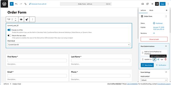


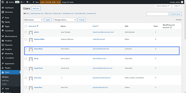
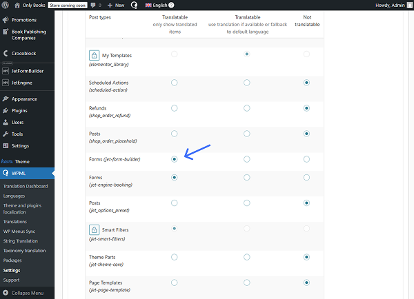
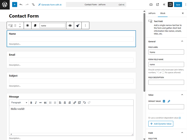
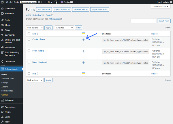
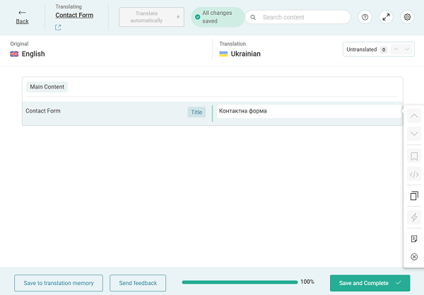
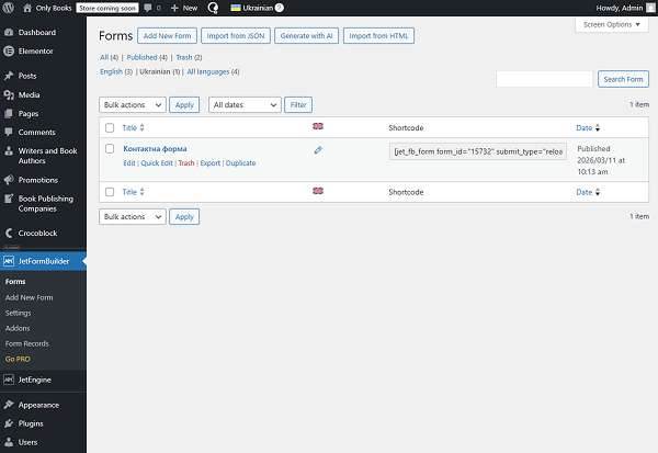
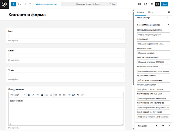
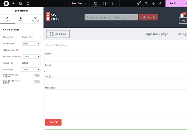
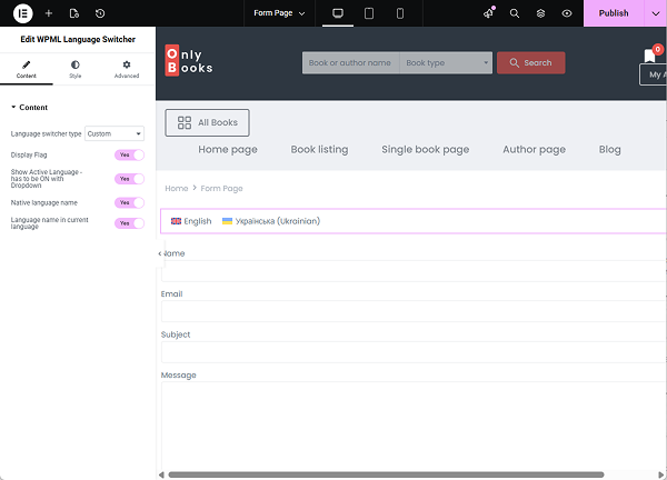
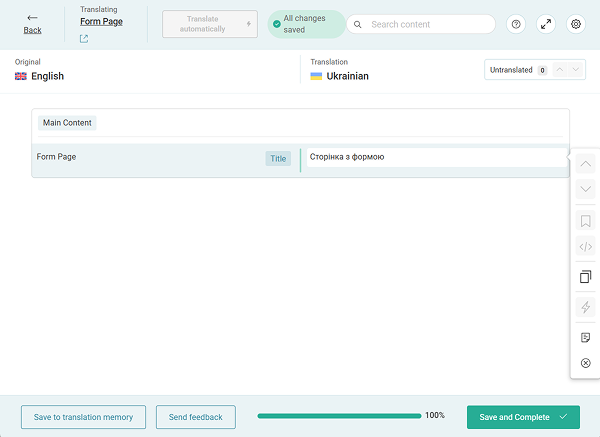
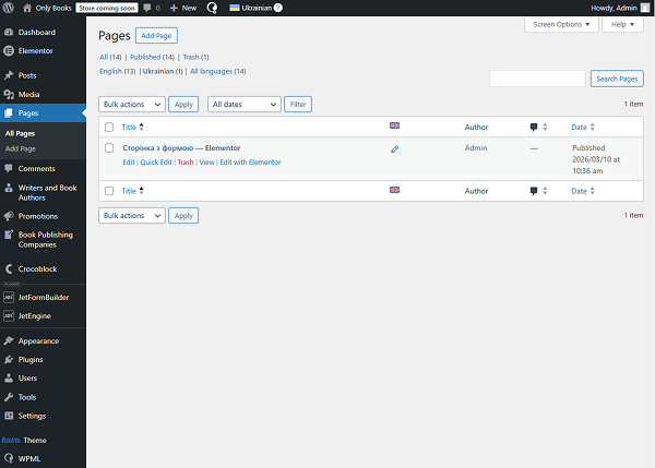
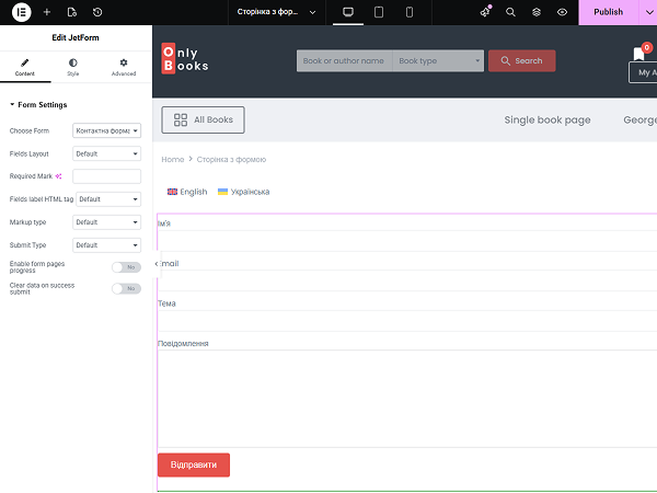
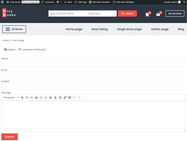
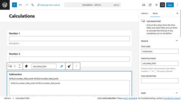

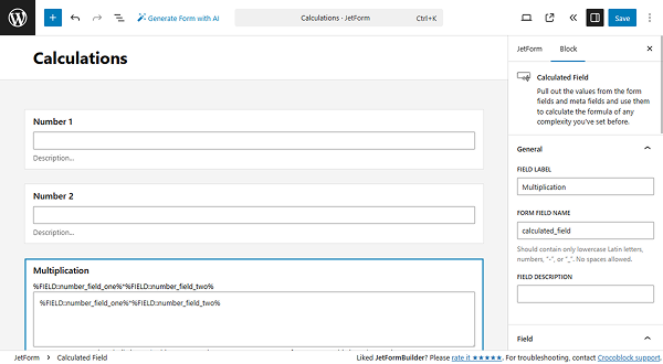
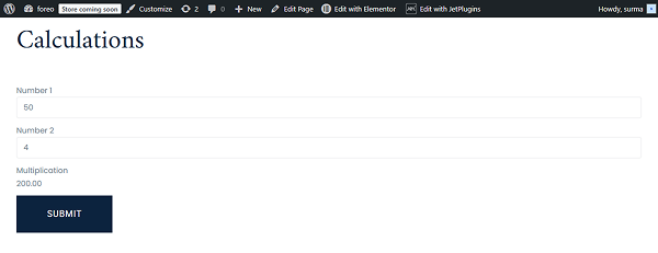


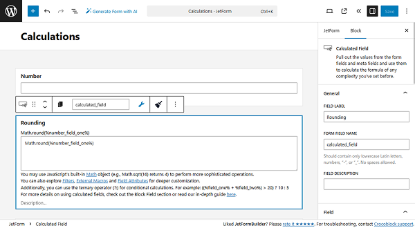


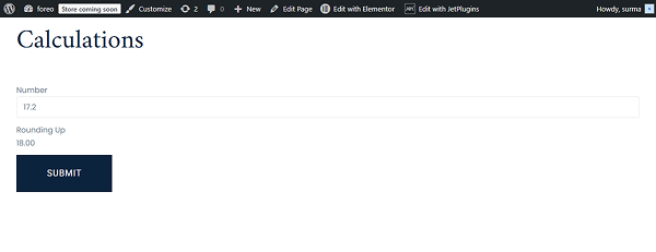
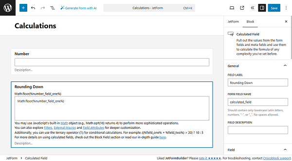

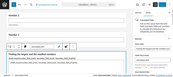

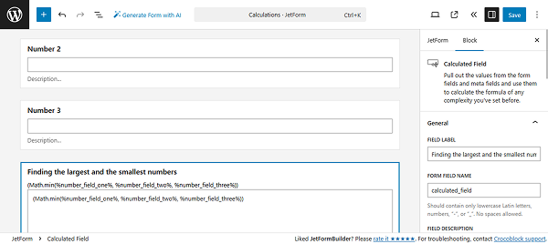
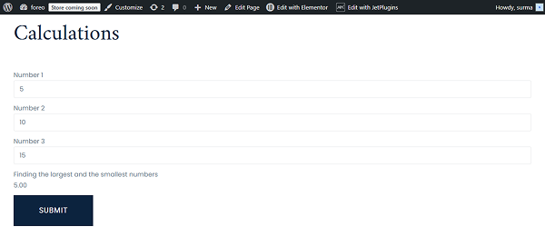
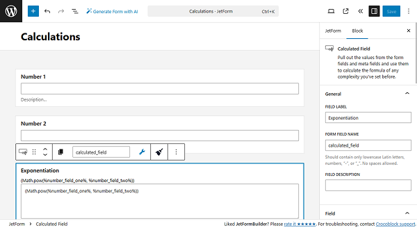
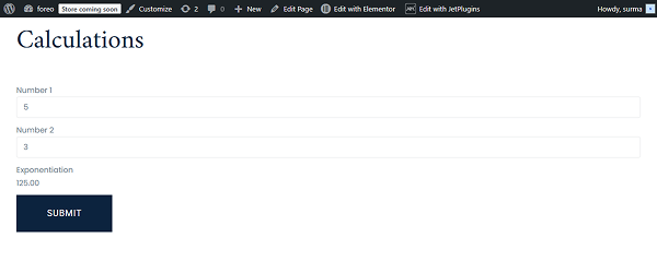

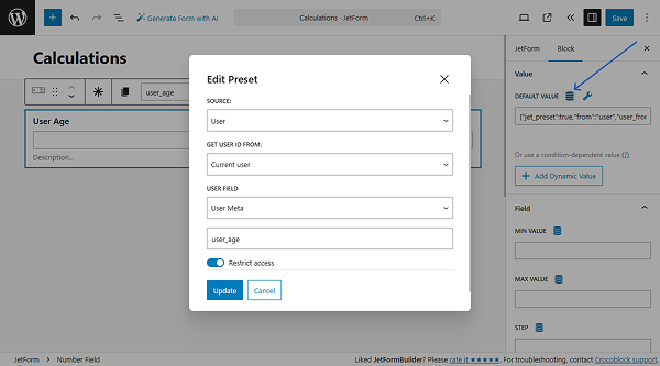
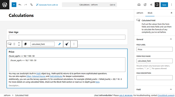

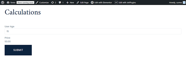
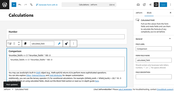
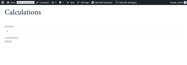
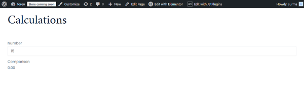
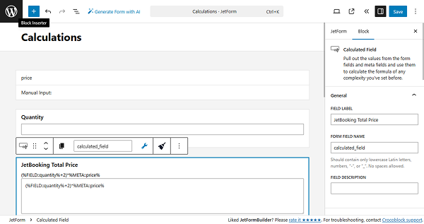
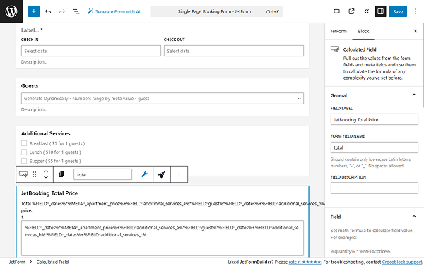
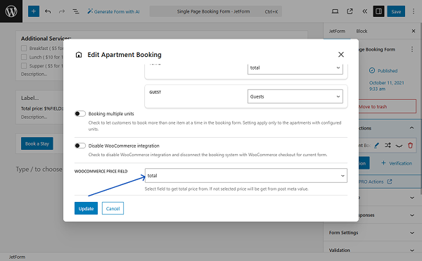
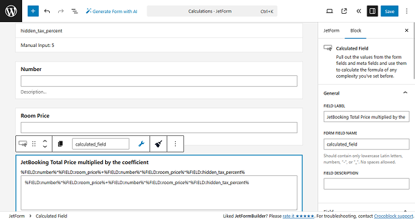
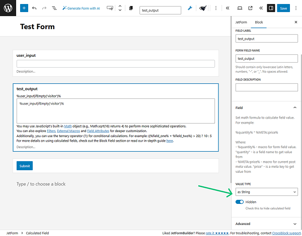
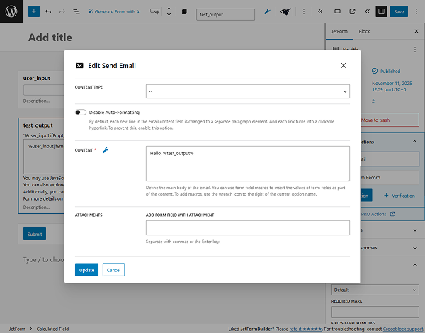
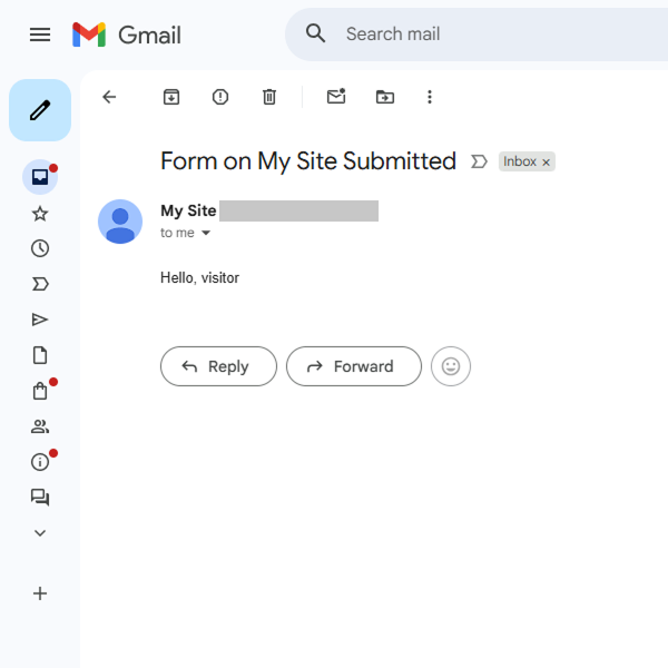
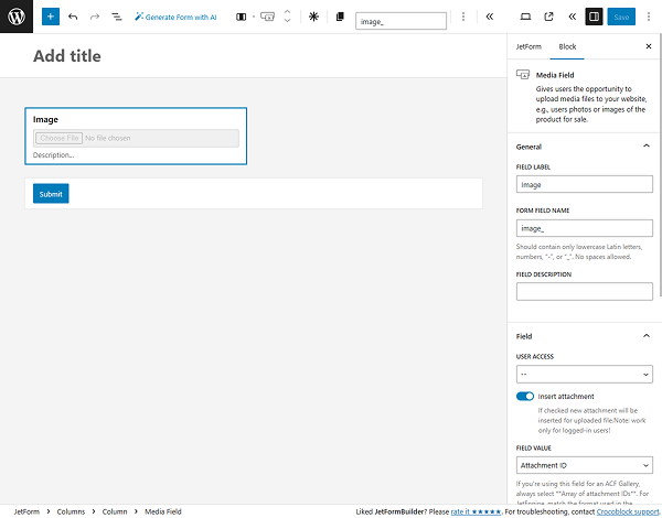
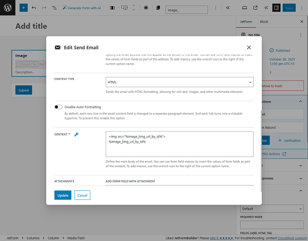
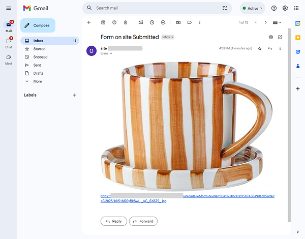
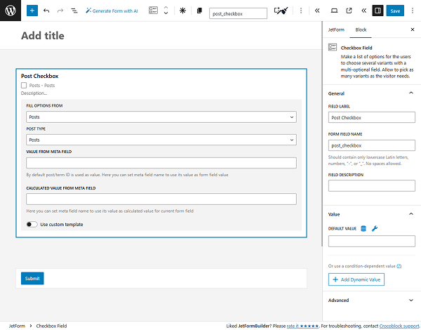

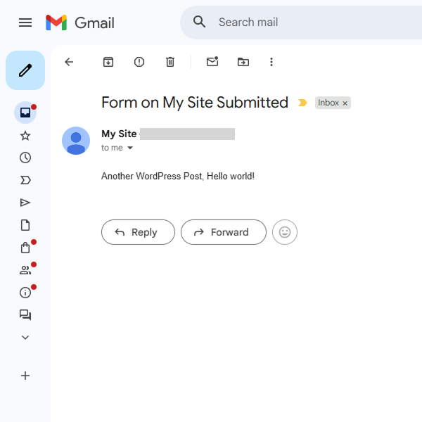
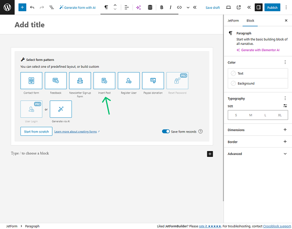
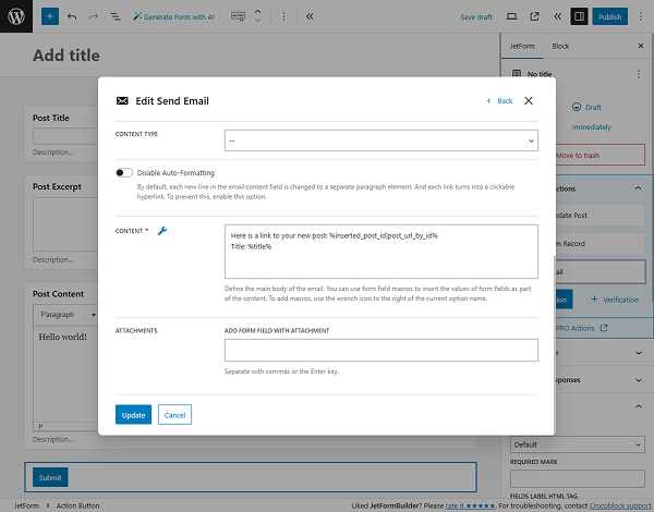
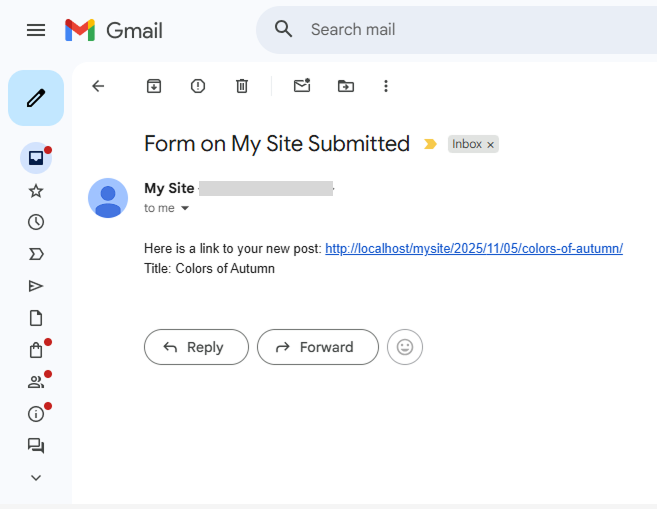
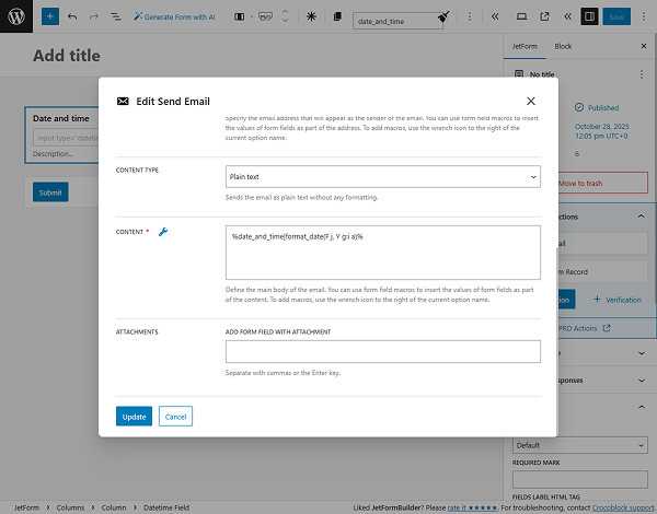
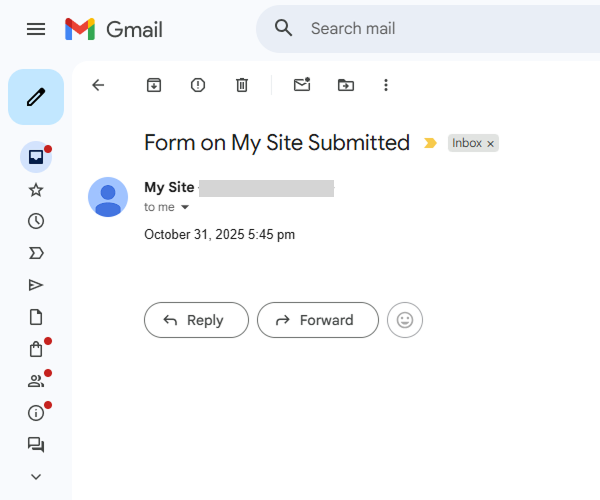

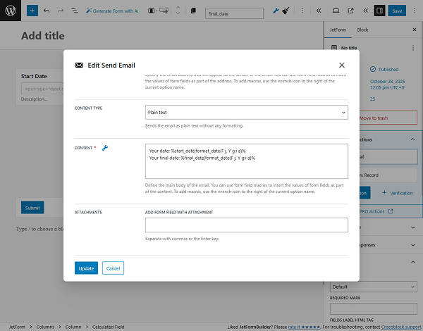

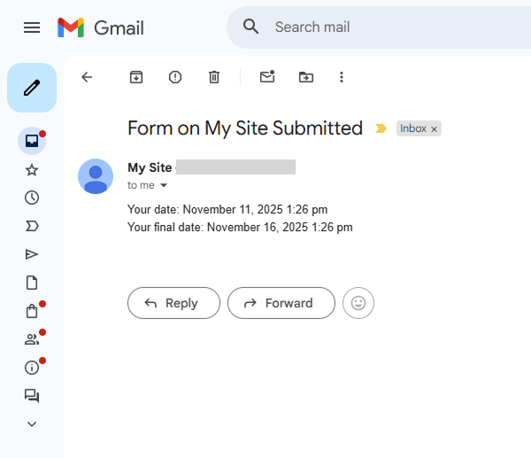
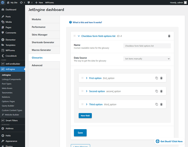
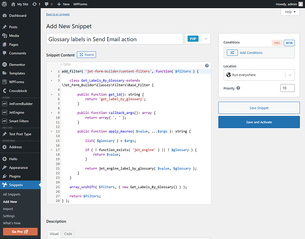
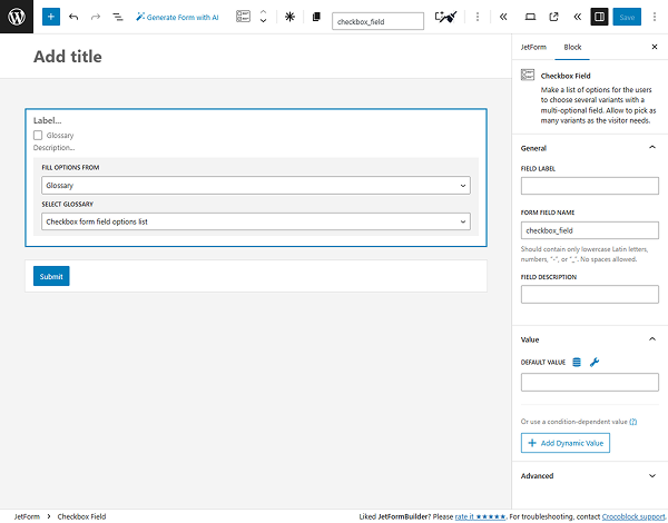
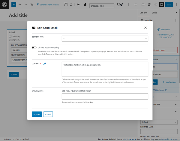
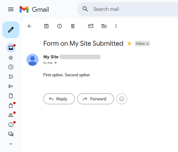

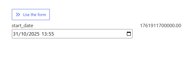
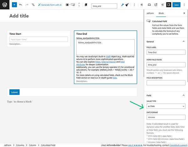
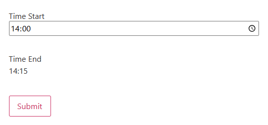

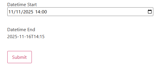
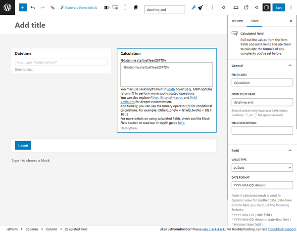

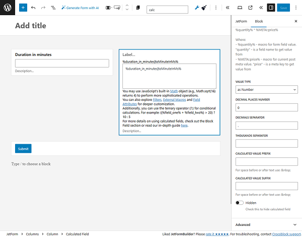
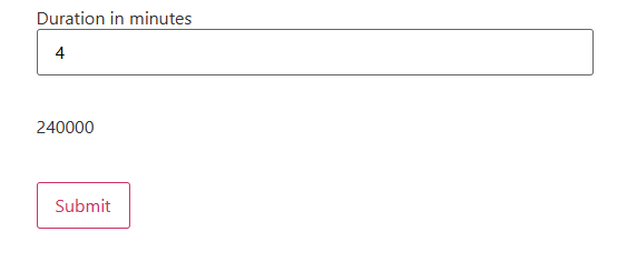
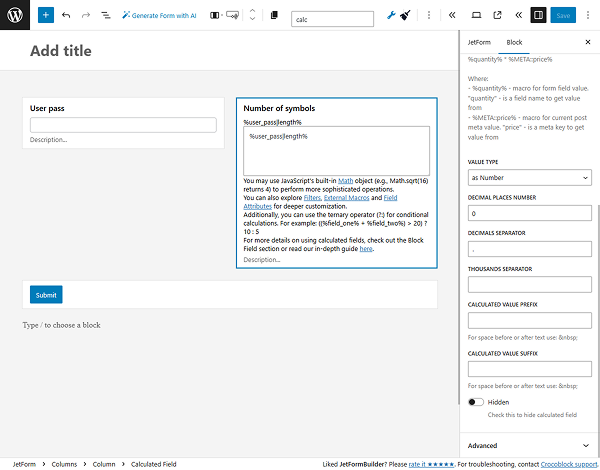
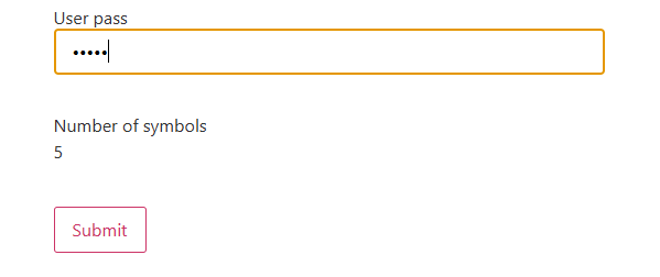

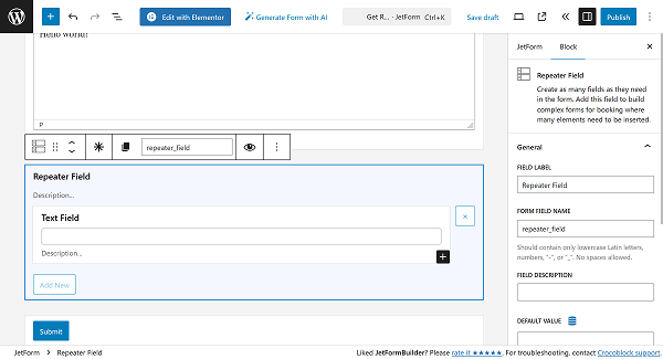
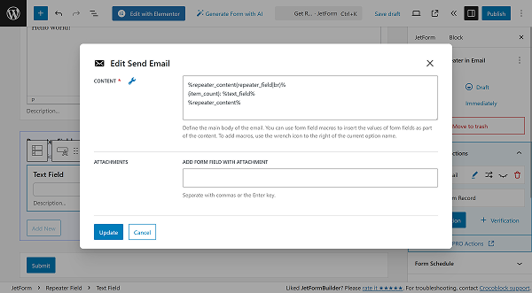
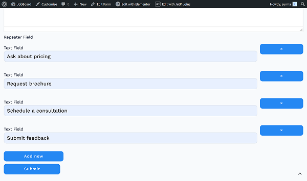
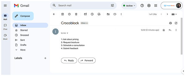
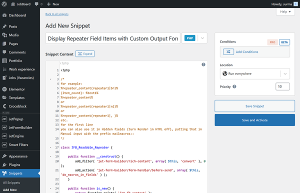
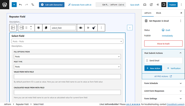
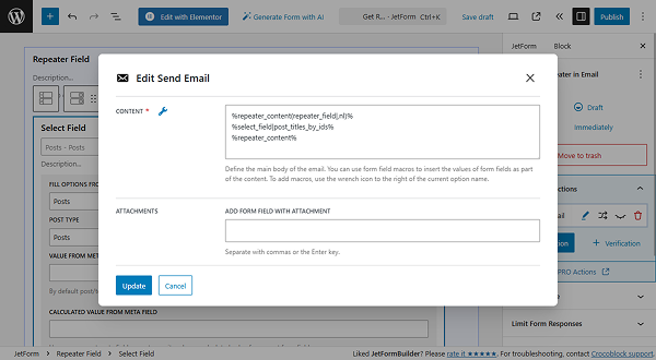
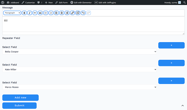
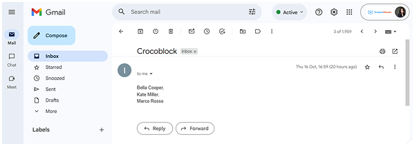
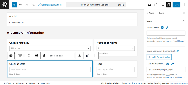
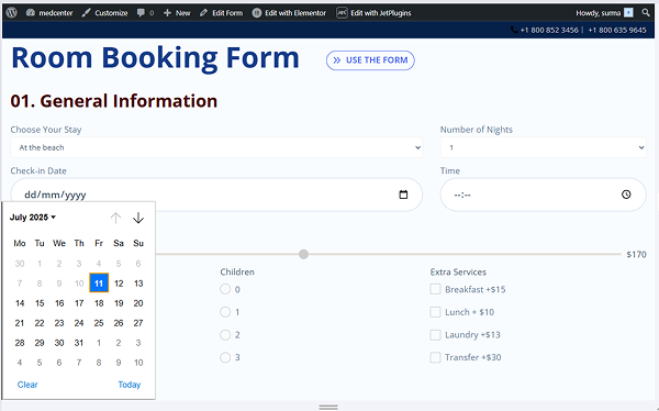
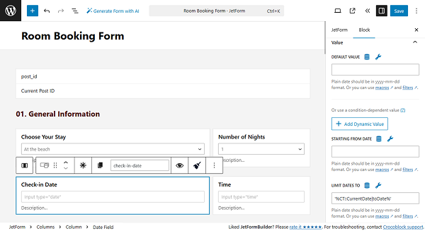
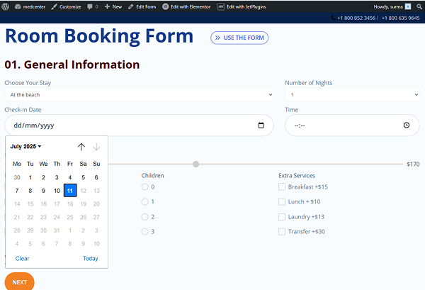
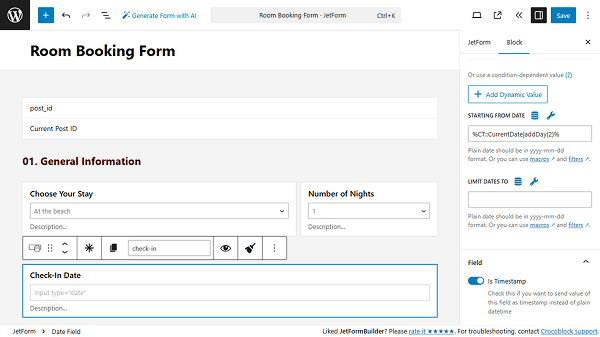
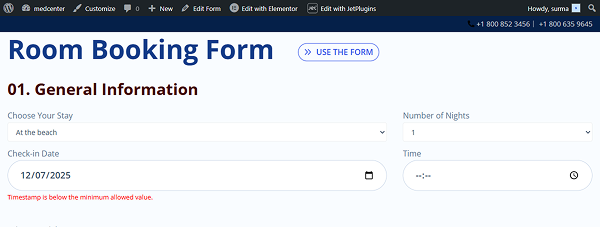
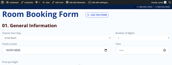
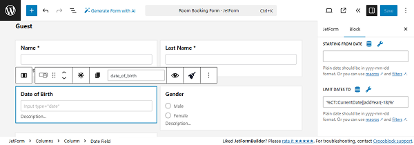
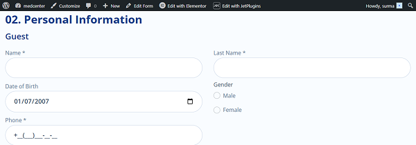
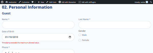
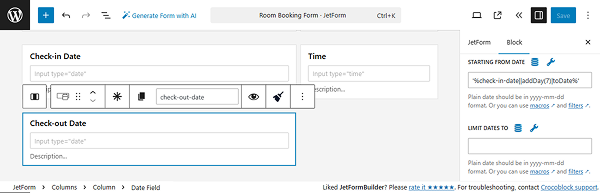
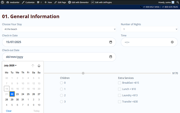
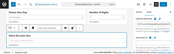
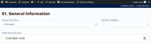
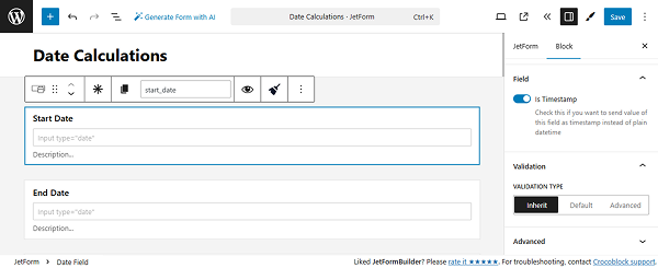
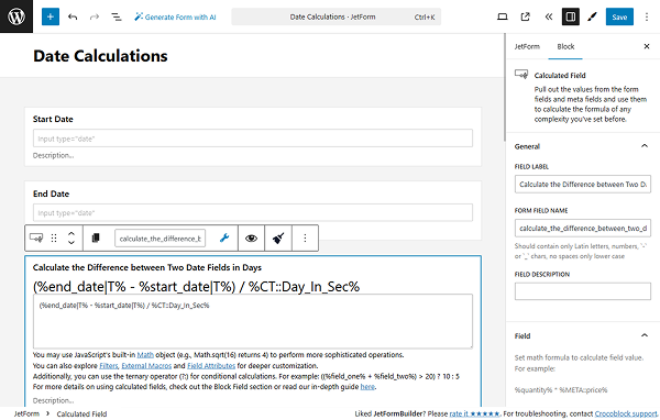
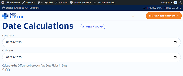

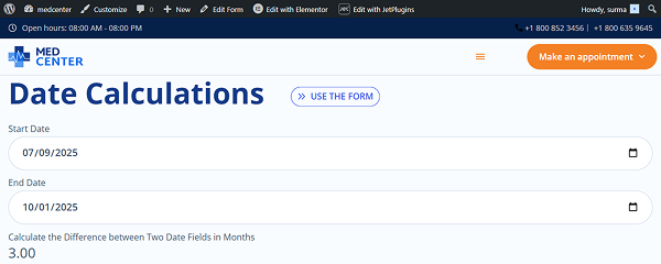
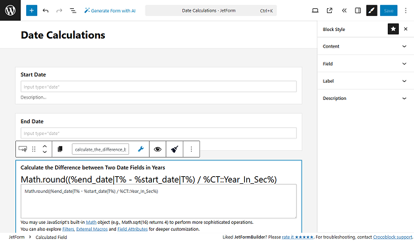
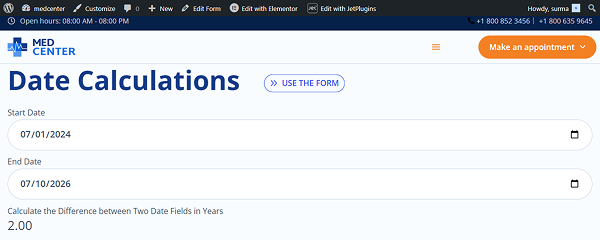
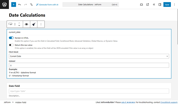
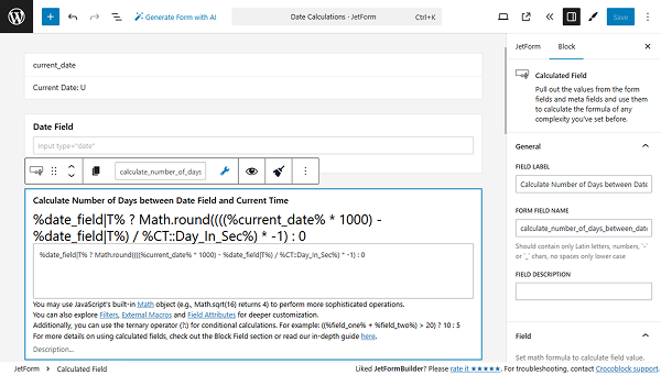
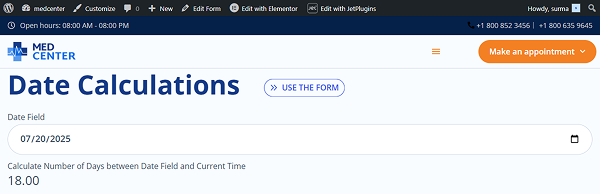
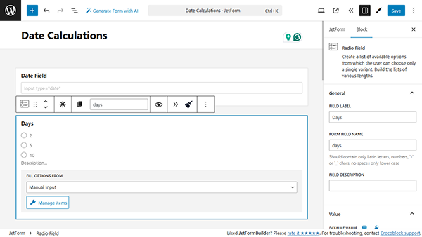
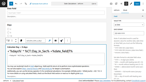
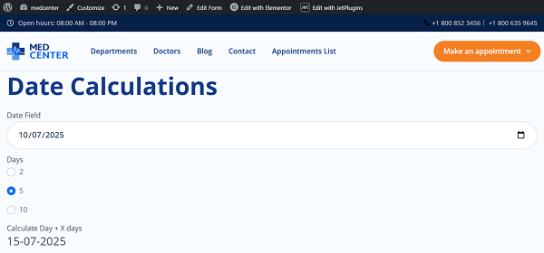
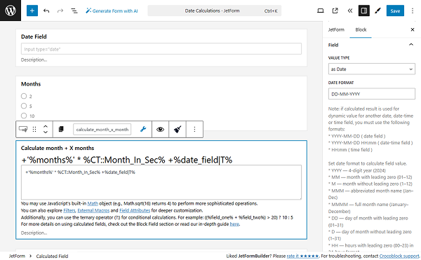
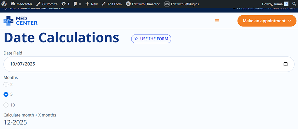
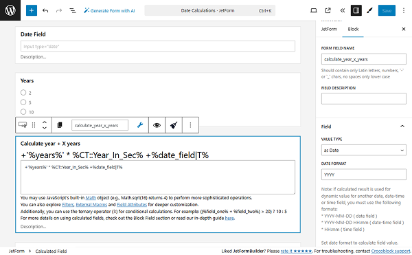
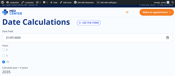
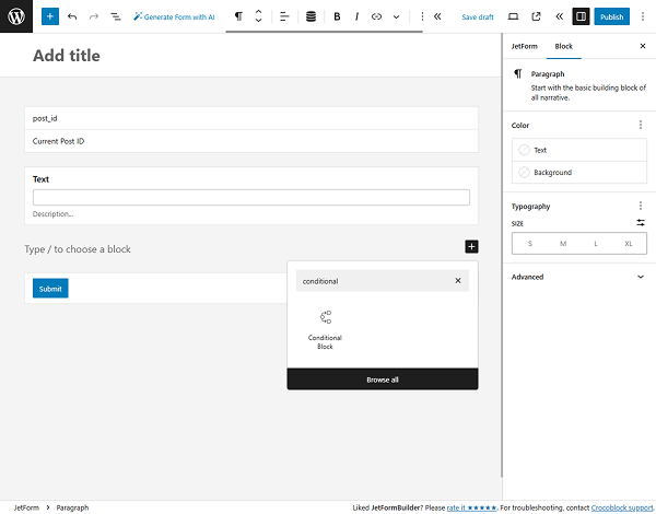
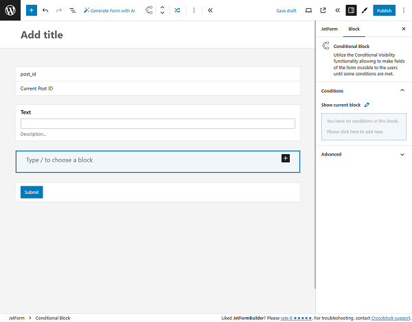
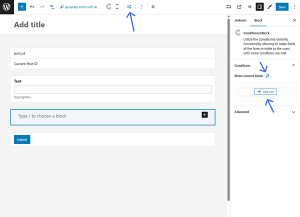
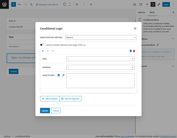
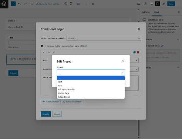
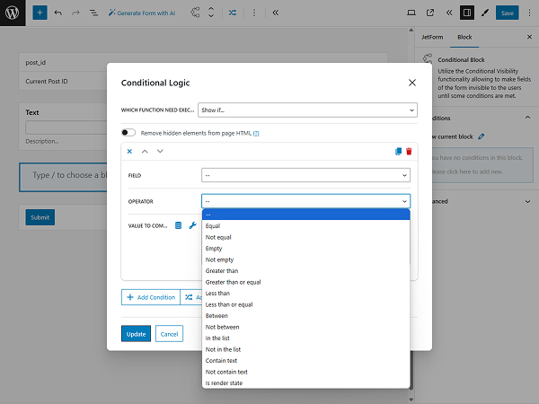
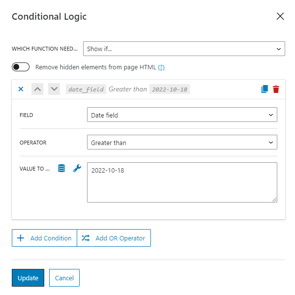
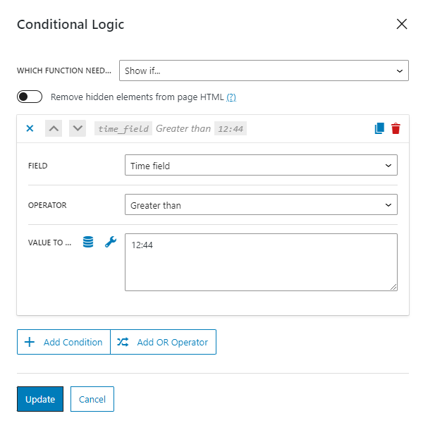
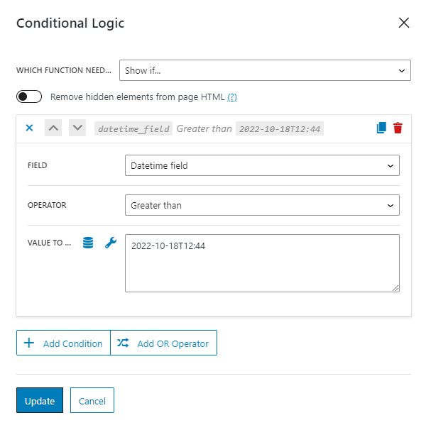
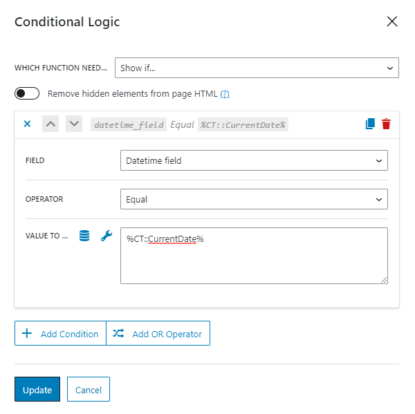
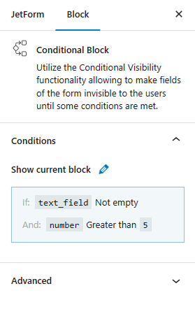
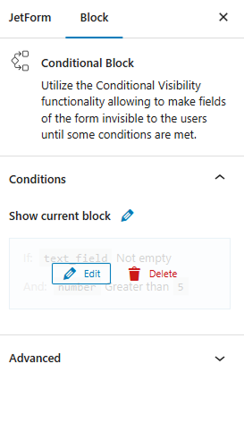
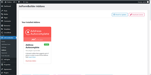
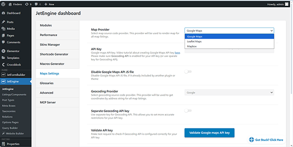
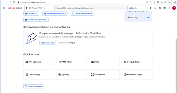
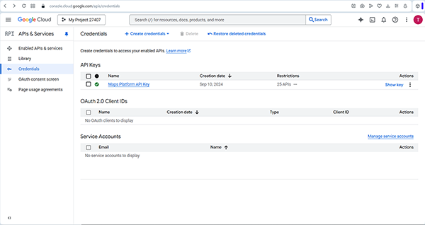
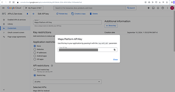
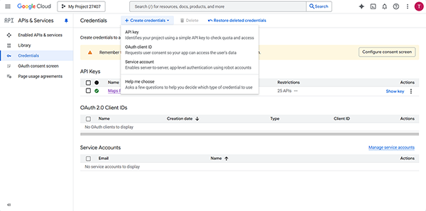
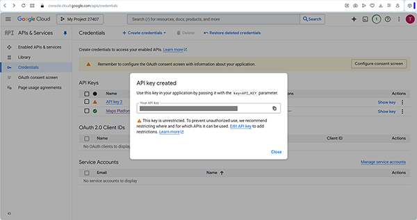
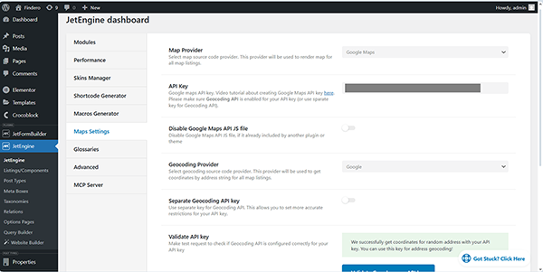
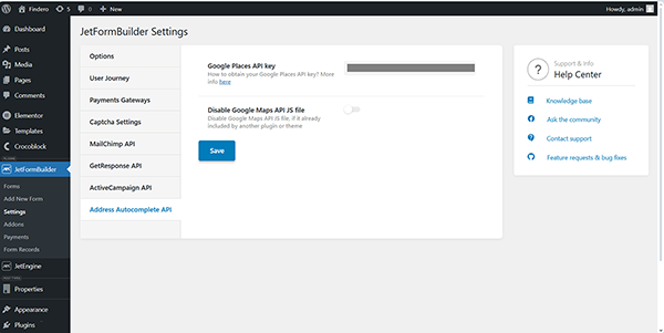
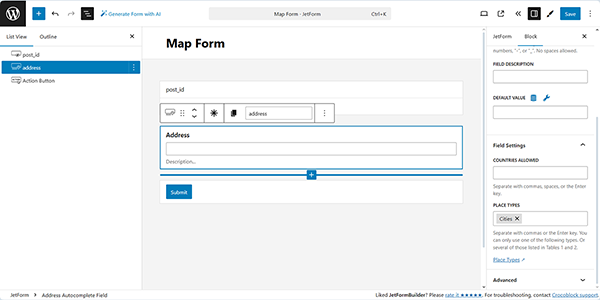
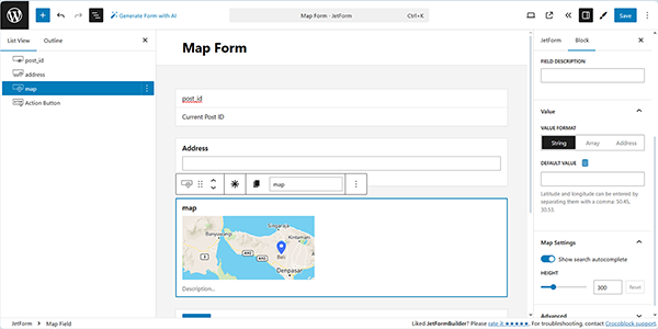
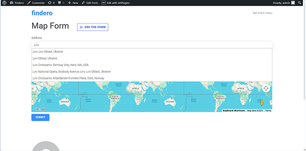
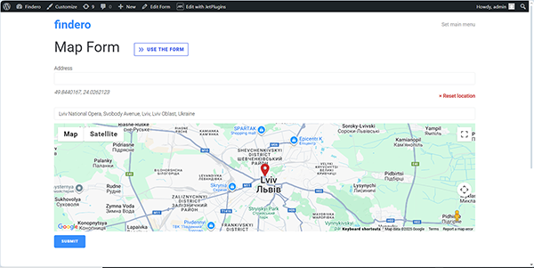
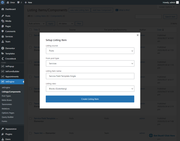
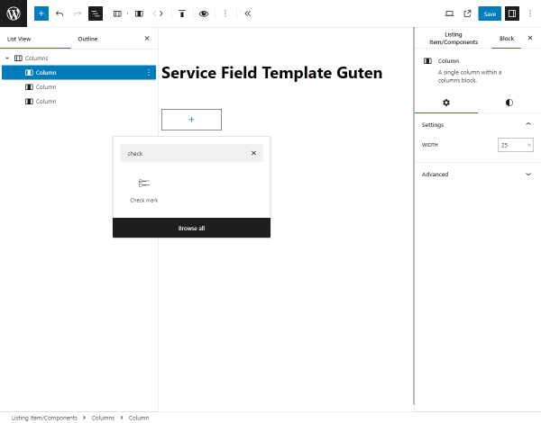
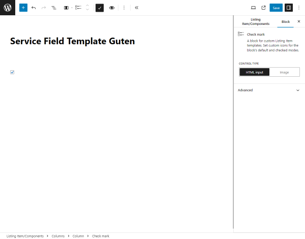
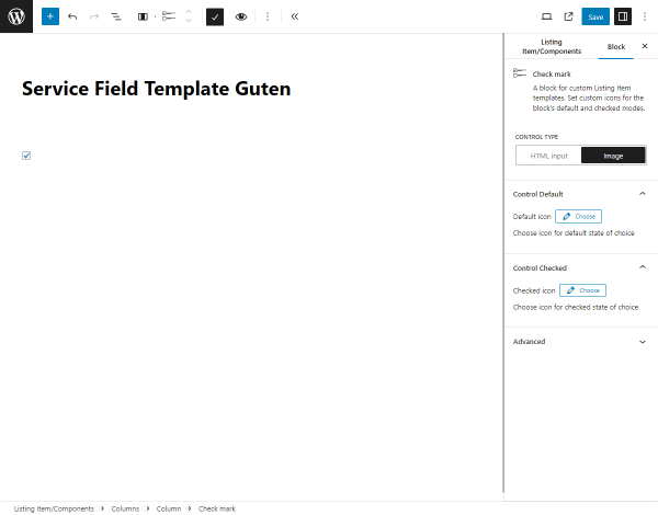
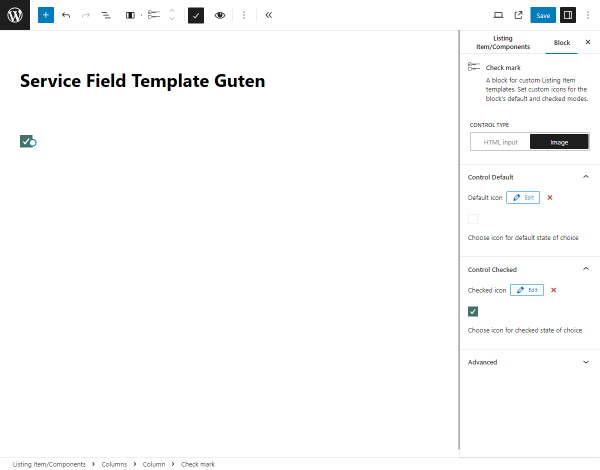
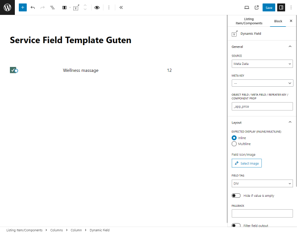
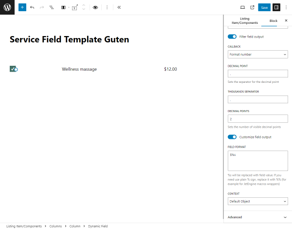
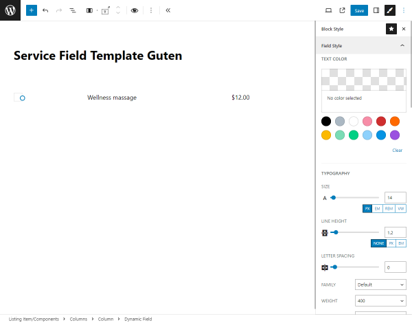
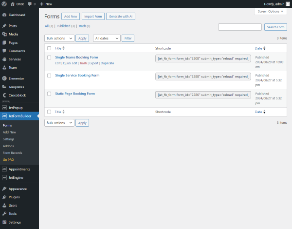
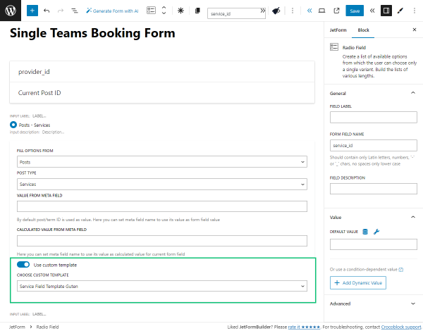
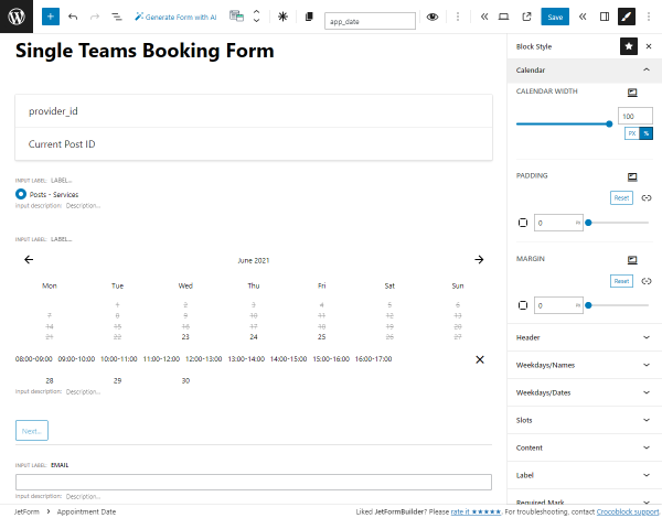
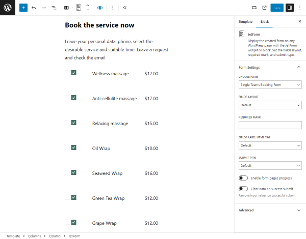
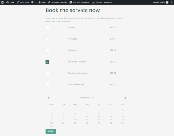
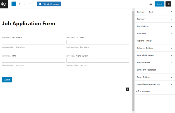
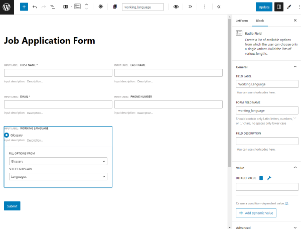
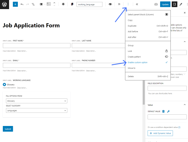
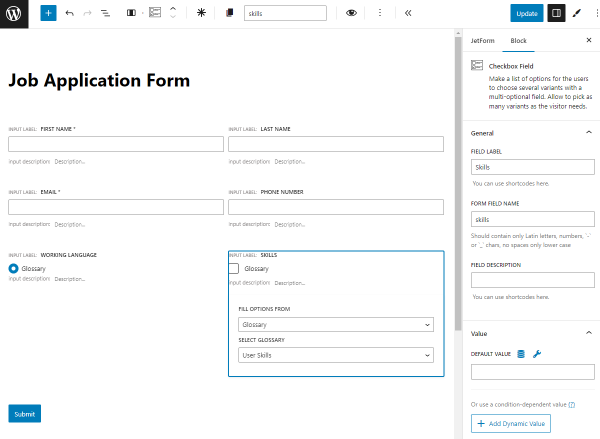
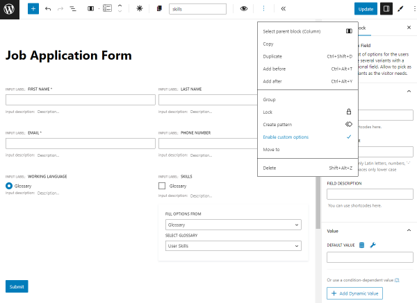
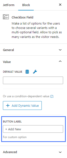
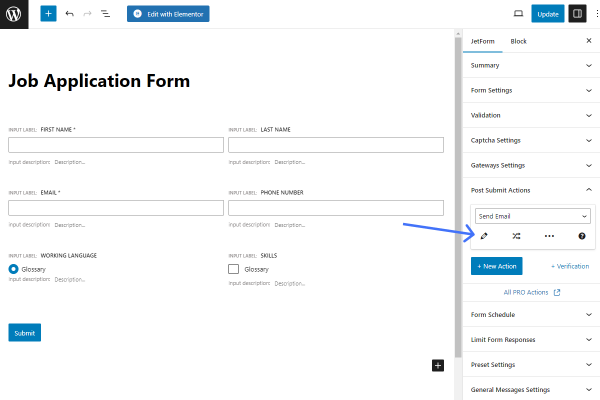
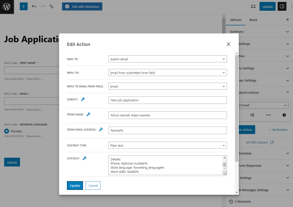
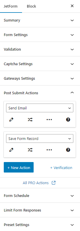
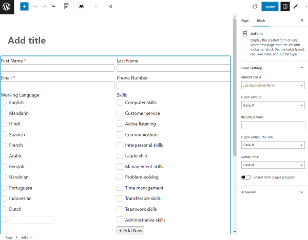
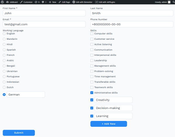
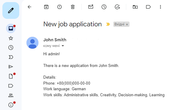
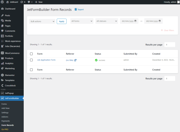
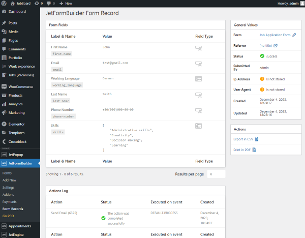
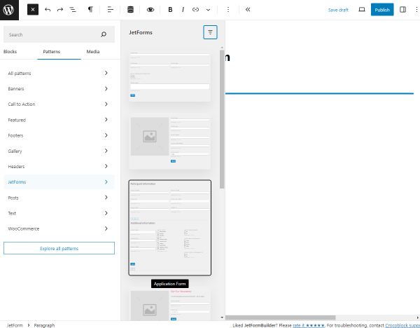
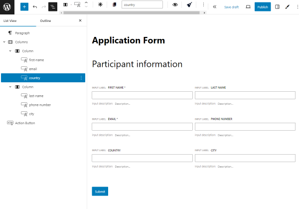
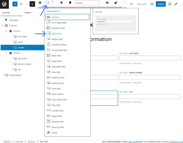
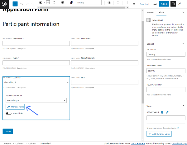
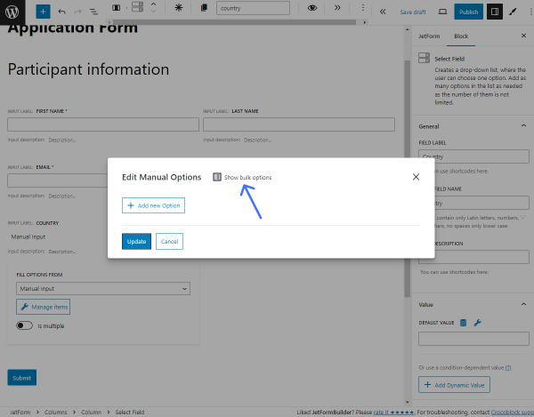
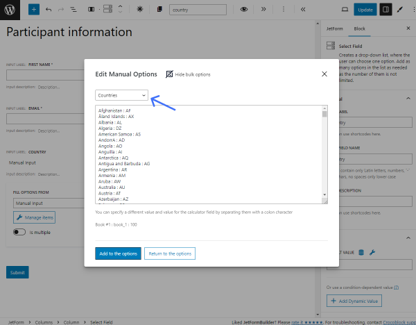
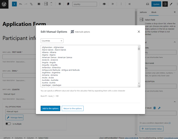
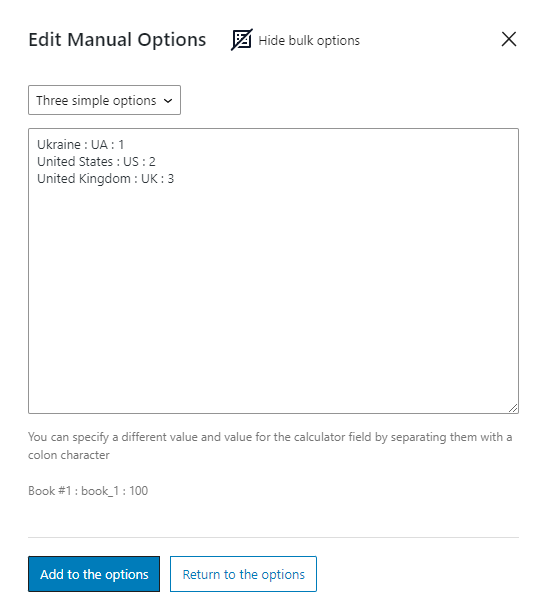
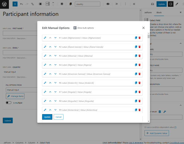
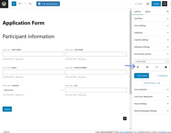
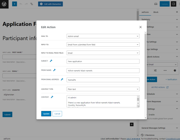
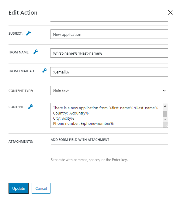
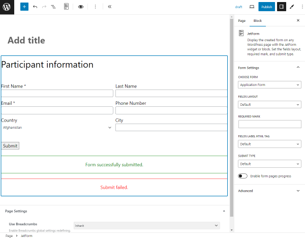
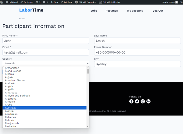
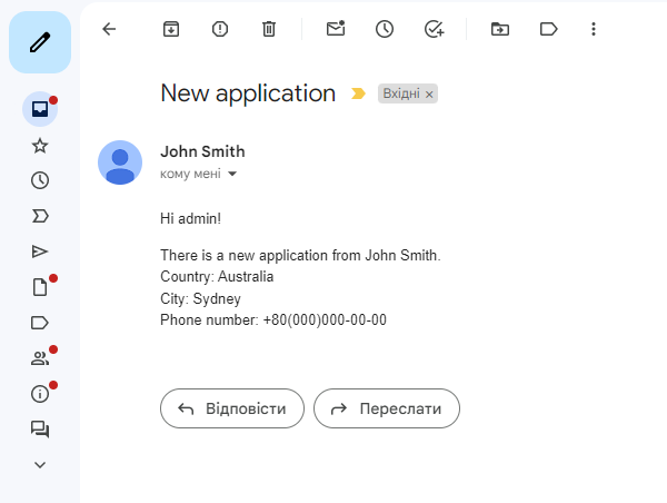
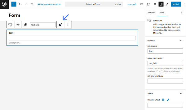
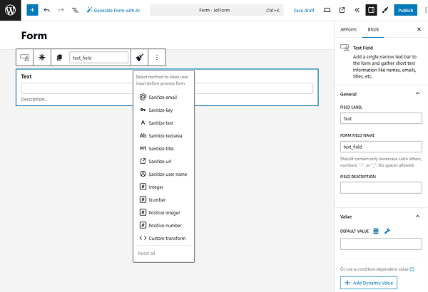
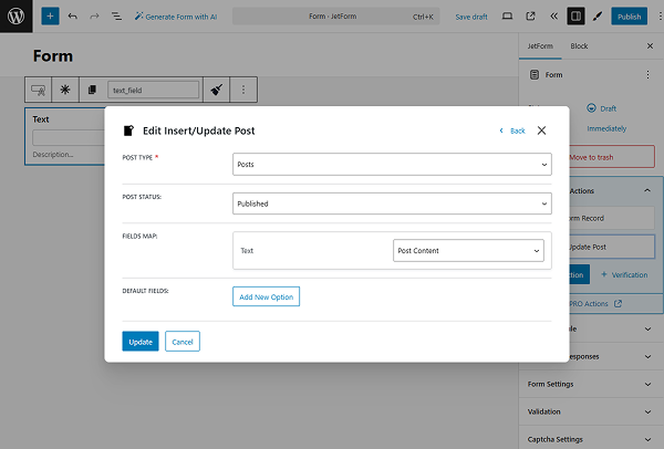
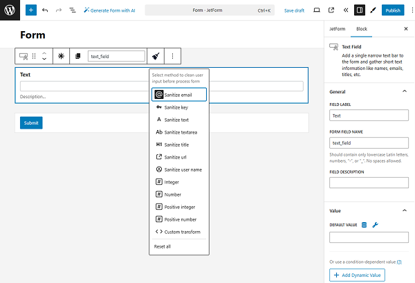
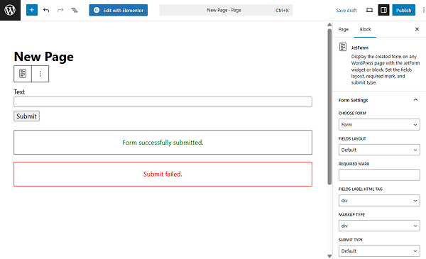
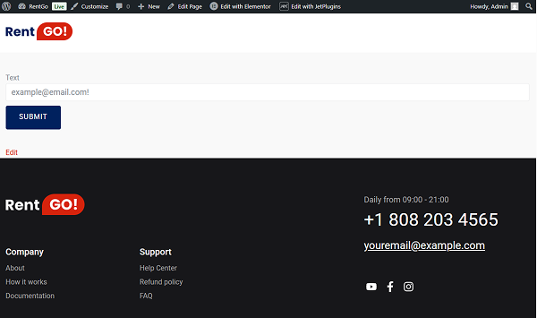

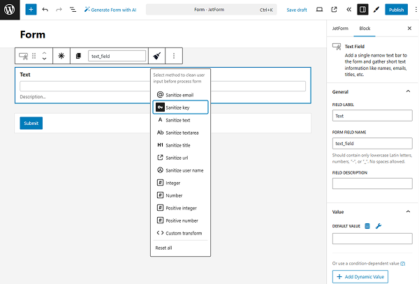
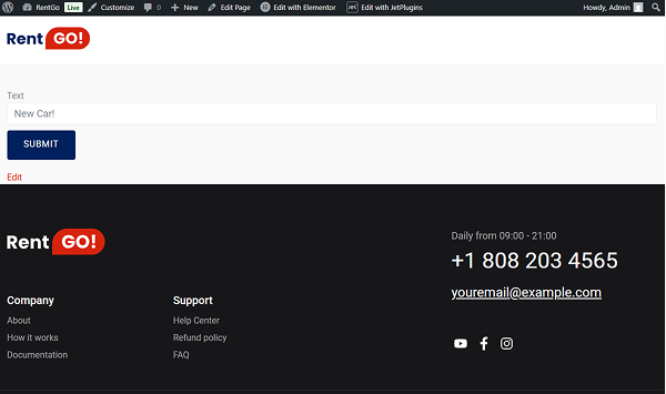

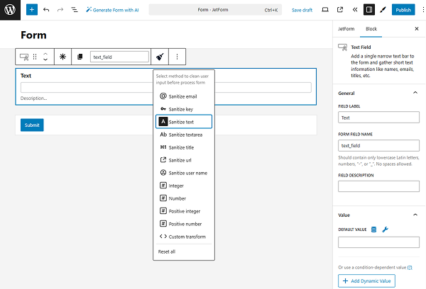
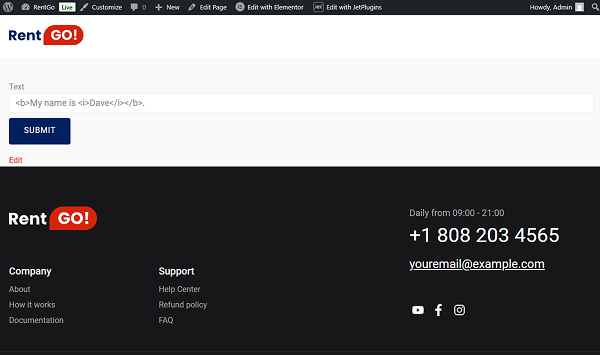

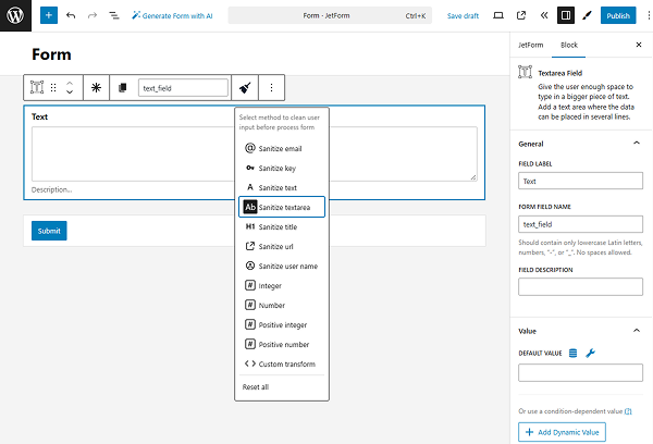
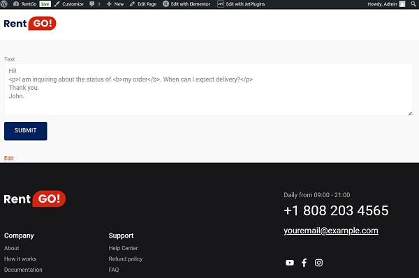
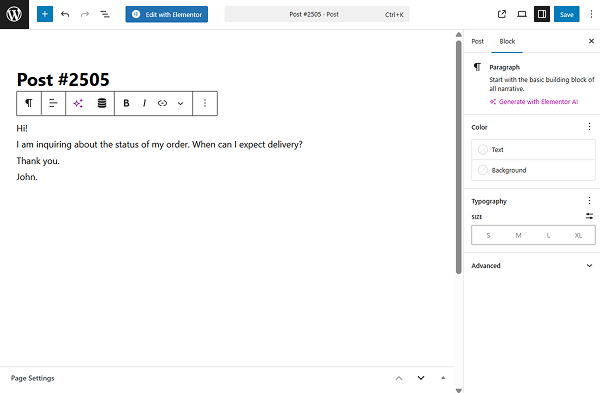
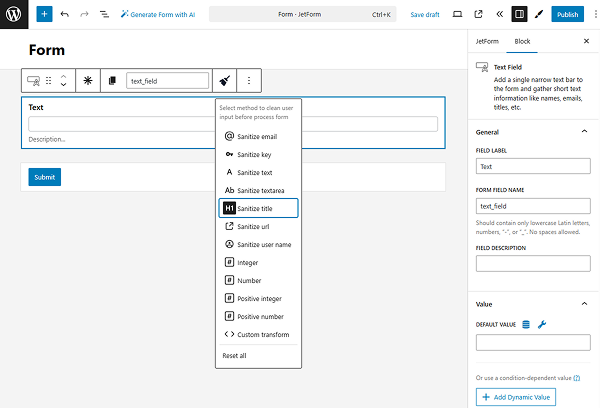
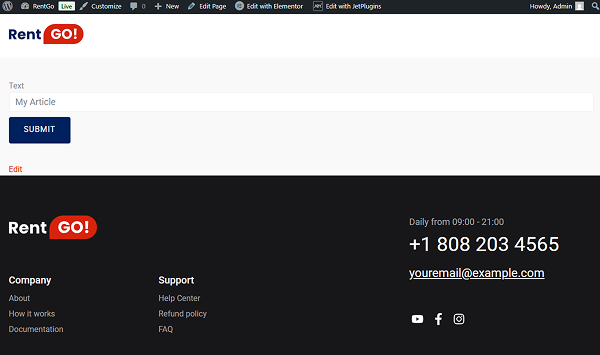

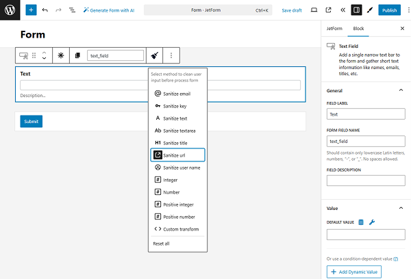

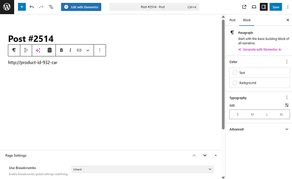
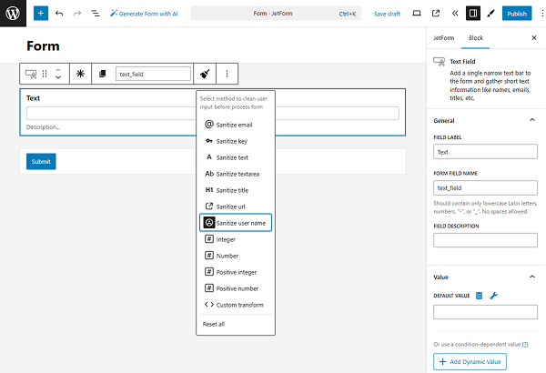
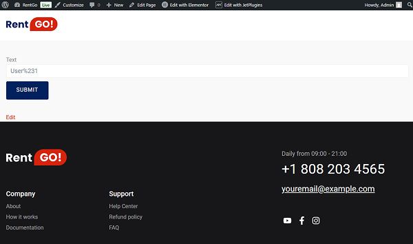

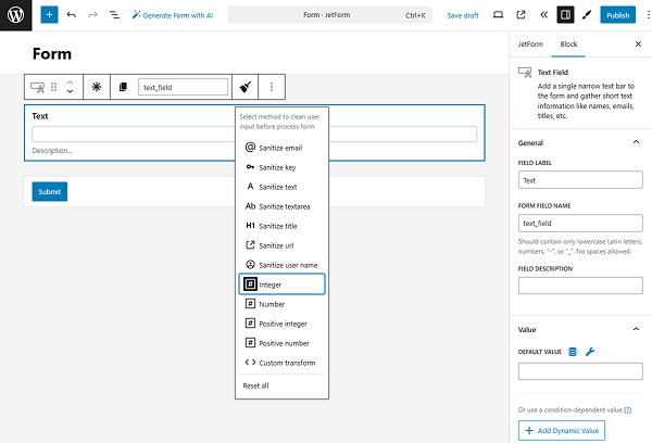


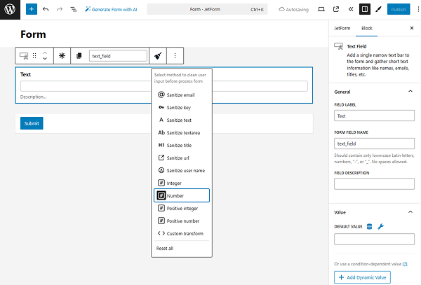


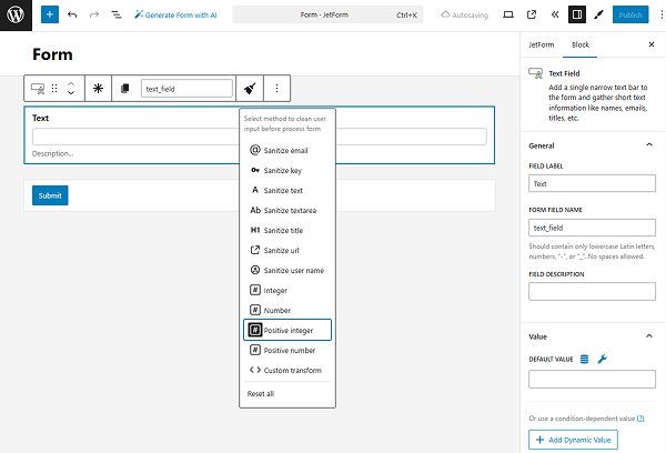
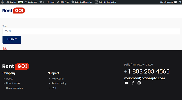

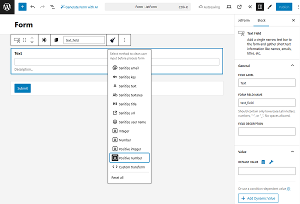
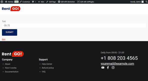
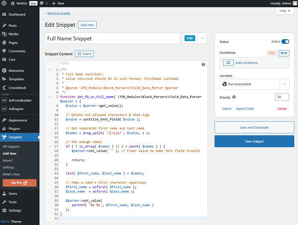
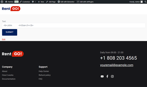
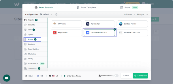
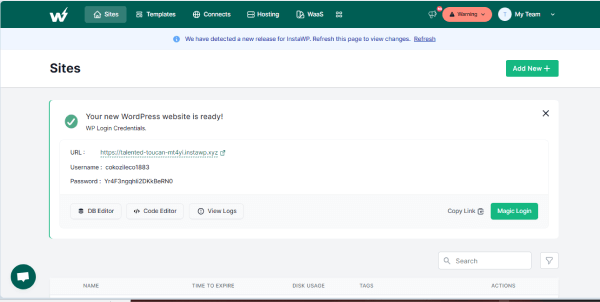
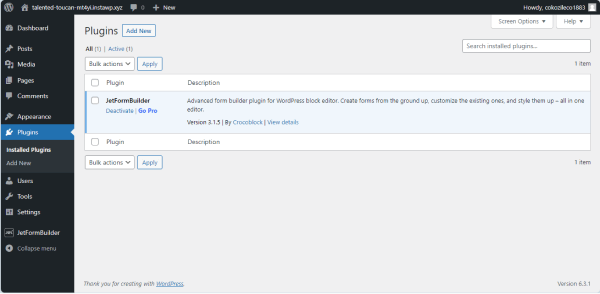
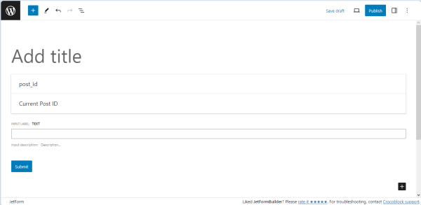
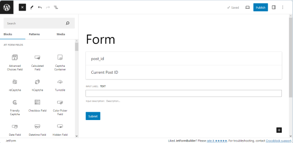
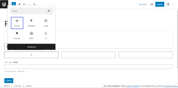
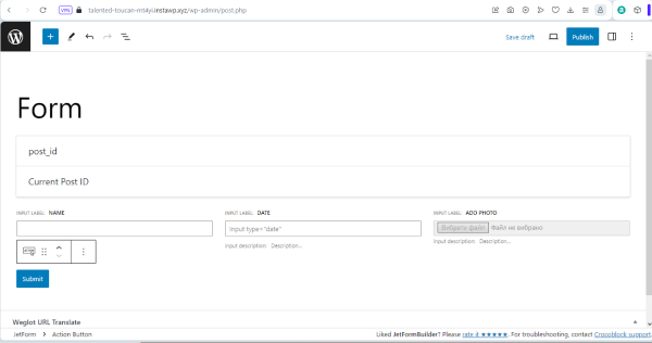
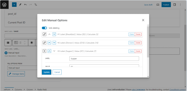
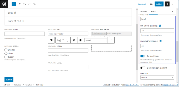
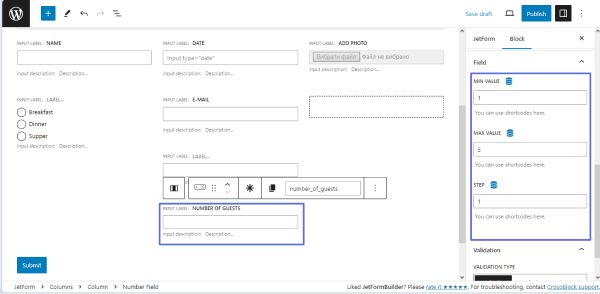
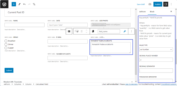
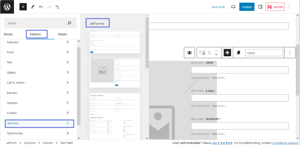
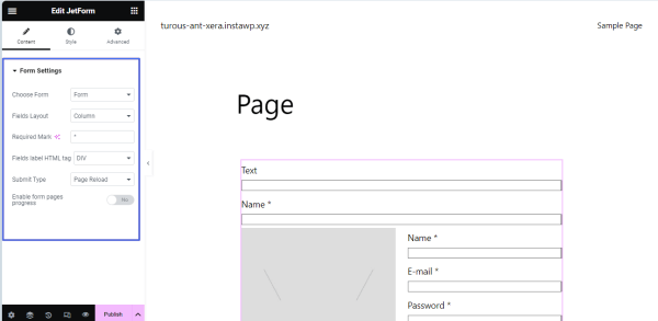
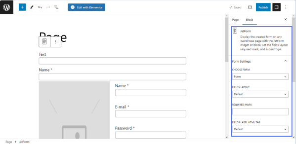
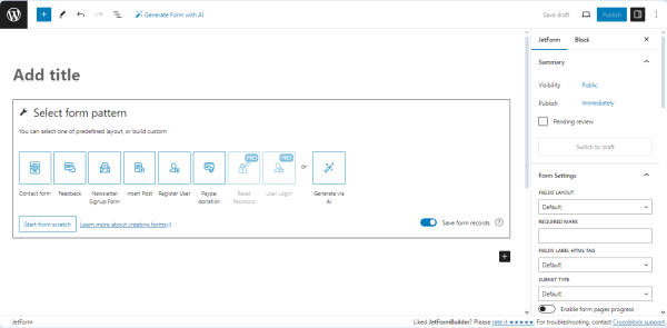
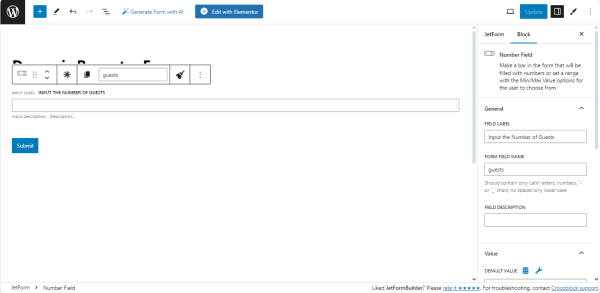
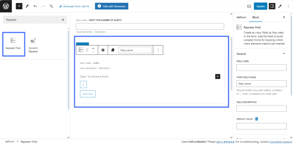
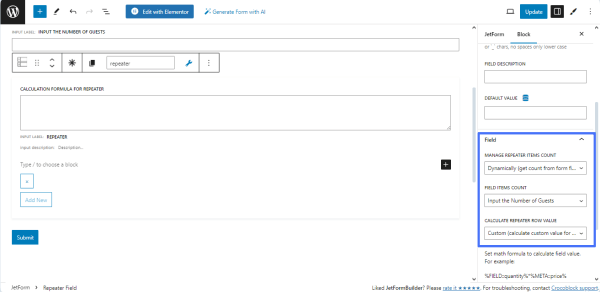
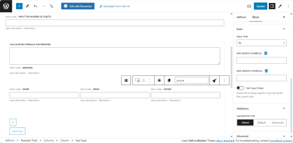
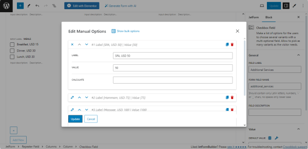
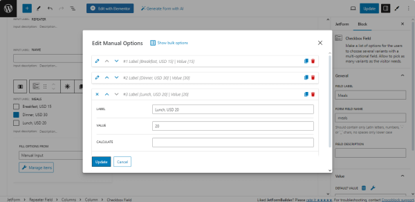
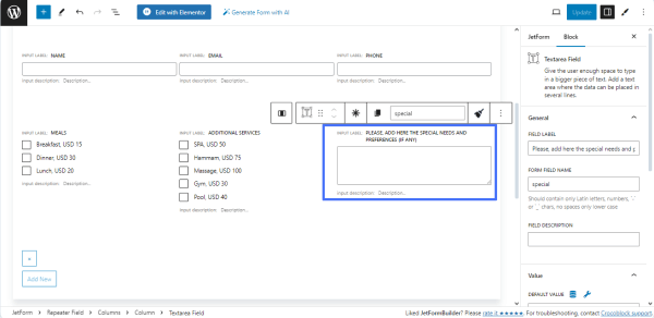
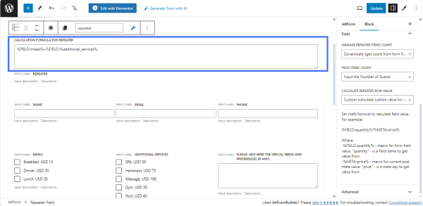
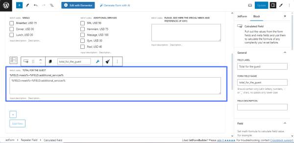
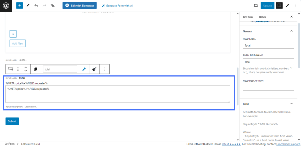
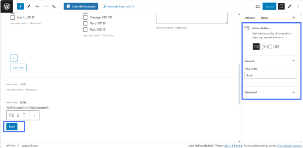
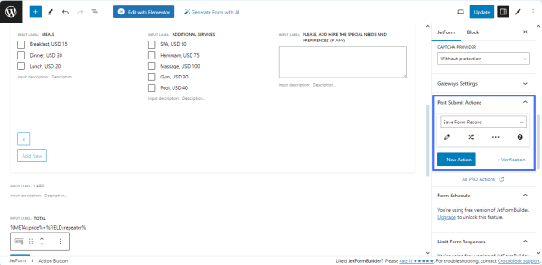
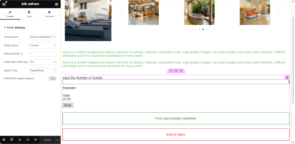
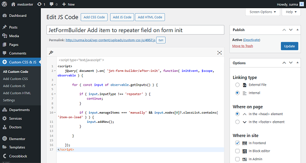
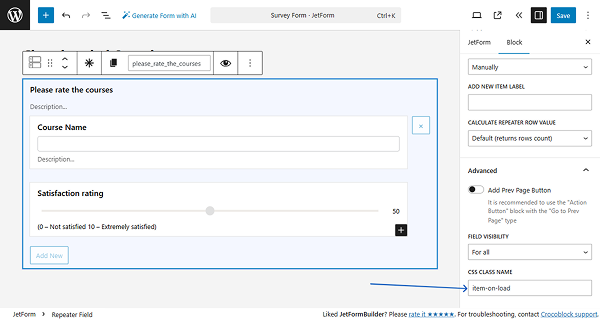
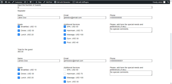
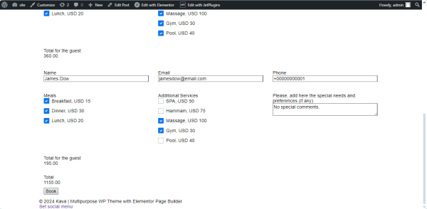
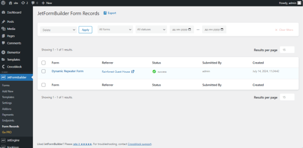
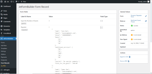
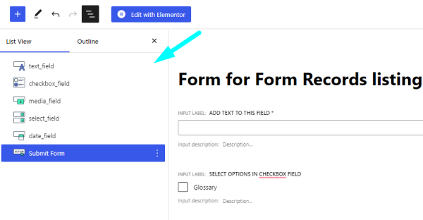
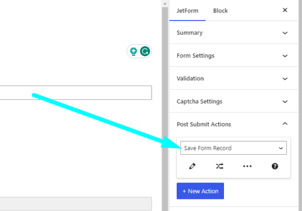
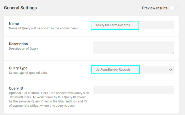
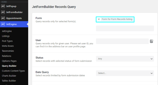
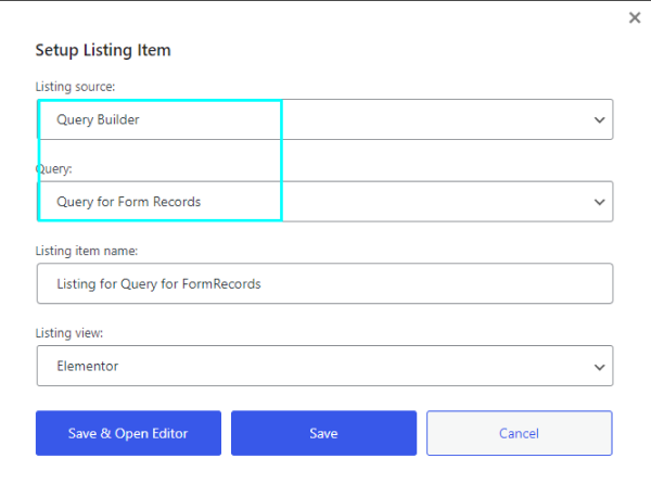
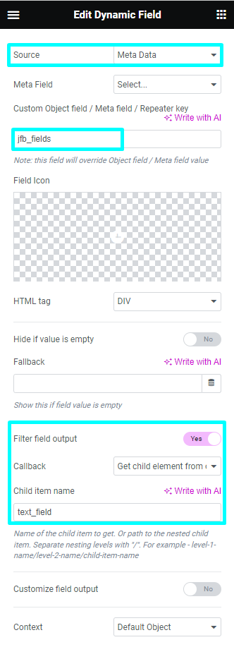
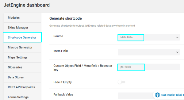
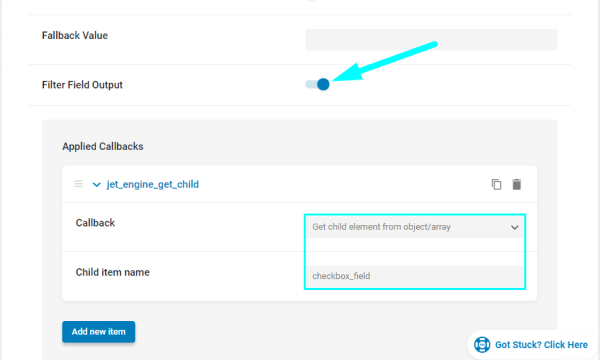
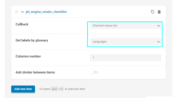
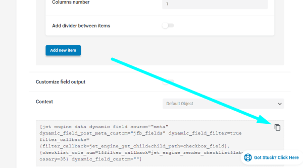
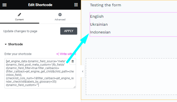
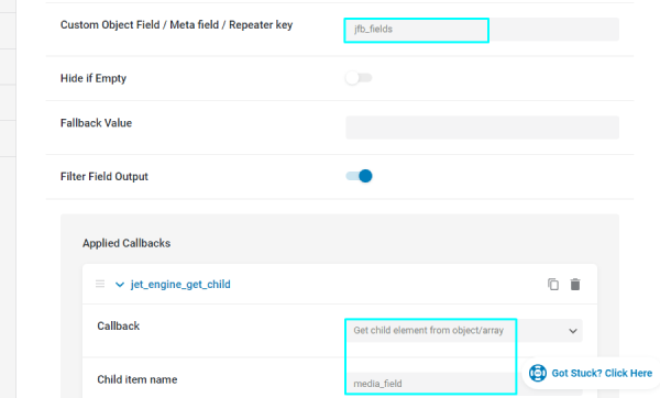
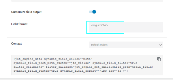
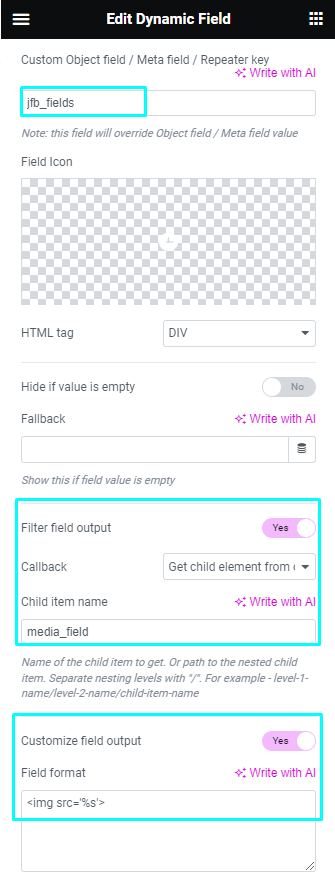

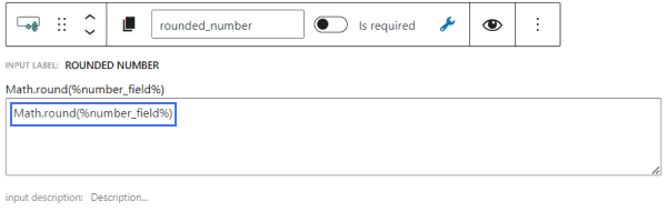
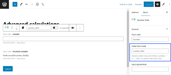
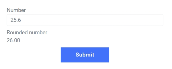
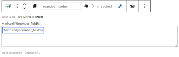
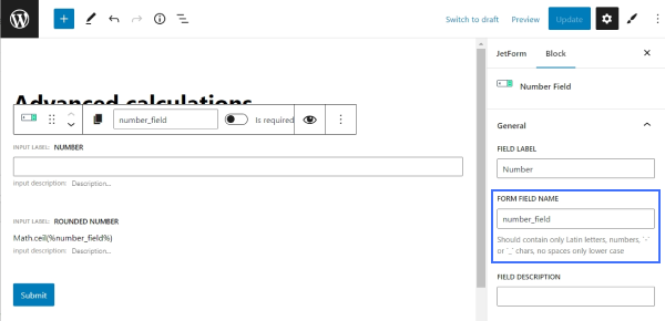
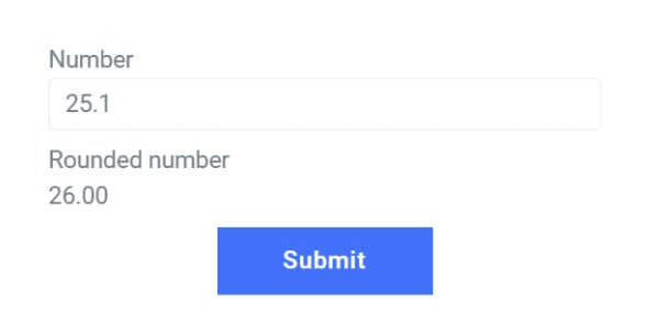
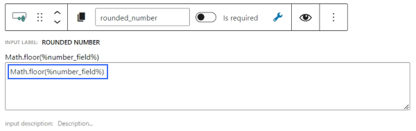
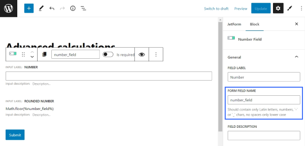
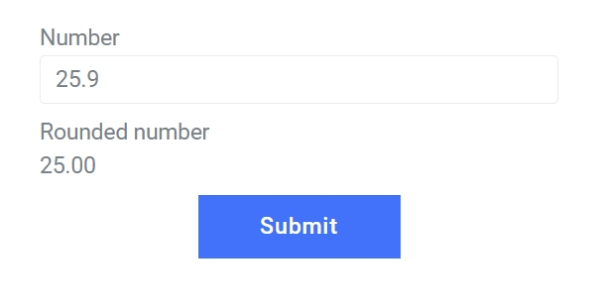
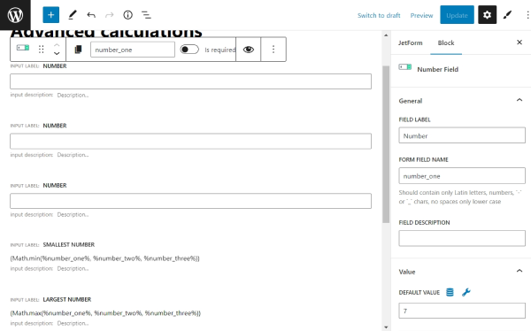
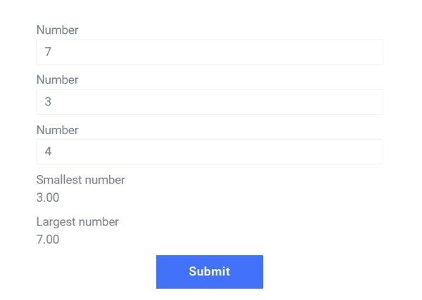
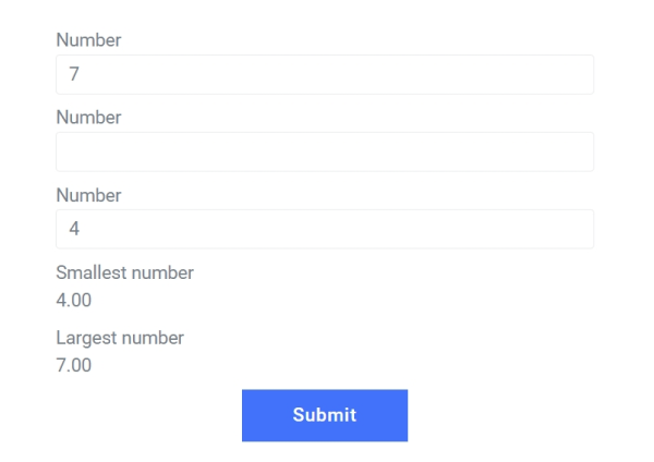
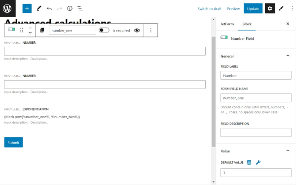
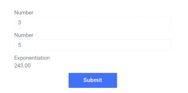
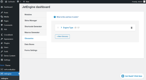
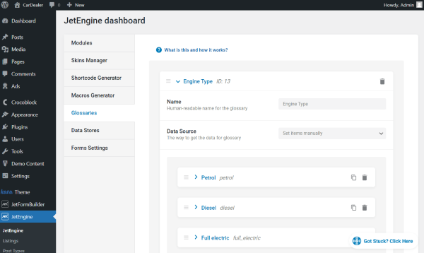
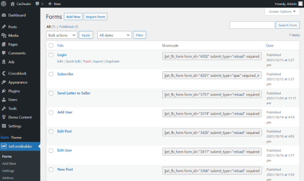
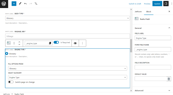
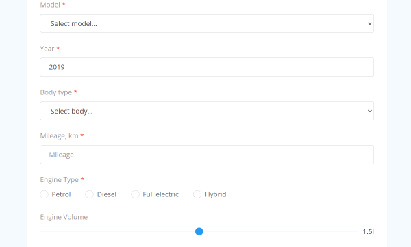
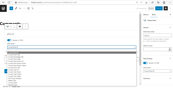
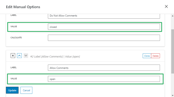
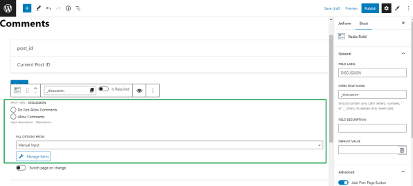
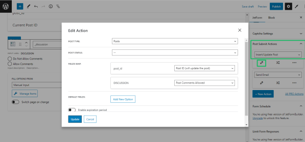
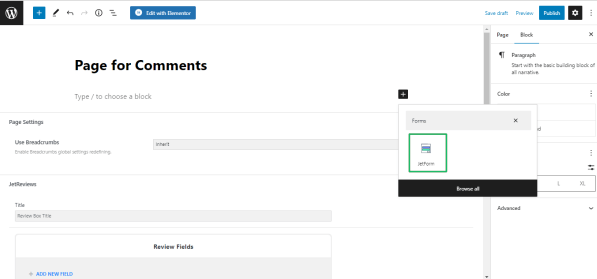