Build a compact WordPress Registration Form allowing users to sign up and get a profile page in no time.
- Why You Need a WordPress Register Form
- Top WordPress Register Form Features
- WordPress Form Pattern Structure
- How to Create a WordPress Custom Registration Form based on Pattern
- Creating a Registration Form From Scratch
- Adding a Payment Gateway to the Register Form
- WordPress Register Form Pro Features
Why You Need a WordPress Register Form
Registration forms help website owners to convert one-time visitors into registered users. They prove to be highly efficient for user data collection and mailing list creation.
Keep the WordPress custom registration form simple and make it quick to submit. With the “Register Form” Pattern, you get a signup form layout in one button click. Proceed to style the form blocks and set post-submit actions, and it’s good to go.
Top WordPress Register Form Features
- Keep the form concise by adding only necessary fields like “Name,” “Email,” “Password,” and “Confirm Password;”
- Add required fields for the essential questions only;
- Prevent spam during user registration with reCAPTCHA v3 validation;
- Provide the Success, Validation, and Error Messages during form submission;
- Boost visitor engagement by carefully styling form fields and buttons;
- Collect user data and sync to MailChimp, GetResponse, Active Campaign, Zapier, and Integromat.
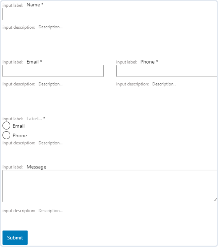
WordPress Form Pattern Structure
- Name — a required Text Field for filling in the user name;
- Email — a required Text Field for filling in the user email;
- Password — a required Text Field for filling in the password for the first time;
- Confirm Password — a required Text Field for filling in the same password for confirmation;
- Country — a Select Field for choosing the country from the drop-down list;
- Submit — the Action Button (formerly Submit Field) to submit a registration form.
How to Create a WordPress Custom Registration Form based on Pattern
The first and primary step is adding a new form. Navigate to WordPress Dashboard > JetForms > Add New.
The editor presents some default blocks – these are Hidden, Text, and the Action Button (formerly Submit Field). They can be customized or deleted.
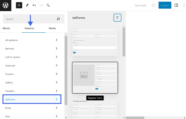
Mainly, there are two ways of creating the Register Form — by manually adding separate blocks or using patterns. Patterns are a WordPress feature that allows the use of already existing content layouts.
The JetFormBuilder plugin provides its own Patterns functionality with a set of patterns. To use one, open the Block Inserter by toggling the plus-shaped icon and navigate to Patterns. Open the JetForms tab and find the “Register Form” Pattern.
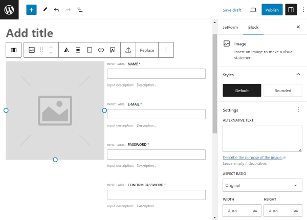
This layout consists of blocks that can be either changed or deleted. Furthermore, Patterns allow adding other blocks to the layout. For instance, the “Register Form” Pattern consists of the following fields:
- Image — upload a picture in this block;
- Text Fields — there are four of them responsible for “Name,” “Email,” “Password,” and “Confirm Password”;
- Select Field — user can choose a “Country” from the drop-down list;
- Action Button (formerly Submit Field) — allows to collect and submit all the input data by clicking on the button.
Let us review these blocks and their customization options.
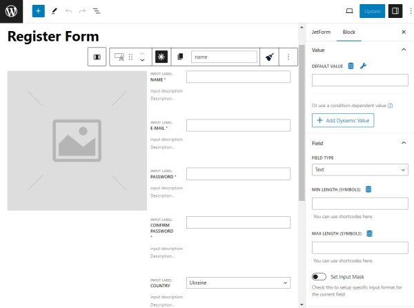
Image block
A Register form should be made as convenient for the user as possible. Customizing a picture is a good starting point.
The Block tab on the right includes the following sections:
- Styles — choose between the “Default” and “Rounded” options to shape the image;
- ALTERNATIVE TEXT — write the description of the image;
- ASPECT RATIO — adjust the image to specific width-to-height ratios;
- WIDTH and HEIGHT — type values manually or set a percentage that will automatically crop the image.
You can also check Advanced settings that include additional customization options.
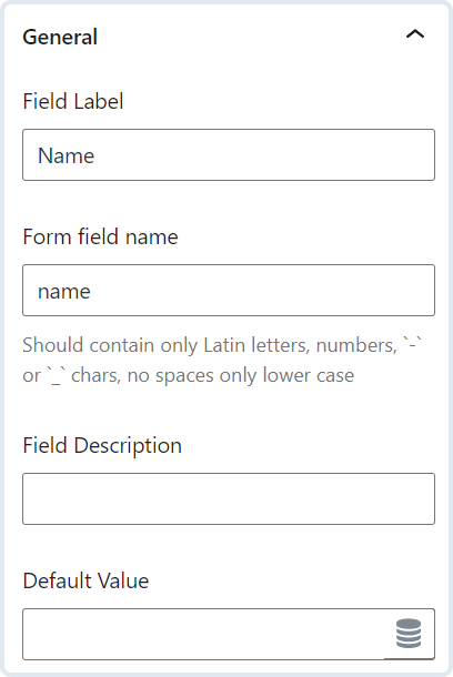
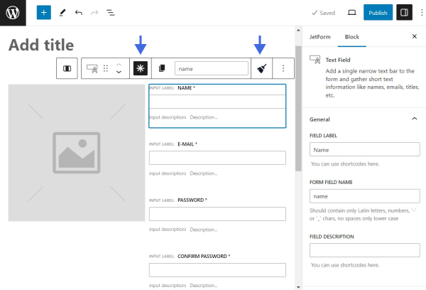
Text field block
WordPress registration form is all about the input data. Therefore, a Text Field is a multi-functional feature. Let’s take a closer look at its settings.
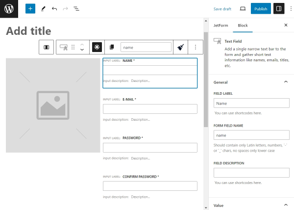
- FIELD LABEL — a name that informs the user about the type of needed information. As an example, it can represent a “Username,” “Password,” or any other data;
- FORM FIELD NAME — a slug name that becomes an ID. It can replicate or correspond to the FIELD LABEL. It should comply with all the requirements, containing only Latin lowercase letters, numbers, hyphens, and underscores. Another rule is to avoid spaces. Use hyphens and underscores to divide words logically;
- FIELD DESCRIPTION — supplemental information that will appear under the field. This description should provide instructions on what users should enter into the field;
- DEFAULT VALUE — can pull out user or post data dynamically. For instance, if the user is logged in, the DEFAULT VALUE feature can fetch the user’s email, name, etc. However, this field is unnecessary when creating a website registration form, as its primary purpose is to register users whose information is unknown at the time;
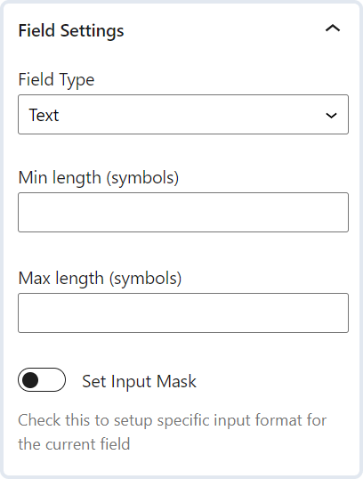
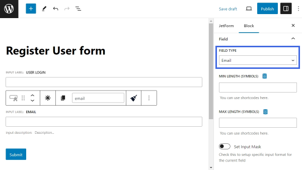
- FIELD TYPE — define the kind of data that should be written in the field. There are five options such as “Text,” “Email,” “Url,” “Tel,” and “Password”;
- MIN LENGTH and MAX LENGTH — specify the number of characters that can be put in the field;
- Set Input Mask — change the default input format into the specific one, pick a MASK TYPE, MASK VISIBILITY, and MASK PLACEHOLDER.
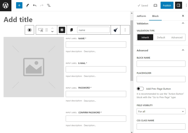
- VALIDATION TYPE — the way in which the user input will be validated. For more information, refer to our Advanced Form Validation article;
- BLOCK NAME — the name of the current block;
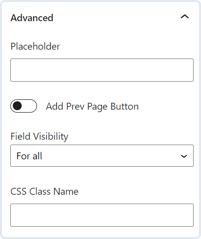
- PLACEHOLDER — a short hint displayed before the user starts typing in the field. It describes the expected input value;
- Add Prev Page Button — enable it if Form Break Field is used. It lets a user return to the previous page;
- FIELD VISIBILITY — choose to make this field visible to all, only to logged-in or not-logged users;
- CSS CLASS NAME — type in a CSS class name to target the field with CSS.
The Block Toolbar above the Text Field provides some additional settings. Among the native block settings, there are two JetFormBuilder-specific features.
- The asterisk-shaped button makes the field required to fill in;
- The “Sanitize Value” button helps to add additional validation. Learn more from our tutorial about “How to Use the Sanitize Data Feature for Text and Textarea Fields.”
Select field block
This block lets the user choose from the diverse drop-down menu options. The selection proposed by this layout is a list of countries, but you can change the options of this block or delete it.
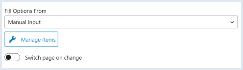
To customize the options of the Select Field, click on the field and press the “Manage items” button.
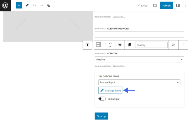
Then, click on the pencil-shaped icons to edit the options or push the “Add new Option” button to add a new option.
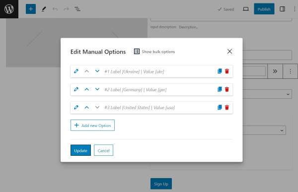
Each option must have a human-readable LABEL and a VALUE. The CALCULATE value represents the calculated value of the current option in a Calculated Field.
Once you finish managing the options, click the “Update” button to close this window.
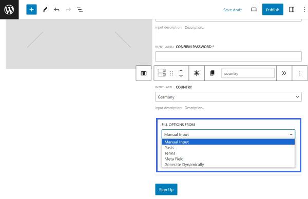
If the options need to be generated dynamically, switch the “Manual Input” type to one of the available options — “Posts,” “Terms,” “Meta Field,” or “Generate Dynamically.” Read more about them in our “Multi-Optional Field Source Settings” guide.
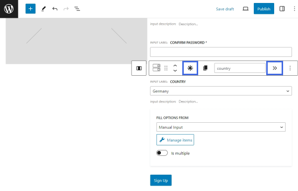
Next, let’s take a look at the Block Toolbar. Among the default block options, there are two JetFormBuilder–specific features:
- An asterisk-shaped button that makes the field required to fill in;
- A button shaped as two arrows, which enables an automatic transition to the next page in the form once an option is selected in the Select Field. This feature is useful in multi-step forms. Read more about multi-step forms in the “WordPress Multi-Step Form with Step Indicator” tutorial.
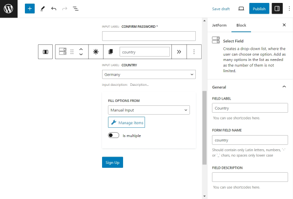
Finally, proceed to edit the block’s settings. They are practically the same as the Text Field settings. You can read about them earlier in this tutorial.
Action Button (formerly Submit field)
Submitting a WordPress form is the final and the most crucial action during the registration. Editing button for this function will take just a couple of minutes.
The settings of the button repeat some of the Text Field block settings. You can return to their description in this tutorial.
After editing all the block settings, you may want to style them accordingly. Gutenberg forms have no styling options, so you may want to use the JetStyleManager plugin to style the Register Form.
JetForm Settings
Apart from the standard block settings, you can edit JetForm settings that apply to the entire WordPress form.
Find them next to the Block settings.
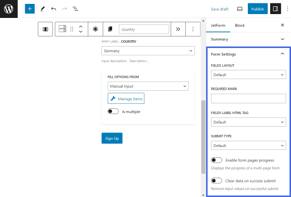
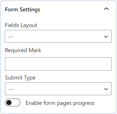
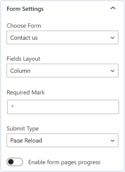
The Form Settings section provides such features:
- FIELDS LAYOUT — pick the positioning of the field bar and the field label. You can set “Column” or “Row” options. In the first case, the label will be displayed over the bar, while in the second one, they will be in the same row;
- REQUIRED MARK — you can either leave this field empty to represent required fields with an asterisk symbol or set another mark;
- FIELDS LABEL HTML TAG — select the HTML tag that will represent the field label. The default tag is LABEL;
- SUBMIT TYPE — specify what action will be carried out after pressing the Action Button (formerly Submit Field). Choose between “Page Reload” and “AJAX,” which will not reload the page;
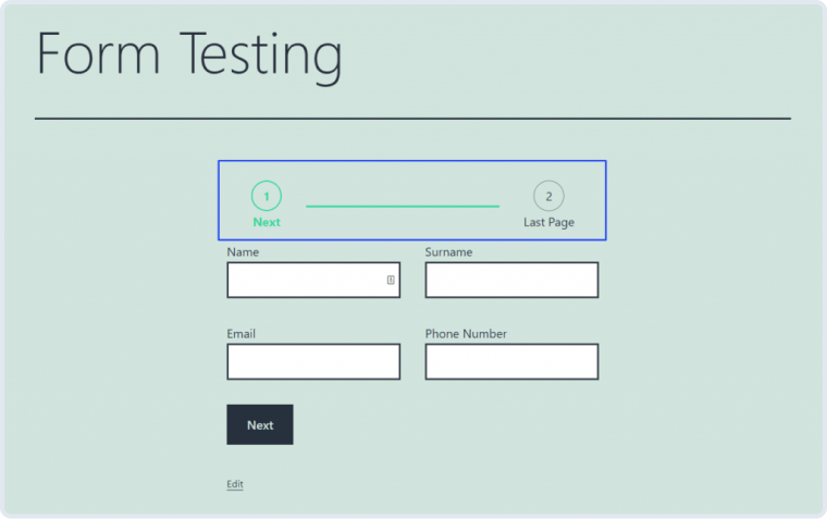
- Enable form pages progress — enable the toggle if you work with the Form Break Field. If the form is divided into parts, the progress bar will be adjusted. This bar will show in which part of the form the user is;
- Clear data on success submit — clear all input values of the form after a successful submission.
Note that most of the settings in the Form Settings section are available in the JetForm widget or block. Later in this tutorial, we will describe how to display a form in Elementor or Block Editor using the JetForm widget or block, the settings of which take precedence. Customizing the Form Settings section is appropriate if the form is to be displayed with a shortcode.
Additionally, you can configure Validation settings by following our “Advanced Form Validation” tutorial. Captcha Settings is also an option for the Register Form creation. Learn more about all the available types of Captcha validation in our article on “Captcha Settings.”
When moving on to Post Submit Actions, ensure you choose the “Register User” option to create the Register Form. You can edit this action by clicking the pencil-shaped button under the drop-down menu. Read more about Register User Submit Action in our tutorial.
You can add more actions. For instance, send an email when the user has been registered. Watch the following Post Submit Actions overview to find out more about other options.
Preset Settings let you choose the source for a global form preset, and General Messages Settings are responsible for different types of notifications. These will be shown in specific cases that can emerge while completing a form.
When you are done with all the form customizations, click the “Publish” button, and feel free to add the Register Form to the page.
You can add a JetForm block in the Gutenberg editor or create an Elementor registration form using the JetForm widget. Also, it is possible to display a form with a shortcode. Learn more about the ways to integrate JetFormBuilder with any page builder in our “Adding the Form Block” article.
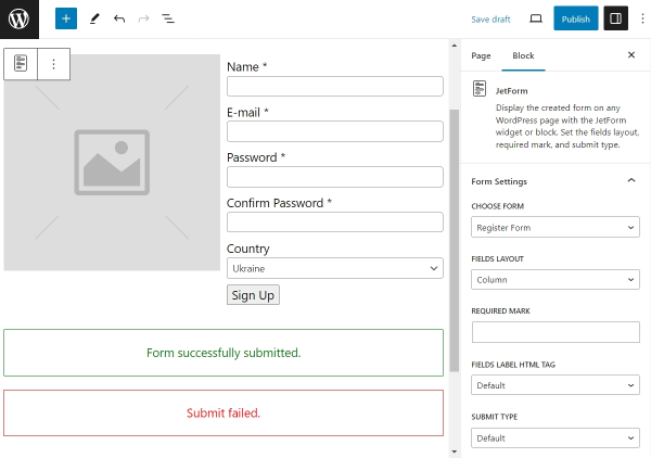
In the JetForm block, choose the form that you have just created and proceed to the following settings. You may notice that these settings replicate the ones described previously; however, the settings of the JetForm block take precedence.
Click the “Publish” button once you are done with editing. Now, the WordPress registration form is ready.
Creating a Registration Form From Scratch
Above, we described how to create a Registration Form using Patterns. You can build your layout with field blocks if you wish to create a fully custom registration form without using ready-made templates.
The first step is adding a new form. Navigate to WordPress Dashboard > JetFormBuilder > Forms > Add New.
The editor already has some default blocks: a Hidden Field, a Text Field, and the Action Button (formerly Submit Field). You can customize them according to your needs or remove them.
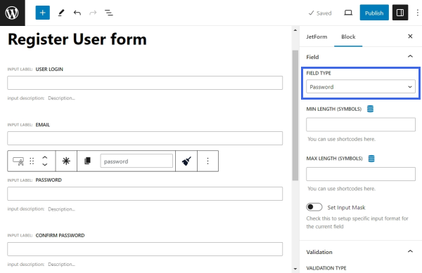
There are four obligatory fields in a typical register form – “User Login,” “Email,” “Password,” and “Confirm Password.” These are required fields for the “Register User” post-submit action. Let’s start building the form by adding them.
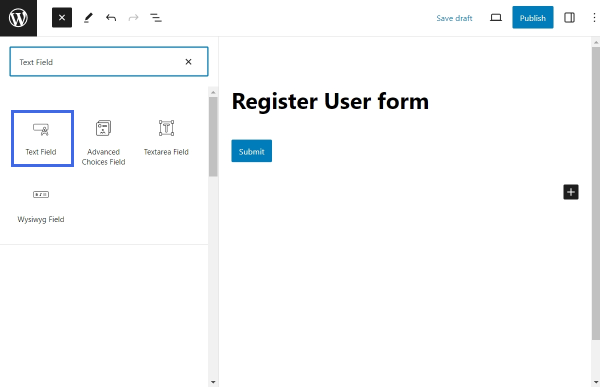
First, add a Text Field block (or use the existing one). To add a new block, open the Block Inserter by clicking the plus-shaped icon and search for the “Text Field.”
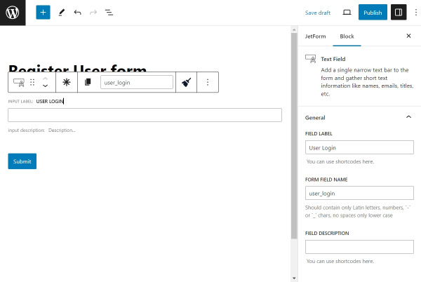
Once the needed field is added, proceed to the Block settings in the right sidebar. Add a FIELD LABEL to this block and a FORM FIELD NAME. The name of the field should comply with all the requirements, containing only Latin lowercase letters, numbers, hyphens, and underscores. Other block settings are optional. Find a detailed description of each option in the Text Field guide.
Then, add another Text Field block for the email address. Assign this block a FIELD LABEL and a FORM FIELD NAME and scroll down to the Field section. For the FIELD TYPE, choose “Email” to add validation for this input type. The rest of the settings are optional.
After that, add two more Text field blocks. Give the first block a label of “Password” and the second block a label of “Confirm Password”. Select “Password” as the Field type to ensure security.
Finally, add the Action Button block that will allow the user to submit the form. Assign it a custom label.
Now, all the required fields are complete. You can continue adding different field types to the form if you need the user to provide additional information. For example, you could add a Media Field, a Radio Field, a Checkbox Field, or a Select Field to your form. Learn more about the multi-optional fields from our Multi-Optional Field Source Settings tutorial.
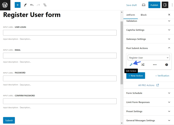
After building the form layout, proceed to the JetForm settings tab in the right sidebar and find the Post Submit Actions tab. Press the “New Action” button to add a “Register User” action. This action will be responsible for registering the user after successful form submission.
You can edit it by clicking the pencil-shaped button. Read more about configuring the Register User action in our tutorial.
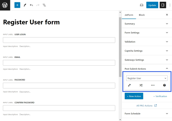
n addition to registering the user, you may want the form to perform other actions. Click the “New Action” button to see the list of all available actions. For example, you can send an email to the registered user with the “Send Email” action.
Mind that all the actions are processed in the defined order. Therefore, each subsequent action is performed only under the condition that the previous action was processed successfully. If one of the actions returns an error, all the subsequent ones are canceled. In this way, the guest user will receive an email right after registration. The email will not be sent if something goes wrong during the registration process.
In the end, style the form. Gutenberg blocks have no styling options by default, but you can use our JetStyleManager plugin to style the registration form.
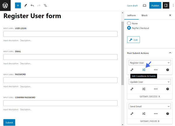
Adding a Payment Gateway to the Register Form
In case you build a website with paid memberships, adding a payment option to the registration process is a must. All the currently supported gateway options by JetFormBuilder forms are covered in our guide on “How to Configure Payment Gateways.” A gateway is triggered once the user submits the form.
After you have enabled and configured the payment gateway, you need to decide how the rest of the post-submit actions will be processed with regard to the payment status. For instance, you may want the registration process to run only after a successful payment; at the same time, you may need a custom email to be sent in case of a failed payment.
All of this is handled by Events. By adding events to the post-submit actions, you configure the scenario that will be performed before payment is processed on successful and failed payments.
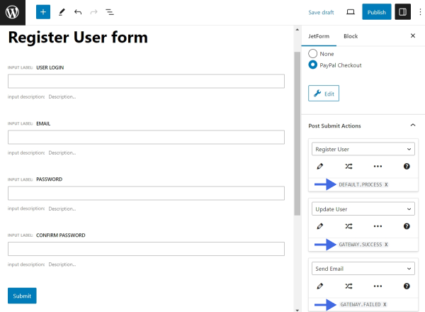
To add an Event to your post-submit action, click the “Edit Conditions & Events” button.
In the popup, proceed to the Events match tab. Select one or several events from the drop-down menu:
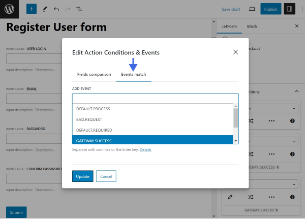
- DEFAULT.PROCESS — this is the moment when actions are processed. The current event will trigger the post-submit action before the payment gateway;
- BAD.REQUEST — this event is executed after request processing in case some of the fields in the form return errors. For example, the action will be triggered if the user uploads a file to the Media Field in the wrong format or if the user exceeds the allowed number of files to upload. This event bypasses the DEFAULT.PROCESS event;
- DEFAULT.REQUIRED — this event is executed in any case. It is the last triggered event before the form response is submitted. The event runs even in case other post-submit actions are not processed successfully;
- GATEWAY.SUCCESS — this one is executed after the user passes the checkout on the side of the payment system; if a payment is successful, the action will be triggered;
- GATEWAY.FAILED — this is performed when the user returns from the checkout page of the payment system without making a payment.
It may be expected that a user should be registered on the site only after a successful payment. However, if the GATEWAY.SUCCESS event is given to the “Register User” action, the action won’t be executed successfully. Inputs entered by the user into the password fields are not stored by JetFormBuilder for security reasons. Therefore, deferring actions that require password inputs, such as the “Register User” action, are not possible until the payment is completed. However, there are two possible workarounds for this case.
Promoting the user after successful payment
To make the users register only after successful payment, the registration process should be split into two parts. Before payment is complete, the guest user will be registered as a Subscriber (or any other role with limited capabilities); after the payment is complete, the user will be promoted to a higher user role. To implement this kind of workaround, follow the steps below.
Firstly, create a custom user role with limited access for users who haven’t finished the payment process. The permissions you grant to this user role depend on your business strategy. Alternatively, you can use the default WordPress Subscriber user role.
After you decide on the user role that will be suitable for your business model, edit the “Register User” action by clicking on the pencil-shaped button underneath.
Select the USER ROLE option for the newly registered user to your custom role or “Subscriber.”
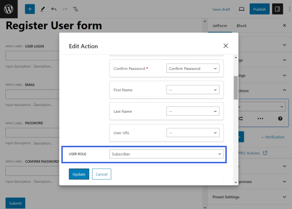
In the same editing screen, scroll down until you find the Log In User after Register and Add User ID to form data toggles. Enable these toggles to be able to use the ID of the newly created user in further post-submit actions.
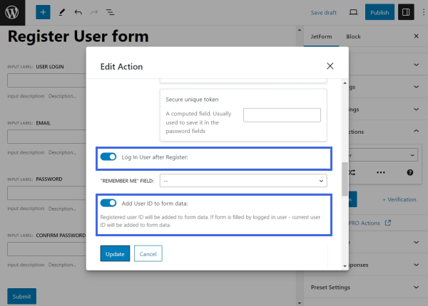
Click the “Update” button to save the changes.
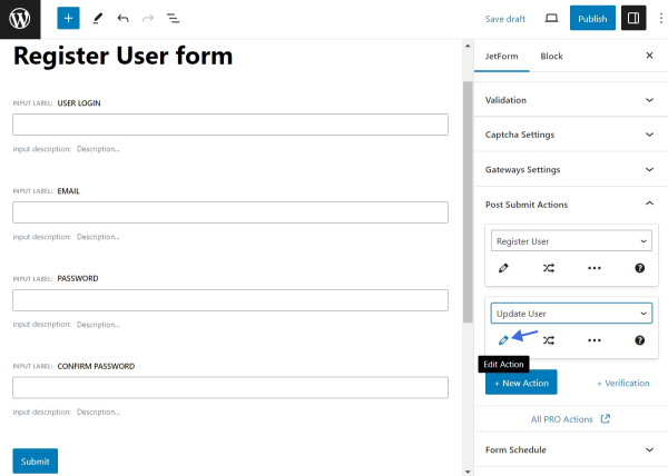
After that, hit the “New Action” button and select a further action — “Update User.” This action will run after the successful payment. Click the pencil-shaped button under the “Update User” action to edit the post-submit action.
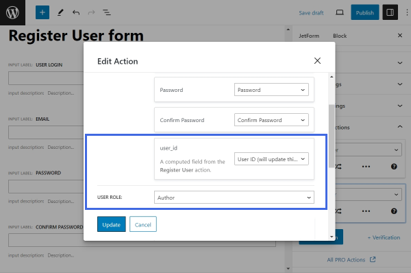
In the FIELDS MAP section, map the user_id field with the “User ID (will update this user)” action. This way, the action will update the user role of the newly registered user. Then, define the user role the customer should receive after the payment.
After saving the changes, the last step is to assign the “Register User” action the DEFAULT.PROCESS event, and the “Update User” action — the GATEWAY.SUCCESS event.
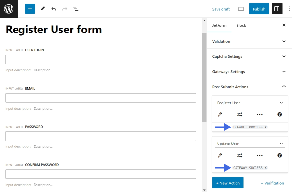
As a result, the form will function by this workflow: after submitting the form, the user is registered as a lower-ranked user with limited access. Then, the user goes through the payment process, after which the user is promoted to a higher user role, and the registration is complete.
Generating the password automatically
Another possible way to integrate the “Register User” action with a payment gateway is to generate the user password automatically after successful payment. In this case, users won’t have to set a password manually during the registration — the password will be autogenerated for them. That password will be sent to users in an email after they complete the payment and register successfully. Later, they will be able to change it from their account.
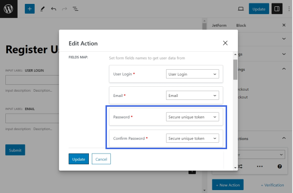
Start by removing the Text Field blocks with the “Password” FIELD TYPE because the password will not be defined by the user.
Then, click the pencil-shaped button under the “Register User” action.
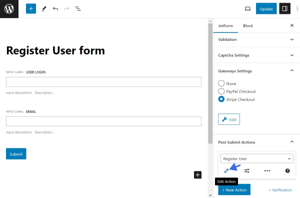
In the editing screen, map the Password and Confirm Password fields with the “Secure unique token” option. It will serve as an auto-generated password.
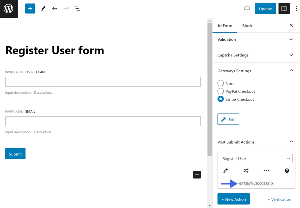
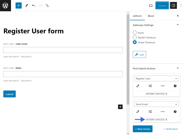
Save the changes. Since the “Register User” action should only be performed after successful payment, assign it the GATEWAY.SUCCESS event.
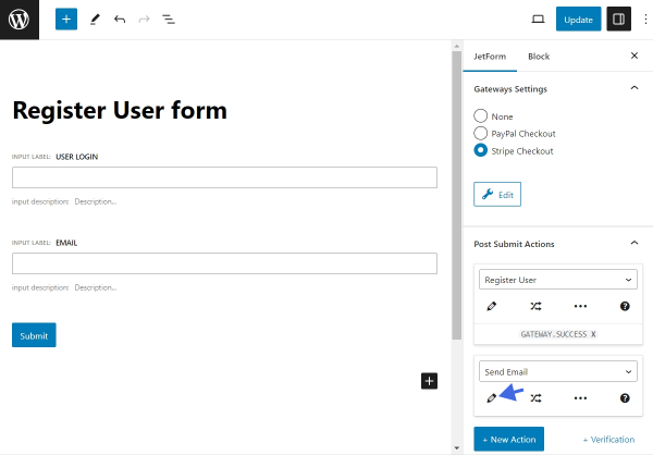
The last step is to send the registered user an email with the generated password. Next, hit the “New Action” button and select a further action – “Send Email.” Click the pencil-shaped button under the “Send Email” action to modify its settings.
For the MAIL TO field, choose the “Email from submitted form field” option; for the FROM FIELD, select your Email field; then, fill in the rest of the required fields according to the “Send Email” action guide.
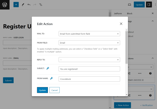
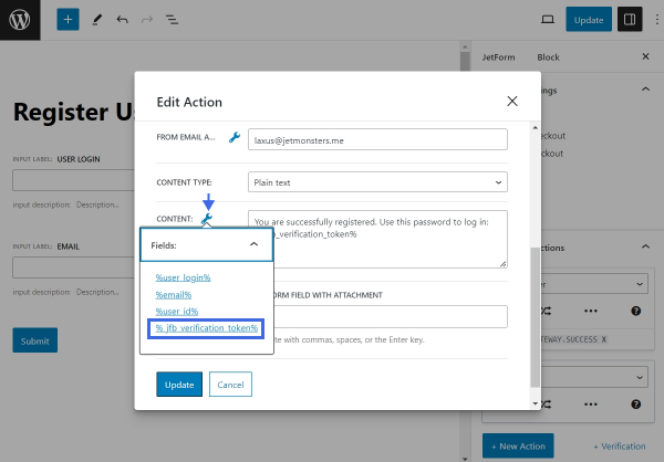
In the Content field area, enter a message that the user will receive after a successful registration. Don’t forget to include the generated password with the help of the %_jfb_verification_token% macro. To find the full list of available macros, click on the wrench-shaped icon near the Content input field.
Update the action settings. To finish the setup, assign the “Send Email” action a GATEWAY.SUCCESS event.
That’s it. Update the form to save the changes.