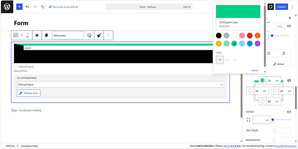
Learn what color settings can be customized for different block field parts (background, borders, text).

There are different color features throughout the Styles settings that differ according to the field part they are meant for, such as Background, Text, or Button Color. However, they look the same and have the same settings.

Color Model Available

Currently, the following color models are available:

  • Hexadecimal – this is the format suitable for HTML. It codes the color in six alphanumeric symbols;
  • RGB – the color is set as a ratio between red, green, and blue colors;
  • HSL – the color is coded as a ratio between hue, saturation, and luminosity.

Default Colors

This feature offers a set of default colors. Those colors will depend on the website template you are using and can change if you install a new skin. Colors can be customized by moving to the WordPress Dashboard > Appearance > Customize path. 

Here, the list of available default colors will be presented in the Color Scheme tab. To change the needed color, the “Select Color” button near the corresponding color should be pressed.
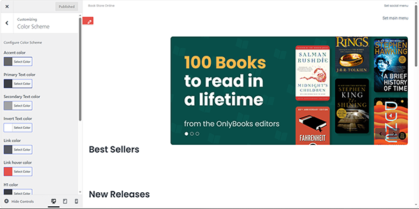
setting the default colors

Also, the background color can be set in the WordPress Dashboard > Appearance> Customize > Colors tab.
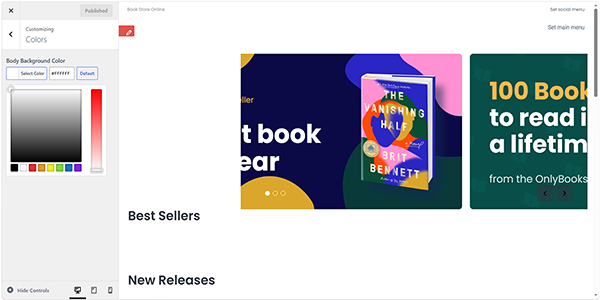
setting the default background color

The needed color can be manually picked, or its code can be inserted via the bar. 

NOTE

Individual settings of form fields have a higher priority than more general ones. This means that if the settings chosen for the whole form differ from the ones set for a Text Field, the Text Field setting will be prioritized.

Text and Background Colors

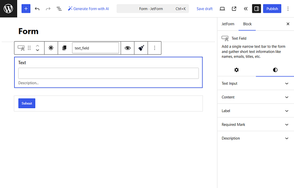
The text and background colors can be set for blocks. The Style settings of the block can be reached by clicking on the “Block Style” button. It is available when clicking on the separate field while creating the form.
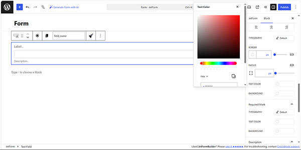
setting the text color

Button Colors

For the elements that can change color on hover, like the “Next Page” buttons, there can be additional tabs in this feature. For example, there can be a Hover tab that allows choosing how the color of the part will change when the user places the pointer over it.
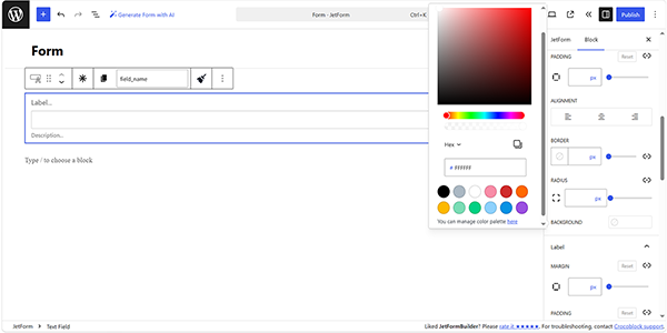
setting the hover color

FAQ

Can I customize button colors?

Yes. Button elements can have their colors customized through the available style settings.

Will changing a default color affect existing fields?

It can affect elements that use the corresponding default color. However, a specific color configured directly for an individual field has higher priority than a general or default color.

How can I restore a field to the default color?

Remove or reset the individually configured color so that the field can inherit the applicable general or default color setting.

Can text and background colors be configured independently?

Yes. Text and background colors are separate settings, allowing you to create different combinations for the content and its background.

Can I customize both normal and hover colors for a button?

Yes, provided the button supports hover styling. You can configure the regular button color and use the Hover tab to specify a different color for the hover state.

That’s it. Now you know what color settings can be customized for different block field parts (background, borders, or text) using the JetFormBuilder plugin for WordPress.
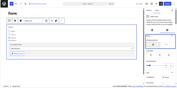
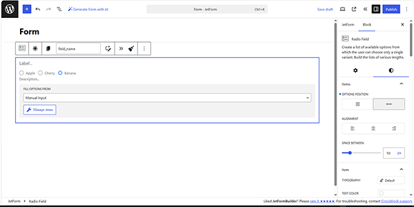
This setting refers to the Radio Field and Checkbox Field and defines the position in which the options will be placed in a line or in a column. 

To set the needed position, move to the Styles block’s settings in the Items section. Here, set the needed position of the filters by pressing the needed OPTIONS POSITION buttons.

The left button, which refers to the column position, is set by default.

the default options position settings

In turn, the right button defines the inline position of the filters. 

the inline options position settings

FAQ

Does changing Options Position change the field values?

No. This setting only changes the visual arrangement of the options and does not change their values or labels.

Does changing the filter position affect site performance?

No, it does not.

Can different Radio or Checkbox Fields have different option positions?

Yes. You can configure the position independently for each field according to the desired form layout.

That’s it. Now you know how to place the Radio and Checkbox Field options inline or in a column using the JetFormBuilder plugin for WordPress.
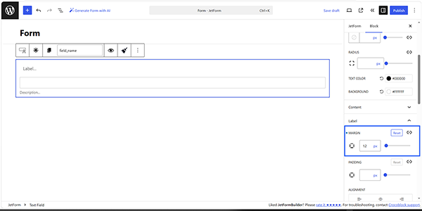
The Margin feature designs a space between the border of the block box and the surrounding elements and allows setting the total or specific widths. 

The settings to customize the Margin can be found in the Styles block’s settings. The settings differ for the blocks; for example, for the Text Field, the MARGIN setting refers to the Content, Label, and Description sections.

The Margin width can be set by moving the MARGIN slider or inserting the corresponding value in pixels (instead of the default value of zero pixels).

the margin settings of the text field label

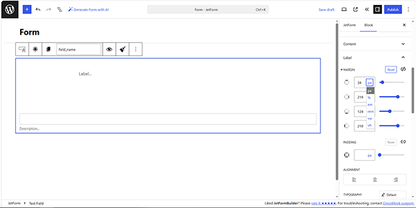
The margin width can be set either for the whole part or separately for each of its sides. To separate the values, the “Unlink Sides” button (a “break link” icon) should be pressed. In this case, bars for each side will appear. 

The first cell is for the top side, the second is for the right side, the third is for the down side, and the fourth is for the left side. The little “square” icon in the left corner shows what side options are set now. To undo all the changes, the “Reset” button should be pressed.

In addition, the width of the margin is set in pixels. Also, other units such as %, em, rem, and others are available.

the individual margin settings of the text field label

FAQ

What’s the difference between the border and margin?

The Margin refers to empty space outside an element’s border to separate it from other blocks, while a border is the visible outline surrounding that element.

Does Margin affect the field’s background color?

No. The background color applies to the field’s box, while margin creates space between that box and surrounding elements.

Can I use different units for the margin widths?

Yes. This width can be specified in pixels (px) as well as other supported units. 

Does changing the margin affect site performance?

No, it does not.

That’s it. Now you know how to customize the Margin of blocks using the JetFormBuilder plugin for WordPress.
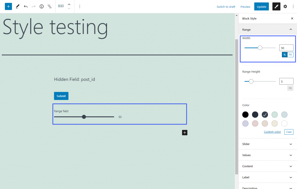
This is a unique styling feature of the Range Field. You can find it in the Range section of the Block Style settings tab. It helps you to set the width of the range. You can use pixels (PX) as the unit of measurement or choose to set the width as the percentage of the total column width. By default, it is set to 100%, so the range occupies the full width of the column to which you have put it.

setting width for the range field

All the settings that are connected to the appearance of the text are gathered here. All elements with text can be customized separately. For example, you can set the look of the label and the description of the field differently. Let’s take a closer look at all of the features that can be placed in the Typography section.

Size

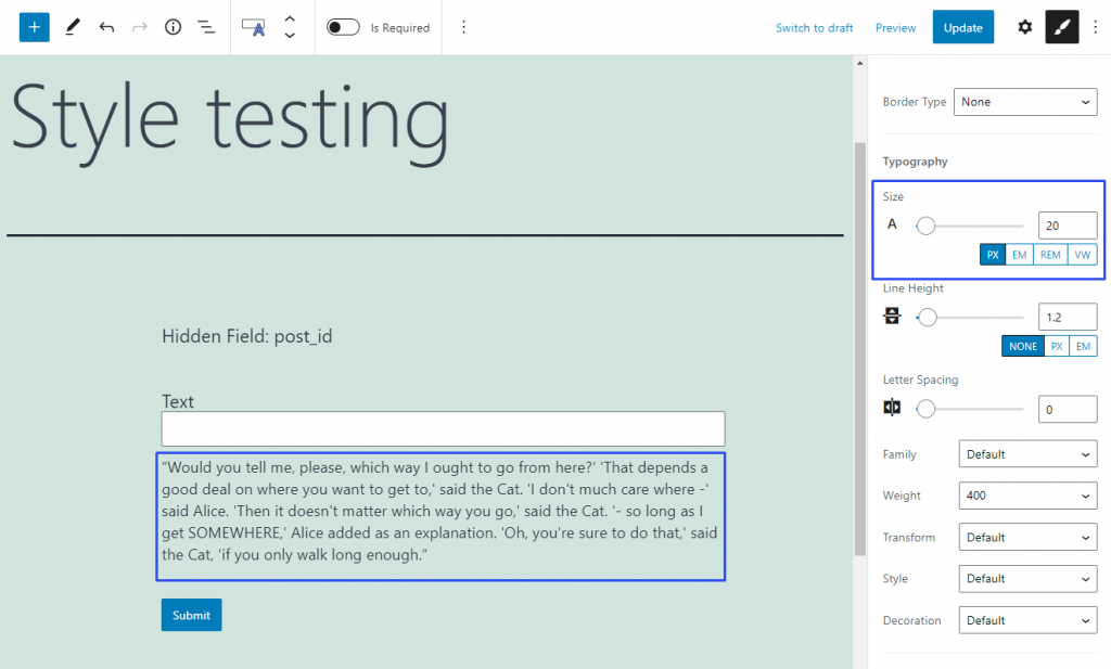
This feature defines the size of the letters. By default, it is set to 14 pixels but you can change it by moving the slider manually or typing the needed size into the bar.

The default units of measurement are pixels (PX) but you can change them to one of three others:

EM – this is the unit that allows you to set the size of the font relatively to the size of some parent element. The parent element can be defined in the CSS code;

REM – this unit sets the size of the font relatively to the size you set in the HTML code;VW – a very flexible unit of measurement. It sets the size of the text relative to the height of the browser window, so it always has the same proportions.

Line Height

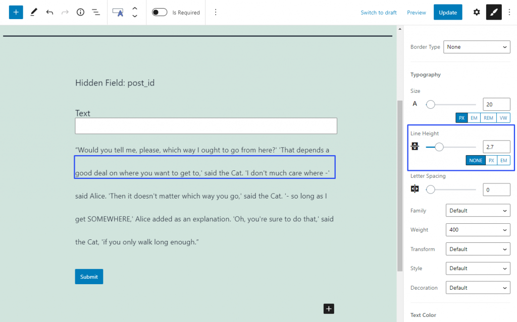
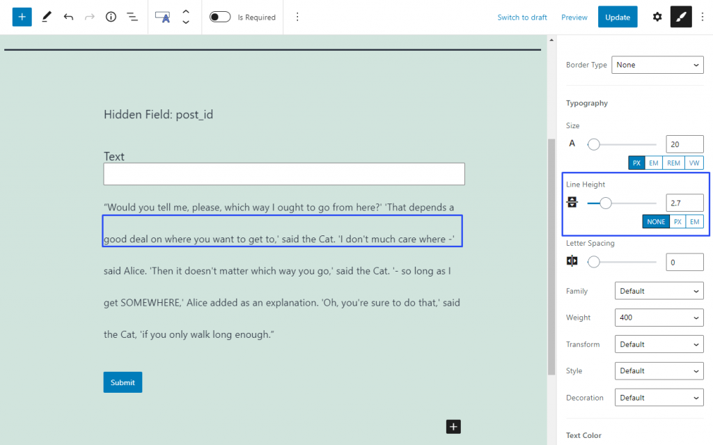
The height of the text line can be changed without changing the size of the letters. When you make it bigger, the space between the lines increases. By default, it is set to 1.2 and you can change it by dragging the slider or typing in the value.

setting line height

NONE measurement unit defines the height of the line according to the height of the text. So, when you set it to 2, it means that the line generally will be twice the height of the text. You can change the measurement unit to pixels (PX) or the unit that depends on the size of some parent element set in CSS code (EM).

Letter Spacing

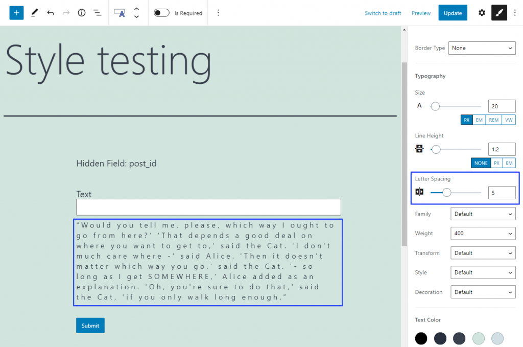
It is clear from the title that this feature allows you to set the space between the letters of the text. By default, it is set to 0, which means that the spacing is normal for the chosen font. When you change that value, either manually or by typing in the number, the normal spacing is multiplied by it. So, when you set the Letter Spacing to 5, it means that space will be five times bigger than normal.

defining spacing between the letters

Family

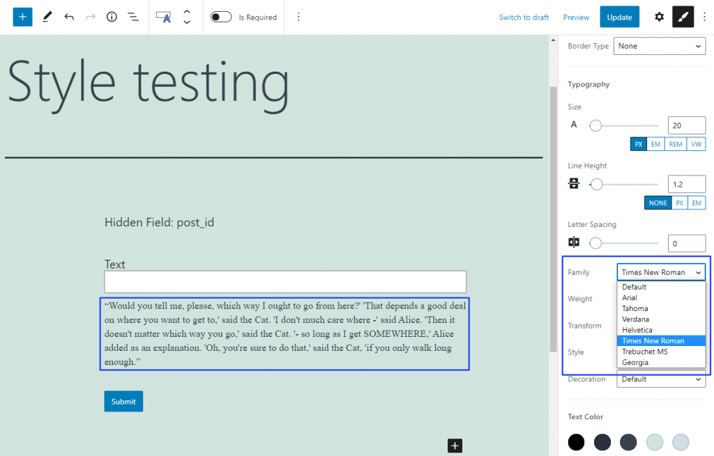
In this drop-down menu, you can choose the font family for your text. The “Default” option means that the text will have a font that is defined by the website template. There are seven additional fonts that are the most popular among the users. The number and type of fonts are set in the JetStyleManager settings and can be changed via coding only.

choosing typography family

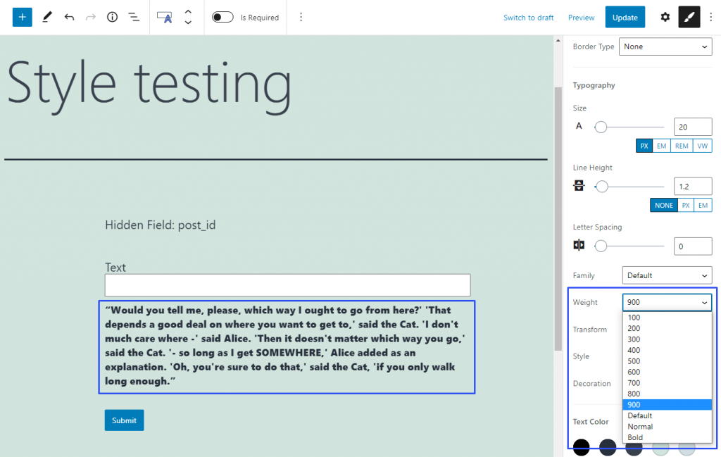
Weight

Here you can choose the boldness of the text. In the drop-down menu, you can select the values from 100 to 900 and also one of the pre-sets:

  • Default – set the weight that is defined by the website template for this part of the page;
  • Normal – the weight of the text will match the “normal” weight of the chosen font;
  • Bold – the weight will match the “bold” style of the chosen font.
defining typography weight

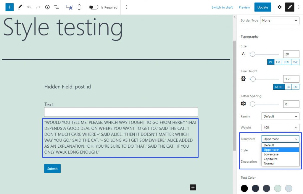
Transform

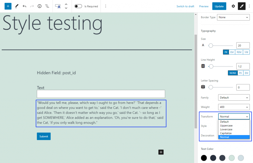
This feature helps you define the case of the text’s letters. Default is the way the text looks after you type it in. 

The Uppercase option makes all letters capitalized.

setting uppercase typography

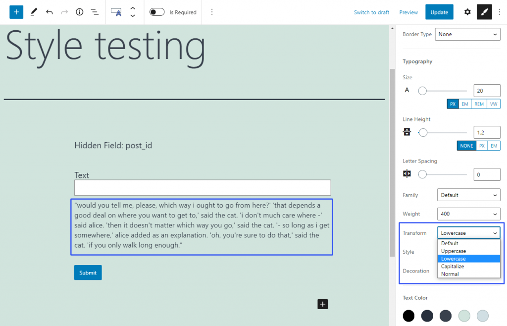
The Lowercase variant makes all the letters small.

setting lowercase typography

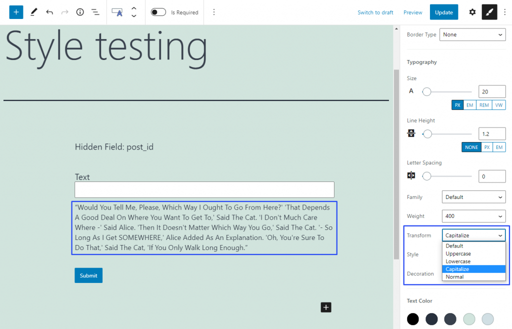
If you choose the Capitalize option, it will capitalize every first letter of every word.

setting capitalization for typography

And the Normal option will capitalize only the first letter in every sentence.

applying normal option for typography

Style

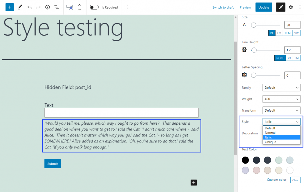
As you can choose the boldness of the letters in the Weight feature, here you can select the tilt. The Default option leaves the text as it was inserted. The Normal option makes the text straight. The Italic and Oblique options make the text slanted. If you have no idea about the difference between those two styles, read this article.

defining typography style

Decoration

In this drop-down menu, you can add some decorative elements that are not crucial for the appearance but could make the text more understandable. The Default option leaves the text you inserted untouched.

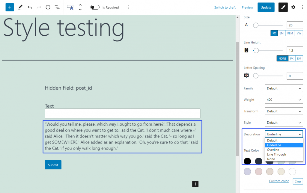
The Underline option will add the line under the text lines.

underline option for the text

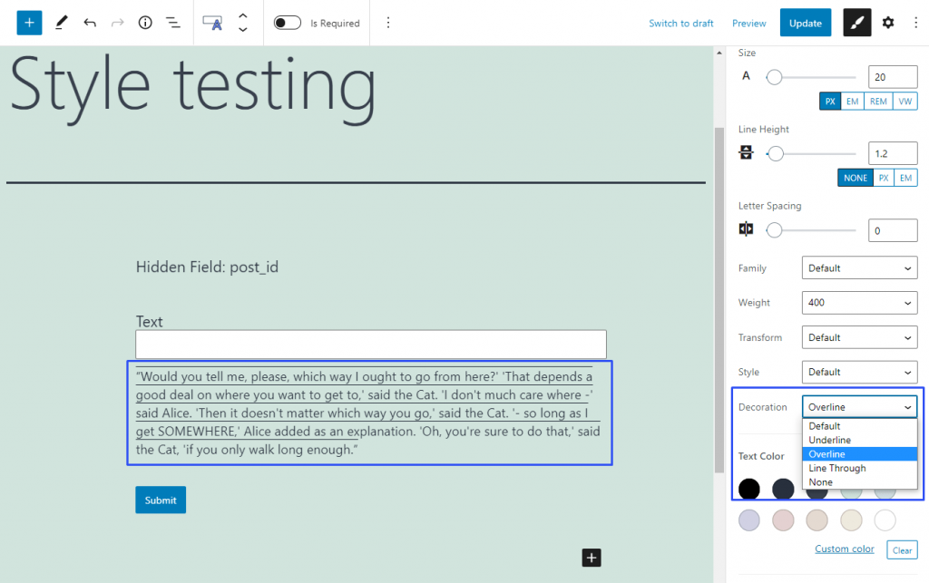
The Overline option will put the line over the text rows.

 overline option for the text

The Line Through option will create a line that goes over the text, crossing it out.

line through option for the text

And the None option will remove all lines from the text, even if there were some in the default text.

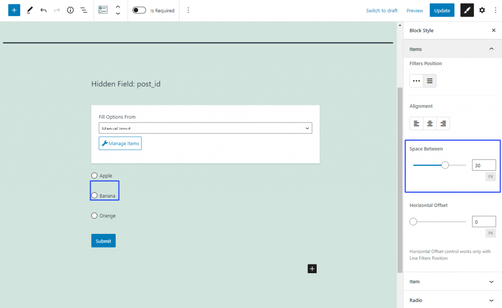
This is the feature of Radio and Checkboxes Fields, so it can be found only in the Items style settings section. With its help, you can set the space between the options. Be aware that it doesn’t change the distance between the options and the edge of the field, the Margin or Padding features can help you with that. By default, this feature is set to 10 pixels but you can freely change that value by moving the slider or typing the needed number into the bar.

changing the space between the radio buttons

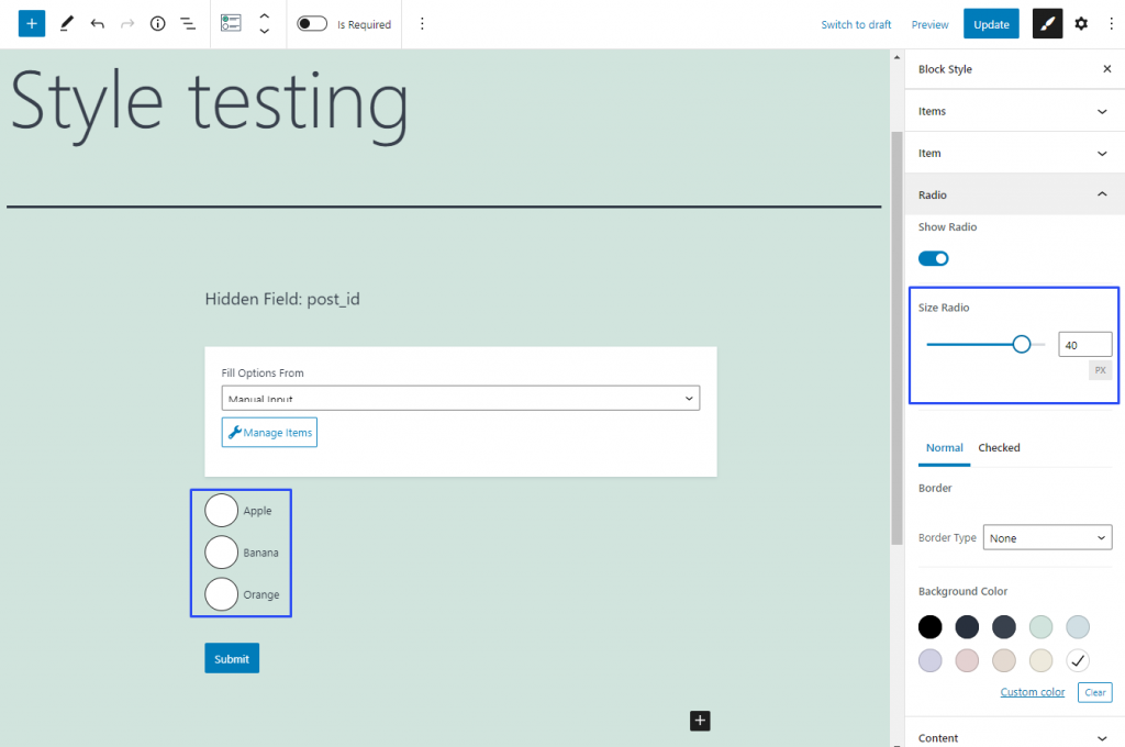
You will come across this feature in the style settings of the Checkbox/Radio Field only. It allows you to change the size of the radio buttons. By default, it is set to 0, which means that the size will be defined by the general design settings of the website’s template. However, you can choose the radius of the radio buttons or checkboxes in pixels by dragging the slider or typing in the numbers.

defining the size of the radio buttons

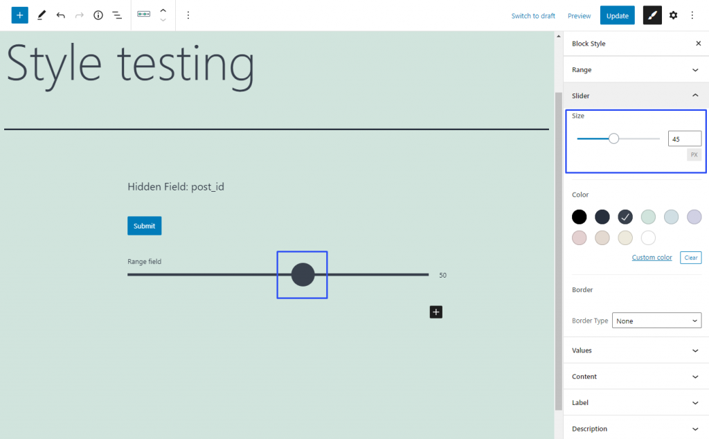
With the help of this feature, you will be able to change the size of the Range Field’s slider. It is a feature that can be found in the Slider section of the Range Field Block Style settings tab only. By default, it has the value of 18 pixels but you can play with the numbers until it fits your taste and needs.

setting range field slider size

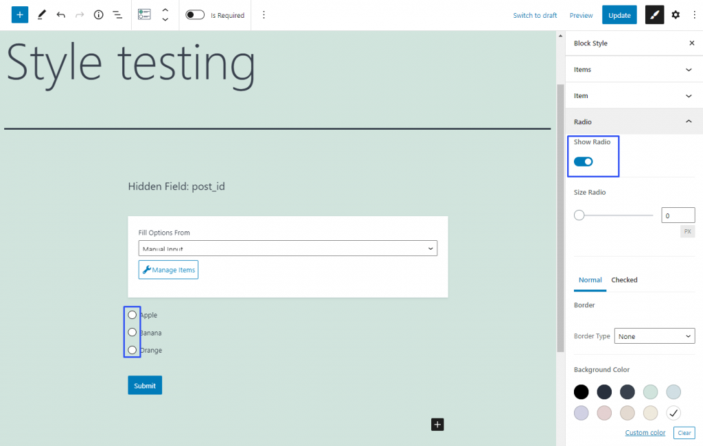
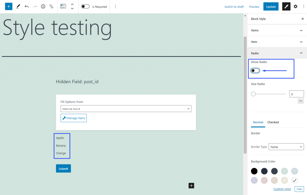
This styling feature is unique for the Radio/Checkbox Field and can be found only in the Radio/Checkbox Block Style settings section of that field. By default, that toggle is enabled but if you turn it off, the radio buttons will hide. 

Here’s how it looks like with the Show Radio/Checkbox toggle turned on:

show radio/checkbox toggle turned on

And now let’s turn it off:

show radio/checkbox toggle turned off

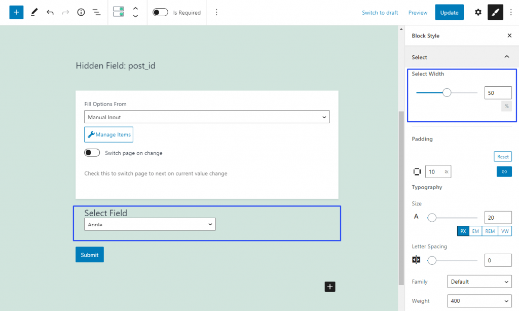
This is a unique styling feature of Select Field, so you will meet it in its Select settings section only. It defines the width of the select field as a percentage of the general form’s width or width of the column you placed it in.

By default, it is set to 50% but in fact, it will occupy the full width of the form or column. To set the select width to 50%, you will have to move the slider manually or type the needed value into the bar.

width set to 50 in the select field

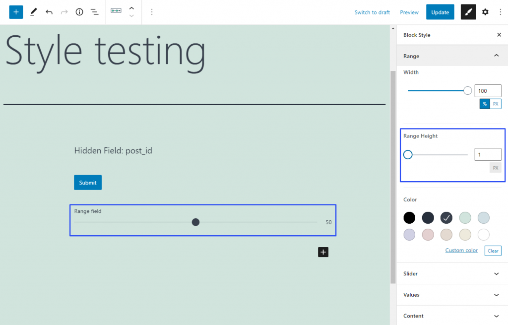
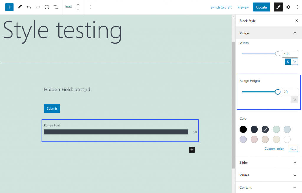
This styling feature allows you to set the height of the Range Field’s range. That’s why you can meet it only in the Range section of that field’s Block Style tab. The height is defined in pixels and set to 5 by default. However, you can type into the bar the number from 1 to 20 or choose the value by moving the slider.

Here’s how the range looks like when the height is set to 1:

setting minimal range

And now let’s change it to 20:

setting bigger range

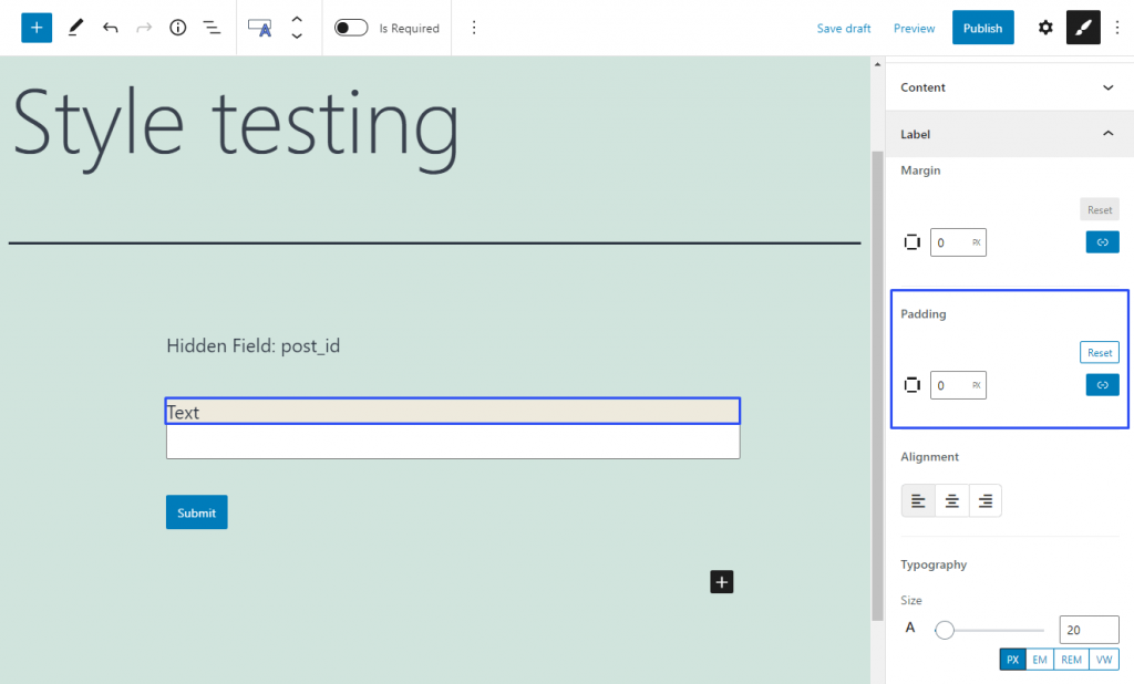
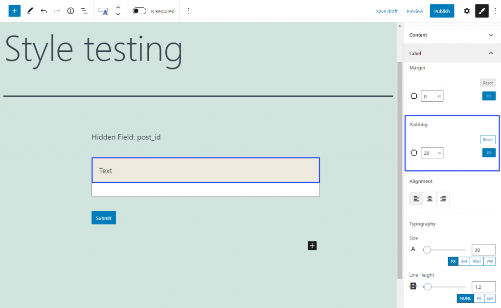
Every element, be it the whole field or its parts, such as label or description, is placed in a box. That box becomes visible when you change the Background Color of the element. The Padding is a space between the edge of the box and the element it contains.

This is how the Text Field label looks like when its Padding is 0:

zero padding

And now pay attention to how it looks like when the Padding is 20:

setting bigger padding

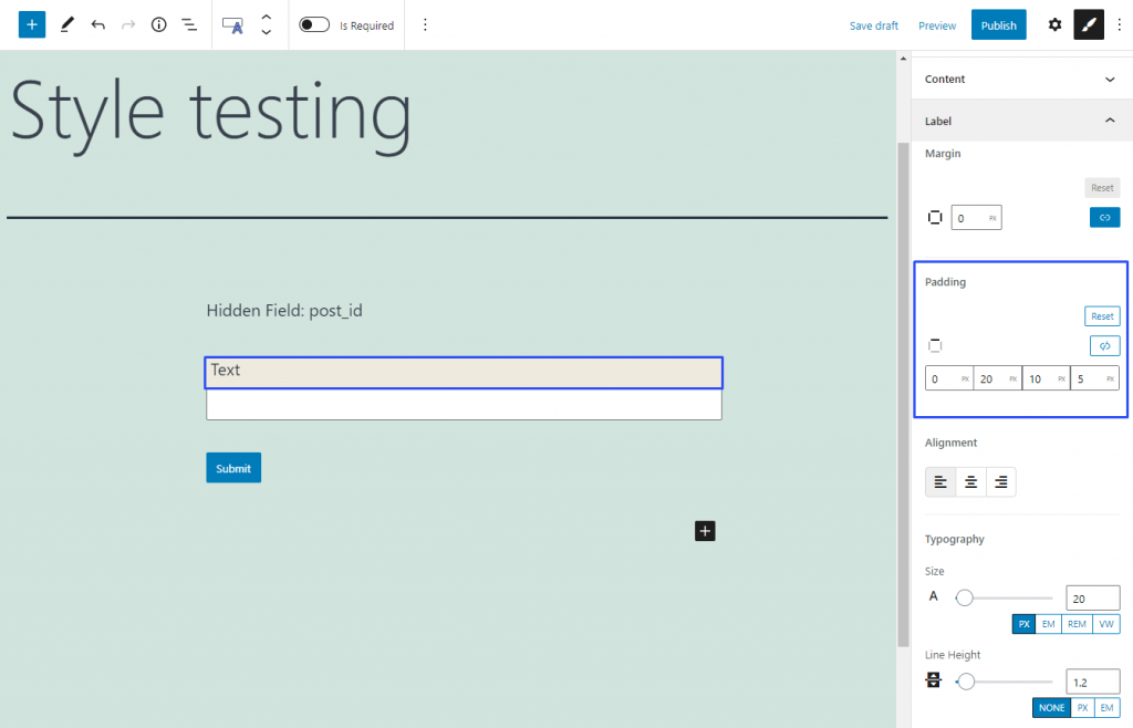
The measurement unit for Padding is the pixel. By default, all the sides of the padding are linked, and you can change all of them at once by typing the value into the bar. However, you can also set different values for different sides. Click on the little blue button with a chain-like icon on it. The four bars you will see are related to the top, left, bottom, and right sides of the padding.

reset button to get zero padding

To link the sides again, just click the same button. You can also reset the values to zero by clicking the “Reset” button.

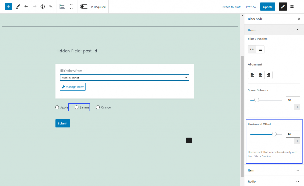
You will stumble upon this feature in the Items settings section of Checkboxes and Radio Fields. Moreover, it works only if you choose the “Line” option in the Filters Position block. It defines the space between the radio button or checkbox and the previous option. By default, it is set to 0 but you can change that value by dragging the slider or typing the needed value in pixels.

defining horizontal offset within the range

Learn how to define the height of the Textarea Field and the Group Break Field.

This setting defines the height of the Textarea Field and the Group Break Field.

In the case of the Textarea Field, the height of the text area can be set by moving the HEIGHT slider or inserting the corresponding value in pixels (instead of the default value of 100 pixels) in the Textarea section of the Styles settings of the block.

setting the textarea height

In the case of the Group Break Field, it is the height of the line that divides groups. It can be set by moving the HEIGHT slider or inserting the corresponding value in pixels (instead of the default value of one pixel) in the Group Break section of the style settings of the block.

setting the group break height

The height can be set either for the whole part or separately for each of its sides. To separate the values, the “Unlink Sides” button (a little blue button with the chain-shaped icon) should be pressed. In this case, bars for each side will appear.

The first cell is for the top side, the second is for the right side, the third is for the down side, and the fourth is for the left side. The little square-shaped icon in the left corner shows what side options are set now. To undo all the changes, the “Reset” button should be pressed.

FAQ

Can I enter the Textarea height manually?

Yes. Instead of using the Height slider, you can enter the required height value in pixels. 

How does increasing the Textarea height affect the field?

Increasing the height provides more vertical space for the textarea, making it easier for users to view and enter longer content. 

Does changing the height setting affect site performance?

No, it does not.

Does changing the Textarea height change the amount of text a user can enter?

No. The Height setting changes the visual size of the textarea. It does not by itself determine the maximum amount of text that can be entered. 

That’s it. Now you know how to define the height of the Textarea Field and the Group Break Field using the JetFormBuilder plugin for WordPress.
Learn how to define the distances before and after the blocks using the Group Break Field of the JetFormBuilder plugin for WordPress.
These two settings are intended to set the width of the space before the Group Break Field line and after it. This setting is also used for the form block rows.

The corresponding values can be set by moving the GAP BEFORE and/or GAP AFTER sliders or inserting the values in pixels (instead of the default value of one pixel) in the Group Break section of the Styles settings of the block.

The GAP BEFORE and/or GAP AFTER field can have the same or different values.

setting the group break gaps
>

FAQ

What are the default Gap Before and Gap After values?

The default value for both settings is one pixel. 

Do changing the gap settings affect site performance?

No, it does not affect site performance.

Can I set the same value for both gaps?

Yes. Enter the same value for Gap Before and Gap After to create equal spacing around the Group Break Field

That’s it. Now you know how to define the distances before and after the blocks using the Group Break Field of the JetFormBuilder plugin for WordPress.
Learn how to customize the border settings (e.g., width, colors, or styles) around the block and its specific parts.

The Border feature defines the visible line framing the block’s part and allows setting the border of the specified type, width, and color around the block and its specific parts. For each part of the field, the border can be set independently.  

The following settings of the Border feature can be set: border width, border color, and border style. The BORDER settings are presented by the controls; each of them has no specific name (except the Border color and style picker). Therefore, in this tutorial, we use their functionality as descriptions.

  • Border width 一 a text field that defines the width of a specific border or the width of all borders as a whole. By default, it can be set in pixels for the whole border.
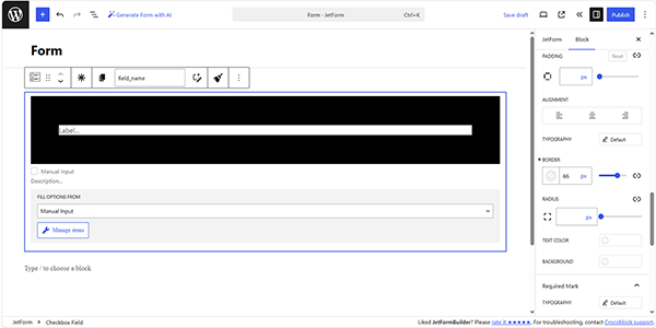
setting the border width

The width of the BORDER can be set either for the whole BORDER or separately for each of its sides. By default, the whole BORDER value is set.

To separate the values for each side, the “Unlink Sides” button (a blue button with the chain-shaped icon) should be pressed. In this case, the BORDER bars for each side will appear. 

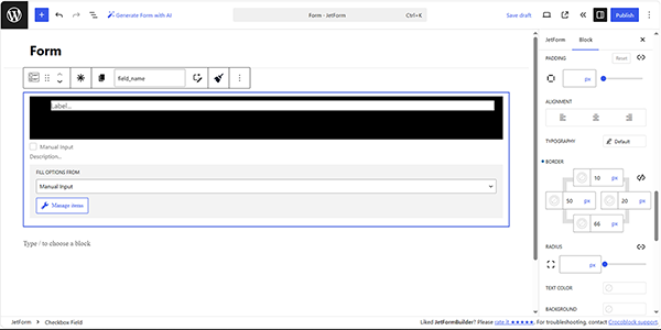
The first cell is for the top side, the second is for the right side, the third is for the down side, and the fourth is for the left side. The little square-shaped icon in the left corner shows what side options are set now. 

To undo all the changes, the “Reset” button should be pressed.

setting the width of all borders separately

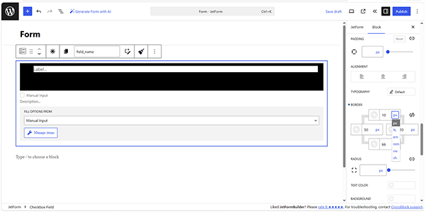
By default, the width of the border is set in pixels. Also, other units such as %, em, rem, vw, and vh are available.

setting the border width units
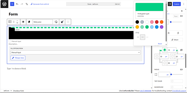
  • Border color and style picker 一 a picker that allows selection of the color of the BORDER and its STYLE. The Color guide should be checked for more details.
setting the border color

Setting the border type, e.g., “Solid,” “Dashed,” or “Dotted”, can be performed by pressing the corresponding button on the Border color and style picker panel.

setting the border style
  • RADIUS 一controls that allow making the angles of the border curvy. In the bar, the radius of curvature in pixels can be inserted. A similar radius for all angles or individual ones can be set. To set different curvatures, the “Unlink Sides” blue button with a chain-shape icon should be clicked. The opened cells correspond with the upper left corner, upper right corner, bottom right corner, and bottom left corner. All the changes can be reset by clicking the “Reset” button or by clicking the same button again to link the sides – “Link Sides”.
setting the border radius

FAQ

Can I set different border widths for each side?

Yes. By default, the same width can be applied to the entire border. To configure each side separately, click “Unlink Sides”.

Can I use different units for the border widths?

Yes. Border width can be specified in pixels (px) as well as other supported units.

That’s it. Now you know how to customize the border settings (e.g., width, colors, or styles) around the block and its specific parts using the JetFormBuilder plugin for WordPress.
Learn more about the positioning of block fields and their parts.

The Alignment feature defines the position of the block or its part. Some parts of the block, such as the FIELD LABEL, FIELD DESCRIPTION, or content, can have different alignment. 

For example, to set the FIELD LABEL in the center of the row, move to the block’s settings and click the Style settings. Then, move to the ALIGNMENT section and press the corresponding button.

the block part align settings

To enable this feature, select the object and click the “Align” button or the Settings panel. 

The block can be aligned horizontally (left, center, and right position). The default alignment is the “None” position.

the block align settings

FAQ

What is the default alignment setting?

The default alignment is “None”, which means no specific horizontal alignment is applied.

Can I align the field label and field description differently?

Yes. When separate alignment settings are available for these block parts, you can configure their alignment independently.

Does changing alignment affect site performance?

No, it does not affect site performance.

That’s all about the alignment feature and positioning the block or its part in the JetFormBuilder plugin for WordPress.
Starting from JetFormBuilder 3.6.0, the plugin includes a built-in Style Manager that allows customizing the appearance of form fields directly in the block settings. Each supported field has two groups of settings:
  • Settings — control the field’s functionality and behavior;
  • Styles — control the field’s appearance, such as colors, typography, spacing, borders, and other design options.
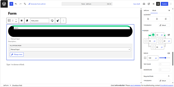
To access the style settings, the needed form field should be selected in the editor. Here, the Styles tab can be accessed in the block settings sidebar.

Style settings are available for all JetFormBuilder fields except the following:

Each field provides its own set of styling options depending on its functionality. The available style settings for every supported field are described in the corresponding tutorials in this category.

style section of the text field

FAQ

Do style settings affect the entire form?

No. The style settings apply only to one selected field. Each supported field can be styled individually.

Why can’t I see the Style tab for some fields?

Not all JetFormBuilder fields support styling. The Style tab is unavailable for the Fields Preview, Hidden Field, Map Field, Form Page Break, and Progress Bar fields.

Do I need the JetStyleManager plugin to style JetFormBuilder fields?

No. Starting from JetFormBuilder 3.6.0, the plugin includes a built-in style manager, so the JetStyleManager plugin is no longer required.

That’s all about the Styles tab overview available as part of the JetFormBuilder fields settings on your WordPress website.