This tutorial is a set of short use cases on configuring macros in the Date, Time, and Datetime Fields to customize user input, format dates and times, use in calculations, and emails sent from your WordPress site.
Table of Contents:
- Where Macros Can Be Used
- Basic Macros List
- Make All Date Fields Clickable
- Use Macros in Date Fields
- Use Date and Time Macros with Calculated Fields
- Use Macros in the Post Submit Actions
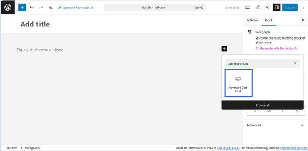
Where Macros Can Be Used
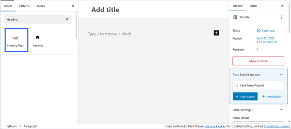
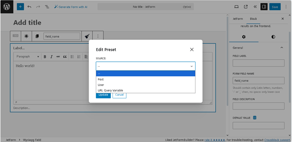
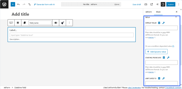
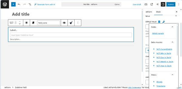
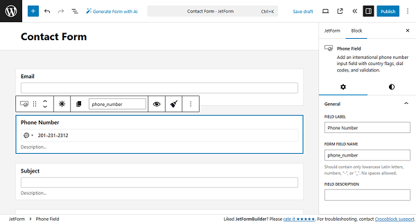
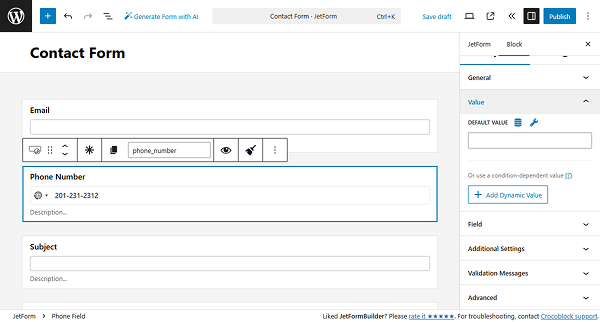
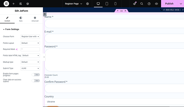
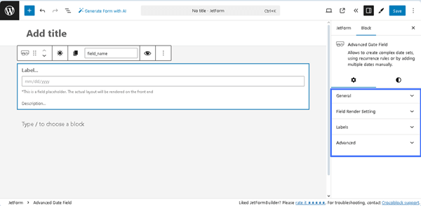
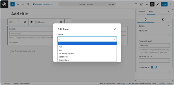
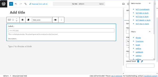
These macros were created for Date, Time, and Datetime Fields. They can be used in the fields of the Block > Value section by clicking the “wrench” button.
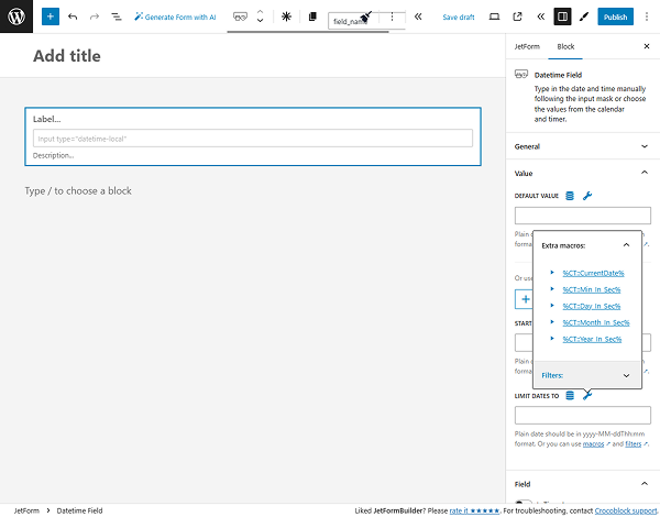
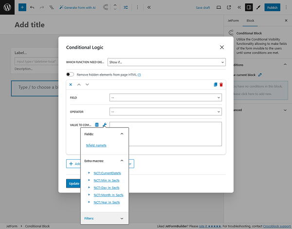
Also, macros can be used in the Conditional Logic pop-up of the Conditional Block.
Additionally, you can use formulas in the Calculated Field.
Basic Macros List
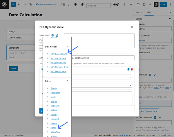
%CT::CurrentDate% — returns the current date and time as a Unix timestamp (the number of seconds since January 1, 1970). This macro acts as a replacement for JavaScript’s Date.now() and can be used in dynamic conditions, filters, or calculations where the current moment in time is needed.
For example, for the Date Field: use the ‘|toDate’ modifier to display only the date in ‘YYYY-MM-DD’ format:
‘%CT::CurrentDate|toDate%’Result:
'2022-10-22'For the Datetime Field: use the ‘|toDateTime’ modifier to display both date and time:
'%CT::CurrentDate|toDateTime%'Result:
'2022-10-22T17:49'For the Time Field: use the ‘|toTime’ modifier to display only the time in ‘HH:MM’ format:
'%CT::CurrentDate|toTime%'Result:
'17:49'%CT::Min_In_Sec% — returns the number of milliseconds in one minute. It’s useful for time-based calculations, especially when defining delays, countdowns, or converting minutes into a usable format for scripts, filters, or dynamic logic.
For example, to get the difference between dates in minutes, use such a formula:
(%some_date_field|T% - %another_date_field|T%) / %CT::Min_In_Sec%%CT::Hour_In_Sec% — returns the number of milliseconds in one hour.
Getting the difference between dates in hours:
(%some_date_field|T% - %another_date_field|T%) / %CT::Hour_In_Sec%%CT::Day_In_Sec% — returns the number of milliseconds in one day.
Getting the difference between dates in days:
(%some_date_field|T% - %another_date_field|T%) / %CT::Day_In_Sec%%CT::Month_In_Sec% — returns the number of milliseconds in one month.
Getting the difference between dates in months:
(%some_date_field|T% - %another_date_field|T%) / %CT::Month_In_Sec%%CT::Year_In_Sec% — returns the number of milliseconds in one year.
Getting the difference between dates in years:
(%some_date_field|T% - %another_date_field|T%) / %CT::Year_In_Sec%Make All Date Fields Clickable
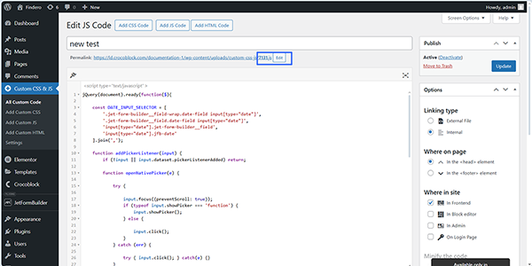
To implement this functionality, download, install, and activate the free Simple Custom CSS and JS plugin. Read the Plugin Installation tutorial to learn the different ways of WordPress plugin installation.
Next, move to the newly appeared WordPress Dashboard > Custom CSS & JS > Add Custom JS tab, press the “Add JS Code” button, and enter the following code into the text field:
jQuery(document).ready(function($){

    const DATE_INPUT_SELECTOR = [
        '.jet-form-builder__field-wrap.date-field input[type="date"]',
        '.jet-form-builder__field.date-field input[type="date"]',
        'input[type="date"].jet-form-builder__field',
        'input[type="date"].jfb-date'
    ].join(',');

    function addPickerListener(input) {
        if (!input || input.dataset.pickerListenerAdded) return;

        function openNativePicker(e) {

            try {

                input.focus({preventScroll: true});
                if (typeof input.showPicker === 'function') {
                    input.showPicker();
                } else {

                    input.click();
                }
            } catch (err) {

                try { input.click(); } catch(e) {}
            }
        }


        input.addEventListener('pointerdown', openNativePicker, {passive: true});
        input.addEventListener('click', openNativePicker, {passive: true});


        input.dataset.pickerListenerAdded = '1';
    }

    function attachToAllDateInputs(root=document) {
        const inputs = root.querySelectorAll(DATE_INPUT_SELECTOR);
        inputs.forEach(function(input){

            if (input.readOnly || input.disabled) return;
            addPickerListener(input);
        });
    }


    attachToAllDateInputs();

    const observer = new MutationObserver(function(mutations) {
        for (const m of mutations) {
            if (m.addedNodes && m.addedNodes.length) {
                m.addedNodes.forEach(node => {

                    if (node.nodeType === 1) {
                        attachToAllDateInputs(node);
                    }
                });
            }
        }
    });

    observer.observe(document.body, { childList: true, subtree: true });


    $(document).ajaxComplete(function(){

        setTimeout(function(){
            attachToAllDateInputs();
        }, 80);
    });

});
Then, insert the snipper’s title in the text field (“new test”, in this case).
After that, assign the code to the specific form (in this case, the form’s ID is “7131”): click the “Edit” link to type the form’s ID near the Permalink. Finally, save the permalink by pressing the “OK” button and publish the snippet.
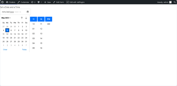
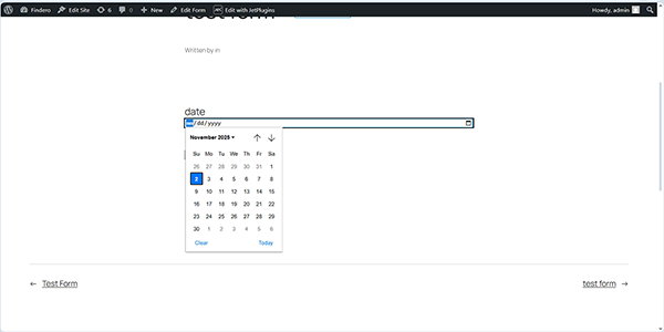
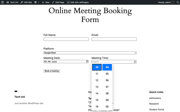
In the final step, create a form with a Date Field, save it, and verify that the Date Field is clickable, not just an icon.
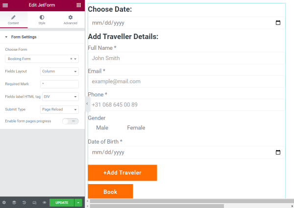
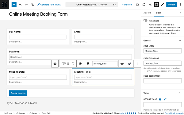
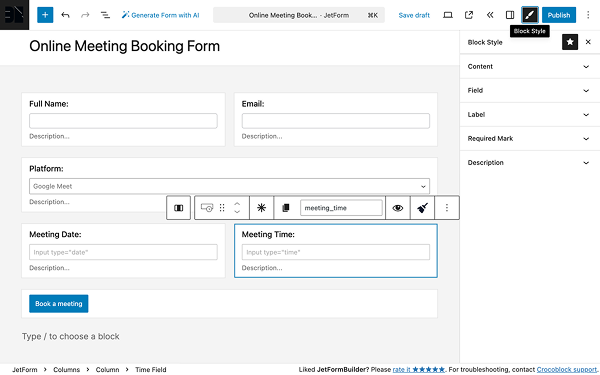
Use Macros in Date Fields
Adjust two date fields in the form so that the second date is not less than the first date
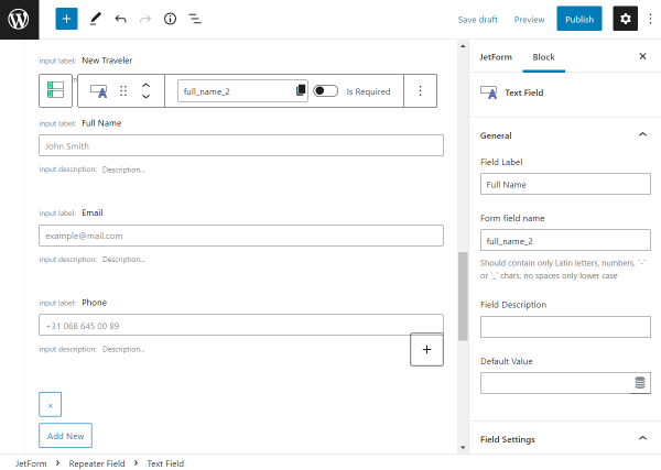
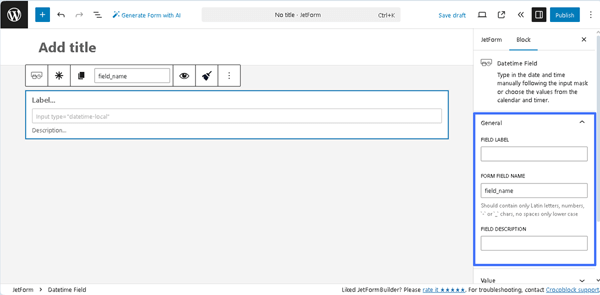
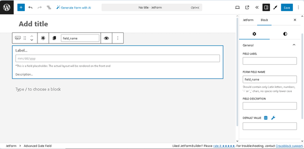
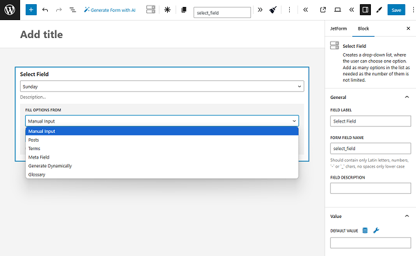
Insert a second Date Field to the form and assign its name by filling out the FIELD LABEL and FORM FIELD NAME fields.
In this case, the fields are named “start_date” and “end_date”.
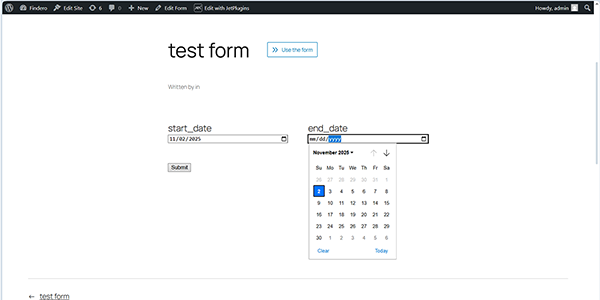
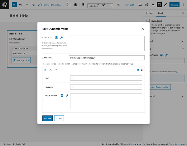
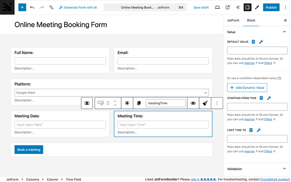
Then, move to the settings of the second Date Field (the “end_date”, in this case). In the STARTING FROM DATE field, press the “wrench” icon to select the previously set “start_date” Date Field from the drop-down list (%start_day%, in this case).
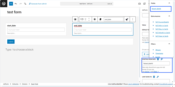
Once set, save the form and move to the front end to check if the second Date Field uses a value from the first Date Field as its minimum date.
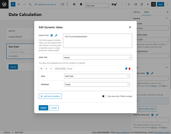
Make the Date Field start from today
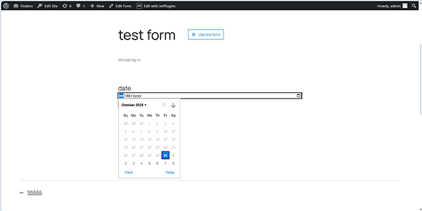
Insert the Date Field into the form and assign its name by filling out the FIELD LABEL and FORM FIELD NAME fields.
Next, move to the Date Field Settings to the STARTING FROM DATE field and insert the macro that returns the current date into it:
‘%CT::CurrentDate|toDate%’
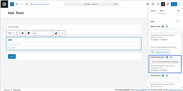
After saving the form, navigate to the front end and verify that the field prevents users from selecting a date in the past.
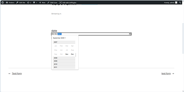
Limit the Date Field to select a date after some days
Insert a Date Field into the form and assign its name by filling out the FIELD LABEL and FORM FIELD NAME fields.
Next, move to the Date Field Settings to the LIMIT DATES TO field and insert the macro that sets the needed days available for selection:
‘%CT::CurrentDate|addDay(2)|toDate%’
where “2” stands for the needed days limitation.
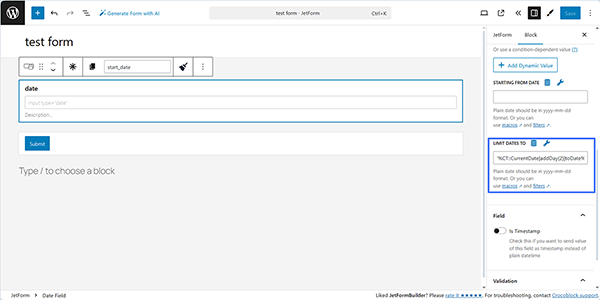
After saving the form, navigate to the front end and verify that the field allows setting the date within the allowed date period.
Change the date format for the date field (date picker)
The Date Field format is determined by the user’s browser settings. Usually, the date format changes based on the browser’s language.
Limit the Date Field to 18 years
To limit a date field to only accept dates from 18 years ago, move to the Date Field Settings, scroll to the STARTING FROM DATE field, and insert the macro:
‘%CT::CurrentDate|addYear(-18)|toDate%’
Here, you can insert the needed age instead of the “18” text.
After saving the form, navigate to the front end and verify that the field allows setting the date within the allowed date period. In this case, dates prior to November 2007 are prohibited.
Disable the Date Field input
In this case, the Date Field displays only the date; therefore, users cannot change it.
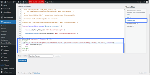
First, insert the following code snippet into the functions.php file:
add_filter( 'jet-form-builder/render/date-field/attributes', function( $attrs, $field ) {
    if ( false !== strpos( $field->block_type->block_attrs['class_name'], 'readonly' ) ) {
        $attrs['readonly'] = 'true';
    }
    return $attrs;
}, 0, 2 );

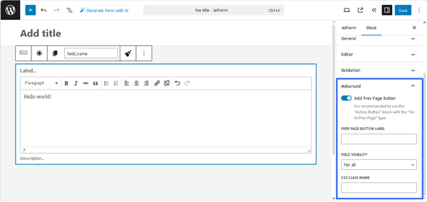
Second, create your form and add the Date Field. Next, move to the Date Field’s settings to the Advanced section and insert the “readonly” CSS CLASS NAME. Finally, save the form.
Move to the front end and check if the field is disabled.
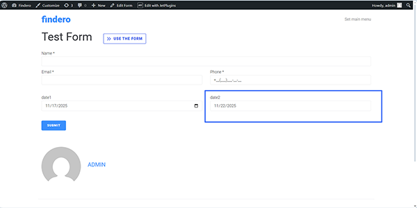
Disable the Date Field input and preset the needed number of days
This case differs from the previous one in the use of two Date Fields: if users select a date in the first Date Field, the second Date Field is disabled and automatically displays the preset date, according to the specified number of days.
Therefore, first, the following code snippet should be inserted into the functions.php file:
add_filter( 'jet-form-builder/render/date-field/attributes', function( $attrs, $field ) {
    if ( false !== strpos( $field->block_type->block_attrs['class_name'], 'readonly' ) ) {
        $attrs['readonly'] = 'true';
    }
    return $attrs;
}, 0, 2 );
Next, insert two Date Fields and assign them the names “date1” and “date2” (in this case). Then, move to the settings of the second Date Field and insert the following text into the DEFAULT VALUE FIELD:
‘%date1|addDay(5)|toDate%’
Here, “date1” is the name of the first Date Field; addDay(5) is the function that adds five days. You can change the number to any number you like.
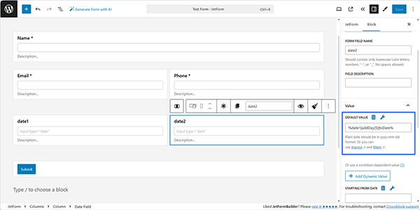
Finally, publish/save the form, then move to the front end to check whether the field is disabled.
Convert dates in labels
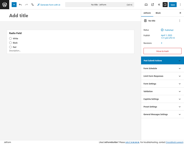
In this case, the data in the Date Field will be used to display the labels for the Radio, Select, or Checkbox Field.
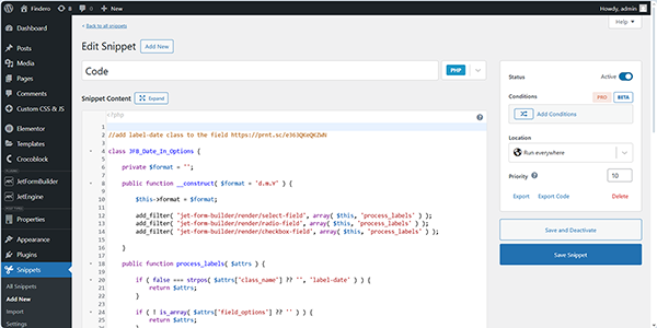
First, add the code below to the functions.php file of your current active child theme directly or using any plugin that allows adding PHP snippets:
<?php


//add label-date class to the field


class JFB_Date_In_Options {

	private $format = '';

	public function __construct( $format = 'd.m.Y' ) {

		$this->format = $format;

		add_filter( 'jet-form-builder/render/select-field', array( $this, 'process_labels' ) );
		add_filter( 'jet-form-builder/render/radio-field', array( $this, 'process_labels' ) );
		add_filter( 'jet-form-builder/render/checkbox-field', array( $this, 'process_labels' ) );

	}

	public function process_labels( $attrs ) {

		if ( false === strpos( $attrs['class_name'] ?? '', 'label-date' ) ) {
			return $attrs;
		}


		if ( ! is_array( $attrs['field_options'] ?? '' ) ) {
			return $attrs;
		}


		foreach ( $attrs['field_options'] as $index => $option ) {


			$timestamp = $option['label'];


			if ( ! is_numeric( $timestamp ) ) {
				$timestamp = strtotime( $option['label'] );
			}

			if ( $timestamp === false ) {
				continue;
			}


			$attrs['field_options'][ $index ]['label'] = date( $this->format, $timestamp );


		}


		return $attrs;

	}

}


//change format here
New JFB_Date_In_Options( 'd/m/Y' );
Second, create the form with the required fields, including the Date Field.
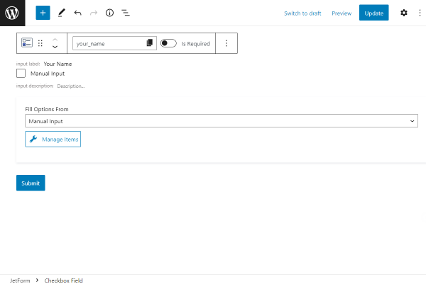
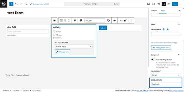
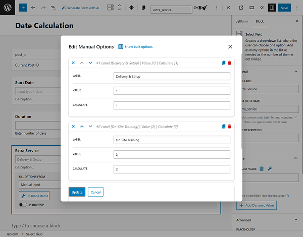
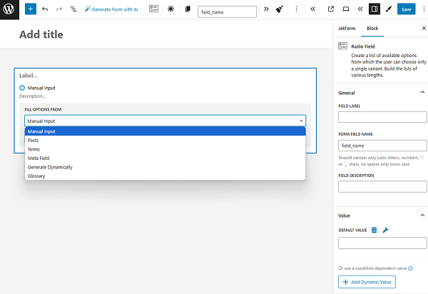
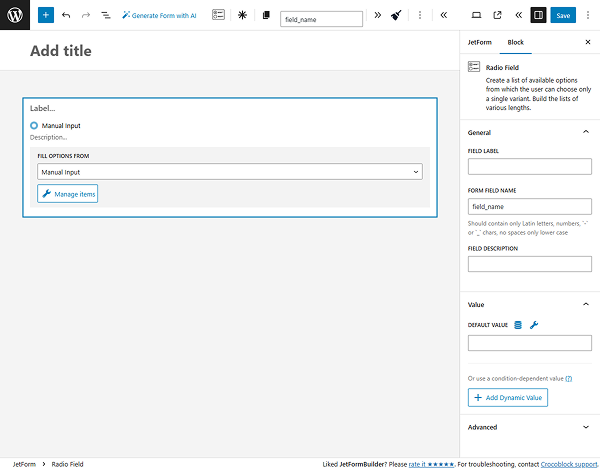
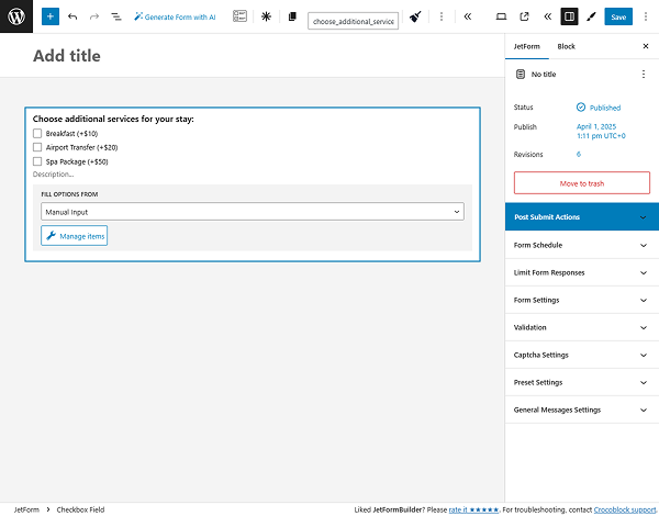
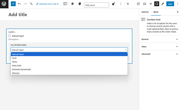
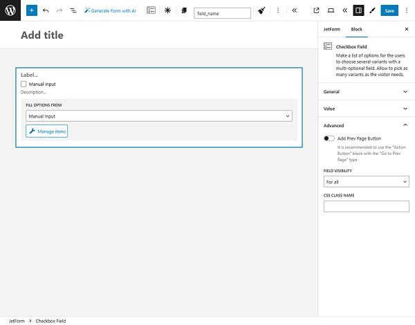
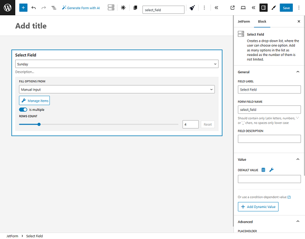
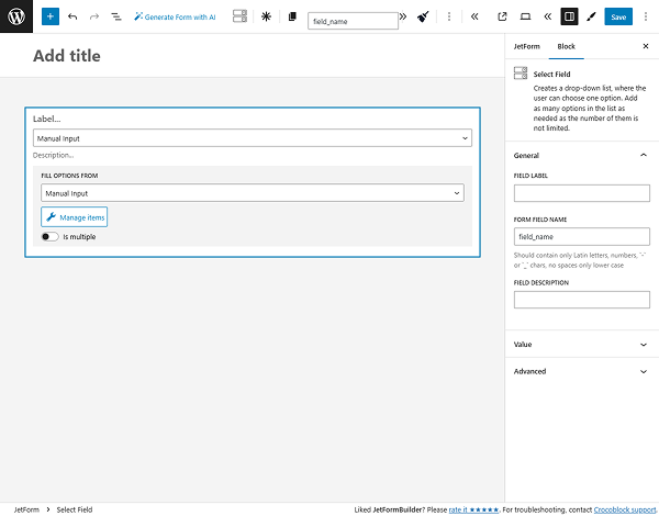
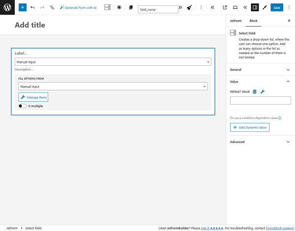
Next, add the Radio (Select or Checkbox) Field, select “Manual Input” in the FILL OPTIONS FROM dropdown, and press the “Manage Items” button. In this case, we manually inserted two options 一 “5 days” and “10 days” with the numerical VALUEs of “5” and “10”.
After that, we move to the Advanced settings of the Radio Field, unroll them, and insert the “label-date” text into the CSS CLASS NAME field.
Finally, publish/save the form and move to the front end to check how it works.
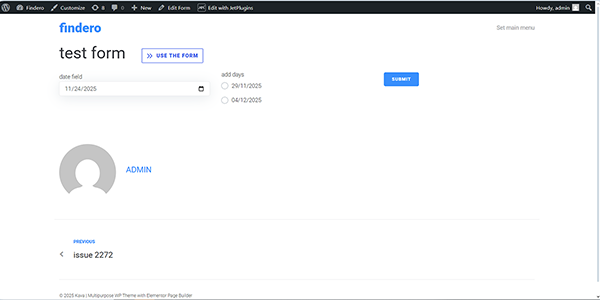
Here, we set the date in the Date Field (e.g., November 24, 2025), and this date is then used together with the predefined options of the Radio Field to generate labels (five and ten days are added, resulting in November 29, 2025, and December 4, 2025 being displayed).
Restrict dates in the Date Field of JetFormBuilder
In this case, we use an add-on for JetFormBuilder to restrict weekends.
First, download the ZIP file of the Flatpickr add-on.

After that, install and activate the Flatpickr add-on as you would any other WordPress plugin, as described in the Plugin Installation tutorial.

Second, create the form with the needed fields, including the Date Field. After activation of the add-on, the Flatpickr Settings section will be added to the Date Field settings.

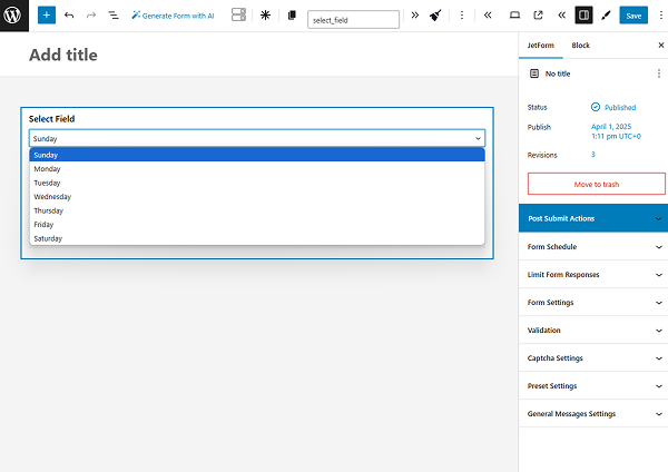
Then, unroll the mentioned settings, activate the Flatpickr enabled toggle, and disable the needed days of the week in the DISABLED WEEK DAYS field. Here, we disabled Sundays and Mondays by entering “0,1”.

Also, to display the date in the right format, use a special macro:
%date_field|format_date(d/m/Y)%
where “date_field” is the name of the field where the user selects a date, and (d/m/Y) is the format in which the date will be displayed in the email. You can set any available format. More about date formats can be found in the Customize date and time format tutorial.
Finally, publish/save the form and move to the front end to check how it works.

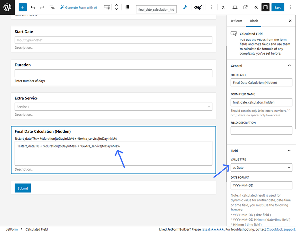
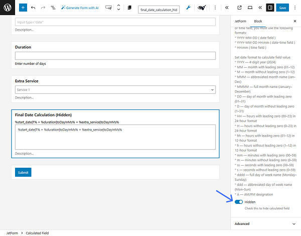
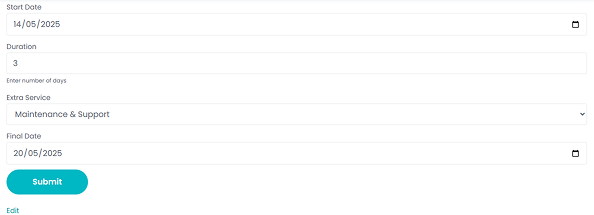
Use Date and Time Macros with Calculated Fields
Calculate the number of days between the Date Field and the current time
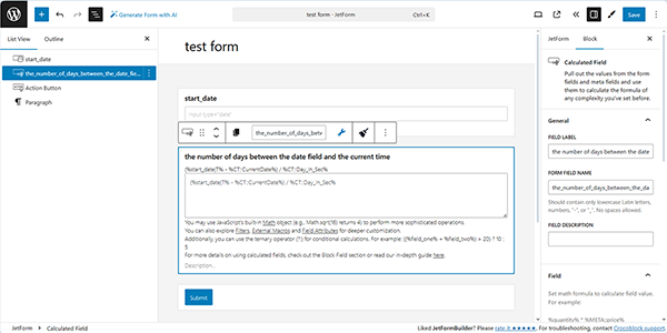
Insert the Date Field into the form and assign its name by filling out the FIELD LABEL and FORM FIELD NAME fields. In this example, entering “start_date” in the FIELD LABEL field automatically fills in the FORM FIELD NAME with the same value.
Next, add the Calculated Field to the form and insert the following text into it:
(%start_date|T% – %CT::CurrentDate%) / %CT::Day_In_Sec%
where “start_date” stands for the FORM FIELD NAME of the Date Field.
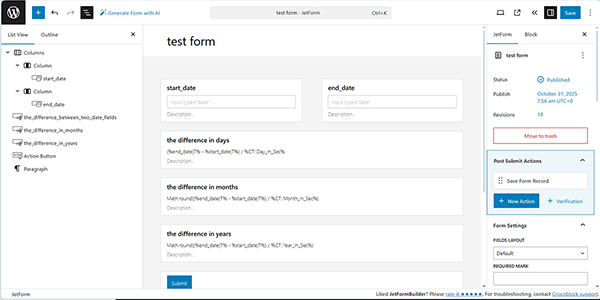
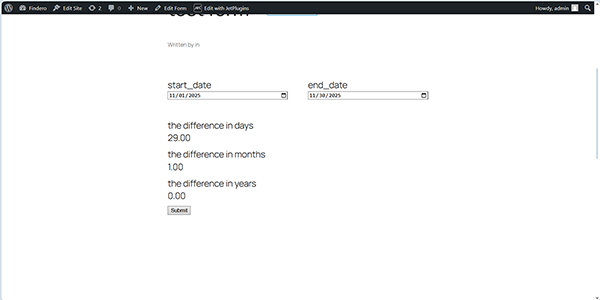
Calculate the difference in days between two Date Fields
Insert a second Date Field to the form and assign its name by filling out the FIELD LABEL and FORM FIELD NAME fields.
In this case, the fields are named “start_date” and “end_date”.
Next, add the Calculated Field to the form and insert the following text into it:
- To calculate the difference between two Date Fields:
(%end_date|T% – %start_date|T%) / %CT::Day_In_Sec%
- To calculate the difference in months, use this formula:
Math.round((%end_date|T% – %start_date|T%) / %CT::Month_In_Sec%)
- To calculate the difference in years, use this formula:
Math.round((%end-date|T% – %start-date|T%) / %CT::Year_In_Sec%)
After saving the form, navigate to the front end, specify the dates, and verify that the fields function correctly.
In addition, for an in-depth understanding of the usage of these macros, follow the How to Calculate a Date Range tutorial.
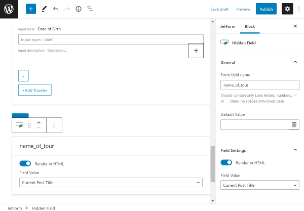
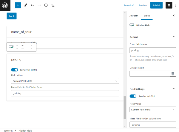
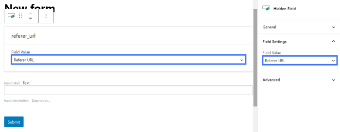
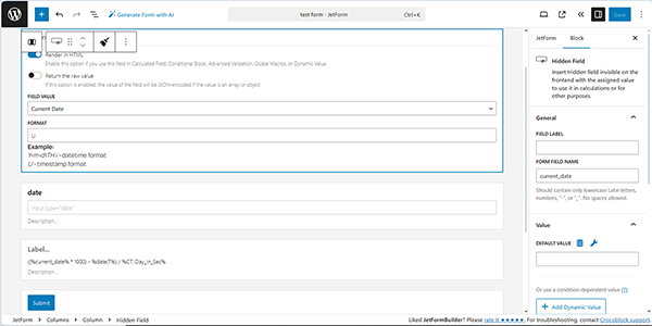
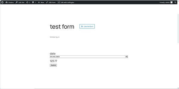
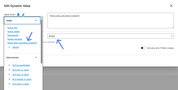
Calculate the difference between the current and past dates
Insert a Hidden Field into the form, set the “Current Data” FIELD VALUE and the “U” FORMAT to pull the current date timestamp. Next, insert the Date Field to allow users to choose a date in the past and assign its FORM FIELD NAME (the “date” in this case).
Then, add the Calculated Field to the form and insert the following text into it:
((%current_date% * 1000) – %date|T%) / %CT::Day_In_Sec%
Where ‘current_date’ stands for the name of the Hidden Field, and ‘date’ stands for the name of the Date Field.
After saving the form, navigate to the front end, set the date, and verify that the Calculated Field correctly calculates the difference between the current and past dates.
For more details on configuring the Hidden Fields and Calculated Fields, refer to the How to Use Hidden and Calculated Field Types tutorial.
Add the selected number of days to the Date Field
In this case, we allow selecting the required number of days via the Radio (or Select or Checkbox Field).
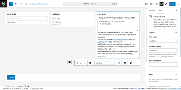
First, create the form and add the required fields, including the Radio Field. Then, assign its FORM FIELD NAME (the “add days”, in this case), and then add the Calculated Field (the “cal field”, in this case).
After that, add the following macro to the Calculated Field:
+’%add_days%’ * %CT::Day_In_Sec% +%date_field|T%
where ‘add days’ is the name of the added Radio Field and ‘date_field‘ is the name of the inserted Date Field. The “+” sign before the %add_days% macro converts the string into a number.
After saving the form, navigate to the front end and verify that the field functions correctly.
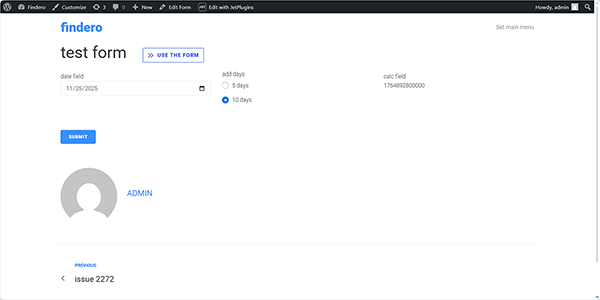
In this case, the date is displayed as a timestamp. Also, if needed, you can display the date in other formats, as described in the How to Calculate Dates Dynamically tutorial.
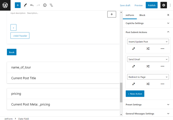
Use Macros in the Post Submit Actions
In this section, we exemplify a limited number of use cases. For more details about how to display user input, format dates and times, show uploaded media, or include links to newly created posts, read the How to Use Macros in Email Formatting tutorial.
Display glossary labels instead of values in e-mails
First, create a glossary using the JetEngine or a similar plugin. For more details about creating and configuring custom fields based on the JetEngine Glossary values, follow the How to Add Glossary Values to Custom Fields tutorial.
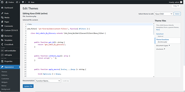
Next, move to WordPress Dashboard > Appearance > Theme File Editor and insert the following code into the theme’s functions.php file.
<?php


add_filter( 'jet-form-builder/content-filters', function( $filters ) {

	class Get_Labels_By_Glossary extends \Jet_Form_Builder\Classes\Filters\Base_Filter {


		public function get_id(): string {
			return 'get_label_by_glossary';
		}


		public function callback_args(): array {
			return array( ', ' );
		}


		public function apply_macros( $value, ...$args ): string {

			list( $glossary ) = $args;

			if ( ! function_exists( 'jet_engine' ) || ! $glossary ) {
				return $value;
			}

			return jet_engine_label_by_glossary( $value, $glossary );
		}
	}

	array_unshift( $filters, ( new Get_Labels_By_Glossary() ) );

	return $filters;
} );
Also, you can use another plugin to add the code, for example, the Code Snippets plugin.
Once completed, proceed to the bottom of the page and press the “Update file” button.
Then, create a form you need and insert a Radio, Select, or Checkbox Field to display the glossary data.
Read the How to Add Glossary to Form Fields tutorial to learn how to build a JetFormBuilder form by using JetEngine Glossary as the data source for the form fields.
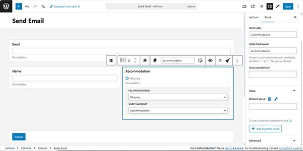
After that, insert the “Send Email” Post Submit Action, configure it as needed, and move to the CONTENT text field. Here, insert the following text:
%field_name|get_label_by_glossary(42)%
where field_name is the name of your form field, get_label_by_glossary is the name of the glossary, and “42” is the ID of your glossary.
In this case, the field name is “accomodation”, the name of the glossary is “get_label_by_glossary”, and the glossary’s ID is 5.
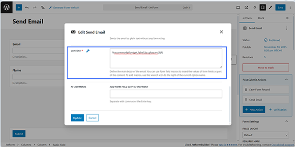
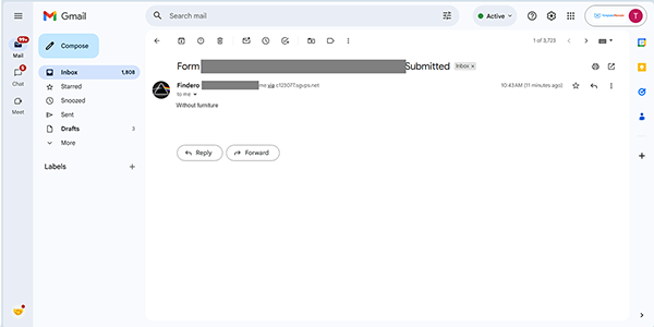
Finally, update the Post Submit Action, publish the form, move to the front end, fill out the form, and submit it.
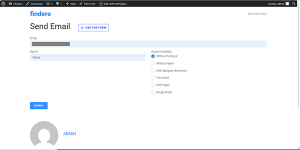
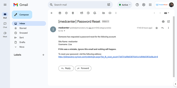
After submission, you will receive an email with the selected options displayed.
Use a callback to send the current date if no date is set
The case described herein allows mailing the empty date and time data if users do not fill them out. In contrast, if this macro is not used, the date and time will be sent with the current date and time.
First, add the following PHP snippet directly to the functions.php file of your child theme, or use the Code Snippets plugin.
<?php


if ( function_exists( 'jet_form_builder' ) ){


   class Format_Date_If_Not_Empty_Filter extends \Jet_Form_Builder\Classes\Filters\Format_Date_Filter {


       public function get_id(): string {
           return 'format_date_if_not_empty';
       }


       public function callback_args(): array {
           return array( '' );
       }


       public function apply_macros( $value, ...$args ): string {
           if ( empty( $value ) ){
               return '';
           }


           return parent::apply_macros( $value, ...$args );
       }


   }


   add_filter( 'jet-form-builder/content-filters', function ( $filters ) {
       $filters[] = new Format_Date_If_Not_Empty_Filter();


       return $filters;
   });
}

Second, create the form with the corresponding fields and insert the “Send Email” Post Submit Action, configure it as needed, and move to the CONTENT text field. Here, insert the following text:
%datetime|format_date_if_not_empty(F j, Y)%
where datetime is the name of your form field, format_date_if_not_empty is the name of the snippet, and (F j, Y) is the date format.
In this case, the field name is “select_date”, “format_date_if_not_empty” is the name of the snippet, and “(F j, Y)” is the date format.
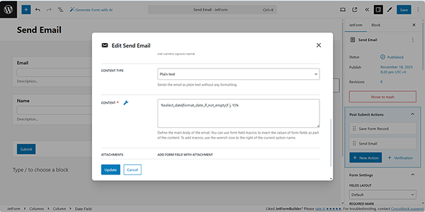
Finally, update the Post Submit Action, publish the form, move to the front end, fill it out, and submit it. Then, the Date Field value will be sent as an empty string if no value is set.
Customize the output Repeater in the Send Email Action
The process is detailed in the How to Customize the Output Repeater in the Send Email Action tutorial.
Display appointment dates in the Send Email Action
The process is detailed in the How to Send an Email with Appointment Details tutorial.
Display dates when creating a PDF file
When you use the PDF Attachment Addon for JetFormBuilder, you can add dates to the generated file and send it by email. For more details, refer to the How to Generate PDF on Form Submission and Generate PDF Form Action Overview tutorials.
That’s it. Now you know how to configure macros in the Date, Time, or DateTime Fields to customize user input, format dates and times, use in calculations, and emails sent from your WordPress site.


