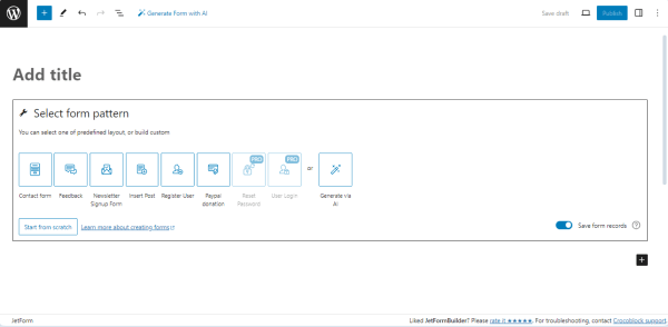
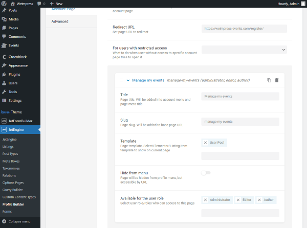
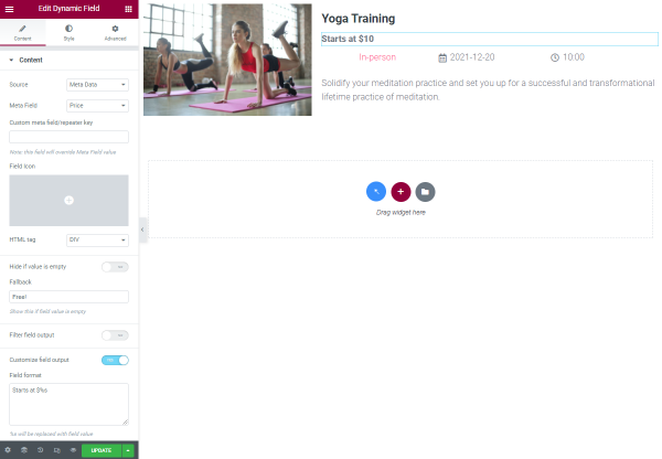
Learn how to create a form for a many-paged quiz that allows multiple choices using the Advanced Choice, Conditional Block, Calculated, and other fields of the JetFormBuilder plugin for WordPress. Also, you can use the pre-made Quiz Form template.
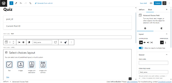
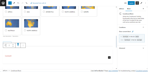
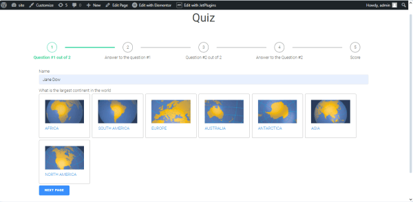
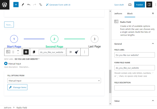
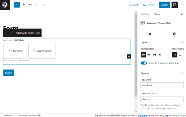
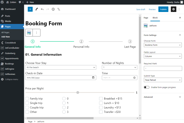
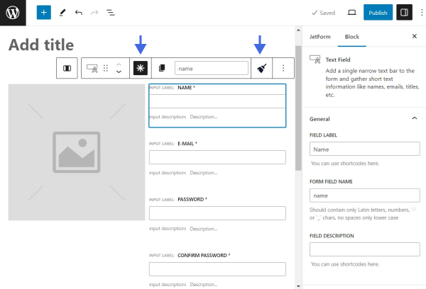
In the given case, we selected the “Images with controls” choice layout.
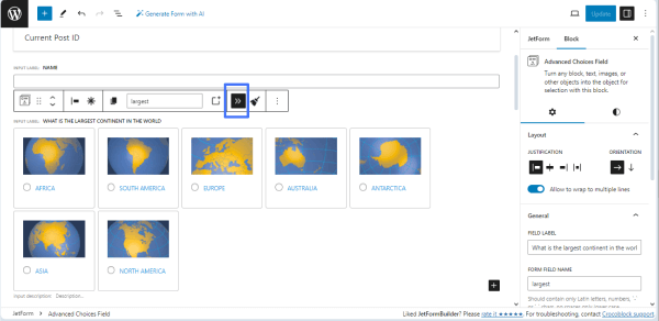
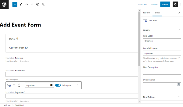
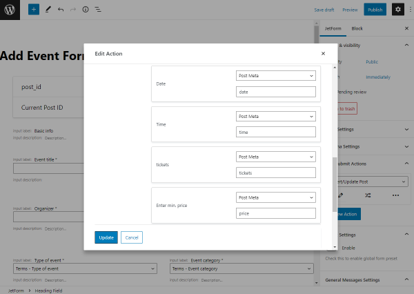
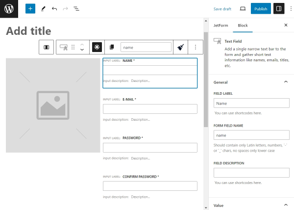
Then, type the field’s name in the FIELD LABEL field (“What is the largest continent in the world?” text, for example) and fill in the FORM FIELD NAME field (e.g., “largest”).
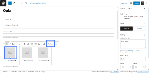
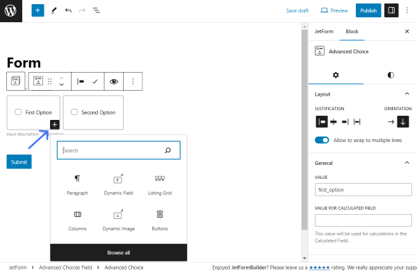
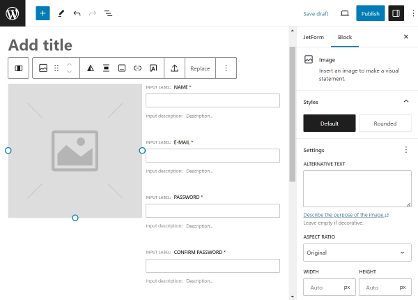
In the next step, select the image above the “Book Name” text on a choice item. Press the “Replace” button on the settings panel that appears and add the image you need.
Type the needed text instead of the “Book Name #” on the choice item.
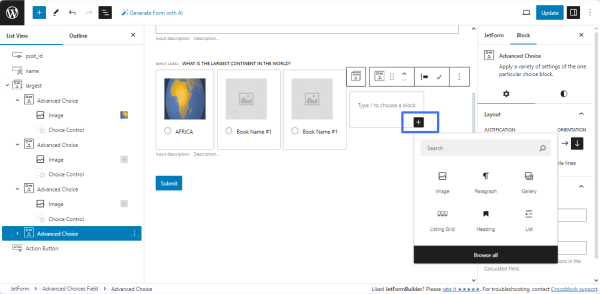
If you need more than three choice items added by default, press the “plus” icon in the bottom right corner of the choice item to add another. Then, add the needed images and texts into the Image and Choice Control fields.
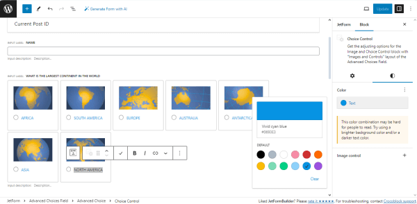
You can customize the style settings as well. To change the text or background color for all options, click the Advanced Choices Field block and open the Block > Styletab.
To alter the style settings of one option, click the needed Choice Control block, open the Block > Styletab, and, for instance, change the text color.
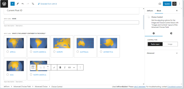
Also, for the Choice Control block, you can open the Block > Settingstab, and, in the CONTROL TYPE field, you can select how the item should be chosen – by pressing the “Image” or using the “Radioinput” option.
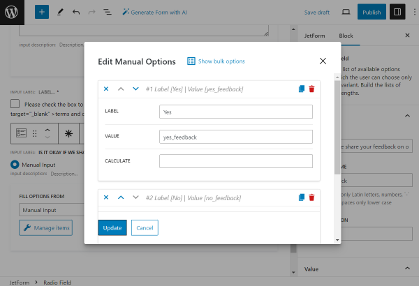
Here, we pick the “Radio input” option.
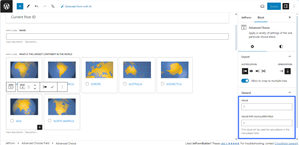
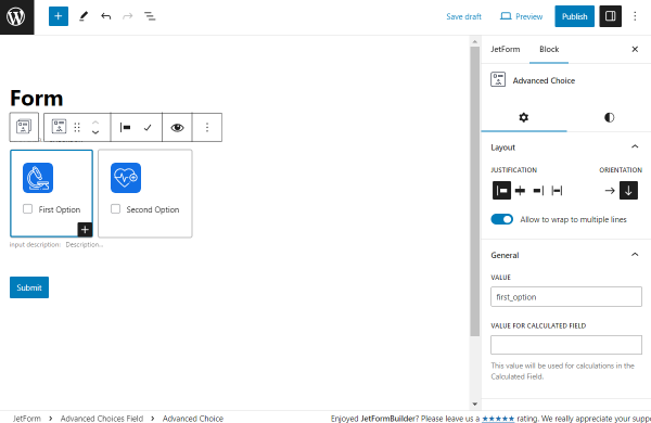
Every option is considered as the Advanced Choice block.
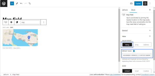
Click the needed Advanced Choice block, open the Block > General tab, and set the needed values in the VALUE and VALUE FORCALCULATED FIELD fields.
Fill in these fields for all choice items.
For instance, we set “zero” for incorrect answers and “one” for the correct answer.
In this tutorial, this question and this Advanced Choices field have only one correct answer.
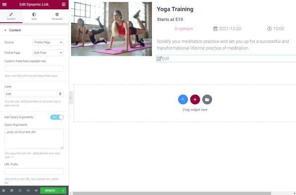
To redirect users to another page, click the “double-chevron” icon on the settings panel. This action enables the automatic transition to the next page when the values are changed.
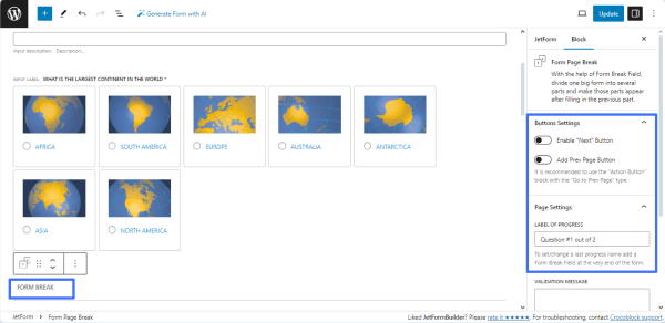
Then, navigate to the ButtonsSettings tab and leave the “Enable “Next” Button” toggle inactive.
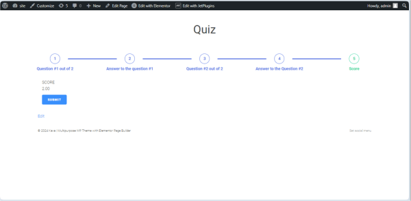
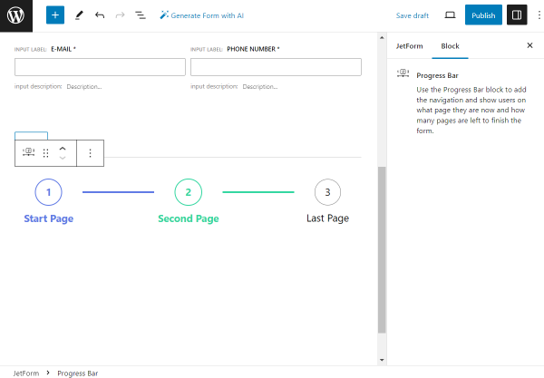
Finally, navigate to the Page Settings block and type the text in the LABEL OF PROGRESS field (e.g., “Question #1 out of 2”).
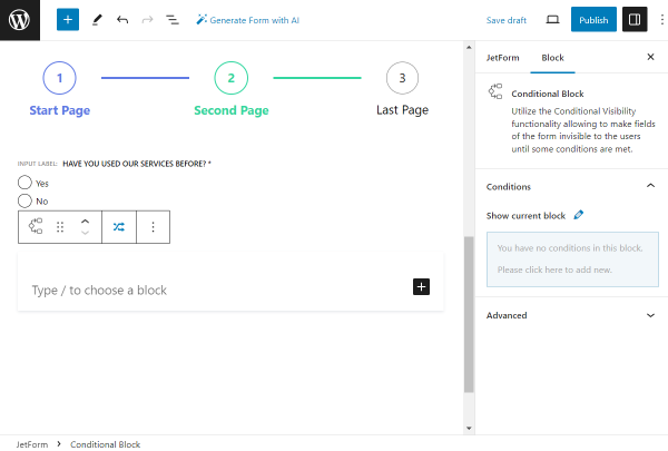
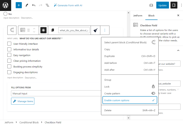
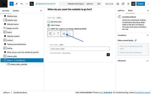
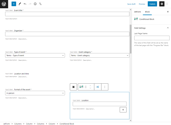
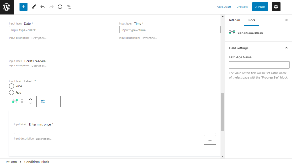
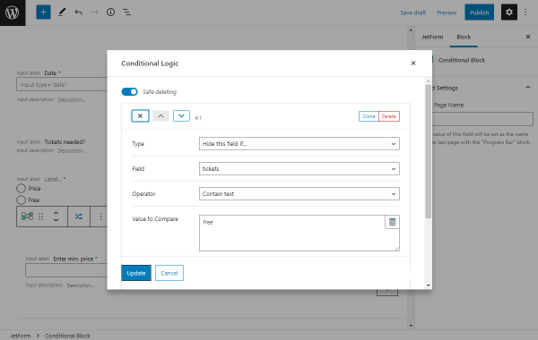
Add the Conditional Block for One Choice
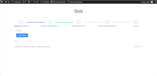
In this tutorial section, we added the Conditional Blocks to display the needed text if users select the correct or incorrect answer.
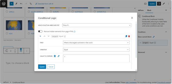
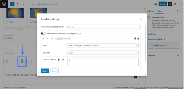
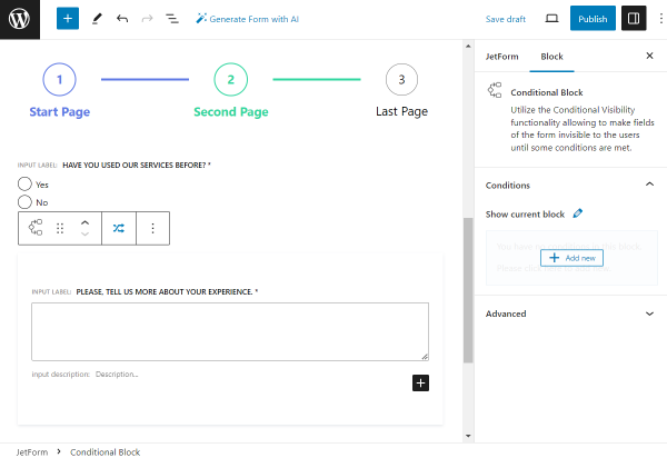
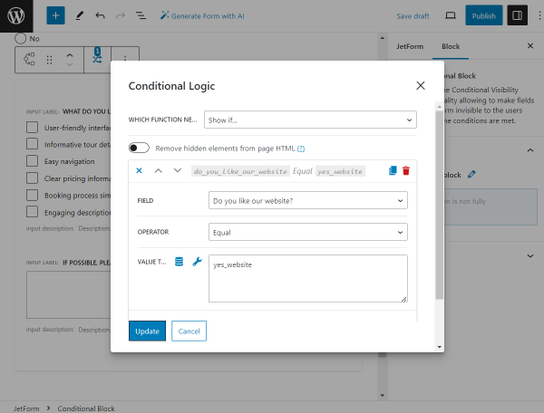
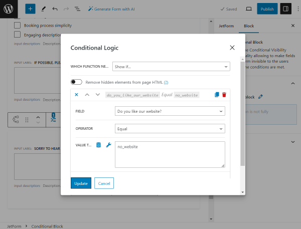
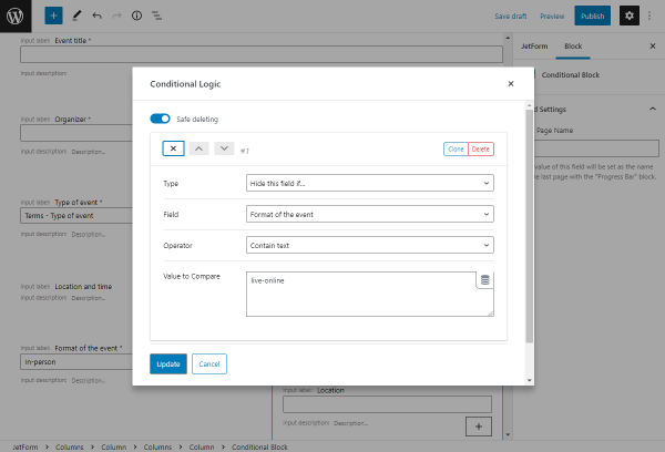
We dragged and dropped the Conditional Block to the page and pressed the “crisscrossed arrows” button in the upper tools panel. Then, the Conditional Logic pop-up will be unrolled.
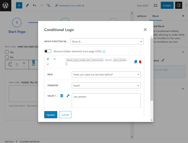
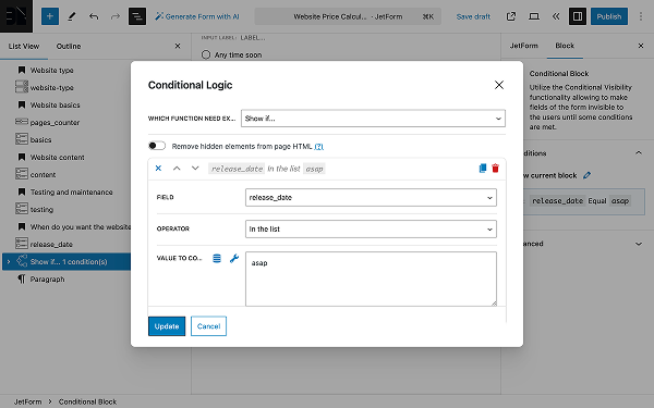
In the Conditional Logic pop-up, we selected the “Show if…” option in the WHICH FUNCTION NEED EXECUTE? drop-down list; then, we pressed the “+ Add Condition” button to set the conditional rule. Here, we selected the Advanced Choices Field label in the FIELD drop-down list (“What is the largest continent in the world?” in this case), chose the “Equal” OPERATOR, and, finally, typed the correct answer value in the VALUE TO COMPARE field (the “1” text, in this case).
Once completed, press the “Update” button.
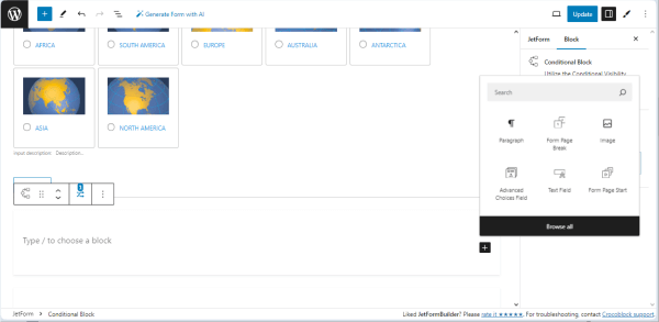
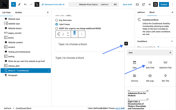
Then, press the “plus” icon on the right side of the Conditional Block and select the needed field.
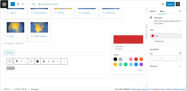
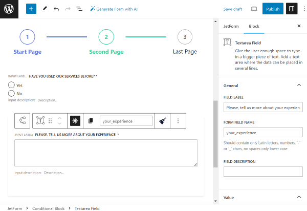
We selected the Paragraph block and typed the “Correct!” text in the Conditional Block text field. We also set the color for this text.
In the same way, we added another Conditional Block that will display the “Sorry, but this answer is not correct!” text in case of an incorrect answer. The only difference is that we set the zero (the “0” text) in the VALUE TO COMPARE field.
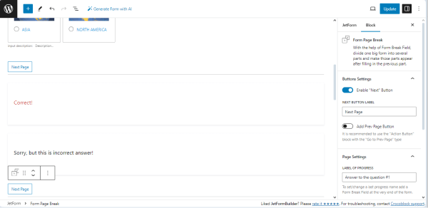
In the next step, we added the Form Page Break block to the page and activated the Enable “Next” button toggle for the button setting block.
Then, we typed the text displayed on the “Next” button in the NEXT BUTTON LABEL field.
Finally, we navigated to the Page Settings block and typed the text in the LABEL OF PROGRESS field (“Answer to the question #1” in our case).
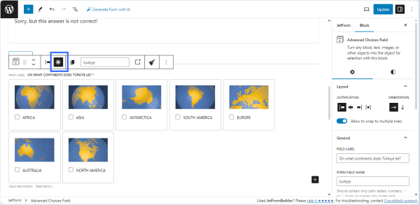
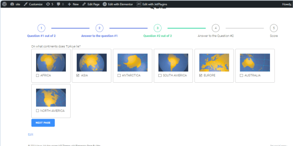
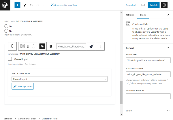
Add the Advanced Choices Field with Multiple Choice
Duplicate the added Advanced Choices Field and move it below the Form Page Break block, or add another Advanced Choices Field and add the needed Images and Choice Controls.
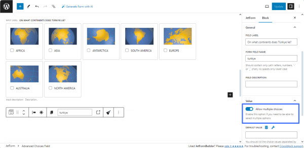
Navigate to the Block > General settings block and type the field’s name in the FIELD LABEL field (“On what continents does Türkiye lie?” text, in this case), then fill in the FORM FIELD NAME field (the “turkiye” text in the given case).
Enable the To allow the multiple choices toggle in the Value setting block of the field.
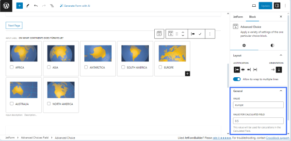
Finally, press the specific item (Advanced Choice block) and set the needed values in the VALUE and VALUE FORCALCULATED FIELD fields of theBlock > General setting tab.
Set these values for all choice items. In the given case, we set the continent names (i.e., “africa,” “asia,” etc.) in the VALUE field for all items. Then, we typed “0.5” for Asia and Europe and “0” for other continents in the VALUE FORCALCULATED FIELD setting fields.
Press the “asterisk” icon to make the Advanced Choice Field required.
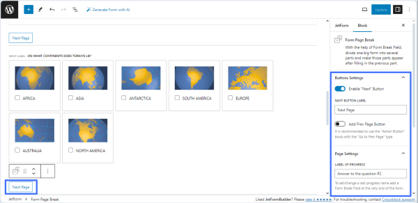
In the last step, we added the Form Page Break block, activated the Enable “Next” Button toggle, and filled in the NEXT BUTTON LABEL and LABEL OF PROGRESS fields.
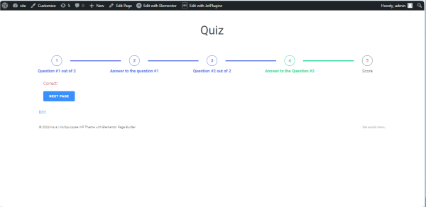
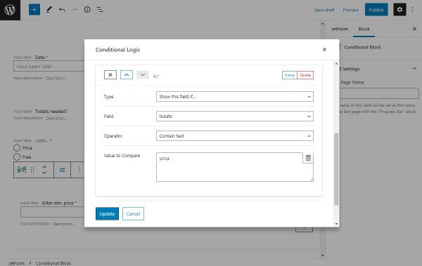
Add the Conditional Block for Multiple Choice
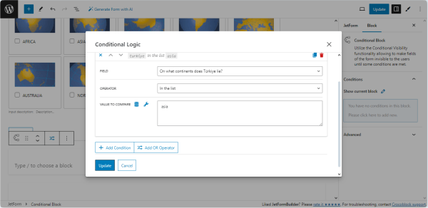
Add the Conditional Block to the page and trigger the Conditional Logic pop-up by clicking the “crisscrossed arrows” button.
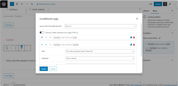
In the Conditional Logic pop-up, we selected the “Show if…” option in the WHICH FUNCTION NEED EXECUTE? drop-down list, then pressed the “+ Add Condition” button to set the conditional rules.
Here, we selected the Advanced Choices Field label in the FIELD drop-down list (“On what continents does Türkiye lie?” text, in this case), chose the “In the list” OPERATOR, and, finally, typed the correct answer value in the VALUE TO COMPARE field (“asia” in this case).
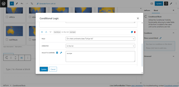
To add another condition, scroll down the pop-up and press the “+ Add Condition” button.
In the appeared fields, select the required FIELD (“On what continents does Türkiye lie?” in this case); choose the “In the list” OPERATOR, and, finally, type the correct answer value in the VALUE TO COMPARE field (“europe” in this case).
Once all conditions are added, press the “Update” button.
Add the needed fields onto the Conditional Block (the Paragraph block and with the “Correct!” text in our case).
Add another Conditional Block and set the conditional rule to display the “Sorry, but this answer is not correct!” text if the conditions are unmet. Here, we set the “Not in the list” operator, and the other settings are the same.
Finally, we added the Form Page Break block, activated the Enable “Next” Button toggle, and filled in the NEXT BUTTON LABEL and the LABEL OF PROGRESS fields (the “Next Page” and “Score” texts, respectively).
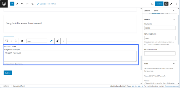
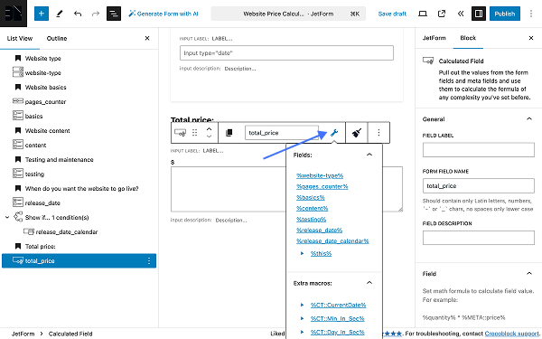
Add the Calculated Field
We added theCalculated Field to show the quiz’s total score. Then, we filled in the FIELD LABEL and FORM FIELD NAME fields (the “SCORE” and “score” texts, respectively).
We typed the “%largest%+%turkiye%” text, which means that this field will calculate the correct answers for the first and second Advanced Choices Fields (in this case, we typed the names of the previously added Advanced Choices Fields).
The last step is adding the Form Page Break block. Here, we did not activate the “Enable “Next” Button” and “Add Prev Page Button” toggles but filled in the LABEL OF PROGRESS field with the text that will be displayed as the last step of the progress bar (the “Score” text).
Finally, once you complete the form with the fields, press the “Update/Publish” button.
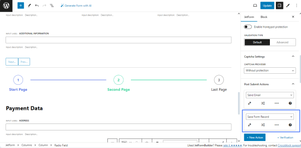
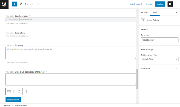
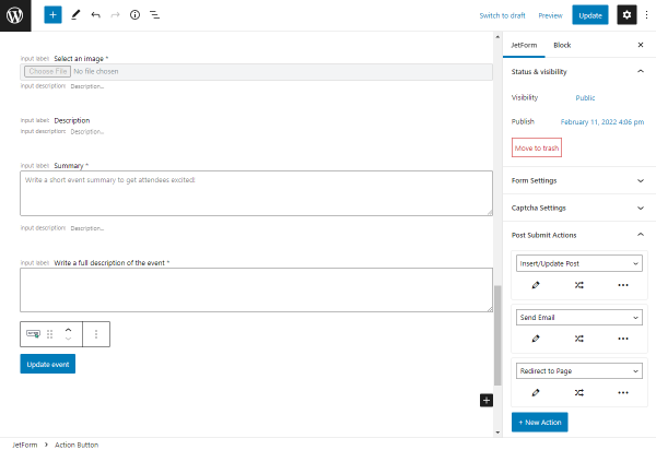
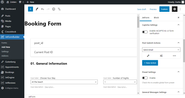
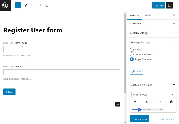
Post-Submit Actions
The “Save Form Record” Post-Submit Action is set by default. We kept this action and did not add any others because such actions are uncommon for online quizzes.
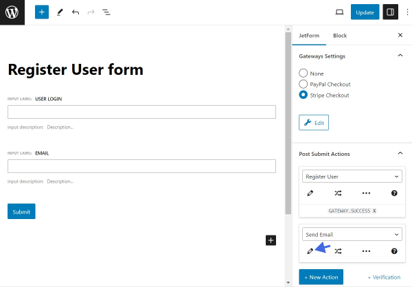
However, you can add other Post-Submit Actions, such as “Send Email.”
Add the Form to a Page
Open a page/post/CPT post/template you need and place the JetForm widget (in Elementor), JetForm block (in Block Editor), or JetForm element (in Bricks). Select the built form in the Choose Form drop-down list.
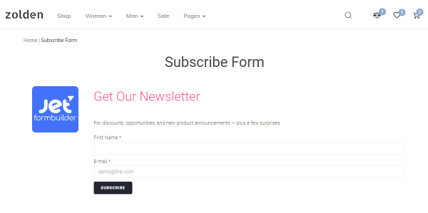
Finally, navigate to the front end and check how this form works.
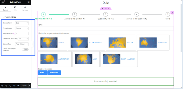
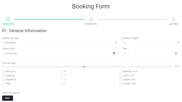
First, we typed the name and pressed the “Asia” choice item. Then, we got the result of the choice.
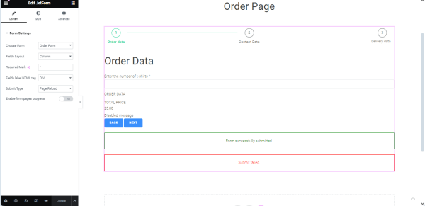
After clicking the “NEXT PAGE” button, we were redirected to the second page of the form.
Here, we ticked the “Asia” and “Europe” checkboxes and clicked the “Next Page” button.
The result will be shown on the next page.
Finally, we were redirected to the last page of the form.
Pressing the “Submit” button submits this form.
That’s all about creating the form for the many-paged quiz that allows multiple choices using the Advanced Choice, Conditional Block, Calculated, and other fields of the JetFormBuilder plugin for WordPress.
RSVP forms (or “Please respond” forms) are intended to collect and manage data on clients who would visit an event.
The RSVP form functionality can be implemented, for example, via the following:
fields to collect the needed data: Text Field (to add the client’s name), Radio or SelectFields(to select the appropriate response option), and TextareaField(i.e., to add a commen);
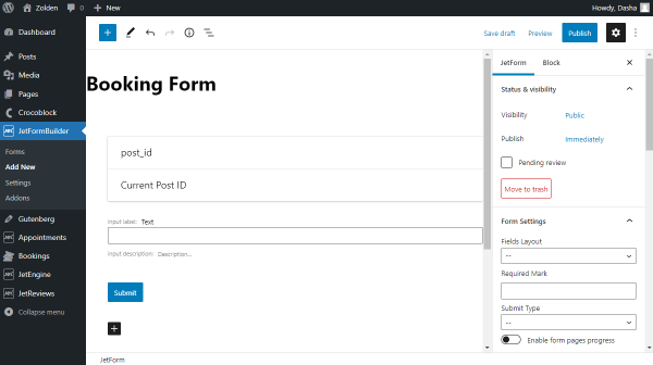
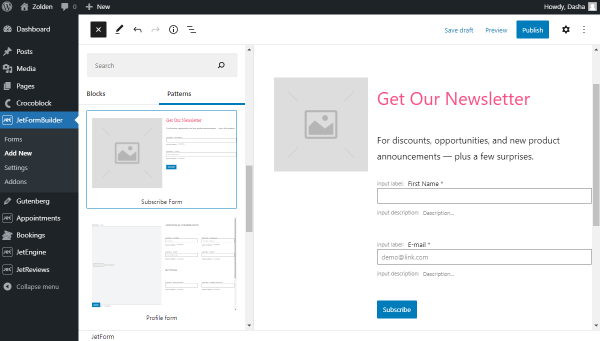
Navigate to the WordPress Dashboard > JetFormBuilder > Forms tab and press the “Add New” button to create a new form. Also, check the tutorial on How to Create a Form.
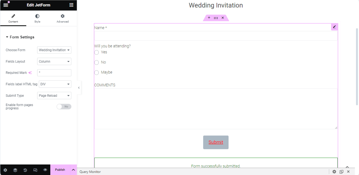
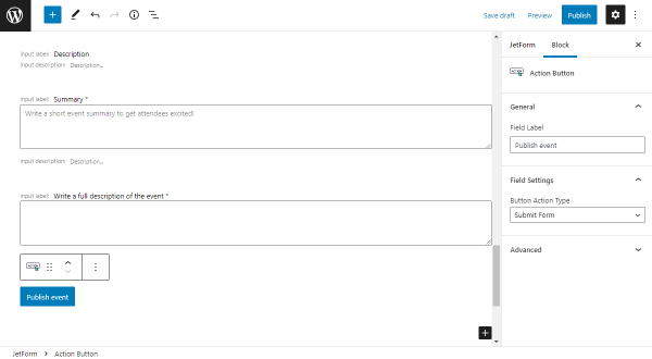
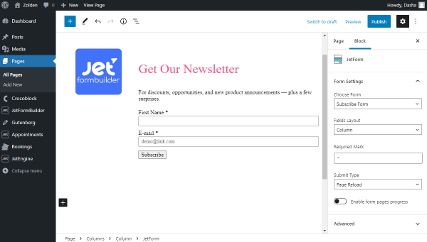
Type the form’s title instead of the default “Add title” heading text (the “Wedding Invitation” text in the given case).
Press the “Start from scratch” button to develop a custom form.
After closing the Welcome block, three blocks are added to the page: the Hidden Field, the Text Field, and the Action Button.
Add Fields to the Form
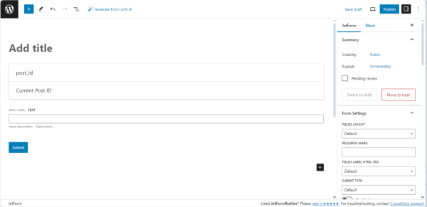
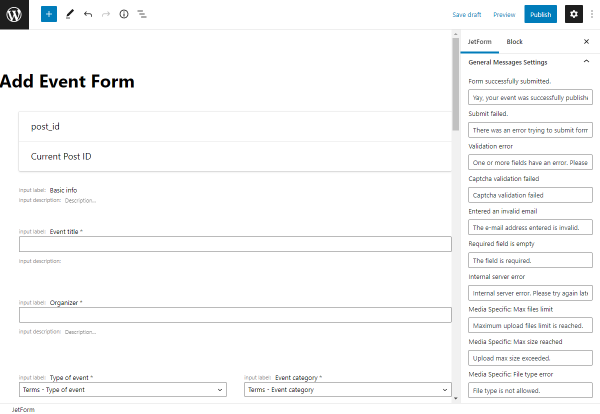
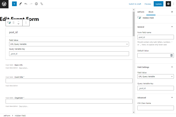
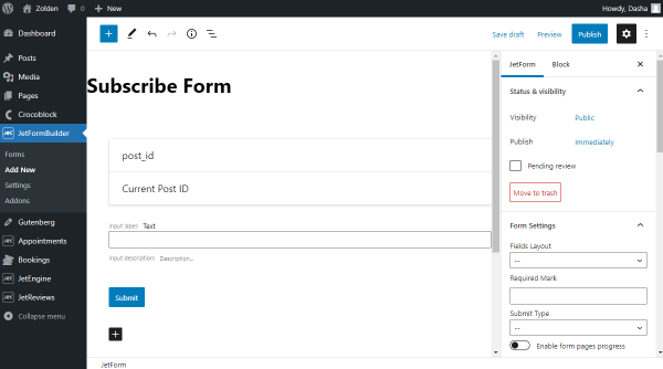
The default Hidden Field is not necessary in this case; we left this field to save the post ID in the form record data.
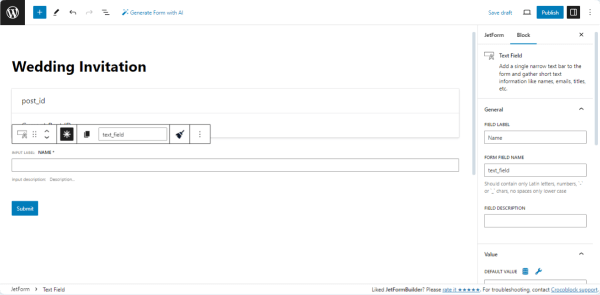
We leave the Text Field, added to the form by default, to get the client’s name.
Unroll the field’s settings, type its name in the FIELD LABEL field, and press the “asterisk” sign to make this field required.
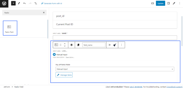
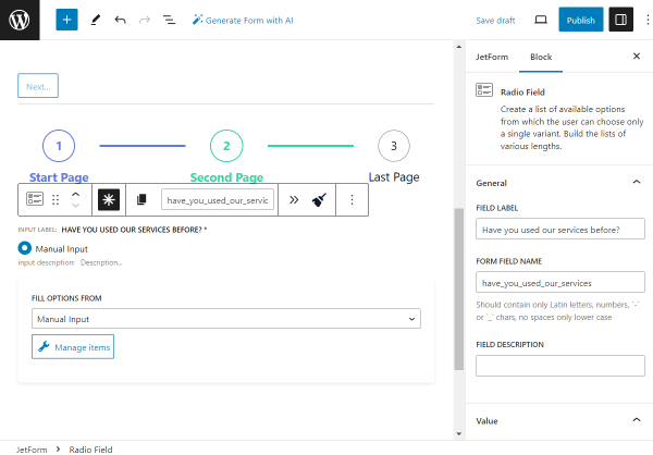
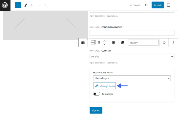
Then, add the Radio Field or Select Field block.
Unroll the field’s settings and complete the FORM FIELD LABEL (in the given case, we set the “Will you be attending?” label).The FORM FIELD NAME field will be filled automatically (in the given case, the “will_you_be_attending” text was added).
NOTE
The FORM FIELD NAME must be unique for this form and can contain only lowercase Latin letters, numbers, and “-” or “_” signs without capital letters or spaces.
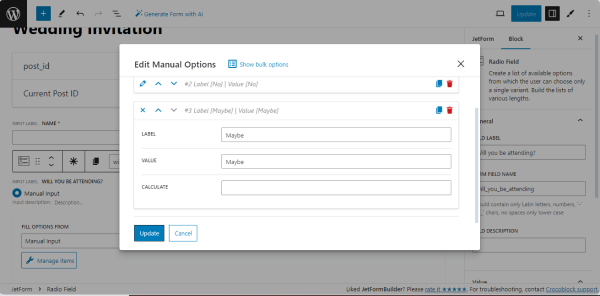
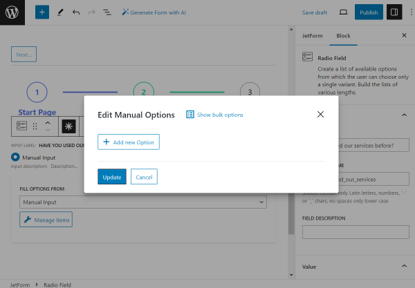
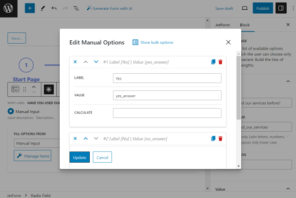
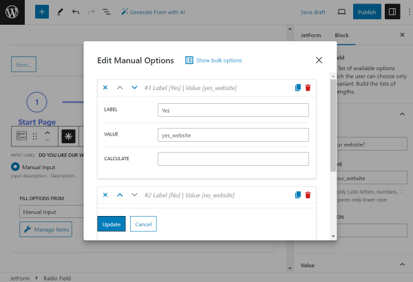
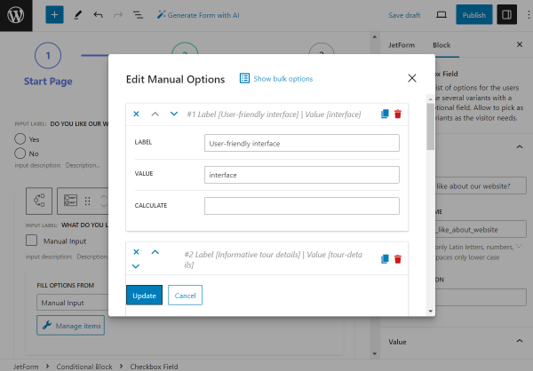
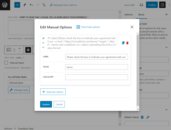
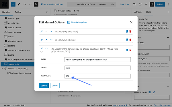
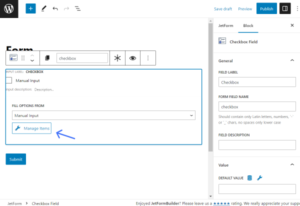
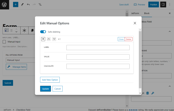
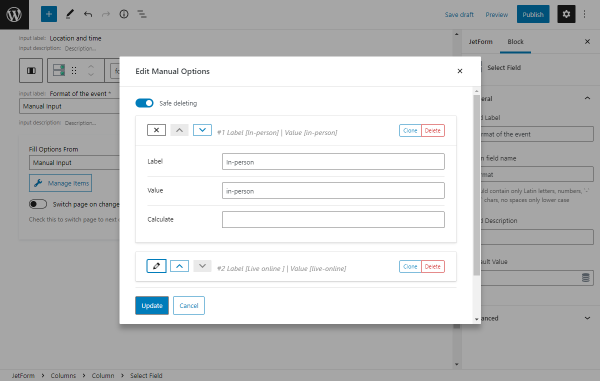
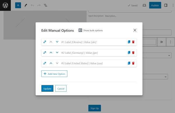
Press the “Manage items” button and add the needed variant of answers in the appropriate fields of the Edit Manual Options pop-up (here, we added the “Yes,” “No,” and “Maybe” options and typed the appropriate texts into the VALUE fields).
Press the “Update” button to save the field’s option and close the pop-up.
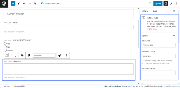
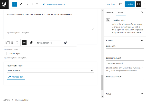
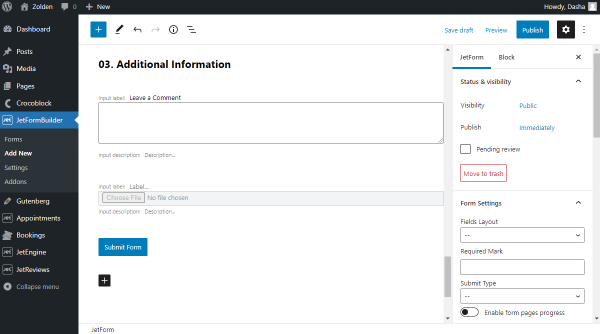
Find and drag-n-drop the Textarea Field. Fill the FIELD LABEL (in the given case, this field is for comments).
Specify the Post Submit Actions
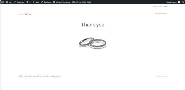
In this section, we set the Post Submit Actions, which will be performed if some conditions are met. In this tutorial, we set the following Post SubmitActions: mailing the letters using the “Send Email” action and redirecting users to the “Thank You” page using the “Redirect to Page” action if users selected the appropriate option from the Radio Field block.
Unroll the JetForm settings. Navigate to the Post Submit Actions tab.
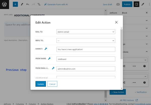
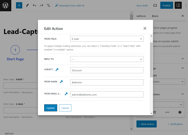
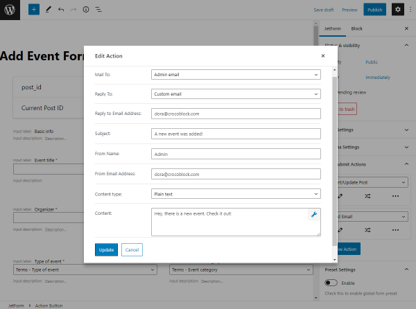
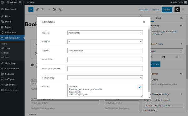
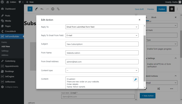
Press the “New Action” button and select the “Send Email” option from the drop-down list. Then press the “pencil” icon and set the following settings in the pop-up:
Select the “Admin email” option from the MAIL TO drop-down list to mail a visit confirmation letter to the site administrator. This email is set in the AdministrationEmail Address field in the WordPress Dashboard > Settings > General tab.
If an appropriate field with the email to reply to is added to the form, unroll the REPLY TO drop-down list and select the “Email from submitted form field” or “Custom email” option. If selected, these options activate the REPLY TO EMAIL FROM FIELD and REPLY TO EMAIL ADDRESS menus, respectively; in this case, we did not intend the form’s field for the client’s email, so we left this field empty.
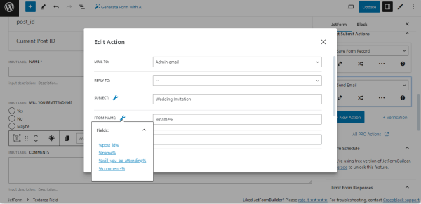
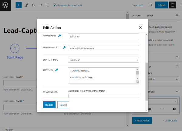
Type values in the SUBJECT field, FROM NAME field, and FROM EMAIL ADDRESS field or choose it from the form’s fields by pressing the Dynamic Tag icon (“wrench“); in the given case, we typed the “Wedding Invitation” text into the SUBJECT field of the pop-up and used the “Name” Text Field toadd the client’s name (%name%) in the FROM NAME field. The FROM EMAIL ADDRESS field is left empty.
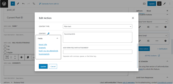
Scroll down the pop-up and select the “Plain text” or “HTML” options from the CONTENT TYPE drop-down list. If selected, both options activate the CONTENT and ATTACHMENT fields, allowing the form fields with attachments to be added. Additionally, the “HTML” option activates the Disable Auto-Formatting toggle, which prevents inserting paragraph breaks automatically in each new line in the email content field.
In the CONTENT text field, type the email message that the admin will receive if clients select the “Yes” option. Alternatively, you can press the Dynamic Tag icon near the CONTENT field and choose the form’s field to get such text. In this tutorial, we selected the “Comments” Textarea Field (the “%comments%” option) to add the client’s message to the email.
Press the “Update” button to close the pop-up.
Now, we will set action conditions to send the email if the needed option from the Radio Field block is selected.
Read the Post-Submit Actions Conditions tutorial to know how to manage the Post Submit Actions and set specific conditions.
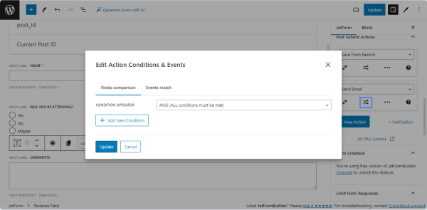
Then, click the “Edit Conditions & Events” button to set the conditions for sending “Thank You” letters.
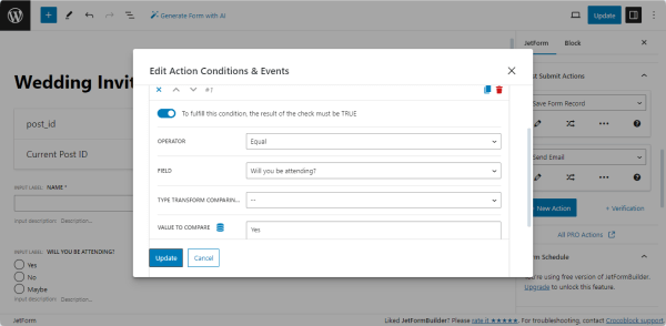
In this case, the emails will be sent if users confirm their attendance.
The “AND (ALL conditions must be met)” option is set by default in the CONDITION OPERATOR drop-down list.
Press the “Add New Condition” button on the pop-up and select the options in the appropriate drop-down lists to set conditions:
To fulfill this condition, the result of the check must be TRUE toggle is enabled by default; therefore, if you need to set the condition opposite to the options from the OPERATOR drop-down list, turn off this toggle;
Unroll the OPERATOR drop-down list and select the needed condition: “Equal,” “Greater than,” “Less than,” “Between,” “In the list,” or “Contain text”;
Unroll the FIELD drop-down list and select the field that contains data for comparison;
If you compare date or time values, you may need to convert them into the timestamp. Select the “String to Timestamp” option from the TYPE TRANSFORM COMPARING VALUE drop-down list;
Type the value to compare in the VALUE TO COMPARE field or press the Dynamic Tag icon and select if from the “Post,” “User,” “URL Query Variable,” and “Option Page” options.
In this tutorial, to meet the condition, users should select the “Yes” text value from the “Will you be attending?” Radio Field. Therefore, we selected the “Equal” option from the OPERATOR drop-down list, then chose the “Will you be attending?” field from the FIELD drop-down list, and finally typed the text equal to the needed value (in the given case, the “Yes” text without brackets) in the VALUE TO COMPARE field.
Once completed, press the “Update” button to close the pop-up.
To set conditions for performing other Post Submit Actions (for example, if clients selected the “No” or “Maybe” options), press the “New Action” button to add another Post Submit Action and set specific conditions as it was done for the “Yes” options.
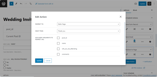
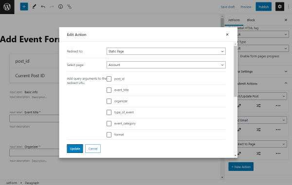
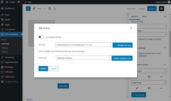
Set the “Redirect to Page” action
Press the “New Action” button and select the “Redirect to Page” option from the drop-down list.
Then, press the “pencil” icon to open the Edit Action pop-up. In this case, users, after selecting the “Yes” variant from the Radio Field, will be redirected to a static page; thus, we set the following settings in the Edit Action pop-up:
Select the needed type of page in the REDIRECT TO drop-down list (here, the “Static Page” option);
Add the particular page in the SELECT PAGE drop-down list.
Press the “Update” button to close the pop-up.
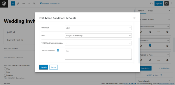
Click the “Edit Action” button to set the conditions of redirecting to the “Thank You” page. In the given case, this pop-up has the same settings as for the “Send Email” action: we selected the “Equal” option from the OPERATOR drop-down list, then chose the “Will you be attending?” field from the FIELD drop-down list, and finally typed the text equal to the needed value (in the given case, the “Yes” text without brackets) in the VALUE TO COMPARE field.
Press the “Update” button to close the pop-up.
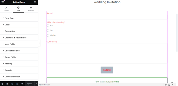
Style the Form
To style the form’s elements, install and activate the JetStyleManager plugin via the WordPress Dashboard.
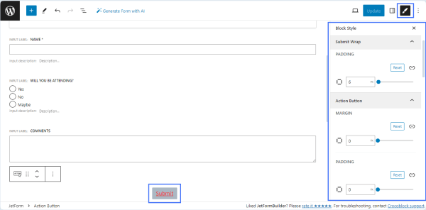
Then, return to the form and press the “brush” icon in the top right corner of the screen.
In this case, we customized the “Submit” button’s background and typography.
NOTE
The free JetStyleManager plugin allows customizing the RSVP form’s design according to the event’s style (i.e., as a wedding invitation card, conference program flyer, etc.).
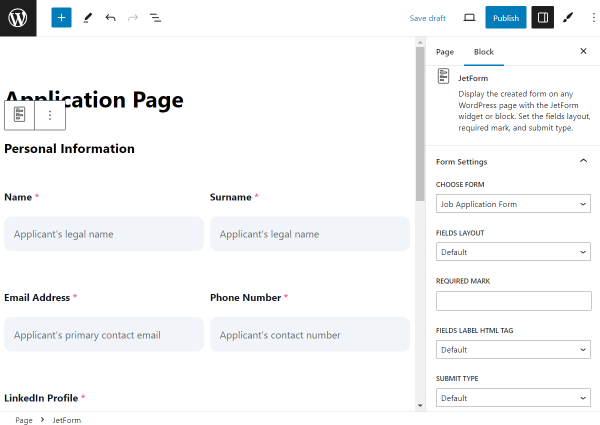
Find the JetForm widget and drag and drop it onto the page. Then, select the just-built form in the Choose Form field.
This widget has Style settings that allow customization of the particular fields (such as the Input Fields or Conditional block) and the form’s style as a whole (such as Form Row or Label). We customized the typography of this form.
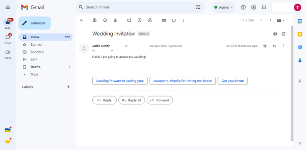
Fill in the form and press the “Submit” button.Then, users will be redirected to the “Thank You” page.
Collect and Process Form’s Data
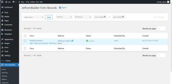
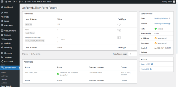
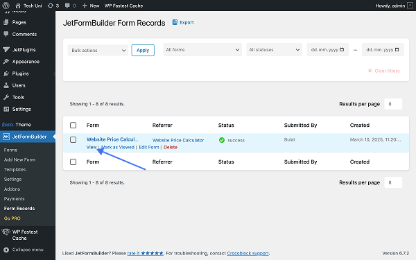
Navigate to the WordPress Dashboard > JetFormBuilder > Form Records tab to see all collected form entries. Open the needed form or hover the cursor over the form’s title.
Press the “View” link under the form’s title to unroll the submitted form data.
Enter your mailbox and open the email you received.
That’s all about creating RSVP forms in WordPress using the JetFormBuilder plugin’s fields and setting different post-submit actions and conditions.
The PayPal payment form is a useful functionality that can be added to WordPress websites for small e-commerce projects or mixed projects that combine content and e-commerce.
With this form, the complex functionality of WooCommerce is not required. So, let’s find out more about the PayPal payment form, which is suitable for small online stores, and build one selling services or products.
PayPal is one of the most popular payment services worldwide. Integrating PayPal into your project can be beneficial, as it can help to capture a larger share of payments.
Adding a PayPal form to a WordPress website does not require an additional plugin.
NOTE
You can use the free version of JetFormBuilder, which has PayPal integrated.
With JetFormBuilder, you can set up a PayPal form to start collecting payments.
Configure the actions that are performed after a successful payment. For example, a PDF with an invoice will only be sent to the user after successful payment. This allows you to automate document delivery and reduce manual work;
Track all transactions and view payment statistics with the Payments section of JetFormBuilder. This is convenient for analyzing financial data and controlling income;
Add Conditional Logic to the payment form. This allows you to customize the form to respond to user actions. For example, you can show or hide certain form fields depending on the options you choose;
Calculate the total amount automatically based on the options selected in the form. This feature can be used in forms where the user can select various additional services or products, and you need to update the total cost dynamically.
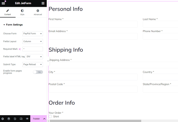
WordPress PayPal Form Structure
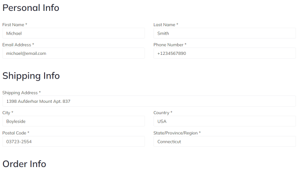
Step 1 — Personal Info
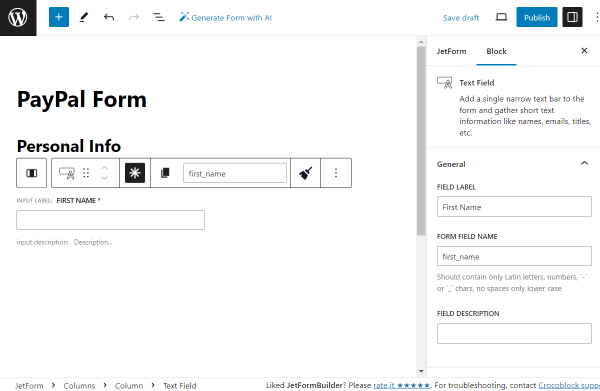
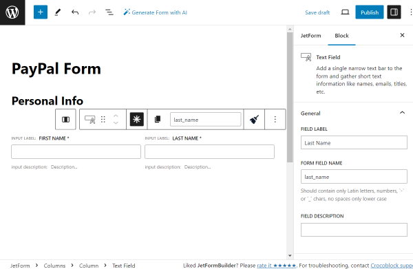
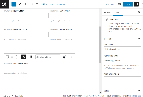
First Name and Last Name. Text Fields to find out the user’s name;
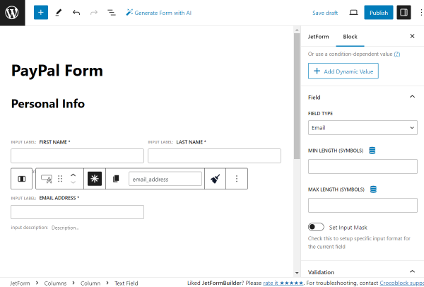
Email Address. A Text Field with the “Email” FIELD TYPE to get the email where the offer will be sent;
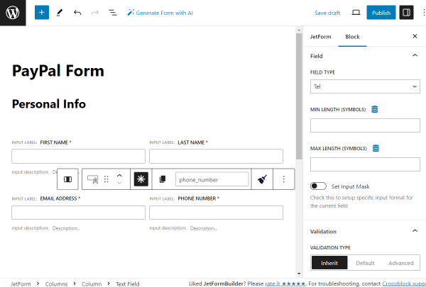
Phone Number. A Text Field with the “Tel” FIELD TYPE in case you need the user’s phone number. For instance, to set the SMS marketing.
Step 2 — Shipping Info
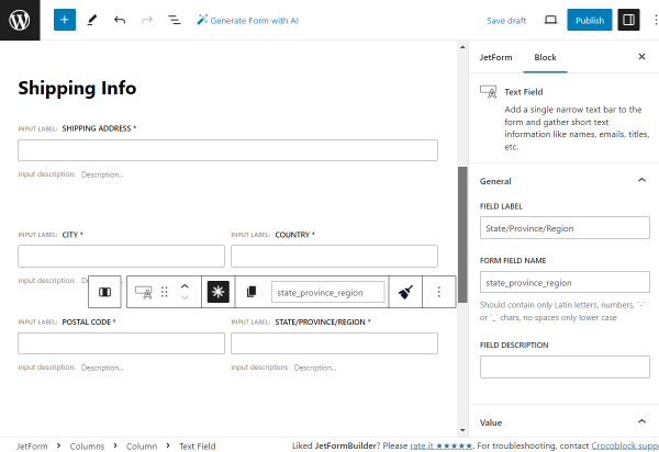
Shipping Address. A Text Field for the address where the order will be shipped;
City, Country, Postal Code, State/Province/Region. Text Fields that specify the address with additional information.
Step 3 — Order Info
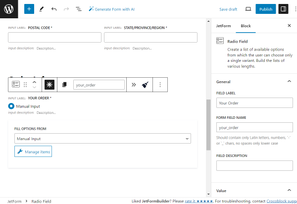
Your Order. A Radio Field where the item for order can be selected;
Quantity. A Number Field indicating the quantity of the ordered item.
Step 4 — Extra Info
Do you want to add something to your order? A Checkbox Field with additional items/services that can be added to the order;
Comments. A Textarea Field where a customer can leave their comments;
Total. A Calculated Field for the total price calculations.
How to Create a WordPress Custom PayPal Form
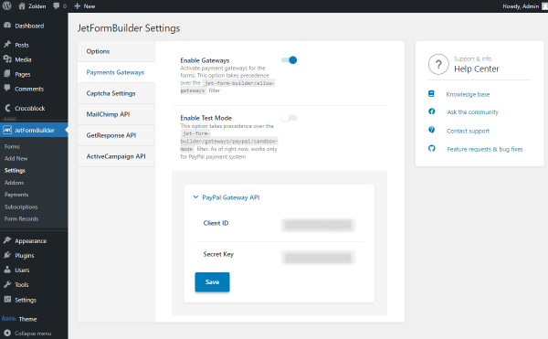
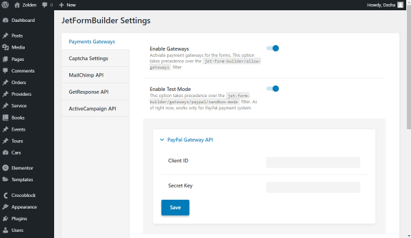
Initially, you should check the settings to adjust PayPal if you have not done so already. So, proceed to WordPress Dashboard > JetFormBuilder > Settings and open the Payments Gateways tab.
Make sure that the Enable Gateways toggle is activated.
Then, complete the Client ID and Secret Key fields. This information can be found in your PayPal account dashboard.
Don’t forget to press the “Save” button.
To build a WordPress PayPal form, navigate to WordPress Dashboard > JetFormBuilder > Add New.
Type in the title of the form.
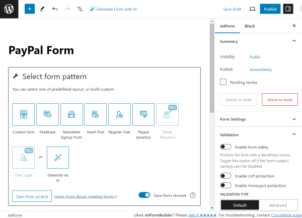
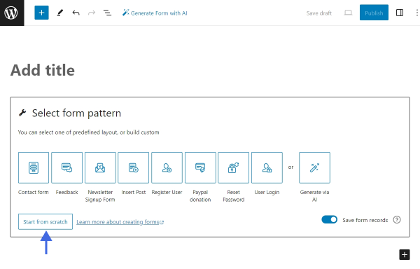
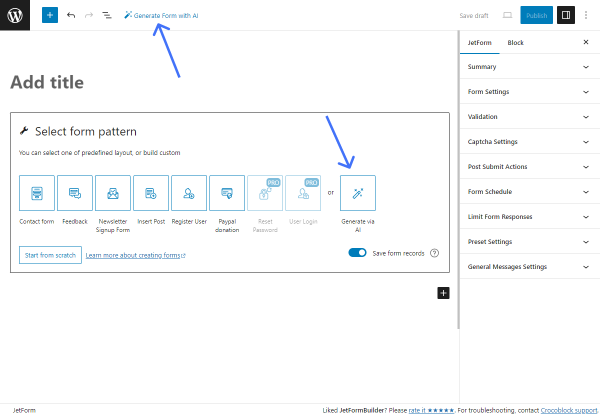
At first, the Welcomeblock is added to the form by default. Push the “Start from scratch” button to build a brand-new form. Or, press the “Generate via AI” button to create a form based on your request.
Initially, we push the “Start from scratch” button and delete three fields added by default.
The first block in the form will be the “Personal Info” Heading.
Then, we add two columns. In the first one, we put the Text Fieldwith the “First Name” FIELD LABEL.
We also press the “asterisk” button above the field to make this field required for completion.
In the second column, we add one more required Text Field indicating the “Last Name.”
Returning to the first column, we add one more required Text Field, “Email Address.”
Also, set the FIELD TYPE to “Email”.
In the second column, we place one more required Text Field, named “Phone Number” this time. So, the FIELD TYPE should be set to “Tel” this time.
Then, we add one more Heading, “Shipping Info.”
After this, we add the required Text Field. This field will contain the shipping address.
You can create several address fields and make them required to ensure the shipping address is complete.
For instance, we add the required “City,” “Country,” “Postal Code,” and “State/Province/Region” Text Fields.
The following Heading is “Order Info.”
The first field in this section will be the Radio Fieldcalled “Your Order.”
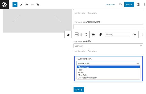
In our case, the FILL OPTIONS FROM field is set to “Manual Input.” If you also pick this option, press the “Manage items” button to manually add options to the field.
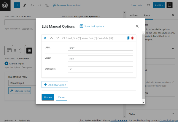
Add all the needed options by pressing the “Add new Option” button whenever you want to add a new option to the radio.
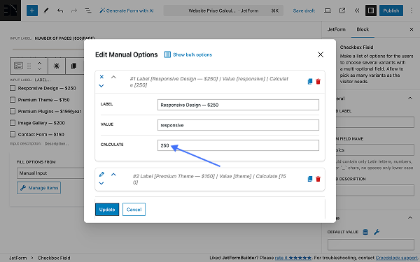
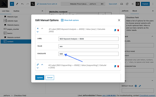
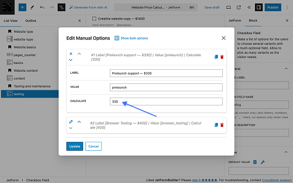
For instance, the first option in the given case has the “Shirt” LABEL, the “shirt” VALUE,and the “20” value set in the CALCULATE field.
“20” in this field indicates the value that will be used for total price computation in the Calculated Field.
After you add all options, press the “Update” button.
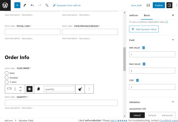
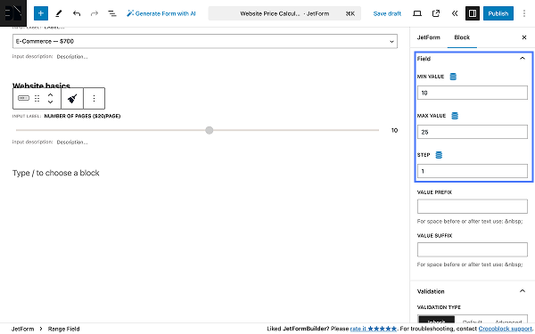
The following is the required Number Fieldindicating “Quantity.”
In the Field settings, we set the “1” MIN VALUE, “5” MAX VALUE, and “1” STEP value.
One more section will be separated by a Heading, which is called “Extra Info.”
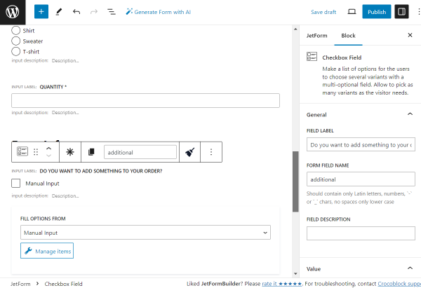
The next field here is a “Do you want to add something to your order?” Checkbox Field.
Then, we set FILL OPTIONS FROM to “Manual input” and click the “Manage items” button.
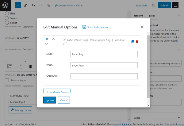
Here, we set three options. The flow is the same as for the Radio Field mentioned above.
Once all the needed options are added, press the “Update” button to return to the form.
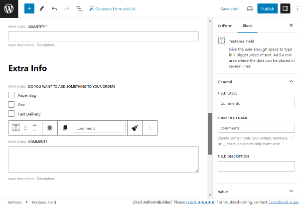
The following field to be added is the Textarea Fieldcalled “Comments,” which will be optional for completion.
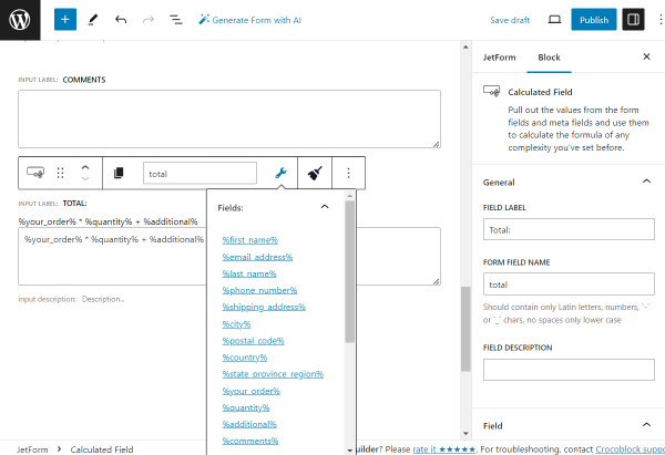
To finalize the form, we add the “Total:” Calculated Fieldand add the following values inside:
%your_order% * %quantity% + %additional%
All of the values presented here are the FORM FIELD NAMES of the previously added fields; all fields and macros can be found in the drop-down list under the “wrench” icon.
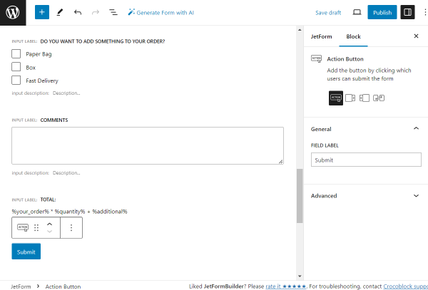
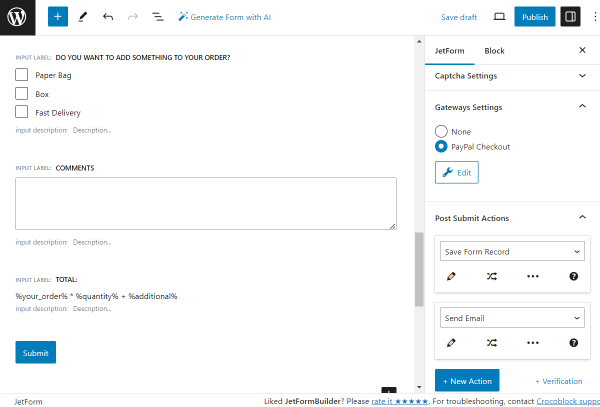
The last field in the form is the Action Button. We leave it as default, but the FIELD LABEL can be changed there if needed.
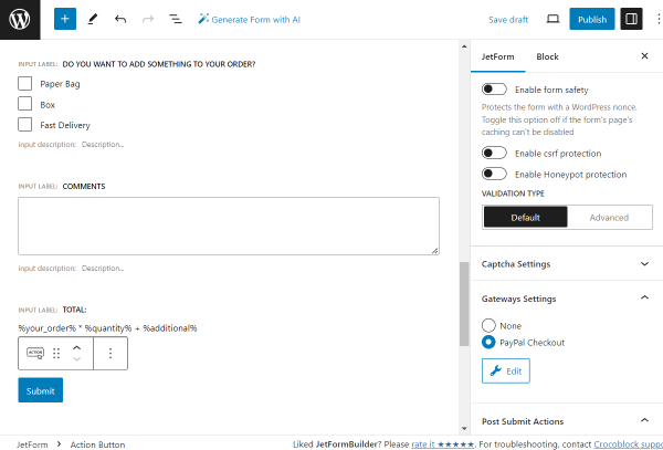
Then, proceed to the JetForm section of the form and open the Gateways Settings tab.
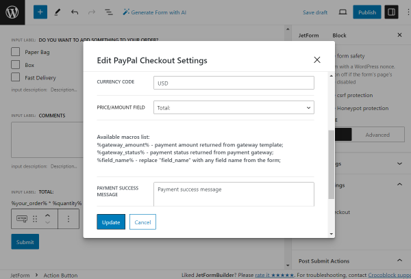
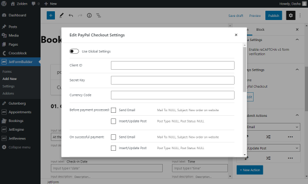
Here, pick the “PayPal Checkout” option and press the “Edit” button to customize the settings.
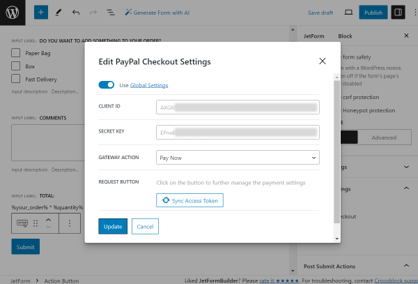
In the pop-up, you can either activate the Use Global Settings toggle to copy the CLIENT ID and SECRET KEY fields from there or complete these fields manually.
Then, select the preferred GATEWAY ACTION; it can be either the “Pay now” or “Create a subscription” option.
The further settings for these options will appear once you press the “Sync Access Token” button, and the synchronization process will be completed successfully.
For instance, we leave the default “Pay Now” GATEWAY ACTION.
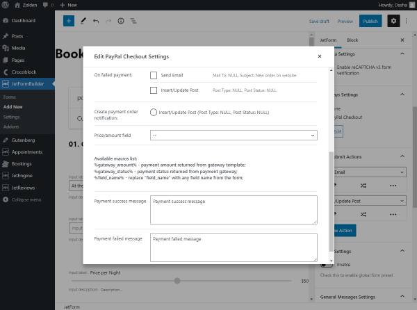
After the synchronization is complete, we adjust the CURRENCY CODE(“USD” in our case) and select our “total” field as the PRICE/AMOUNT FIELD so the price for PayPal transaction will later be taken from this Calculated Field.
You can also customize the following payment messages if desired or leave them as default.
Press the “Update” button to save the changes.
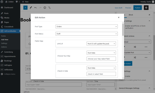
Head to the Post Submit Actions tab. Here, we set the “Save Form Record” action and leave its settings unchanged; with this action, the values entered in the form will be saved to the JetFormBuilder plugin’s Form Records directory.
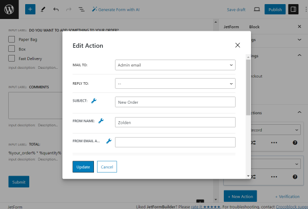
One more action we add is “Send Email.” It can be edited by pressing the “pencil” button below the option.
Here, adjust the settings according to your needs. More about the customization of this action can be found in the “Send Email” overview.
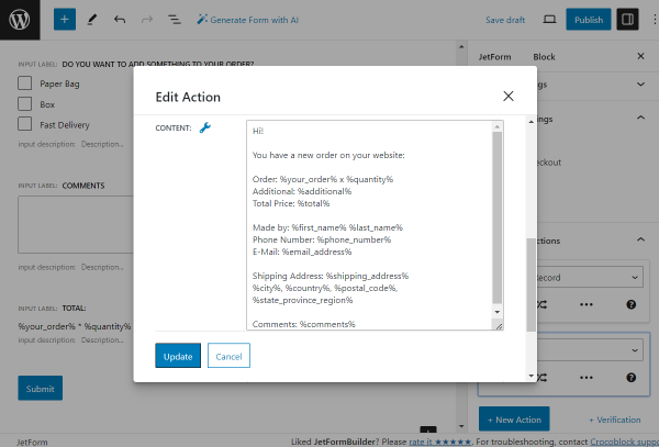
For instance, we added the CONTENT to the sent email based on our form fields.
In this message, the fields are presented with macros (based on their FORM FIELD VALUE and put inside two “percent” symbols). This way, the values put in the form will be dynamically pulled to the sent email.
Push the “Update” button to save the action settings.
You can customize the form further if needed. For instance, you can adjust the style settings with the free JetStyleManagerplugin.
Once the form is ready, press the “Publish” button.
Let’s add a form to the page/template. For example, we will work with the static page, so we open WordPress Dashboard > Pages and press the “Add New” button.
The form built with JetFormBuilder can be placed on pages/templates built with Elementor, Gutenberg, or Bricks. The JetForm settings in all the available builders are the same.
In our case, we work with Elementor.
Add the additional content to the page if needed. Then, find the JetFormwidget/block/element and put it on the page.
Select the just-built form in the corresponding field (Choose Form).
Once you customize all the desired settings, press the “Publish/Update” button.
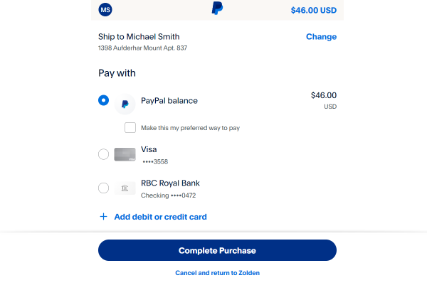
Head to the front end of the just-edited page. Complete the form and press the “Submit” button.
If everything is completed correctly, you will be redirected to the PayPal page, where you can complete the transaction.
Once the transaction is done, the form should be fully submitted.
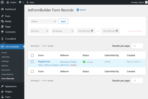
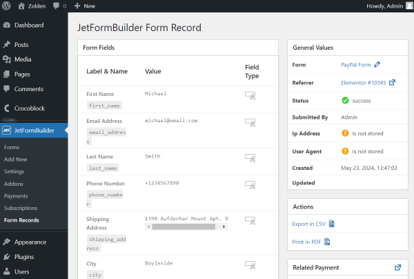
You can also check WordPress Dashboard > JetFormBuilder > Form Recordsif the corresponding action was set previously.
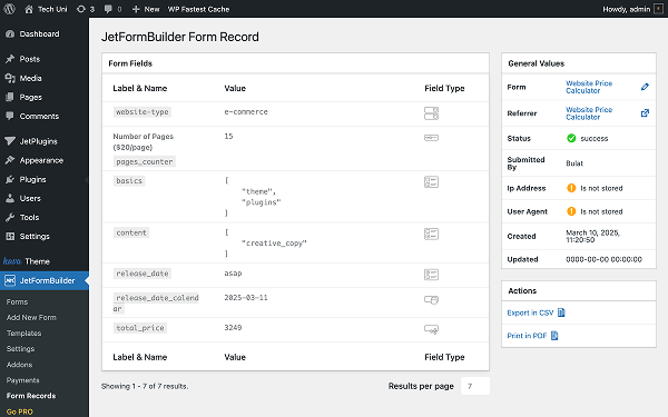
There, you can find the information on the available form records.
To see the full information, hover over the needed record and push the “View” button.
There, you can check the information about the completed fields in the form.
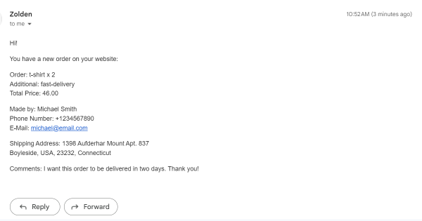
Also, as we have added the “Send Email” action, we receive an email containing the necessary information from the completed form.
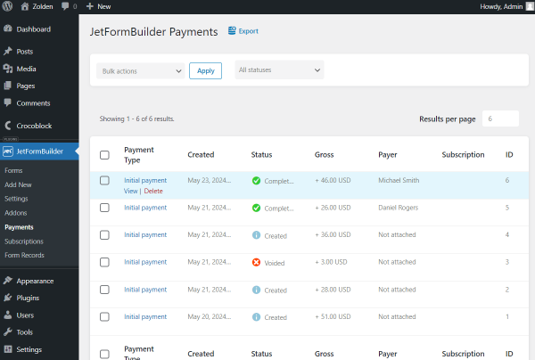
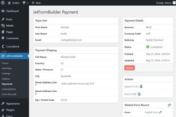
The final step is to check the WordPress Dashboard > JetFormBuilder > Payments directory.
Hover over the needed transaction and click the “View” button.
Here, the information about the transaction can be checked.
That’s all; now you know how to build a PayPal form using the JetFormBuilder plugin for WordPress.
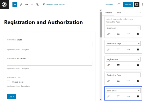
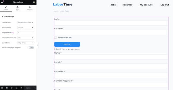
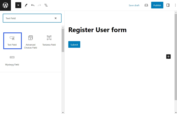
The free version of JetFormBuilder allows building a Register Form, and the User Login Action addon enables the creation of a front-end login form. While they can exist as two separate forms, it is possible to combine the functionalities of registration and login in one form using the Render States.
This tutorial will explain how to use the Render States feature to combine the two forms and switch between them with a button.
Follow to WordPress Dashboard > JetFormBuilder > Forms > Add New to create a new form. To start building a new form from scratch, press the “Start from scratch” button in the Welcome block.
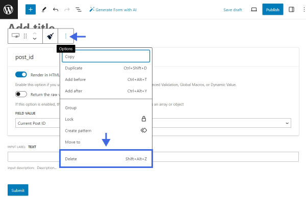
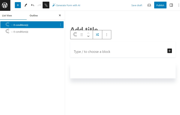
Give the form a title and remove all the field blocks from the canvas. To remove a block, click on it, find the “Options” button in the toolbar, and select “Delete.”
After removing all the blocks, toggle the Block Inserter by clicking the blue “plus” icon in the top toolbar and search for the Conditional Block. Add two Conditional Blocks to the canvas. Alternatively, use the shortcut slash command “Conditional Block” to add the blocks quickly.
The first Conditional Block will display the login form, and the second block will show the registration form. Using the Change Render State buttons, we will switch between the Conditional Blocks, and as a result, the user will see only one form at a time.
Build the Login Form
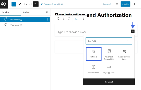
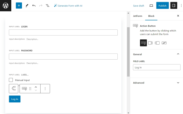
Let’s build the login form in the first Conditional Block. The form will consist of a Text Field for login, a Text Field for password, and a “Remember Me” Checkbox Field. We will also add an Action Button to submit the form and a Change Render State button to switch to the registration form.
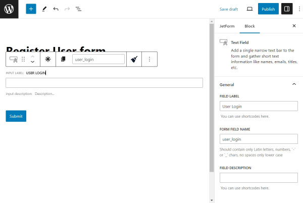
Select the first Conditional Block and click the black “plus” icon on the right side to toggle the Block Inserter. Search for the Text Field and add it.
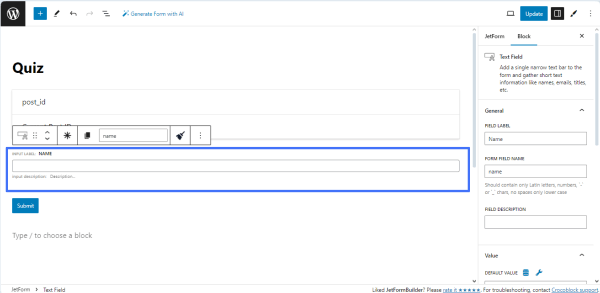
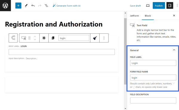
Open the Block settings. Give this field a FIELD LABEL — “Login,” and a FORM FIELD NAME — “login.” In this field, users will insert their login.
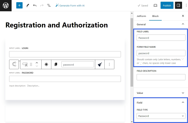
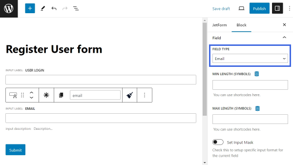
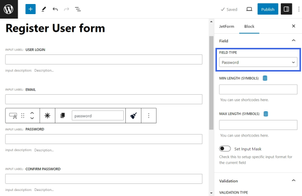
Next, add a new Text Field for the user password. Set the FIELD LABEL to “Password” and the FORM FIELD NAME to “password.” Then, scroll the Block settings down and find the FIELD TYPE drop-down menu. Select the “Password” option.
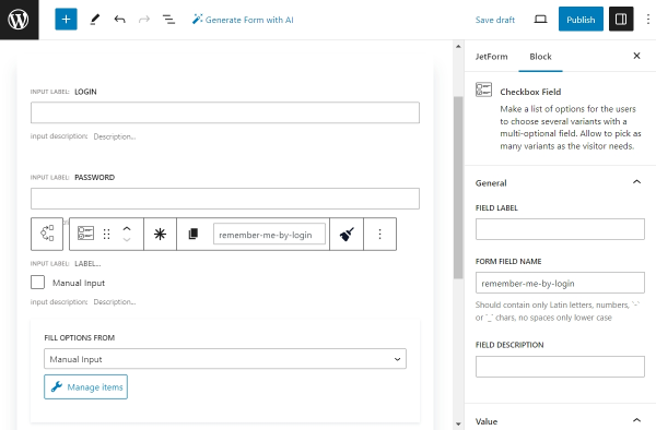
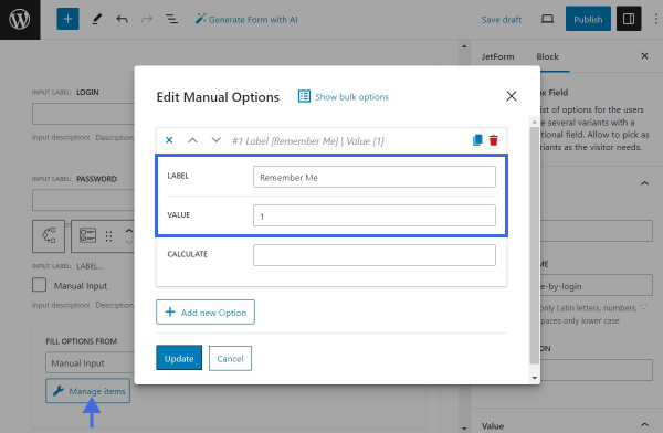
After that, add a Checkbox Field below the Text Fields, but still inside the Conditional Block. Leave the FIELD LABEL empty and enter the FORM FIELD NAME — for example, type “remember-me-by-login.”
The “Remember Me” field helps to keep the user authenticated for a longer period of time — after checking the “Remember Me” checkbox, the user will remain logged in for fourteen days; if not, only for two days.
Press the “Manage Items” button to add checkbox options. In the opened pop-up, click “+ Add new Option.” Insert “Remember Me” as the LABEL of the option and “1” as its VALUE.
Save the changes by clicking the “Update” button.
Finally, add an Action Button to let users submit the login form. Enter “Log In” as the FIELD LABEL.
For now, the layout of the login form is completed. The Change Render State button will be added later.
Let’s proceed to setting up the current Conditional Block.
Render State for Login Form
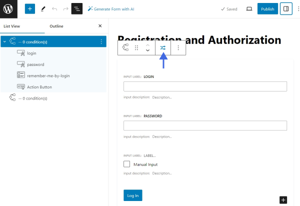
Select the first Conditional Block and click the button in the toolbar to assign a new condition.
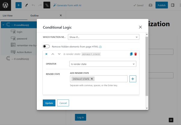
Inside the Conditional Logic pop-up, select which function to execute — “Show if…”. Then, press the “+ Add Condition” button and start setting up the condition. In the OPERATOR drop-down list, select the “Is render state” option. Pick the “DEFAULT.STATE” option from the RENDER STATE list. Click “Update” to save the changes.
The “DEFAULT.STATE” is a form default render state. When a page with a JetFormBuilder form is opened in a browser, the form is rendered in its default state. Therefore, all the content inside this Conditional Block will be displayed simultaneously. To see the content of other Conditional Blocks designed for different form states, you should switch the form state to the one needed.
Now, let’s proceed to building the Registration Form part.
Build the Registration Form
Find the second Conditional Block. Inside this block, we will place a Registration Form.
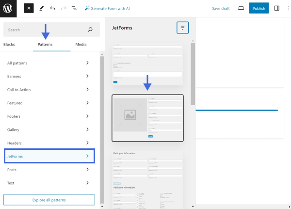
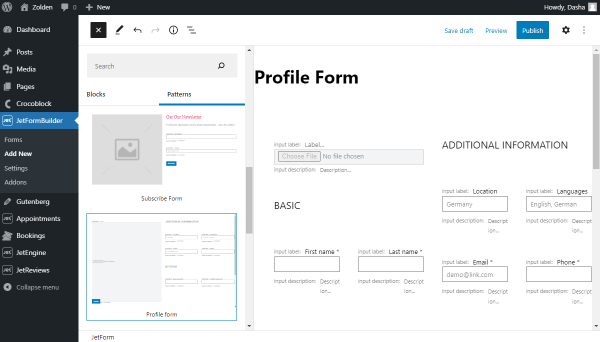
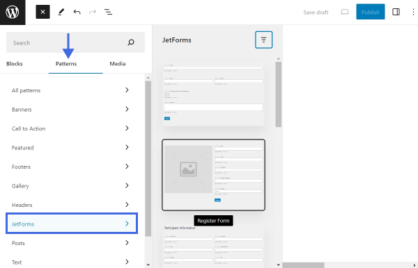
Instead of building this part from scratch, we will use a ready Pattern. Toggle the Block Inserter (the blue “plus” button) in the top toolbar and switch to the Patterns tab. Proceed to the JetForms tab and select the “Register Form” Pattern. Place it inside the second Conditional Block.
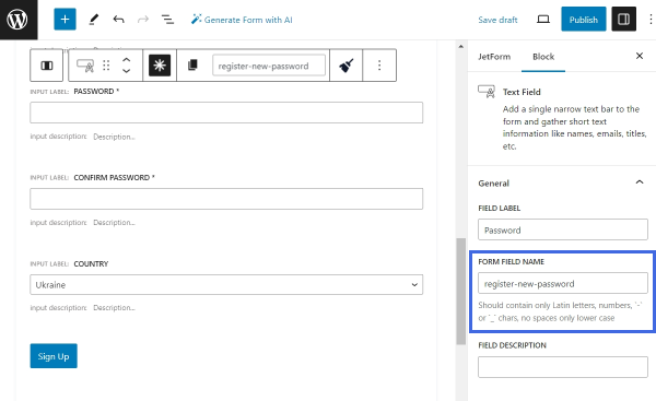
Next, remove any extra columns and blocks. Rename the FORM FIELD NAME of the “Password” Text Field. We will give it a unique name — “register-new-password.”
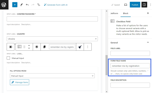
Lastly, copy the “Remember Me” field from the login form and insert it into the registration form part right above the Action Button. Give it a new FORM FIELD NAME.
With that, the registration part is completed.
Render State for Registration Form
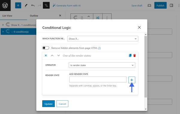
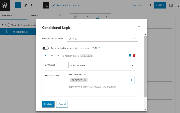
Let’s configure the render state of the second Conditional Block. As previously, select the block and open the Conditional Logic pop-up. Set the function to “Show if…” and the Operator to “Is render state.”
Then, press the “New render state” plus-shaped button to add a new custom state.
Set the name of your choice. We will call the new state “REGISTER.” Once the new state is added, it is assigned automatically to the Conditional Block.
Lastly, save the changes by hitting the “Update” button.
Add the Change Render State Buttons
To switch between states, the Change Render State block should be utilized. We will place this block inside both Conditional Blocks. The Change Render State blocks will enable us to switch between the form for login and the form for registration.
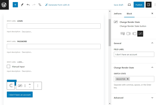
Locate the first Conditional Block. Under the Action Button, place the Change Render State block.
This button will allow users to switch from the login form, the default state, to the registration form. Therefore, give this block an appropriate label and set the “REGISTER” state into the SWITCH STATE multi-select.
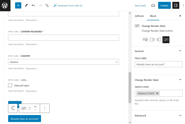
Next, add a new Change Render State block into the second Conditional Block. This button will enable users to switch from the registration to the login form. In the SWITCH STATE field, pick the “DEFAULT.STATE” option.
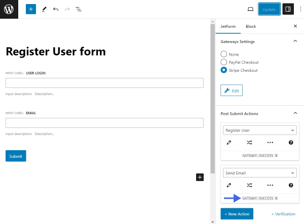
Post Submit Actions
The form layout is complete. The next part of the work is to add Post Submit Actions that should be executed after form submission.
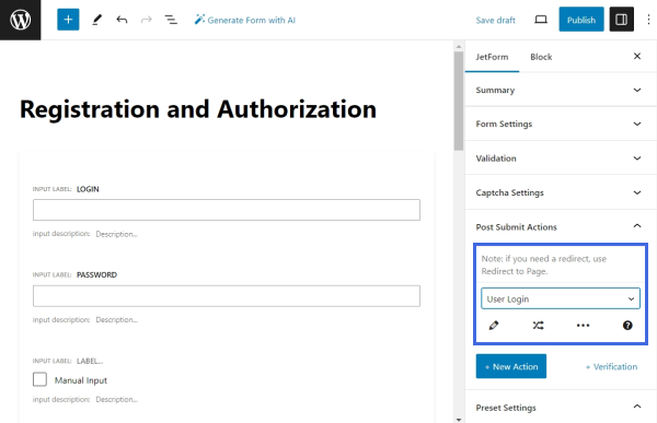
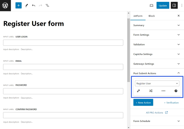
User Login
Let’s start by adding the “User Login” action, which will log users in if they submit the first part of the form.
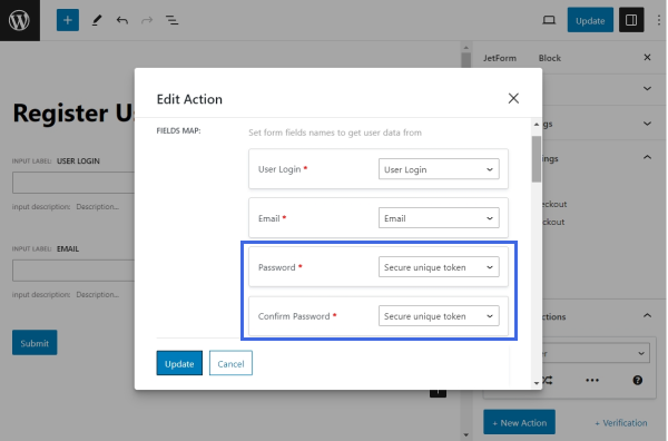
Switch to the JetForm settings tab in the right sidebar and unfold the Post Submit Actions tab. Instead of the default “Save Form Record” action, pick the “User Login” action.
Click the pencil-shaped button under the action name to edit it.
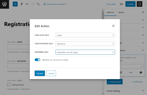
Map the USER LOGIN FIELD with the “Login” form field, the USER PASSWORD FIELD with the “Password” field, and the REMEMBER FIELD with the “remember-me-by-login” Checkbox Field from the first Conditional Block.
Click the “Update” button to save the changes and proceed to the next step.
Register User
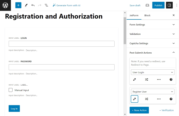
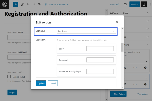
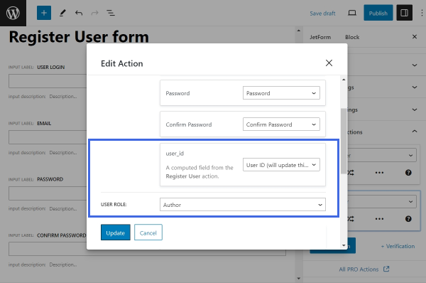
Click the “+ New Action” button to add a new action — “Register User.” This action will be executed if the user completes the second part of the form.
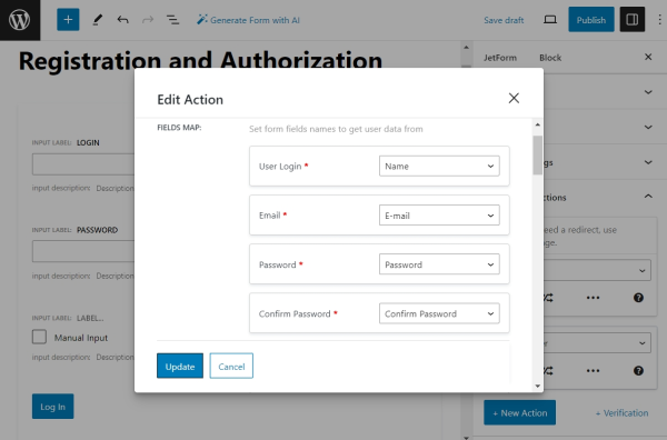
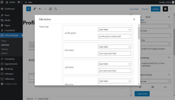
Press the “pencil” button to edit the action. Then, link the User Login, Email, Password, and Confirm Password fields with their corresponding form fields from the second Conditional Block.
Scroll the settings down to select the USER ROLE, which will be assigned to the newly registered user. If you previously created custom meta fields for users, you can link the form fields with them. To link a form field with a custom field of a user, type in the name of the corresponding meta field in front of the form field’s name in the USER META section.
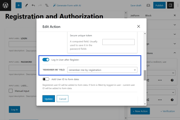
Scroll past the USER META section to activate the Log In User after Register toggle. Connect the “REMEMBER ME” FIELD with the “remember-me-by-registration” Checkbox Field from the registration form. This setting allows users to log in automatically after the registration is completed.
Follow the article about the “Register User” action to learn about each further setting in detail.
Once done, click “Update” to save the changes.
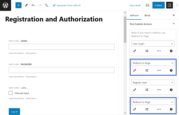
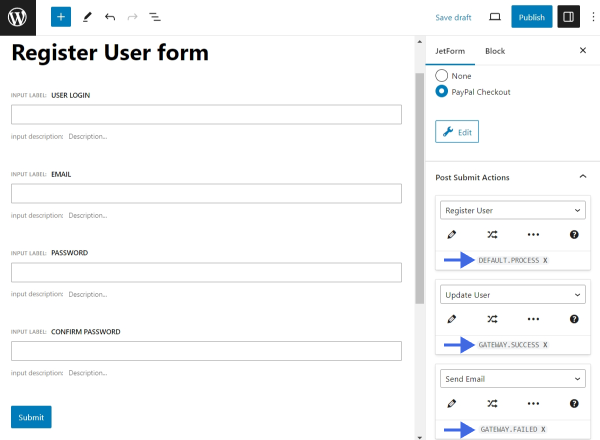
Redirect to Page
After users log in or register, it might be convenient to redirect them to different pages. For this purpose, add two “Redirect to Page” actions — one below the “User Login” action and another below the “Register User” action.
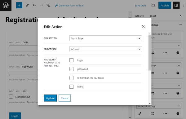
Edit the first action. In our case, we will use it to redirect users to their “Account” page after they log in.
Select the “Static Page” option from the REDIRECT TO drop-down and select the needed page — we will select the “Account” page.
Repeat the same procedure for the second “Redirect to Page” action.
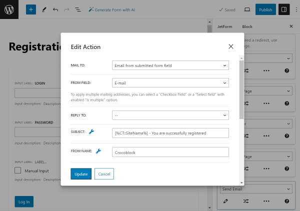
Add the last post submit action to the form—the “Send Email” action—at the end of the actions list. This action will send an email to the user after a successful registration. Then, click the “pencil” icon to edit the action.
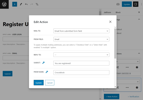
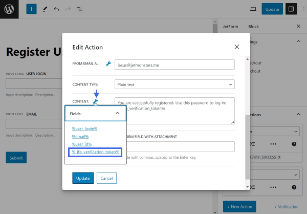
Proceed with the configuration according to our guide on the “Send Email” action. Set the MAIL TO setting to “Email from submitted form field” and select the “E-mail” field in the dropdown below. Next, define the subject of the email. Use the macro [%CT::SiteName%] to insert the website’s name dynamically into the email subject or content. Then, fill in the required fields FROM NAME, FROM EMAIL ADDRESS, and CONTENT.
Once the setup is complete, click the “Update” button to save the changes.
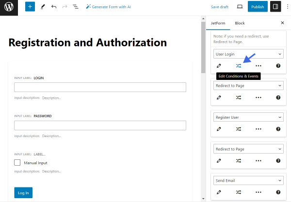
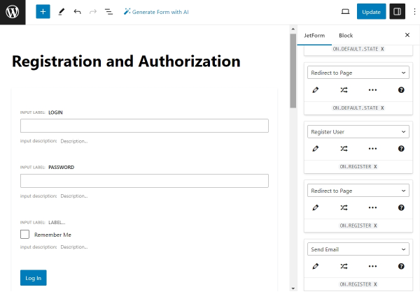
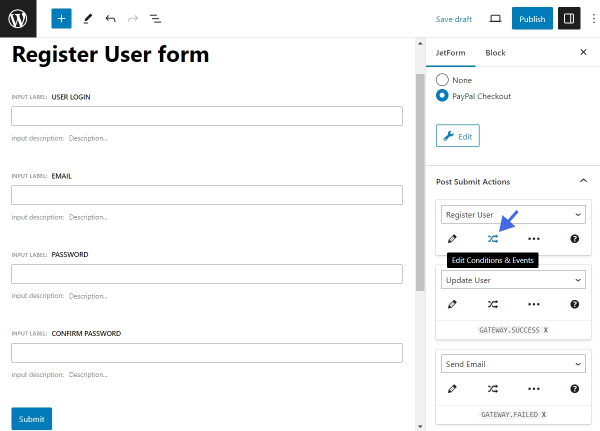
Set Up Events for Actions
The last step in the form configuration process is to assign Post Submit Actions with Events. Events define when a specific action is executed.
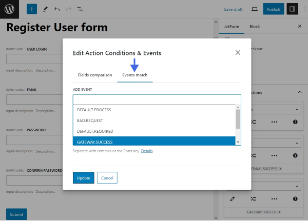
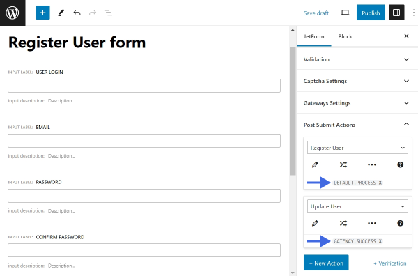
Click the “Edit Conditions & Events” button under the first action, “User Login.”
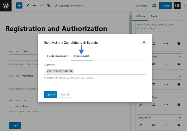
Inside the “Edit Action Conditions & Events” pop-up, switch to the “Events match” tab and assign the “ON.DEFAULT.STATE” EVENT.
Click “Update” to save the changes. Assign the same “ON.DEFAULT.STATE” EVENT to the first “Redirect to Page” action. Then, assign the “ON.REGISTER” EVENT to the rest of the actions.
Now, click “Publish/Update” to create the form. The configuration part is complete.
Add the Form to a Page
Open the page or template where the form should be located and place it using the JetForm widget (in Elementor), JetForm block (in Block Editor), or JetForm element (in Bricks). From the CHOOSE FORM drop-down list, select the built form. Learn about other settings from the JetForm Overview.
We placed our form on the page edited in Elementor. To display the form on other page builders, check our guide on How to Display a Form on the Front End.
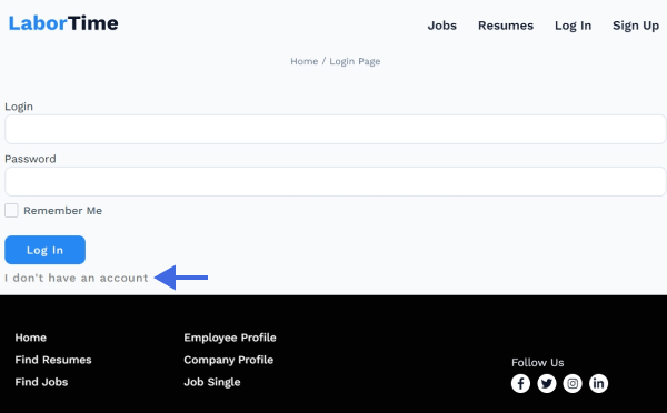
Test the Flow
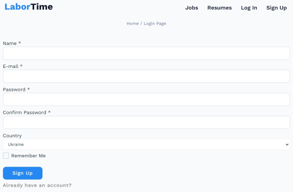
Open the page where the form is located on the front end. Only the first part—the login form—should be visible. To switch to the registration form, click the “I don’t have an account.” — the Change Render State button.
Now, the registration form is displayed.
That’s all about using the Render States to combine the functionalities of several forms in one with the JetFormBuilder plugin on your WordPress website.
The file uploading functionality is implemented via the Media Field block of the JetFormBuilder plugin. It allows different user access, storage of attachments, and specification of the maximum size of the uploaded files and their formats. Users can use the MediaField block independently, as part of the pre-built forms, or as generated by the AI ones.
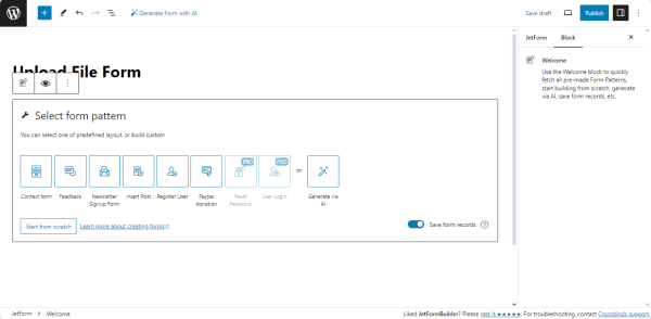
Navigate to the WordPress Dashboard > JetFormBuilder > Forms tab and press the “Add New” button to create a new form. Also, check the tutorial on How to Create a Form. Initially, the form includes the Welcome block, which allows the application of a pre-created or AI-generated form.
Press the “Start from scratch” button to develop a custom form.
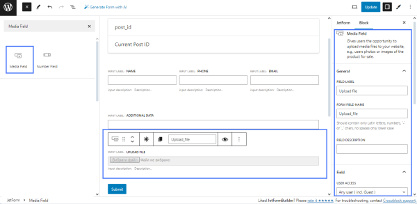
Add the Media Field Block
In the given case, we added only the Text Fields for the contact data, but you can add all the needed fields.
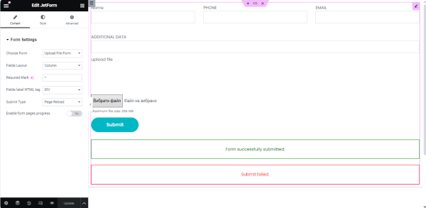
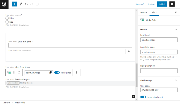
Find, drag, and drop the Media Field block. Fill in the FIELD LABEL field (in this case, “Upload file”). The FORM FIELD NAME field will be filled in automatically, but this value can be changed if desired.
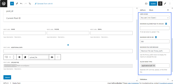
Set the following settings of the MEDIA FIELD block:
USER ACCESS — select the user type available to upload the files. In the given case, we allow uploading for the “All users (inc. Guests)” option;
MAXIMUM ALLOWED FILES TO UPLOAD — type the maximal number of allowed files to upload (for the given case, we left this field blank to upload one file);
MAXIMUM SIZE IN MB — type or select the maximum size of the uploaded files (here, we specified 500 MB);
MAXIMUM FILE SIZE MESSAGE — type the text to be displayed instead of the default “Maximum file size %max_size%” text;
ALLOW MIME TYPES — specify the allowable file types. For instance, we allowed uploading only PDF files.
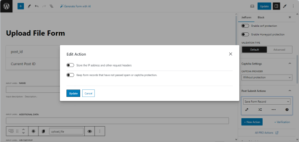
Set the Post Submit Actions
Navigate to the JetForm settings and scroll down to the Post Submit Actions settings.
The “Save Form Record” action is set by default, allowing the saving and processing of form data. If needed, edit this action and turn on the following toggles: Store the IP address and other request headers and Keep form records that have not passed spam or captcha protection. In the given case, we did not activate these toggles.
Create a page in Elementor/Block Editor/Bricks. In the given case, we created the page in Elementor.
Find the JetForm widget/block/element and drag and drop it onto the page. Once you are through with the page editing, press the “Update” button to save the result.
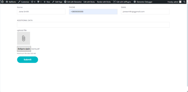
Navigate to the front end to check if the form works correctly.
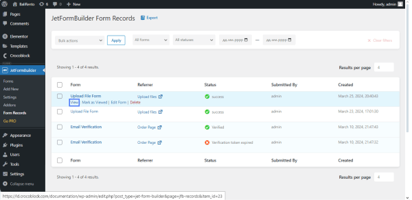
Navigate to the WordPress Dashboard > JetFormBuilder > Form Records tab to see all collected form entries. Hover the cursor over the needed form and press the “View” link under the form’s title.
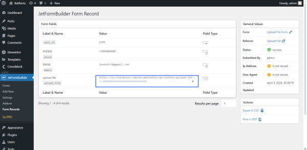
The form record displays all collected data, including a link to the uploaded file.
Follow the link to see the file uploaded with this form. To check all collected uploaded files via the developed form, navigate to the JetFormBuilder folder (wordpress/htdocs/wp-content/uploads/jet-form-builder) on the PC where your WordPress is installed.
That’s all about creating file upload forms and storage attachments in different ways on your WordPress website using the JetFormBuilder plugin.
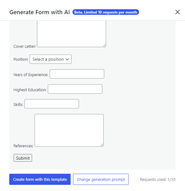
Job application forms on WordPress sites are vital for a streamlined hiring process. They help collect necessary applicant information, such as contact details, qualifications, and experience.
Using WordPress for these forms simplifies application collection and candidate management, which is especially beneficial for recruiting agencies, hiring websites, and businesses of all sizes.
With JetFormBuilder, you can create a job application form by implementing all the needed features.
The JetFormBuilder application forms help to collect job applications and detect potential employees directly on your website.
With a user-friendly form, you can not only attract more candidates but also organize the needed candidate information in one place for easy comparison and selection.
Top WordPress Job Application Form Features
Turn long application forms into multi-step and make them user-friendly;
Decide which form fields you want to make required;
Allow applicants to easily attach files to their applications. Set specific file types and sizes, adjust restrictions and verification options to ensure file security and maintain a clean database;
Implement the Conditional Visibility feature to make job application forms more dynamic. It allows form fields to be shown or hidden based on the applicant’s previous inputs;
Use reCAPTCHA v3 validation to protect the application form from spam and bot submissions. Keep the application pool relevant and manageable, saving time and resources in the recruitment process;
Provide the Success, Validation, and Error Messages during form submission;
Receive email notifications to the specified email address each time the form is submitted.
WordPress Job Application Form Structure
Step 1 — Personal Information
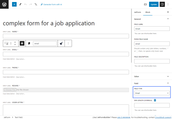
Name. A required Text Field for filling in the applicant’s name;
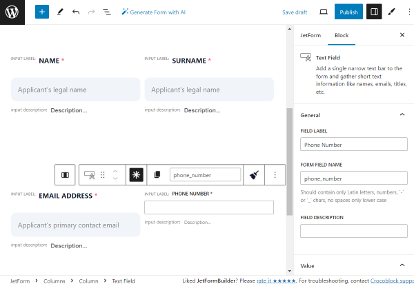
Surname. A required Text Field for filling in the applicant’s last name;
Email Address. A required Text Field of “Email” FIELD TYPE for filling in the applicant’s email;
Phone Number. A required Text Field of “Tel” FIELD TYPE for filling in the applicant’s phone number;
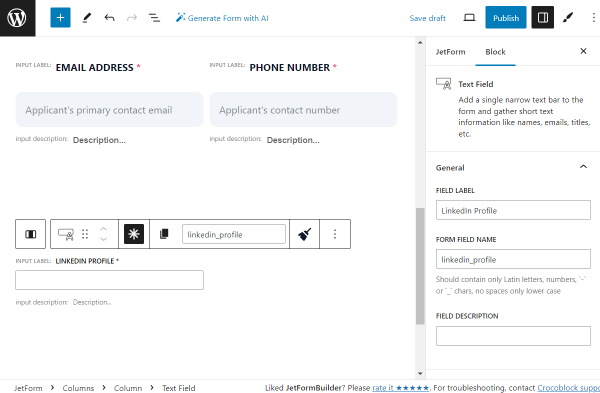
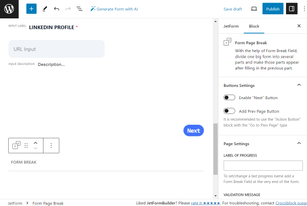
LinkedIn Profile. A required Text Field for filling in the applicant’s LinkedIn profile;
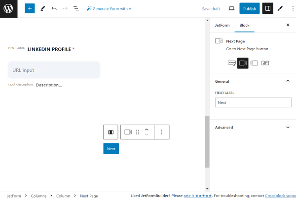
Next page. A Next Page block for proceeding to the next page;
Form Page Break. An indicator of the end of the first part of the form.
Step 2 — Experience
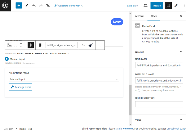
Fulfill Work Experience and Education Info. A required Radio Field with two options so the applicant can choose whether they want to upload a resume or complete the needed information manually;
Upload Resume. A required Media Field for the resume file uploading;
Job Title. A required Select Field for filling in the applicant’s previous job title;
Company Name. A required Text Field for filling in the company name of the applicant’s previous place of work;
Start Date. A required Date Field for filling in the start date of the applicant’s previous company;
End Date. A required Date Field for filling in the end date of the applicant’s previous company;
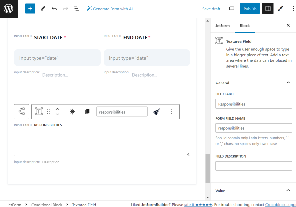
Responsibilities. A Textarea Field for filling in the applicant’s responsibilities;
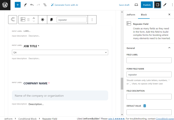
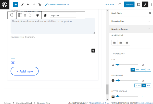
Repeater. A Repeater Field if the applicant wants to add several places of work;
Previous page. A Prev Page block for going back to the previous page;
Next page. A Next Page block for proceeding to the next page;
Form Page Break. An indicator of the end of the second part of the form.
Step 3 — Education
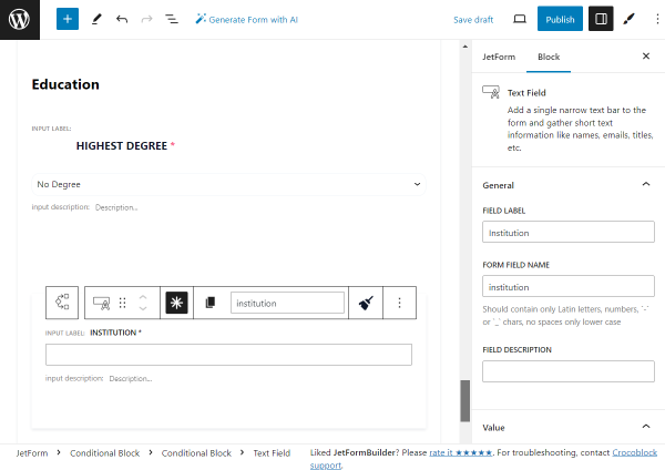
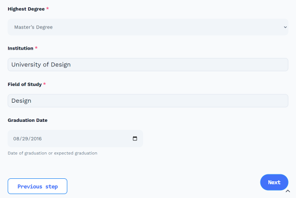
Highest Degree. A required Select Field for filling in the applicant’s higher education degree;
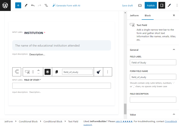
Institution. A required Text Field for filling in the applicant’s institution of learning;
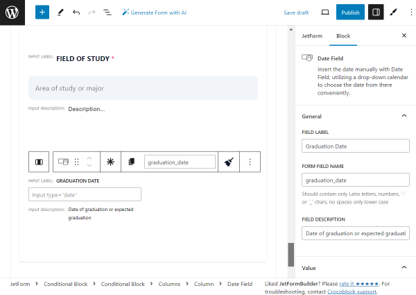
Field of Study. A required Text Field for filling in the applicant’s field of study;
Graduation Date. A Text Field for filling in the applicant’s graduation date;
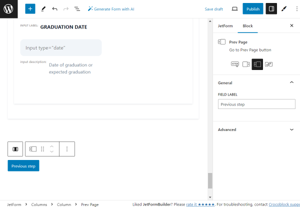
Previous page. A Prev Page block for going back to the previous page;
Next page. A Next Page block for proceeding to the next page;
Form Page Break. An indicator of the end of the third part of the form.
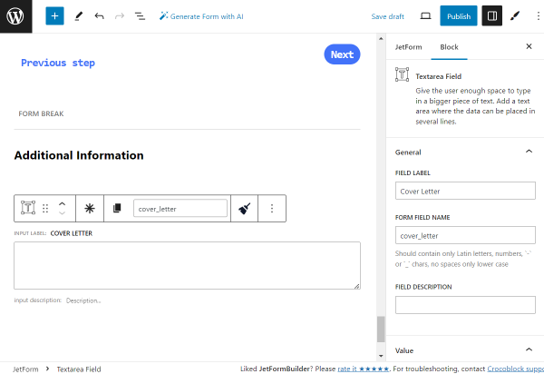
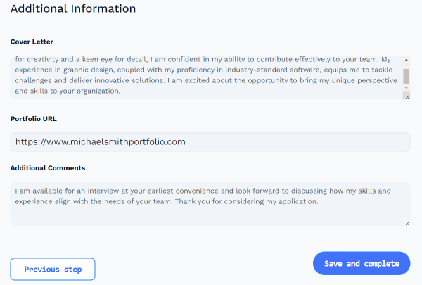
Step 4 — Additional Information
Cover Letter. A Textarea Field for filling in the applicant’s cover letter;
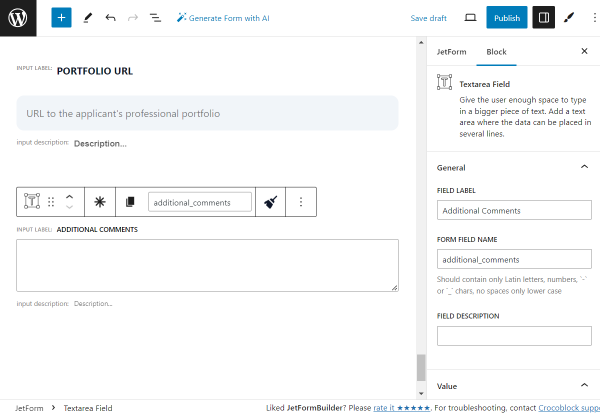
Portfolio URL. A Text Field of “Url” FIELD TYPE for filling in the URL of the portfolio;
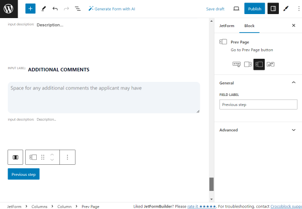
Additional Comments. A Textarea Field for filling in the applicant’s additional comments;
Previous page. A Prev Page block for going back to the previous page;
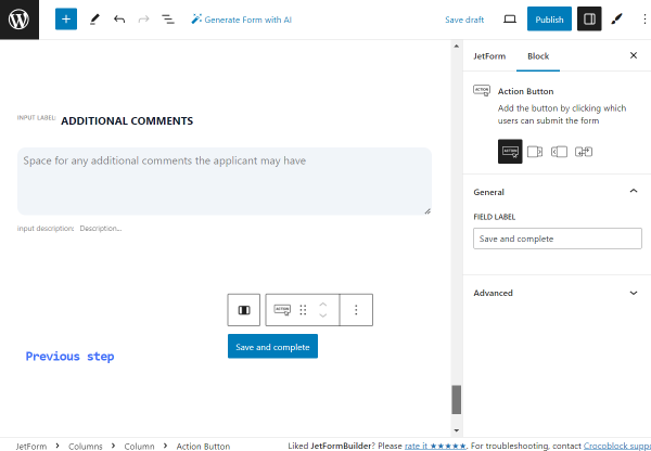
Save and complete. An Action Button block for completing the form.
How to Create a WordPress Custom Job Application Form
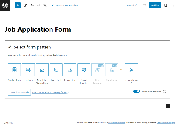
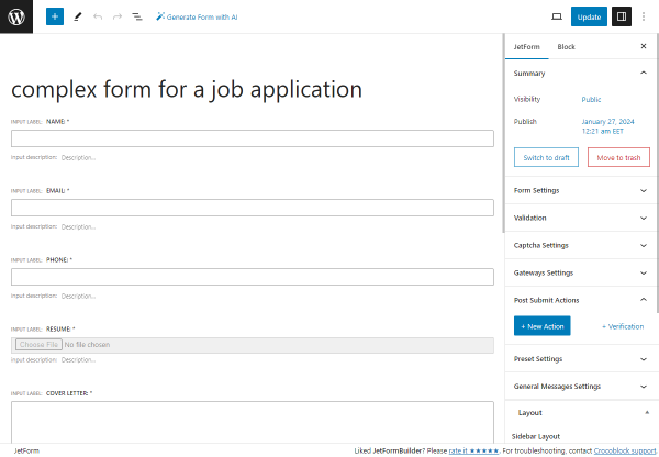
To create a WordPress online application form, navigate to WordPress Dashboard > JetFormBuilder > Add New.
Type in the title of the form.
At first, the Welcome block is added to the form by default. Push the “Start from scratch” button to build a brand-new form.
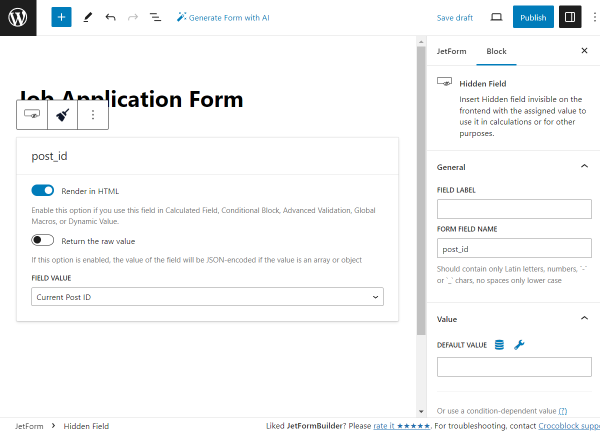
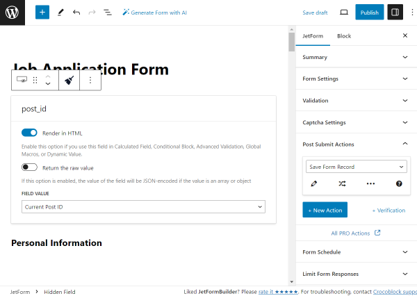
We delete the Text Field and the Action Button,leaving only the Hidden Field on the page.
No alterations to the block are needed at this time. We will keep the settings default to save the “Current Post ID” to the Form Records page later.
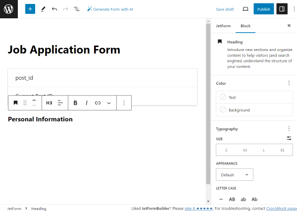
We begin the form with the “Personal information” Heading block.
The style settings can be adjusted right in the block settings.
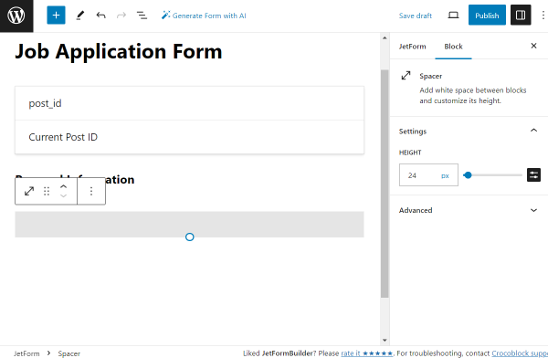
The following block is a Spacer placed to create additional space between the fields.
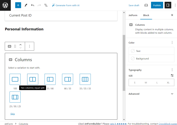
Then, we add the Columns block and choose the two-column layout.
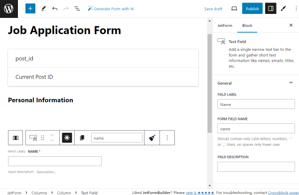
In the left column, we add the first Text Field.
We set its LABEL to “Name,” and therefore, the FORM FIELD NAME is generated automatically based on the set LABEL — “name.” It can be optionally changed if needed.
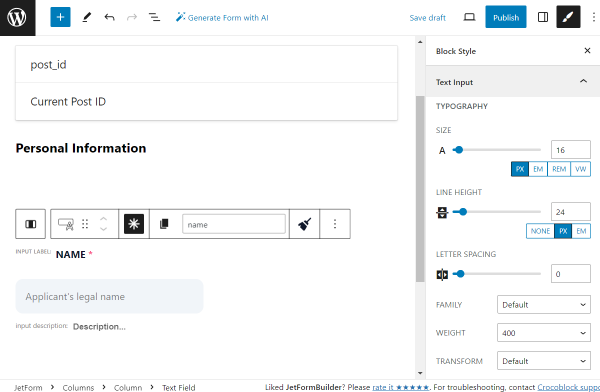
We also make this field required by clicking the “asterisk” icon located above it in the horizontal settings panel.
Right away, we work on the style settings. To make it possible, we installed and activated the free JetStyleManagerplugin.
Every style change is up to your preference.
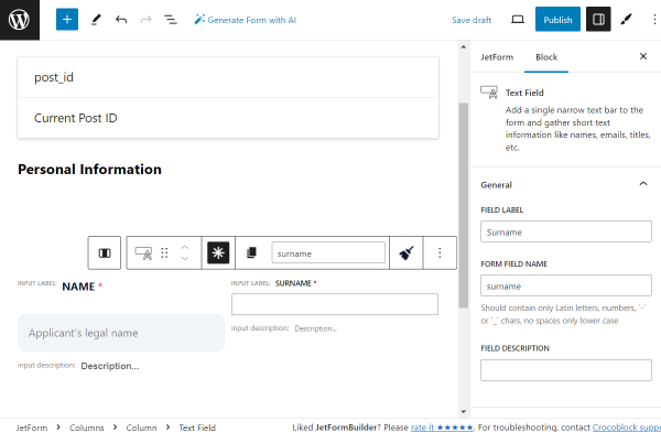
In the right column, we place the Text Field indicating “Surname,” which is also set as required and has settings similar to those of the previous field.
Adjust the style settings according to your preferences.
We add one more Spacer to create a gap between the previous and following fields.
Then, we add one more two-column layout with the help of the Columns block.
In the left column, we put the required Text Field with the “Email Address” Label.
This time, we change the FIELD TYPE from the default “Text” option to “Email.”
Adjust the style settings according to your preferences.
In the right column, we put the following required Text Field with the “Phone Number” FIELD LABEL.
Its FIELD TYPE should be set to “Tel.”
Adjust the style settings according to your preferences.
Then, we add one more Spacer and the Columns block with a two-column layout once again.
In the left column, we put the last Text Field of this form part, the required “LinkedIn Profile.”
We change the FIELD TYPE to “Url” and leave other settings by default.
Adjust the style settings according to your preferences.
We leave the right column of this two-column layout blank and add one more Columns block with the two-column layout below.
The left column is empty now, and in the right column, we put Spacer.
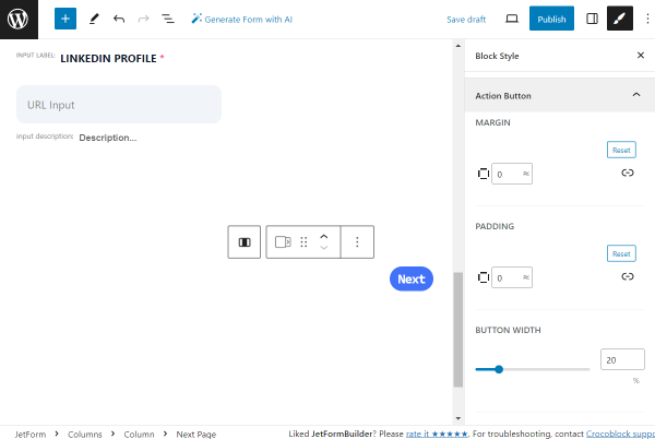
Below the Spacer, in the same column, we add the Next Pageblock. Since it will serve as the “Next” button, we complete the FIELD LABEL accordingly.
Adjust the style settings according to your preferences.
Then, we add the Form Page Breakblock to finish this part of the form. Its settings remain default.
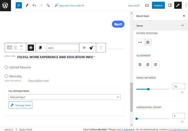
The first field of the second part of the form is the required Radio Field.
Its LABEL is set to “Fulfill Work Experience and Education Info,” the FORM FIELD LABEL is generated automatically, and the DEFAULT VALUE is set to “manually,” the option we will now add to the radio.
To add the options, push the “Manage items” button.
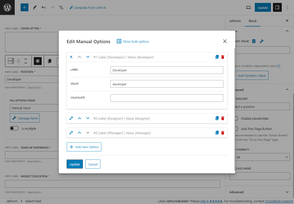
In the opened pop-up, click the “Add new Option” button.
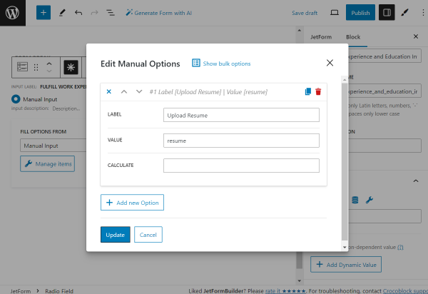
We add the first option, setting its LABEL to “Upload resume” and VALUE to “resume.”
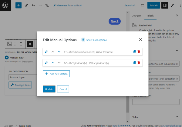
Then, we add one more option by clicking the “Add new Option” button.
Another option has the “Manually” LABEL and “manually” VALUE.
Once all the options are set, push the “Update” button.
Now, adjust the style settings according to your preferences.
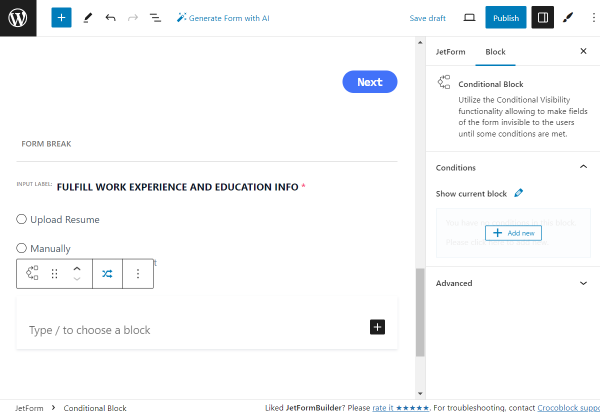
We want to show different fields depending on the selected field in the previous Radio Field. So, we add the Conditional Blockto the page.
The first Conditional Block is for the “Resume” option. We click the “Add new” button that appears when hovering over the section in the Show current block field of the Conditional Block settings.
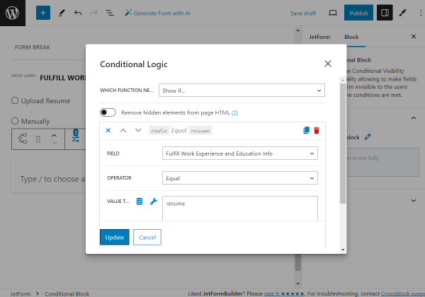
In the appeared pop-up, we define the “Show if…” option in the WHICH FUNCTION NEED EXECUTE? field, pick the “Fulfill Work Experience and Education Info” FIELD, set “Equal” OPERATOR, and complete the VALUE TO COMPARE field with the “resume” value.
Then, we hit the “Update” button.
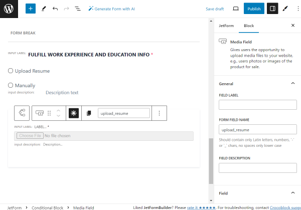
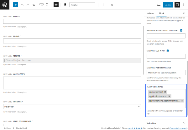
Next, we add the required Media Fieldblock. We leave the LABEL field empty and complete the FORM FIELD NAME with the “upload_resume” value.
Also, in the Field tab, you can set the needed USER ACCESS option. For instance, the “Any registered user” option allows uploading files for only the registered users correspondingly.
If enabled, the Insert attachment toggle will save the attachment to the Media Library.
The MAXIMUM ALLOWED FILES TO UPLOAD field allows you to define the maximum number of files the user can upload. If left empty, the uploading limit is set to one file.
We set the MAXIMUM FILE SIZE MESSAGE to “Upload PDF or DOCX file up to %max_size%,” where the %max_size% value is the macro used to display the maximum allowed file size.
NOTE
If several files are allowed to be uploaded in the MAXIMUM ALLOWED FILES TO UPLOAD field, this field defines the maximum total size of all downloaded files, not each of them.
Adjust the style settings according to your preferences.
The first Conditional Block is now completed.
Now, we add one more Conditional Block; this time for the “Manually” answer selected in the previously added “Fulfill Work Experience and Education Info” Radio Field.
Once again, we click the “Add new” button to add a condition for the current block.
In the appeared pop-up, we define the “Show if…” option in the WHICH FUNCTION NEED EXECUTE? field, pick the “Fulfill Work Experience and Education Info” FIELD, set “Equal” OPERATOR, and complete the VALUE TO COMPARE field with the “manually” value this time.
The first block in this condition is the Spacer,which creates a space between the fields.
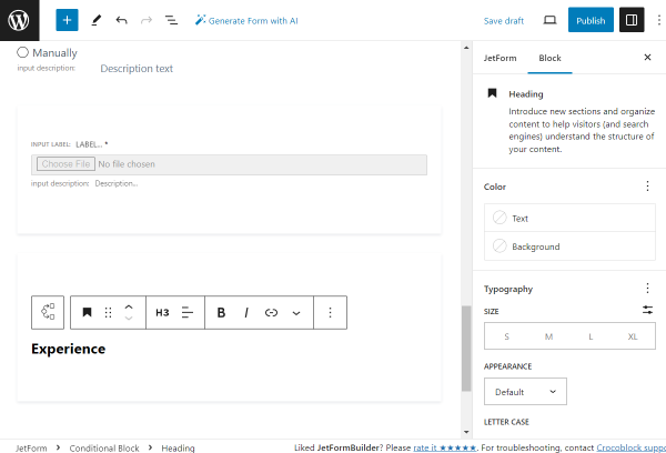
To begin a “Manually” part of the form, we add a Heading block, “Experience.”
In this case, the style settings can be adjusted right in the block settings.
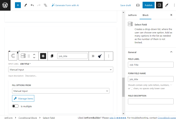
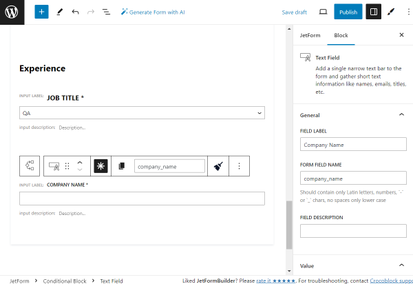
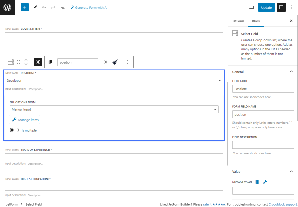
The following block is the required Select Field. Its FIELD LABEL is set to “Job Title” and the FORM FIELD NAME to “job_title” accordingly.
In the Advanced tab, we set the PLACEHOLDER to the “Title of the position held.” Also, we activate the Disable placeholder feature, so the placeholder itself can not be picked as an option.
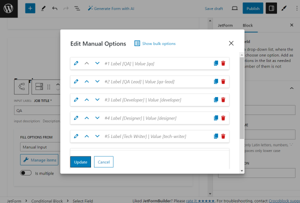
Click the “Manage options” button to add the options for selection.
We add the following options: “QA,” “QA Lead,” “Developer,” “Designer,” “Tech Writer,” and “Motion designer.”
Once the options are set, push the “Update” button.
Adjust the style settings according to your preferences.
We place one more Spacer in the form.
Then, we add one more required Text Field with the “Company Name” FIELD LABEL.
Adjust the style settings according to your preferences.
We place one more Spacer on the page.
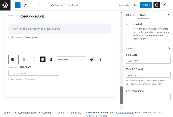
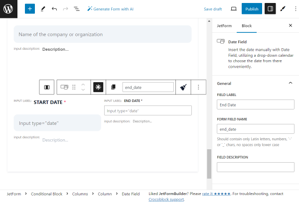
Then, we add the Columns block with the two-column layout. In the left field, we place the required Date Fieldnamed “Start Date.”
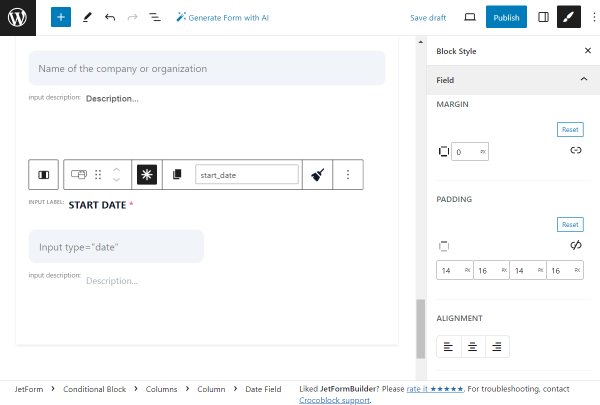
Adjust the style settings according to your preferences.
In the right column, we add one more required Date Field called “End Date.”
Adjust the style settings according to your preferences.
Now, we put one more Spacer to create some space between blocks.
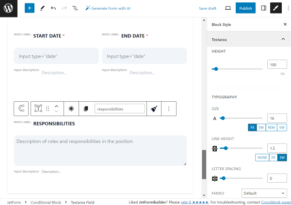
The next block we add is the “Responsibilities” Textarea Fieldblock. Its settings are left default in the described case.
Adjust the style settings according to your preferences.
We add a Spacer block to create an additional space between blocks.
Then, we add the Repeater Field so the applicant can later add several job positions held.
Leave the FIELD LABEL field empty and complete the FORM FIELD NAME with the “repeater” value.
In the MANAGE REPEATER ITEMS COUNT, we leave the “Manually” option so the user can add blocks by clicking the button. The ADD NEW ITEM LABEL is set to “+ Add new.”
Inside the Repeater, we put the same fields we put before, beginning from the “Job title” Select Field and ending with the “Responsibilities” Textarea Field.
Adjust the style settings of all mentioned fields according to your preferences.
Then, we add one more Spacer to the form.
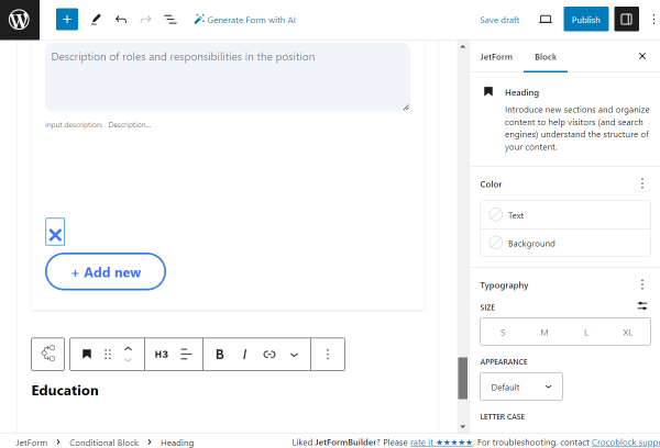
The following block is the Heading indicating the “Education” part of the form.
In this case, the style settings can be adjusted right in the block settings.
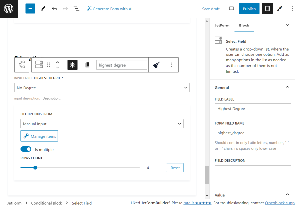
The next field is the required Select Field block called “Highest Degree.”
The PLACEHOLDER here is set to “The highest level of education attained by the applicant.” Also, we activate the Disable placeholder feature, so the placeholder can not be picked as an option.
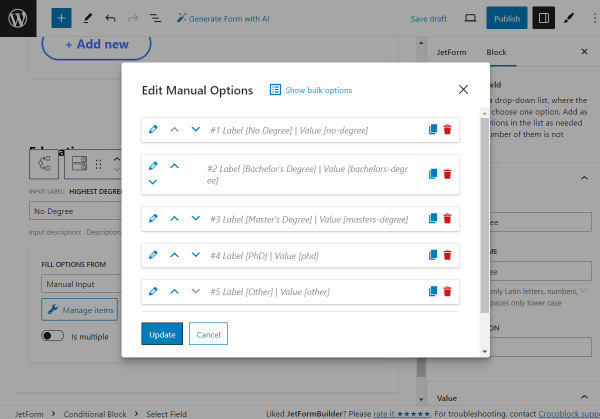
Click the “Manage items” button to set the select options.
You can add the necessary options by clicking the “Add new Option” button each time you need a new one.
Once all the options are added, press the “Update” button.
Adjust the style settings according to your preferences.
Then, we add one more Spacer to the block.
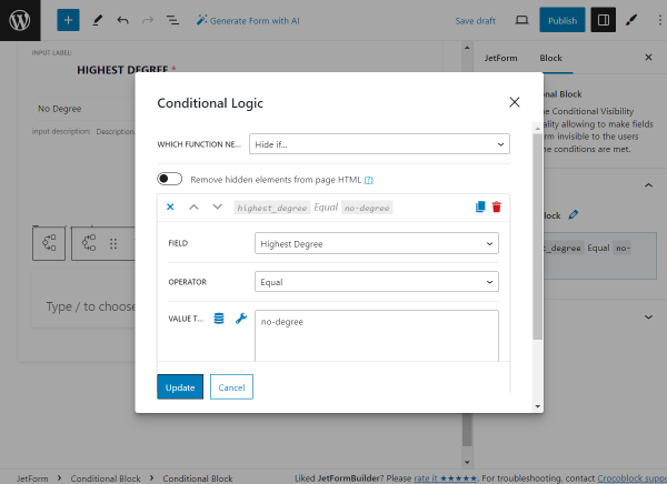
Inside the current Conditional Block, we add one more Conditional Block. This time, it will hide the following fields if the “No Degree” option is selected in the “Highest Degree” Select Field.
So, in the appeared conditions pop-up, we now define the “Hide if…” option in the WHICH FUNCTION NEED EXECUTE? field, pick the “Highest Degree” FIELD, set “Equal” OPERATOR, and complete the VALUE TO COMPARE field with the “no-degree” value this time.
Once done, we push the “Update” button.
As the first block in this Conditional Block, we add a required Text Field, “Institution.”
Adjust the style settings according to your preferences.
Then, we put one more Spacer on the page.
After that, we add one more required Text Field, “Field of study.”
Adjust the style settings according to your preferences.
We add one more Spacer to the form.
Then, we add one more Date Field to the form. The FIELD LABEL is “Graduation Date,” and the FIELD DESCRIPTION is “Date of graduation or expected graduation.”
Adjust the style settings according to your preferences.
Outside of the Conditional Block, we add a Spacer.
After the Conditional Block, we create one more two-column layout with the help of the Columns block.
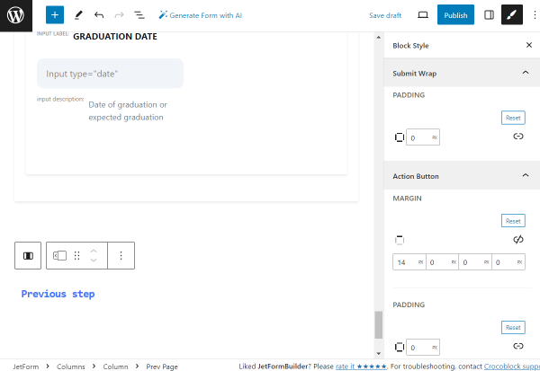
In the left column, we add the Prev Page block with the “Previous step” FIELD LABEL.
Adjust the style settings according to your preferences.
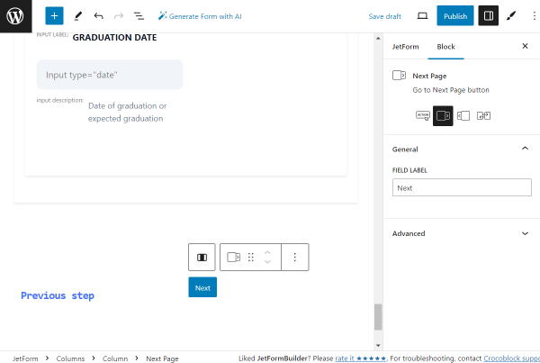
In the right column, we put the Next Page block with the “Next” FIELD LABEL.
Adjust the style settings according to your preferences.
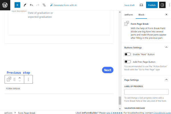
Now, we add one more Form Page Break block to indicate the end of the second part of the form.
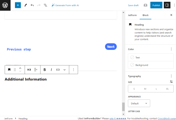
Then, we add one more Heading block, “Additional Information.”
In this case, the style settings can be adjusted in the block settings.
Next, we add a Spacer block to the form.
The following field is the Textarea Field named “Cover Letter.”
Adjust the style settings according to your preferences.
Now, let’s add one more Spacer.
The next field is a Text Field with the “Portfolio URL” FIELD LABEL.
Adjust the style settings according to your preferences.
After that, we add one more Spacer.
Then, we add one more Textarea Field block called “Additional Comments.”
Adjust the style settings according to your preferences.
We add one more Spacer to the form.
Then, we create one more two-column layout with the Columns block.
In the left column, we put the Prev Page block with the “Previous step” FIELD LABEL.
Adjust the style settings according to your preferences.
In the right column, we put the last block of the form, the Action Button block with the “Save and complete” FIELD LABEL.
Adjust the style settings according to your preferences.
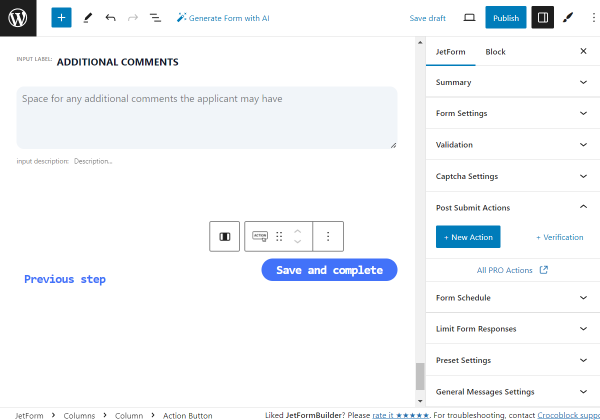
Now, let’s adjust the Post Submit Actions. To do so, open the JetForm tab of the settings and find the Post Submit Actions section.
The tutorial details creating a user-friendly, functional, and conversion-making T-shirt order form using the JetFormBuilder plugin for WordPress. It covers managing specific form fields, adding integrations with payment and marketing plugins and add-ons through Post Submit Actions, and optimizing orders for your business or event.
The T-shirt order form is the last stage of the sales funnel and a huge marketing tool, which:
Collects fully personalized data on users and their preferences;
Collects users’ emails for further marketing communications (i.e., for mailing propositions on sales or post-sales communications);
Contributes to conversions by addressing the issue of users exiting the forms at the last step;
Generates leads;
Makes your site more user-friendly and thus increases the probability of further orders;
Makes purchases easy and orders proceed quickly and safely by seamlessly integrating with payment systems and providing the needed security means.
Top WordPress T-Shirt Form Features
Order forms are a necessary site element and the last step between clients and their orders. Therefore, they should be user-friendly (intuitive, discreet, and simple), functional (provide payments and seamless integration with plugins and add-ons), and effective (provide conversions and collect the necessary marketing data on users and their orders).
Develop a clear structure of a multi-step form with a logical sequence of only needed fields divided by breaks;
Specify the required and not form fields;
Provide safety identification, verification, and validation (i.e., reCAPTCHA v3) of the user-associated actions (i.e., auto-filling of fields after user registration);
Collect and proceed with the order data via one dashboard;
Generally, the JetFormBuilder plugin provides the following:
Variety of combinable tools: users can use JetFormBuilder’s block fields and patterns separately, generate forms via AI, or combine all three;
Post Submit Actions automatize order being processed, i.e., redirect to pages, save data in the database, send emails, etc.;
Seamless integration with JetPlugins, WooCommerce,and email marketing services (i.e., ActiveCampaign, GetResponse, Mailсhimp, Zapier, and Make);
Form style customizations using the free JetStyleManager plugin;
Safe payments and storage of user’s data;
Different verification and validation methods;
Identification of users and pre-filling the form fields with the saved data;
Multiple PRO add-ons for additional tasks such as hierarchical selection, user login, advanced color picking, field autocompleting, saving form progress and form scheduling, payments, and more.
T-Shirt Order Form Typical Structure
Step 1 一 Order data
This step includes fields for uploading images for printing on the T-shirt(s) and selecting the T-shirt sizes, colors, and quantities. It contains such blocks:
Progress Bar block to specify the start of the form proceeding;
NumberField to input the number of needed T-shirts;
RepeaterField with the nested fields:
MediaField for uploading an image for printing on the T-shirt,
Advanced Choice Fields for selecting the size and colors available;
Calculated Field to calculate the approximate price;
Form Page Break to divide the form into steps;
“Next” button to navigate to the next page.
Step 2 一 Contact data
This step includes the fields to store users’ data. It comprises such blocks:
Progress Bar block to specify the next stage of the form proceeding;
Text Fields to store users’ contact data;
Form Page Break field to allow navigation to the next and previous pages.
Step 3 一 Delivery data
Felds for address and delivery method data. It contains such blocks:
Progress Bar block to specify the next stage of the form proceeding;
TextFields to store the delivery settings;
“Action” button to submit the form.
How to Create a WordPress Custom T-Shirt Form
In the given case, we explain how to build a multi-step form for ordering the needed number of T-shirts with a printed user’s image. Additionally, users can select the required color and size of the T-shirts. Due to this, pricing issues relating to printing are not considered.
Create a multi-step form
Navigate to the WordPress Dashboard > JetFormBuilder > Forms tab and press the “Add New” button to create a new form.
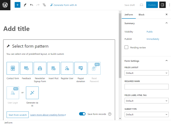
The created form has the Welcomeblock, allowing the application of a pre-created form. In the given case, we make the form from the beginning, so press the “Start from scratch” button.
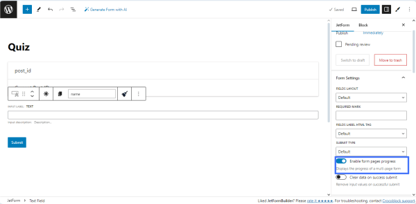
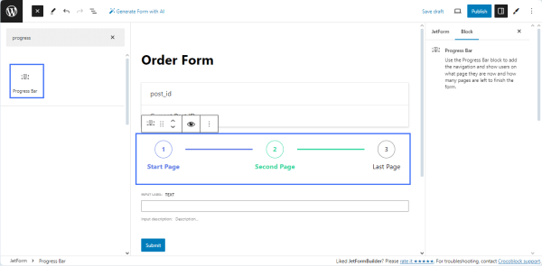
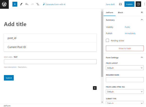
The Hidden Field, Text Field, and Action Button blocks are added by default; therefore, you can delete them if they are not needed in your form. Add the form’s title. Find the Progress Bar block and add it to the page.
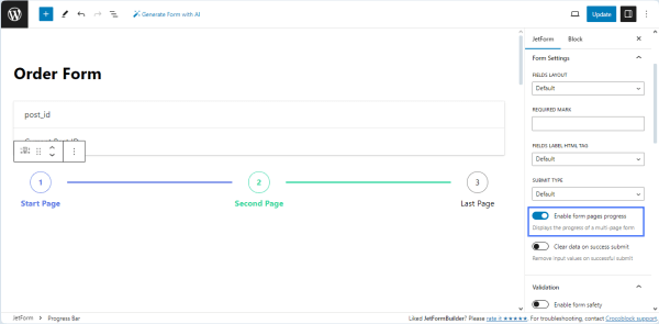
To divide the form into pages on the front end and display the progress on each page, navigate to the JetForm settings and activate the Enable form pages progress toggle.
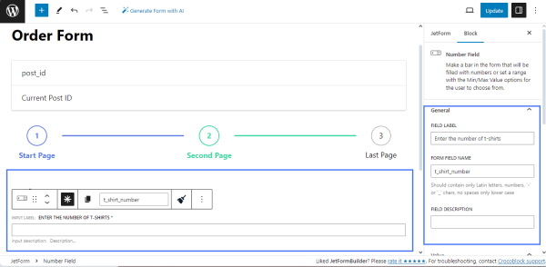
Drag and drop the NumberField to allow users to type the desired quantity of T-shirts.
Navigate to the settings block and type the name in the FORM FIELD NAME field (e.g., “t_shirt_number”) and optionally type the FIELD LABEL (e.g., “Enter the number of T-shirts”).
NOTE
The FORM FIELD NAME should contain only Latin letters in lowercase, numbers, hyphens, and underscores. Spaces are inapplicable, so if you want to write two words or more, divide them with hyphens or underscores.
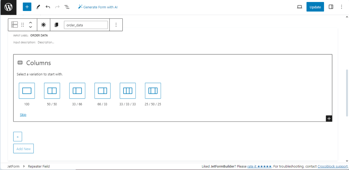
Add the Repeater Field and nested fields
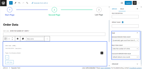
Then, find the Repeater Field and drag and drop it to the page.
Navigate to the settings block, enter the FORM FIELD NAME (e.g., order_data), and select the following:
Select the “Dynamically (get count from form field)”option from the MANAGE REPEATER ITEMS COUNT field;
Choose the name of the previously added Number Field (here, t_shirt_number) in the FIELD ITEMS COUNT drop-down list;
Select the Default (columns row count) option from the CALCULATE REPEATER ROW VALUE drop-down list.
Press the “+” icon to add the Columns block into the Repeater Field.
Here, we divided the form into two columns and added the following nested fields into the Repeater Field:
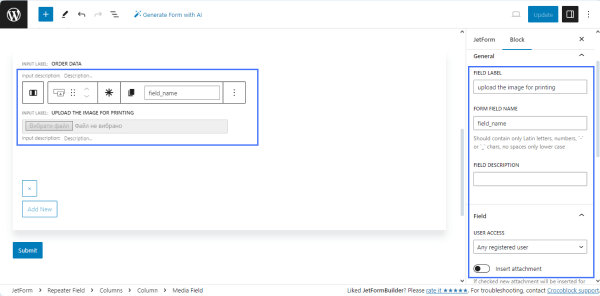
theMedia Field to upload an image for printing with the entered FIELD LABEL (e.g., “Upload the image for printing”) and FORM FIELD NAME (e.g., “image_for_printing”);
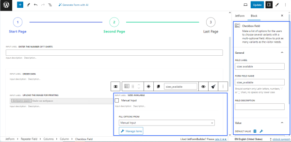
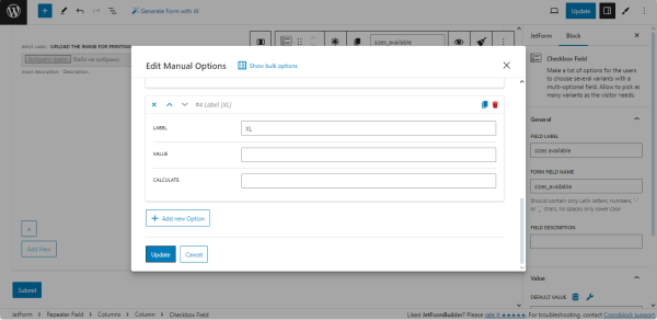
theCheckbox Field to select the needed size of the T-shirt. Find the Checkbox Field block and drag and drop it to the page. Fill in the FIELD LABEL field (e.g., “sizes available”) and the FORM FIELD NAME field (e.g., “sizes_available”). The “Manual Input” option is selected by default in the FILL OPTIONS FROM drop-down menu.
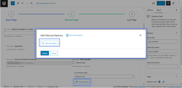
Press the “Manage items” button to open the Edit Manual Options pop-up to adjust the checkbox options and hit the “Add new Option” button.
By clicking the button, you can add as many choice options to the Checkbox Field as needed. The settings include the LABEL field, which should be filled in with data displayed on the form as a list of variants (i.e., XS, S, L, etc.); the VALUE field, which should be filled in with inner data that corresponds to the option; and the CALCULATE field, which can be used in formulas.
For this tutorial, we used the same price for all sizes, so we left the VALUE and CALCULATE fields blank. To add new options to the checkbox list, scroll down the Edit Manual Options pop-up and press the “Update” button.
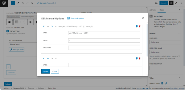
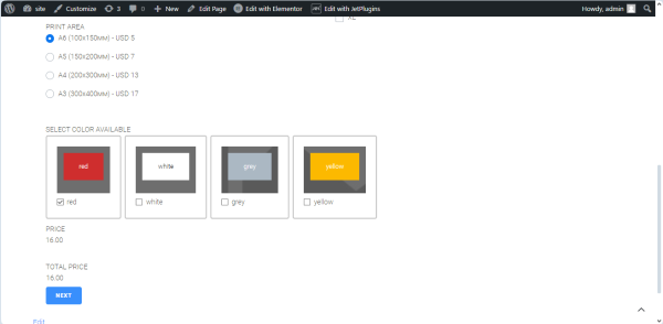
the Radio Field to select the print area. The settings of this field are similar to those of the Checkbox Field block. In the given case, we added four variants to allow users to select the appropriate print area. Therefore, the only difference is adding the values into the VALUE fields of every item from the list.
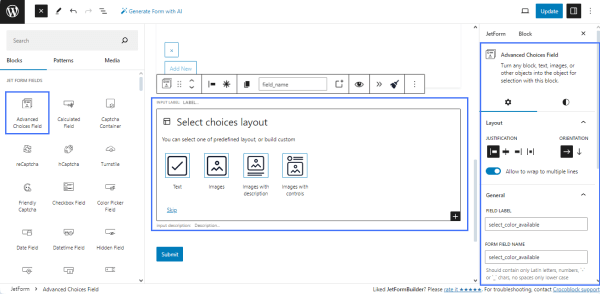
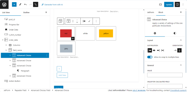
the Advanced Choice Field to select the T-shirt color. Select the needed layout and type the field’s name (e.g., select color available). We selected the “Images with controls” layout option and filled in the FIELD LABEL and FORM FIELD NAME fields.
Due to the printing technology, we selected the colors of the covers, controls, and texts and added the specific VALUE FOR CALCULATED FIELD for each T-shirt color.
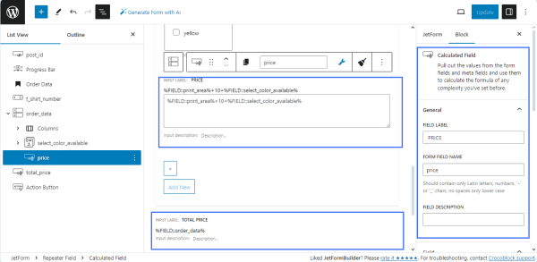
Calculated Fields
To calculate the approximated price for every T-shirt, we added the Calculated Field into the Repeater Field. Inside the Repeater Field, the Calculated Field defines the cost of printing for every T-shirt, and outside the Repeater Field, another Calculated Field defines the total costs.
The Calculated Field inside the Repeater Field summarizes the values from the selected fields; partially, it adds the options referring to the print area (Radio Field), T-shirt color (Advanced Choice Field), and the regular T-shirt price (here, USD 10). The calculation formula here is as follows: %FIELD::print_area%+10+%FIELD::%select_color_available%.
The Calculated Field outside the Repeater Field summarizes the values for each row from the Repeater Field and defines the total cost of the order. The calculation formula here is as follows: %FIELD::%order_data%, where the order_data is the Repeater Field’s name.
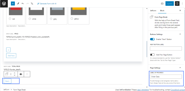
Separating the form pages
Add the Form Page Break field to separate the pages. Navigate to the block settings and activate the Enable “Next” button toggle to add the appropriate button to the form. Type the title of the form step in the LABEL OF PROGRESS field (e.g., Order Data). This text will be displayed via the PROGRESS BAR as the title of the form proceeding stage.
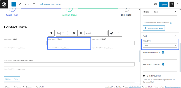
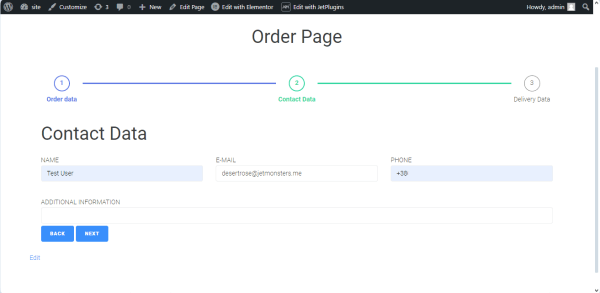
Add fields for contact data
For the second page of the form, we added the Progress Bar block to display progress, the Heading field to display the step name (e.g., Contact Data), Columns to display text inline, TextFields to input the users’ contact data (name, email, and phone), and the Form Page Break field to allow navigation to the previous page. Specify the Text Field types: navigate to the Block settings, unroll the FIELD TYPE drop-down menu, and select the “Email” option for the “Email” Text Field and the “Tel” option for the “Phone” Text Field.
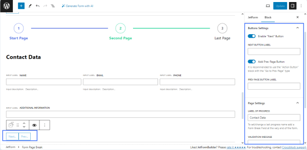
For the Form Page Break,we enabled the Add “Next” Button and Add Prev PageButton toggles to allow users to amend the entered data. We left blank the NEXT BUTTON LABEL and PREV PAGE BUTTON LABEL to display the default texts, but users can add any needed text. Then, we typed the text into the LABEL OF PROGRESS field (here, “Contact Date”) to display the form progress stage.
Add fields for delivery data
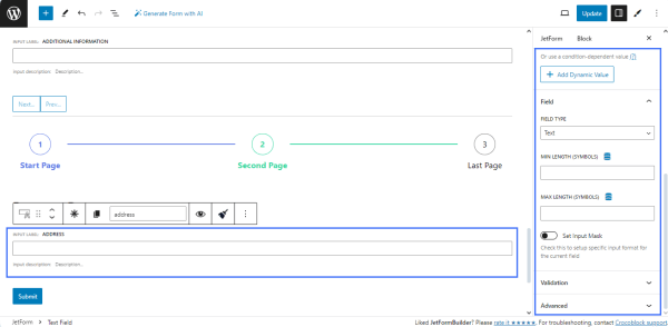
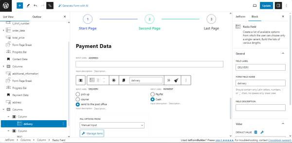
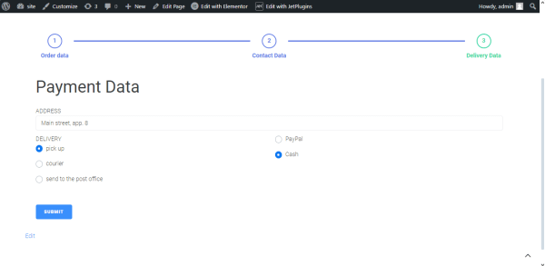
The last page contains data on the delivery method and payment. The page includes the Progress Bar block, Heading, Text Fields, Radio Fields, “Action” button, and Form Page Break block to submit the form. The Progress Bar displays the current form proceeding stage, the Heading displays the page’s name (e.g., “Payment Data”), and the Text Field is intended to display the client’s address. As far as we did not limit the client’s location, we did not specify the min and max length of the field.
We added the Column block to display the Radio Fields and divided the form into two equal columns. We added the Radio Fields to each column. The first Radio Field is intended to select the preferred delivery method (e.g., pick up, courier, or send to a post office), and the second Radio Field allows the selection of the payment method. The settings of the Radio Fields are similar to the CheckboxesField settings described above.
Add the Form Page Break block and enable the Add Prev PageButton to allow users to modify the entered data. Then, we typed the text into the LABEL OF PROGRESS field (here, Delivery Data) to display the form progress stage.
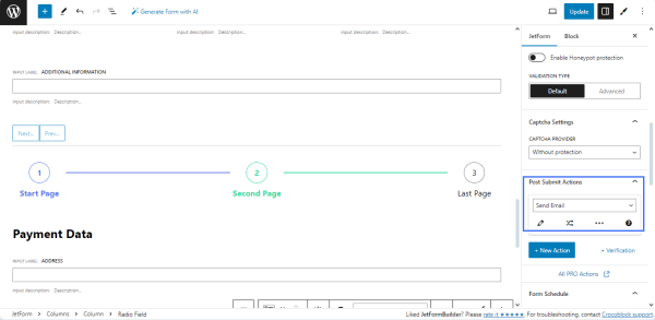
Post Submit Actions
Go to JetForm, unroll the Post Submit Actions tab, and select the needed action from the drop-down list. Here, we selected the “Send Email” option to notify the user about the order.
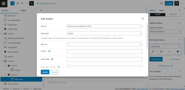
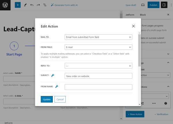
Select the “Email from submitted field option” from the MAIL TO field and pick the name of the email form field from the FROM FIELD source to send the notification to the email the user will enter in this field.
If needed, scroll down the pop-up and fill in the following fields:
SUBJECT to add the email subject;
FROM EMAIL ADDRESS to add the email address from which the users will get the notifications;
select the “Plain text” option from the CONTENT TYPE drop-down list;
type the email text in the CONTENT field.
Press the “Update” button to save the action settings. Add another Post Submit Action; select the “Save Form Record” option from the drop-down list to allow storage and managing of all orders.
After completing, publish or update the form.
NOTE
The JetFormBuilder’s PRO add-ons allow users to log in using the provided email/login and password. They can help to autocomplete the form’s fields, save the form’s progress, provide payment options, integrate email marketing and CRM services, etc.
Add the form to a page
Open a page/post/CPT post/template you need and place the JetForm widget (in Elementor), JetForm block (in Block Editor), or JetForm element (in Bricks). Select the built T-shirt order form in the Choose Form drop-down list. Learn about other settings from the JetForm Overview.
Publish or update the page.
Order form in action
Open the page with the order form on the front end. Complete the form to check if it works correctly.
Scroll down the first form’s page and fill in all the fields.
Move to another page of the form and fill in the fields as well.
Fill in the fields on the last page and hit the “Submit” button.
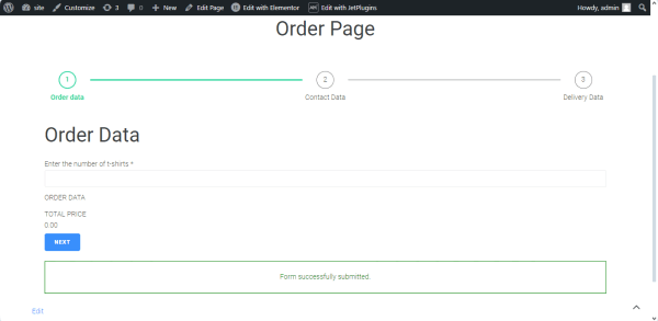
After successful submission, the “Form successfully submitted” message will appear.
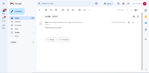
The form has sent a notification to the email user entered into the email form field with the predefined text:
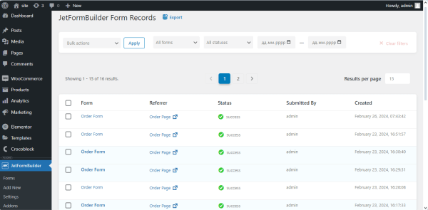
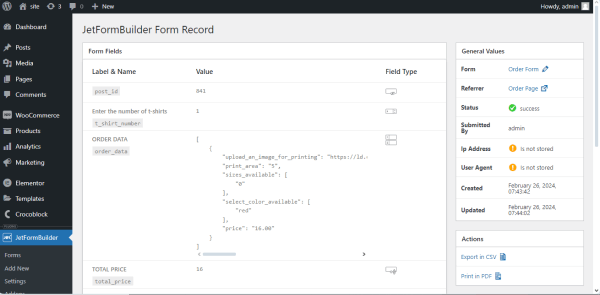
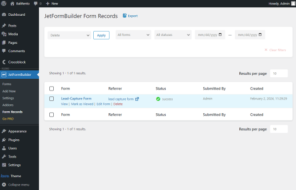
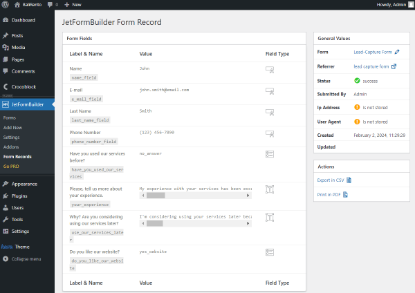
Navigate to the WordPress Dashboard >JetFormBuilder > Form Records tab. This tab collects all submitted form data.
Click the “View” link under the form title (under the “Order Form” in our case) to unroll the recently submitted form and check the values from the submitted fields.
That’s all about creating a T-shirt order form using the JetFormBuilder plugin for WordPress and managing the form’s specific fields and Post Submit Actions.
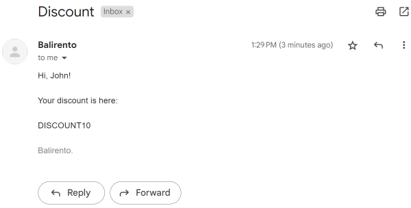
Build a lead-capture form that will gather information about the website users in exchange for great deals like some valuable information or discount offers.
Lead-capture form is a versatile tool for gathering data on your WordPress website. Such forms can collect information through simple form fields or surveys. The data collected can be used for sending promotional offers and understanding your audience’s needs better.
Having a lead-capture form on the WordPress website will help you get needed responses and keep users engaged if they find the content in return valuable. For instance, after completing the form, the user will receive a unique discount code or access to useful educational materials.
The type of services you offer determines how you can use the lead-capture form on your WordPress site. For instance, let’s look through several possible cases:
Web development agency. Create the marketing-qualified lead form with relevant questions. For example, ask about the budget allocated for website development to quickly identify whether a potential client meets your criteria.
E-commerce. Build a “Limited Offer” form or one-click purchase form with no registration required.
Small business. Adjust the multi-step questionnaire with the demo product bonus that serves as a lead qualification and reveals the user’s motivation thanks to clarifying questions.
Top WordPress Lead-Capture Form Features
Add and customize necessary fields to make the form engaging;
Create a user-friendly form with multiple steps;
Decide which form fields you want to make Required;
Implement conditional logic to dynamically display or hide form fields;
Use reCAPTCHA v3 validation to protect the application form from spam;
Adjust email notifications and fill them with tempting offers;
Save the received form submissions into one convenient dashboard list;
Create a desired design of the form in the Block Builder, Elementor, or Bricks;
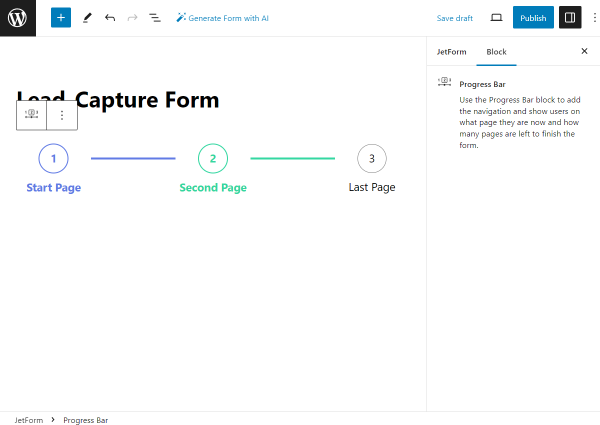
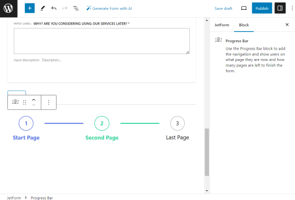
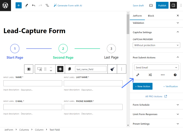
Progress Bar. A field to begin a multi-step form creation process;
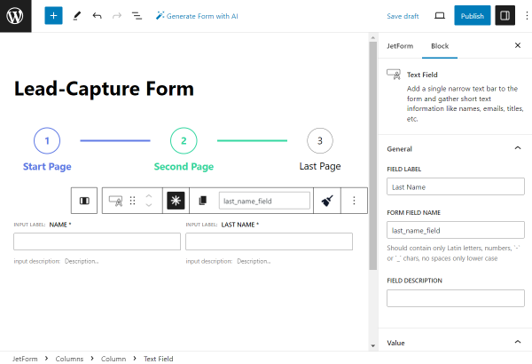
First Name and Last Name. Required Text fields to find out the user’s name;
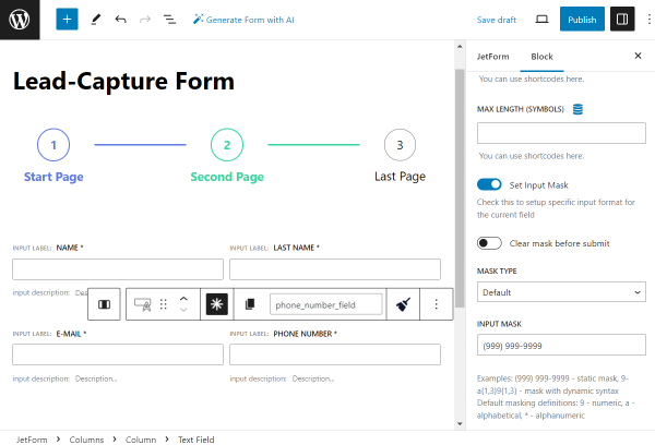
E-mail. A Text field with the “Email” FIELD TYPE to get the email where the offer will be sent;
Phone Number. A Text field with the “Tel” FIELD TYPE in case you need the user’s phone number. For instance, to set the SMS marketing;
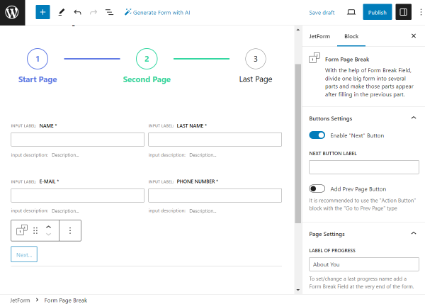
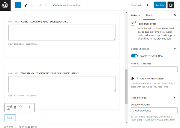
“Next” button. A Form Page Break field that will serve as the “Next” button. It also lets changing the first step of the progress bar.
Step 2 — Introductory questions
Progress Bar. One more Progress Bar for the second part of the form;
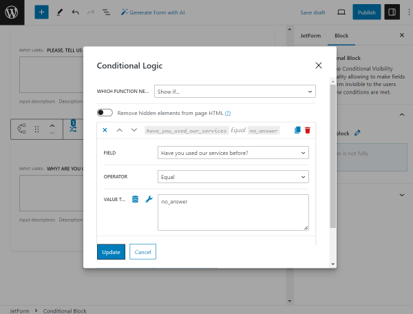
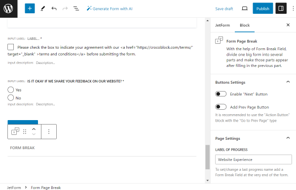
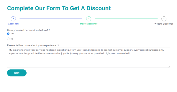
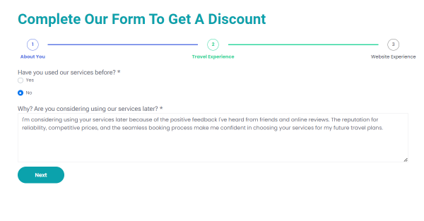
Radio Field with a question. A field with the “Have you already used our services?” question and “Yes” and “No” answers to implement the Conditional Logic based on the given answer;
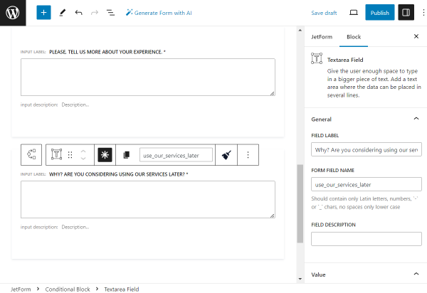
Conditional Logic. Ablock for the “Yes” answer given in the previously added Radio Field, which contains the Textarea Field with the corresponding question;
Conditional Logic. Ablock for the “No” answer with the corresponding Textarea Field inside;
“Next” button. A button to move to the next part of the form.
Step 3 — Final part of the questionnaire
Progress Bar. A step indicator of the last part of the form;
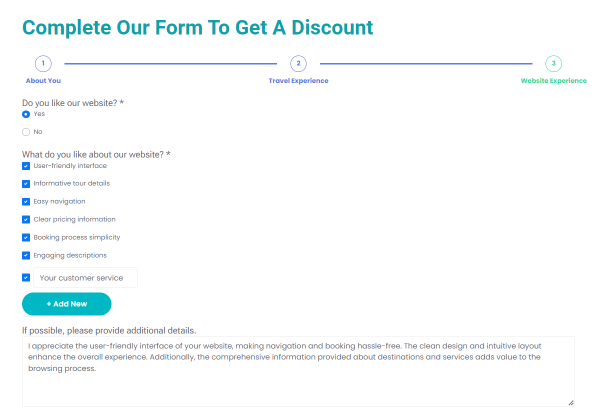
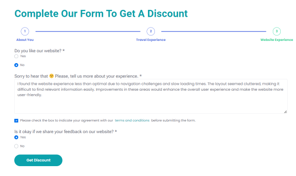
Questions Part. Any desired fields like Radio, Checkbox, Textarea, etc., to get the needed information;
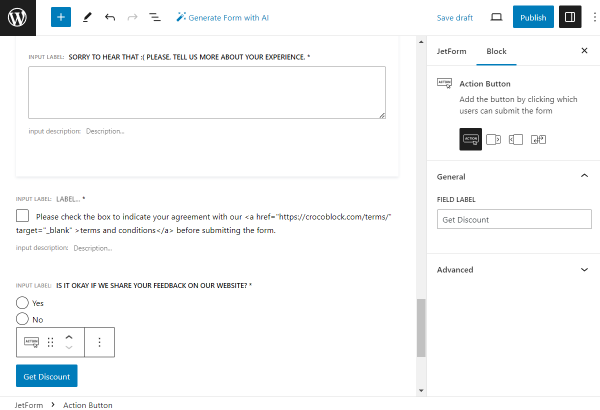
“Terms and Conditions” Field. A Checkbox Field with the link to the “Terms and Conditions” page, which is vital in order to provide a personal data consent agreement;
“Submit” button. A button that will send the submitted form;
Final Form Page Break.The last step is the name of the Progress Bar.
How to Create a Custom WordPress Lead-Capture Form
Head to WordPress Dashboard > JetFormBuilder > Add New.
Initially, the form includes the Welcome Block with form patterns. As we don’t need them now, we press the “Start from scratch” button to build our own form.
Here, you will see that some blocks are added to the form by default. These are the Hidden Field, Text Field, and Action Button blocks, which can be deleted if you don’t need them to be in the current form.
To add another content to the lead-capture form, you can use Gutenberg blocks. Open their list by pressing the plus-shaped button and type in the needed block name to find it easily.
The form we give in this tutorial is an example of the lead-capture form that you can recreate on your website or build your own form that will be more suitable for your needs.
We begin with the Progress Bar block that will make a start to our multi-step lead-capture form. It will give users an understanding of how quickly this form can be completed.
It doesn’t have any settings, so we move on to the next field.
We begin building our form with the Columns block to make the two columns layout with fields inside.
There, we place two Text Fieldsindicating the “First Name” and “Last Name” fields.
One more row of two columns containing two fields will represent the “E-mail” and “Phone Number” fields.
For the “E-mail” field, we set the “Email” FIELD TYPE,and for the “Phone Number” field, we set the “Tel” FIELD TYPE accordingly.
For the phone number field, we also set the INPUT MASK.
To finalize the first form page, we add the Form Page Breakblock.
Also, we change the LABEL OF PROGRESS that will be displayed as the first step of the Progress bar.
In the second part of the form, we begin with the Progress Bar block as well.
The first form field we add to the second part is the Radio Fieldwith the “Have you used our services before?” FIELD LABEL.
This field is also set to be obligatory.
In the FILL OPTIONS FROM selector, we pick the “Manual Input” option and click the “Manage items” button.
Once the editing pop-up opens, we push the “Add new Option” button to create radio options manually.
We build two options: one has the “Yes” LABEL and the “yes_answer” VALUE, and the other has the “No” LABEL and the “no_answer” VALUE correspondingly.
To save the options, we press the “Update” button.
The following logic we want to implement is different Textarea Fieldsdisplayed depending on the selected option in the previous “Have you used our services before?” Radio Field.
It can be done with the help of the Conditional Block, so we add it to the page.
Right in the Conditional Block, we place the Textarea Field block named “Please, tell us more about your experience.” and set this field to be required.
Then, we return to the Conditional Block customization. In the Conditions tab, we click the “Add new” button in the corresponding window.
In the first WHICH FUNCTION NEED EXECUTE? selector, we pick the “Show if…” option.
As the FIELD value, we set the “Have you used our services before?” Radio Field we built previously.
The OPERATOR should be set to “Equal” and VALUE TO COMPARE to “yes_answer.”
That’s it with adjusting this Conditional Block, so we press the “Update” button.
Then, we add one more Conditional Block, this time for the “No” option of the “Have you used our services before?” Radio Field.
Once added, we also put the Textarea Field inside the Conditional Block.
Its LABEL is set as “Why? Are you considering using our services later?” and the field itself is set to be required.
Now, we return to the Conditional Block settings to adjust conditions, as in the previous case, in the conditions pop-up.
In the WHICH FUNCTION NEED EXECUTE? selector, we pick the “Show if…” option.
Here, as the FIELD value, we also set the “Have you used our services before?” Radio Field.
Then, we pick the “Equal” OPERATOR and “no_answer” as VALUE TO COMPARE.
To save the conditions, we push the “Update” button.
To finalize the form page, we add the Form Page Break field and set its LABEL OF PROGRESS to “Travel Experience.”
The final part of the form will also begin with the Progress Bar block.
Now, we add one more Radio Field block to the form called “Do you like our website?”, set it to be required, and pick the “Manual input” option as FILL OPTIONS FROM.
To edit radio options, we press the “Manage options” button.
We add two options, with “Yes” and “No” LABELS,but this time, VALUES will be set to “yes_website” and “no_website” accordingly (as the VALUE field should include only unique identifiers and we already have “yes_answer” and “no_answer” VALUES used.)
Don’t forget to click “Update” so the changes are saved.
Now, we will implement one more conditional logic depending on the selected option in the “Do you like our website?” Radio Field.
So, we add a Conditional Block to the page and place the Checkbox Fieldinside it.
This field is obligatory; it is called “What do you like about our website?” and has the “Manual Input” FILL OPTIONS FROM option selected.
To edit the checkbox options, we push the “Manage options” button.
In the Edit Manual Options pop-up window, we complete the needed options and press the “Update” button.
NOTE
You can also click the Enable custom options option in the additional settings section of the field. This way, the user will be able to add their own options to the checkbox list.
Inside the current Conditional Block field, we also place the “If possible, please provide additional details.” Textarea Field.
Then, we return to the Conditional Block field settings to adjust the conditions.
The WHICH FUNCTION NEED EXECUTE? field is completed with the “Show if…” option.
The FIELD is now set to the “Do you like our website?” option, which is the LABEL of our Checkbox Field block.
The OPERATOR is “Equal,” and the VALUE TO COMPARE is “yes_website,” which was attached earlier to the “Yes” option VALUE of the Checkbox Field block.
The conditions should then be activated with the “Update” button.
Now, we add one more Conditional Block to our form for the “No” option of the Checkbox Field.
Inside, we place the Textarea Field block, which is obligatory for the completion and is called “Sorry to hear that 🙁 Please, tell us more about your experience.”
In the conditions settings of this Conditional Block, we set almost the same options as in the previous Conditional Block field: “Show if…” in the WHICH FUNCTION NEED EXECUTE? field,“Equal” in the OPERATOR field, and the “no_website” VALUE TO COMPARE as it is the VALUE of the “No” option Checkbox Field block.
Now, we click the “Update” button.
The following Checkbox Field block will be put outside the Conditional Block.
This field will aim to provide the “Terms and Conditions” document to the users who complete the form so they can read the information and agree if applied.
So, the “Manual Input” should be picked in the FILL OPTIONS FROM field. Once done, click the “Manage options” button to open the pop-up with editing fields.
The LABEL of the only option in our case will be set to “Please check the box to indicate your agreement with our <a href=”https://crocoblock.com/terms/” target=”_blank” >terms and conditions</a> before submitting the form. ”
So, in the middle of the label, we put the following piece of code that will turn the needed part of the text into the link:
<a href=”https://crocoblock.com/terms/”>terms and conditions</a>
Here, “https://crocoblock.com/terms/” is the website page with the terms of use, and “terms and conditions” is the text that will contain the link.
We also set the VALUE to a shorter version of the field LABEL and hit the “Update” option.
The following “Is it okay if we share your feedback on our website?” RADIO FIELD with the “Manual Input” source (the FILL OPTIONS FROM field) will be required.
After the “Manage items” button is clicked, we create two options with the “Yes” and “No” options with the “yes_feedback” and “no_feedback” VALUES correspondingly.
After completing the needed options, we push the “Update” button.
The next block is the Action Button, the one that will end the form completion.
In the button settings, we change the FIELD LABEL to “Get Discount.”
The final block of the form is another Form Page Break field that is added to change the last page of the form Progress Bar.
So, we deactivate the Enable “Next” Button toggle and type in the “Website Experience” in the LABEL OF PROGRESS field.
That’s all with the form fields. Now, we move to the Post Submit Actions tab to adjust the action once the form is submitted.
The first action we set is “Send Email.” We click the pencil-shaped button to edit the settings.
In the pop-up, we select the “Email from submitted form field” MAIL TO option and pick the “Email” field as the FROM FIELD source.
We also specify the SUBJECT, FROM NAME, and FROM EMAIL ADDRESS values.
The CONTENT TYPE is set to “Plain Text,” and CONTENT is filled in with the following text:
“Hi, %first_name%!
Your discount is here:
DISCOUNT10
Balirento.”
To save the action settings, we push the “Update” button.
The following action is going to be “Save Form Record,” which will save the data about the completed fields in the Form Records directory of JetFormBuilder.
We will not alter settings in the pop-up; the default ones are okay in the described case.
Now, move to the page you want to add the form to. For instance, it can be the landing page of your website.
So we can find it in the WordPress Dashboard > Pages directory and press the “Edit” button next to the needed option. Or, build a new page with the “Add New” button.
The page can be edited with Gutenberg, Elementor, or Bricks.
Once the editor is opened, find the JetForm block/widget/element in the search bar and add it to the page.
Open the JetForm settings. Initially, select the needed form in the CHOOSE FORM selector.
Work on the following settings depending on your needs, and when the page is ready, press the “Publish/Update” button.
Proceed to the just edited page on the front end. Now, let’s complete the form to check if the form works correctly.
In the second part of the form, we see only one Radio Field. But, if we select one of the options, additional fields that we have put earlier in the Conditional Block will be shown.
If the “Yes” option is selected, the “Please, tell us more about your experience.” Textarea Field is displayed.
But if the “No” option is selected, the “Why? Are you considering using our services later?” Textarea Field is displayed.
In the “Do you like our website?” Radio Field, there are also two options that can be selected to trigger the appropriate fields.
If the “Yes” option is selected, the “What do you like about our website?” Checkbox Field and “If possible, please provide additional details.” Textarea Field are displayed.
Also, in the “What do you like about our website?” Checkbox Field, users can add custom options if desired by pushing the “Add New” button.
And if the “No” option is selected, the “Sorry to hear that 🙁 Please, tell us more about your experience.” Textarea Field is displayed.
The following Checkbox Field includes the terms and conditions link added.
The user will be redirected to the “Terms of Use” page if they click on the button. This page will be opened in a new tab.
Also, there is the last “Is it okay if we share your feedback on our website?” Radio Field and the “Get Discount” button.
So, once we click on the button, the form is submitted.
It’s time to check the email we have entered in the first part of the form. The letter with the discount has already been sent there.
As we can see, it says:
“Hi, John!
Your discount is here:
DISCOUNT10
Balirento.”
Here, instead of the %first_name% macro we put in the CONTENT field, there is actually the name displayed, the one that was completed earlier in the “First Name” Field.
Now, let’s check if the second “Save Form Record” Post Submit Action has also worked.
Go to WordPress Dashboard > FormBuilder > Form Records.
NOTE
You can export the form records in CSV if needed by pressing the according button on the top of the page.
In the list of records, find the recently added record. Click the “View” button to check if all the needed information has been collected.
Here, we can see the data we recently entered in the form.
NOTE
You can export the current form record separately as well in the Actions tab.
That’s all; now you know how to build a high-performance lead-capture form on your WordPress website with the JetFormBuilder plugin.
With the Open AI integration, you can generate complex forms with various field types with a few clicks instead of adding every field manually. After that, you just need to tweak the field settings and configure other form options, such as post-submit actions, style settings, etc.
To generate a new form with AI, proceed to the WordPress Dashboard > JetFormBuilder > Forms tab and hit the “Generate with AI” button.
Or you can proceed to the WordPress Dashboard > JetFormBuilder > Add New tab. Here, you can push “Generate Form with AI” from the header toolbar or the “Generate via AI” button from the Welcome block.
These buttons trigger a pop-up with the AI generator:
Currently, you can make 10 (ten) requests per month.
In the text area, you can describe what form you want to create (e.g., “Simple contact form”).
Also, you can find tips for successful prompt writing (start with the main purpose, describe the specific fields, and use the English language for prompts) and prompt examples.
After you enter a prompt into the text area, the “Generate” button will appear.
After clicking the “Generate” button, the pop-up will show the form fields preview.
For the “Simple contact form” request, Open AI generated three simple fields for the name, email, and message, and the “Submit” button.
If you are satisfied with the result, you can press the “Use this form/Create form with this template” button. If you are not, you can tap the “Change generation prompt” button and rewrite the request.
We hit the “Change generation prompt” button and expanded the prompt. In the request, the form fields and the Action Button can be described, so we typed this prompt: “Contact form with name, email, subject, message, phone number, company name, website, and address fields with the “Send Email” action button.”
NOTE
It’s advisable to mention all required fields in the prompt to avoid overlooking some in the final result.
In the new preview, Open AI generated all the mentioned fields and the Action Button with the “Send Email” label.
After hitting the “Use this form” button, you’ll obtain two options: “replace” or “append” form settings and blocks. Pick the preferable one.
We chose the “replace” option, so the form fields and the Action Button replaced the Welcome block.
Be aware that certain fields have the “Required” option activated. You can modify this and other settings individually for each form field block.
If you generate a form from the JetFormBuilder > Forms tab, the written prompt will be inserted into the form title.
Registration Form Generated with AI
To generate a simple “Registration” form, we opened the Generate Form with AI pop-up, clicked the “Registration form with minimum inputs” prompt example, and hit the “Generate” button.
The Open AI generated three basic fields for the name, email, and password, and the “Submit” button.
After clicking the “Use this form” button, the fields and the action button were inserted into the form editing page.
Opt-in Form Generated with AI
To generate an “Opt-in” form with the specific Radio Field, we opened the Generate Form with AI pop-up, clicked the “Opt-in form with gender selector like radio” prompt example, and hit the “Generate” button.
The Open AI generated the “Name” and “Email” Text Fields, the “Gender” Radio Field with the “Male,” “Female,” and “Other” options, and the “Submit” button.
After clicking the “Use this form” button, the fields and the action button were inserted into the form editing page.
Quiz Form Generated with AI
To generate a Quiz form, we opened the Generate Form with AI pop-up, clicked the “Quiz form with 5 questions with choices about math” prompt example, and hit the “Generate” button.
The Open AI generated five Radio Fields with math questions, four options for each of them, and the “Submit” button.
After clicking the “Use this form” button, the fields and the action button were inserted into the form editing page.
Job Application Form Generated with AI
We proceeded to the WordPress Dashboard > JetFormBuilder > Forms tab, hit the “Generate with AI” button, and opened the Generate Form with AI pop-up.
We typed the “complex form for a job application” prompt into the text area and hit the “Generate” button.
We got the name, email, phone number, resume, cover letter, position, years of experience, highest education, and references fields generated.
We hit the “Create form with this template/Use this form” button and inserted the fields into the form editing page.
Let’s check the form field settings.
The “Name,” “Email,” and “Phone” Text Field blocks have different FIELD TYPES: “Text,” “Email,” and “Tel,” accordingly.
The “Resume” is the Media Field block. In the ALLOW MIME TYPES field, the AI generator pulled the “application/pdf,” “application/msword,” and “application/vnd.openxmlformats-officedocument.wordprocessingml.document” options that are MIME types for the PDF, DOC, and DOCX formats, which are usually used for resumes. The MIME types can be modified according to the preferences.
The “Position” is the Select Field with the “Manual Input” option set in the FILL OPTIONS FROM drop-down menu.
If we hit the “Manage Items” button, we will see three options: “Developer,” “Designer,” and “Manager.” Learn how to add new options from different sources from the Multi-Optional Field Source Settings tutorial or write a more precise prompt with specified options or purpose for such a field.
The “Cover Letter” and “References” are the Textarea Fields, and the “Years of Experience” is the Number Field, and they don’t have any specific settings.
Any blocks can be added and modified according to the form’s purposes.
To display Google Maps, Leaflet Maps, or Mapbox via the Map block field of the JetFormBuilder plugin, install and activate the JetEngineplugin (at least 3.0.3 or higher versions) and enable its Map Listing Module.This tutorial explains how to display Google Maps.
Fill in the appropriate fields of the Account Information and Payment Information Verification windows.
Navigate to the APIs & Services tab of Google Cloud Platform Console and press the “Create Project” button. Scroll down, select the Maps Javascript API (and other necessary services), and press the “Enable” button.
Navigate to the Keys & Credentials tab and press the “SHOW KEY” button to get the API key.
Copy the data from the Your API Key field.
JetEngine Settings
Navigate to the WordPress Dashboard. Open the JetEngine > JetEngine > Maps Settings tab. Paste the copied API Key into the API Key field.
Map Field Usage
Navigate to the JetFormBuilder tab and create a form.
Open the form and add the necessary fields.
Find the MapField block and drag-n-drop it onto the form. Unroll the VALUE FORMAT settings and type/paste the coordinates that define the center of the map.
Unroll the ZOOM settings and select the necessary zoom option.
Zoom settings determine how much the map will zoom in after the user specifies a location (via coordinates, address, or point on the map), which is then used as the center of the map. The zoom settings range from “1” to “18,” with a value of “1” providing the least amount of zoom and “18” showing the most area in the map field.
Unroll the Map Settings and toggle the necessary map size.
Add the form to a post or a page to see how the map looks on the front end.
That’s all about setting map zoom by a specific area.
A website cost calculator allows users to estimate the price of developing a website based on their specific needs. This form is useful for freelancers, agencies, and businesses offering website development services. By selecting various options, users receive an estimated cost tailored to their project.
Website type section that includes a Select Field block where users can choose the type of website: “Ecommerce,” “Blog,” “Portfolio”;
Website basics section that includes a Range Field block which defines the number of pages (minimum “10,” maximum “25”) and a Checkbox Field block with additional features like:
”Responsive Design”;
“Premium Theme”;
“Premium Plugins”;
“Image Gallery”;
“Contact Form”;
Website content section that includes a Checkbox Field block with the following options:
“SEO Keyword Analysis”;
“SEO Copywriting”;
“Basic website copy”;
“Creative website copy”;
Testing and maintenance section that includes a Checkbox Field block with the following options:
“Prelaunch support”;
“Browser Testing”;
When do you want the website to go live? section that includes a Radio Field block with the following options:
“Any time soon”;
“I don’t know”;
“ASAP!”;
and a Conditional Block that’s triggered if the “ASAP!” option is selected, revealing a Date Field block for users to specify the exact launch date.
Go to WordPress Dashboard > JetFormBuilder, click the “Add New Form” button to create a new form and name it Website Price Calculator.
Upon default, the newly created form contains a Welcome Block;feel free to remove it.
Website type section
Click on the “+” to open the block inserter. In the search field, type “heading” to find the Heading block. Then, drag it onto the form editor. Finally, type “select” to find the Select Field block and drag it onto the form editor.
In the Select Field block settings, go to the General section and set the FORM FIELD NAME value to “website-type.” Then click on the “Manage items” button to open the Edit Manual Options pop-up to add website options.
As mentioned previously, this form field will contain three options: “E-commerce,” “Blog,” and “Portfolio.” For each value, we need to fill in the CALCULATE field. The amount will be calculated in the Total field at the end of this form.
When done, click on the “Update” button. For more convenience, you can unite the Heading and Select Field blocks into a group.
Website basics section
Click on the “+” to open the block inserter. In the search field, type “heading” to find the Heading block. Then, drag it onto the form editor. Finally, type “range” to find the Range Field block and drag it onto the form editor.
The Heading block will display the “Website basics” title. Now, go to the Range Field block settings to finetune it.
In the General section, fill in the FIELD LABEL field with a relevant name. We’ll use “Number of Pages ($20/page),” which will also notify the user of the price per page.
In the Value section, fill in the DEFAULT VALUE field, which will indicate that the default number of pages is “10.”
Scroll down to the Field section and fill in the next set of fields:
MIN VALUE — this field corresponds to the DEFAULT VALUE field and is “10”;
MAX VALUE — this field corresponds to the maximum number of pages the user may order. For instance, we will set it to “25”;
STEP — this field corresponds to the exact number of pages the user may order. We will set it to “1.”
For more convenience, you can unite the Heading and Range Field blocks into a group.
Now, go back to the block inserter and add a Checkbox Field block. It will display functional website options, which the user may order. After adding the block to the editor, go to the block’s settings and enter a unique FORM FIELD NAME value. We’ll need it as well for the formula.
Then click on the “Manage items” button to open the Edit Manual Options pop-up, where we can add website options.
For each of your options, you need to fill in the CALCULATE field. The amount will be calculated in the Total field at the end of this form.
When done, click on the “Update” button to save the changes.
Website content section
To speed up the process, you can duplicate the previous section. The Heading block will display the “Website content” title, and the Checkbox Field block’s FORM FIELD NAME value is “content”.
In the Checkbox Field, click the “Manage items” button to open the Edit Manual Options pop-up, where you can add content options.
For each option, enter a value in the CALCULATE field. This amount will be included in the Total field at the end of the form.
Once finished, click the “Update” button to save your changes.
Testing and maintenance section
For this section, you can also use two previous blocks. The Heading block will display the “Testing and maintenance” title, and the Checkbox Field block’s FORM FIELD NAME value is “testing.”
In the Checkbox Field, click the “Manage items” button to open the Edit Manual Options pop-up, where we can add testing and maintenance options.
Enter a value in the CALCULATE field for each option. This value will be added to the Total field at the end of the form.
When you’re done, click the “Update” button to save progress.
When do you want the website to go live? section
For this section, we need to add a set of blocks, including:
Heading block;
Checkbox Field block;
Conditional Block:
Date Field block.
The Checkbox Field block will display options grading the degrees of urgency, starting from the least urgent to the most urgent (“ASAP!”). When the “ASAP!” option is selected, it will trigger the Conditional Block, revealing the Date Field block where users may select the exact date when they need a website to go live.
To display graded values, you can use other blocks, such as the Select Field, Radio Field, or Range Field block.
After adding the Checkbox Field block, go to the General block settings and set the FORM FIELD NAME value to “release_date”. Then click on the “Manual items” button to reveal the Edit Manual Options pop-up.
We will add three options, including: “Any time soon,” “I don’t know,” and “ASAP!”. For the “ASAP!” option, we need to fill in the:
VALUE — it will be used in the next block (Conditional Block);
CALCULATE — its value will be used in the final formula, since the urgency of website production requires additional spending.
When you’re done, click the “Update” button to save your progress. Now, let’s fine-tune the Conditional Block. Click the “crossed arrows” buttons to open the Conditional Logic pop-up.
After that, feel free to apply the following set of settings:
WHICH FUNCTION NEED EXECUTE? — in this field, select the “Show if…” option;
FIELD — in the dropdown, select the field that will trigger conditional logic. In our case, it’s the “release_date” field;
OPERATOR — in the dropdown select the value “In the list”;
VALUE TO COMPARE — in this field, we need to enter the Checkbox Field “ASAP!” option value, which is “asap”.
When done, click the “Update” button. Now we can add the Date Field block to the Conditional Block. Click on the “+” button, and then type date in the search field to add the Date Field block.
Total section
This is the last section of the form. Feel free to add the following blocks:
Heading block;
Calculated Field block.
The Calculated Field block will include the formula that counts the final price of the website creation. Let’s fine-tune the block. Click on the button with the “wrench” icon to add a set of fields to the block’s input.
Basically, we’re summing up all the values of the selected options in six fields. The %pages_counter% field is multiplied by twenty (20) because creating each additional page costs $20.
When done, click on the “Publish” button to publish your form.
Other Field and Form Actions
If you want this calculator to act as a request form, you can add an Action Button block to allow users to submit the results.
In order to save them in the Form Records section, which can be accessed via WordPress Dashboard > JetFormBuilder > Form Records path, you need to add the “Save Form Record” form action. To do so, go to the JetForm tab in the form settings, scroll down to Post Submit Actions, and click “+ New Action.” In the Add new action pop-up, find the “Save Form Record” form action and click on it.
On the next screen, click the “Update” button. After adding the form action, update the form to save your progress.
Check the Results
Before we check the form, we need to add it to the page. To do so, click on the “<<” button in the upper right corner. It will trigger the Use the form pop-up, where you can choose how to add a form to the final page.
Now let’s preview the form. In the form, we will select the following options:
Testing and maintenance — “Prelaunch support — $330”;
When do you want the website to go live? — “ASAP!”:
“11.03.2025.”
If we click on the “SEND REQUEST” button, we’ll receive a “Form successfully submitted.” notification, and we can go to WordPress Dashboard > JetFormBuilder > Form Records to see the form entry.
Hover the form entry over and click on the “View” link.
As you can see, all the form field options that we selected while filling out the form were fully stored.
Following these steps, you can successfully create a cost calculator WordPress form using JetFormBuilder. This form will provide a seamless and interactive experience for users estimating website development costs.
Open the existing form in the WordPress Dashboard > JetFormBuilder directory. Or, press the “Add New” button to build a new form.
If you haven’t added a Checkbox Field beforehand, you can find it in the block inserter or by typing the “/” symbol right in the form.
Once added, adjust the Checkbox Field settings located on the right side of the screen.
Now move to the block in the form itself. The “Manual Input” source is set as default for the field. You can change it if needed.
Press the “Manage Input” button to open additional settings.
Here, add desired items by completing the Label and Value fields. You can also fill in the Calculate field if needed.
Click the “Add New Option” to create an additional field option whenever needed.
After building the desired options, push the “Update” button.
Migrating from Checkbox Field
Now, you can upgrade your Checkbox Field by clicking on it and the first icon in the toolbar above the field.
Here, you can pick the block into which you want to transform the Checkbox Field. Among the options are default Columns, Text Field, Conditional Block, Radio Field, Select Field, or Group.
Why You Need a WordPress Front-End Post Submission Form
Allowing users to submit posts right from the front end makes the work with the WordPress website even more efficient than it was before. Engage users to add more and more exciting posts.
Using this feature, you can allow users to submit their products and ads to the marketplace website, enter a competition, submit art gallery work, and, certainly, post guest articles on your blog.
Create a WordPress form and select needed post-submit actions to freshen your website. Use the JetFormBuilder plugin to simplify the process.
Top WordPress Front-End Post Submission Form Features
Create two forms, one for posts submitting and the other for their editing;
Add the only fields you need and connect them with the created meta fields, terms, and other vital post elements;
Style up the form to meet your requirements;
Set the post-submit actions to update the post, redirect to the page, and send an email about the form submission right to the admin’s email;
Use Conditional Logic to show or hide certain fields under the set conditions;
Adjust JetFormBuilder presets so that users do not fill in fields that they have already completed before.
How to Create a WordPress Custom Front-End Form
Before we start, make sure you have the following plugins installed and activated:
JetFormBuilder — build a form, edit the post submit actions, and add a captcha if needed;
JetEngine — create a CPT, add custom meta fields and taxonomies;
JetEngine Profile Builder module — make an account page, add posts, and edit post templates;
Elementor — add the created form into the editor to finalize the customization, style up the page, and publish it right away. Or use Gutenberg block editor, as it is fully compatible with the JetFormBuilder plugin; it’s up to you.
Create custom post type
Proceed to the WordPress Dashboard > JetEngine > Post Types. Add a new custom post type by pushing the “Add New” button, or open the one that you have created earlier.
Once the custom post type editor is opened and General Settings are adjusted, scroll down to the Meta Fields tab.
As your form will include fields for completing, some of them will repeat the CPT meta fields you edit here. That’s why you need to set up the needed fields.
Let’s take a look at the example fields.
NOTE
Please ensure that the needed Supports are enabled in the Advanced Settings tab. We especially need Title, Excerpt, Thumbnail (Featured Image), and Custom Fields in the described case.
After implementing the changes, press the “Add/Update Post Type” button.
Add taxonomies to custom post type
Now let’s build some categories for the CPT posts. Move to the WordPress Dashboard > JetEngine > Taxonomies. Open the taxonomy you have already created, or click on the “Add New” button to build a new one.
Take into consideration that the taxonomies you build should be connected with the previously mentioned post type. To do so, choose the needed option in the Post Type field.
Don’t forget to press the “Add/Update Taxonomy” button after all the settings have been adjusted.
Create profile page with JetEngine Profile Builder
The next step is enabling the Profile Builder. Navigate to the WordPress Dashboard > JetEngine > JetEngine, toggle the Profile Builder and press the “Save” button. Now the feature is activated.
Set the Profile Builder according to your needs, or import the premade configurations. Head to the Skins Manager and unfold the Presets. They add pages and templates automatically.
Select the desired preset and hit the “Import” button.
User profile with editable content — allows registered users to publish and edit forms. We import this preset as we work with the posts only;
Editable user settings page for user profile — adds user settings subpage to Profile Builder.
So we select the first option. Move to the WordPress Dashboard > Pages to check if the new page was created. The “Account” page is now displayed here.
Besides, you can check the WordPress Dashboard > Templates > Saved Templates. Here, if the Preset was imported, the new templates would appear.
Also, you can see one added listing if you proceed to the WordPress Dashboard > JetEngine > Listings.
Go to WordPress Dashboard > JetEngine > Profile Builder to adjust the settings.
Check that the “Account” option is selected as the Account Page; enable the Users page, and Single user page if desired.
You can also adjust the following fields, but it’s unnecessary in the described case.
Open the Account Page tab.
Work on the initial fields and add some subpages to the account page. Check the following video to learn how to do it without any effort.
Take a look at the example subpage settings. We fill in a Title and Slug.
NOTE
The Slug should contain no capital letters, spaces, or special symbols. Use only Latin letters and “-”, “_” symbols to separate the words. Stick to this step as it is necessary for the proper saving of information in the database.
Select a Template by typing its name in the particular field and move to the following Hide from menu toggle. It should be left disabled if you want to display the current subpage as a menu item in the Profile Menu widget.
Moreover, you can select user roles for which the page will be available in the Available for the user role field.
After building all the required subpages, push the “Save” button.
Add new form for submitting posts
Go to WordPress Dashboard > JetFormBuilder > Add New.
Give a title to the form and delete the default fields, except for the Hiddenone.
Make sure that its Form field name is set to ‘post_id’ in the General tab and the “Current Post ID” is selected as a Field Value in the Field Settings; we’ll need it later.
Hit the plus-shaped button to add a new block. Add all the needed fields to the form.
Firstly, we add a Heading Field. This one will serve as a section title.
We begin the section with a couple of Text Fields. We suggest you fill in the Form field name with the same meta field values you have added to the CPT meta fields. This way, you will not get confused when connecting fields.
NOTE
Mind enabling the Is Required toggle for the fields you want to make obligatory.
The following fields we place in the form are Select Fields. We choose the “Terms” option in the Fill Options From field and define the needed Taxonomy as a source.
Thus the user will select between categories and attach a post right to the needed one.
We add one more Heading Field and add one more Select Field. This time we set the “Manual Input” source in the Fill Options From field.
Fill in the Label and Value fields for all the options you want to add in the selector.
Hit the “Update” button to save the result.
Another feature we will use in the current form is the Conditional Block. We continue building the form with the Text Field displayed under the set conditions.
Let’s press the arrow-shaped button to proceed to the editor and hide the block when the “Live online” option is selected.
In the first, Type field select the “Hide the field if…” option and move to the Field. Here you should choose the compared field.
Pick the “Contain text” Operator and define the needed Meta Field Name as the Value to Compare.
To find out more info about the conditional logic in JetFormBuilder form fields, watch our video with the detailed use case.
Mind pushing the “Update” button after implementing the changes.
We add two more Text Fields and move to the next section. It will be separated from the previous one by another Heading Field.
Place the Radio Field in the form editor. In the Fill Options From drop-down menu, we choose the “Manual Input” and push the “Manage Items” button.
As the new window is displayed, press the “Add New Option” button and fill in the Label and Value fields.
For example, we will adjust two such fields; one is for the “price,” and the other is for the “free” option. However, you can add other options you need as your form may differ from the one described in the tutorial.
Mind clicking the “Update” button after making the changes.
The following field we add is another Conditional Block with the Text Field inside it.
The main goal now is to hide the Text Field we have added once the “Free” option in the previous field is picked. So select the Conditional Block and click on the arrows-shaped icon to open the settings window.
Push the “New Condition” button to work on the first condition. Select the “Hide this field if…” as a Type and select the field you want to hide in the Field drop-down list.
Also, set the “Contain text” option in the Operator field and define the Value to Compare.
One more condition we need to set is displaying the following field if the “price” option is picked. So, push the “New Condition” button one more time.
Choose the “Show this field if…” Type and select the needed option as the Field.
The Operator should be picked as “Contain text,” and Value to Compare is “price” now.
Save the changes by clicking on the “Update” button and continue to add new fields if needed.
We add one more Heading Field for the next logical part of the form.
We also place the Media Field for users to upload the desired images to the post. Don’t forget to work on its Field Settings in case of need.
The last part of the form will include another Heading Field, Textarea Field, and a WYSIWIG Field representing the excerpt and the content of the future posts.
Don’t forget to finalize the form with an Action Button and adjust it as desired.
However, the form is not ready yet. To adjust it thoroughly, head to the JetForm tab.
Work on the Form Settings and Captcha Settingsif needed and proceed to the Post Submit Actions tab.
Customize post submit actions
The first action we will adjust is “Insert/Update Post”, you can pick it from the drop-down menu. It is essential in the current form, so mind adjusting it correctly.
Press the pencil-shaped button to edit the action.
Select the needed Post Type in the appeared pop-up and set the Post Status to “Published.”
In the Fields Map, there are the fields you have added to the form. It will link the form fields with the specific meta fields.
Leave the “post_id” field empty and work with the following fields.
We select the “Post Title” as the Event title and move to the Organizer field. This field should be connected with the matching meta fields you have created earlier during the post type editing.
To connect them, choose the “Post Meta” option in the first selector and complete the second field with the needed Meta Field Name.
As you remember, the next Type of event, Event category, and Format of the event fields represent taxonomies. That is why we pick “Post Terms” and specify the taxonomy in the following drop-down menus.
Complete the following fields with the corresponding source values.
When you get to the Media Field, you should select the “Post Thumbnail” option as a source. We choose the “Post Excerpt” and “Post Content” options in the following Textarea and WYSIWYG fields.
That’s it with the “Insert/Update” Post Submit Action, so hit the “Update” button.
Then click on the “+ New Action” button to add another Post Submit Action, “Send Email.” Whether you want to adjust it to get a notification once the user has added the new post is entirely up to you.
Complete the fields with the required data and press the “Update” button.
The last post submit action is “Redirect to Page.” If desired, you can create one by pushing the “+ New Action” one more time.
Complete the Redirect to field. The new field may appear depending on the source you choose. For instance, we select the “Static page” option, so we complete the Select page field with the desired page.
Moreover, you can work on the Add query arguments to the redirect URL and Add hash to the redirect URL fields.
Don’t forget to press the “Update” button once all the adjustments have been made.
Navigate to the General Messages Settings,where you can change the default notifications or leave them “as is.”
Finally, click on the “Publish”button to save the form.
Create form for posts editing
There is no need to create one more similar form that will edit posts, as we can duplicate the one for post submitting we have just built.
Head to the WordPress Dashboard > JetFormBuilder > Forms and hover on the newly created form. As the “Duplicate” button appears, click on it, and the copy will be added to the list.
Now you can press the “Edit” button displayed once you hover over the copy.
Change the title of the form and proceed to the Hidden Field.
Leave the General tab of the block settingsand move to the Field Settings.
Select the “URL Query Variable” option in the Field Value drop-down menu and paste the “_post_id” value in the Query Variable Key field.
Besides, work on the Advanced tab to add the CSS Class Name.
If you work with Gutenberg only, you can also install and activate the JetStyleManagerplugin to style up the form according to your wishes. However, we consider the case with Elementor so that we will adjust the style settings a little bit later, right in the Elementor editor.
Also, remember to change the Field Label of the Action Button.
Go to the JetForm tab to work on the general form settings. Customize the Form Settings and Captcha Settings if needed and move to the Post Submit Actions.
Configure post submit actions
We also need to adjust the “Insert/Update Post” action, so press the pencil-shaped icon to open the editing window.
This time choose the “Post ID (will update the post)” option in the post_id field of the Fields Map.
All the other fields should be left without changes. Click on the “Update” button to save the changes.
The following post-submit actions can also be left or deleted as they are not necessary for the correct work of the form.
Go to the Preset Settings and activate the Enable toggle. We do it to save the data that was already completed in the fields. So, there is no need to retype the info once the user gets to the editing.
Set the “Post” as Source as we are working with CPT, and select the “URL Query Variable” option in the Get post ID from list.
We need to paste the ‘_post_id’ value into the Query variable name to get the information from this particular post.
The following selectors are the same form fields we have added before. So now we build a connection between form fields and default/custom meta fields.
Select the “Post ID” option for the ‘post_id’ field, set “Post Title” as ‘event_title,’ and pay attention to the following ‘organizer’ field.
This one refers to the custom post type meta field. That’s why we need to pick the “Post Meta” option and define the required Meta Field Name in the appeared field.
The following ‘type_of_event’ source in the form was selected as the taxonomy, so set the “Post Terms” option in this field. Then define the needed taxonomy in the selector.
Repeat the same steps for similar fields.
Besides, pay attention to the ‘select_an_image,’ ‘summary,’ and ‘event_description’ fields of ours.
The first field is connected to the “Post Thumbnail,” the second to the “Post Excerpt,” and the third one to the “Post Content.”
Mind changing the General Messages Settings default values and save the form by pressing the “Update” button.
Add forms to templates
Go to the WordPress Dashboard > Templates > Saved Templates and open the “Add Post” template editor.
The Profile Menu is already added to the page. These subpages are taken from the Account Page settings we have edited in the Profile Builder.
If you remember, we have added four subpages; however, the “Add New Post” and “Edit Post” are set to be hidden from the menu, so there are only two subpages.
Drag the JetForm widget to the page. Select the form for the post submitting in the Choose Form drop-down menu.
You can also adjust other features in the Form Settings and work on the Style tab settings if needed.
Mind pushing the “Update” button once all the adjustments have been made.
Let’s check the result on the front end. To do so, we have added a special Button in the header that links to the Profile page.
By pressing the “Dynamic Tags” button next to the Link field, you can select the “Profile Page URL” option under the JetEngine title.
Pick “Add New Post” as Profile Page in the appeared tab and leave the default “Queried User” Context.
Hit the “Update” button to save the changes.
Return to the WordPress Dashboard > Templates > Saved Templates and select the “Edit Post”template for editing now.
Now the same steps should be taken. Add the JetForm to the page and pick the second form we created, responsible for post editing.
Proceed to customize Form Settings and the Style tab to get the desired form appearance. You can copy and paste the style of the “Add Post” form to receive a similar page appearance.
Press the “Update” button to save the template.
To see the data you have put in the form on the front end, head to the WordPress Dashboard > JetEngine > Listings.
Find the User Posts Item listing created after we have imported the preset. Now we push the “Edit with Elementor” button to open the editor.
Begin with the Listing Item Settings. Press the arrow on the Elementor Dashboard and open the Listing Settings tab.
Ensure that the Listing source is set correctly and the needed option is selected in the From post type selector.
For instance, we select the “Posts” as the Listing source and specify it in the following drop-down menu.
Now you can push the “Update” button and refresh the page to pull the example post from the source.
NOTE
Check whether the picked source contains any posts. Otherwise, there will be no data seen in the listing item.
As it is preset, the listing already includes Dynamic Image, Dynamic Field, and Dynamic Link widgets.
Leave the default widgets or add more items according to your wishes.
Currently, we will delete the “Edit Post” Dynamic Link button. To meet our needs, we add the Dynamic Terms widget to pull out the event’s format, the Dynamic Field widget to display the date and time, price, and a summary of the event.
Don’t hesitate to add the widgets you need at the moment. The data will be pulled out automatically and show the required post information if you are using dynamic widgets.
We also set the Fallback for the ‘price’ field if the event is defined as free. Besides that, we have enabled the Customized Field Output to complete the Field format with the default value displayed before the price number.
As we have deleted the “Edit Post” button, let’s add one more Dynamic Link. Begin with finding and selecting the “Profile Page”from the Source menu.
The Profile Page field should also be completed; this time, pick the “Edit Post” option.
Besides, don’t forget to change the Label.
NOTE
For the correct work of the link, head to the Add Query Arguments toggle and enable it. Once done, paste the ‘_post_id=%current_id%’ argument in the Query Arguments field.
The ‘_post_id’ is the same key we have entered during the form customization, and the ‘current_id’ is the macro that returns the current post ID.
Proceed to other settings and style up the listing according to your preferences.
Once everything is ready, don’t forget to update the listing item by pushing the same name button.
Return to the WordPress Dashboard > Templates> Saved Templates and open the “User Post” template editor.
Make certain that this template looks precisely like the rest of the templates you are working with.
Though this time, instead of the form, we add the Listing Grid widget and pick the “User Posts Item” in the Listing field.
Then you can also change the Column Number and Posts number and work on the gaps in the Style tabs.
That’s it; push the “Update” button.
Proceed to your website and click on the button to open the form.
Now you can complete all the fields and submit a new event. Pay attention that we create an online event, so the location becomes hidden once we select the “Live online” option.
The same situation is with the price of the tickets. If we choose the “Price” option in the radio field, the “Enter min. price” field appears. And once the “Free” option is selected, there are no additional fields for completing.
Once you push the button, the post becomes live. The redirection also works fine, as we are on the Account page now.
Let’s press the “Edit” button and work on the post we have created.
You may also notice a post URL at the bottom of your screen on hover. The post ID is displayed as a slug.
All the information is already completed in the editor as we used Presets. That’s why you don’t need to enter the data again; you can just change the desired fields.
So, as you can see, after the form submission, the information has been changed.
Now let’s check the entered information in the CPT you are currently working with. So, we head to the WordPress Dashboard > Events and open the editor of the post we have just added and edited.
You can see that the fields are completed with up-to-date information. We nailed it; not only the meta fields are completed with data, but also the taxonomy tags, featured image, excerpt, and the content of the post.
That’s it; the form has been completely set, and now you know how to create a WordPress post submission and editing form.
Booking forms allow business owners to streamline the online booking routine. Add a multi-step WordPress booking form to the website for all booking requests to land in the same place.
A dedicated booking form can be used to arrange a flight reservation, a room reservation, hotel accommodation, and more. To create a WordPress simple booking form, you’ll need the JetFormBuilder Pattern and some time. Customize the form fields and add a payment gateway to it if necessary.
Top WordPress Booking Form Features
Use the shortcode to add a WordPress simple booking form to posts, pages, widgets;
Choose Your Stay. A Select field for choosing the desired location;
Number of Nights. A Select field for picking the number of days to stay;
Check-in Date. A Date field for filling in the arrival day;
Time. A Time field for filling in the arrival time;
Price per Night. A Range field with prices per night;
Kind of Trip. A Checkbox field for indicating the journey type;
Children. A Radio field to submit the number of children;
Extra Services. A Checkbox field for picking additional services;
Total Price. A Calculated field with the set formula to calculate the total price;
Next/Previous button. A Form Break Field that splits form into steps.
Step 2 – Personal information
Name. A required Text field for filling in the customer’s name;
Last Name. A required Text field for filling in the customer’s last name;
Phone. A required Text field for filling in the phone number;
Gender. A Radio field for indicating the customer’s gender;
Additional Information. A Textarea field for providing extra details about the booking;
Next Guest. A Repeater field for submitting the +1 guest’s details;
Next/Previous buttons. A Form Break Field allows you to switch between the form steps.
Step 3 – Additional information
Leave a Comment. A Textarea field for providing extra details about the booking;
Choose File Button. A Media field to upload additional files if needed;
Submit. A Submit field to submit a WordPress simple booking form.
How to Create a Custom WordPress Booking Form
Building an online booking system is a multi-structured task. Needless to say that in this situation, you may want the user not only to look at the available booking options but also have a possibility to reserve preferred apartments. That’s why you may like WordPress Booking Form Pattern from the JetFormBuilder plugin.
Create a new form
Begin the work from JetFormBuilder > Add New and give a name to the form.
You can delete the default Hidden, Text, and Submit Fields. We don’t need them as we will work with Pattern that already includes other essential fields for booking.
Place a Booking form pattern
The Pattern is a layout that can be customized and styled up. It includes fields that can likely be used to meet specific needs.
Although mind that to style the form, you may need to install the JetStyleManager plugin. It will allow you to apply any desired changes to the form appearance.
Navigate to adding the new block by clicking on the “Plus” icon on the top left side of the WordPress Editor. Open the Patterns tab and choose the “JetForms” option from the drop-down menu. Find and place the Booking Form on the page.
This pattern comprises three parts. Let’s take a closer look at each of them and the inserted fields.
Above all the sections, there is a Hidden Fieldthat the users will not see. Apply it if you need to use the data for calculations.
General Information consists of the following fields:
Select Fields—allow customers to select the type and duration of stay;
Range Field—lets users set out the wished price per night;
Checkbox Fields— for several options to choose from, responsible for kind of a trip and extra services provided;
Radio Field—gives options where only one can be picked. In this case, it is to inform if the user is traveling with children;
Calculated Field — counts the total price drawing attention to the previously input data;
Form Break Field—divides form into parts that are displayed separately. Click on it and change its label of progress to show it under the step indicator.
Personal Information is responsible for the guest data input and encloses such fields:
Text Fields— for the personal identification details needed for the execution of entrance;
Textarea Field— additional information a user would like to add;
Repeater Field—provides the form with a repeatable block that will double itself when the user clicks on it, works for adding guests that travel together with the user filling out the form;
Form Break Field—enables a user to proceed to the next part of the form.
Additional Information is the last part of the Form Pattern that involves a couple of other fields:
Wysiwyg Field—admits a user to type the desired styled information or some other content;
Media Field— set for uploading some pictures needed for the convenient booking. For instance, it can be a photo of required documents;
Submit Field— the final point on the way to sending a WordPress Booking Form.
Edit or delete all the desired fields. It is possible as they are not preset.
Work on the JetForm settings
JetForm Settings are capable of changing the layout of the whole form.
Form Settings embrace the following:
Fields Layout — defines the relation of the field label and the field bar. Choose “Column” if you want to put the label above the bar, and “Row” if one line is desired;
Required Mark — lets you adjust a symbol that is used to determine the necessary fields;
Submit Type — enables setting a “Page Reload” or “AJAX”option that will not reload the page;
Enable form pages progress — if you work with the Form Break Field you can add a step indicator to the form parts.
Captcha Settingscan also be set up to meet all the requirements. You can learn about it in detail from our reCAPTCHA video overview.
Post Submit Actionsare the most vital part of the booking form creation process. They define in which way information will be processed after the form submission.
Edit this action according to your requirements. If you want to send a reply to the customer, you can also add an Email Text Field to the form. When you have finished editing, push the “Update” button.
One more post-submit action that can be added to the booking form is “Insert/Update Post,” which creates or edits the existing post type to insert data to the post automatically when a customer fills in the form.
To adjust this section properly, you may need to install and activate the JetEngine plugin. It will help to create meta fields for all the input data.
Create meta fields for all the fields that require input information and click on the “Add Meta Box” button. Once you are done, return to the form and open the “Insert/Update Post” Submit Action edit window.
Select Post Type where the data will be inserted, its Status, and Fields Map. The last tab is accountable for the meta fields you have just created. Type the Meta Field Names in the corresponding fields. Update the action.
Preset Settings. You may also enable the preset setting for this Booking pattern to add recurring data. Thus, the form would be more user-friendly.
Payment customization
Let us also enable a possibility to pay for the apartments. To do this, proceed to JetFormBuilder > Settings > Payments Gateways.
Enable Gateways to start working with payments and toggle Test Mode to check the function before the actual charge. Put the Client ID and Secret Key, read more about how to get them.
Besides PayPal, you can use Stripe Payments to enable another payment option on the website.
Go back to the form editor and enable PayPal Checkout in the Gateways Settings. Consider editing it consequently.
Client ID and Secret Key — the same values that were input earlier in the JetFormBuilder Settings;
Currency Code — shows what currency will be used for the payment;
Before payment processed and On successful payment — in charge of what options will be performed. These are Post Submit Actions that you have configured for the form.
On failed payment — pick actions to be performed when the payment is failed ;
Create payment order notification –choose here the associated post-submit action;
Price/Amount field — set where to pull the price from;
Payment success and failed messages — type in the notifications displayed to users in the relevant situations.
Update settings to attach PayPal to the WordPress booking form with payment. Work on the Preset and General Messages Settings supplementary if needed, and click on the “Publish” button once you are done editing the form.
Now let’s check how to add the newly created form to the page.
Add a form to the page
Head to Pages > Add New. You can add the form to Gutenberg or create an Elementor Booking Form. Put the JetForm block on the page.
The Booking Form is already displayed with the step indicator above. If you have changed their Labels of Progress, they will be shown here.
If you want to change the “Last Page” label, you need to add one more Form Break Field after the Submit Field in the form editor and give it a name.
There you can also change Form Settings. However, if you have already applied these settings while creating the form with JetFormBuilder, there is no need to do it one more time. Those settings will override these.
Moreover, you can add some CSS classesin the Advanced Settings if needed.
Let’s publish the page and check it on the front-end.
That is it. We’ve created a WordPress simple booking form that’s ready to cover customer reservations.
Profile forms allow users to provide their details after registration. Such forms usually ask people to share more than just first and last names; location, occupation, family status, and other questions can be there. Filled forms are a quick way to reach out to website users.
Profile Pattern is a WordPress form pattern having three different question groups: Basic, Additional, and Settings. Use it to hatch a ready-made WordPress profile form. To collect as much client info as needed, add extra field blocks to it.
Add a profile form to the single user page using the shortcode or widget/block;
Inform users about successful profile updates via email and notification on the website;
Update user profile info on the site right after the form submission.
WordPress Form Pattern Structure
Choose File button. A Media field for uploading the user profile picture.
1 – Basic
First name. A required Text field for filling in the user’s first name;
Last name. A required Text field for filling in the user’s last name;
About me. A Textarea field where users can provide additional information.
2 – Additional information
Location. A Text field for filling in the country;
Languages. A Text field for filling in the languages the user can speak;
Email. A required Text field for filling in the user email;
Phone. A required Text field for filling in the phone number.
3 – Settings
Password. A Text field for entering the password for the first time;
Confirm Password. A Text field for entering the same password for confirmation;
Update. A Submit field to submit a WordPress profile form.
How to Create a WordPress Profile Form
Once you build a WordPress website that allows users to register, you need to give them the possibility to enter their personal information and update it when desired. In this case, you may want to create a WordPress Profile Form. Feel free to use the Profile Form Pattern from the JetFormBuilder plugin, including all necessary fields.
Add a new form
Initially, navigate to JetFormBuilder > Add New. The first stage is to give a title to the form.
Three fields are set beforehand. These are Hidden, Text, and SubmitFields. Delete them as we will use the Pattern with all the required fields for a profile update.
Attach a Profile form pattern
The main advantage of the Pattern is already embedded fields that will speed up the process of form creation. Now we pick a Profile Form Pattern that will serve as a layout for the form.
Push the “Plus” icon to add a Pattern. From the drop-down menu, pick a “JetForms” option. There you can find a Profile Form Pattern; click on it to apply it to the form.
The pattern embraces the following fields:
Paragraphs that conditionally divide the form into sections;
Media Fieldlets users upload their profile photos;
Text Fieldsare responsible for the input of requested information;
Submit Field serves as a confirmation button for the form.
If desired, there is an opportunity to edit or delete these fields and add new blocks to the WordPress Profile Form.
Adjust JetForm settings
Change default settings of the form to set its suitable layout.
Fields Layout is in charge of the interrelationships between the field label and the field bar. “Column” option places label above the bar, and “Row” displays them in one line;
Required Mark is responsible for changing a default asterisk into another symbol;
Submit Type affords to choose between Page Reload and AJAX that will not reload the page;
“Enable form pages progress” toggle works for forms that are divided into parts by the Form Break Field. It appends a step indicator to the top of the form.
The next are Captcha Settings. Watch our video overview on this topic to modify them properly.
Proceeding to the Post Submit Actions, pay attention that this is a significant point if you want to get a correctly working and functional form.
Post submit action customization
You can use several Post Submit Actions for the WordPress Profile Form. Though, let’s add one, the most meaningful action that will work in this matter, Update User.
To begin with, check if you have the JetEngine plugin installed, as we will need to put meta fields while editing the action.
Go to WordPress Dashboard > JetEngine > Meta Boxesand add a new Meta Box. We need it for creating meta fields that will be input during the Update User Post Submit Action editing.
Fill out the required General Settings fields. Note that you should choose “User” as the source in the Meta Box for drop-down menu. Scroll down to the Meta Fields.
We need to create meta fields for all the bars that will include information about the user. It means a Media, Textarea, and eight Text meta fields.
Mind that if you have added some other fields, you need to apply meta fields for them as well.
Push the “Add Meta Box” button and go back to the form editor.
Open the Post Submit Acton Editor, fill in the Fields Map with “User Meta,” and type in meta field names that you have entered to each field while adding the meta box.
Define a User Role for the updated user and set messages displayed to the users in specific cases.
Publish the form once you finish all the revisions.
Place a form on the page
Head to the page where you want to place the WordPress Profile Form. This page can be edited with both Gutenberg and Elementor.
Locate the JetForm block on the page and proceed to the settings. Choose a form that you have added from the drop-down menu.
Pick Fields Layout, Required Mark, and Submit Type if you haven’t done it yet. Turn attention to the fact that the settings you have customized earlier in the form editor are the higher-priority ones, which means they will override the JetForm block settings in the page editor.
Check Advanced settings to apply a CSS class to the form. Click on the “Publish” button to make the page functioning.
The WordPress Profile Form is ready for any user data updates.
Subscribe forms are a must when it comes to collecting email addresses and getting new leads. Blog and business owners can send out exclusive deals and quality content to those interested subscribers. Moreover, the obtained data can be used for mailing list creation.
To create a Subscribe Form for WordPress websites, you’ll need a JetFormBuilder pattern. It is a ready-made WordPress Form Pattern that you are free to customize anyhow you like. Style the form blocks, configure post-submit actions, and add as many new fields as necessary.
Top WordPress Subscribe Form Features
Use a shortcode to add the free WordPress subscription form to posts, pages, widgets;
Receive form submissions to the default admin email or custom email address;
Embed additional sender’s details into a notification by email;
Use reCAPTCHA v3 validation to protect the subscription form from spam;
Decide which form fields you want to make Required;
Provide the Success, Validation, and Error Messages during form submission;
Image. An Image block for adding visuals to the form;
First Name. A required Text field for filling in the user name;
Email. A required Text field for filling in the user email;
Subscribe button. A Submit field to submit a WordPress subscription form.
How to Create a WordPress Subscription Form
Add a new form
To create a Subscribe Form in WordPress, head to JetFormBuilder > Add New. Give a name to the form.
As you may notice, there are default fields, namely Hidden,Text,and Submit fields. For now, we can delete them to implement the pattern.
Apply a Subscribe form pattern
Patterns are pre-set layouts created for specific purposes. Let’s add a Subscribe Form Pattern. You can delete existing form fields, edit them or put other ones that you can customize freely.
Push the “Plus” icon in the editor to navigate to Patterns. Open the drop-down menu and pick the “JetForms” option. Scroll down to find a Subscribe Form and click on it.
The pattern is pretty short and quick to fill in. It includes the following fields:
Paragraphs to tell the user about the purpose of the form;
An Image that can be an addition to the form;
Text Fieldsare used for typing different kinds of information. In this case, two fields represent First Name and E-Mail; they are required. You can enable this option to other added fields by clicking on the block and toggling the Is Required option;
Submit Field is the button that allows the user to confirm the information they have typed in. In such circumstances, the button represents subscription confirmation.
Place other desired fields or delete the ones already embedded in the Subscribe Form Pattern and listed above.
Personalize JetForm settings
If you want to change the default layout, remember to make it in the JetForm Settings.
Fields Layout allows you to pick between “Column” and “Row” options. The first one places the field bar under the label, and the second puts them in one line;
Required Mark is a symbol that will be displayed near required fields;
Submit Type can work on “Page Reload” or “AJAX.” You can select the second one if you don’t want to reload the page;
Enable form pages progress if you have made a multi-step form with Form Break Fieldto set a step indicator above the form.
The next step is Captcha Settings. Learn more about them in our Form reCAPTCHA customization video tutorial.
Mind that the following step, Post Submit Actions, is significant. Choose in which way you will receive information about submitting a form by a user.
As we create a Subscribe Form, we can use several submit actions in one form. Let’s integrate the “Send Email” and “MailChimp” options.
“Send Email” post submit action
To customize “Send Email” accordingly, check our detailed overview. Edit action to set it for correct work.
For instance, in the Content tab, you can put the data input by the user. In our case, it is the first name and email address.
The example text can look like this:
“Hi, admin!
There is a new subscription on your website.
Subscription details:
Name: %first-name%
Email: %e-mail%”,
where %first-name% and %e-mail% stand for the user’s input information.
Publish the form and move to the page where you want to locate the form. It can be either Elementor or Gutenberg edited pages.
Attach form to the page
Place the JetForm block in the editor and select the form you have just created.
Adjust the Form and Advanced Settings. Note that the page editor settings will not overwrite the form settings. So if you have already established them while creating the form, there will be no point in doing it in the page editor one more time.
Publish the page and go to check how it looks like on the front-end.
The work is done. Now the free WordPress subscription form is ready for further use.
Registration forms help website owners to convert one-time visitors into registered users. They prove to be highly efficient for user data collection and mailing list creation.
Keep the WordPress custom registration form simple and make it quick to submit. With the “Register Form” Pattern, you get a signup form layout in one button click. Proceed to style the form blocks and set post-submit actions, and it’s good to go.
Top WordPress Register Form Features
Keep the form concise by adding only necessary fields like “Name,” “Email,” “Password,” and “Confirm Password;”
Add required fields for the essential questions only;
Prevent spam during user registration with reCAPTCHA v3 validation;
Provide the Success, Validation, and Error Messages during form submission;
Boost visitor engagement by carefully styling form fields and buttons;
Name — a required Text Field for filling in the user name;
Email — a required Text Field for filling in the user email;
Password — a required Text Field for filling in the password for the first time;
Confirm Password — a required Text Field for filling in the same password for confirmation;
Country — a Select Field for choosing the country from the drop-down list;
Submit — the Action Button (formerly Submit Field) to submit a registration form.
How to Create a WordPress Custom Registration Form based on Pattern
The first and primary step is adding a new form. Navigate to WordPress Dashboard > JetForms > Add New.
The editor presents some default blocks – these are Hidden, Text, and the Action Button (formerly Submit Field). They can be customized or deleted.
Mainly, there are two ways of creating the Register Form — by manually adding separate blocks or using patterns. Patternsare a WordPress feature that allows the use of already existing content layouts.
The JetFormBuilderplugin provides its own Patterns functionality with a set of patterns. To use one, open the Block Inserter by toggling the plus-shaped icon and navigate to Patterns. Open the JetForms tab and find the “Register Form” Pattern.
This layout consists of blocks that can be either changed or deleted. Furthermore, Patterns allow adding other blocks to the layout. For instance, the “Register Form” Pattern consists of the following fields:
Image — upload a picture in this block;
Text Fields — there are four of them responsible for “Name,” “Email,” “Password,” and “Confirm Password”;
Select Field — user can choose a “Country” from the drop-down list;
Action Button (formerly Submit Field) — allows to collect and submit all the input data by clicking on the button.
Let us review these blocks and their customization options.
Image block
A Register form should be made as convenient for the user as possible. Customizing a picture is a good starting point.
The Block tab on the right includes the following sections:
Styles — choose between the “Default” and “Rounded” options to shape the image;
ALTERNATIVE TEXT — write the description of the image;
ASPECT RATIO — adjust the image to specific width-to-height ratios;
WIDTH and HEIGHT — type values manually or set a percentage that will automatically crop the image.
You can also check Advanced settings that include additional customization options.
Text field block
WordPress registration form is all about the input data. Therefore, a Text Field is a multi-functional feature. Let’s take a closer look at its settings.
FIELD LABEL — a name that informs the user about the type of needed information. As an example, it can represent a “Username,” “Password,” or any other data;
FORM FIELD NAME — a slug name that becomes an ID. It can replicate or correspond to the FIELD LABEL. It should comply with all the requirements, containing only Latin lowercase letters, numbers, hyphens, and underscores. Another rule is to avoid spaces. Use hyphens and underscores to divide words logically;
FIELD DESCRIPTION — supplemental information that will appear under the field. This description should provide instructions on what users should enter into the field;
DEFAULT VALUE — can pull out user or post data dynamically. For instance, if the user is logged in, the DEFAULT VALUE feature can fetch the user’s email, name, etc. However, this field is unnecessary when creating a website registration form, as its primary purpose is to register users whose information is unknown at the time;
FIELD TYPE — define the kind of data that should be written in the field. There are five options such as “Text,” “Email,” “Url,” “Tel,” and “Password”;
MIN LENGTH and MAX LENGTH — specify the number of characters that can be put in the field;
Set Input Mask — change the default input format into the specific one, pick a MASK TYPE, MASK VISIBILITY, and MASK PLACEHOLDER.
VALIDATION TYPE — the way in which the user input will be validated. For more information, refer to our Advanced Form Validationarticle;
BLOCK NAME — the name of the current block;
PLACEHOLDER — a short hint displayed before the user starts typing in the field. It describes the expected input value;
Add Prev Page Button — enable it if Form Break Field is used. It lets a user return to the previous page;
FIELD VISIBILITY — choose to make this field visible to all, only to logged-in or not-logged users;
CSS CLASS NAME — type in a CSS class name to target the field with CSS.
The Block Toolbar above the Text Field provides some additional settings. Among the native block settings, there are two JetFormBuilder-specific features.
The asterisk-shaped button makes the field required to fill in;
This block lets the user choose from the diverse drop-down menu options. The selection proposed by this layout is a list of countries, but you can change the options of this block or delete it.
To customize the options of the Select Field, click on the field and press the “Manage items” button.
Then, click on the pencil-shaped icons to edit the options or push the “Add new Option” button to add a new option.
Each option must have a human-readable LABEL and a VALUE. The CALCULATE value represents the calculated value of the current option in a Calculated Field.
Once you finish managing the options, click the “Update” button to close this window.
If the options need to be generated dynamically, switch the “Manual Input” type to one of the available options — “Posts,” “Terms,” “Meta Field,” or “Generate Dynamically.” Read more about them in our “Multi-Optional Field Source Settings” guide.
Next, let’s take a look at the Block Toolbar. Among the default block options, there are two JetFormBuilder–specific features:
An asterisk-shaped button that makes the field required to fill in;
A button shaped as two arrows, which enables an automatic transition to the next page in the form once an option is selected in the Select Field. This feature is useful in multi-step forms. Read more about multi-step forms in the “WordPress Multi-Step Form with Step Indicator” tutorial.
Finally, proceed to edit the block’s settings. They are practically the same as the Text Field settings. You can read about them earlier in this tutorial.
Action Button (formerly Submit field)
Submitting a WordPress form is the final and the most crucial action during the registration. Editing button for this function will take just a couple of minutes.
The settings of the button repeat some of the Text Field block settings. You can return to their description in this tutorial.
After editing all the block settings, you may want to style them accordingly. Gutenberg forms have no styling options, so you may want to use the JetStyleManager plugin to style the Register Form.
JetForm Settings
Apart from the standard block settings, you can edit JetForm settings that apply to the entire WordPress form.
Find them next to the Block settings.
The Form Settings section provides such features:
FIELDS LAYOUT — pick the positioning of the field bar and the field label. You can set “Column” or “Row” options. In the first case, the label will be displayed over the bar, while in the second one, they will be in the same row;
REQUIRED MARK — you can either leave this field empty to represent required fields with an asterisk symbol or set another mark;
FIELDS LABEL HTML TAG — select the HTML tag that will represent the field label. The default tag is LABEL;
SUBMIT TYPE — specify what action will be carried out after pressing the Action Button (formerly Submit Field). Choose between “Page Reload” and “AJAX,” which will not reload the page;
Enable form pages progress — enable the toggle if you work with the Form Break Field. If the form is divided into parts, the progress bar will be adjusted. This bar will show in which part of the form the user is;
Clear data on success submit — clear all input values of the form after a successful submission.
Note that most of the settings in the Form Settings section are available in the JetForm widget or block. Later in this tutorial, we will describe how to display a form in Elementor or Block Editor using the JetForm widget or block, the settings of which take precedence. Customizing the Form Settings section is appropriate if the form is to be displayed with a shortcode.
Additionally, you can configure Validation settings by following our “Advanced Form Validation” tutorial. Captcha Settings is also an option for the Register Form creation. Learn more about all the available types of Captcha validation in our article on “Captcha Settings.”
When moving on to Post Submit Actions, ensure you choose the “Register User” option to create the Register Form. You can edit this action by clicking the pencil-shaped button under the drop-down menu. Read more about Register User Submit Action in our tutorial.
You can add more actions. For instance, send an email when the user has been registered. Watch the following Post Submit Actions overview to find out more about other options.
Preset Settings let you choose the source for a global form preset, and General Messages Settings are responsible for different types of notifications. These will be shown in specific cases that can emerge while completing a form.
When you are done with all the form customizations, click the “Publish” button, and feel free to add the Register Form to the page.
You can add a JetForm block in the Gutenberg editor or create an Elementor registration form using the JetForm widget. Also, it is possible to display a form with a shortcode. Learn more about the ways to integrate JetFormBuilderwith any page builder in our “Adding the Form Block” article.
In the JetForm block, choose the form that you have just created and proceed to the following settings. You may notice that these settings replicate the ones described previously; however, the settings of the JetForm block take precedence.
Click the “Publish” button once you are done with editing. Now, the WordPress registration form is ready.
Creating a Registration Form From Scratch
Above, we described how to create a Registration Form using Patterns. You can build your layout with field blocks if you wish to create a fully custom registration form without using ready-made templates.
The first step is adding a new form. Navigate to WordPress Dashboard > JetFormBuilder > Forms > Add New.
The editor already has some default blocks: a Hidden Field, a Text Field, and the Action Button (formerly Submit Field). You can customize them according to your needs or remove them.
There are four obligatory fields in a typical register form – “User Login,” “Email,” “Password,” and “Confirm Password.” These are required fields for the “Register User” post-submit action. Let’s start building the form by adding them.
First, add a Text Field block (or use the existing one). To add a new block, open the Block Inserter by clicking the plus-shaped icon and search for the “Text Field.”
Once the needed field is added, proceed to the Block settings in the right sidebar. Add a FIELD LABEL to this block and a FORM FIELD NAME. The name of the field should comply with all the requirements, containing only Latin lowercase letters, numbers, hyphens, and underscores. Other block settings are optional. Find a detailed description of each option in the Text Field guide.
Then, add another Text Field block for the email address. Assign this block a FIELD LABEL and a FORM FIELD NAME and scroll down to the Field section. For the FIELD TYPE, choose “Email” to add validation for this input type. The rest of the settings are optional.
After that, add two more Text field blocks. Give the first block a label of “Password” and the second block a label of “Confirm Password”. Select “Password” as the Field type to ensure security.
Finally, add theAction Button block that will allow the user to submit the form. Assign it a custom label.
Now, all the required fields are complete. You can continue adding different field types to the form if you need the user to provide additional information. For example, you could add a Media Field, a Radio Field, a Checkbox Field, or a Select Field to your form. Learn more about the multi-optional fields from our Multi-Optional Field Source Settings tutorial.
After building the form layout, proceed to the JetForm settings tab in the right sidebar and find the Post Submit Actions tab. Press the “New Action” button to add a “Register User” action. This action will be responsible for registering the user after successful form submission.
You can edit it by clicking the pencil-shaped button. Read more about configuring the Register User action in our tutorial.
n addition to registering the user, you may want the form to perform other actions. Click the “New Action” button to see the list of all available actions. For example, you can send an email to the registered user with the “Send Email” action.
Mind that all the actions are processed in the defined order. Therefore, each subsequent action is performed only under the condition that the previous action was processed successfully. If one of the actions returns an error, all the subsequent ones are canceled. In this way, the guest user will receive an email right after registration. The email will not be sent if something goes wrong during the registration process.
In the end, style the form. Gutenberg blocks have no styling options by default, but you can use our JetStyleManager plugin to style the registration form.
Adding a Payment Gateway to the Register Form
In case you build a website with paid memberships, adding a payment option to the registration process is a must. All the currently supported gateway options by JetFormBuilder forms are covered in our guide on “How to Configure Payment Gateways.” A gateway is triggered once the user submits the form.
After you have enabled and configured the payment gateway, you need to decide how the rest of the post-submit actions will be processed with regard to the payment status. For instance, you may want the registration process to run only after a successful payment; at the same time, you may need a custom email to be sent in case of a failed payment.
All of this is handled by Events. By adding events to the post-submit actions, you configure the scenario that will be performed before payment is processed on successful and failed payments.
To add an Event to your post-submit action, click the “Edit Conditions & Events” button.
In the popup, proceed to the Events match tab. Select one or several events from the drop-down menu:
DEFAULT.PROCESS — this is the moment when actions are processed. The current event will trigger the post-submit action before the payment gateway;
BAD.REQUEST — this event is executed after request processing in case some of the fields in the form return errors. For example, the action will be triggered if the user uploads a file to the Media Field in the wrong format or if the user exceeds the allowed number of files to upload. This event bypasses the DEFAULT.PROCESS event;
DEFAULT.REQUIRED — this event is executed in any case. It is the last triggered event before the form response is submitted. The event runs even in case other post-submit actions are not processed successfully;
NOTE
If you set the DEFAULT.REQUIRED event to several actions, and one of your actions is the “Store Form Record” action, make sure to put the “Store Form Record” action the last in the row.
GATEWAY.SUCCESS — this one is executed after the user passes the checkout on the side of the payment system; if a payment is successful, the action will be triggered;
GATEWAY.FAILED — this is performed when the user returns from the checkout page of the payment system without making a payment.
NOTE
Mind that the “Store Form Record” action does not require any event.
It may be expected that a user should be registered on the site only after a successful payment. However, if the GATEWAY.SUCCESS event is given to the “Register User” action, the action won’t be executed successfully. Inputs entered by the user into the password fields are not stored by JetFormBuilderfor security reasons. Therefore, deferring actions that require password inputs, such as the “Register User” action, are not possible until the payment is completed. However, there are two possible workarounds for this case.
Promoting the user after successful payment
To make the users register only after successful payment, the registration process should be split into two parts. Before payment is complete, the guest user will be registered as a Subscriber (or any other role with limited capabilities); after the payment is complete, the user will be promoted to a higher user role. To implement this kind of workaround, follow the steps below.
Firstly, create a custom user role with limited access for users who haven’t finished the payment process. The permissions you grant to this user role depend on your business strategy. Alternatively, you can use the default WordPress Subscriber user role.
After you decide on the user role that will be suitable for your business model, edit the “Register User” action by clicking on the pencil-shaped button underneath.
Select the USER ROLE option for the newly registered user to your custom role or “Subscriber.”
In the same editing screen, scroll down until you find the Log In User after Register and Add User ID to form data toggles. Enable these toggles to be able to use the ID of the newly created user in further post-submit actions.
Click the “Update” button to save the changes.
After that, hit the “New Action” button and select a further action — “Update User.” This action will run after the successful payment. Click the pencil-shaped button under the “Update User” action to edit the post-submit action.
In the FIELDS MAPsection, map the user_id field with the “User ID (will update this user)” action. This way, the action will update the user role of the newly registered user. Then, define the user role the customer should receive after the payment.
After saving the changes, the last step is to assign the “Register User” action the DEFAULT.PROCESS event, and the “Update User” action — the GATEWAY.SUCCESS event.
As a result, the form will function by this workflow: after submitting the form, the user is registered as a lower-ranked user with limited access. Then, the user goes through the payment process, after which the user is promoted to a higher user role, and the registration is complete.
Generating the password automatically
Another possible way to integrate the “Register User” action with a payment gateway is to generate the user password automatically after successful payment. In this case, users won’t have to set a password manually during the registration — the password will be autogenerated for them. That password will be sent to users in an email after they complete the payment and register successfully. Later, they will be able to change it from their account.
Start by removing the Text Field blocks with the “Password” FIELD TYPE because the password will not be defined by the user.
Then, click the pencil-shaped button under the “Register User” action.
In the editing screen, map the Password and Confirm Password fields with the “Secure unique token” option. It will serve as an auto-generated password.
Save the changes. Since the “Register User” action should only be performed after successful payment, assign it the GATEWAY.SUCCESS event.
The last step is to send the registered user an email with the generated password. Next, hit the “New Action” button and select a further action – “Send Email.” Click the pencil-shaped button under the “Send Email” action to modify its settings.
For the MAIL TO field, choose the “Email from submitted form field” option; for the FROM FIELD, select your Email field; then, fill in the rest of the required fields according to the “Send Email” action guide.
In the Content field area, enter a message that the user will receive after a successful registration. Don’t forget to include the generated password with the help of the %_jfb_verification_token% macro. To find the full list of available macros, click on the wrench-shaped icon near the Content input field.
Update the action settings. To finish the setup, assign the “Send Email” action a GATEWAY.SUCCESS event.